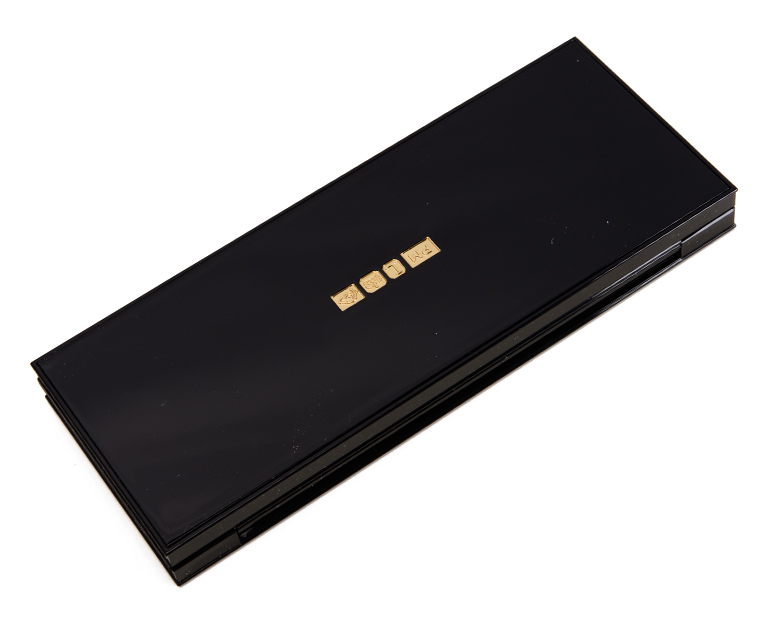
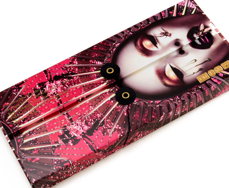
Which Pat McGrath Mothership Palette should I get?
With the price point of Pat McGrath Mothership palettes being a whopping $125 a pop, the question of “which one” to get is something I get routinely asked by readers. Unsurprisingly, my answer is “it depends!” First and foremost, they’re great palettes from a quality perspective, but whether they’re “worth it” ultimately depends on your needs, your preferences, and your collection.
If you have 45 eyeshadow palettes you love, what do you really think Pat McGrath–or any new palette–is going to offer you that’s substantially different? I also think if you’re curious about the formula, the brand runs sales often enough (10% off for new releases and 20% off during sale events) (aka wait!) and has released (with some still available) smaller format palettes that can give one a taste of the brand without making a $125 commitment. Lastly, really look at the shades that you’re drawn to and ask yourself the following questions:
- What is it about this shade that speaks to me? Is it the color? The finish? The pigmentation?
- How many shades in the palette do I love? How many would I use?
- How will I use this palette? As a standalone palette or paired with something else? What? How does it fit into my collection?
- Can I get close to shades that catch my eye with what I already own? By layering?
For each palette, I’ve looked at the palette as a Color Story as well as from a Quality standpoint. A color story is the composition of colors, including depth, undertone, and finish, and how they are arranged within the palette. Aside from wanting a palette of quality, the color story is the most important part of a palette. It’s really the composition and arrangement of a pre-made palette that catches one’s eye and determine whether it “makes sense” to our eye or not.
Table of Contents
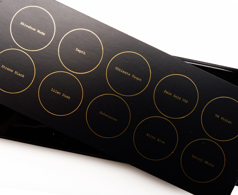
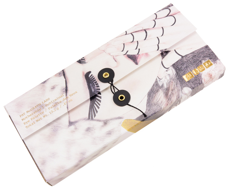
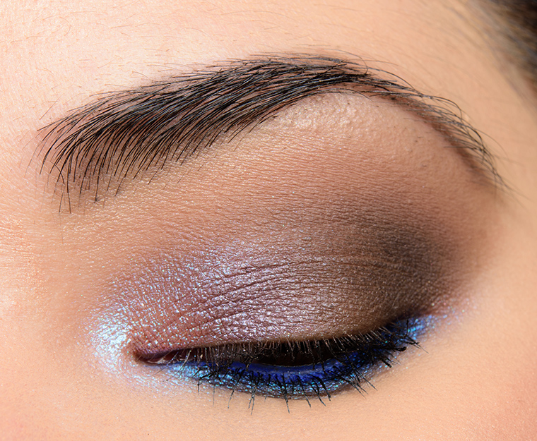
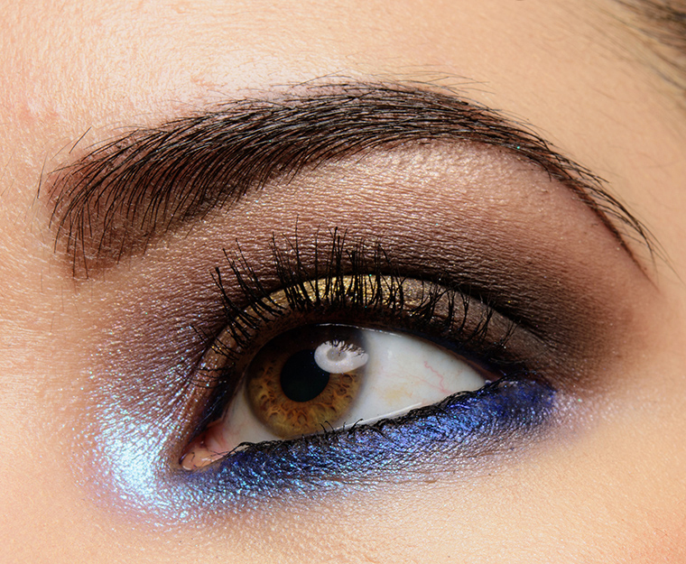
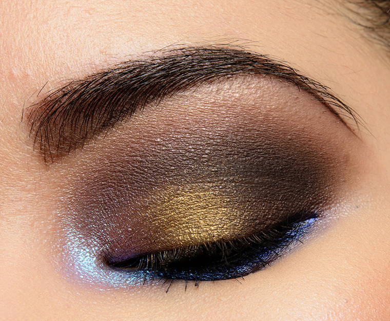
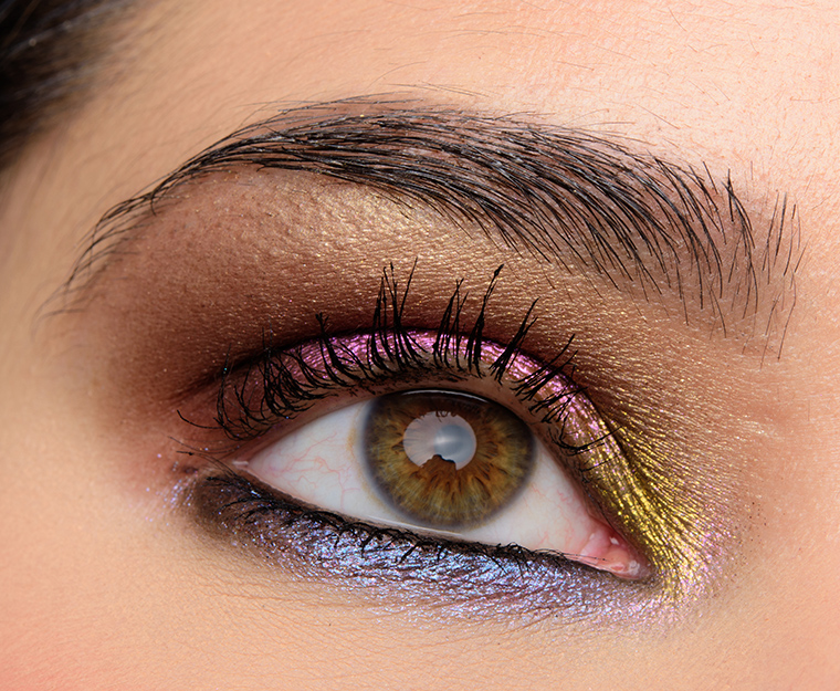
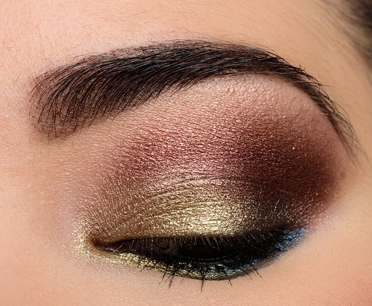
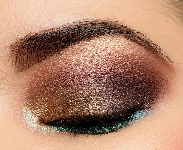
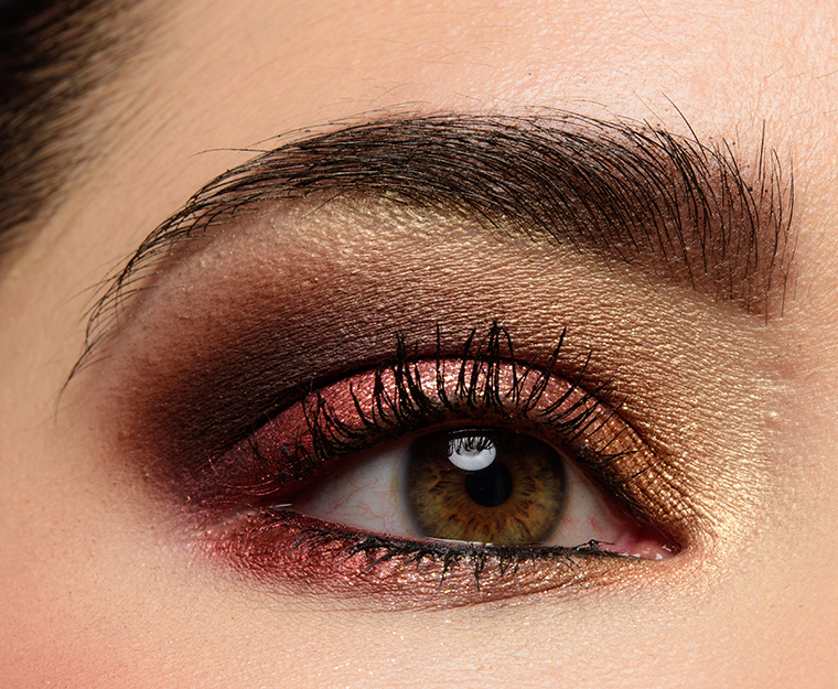
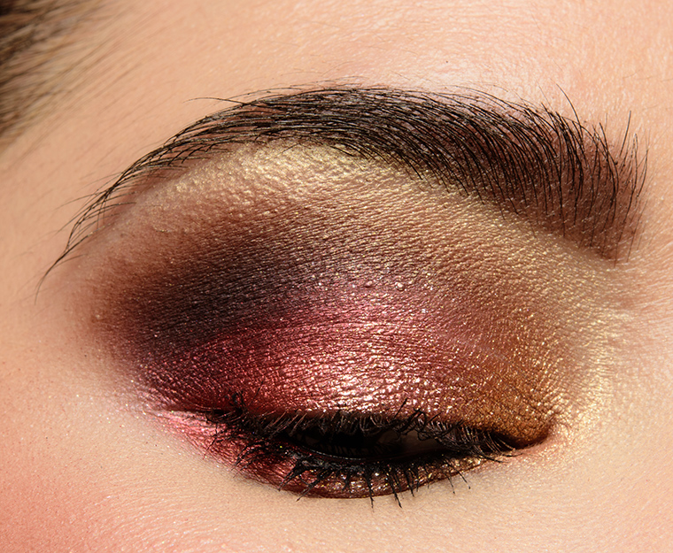
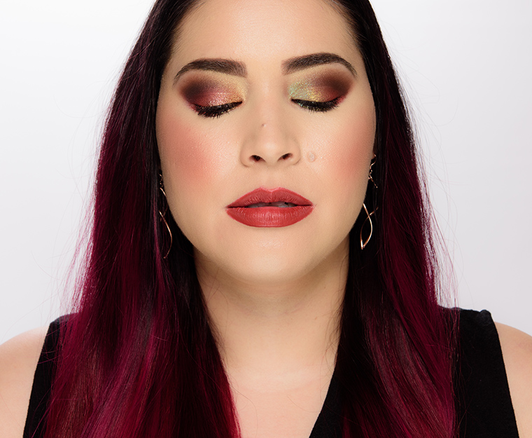
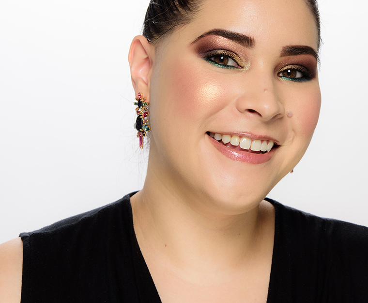
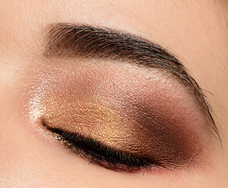
Mothership I: Subliminal


Color Story
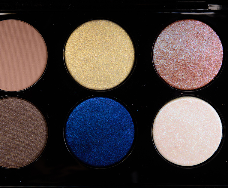
It’s a darker, smokier, cooler-toned story that leans more neutral. There are five neutrals–beige, three taupe/browns, one black–along with two more lavender hues and a gold that are more neutral-adjacent than full-on color. VR Violet and Blitz Blue are the most “colorful” in the palette with the Blitz Blue being the real pop of color; Pale Gold 002, VR Violet, and Astral White are more of a pop of sparkle/sheen than vivid color.
Finishes
-
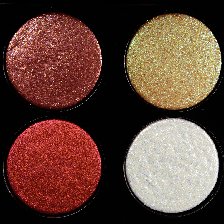
- Matte: Depth, Ultimate Taupe, Xtreme Black
- Satin/Pearl: Lilac Dust, Substance
- Metallic: Skinshow Nude, Pale Gold 002, Blitz Blue
- Sparkly: VR Violet, Astral White
Cohesiveness
It is a cohesive combination of colors as there’s good range from very light (Skinshow Nude, Astral White, Pale Gold 002) to very deep (Xtreme Black) and a mix of mattes and shimmery shades. The tones of the colors work well together to create a cohesive look. The looks derived from the color story will tend to be smokier with a pop of shimmer/sparkle, but it should be easy to have a more diffused and blended out crease area with the included neutrals.
Originality
It is hard to find cooler-toned palettes on the market place, so I think the fact that it is on the cooler side of things makes it standout a bit. A lot of shades are less unique when looked at alone, though. Even something like Blitz Blue, which might catch the eye at a glance, is the type of blue that is fairly common to see.


Quality
It received a B+ or 88% rating when I reviewed it, so it was a good palette overall with more minor issues or areas of improvement. In this particular instance, some of the more metallic and sparkly shades had to be applied with a fingertip or with a dampened brush to get full coverage. I still think the brand’s quality is a little higher in later Mothership releases compared to this one.
Pigmentation
The majority of the shades were pigmented. Shades like Pale Gold 002 and Astral White yielded the best coverage with a fingertip or dampened brush, so for those who don’t mind those application methods, I would consider the palette to have the pigmentation you’d want. Depth and Ultimate Taupe required light to moderate building, and in practice, this made them easier to use in my experience.
Texture
Some of the shimmers felt a little drier when applied dry, which was also why fingertip/dampened application is more critical when using this palette than some of the other releases. The mattes are soft and blendable with light powderiness, usually restricted to the pan-only with limited to no fallout during application.
Longevity
The majority of shades lasted around eight hours on me before fading noticeably, which is slightly lower than typical for some of the brand’s later releases but is typical across most powder eyeshadows (without primer, of course).
Application
I really think you have to enjoy–and prefer!–applying your shimmers with a fingertip or a dampened brush OR enjoy more of a wash of shimmer/sparkle for layering. I usually press and pat more shimmery/sparkly shades into place, and then blend, which usually works out well with Pat McGrath’s formula and makes clean-up minimal to none. The mattes work best built up, too, so someone who is heavy-handed may find it less foolproof to work with.
Bottom Line
Subliminal is best for: Someone looking for a darker, smokier look and prefers cooler undertones and finds most of the brand’s Mothership palettes too shimmer-heavy. Someone who likes sheerer shimmers or doesn’t mind using a fingertip or wet brush to amplify shine/coverage.
Complements: This palette pairs best with Subversive (Mothership III) and Decadence (Mothership IV), which are both slightly smoky, more muted and/or cooler-toned (or at the very least, have less orange-based warmth).
Editor’s Thoughts: As much as I love taupe shades, this palette is my least-used Pat McGrath palette, and it’s the one color story that gets lost in my memory.
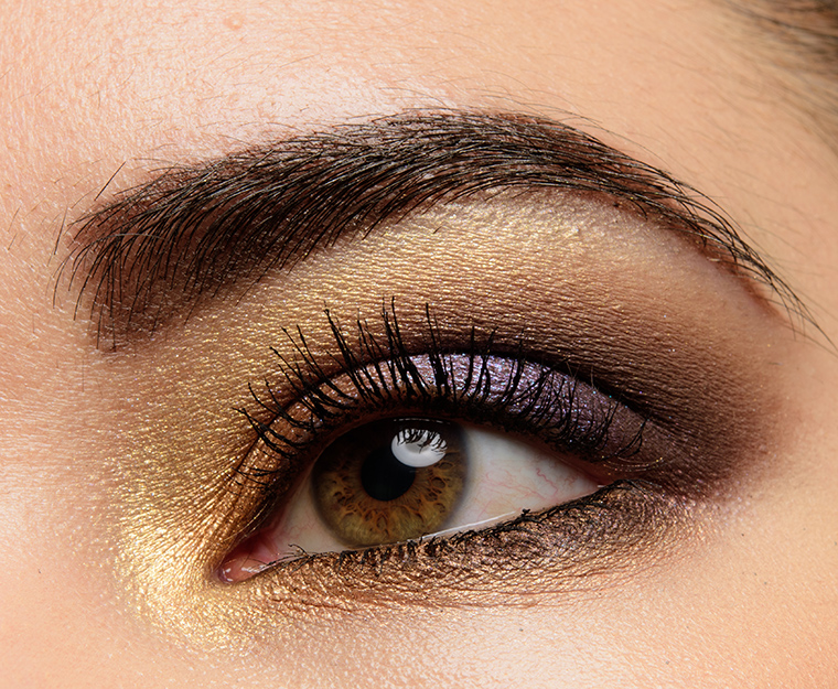
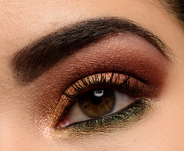
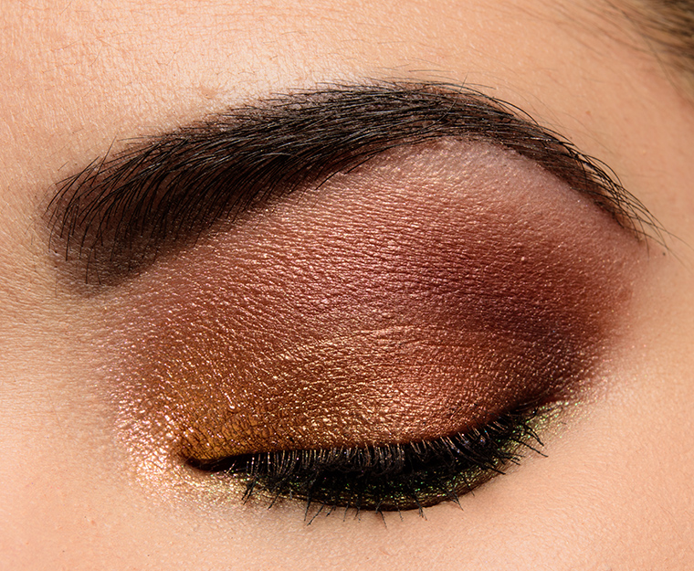
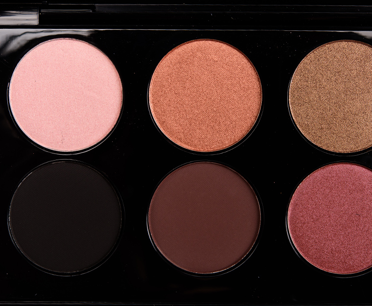
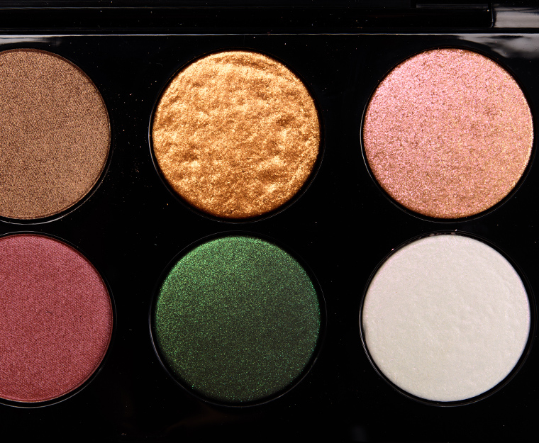
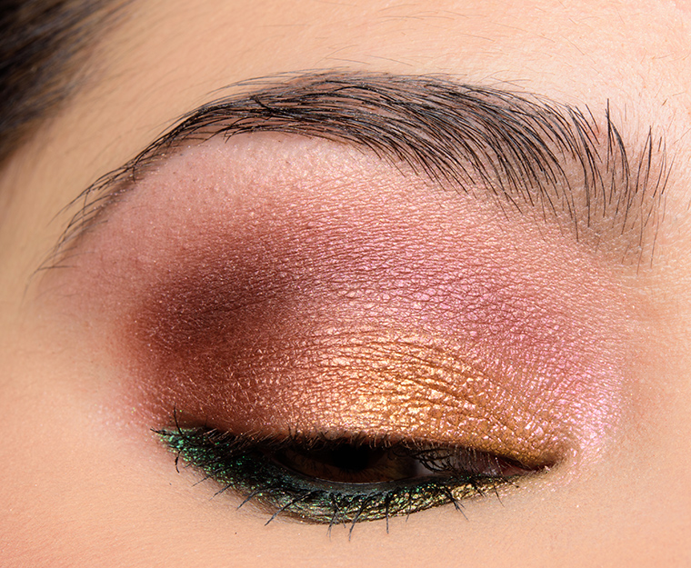
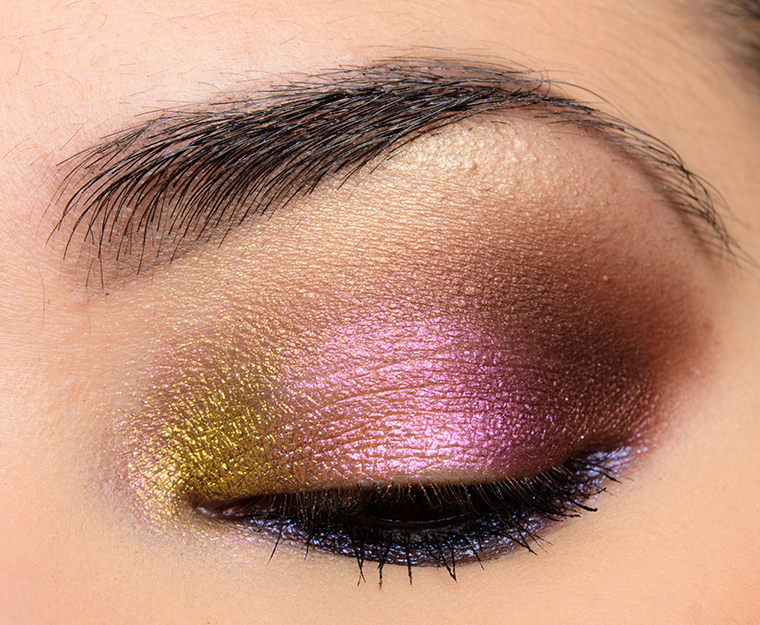
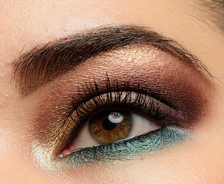
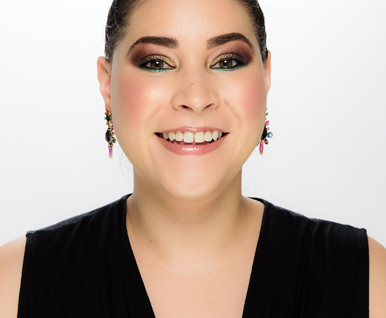
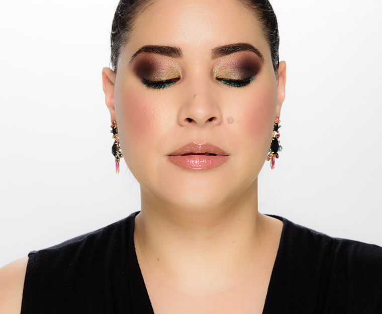
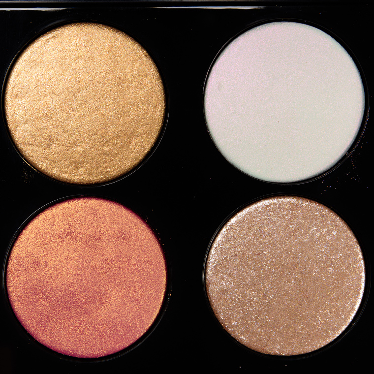
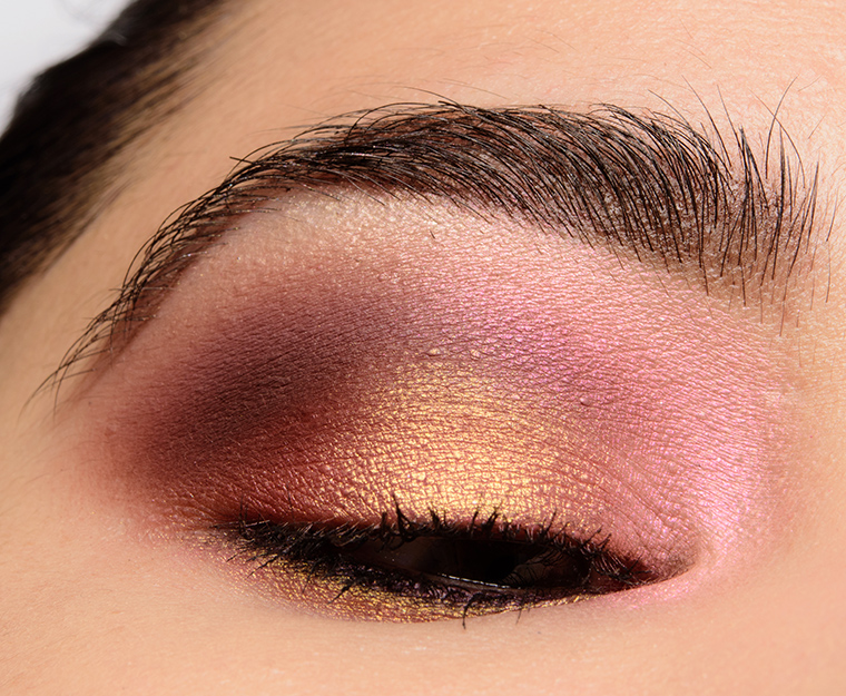
Mothership II: Sublime


Color Story
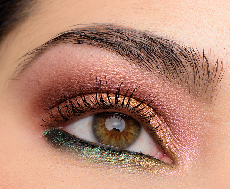
It is a fairly shimmery, warmer neutral palette with a pop of green. It has more of a mid-depth to medium-dark depth with warmer, more bronze and copper neutrals paired with a pop of emerald green. Both of the matte shades included are quite dark, so I think a lot of looks using this palette can end up looking darker and smokier. To get softer looks, one has to use only shimmers or pull in different matte shades.
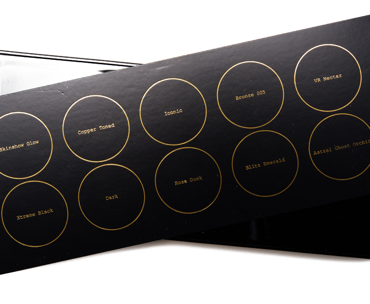
Finishes
- Matte: Xtreme Black, Dark
- Satin/Pearl: Skinshow Glow, Copper Toned, Rose Dusk
- Metallic: Iconic, Blitz Emerald
- Sparkly: Bronze 005, VR Nectar, Astral Ghost Orchid
Cohesiveness
As both of the matte shades are very deep, a lot of looks can have a similar smoky, deeper vibe. The palette can be used cohesively but is one that benefits from pulling in more mid-tone mattes to create a range of softer and sultrier looks. Copper Toned, Iconic, and Bronze 005 differ noticeably, but they are closer in depth than might be desired for greater versatility. The pink tone of Skinshow Glow doesn’t always pair as well with the warmer-toned neutrals in my experience.
Originality
Shades like Copper Toned and Bronze 005 are both in the copper family, which is a color I find is well-represented across brands. The blendability of Xtreme Black makes it a welcome addition, but it is still a matte black. The finish and intensity of sparkle/sheen of Blitz Emerald makes it standout more than it might otherwise.


Quality
The palette received an A- or 91% rating when it was reviewed. Like Subliminal, the more intense, sparkly shades tended to work best applied with a dampened brush, which improved application, adhesion, and coverage (the latter being more intended by the brand). The palette was easy enough to apply, blend and build, and lasted eight to nine hours, generally.
Pigmentation
Most shades had semi-opaque to opaque coverage in a single layer with VR Nectar and Astral Ghost Orchid needing to be built up or applied with a dampened brush/fingertip for better coverage (sometimes intended, sometimes not).
Texture
The domed shades felt slightly drier to the touch (I find the more recent iterations to be a bit smoother and more finely-milled, almost creamier at times, but it does depend on the shade), so there could be a bit of fallout during application and/or during wear if I wasn’t careful. You also have to appreciate and enjoy shimmer finishes that aren’t always intensely metallic.
Longevity
Most shades lasted an average of eight hours on me with Bronze 005 and Astral Ghost Orchid yielded some fallout during wear when used dry.
Application
I really think you have to enjoy–and prefer!–applying your shimmers with a fingertip or a dampened brush OR enjoy more of a wash of shimmer/sparkle for layering. Those shimmer/sparkly shades responded well to fingertips or a wet brush, though, and everything was blendable and workable. I usually press and pat more shimmery/sparkly shades into place, and then blend, which usually works out well with Pat McGrath’s formula and makes clean-up minimal to none. I didn’t feel like the palette was difficult to apply, but it could be easy to over-apply the darker mattes and get a much darker-than-intended look.
Bottom Line
Sublime is best for: someone who loves warmer, pearl and metallic red- and orange-based shades, like copper and peach, and likes a darker, sultrier look. You should like (or even prefer) to apply shimmers with your fingertips or with a dampened brush or else like the sheerer effect of those shades dry.
Complements: This palette pairs best with Midnight Sun (Mothership VI) and Bronze Seduction (Mothership V), which both have green shades in them and can help extend the depth and finish of Sublime. It can be paired with most of the other Motherships, too, but the two listed are my personal picks.
Editor’s Thoughts: Blitz Emerald is the most memorable shade in the palette for me, but it has ended up a palette that I tend to pair with other Motherships than use on its own. I particularly like incorporating some of the less-intense shimmers in this with more metallic shades from other palettes.
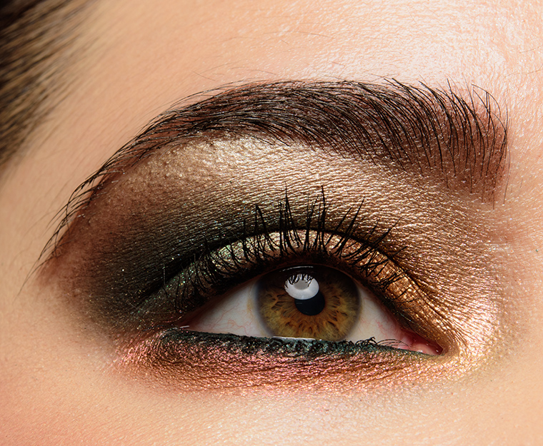
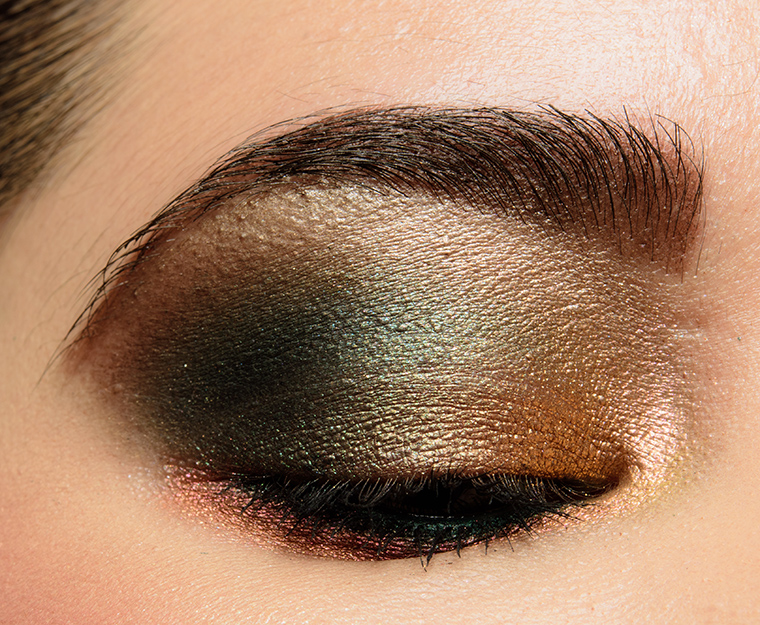
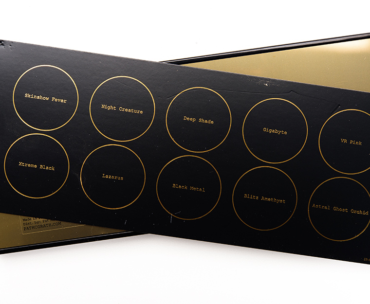
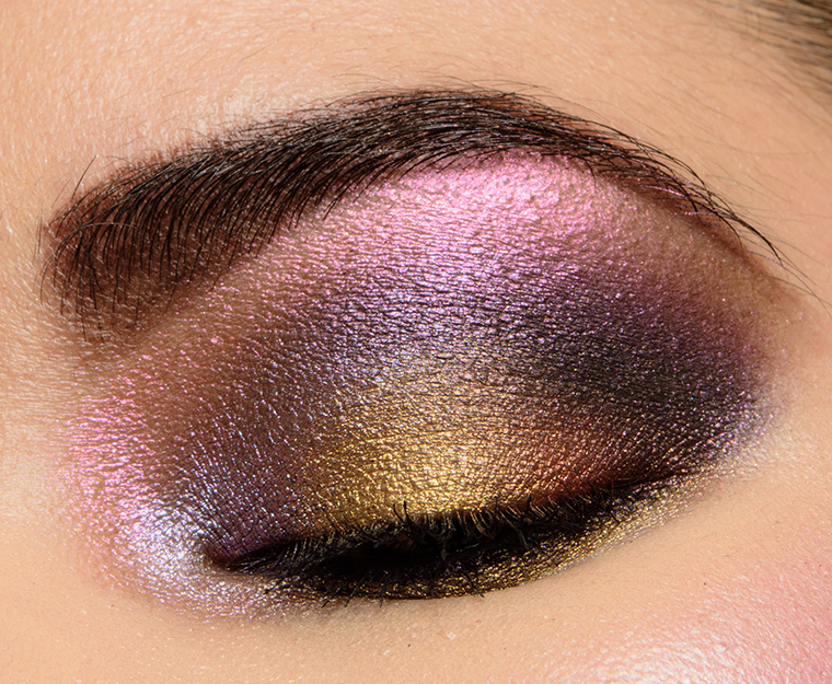
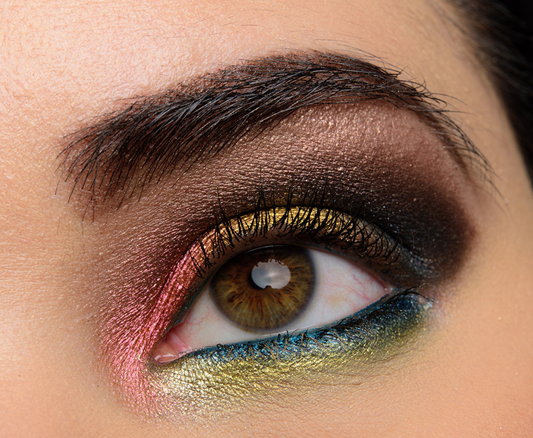
Mothership III: Subversive


Color Story
It’s a brighter, more sparkling mix of shades that gives off space/galaxy vibes. Every time I look at this one, I think about galaxies and nebulas. I’d argue it’s still a warmer-toned palette on the whole, but it is anchored by more neutral or “less-cool” shades like Night Creature, Gigabyte, and Black Metal.
Finishes
- Matte: Deep Shade, Xtreme Black
- Satin/Pearl: Skinshow Fever, Lazarus
- Metallic: Gigabyte
- Sparkly: Night Creature, VR Pink, Black Metal, Blitz Amethyst, Astral Ghost Orchid
Cohesiveness
I feel that all of the shades coordinate well with each other from tonal and finish perspectives. I think there could be more variety in depth–like the others, it has a darker, smokier lean to it that likely will require incorporating your favorite mattes into a look for greater versatility. For example, Lazarus could be lighter and a bit brighter on its own, because you can use Deep Shade or Xtreme Black to darken it readily.
Originality
Shades like Night Creature, Gigabyte, VR Pink, Black Metal, and Blitz Amethyst are more standout shades. You don’t get a lot of purple/berry hues that perform this well, and deeper, almost “cool-toned” golds like Gigabyte are rarer compared to more typical yellow golds (which PMG has plenty to choose from). Xtreme Black is repeated through Motherships I, II, and III, so obviously once you have one….


Quality
It was rated a B+ or 89% when it was originally reviewed. Where it under-performed was with respect to the more domed shimmers, which were slightly drier or more prone to fallout and didn’t sync up with the pigmentation level as marketed. Like the prior two Motherships, these shades yield smoother, richer payoff with less tendency for fallout when used with fingertips or a wet brush.
Pigmentation
Most of the shades had semi-opaque to opaque coverage with the more sparkling shimmers being more medium to opaque depending on application (dry/wet or with fingertips). Deep Shade had to be built up for full coverage, though it made it more foolproof to work with. The more pearly shades like Skinshow Fever and Lazarus were very pigmented.
Texture
Four shades were more sparkly, which resulted in light fallout during application and, at times, during wear, especially when applied with a dry brush. Like the previous Motherships, to get the smoothest, most even application, least fallout, and most coverage, application with fingertips or a wet brush were key. If you prefer more of a wash of shimmer, you may still find a fingertip to be the best for diffusing and blending to avoid light fallout. Deep Shade has a less substantial, velvety feel to it compared to most of the brand’s matte shades.
Longevity
The majority of shades lasted around eight hours on me before fading noticeably, which is slightly lower than typical for some of the brand’s later releases but is typical across most powder eyeshadows (without primer, of course). Shades like Blitz Amethyst and VR Pink could have light fallout if applied dry during wear.
Application
At this point, you might be sensing a theme: you’ll get the most mileage out of Pat McGrath’s sparkly shades by using them with a fingertip or a dampened brush if you are looking for maximum coverage and sparkle and minimal fallout. I absolutely use them dry, too, but if I do so, I’ll make sure to apply my eyeshadows before my base products to clean up as necessary. I usually press and pat more shimmery/sparkly shades into place, and then blend, which usually works out well with Pat McGrath’s formula and makes clean-up minimal to none.
Bottom Line
Subversive is best for: someone looking for a “wearable,” but richer color story that doesn’t lean overly warm or overly cool-toned and enjoys a their shimmer. You’ll also want to be comfortable using fingertips or a wet brush (even with just water!) if you require opaque coverage out of couple of the more sparkly shades.
Complements: This palette pairs well with Bronze Seduction (Mothership V) and Divine Rose II (Mothership VIII).
Editor’s Thoughts: From the original three Motherships released, Subversive is actually my favorite. I love the space vibe from it! I tend to pair it with another palette, though, to get a brighter look at times.
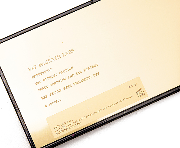
Mothership IV: Decadence


Color Story
It’s all about more muted, deeper jewel-tones with shiny, smoother metallic finishes. It is more balanced between warm and cool undertones, and because the metallic finish is quite smooth, the effect is more molten, seamless when applied.
Finishes
- Matte: N/A
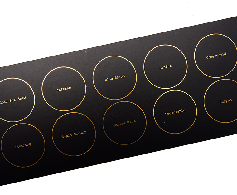
- Satin/Pearl: Underworld, Enigma
- Metallic: Gold Standard, Inferno, Blueblood, Sinful, Sterling, Lapis Luxury, Divine Mink, Hedonistic
- Sparkly: N/A
Cohesiveness
The palette features all shimmers, which is typically not the go-to for most readers in my experience, so it is the least cohesive Mothership that has been released to-date. I think the colors themselves can easily be paired with each other, but it is likely that incorporating other matte shades from other palettes would be necessary to get the most out of this palette.
Originality
At least half of the shades are what I’d consider to be dupable–like Gold Standard, Sterling, and Hedonistic–while others are harder to find with the level of depth and finish–like Sinful, Lapis Luxury, and Divine Mink. The finish is a smoother metallic, which almost looks “melted” on the skin rather than being sparkly or more textured and that type of finish isn’t quite as common.


Quality
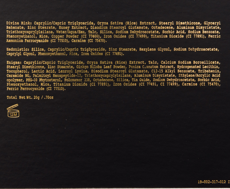
It received an A or 98% rating when it was originally reviewed. The formula is extremely consistent with an excellent, easy-to-use texture, intense pigmentation, and stellar longevity. Between the texture and payoff, they’re the kind of eyeshadow that you can swatch on your arm and just keep dragging your finger across and getting so much coverage; it’s just that creamy, smooth, and pigmented.
Pigmentation
All 10 shades were very pigmented applied with a dry brush, and they could, of course, be intensified by applying with a fingertip or a dampened brush (the latter would bring out the sheen).
Texture
The formula in this palette was creamier, denser, and richer in feel, but they weren’t overly thick, so they still picked up well with a variety of brush types. They also had a more “melted” effect–as they were so smooth and shiny–on skin that didn’t emphasize skin texture. There was only the barest amount of fallout (after 10 hours of wear) with Sinful.
Longevity
Most shades lasted 10 hours before fading–that’s without a primer–which is pretty impressive.
Application
They were very easy to pick up, apply, and blend out. They’re some of the nicest and easiest shimmers I’ve worked with, and it helps that they’re consistent within the palette.
Bottom Line
Decadence is best for: someone who is die-hard over smooth metallics in these types of colors and is happy to pull out additional matte shades or pair it with another palette.
Complements: This palette pairs well with Bronze Seduction (Mothership V) and Subversive (Mothership III) in my experience. I also like it with Midnight Sun (Mothership VI) and Divine Rose (Mothership VII).
Editor’s Thoughts: It’s my all-time favorite Pat McGrath palette, and it’s pretty much my favorite eyeshadow palette, period. I love the finish and ease of the formula–so pigmented but so easy to apply and blend out.
Mothership V: Bronze Seduction


Color Story
It’s a warm-toned neutral palette with a mix of mattes and metallics that lean slightly redder/rosier overall and has a pop of green duochrome. The end results are quite glitzy with sparkling, shiny finishes that brighten while the mattes add a lot of drama.
Finishes
- Matte: Entrapment, Xtreme Aubergine, Disobedient
- Satin/Pearl: Skinshow Divine Glow
- Metallic: VR Fire Opal, Blitz Flame
- Sparkly: Bronze Blaze, Rose Gold 005, Gilty Pleasure, Astral Luna Gold
Cohesiveness
This palette is one of the more cohesive palettes from the brand as light to dark runs between both shimmers and mattes, and it also includes three matte shades (whereas most past palettes contained only two). The undertones also complement each other, so it is hard to go wrong when pairing two or three shades together.
Originality
Since the palette covers warmer, neutral territory, it is less unique in a sea of warm neutral palettes. Pat McGrath included two more duochrome shades–VR Fire Opal and Astral Luna Gold–that I think give it more interest. It is also harder to find deeper purples like Xtreme Aubergine (and done well).


Quality
It received an A or 96% rating when originally reviewed. It largely lived up to the claims made by the brand, so it was pigmented where it was supposed to be (and buildable where it was supposed to be), blendable, easy to work with, and longer-wearing. It’s actually with this release that I feel the brand revved up existing formulas a touch–not massive departures, but they feel more buttoned up as the shimmers/sparkly shades were smoother, less dry, and less prone to fallout during application.
Pigmentation
The mattes had excellent, opaque color coverage, but they could be built up with a lighter touch as they were more substantial (but not overly powdery). You will want to use a fluffier, less-dense or pointed brush for more diffused or sheerer coverage. The majority lived up to claims, but shades like Rose Gold 005, Gilty Pleasure, and Astral Luna Gold are designed to be applied with fingertips (or with a wet brush) for maximum coverage. The other shimmers were nearly opaque or opaque regardless of dry, wet, or fingertip application.
Texture
The mattes were velvety, substantial, and dense without being prone to fallout, which made them more intense and true-to-pan in color during application. The shimmers–that weren’t domed–were lightly creamy, dense but not thick, while the more dome-shaped shimmers felt smooth to the touch, more baked but not actually dry or chunky.
One shade, Bronze Blaze, does include plastic (PET) glitter, which gave it a chunkier texture relative to the others, though it seemed smoother and finer (in particle size) that I didn’t even realize it actually contained plastic glitter for awhile. Astral Luna Gold might have some fallout if applied dry (the brand recommends using a fingertip and patting to apply).
Longevity
The majority of shades lasted nine hours or better on me with minimal, even fading with minimal fallout (over time) from some of the more sparkly shades.
Application
The matte shades are richer and more intense, so for someone who wants a really diffused, more semi-sheer application of color, it might be painstaking to do so. I considered the mattes to be blendable to get softer edges, just not to take them from opaque to semi-sheer with ease. The more sparkly shimmers are better applied with fingertips or a wet brush to get better coverage and to minimize fallout (both during application as well as during wear). Nevertheless, the shimmers work dry, but they can just have more initial fallout if I am not careful (and may have a little bit more during wear, too). Astral Luna Gold can work well to add sparkle/shine to any shade by patting it gently on top.
Bottom Line
Bronze Seduction is best for: someone who likes sparkling, warm-toned neutrals that can get intense and smoky really quickly–or else has plenty of mattes already to pair with and extend the palette. Someone who wants glam, holiday party vibes with twinkling rose gold and gold.
Complements: This palette pairs well with Divine Rose (Mothership VII) and Midnight Sun (Mothership VI). I think it works with just about all of the Motherships (Subliminal, Mothership I, might be the most contrasting), though.
Editor’s Thoughts: I’ve found that shades like Xtreme Aubergine, VR Firal Opal, and Rose Gold 005 pair particularly well with the other Mothership color stories and have reached for this one over and over again. It also feels more foolproof as a standalone palette, too, for me.
Mothership VI: Midnight Sun


Color Story
It is a warm-toned, slightly earthier take on neutrals with a pop of purple. It is less deep and rich compared to most of the other previously-released Motherships and includes one of the lighter matte shades released (Taboo). It offers both softer and more intense looks as a result.
Finishes
- Matte: Vermillion Venom, Xtreme Dusk, Taboo
- Satin/Pearl: Skinshow Moon Glow, Wicked Envy
- Metallic: Bronze Eclipse
- Sparkly: Blood Moon 005, Jubilee, Blitz Violet Orchid, Astral Solstice
Cohesiveness
With three mattes that differ distinctively in undertone and depth with seven shimmers that also range from almost sparkling, translucent to purple, there are a lot of different color combinations to be worn at differing intensity levels. A lot of Pat McGrath’s palettes utilize deeper mattes, which are effective at ensuring greater usability of all shades across skin tones, but it can result in a darker, more intense look more often. There was also less overlap (while still being tonally harmonious) between the shimmers–like Bronze Eclipse is more golden whereas Blood Moon is quite red-orange.
Originality
The quality and intensity of shades like Vermillion Venom and Xtreme Dusk are harder to find–these shades are often dry, stiff, or challenging to blend. The effect and how the sparkles in shades like Astral Solstice and Blitz Violet Orchid sit on skin is more impactful than typical shimmery shades, too, especially in pressed form (I feel like formulas that compete with these are in loosely-pressed in pots). Shades like Jubilee and Blood Moon 005, though, are ones we’ve seen plenty of over the years!


Quality
It received an A- or 92% rating when originally reviewed. The weakest performing shade, by the books, was Astral Solstice, though I know many readers love it for how it performs (regardless of what the brand says it’s supposed to do), which was sheerer in action than marketed. Otherwise, performance was comparable to past experiences: mattes were pigmented, blendable, and long-wearing, while traditional shimmers were pigmented, almost creamy, and long-wearing; and the more sparkly/domed shades tended to apply a bit better with fingertips or a dampened brush (for greatest opacity and least fallout). Most of the domed shades were easy to use dry, though, which hasn’t always been the case.
Pigmentation
All three mattes had good pigmentation and were fairly true-to-color from their pans. The more traditional shimmers were mostly opaque to opaque, while Astral Solstice had to be used with a wet brush for full opacity but was more of a sheer to medium-coverage “topper” shade used with a dry brush or fingertip. Blood Moon 005, Jubilee, and Blitz Violet Orchid were fairly pigmented dry as well as wet but would benefit from fingertip or wet application if opacity was desired.
Texture
The majority of the shades were easy to work with: blendable, no to minimal fallout, and good, even adhesion. Shades like Blood Moon 005 and Astral Solstice had slight to light fallout when used dry, though fallout during wear was only an issue with Astral Solstice. The more pearly to metallic finishes sit well on bare skin without emphasizing lid texture, while the sparkle used was flatter, so reflective but better adhering than some sparkly products (more from years past).
Longevity
As I mentioned, since Mothership V, I felt like the formulas got amped up, and most of the shades lasted between nine and 10 hours on me before showing signs of wear. There was some fallout with Astral Solstice when used dry, which was the worst of the bunch.
Application
It’s one of the easiest, more foolproof palettes to use in the line-up as most of the shades can be used with good to great results with a dry brush. For more intense shine/depth, all of the shimmers can still be applied with a fingertip or with a wet brush, but it was only necessary (for opacity purposes) with Astral Solstice (which, because it has more of a transparent base, works beautifully as a sheer, all-over wash or to layer over anything else).
Bottom Line
Midnight Sun is best for: someone who doesn’t like really all warm-toned neutrals (like in Bronzed Seduction) but is looking for an “amped up” neutral palette (Wicked Envy and Blitz Violet Orchid change it up) with noticeable sparkle. This is also a palette that works well dry for nine of 10 shades, which may make it a better fit for anyone who’s been put off by having to use fingertips and/or wet application.
Complements: This palette pairs well with Bronze Seduction (Mothership V) and Divine Rose I (Mothership VII).
Editor’s Thoughts: I find myself using this one with other palettes and the smaller quads. I really like the variety in depth and undertone of the mattes, and Taboo is more of a workhorse shade for me, personally. It’s not the most interesting or complex from the brand’s range, but it comes together really well in practice.
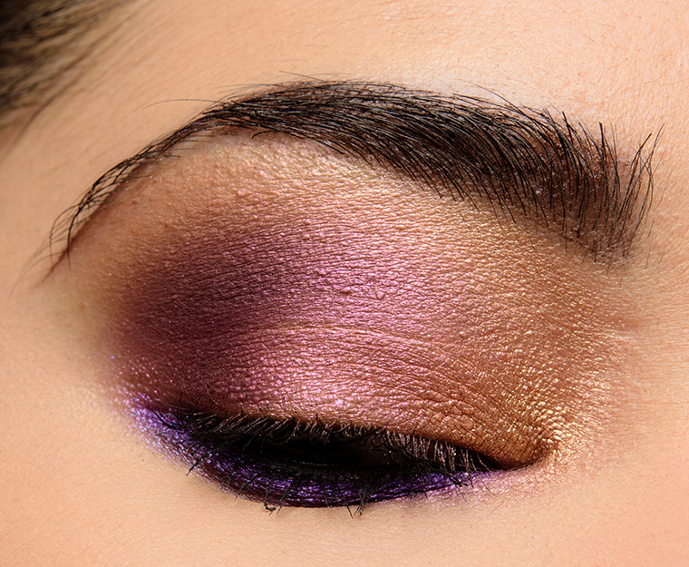
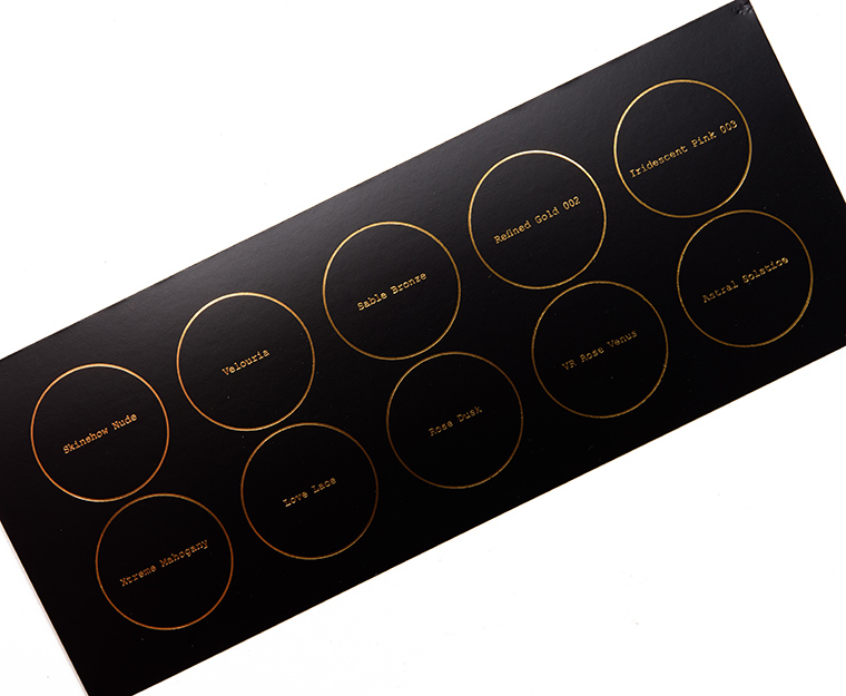
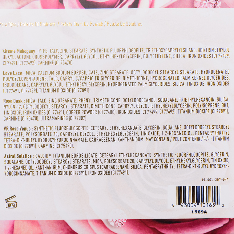
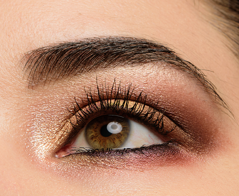
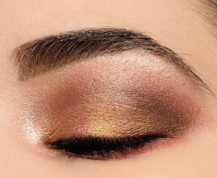
Mothership VII: Divine Rose I


Color Story
It’s a softer, more “romantic” mix of gold, pink, and mauve neutrals with a mix of mattes, shimmers, and metallics. It is one of the “lighter” color stories from the brand, though it’s still more mid-depth to my eye as Velouria goes on darker in practice than it appears in the pan.
Finishes
- Matte: Velouria, Xtreme Mahogany
- Satin/Pearl: Skinshow Nude, Rose Dusk
- Metallic: Sable Bronze, Refined Gold 002, Iridescent Pink 003, Love Lace, VR Rose Venus
- Sparkly: Astral Solstice
Cohesiveness
It has a similar level of cohesiveness as Motherships V and VI, though with only two mattes, it may not be quite as versatile as the prior two releases. The two mattes had a good contrast in depth and undertone, though, so I think that when they blend together, it is easy to make it appear warmer, darker or lighter and cooler as desired. VR Rose Venus is more complex swatched than on for me, as it often looks more like an orange-y gold than a gold-to-pink shift, so sometimes it doesn’t look that different from Refined Gold 002 in practice. This palette has five lighter/brighter shimmers, which is the most in any release, so might lend itself better to someone who does 1-3 shade looks or likes a wash of lighter shimmer all-over.
Originality
It’s at this point in the process where Pat McGrath’s fascination with gold eyeshadow becomes glaringly apparent! Astral Solstice is a repeat from Midnight Sun (Mothership VI), Skinshow Nude is from Subliminal (Mothership I), and Rose Dusk is from Sublime (Mothership III), while Iridescent Pink 003 is quite close to the same-named shade in a highlighter trio (and while it has a strong shift, this type of duochrome is quite common). The intensity and quality of pigmentation/blendability of Velouria and Xtreme Mahogany make them standout with the latter being more common.


Quality
It received an A or 94% rating when it was originally reviewed. All of the shades had semi-opaque or better pigmentation with soft, blendable textures with eight to 10 hour wear, and in general, they were consistent with past experiences with the brand’s eyeshadows and palettes. Astral Solstice performed better in this palette than it had for me in Midnight Sun (Mothership VI).
Pigmentation
All 10 shades had semi-opaque to opaque pigmentation with sheerer shades being Astral Solstice, if not used with a fingertip/wet. I suspect that for most, the transparent base packed with sparkle of Astral Solstice means that a lack of actual pigmentation is not a deal-breaker.
Texture
Iridescent Pink 003 has a slightly powdery base, which is uncommon in the brand’s range, and this made it work better applied with a fingertip or a lightly dampened brush. The majority of the shimmers were creamy, dense without being thick or stiff, and blendable without difficulty. The mattes were velvety and substantial but still blendable. Astral Solstice was noticeably sparkly and had light fallout if used with a dry brush (rather than patted on with a fingertip or with a dampened brush).
Longevity
Astral Solstice gave me light fallout after nine hours of wear, but the remaining shades were longer-wearing and fell between nine and 10 hours before showing signs of wear.
Application
Given Astral Solstice is in this palette as well as the previous palette, I’ll sound like a broken record, but this was the “hardest” shade to use since it required changing techniques to minimize fallout and improve coverage, while the others were all blendable, pigmented, and not prone to fallout. I felt Iridescent Pink 003 applies best with a lightly dampened brush for evenness if used on a larger area, like the lid, but it worked well dry pressed in the inner corner or on the center of the lid. Velouria always goes on a bit darker than I expect it to, which may or may not be a good thing depending on your needs!
Bottom Line
Divine Rose is best for: someone who has been hoping for a more “wearable” or “lighter” color story from the brand and likes a mix of warmer golds with mauve/plum. It is also a better match for someone who prefers to work with their eyeshadows with dry brushes rather than fingertips or with a dampened brush. It is also going to fill in the collection of someone who doesn’t already own a lot of Pat McGrath palettes (as this has some repeats).
Complements: This palette pairs well with Bronze Seduction (Mothership V) and Divine Rose II (Mothership VIII). I also like it with Midnight Sun (Mothership VI) and Subversive (Mothership III).
Editor’s Thoughts: I use Divine Rose a lot more than I expected, but I reach for it because of its consistent quality and easy-to-wear shades. Like Bronze Seduction, I feel like I can pair it with a lot of the other Pat McGrath palettes I own to ground more complex or interesting shades.
Mothership VIII: Divine Rose II


Color Story
It’s a richer, rose- and berry-themed story with pops of copper and gold that runs warmer and deeper than the original Divine Rose. It sits more in a mid-depth territory with Xtreme Burgundy being lighter than most of the Xtreme ____ mattes found in past releases. All of the shades are warmer toned, though more golden or red-leaning than orange-y.
Finishes
- Matte: Naked Blush, Xtreme Burgundy
- Satin/Pearl: Skinshow Rose Opal, Divine Dusk, Rose Seduction
- Metallic: Eleganza, Bronze Rose 005, VR Sextraterrestrial
- Sparkly: Astral Pink Moon
Cohesiveness
It seemed less cohesive than the last three releases but more cohesive than the initial three Motherships. Eleganza, Divine Dusk, and VR Sextraterrestrial (when it isn’t reflecting light) run together more than I’d say is ideal for one palette. I can notate the differences between the three, but if you put them all side-by-side on the lid, some nuance would be lost.
I felt like the two mattes were particularly well-coordinated with each other and the palette as a whole, though, and helped to give both lighter and darker effects. A lot of the shimmers seemed to sit in more of a mid-depth that there wasn’t as much contrast between shimmers as other palettes, which usually limits versatility.
Originality
VR Sextraterrestrial is a standout shade as it’s one of the first multi-chrome shades by a mainstream brand (primarily indies have dealt in multi-chromes, so this shade isn’t original, point blank, but it could pave the road for making it a mainstream trend). What I found was that the shift was stronger and more noticeable with less contortion than I have experienced with some multi-chromes from indie brands (but this shift intensity does vary from shade to shade, formula to formula). Rose Seduction is a pressed pigment, which made it less unique since fuchsia pink is a common shade seen in pigment-form. Shades like Gold Lust 001 and Bronze Rose 005 are ones the brand has even done in close-enough variations in the past.


Quality
It received an A or 96% rating when originally reviewed. The majority of the palette performed exceptionally well–pigmented as claimed, blendable, easy to use, long-wearing–and the only shades that gave me (minor) trouble were Skinshow Rose Opal, which seemed to be thicker in its consistency, and Astral Pink Moon, which was quite sparkly so there was slight fallout during application and over time.
Pigmentation
Every shade had nearly opaque to opaque coverage except Astral Pink Moon, which wasn’t intended to; the brand recommended to apply it with a fingertip and build up to desired intensity, which was an accurate description of my experience with it. Astral Pink Moon was a lot like Astral Solstice, but it seemed a bit more pigmented (with finger gold shimmer) and could be used as more of a sheer wash or layering shade as well as on its own.
Texture
Both mattes were velvety, substantial but still blendable. Eleganza had an enviable texture (like why aren’t all shimmers this smooth!), while Bronze Rose 005 and Gold Lust 001 had that baked-like feel (slightly dry but not dusty or powdery) but melded well with bare skin. Skinshow Rose Opal did lay down as smoothly as easily as I expected, though workable, while there was light fallout when I worked with Astral Pink Moon.
Longevity
The majority of the shades lasted between nine and 10 hours on me with Astral Pink Moon having light fallout while worn.
Application
The shades applied intuitively and worked well applied dry without special brushes ore techniques (even Astral Pink Moon). You can use the shimmery and sparkly shades wet or apply with fingertips for a stronger finish (more metallic/sparkly), but it wasn’t necessary, which I think made it easier to use (overall) and more versatile. I was also impressed by how readily Rose Seduction blended out as it was a pressed pigment (so not intended for the eye area) and could actually be applied and diffused like a blush (with ease!).
Bottom Line
Divine Rose II is best for: someone who loves gold and plum with lots of metallic shimmer and warm undertones. There are three gold-ish and three plummy shades (with VR Sextraterrestrial being plummy/mauve sometimes) that they’re varying degrees of a similar color story. As a result, this might be easier for someone who finds too much contrast difficult to work with or someone who likes subtle changes in a look that is still more in the same vein (pink and plum or gold and plum).
Complements: It pairs well with Divine Rose (Mothership VII) and Subversive (Mothership III).
Editor’s Thoughts: While I love the idea of multi-chromes making their way into mainstream brands, the rest of the palette feels like it overlaps with shades I have from the brand, so I’m not entirely sure how often I’ll reach for this one going forward. I might use it in lieu of Divine Rose when paired with other palettes initially… we shall see how it shakes out (it’s too new to make a long-term call!).
Summary
The brand has a lot of formulas it uses throughout its palettes, and the brand routinely mentions this shade is buildable or to be applied with fingertips or a wet brush, so your mileage may vary by shade, by formula, and on what you consider “too much” work or part and parcel of your typical routine (some people only apply shimmer shades with fingertips!).
Motherships I, II, and III are least consistent and require more learning or use of techniques to get the most out of each palette. The domed-shaped shades, which are often duochromes or more sparkly, tend to require application with fingertips or a dampened brush if coverage and minimal fallout are desired. Later releases seem to have greater consistency and work better dry as well as with fingertips and dampened brushes, which make them more versatile and may be less fussy to work with.
The mattes are more consistent across the original and later releases, but the later releases have longer wear-times and a more substantial texture. The matte formula is very pigmented and that more substantial texture can result in over-application for those unfamiliar with that payoff level with that texture type. I recommend using a lighter touch and building up if necessary when initially working with the formula. I also find that more precise brushes work better for laying down color and clean, fluffier brushes for diffusing the edge (going back to pick up a touch of product if necessary) ensures I don’t over-do a matte shade.
Mothership IV is least like the others, and in terms of finish, really a smoother, shinier metallic than is used in most of the other palettes. It has no mattes, though, which makes it less cohesive and less versatile. It is more of a complementary palette in my experience.
Mothership V, VI, and VII are most cohesive and most consistent, and along with VIII, reflect an uptick in performance across shades compared to the first three Mothership releases.
The brand doesn’t adhere to the components of the average color story where you see two or three lighter shades that often don’t work on deeper skin tones, and the matte shades in Pat McGrath palettes are often significantly darker than what you’ll find in most pre-made palettes. As a result, having a go-to set of complementary crease, transition, and/or brow bone shades may be necessary to get the most use out of each palette. For deeper skin tones, this means more shades that show up on your skin tone and/or show up more true-to-color.
Pat McGrath palettes always make me keenly aware that they’re created by a makeup artist but still designed for the consumer to use. They come together and have more nuance applied and in action, but you may have to experiment and play to master your technique per formula and your own preferences.
I definitely think that the domed-shaped shades tend (often having names starting with Blitz, Astral, VR or ending in three numbers, like 001 or 005) are the more interesting shades, while there’s something to be said about the quality and intensity of the mattes in shades that brands often don’t bother to do. It would be great to see the brand release 1) an all-matte eyeshadow palette and 2) release some of the more unique shades as standalone singles or even coordinating duos.
This is AMAZING! I’m leaning back toward Divine Rose I now!
Right now, I can’t justify $170 Canadian for any of the palettes. That is not $125 US – closer to $200 – and a no, I have other expenses and the price point is high.
Maybe going through my stash and working with a makeup artist to see what would work for me might be an incentive. I have smaller palettes and I wouldn’t mind finishing a few.
In terms of packaging, I like a smaller, more portable palette.
Maybe sometime down the road.
Christine, I forgot to thank you for the massive amount of work involved in putting this guide together. Ver well done. Hopefully many people will read it and make informed purchases as to which palette (s) is/are best for them.
Hope to help a few, at least! 🙂
I’m also in Canada so the price tag IS an issue. Also, I so wish I could pick and choose shadows from among the palettes as there are a few in each that I really love and would wear (VR Fire Opal has me fascinated as do a few other VR shades) but more than half of each of the palettes has colours I either have already and rarely use or colours I just would never, ever use so to drop a significant amount of money on a palette that is maybe 1/3 usable/pleasing to me and my personal tastes is just wasteful.
I agree. Too bad there isn’t a custom option where you can pick and choose colours and snap them in to your own palette. I too only found a few colours in each that I would use.
I’d be down for a pick & choose approach for sure – there’s always two if not thre colours I wouldn’t use in her mothership palettes and, at that price, it makes me back down from a purchase.
This is fantastic, I’ve been going back and forth about buying divine rose and this summary is just what I needed!
Loved this comparison review Christine, so in depth and thorough.
Sadly, I’ve gone for all of them. I buy into the hype.
Do you enjoy them? I mean, nothing wrong with having all of them if you love ’em! 🙂
The enjoyment is buying and the “hunt”, I suppose. Maybe I was a caveman in a previous life, haha (or no haha). Her eye shadows are so beautiful, there’s no question. I just worry about hitting pan. Am I the only person that finds applying with fingers works better with some of her shimmer shades? It’s not exactly my favorite way to apply color, so that stops me. I just have wayyy too many eye shadow palettes and when I’m getting ready, I think, “Hey, this doesn’t rise to the Pat McGrath level,” so I wind up with something else, saving it for special occasions, when I could use a different palette every day of the week for a couple weeks, at least.
Your question has sparked something in me. I had started “de-stashing” already a couple weeks ago, so I have already cleared out a large amount of makeup and skin care…probably thousands of dollars worth…and given it to my Mother. I’ve asked her to keep whatever she likes and then donate the rest to my SIL to give to ladies in her church for women going back to work. So, I was already in the process of using my nicer palettes anyways, but now, I’m going to just do it. Why have something and not enjoy it? I do enjoy her palettes, but would stop myself, but will stop stopping myself. I truly sound like a loon, looking at my thoughts in words.
That made sense to me, Hope! 🙂 I totally advocate for using what you love and using it often! I always say that it’s better to run out than hardly use it – imagine how much joy you will get going forward!
same here, hope. i got a couple as gifts, and once i tried them i was really impressed and got addicted to collecting them all (except for midnight sun, which still hasn’t caught my eye.)
Thanks for acknowledging the hefty (let’s face it: ridiculous) price tag of these palettes and for being so detailed in your assessments of each one. I always head to to your site for your no-nonsense, honest approach and this post is no exception!
Excellent review such a great detailed answer.
I really enjoyed this comprehensive review!
I own IV, V, VI, VII. IV (Decadence) was my first purchase– after comparing your reviews with the first 3 Motherships– and has become my favorite. I have developed buyer’s remorse after purchasing 5 of her 6 pan, cardboard- housed “limited editions” including the Star Wars themed releases. I never reach for any of them anymore and have since given each of them away.
I will be (finally) skipping on the latest Mothership and using the saved 125$ towards sprucing up my home office. — feels so good to resist temptation!
This is very helpful! A perfect guide for those looking to invest in Pat McGrath. Surprisingly, I like the original Subliminal palette the most but don’t want to splurge on it (particularly if its performance isn’t quuuuite as consistent, as you point out.) When I like PMG and Charlotte Tilbury shades I usually scroll through to find the nearest Sydney Grace dupe ?
I own a smaller 6 pans and have been drooling over one of the 10 pan. My question is, is it really true that there are more products overall in the 6 pans then the 10 pans? Not like I would ever hit pan, but I can’t wrap my head over it, and that kind of prevent me from buying one.
Motherships have 0.47 oz. and MTHRSHPs have 0.42 oz., so it’s slightly more but not a lot more. I will say that the weight of a lot of baked kind of products (so the 4 domed-shape shades in a Mothership) tend to have greater volume but a lower weight (and often cost more when released by brands than standard eyeshadow).
Thanks for clarifying that!
Wow, thank you for putting this together!!
Wow this sort of post it’s a dream for every pallette lover! Excellent work Christine! It guess the titanic effort behind this. After years of blogging you are still able to renew your contents and create something new that it’s incredible even more interesting. Hope that you will continue to do this kind of post even for other brands (i.e natasa denona, huda beauty, abh etc..). Regarding PML, even if I am a palette lover, there is no way I’m going to buy one of these, not at this price point, but it’s still interesting to see this post. However, from the colour story I say that my favourite it’s decadence. It’s not a problem the lack of matte shades, I’m plenty of shades that are perfect as deppening and transition for me. Moreover most of the matte in her other palette are quite dark to be used as transition
I’m not generally drawn to Pat McGrath, but I like Eleganza (purple!) and Rose Seduction (hot pink) and I’m so incredibly drawn to VR Sextraterrestrial, so I think I’ll wait and see if Divine Rose II lasts long enough to go on sale and does so. Either that, or my backup is to go to Clionadh Cosmetics and buy Forge as a Sextra dupe.
Thank you Christine for this Article. I have Divine Rose and really wanted Bronze Seduction but the glitter from Bronze Blaze really scare me 🙁 .
I would never purchase a Pat McGrath palette because I’m too satisfied with my custom made palette.
But, if I were to consider a pre-made palette, it’s not the price or quality that for me is a deal-breaker. It’s just while I love 3-5 colors of each palette and I would get some use of most of the others, each palette has 1-3 shades I would never use; and for me it would be wasteful, considering the price. Maybe Divine Rose I would be something I might something I would use every color, but I would change any day Iridescent Pink 003 and VR Rose Venus with Blitz Blue and Blitz Emerald.
I think that mother Pat McGrath herself, will be pleased and pleasantly surprised by this article! Excellent!
Thank you, Christine! This will be a wonderful resource for the million-dollar question. I will refer to this when anyone poses this question to me directly or in forums. I actually have someone in mind to share this with right now :).
I have II-VIII (baby is on the way to me today!) and I love Pat McGrath’s shadows. As a dark skin black woman, I have always hated buying palettes that contained transition shades for only lighter skin tones, for me it is a waste of space. I think the dark mattes can be used with a lighter hand and of course, you can always pull from the plethora of transition shades that exist in other palettes.
I did not pick up Subliminal due to the overall smokiness of the palette. The feeling of completing the “collection” does creep up on me from time to time though. I resist this pretty well with her minis though.
What a fantastic article! Thank you for putting the time and effort into this comparison. I love the way you examine each palette methodically and analyze the detail of each color (and then add your personal feelings as a side note.) Your honest perspective in your reviews overall are reliable and genuine, but its these extra articles in helping educate your readers that makes you leagues above your peers. We, your readers, are grateful.
I remember when I’ve bought my first Mothership palette, it was the Subversive III. I was disappointed. I didn’t know how to work with it, I didn’t like the mattes, they were super pigmented and difficult to blend, the colours were difficult to pair together without reaching for another palette… I didn’t understand the hype. Was I doing something wrong?
After few months I’ve decided to pass it to my sister (she absolutely loves it?) and I wasn’t about to buy another palette from Pat ever again.
But then I fell into the hype again when everyone was raving about Bronze Seduction. That was much more my colour story. I’ve bought it, absolutely adore it and since then my Pat McGrath eyeshadow collection grew quite a bit.???
Right now I’m proud owner of three Mothership palettes (Bronze Seduction, Midnight Sun and hopefully Divine Rose II soon on the way?), two quads, two 6-pan palettes from her Star Wars collection and I love them all.
As Christine wrote, I think the formula improved from her firstly released palettes. I guess I step up and improve my makeup game over the years too, and now I really enjoy them. Definitely won’t be buying something just for the hype anymore. If I already know I’d like only one or two shades in the palette, it’s not worth the purchase (looking at you Divine Rose I).
Christine thanks for the review! You did an awesome job <3
Here comes a long opinion 😀
I have the I, III, V, VII and I ordered the VIII minutes after the launch 😀
The Mothership IV is the one I wanted the most but finished by not buying it because I got the Eye Ecstasy Subversive as my first Pat Mcgrath palette and has already three colors of the Decadence (and lapis luxury and divine mink were the ones I wanted the most, they're the most unique, the other ones I can dupe easily). It's a gorgeous palette, but It's not a color story that I love that much to want to have it in the Pat Mcgrath formula.
I think the main thing to take into consideration when buying these palettes is the color story. They're all good quality more or less, but which one has the colors that you love or use most? I think the color story, the curation of the shades and textures is the most interesting thing about Pat's palettes. Once I tried the Motherships, I felt like most of my other palettes are simply beautiful or trendy colors put together in one palette, but they don't have a vision or a "story" behind. You can't create many unique looks by simply layering shades with most mainstream palettes, because even if they're great quality, they won't layer as well in my opinion.
Formula-wise I feel that the most special shades are the final quads on the right, they work great on their own, as toppers, wet and dry. I don't have many similar formulas in my collection. The shimmers are very beautiful, they won't look cakey or thick on the lid (so great for mature lids). Natasha Denona's metallics are more foiled and have more impact, but Pat's are more multi-tasking (better for blending in the crease instead of a matte, better as a wash of color or with glittery eyeshadows on top). Sadly I can't say I love Pat's mattes. They're good and it's very hard to find dark, beautiful mattes with such great pigmentation, but they're not the easiest to blend, you must be very careful with the brushes and placement and I find they don't go well with all the primers because if the base is too tacky, they will cling more to the spot where you placed the brush first and that spot will kind of oxidize, get darker and never blend perfectly. Maybe I simply don't have enough experience with her mattes or maybe is more of a problem for fair-light skin toned people, because the mattes are quite dark so "errors" are more noticeable, but I still prefer Viseart, MUFE and Natasha Denona for mattes because they're easier to use, blend beautifully with any base or brush I use and I don't have to use different techniques. Let's say I don't use Pat's mattes if I'm in a hurry because I don't trust them fully :D…But at least we have some mattes that show up gorgeously on dark and very dark skin tones.
I think I and III have the most unique color stories and are my favorites for that reason. The V, VI (it's on my wishlist, I think it's gorgeous for the end of summer-fall period), and VII have the most user-friendly, everyday colors. I think VIII is a great addition for my collection, has a summery vibe to me, and looks great paired with VII. I also have II on my wishlist, but I already have 3 of the shadows in other palettes and I want it mostly for VR Nectar and Blitz Emerald so probably it isn't a wise thing to buy it.
However, these aren't palettes for any makeup user: I wouldn't recommend them for beginners, for who uses mostly mattes or dislikes sparkles, for the user that gets bored easily when using the same palette, the one that loves colorful looks or doesn't care about luxury (and heavy) packaging. Personally they are worth the splurge because they are very good quality and very well curated (colors and finishes) and in the long run they make me less and less interested in other new palettes, so in the end, I'm buying less quantity and enjoying way much what I have. It's a luxury product and gives a luxury experience (sadly the website isn't a luxury experience at all, at least for us European customers), but not everyone cares about luxury eyeshadows and that's perfectly fine.
I really agree with all you’ve written here! It was a learning curve for me at first, but I realized I can apply many of her eyeshadows best on my eyelids with my hands and not using brushes. Now it’s hard to picture buying much from other brands.
Also, once I got so many of the others, Mothership II felt a bit repetitive, though it certainly also has beautiful shades that are unique to that palette.
Yes, even if I keep my nails on the longer side, nothing beats fingers with pigments and creams.
Exactly, it seems a little bit repetitive and I can’t justify buying it for VR Nectar and Blitz emerald right now. But I really want the VI.
I’m also wondering if the mthrshps complement well the first three motherships. Like Mothership I with platinum bronze, Mothership II with bronze seduction and Mothership III with la vie en rose
I love this! Unfortunately, it just reinforces my desire for both Bronze Seduction and Midnight Sun, and makes them both sound delicious! I still can’t choose, despite your very thorough discussion, Christine! The green in Midnight Sun gets me every time, but the workhouse draw of Bronze Seduction also appeals.
Thanks for this post!
Hi Charlie, I have the last four Mothership palettes and I would say Midnight Sun is my favourite and definitely more user friendly and versatile. Bronze Seduction blends beautifully but is very glittery – definitely more for holiday looks. There are chunks of glitter in both Bronze Blaze and Guilty pleasure (the more neutral shades) and I find I get fallout in all of the glitter shades if I don’t use them wet. Taboo in Midnight Sun is the perfect transition shade, and VI is my Day to Night palette. The violet shade is not as punchy as the red though (which I personally prefer).
Wow thank you for this amazing post!!! I love how you have broken them down. I still want to purchase Sublime, Subversive, Midnight Sun, and Divine Rose. I have Bronze Seduction but after your post on PET glitters I really don’t know if I feel comfortable using it. Such a shame. I could have put that into a non-PET glitter PMG palette instead.
Comprehensive and transparent posts like this are why I’ve been coming to your blog for years!! Thanks for the amazing content!!
Christine, this is incredible work! I envy the people who are just getting into PMG and can get your thorough guidance! Like a few other readers, I already own a good number of her 10-pans: I, V, VI, VII, and have VIII on the way. I really enjoyed the read regardless. 🙂
I bought Subliminal when it first came out, and still kinda wish I went with Sublime back then. I was just starting to up my makeup game to better work with my undertones, features, etc., and I thought that because I was fair and strawberry blonde, neutral-to-cool shades would work better. It’s a beautiful palette, but I don’t go for the smokey look very often, and I since discovered that warm browns, roses and oranges are the best friends of my blue eyes and warm undertones for everyday. And as you pointed out, because quality has gone up since the first palettes, I prefer to keep my money for upcoming releases as opposed to circling back and getting Sublime. Oh well, I’ll probably have to keep lusting after VR Nectar for the near future!
I don’t have any of the Motherships, and I cannot see myself spending $125 on one anytime soon, but the ones I’m most drawn to are Bronze Seduction and Divine Rose II. I have four of her MTHRSHP palettes and one Eye Ecstacy palette, all of which I’ve gotten on sale. I’m super curious about the “special” formula though that isn’t in any of the palettes I have. I guess I’ll hold out hope for there to be an irresistible sale, but until then I’ll live vicariously through swatches and videos.
This is very helpful. My first palette from PML was the Subliminal Platinum and I learned that these palettes really require a level of skill I did’t have. I’m an apply two different shades and go time of gal and work in an office, so my looks have to be kind of conservative. It was only after watching some videos on how to apply PML shades with looks I could wear that I really appreciated them. I eventually also got the Eye Ecstasy palettes and was pleasantly surprised how I was able to use the more colorful palette judiciously for office-friendly looks – at a budget friendly entry point. I was really soured by the brand’s Divine Rose I rollout – I love the palette, but I ended up paying $170 with shipping to get it from Selfridges when I could have bought it on sale at Sephora if I knew it would not actually be limited edition. I’m glad Divine Rose II seemed to be a smoother rollout (although we still don’t know if the black packaging is limited? WTF?). If she could let us do our own custom palettes from her shades, I’d do that in a minute. I love her greens, but am not spending $375 to get them all!
I’m glad you’ve found a way to work with all of her eyeshadows!
It would be amazing if custom palettes existed!
This is so helpful Christine. Thank you.
This is a fantastic overview and very helpful. Thank you for your time to put this together. I have the Subliminal Platinum Bronze that I enjoy because of how cohesive the color story is. I have a hard time justifying the price point for these 10 pan palettes simply due to the color selection not entirely all being shades that I can see myself using regularly. Particularly because I have an extensive collection of shadows already. I would love to see a palette from her of all “one shadow” eyeshadows that have the interesting depth of Divine Mink and Eleganza.
I love the MTHRSHPs! They’re such a great value, too. I wish there were more/they were permanent!
This is a really wonderful review! So professional! Thanks a lot! I don´t own any Mothership palette… yet. So this is very, very useful! But I wanted to ask you do you think the formula and colour scheme is better than Natasha Denona´s? I know it is a tough one, but I really appreciate your opinion. Thanks again!
I think ND is more user-friendly – like very few shades require special handling. I also think ND’s color stories are generally more cohesive! I definitely reach for both brands often, and I pair them together sometimes.
Concur with Christine about ND. I work a little harder with Pat’s palette. That said, Pat’s VR shades are quite unique and I think trying and owning one or two is worth considering. If she ever came out with a 10 palette of those even at 150$ I’d DEFINITELY consider it.
Wow, Christine, you did such a detailed and fabulous job, it’s so impressive and helpful! I will definitely suggest this guide to the people I know who are interesting in buying a Mothership palette from Pat McGrath!
On my end, I started my collection with Mothership V Bronze Seduction (and I really recognized myself in the “Bronze Seduction is best for” paragraph!) on December 31st, 2019. And now, 6 months later…I own all PMG palettes with Divine Rose II on her way (but the 6-pan Bronze Temptation and Metalmorphosis from her LE 2018 holiday collection). Of course, this represents a whole lot of money (some were kindly gifted to me by my husband like Midnight Sun and Divine Rose II) but I don’t regret it a bit: these palettes are literally beautiful treasures to me, they have a very special place in my collection and I love them (I’ve always admired Pat McGrath and her artistry, and owning palettes she created was one of my dreams since I got into make-up!).
However, I also can easily understand that some people cannot justify the price tag, and I do agree that a lot of shades can be found elsewhere. I personally find that there is something about the experience from the make-up but also beyond the make-up and from the artistry behind the products and their creator which is quite unique and that I haven’t found elsewhere, but I totally get that it’s not for everyone, and fortunately, there’s largely enough options available on the market to match everyone’s needs and preferences!
I have them all except the 4, that one just isn’t interesting enough to shell big bucks for. My favorites are 5, 6, and 3, but I think the latest one will also stand up on top. I wasn’t impressed with Divine Rose 1 and am hoping that the second one is more interesting
Christine, EXCELLENT post.
I have all except III and VIII. Those are easy passes. I don’t find myself leaning towards violet eye looks and it is a hard no for me regarding bright pinks. I love Bronze Seduction but have found new love for the first one during winter…I’m usually a warm gal. The taupes work real well for me during winter. There is just a tad bit of warmth that they work and look amazing with a red lip. I have 4 of the MTHRSHIPS with Bronze Temptation being my absolute fave. I adore Provacatrix and would definitely purchase a single of that if available.
I got my former boss hooked and we always talk makeup when we catch up. I don’t really buy palettes to much anymore. I do have a few ND’s and bought the Camel 5 pan to pair with Pat’s 10 pans for travel for lighter nudes. I also purchased Charlotte’s green quad as I don’t really have a decent set of cohesive greens. But I’m trying to destash other palettes I just don’t use any longer.
How fun that you have someone to chat makeup IRL!! That is so cool 🙂
What a thorough, informative post! I really enjoy reading your features and editorials. I’m most drawn to Decadence and Midnight Sun, although I have the colourful Eye Ecstasy palette that has a lot of overlap with Decadence, so that might be redundant.
I think with the two mini Eye Ecstasy palettes, Decadence becomes less of a must-have (if it caught your eye) – especially given the price differential!
Thank you so very much! Thorough article! So funny that I only have Subliminal and still like it for it’s uniqueness (Cool yet works for me with a yellow-neutral skin tone) in her line. I find myself less drawn to any of the other originals or any there after except Subversive (again due to what you id’d as “space” look, which I concur.) Actually, Subversive makes me think of David Bowie in “Labyrinth” and I think that association with him makes me see it too as unique. The one exception for being drawn by any of the other newer palettes is the latest, Divine Rose II, as it seems very cohesive ( though I’ve noted you feel it’s not compared to the ones before it) when you look at it and the duochrome shift to green color, VR Sex…, is lovely! Does it to do on the lid when The light hits it right?!! Also, Divine Rose II seems like a mature woman’s rose palette versus pinky pinky or old lady rose, if that makes sense. It’s a modern, slightly edgy rose palette to me in photos. So, when I catch a sale only Divine Rose II and Subversive will be considerations. And your review confirms to me I can live without the others. Thanks again! Saves me money ?!
Thank you for this post! I found it really helpful and was able to carefully curate which of the Motherships I want to add to my collection.
Glad it helped! Which one(s) are on your list?