Huda Beauty Rose Gold Textured Shadows Palette Review, Photos, Swatches

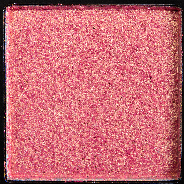
Rose Gold
Huda Beauty Rose Gold Textured Shadows Palette ($65.00 for 0.63 oz.) contains eighteen eyeshadows with a mix of matte and metallic finishes across mostly warm-toned hues. The metallic eyeshadows are very, very dense, with some being drier and dense and others being creamier and dense. The ones that were drier tended to yield chunkier pieces of product that were difficult to apply to the lid, even using fingers as recommended by the brand. They had a tendency to emphasize the texture of my lid, which made the area appear more wrinkled and thicker/uneven. I was able to apply the metallic shades with a damp, flat synthetic brush (MAC’s 242) as well as with fingertips (but the brush gave me a lot more precision). Some shades lasted around eight hours while a few were more prone to fallout and creasing after six hours of wear.
What I was more surprised by was just how chalky and thin the matte eyeshadows were with some being better and others being worse in practice. I think that the mattes applied better than I expected, but they were quicker to fade and crease within six to seven hours of wear. One shade wasn’t usable at all; the texture felt like velvet, but it yielded almost no coverage at all. It seemed like the pan was so firmly pressed that no powder was able to come off the surface.
I’m not bothered by the use of cardboard for palettes (they absorb impact better than plastic/metal!), even at this price point, but the cardboard used by the brand is some of the lightest weight and cheapest in feel–it felt thin and dented/scuffed easily. Even the clear, plastic lid felt thin and prone to being scratched/dented/torn. For reference, a Z Palette feels 10x sturdier and stronger to me.
Rose Gold
LELimited Edition. $65.00.
[P.S. — Can you let me know whether you prefer photos/swatches at the end of all the eyeshadows or do you prefer slideshows for each shade? I’ve turned on slideshows for the first three shades. I’d love to hear your feedback, and then I’ll make sure to adjust the post (and future palette posts) to be consistent with that. I am worried that with just two photos it is unnecessary/too tedious. For those who never want slideshows, just click “show all” whenever you see a slideshow 🙂 Thank you!
Update: Feedback has been strongly in favor of slideshows, so I have made it so they are all on, but I’m happy to still get feedback in support of either side!]
Get a shade-by-shade breakdown of this palette, along with individual photos and swatches…

Dubai
Dubai is a medium-dark, golden brown with warm, olive undertones and a metallic finish. The consistency was cream-like and incredibly dense, while it had excellent pigmentation but was difficult to diffuse and blend out. It was much thicker on the lid compared to the matte shades, so when I attempted to have the two finishes next to each other on the lid, it always looked off. This shade started to crease after seven hours of wear but had very little fallout over time.
FURTHER READING: Formula Overview for details on general performance and characteristics (like scent).
Top Dupes
- Give Me Glow Glamorous (P, $10.00) is lighter (95% similar).
- Sydney Grace Firelight Glow (LE, $6.00) is lighter (95% similar).
- Melt Cosmetics Sweet Lucy (PiP, ) is lighter (95% similar).
- Natasha Denona Spectrum (101K) (PiP, ) is darker (90% similar).
- Danessa Myricks Muse (P, $18.00) is lighter (90% similar).
- Gucci Beauty Iconic Gold (DC, $37.00) is less shimmery (95% similar).
- Sydney Grace The Scoop (P, $8.00) is lighter (90% similar).
- Stila Vivid Smoky Quartz (P, $24.00) is less shimmery, lighter (90% similar).
- Huda Beauty Dubai (Remastered) (PiP, ) is less shimmery, lighter (90% similar).
- Too Faced Buche de Noel (LE, $16.00) is less shimmery (90% similar).
Formula Overview
-
The mattes are supposed to be “highly-pigmented” and “butter-smooth.” The formula has a chalkier, drier feel to them–almost sandpapery in a way–with a thin texture that has slight to moderate powderiness in the pan. I did not find these shades to be that prone to fallout; I did not feel like I had to take great care to minimize fallout and ultimately had little fallout after producing looks from this palette. Something I noticed was that while the matte shades looked fairly matte on the lid, most of them had very tiny, almost imperceptible micro-pearl in them. The pigmentation varied but most were pigmented and fairly blendable to very blendable. They wore anywhere from seven to eight hours on me.
The “Pressed Pearls” are supposed to be “rich” and “add depth and intensity” and can be used alone or layered over the mattes. The consistency of the formula was creamier and slightly denser, but the eyeshadows never felt stiff or difficult to pickup on a brush. These were the ones that applied well with a brush, though I noticed a couple did not appear as metallic after blending as they did initially. They were also quite pigmented and wore between seven and eight hours.
The “Duo-Chrome Toppers” are “ever-changing illusions” so the colors are designed to shift. The brand recommends blending these “into the base shadow with a brush or apply with finger to maximise the reflection.” They are not as chunky as last year’s Rose Gold eyeshadows, and they definitely bind together better on the lid, but they were not very usable dry, even when I used a fingertip. I tried patting on top of other eyeshadows with my fingertip, and the majority of product just stuck to my fingertip with little transfer and visible shift over the base eyeshadow. I also tried the same layering technique using a brush and had better results but they were still subpar. The best technique I found was using a flat, synthetic brush dampened or even using a light adhesive on the brush. By the name and limited description, they seemed design to be layerable, e.g. not fully opaque.
The “Pure Glitter” is described as a “ready-to-go formula” that can be “dabb[ed] on with a flat brush.” The idea that it is a “Pure Glitter” is an odd way to put it, as pure glitter seems like it would just be glitter/sparkle and nothing else, but the ingredient list for Cosmo is as long as all the rest of the eyeshadows. The idea of it being “ready-to-go” and the recommended application not mentioning adhesive or even dampening the brush also suggests that it can be used as-is. Well, not really–there is a creaminess to it, but it is half-loose, half-pressed, and moves around easily in the pan. It doesn’t fly away like a truly loose glitter would when applied directly onto skin or over a powder eyeshadow, but it does not stay in place for long at all. To use this, I would recommend using an adhesive base or patting over a cream product.
Browse all of our Huda Beauty Textured Shadow swatches.
Ingredients
Octyldodecyl Stearoyl Stearate, Hydrogenated Polycyclopentadiene, Caprylic/Capric Triglyceride, Zinc Stearate, Dimethicone, C10-18 Triglycerides, Caprylyl Glycol, Polyethylene, Phenoxyethanol, Tin Oxide, Copernicia Cerifera (Carnauba) Wax, Dehydroacetic Acid, Hexylene Glycol, Disodium Edta, Tocopherol+/- Silica, Mica, Calcium Sodium Borosilicate, Synthetic Fluorphlogopite, Ci 77891 (Titanium Dioxide), Ci 77491 (Iron Oxides), Ci 77499 (Iron Oxides), Ci 75470 (Carmine).
Disclaimer: Ingredient lists are as available by the brand (or retailer) at the time of publishing. Please always check product packaging, if it exists, for the ingredient list applicable to the product you're purchasing, or the brand or retailer's website for the most up-to-date ingredient list.
Dubai
LELimited Edition.

Fling
Fling is a deep cranberry red with warm, copper undertones and a metallic finish. It had intense, full-color coverage with a creamy, moderately dense texture that was a bit easier to work with compared to Dubai as it wasn’t as thick on the lid. This shade blended out decently, but it was hard to get a really soft, faded edge, so I would recommend using one of the warmer mattes to help with that. It wore well for eight hours on me.
FURTHER READING: Formula Overview for details on general performance and characteristics (like scent).
Top Dupes
- ColourPop Pinky Promise (P, $4.50) is less shimmery, cooler (95% similar).
- Coloured Raine Noblewoman (PiP, $6.99) is less shimmery (95% similar).
- ColourPop Play to Wine (LE, $4.50) is lighter (95% similar).
- Makeup Geek Curtain Call (P, $9.99) is less shimmery, darker (90% similar).
- Coloured Raine Passion (DC, $6.99) is less shimmery, warmer (90% similar).
- Melt Cosmetics Haze (PiP, ) is less shimmery, lighter, cooler (90% similar).
- ColourPop Mercy (LE, $4.50) is lighter, cooler (90% similar).
- Natasha Denona Purpure (147M) (DC, $29.00) is less shimmery (90% similar).
- Pat McGrath Crimson Fire (DC, $25.00) is less shimmery, lighter (90% similar).
- Viseart Clove (PiP, ) is lighter, warmer (90% similar).
Formula Overview
-
The mattes are supposed to be “highly-pigmented” and “butter-smooth.” The formula has a chalkier, drier feel to them–almost sandpapery in a way–with a thin texture that has slight to moderate powderiness in the pan. I did not find these shades to be that prone to fallout; I did not feel like I had to take great care to minimize fallout and ultimately had little fallout after producing looks from this palette. Something I noticed was that while the matte shades looked fairly matte on the lid, most of them had very tiny, almost imperceptible micro-pearl in them. The pigmentation varied but most were pigmented and fairly blendable to very blendable. They wore anywhere from seven to eight hours on me.
The “Pressed Pearls” are supposed to be “rich” and “add depth and intensity” and can be used alone or layered over the mattes. The consistency of the formula was creamier and slightly denser, but the eyeshadows never felt stiff or difficult to pickup on a brush. These were the ones that applied well with a brush, though I noticed a couple did not appear as metallic after blending as they did initially. They were also quite pigmented and wore between seven and eight hours.
The “Duo-Chrome Toppers” are “ever-changing illusions” so the colors are designed to shift. The brand recommends blending these “into the base shadow with a brush or apply with finger to maximise the reflection.” They are not as chunky as last year’s Rose Gold eyeshadows, and they definitely bind together better on the lid, but they were not very usable dry, even when I used a fingertip. I tried patting on top of other eyeshadows with my fingertip, and the majority of product just stuck to my fingertip with little transfer and visible shift over the base eyeshadow. I also tried the same layering technique using a brush and had better results but they were still subpar. The best technique I found was using a flat, synthetic brush dampened or even using a light adhesive on the brush. By the name and limited description, they seemed design to be layerable, e.g. not fully opaque.
The “Pure Glitter” is described as a “ready-to-go formula” that can be “dabb[ed] on with a flat brush.” The idea that it is a “Pure Glitter” is an odd way to put it, as pure glitter seems like it would just be glitter/sparkle and nothing else, but the ingredient list for Cosmo is as long as all the rest of the eyeshadows. The idea of it being “ready-to-go” and the recommended application not mentioning adhesive or even dampening the brush also suggests that it can be used as-is. Well, not really–there is a creaminess to it, but it is half-loose, half-pressed, and moves around easily in the pan. It doesn’t fly away like a truly loose glitter would when applied directly onto skin or over a powder eyeshadow, but it does not stay in place for long at all. To use this, I would recommend using an adhesive base or patting over a cream product.
Browse all of our Huda Beauty Textured Shadow swatches.
Ingredients
Octyldodecyl Stearoyl Stearate, Hydrogenated Polycyclopentadiene, Caprylic/Capric Triglyceride, Zinc Stearate, Dimethicone, C10-18 Triglycerides, Caprylyl Glycol, Polyethylene, Phenoxyethanol, Tin Oxide, Copernicia Cerifera (Carnauba) Wax, Dehydroacetic Acid, Hexylene Glycol, Disodium Edta, Tocopherol+/- Silica, Mica, Calcium Sodium Borosilicate, Synthetic Fluorphlogopite, Ci 77891 (Titanium Dioxide), Ci 77491 (Iron Oxides), Ci 77499 (Iron Oxides), Ci 75470 (Carmine).
Disclaimer: Ingredient lists are as available by the brand (or retailer) at the time of publishing. Please always check product packaging, if it exists, for the ingredient list applicable to the product you're purchasing, or the brand or retailer's website for the most up-to-date ingredient list.
Fling
LELimited Edition.

24K
24K is a medium, yellow gold with warm undertones and a glittery, metallic finish. The texture felt slightly emollient, but it had the feel of a partially dried-out cream eyeshadow, and it had a tendency to skip on the skin, even as I applied it with a fingertip. This resulted in uneven coverage with chunks of sparkle and a greater amount of fall out both during application as well as during wear. This shade lasted for six and a half hours before I noticed creasing (and fallout).
FURTHER READING: Formula Overview for details on general performance and characteristics (like scent).
Top Dupes
- Coloured Raine 24 Karat (PiP, $6.99) is darker (95% similar).
- Sydney Grace Toffee Crunch (DC, $8.00) is more shimmery, darker, cooler (95% similar).
- ColourPop Night Show (P, $4.50) is darker, brighter (95% similar).
- Obsessive Compulsive Cosmetics Triptych (DC, $14.00) is brighter (90% similar).
- Fenty Beauty Ice Dunes (LE, ) is less shimmery, darker, warmer (90% similar).
- Estee Lauder Naked Gold (P, $25.00) is cooler (90% similar).
- ColourPop Pain and Panic (LE, $4.50) is more shimmery, warmer (90% similar).
- Natasha Denona Sundazed (128K) (PiP, ) is less shimmery, lighter (90% similar).
- Charlotte Tilbury Icon Date Eyes #1 (LE, ) is more shimmery, darker, warmer (90% similar).
- Chanel Signe Particulier #4 (LE, ) is less shimmery, lighter (90% similar).
Formula Overview
-
The mattes are supposed to be “highly-pigmented” and “butter-smooth.” The formula has a chalkier, drier feel to them–almost sandpapery in a way–with a thin texture that has slight to moderate powderiness in the pan. I did not find these shades to be that prone to fallout; I did not feel like I had to take great care to minimize fallout and ultimately had little fallout after producing looks from this palette. Something I noticed was that while the matte shades looked fairly matte on the lid, most of them had very tiny, almost imperceptible micro-pearl in them. The pigmentation varied but most were pigmented and fairly blendable to very blendable. They wore anywhere from seven to eight hours on me.
The “Pressed Pearls” are supposed to be “rich” and “add depth and intensity” and can be used alone or layered over the mattes. The consistency of the formula was creamier and slightly denser, but the eyeshadows never felt stiff or difficult to pickup on a brush. These were the ones that applied well with a brush, though I noticed a couple did not appear as metallic after blending as they did initially. They were also quite pigmented and wore between seven and eight hours.
The “Duo-Chrome Toppers” are “ever-changing illusions” so the colors are designed to shift. The brand recommends blending these “into the base shadow with a brush or apply with finger to maximise the reflection.” They are not as chunky as last year’s Rose Gold eyeshadows, and they definitely bind together better on the lid, but they were not very usable dry, even when I used a fingertip. I tried patting on top of other eyeshadows with my fingertip, and the majority of product just stuck to my fingertip with little transfer and visible shift over the base eyeshadow. I also tried the same layering technique using a brush and had better results but they were still subpar. The best technique I found was using a flat, synthetic brush dampened or even using a light adhesive on the brush. By the name and limited description, they seemed design to be layerable, e.g. not fully opaque.
The “Pure Glitter” is described as a “ready-to-go formula” that can be “dabb[ed] on with a flat brush.” The idea that it is a “Pure Glitter” is an odd way to put it, as pure glitter seems like it would just be glitter/sparkle and nothing else, but the ingredient list for Cosmo is as long as all the rest of the eyeshadows. The idea of it being “ready-to-go” and the recommended application not mentioning adhesive or even dampening the brush also suggests that it can be used as-is. Well, not really–there is a creaminess to it, but it is half-loose, half-pressed, and moves around easily in the pan. It doesn’t fly away like a truly loose glitter would when applied directly onto skin or over a powder eyeshadow, but it does not stay in place for long at all. To use this, I would recommend using an adhesive base or patting over a cream product.
Browse all of our Huda Beauty Textured Shadow swatches.
Ingredients
Octyldodecyl Stearoyl Stearate, Hydrogenated Polycyclopentadiene, Caprylic/Capric Triglyceride, Zinc Stearate, Dimethicone, C10-18 Triglycerides, Caprylyl Glycol, Polyethylene, Phenoxyethanol, Tin Oxide, Copernicia Cerifera (Carnauba) Wax, Dehydroacetic Acid, Hexylene Glycol, Disodium Edta, Tocopherol+/- Silica, Mica, Calcium Sodium Borosilicate, Synthetic Fluorphlogopite, Ci 77891 (Titanium Dioxide), Ci 77491 (Iron Oxides), Ci 77499 (Iron Oxides), Ci 75470 (Carmine).
Disclaimer: Ingredient lists are as available by the brand (or retailer) at the time of publishing. Please always check product packaging, if it exists, for the ingredient list applicable to the product you're purchasing, or the brand or retailer's website for the most up-to-date ingredient list.
24K
LELimited Edition.

Rose Gold
Rose Gold is a medium-dark, reddish copper with warm undertones and a glittery finish. It had a similar texture to 24K, which was that of a partially dried out cream product. It was hard to blend and apply to the skin, even as used my fingertips as recommended by the brand. The eyeshadow looked patchy and uneven, and the more I tried to fuss with it, the worse it looked and the more fallout there was. It lasted for six hours before creasing on me.
FURTHER READING: Formula Overview for details on general performance and characteristics (like scent).
Top Dupes
- ColourPop Arrow (P, $6.00) is warmer (95% similar).
- NARS Bayadere #2 (PiP, $19.00) is less shimmery, darker, warmer (95% similar).
- Urban Decay Ambitious (PiP, $19.00) is darker (95% similar).
- ColourPop My Prince (LE, $4.50) is less shimmery, warmer (95% similar).
- Hourglass Blaze (P, $29.00) is lighter (95% similar).
- ColourPop Birthday Cake (LE, $6.00) is darker, cooler (95% similar).
- Huda Beauty Nude Rich #4 (PiP, ) is cooler (90% similar).
- NABLA Cosmetics Metal Cupid (PiP, ) is brighter (90% similar).
- MAC Left You on Red (P, $17.00) is lighter (90% similar).
- Ciate Love Letter (LE, ) is less shimmery, darker, warmer (90% similar).
Formula Overview
-
The mattes are supposed to be “highly-pigmented” and “butter-smooth.” The formula has a chalkier, drier feel to them–almost sandpapery in a way–with a thin texture that has slight to moderate powderiness in the pan. I did not find these shades to be that prone to fallout; I did not feel like I had to take great care to minimize fallout and ultimately had little fallout after producing looks from this palette. Something I noticed was that while the matte shades looked fairly matte on the lid, most of them had very tiny, almost imperceptible micro-pearl in them. The pigmentation varied but most were pigmented and fairly blendable to very blendable. They wore anywhere from seven to eight hours on me.
The “Pressed Pearls” are supposed to be “rich” and “add depth and intensity” and can be used alone or layered over the mattes. The consistency of the formula was creamier and slightly denser, but the eyeshadows never felt stiff or difficult to pickup on a brush. These were the ones that applied well with a brush, though I noticed a couple did not appear as metallic after blending as they did initially. They were also quite pigmented and wore between seven and eight hours.
The “Duo-Chrome Toppers” are “ever-changing illusions” so the colors are designed to shift. The brand recommends blending these “into the base shadow with a brush or apply with finger to maximise the reflection.” They are not as chunky as last year’s Rose Gold eyeshadows, and they definitely bind together better on the lid, but they were not very usable dry, even when I used a fingertip. I tried patting on top of other eyeshadows with my fingertip, and the majority of product just stuck to my fingertip with little transfer and visible shift over the base eyeshadow. I also tried the same layering technique using a brush and had better results but they were still subpar. The best technique I found was using a flat, synthetic brush dampened or even using a light adhesive on the brush. By the name and limited description, they seemed design to be layerable, e.g. not fully opaque.
The “Pure Glitter” is described as a “ready-to-go formula” that can be “dabb[ed] on with a flat brush.” The idea that it is a “Pure Glitter” is an odd way to put it, as pure glitter seems like it would just be glitter/sparkle and nothing else, but the ingredient list for Cosmo is as long as all the rest of the eyeshadows. The idea of it being “ready-to-go” and the recommended application not mentioning adhesive or even dampening the brush also suggests that it can be used as-is. Well, not really–there is a creaminess to it, but it is half-loose, half-pressed, and moves around easily in the pan. It doesn’t fly away like a truly loose glitter would when applied directly onto skin or over a powder eyeshadow, but it does not stay in place for long at all. To use this, I would recommend using an adhesive base or patting over a cream product.
Browse all of our Huda Beauty Textured Shadow swatches.
Ingredients
Octyldodecyl Stearoyl Stearate, Hydrogenated Polycyclopentadiene, Caprylic/Capric Triglyceride, Zinc Stearate, Dimethicone, C10-18 Triglycerides, Caprylyl Glycol, Polyethylene, Phenoxyethanol, Tin Oxide, Copernicia Cerifera (Carnauba) Wax, Dehydroacetic Acid, Hexylene Glycol, Disodium Edta, Tocopherol+/- Silica, Mica, Calcium Sodium Borosilicate, Synthetic Fluorphlogopite, Ci 77891 (Titanium Dioxide), Ci 77491 (Iron Oxides), Ci 77499 (Iron Oxides), Ci 75470 (Carmine).
Disclaimer: Ingredient lists are as available by the brand (or retailer) at the time of publishing. Please always check product packaging, if it exists, for the ingredient list applicable to the product you're purchasing, or the brand or retailer's website for the most up-to-date ingredient list.
Rose Gold
LELimited Edition.

Trust Fund
Trust Fund is a medium-dark, coppery brown with warm undertones and a sparkling, metallic finish. This shade had a chunkier texture where a lot of the sparkle gathered on itself, which gave the lid a very textured, uneven look that appeared more wrinkled (at least on me). It had a slightly less dry feeling compared to the prior two shades, but it was still harder to work with. This shade started to crease on me after seven hours of wear.
FURTHER READING: Formula Overview for details on general performance and characteristics (like scent).
Top Dupes
- Makeup Geek Solar Flare (P, $12.00) is more shimmery (95% similar).
- Anastasia Henna (P, $12.00) is less shimmery, darker (90% similar).
- ColourPop Lightning Bug (PiP, $6.00) is lighter (95% similar).
- ColourPop Star Dust (PiP, $4.50) is lighter (90% similar).
- Viseart Melonie (PiP, ) is less shimmery (90% similar).
- Marc Jacobs Beauty Copperazi (P, $28.00) is more shimmery, lighter, cooler (90% similar).
- NARS Mendoza (DC, $25.00) is less shimmery, cooler (90% similar).
- NARS Mendoza (P, $22.00) is more shimmery, lighter (90% similar).
- Makeup Geek Roulette (DC, $6.00) is less shimmery (90% similar).
- Stila Kitten (LE, $30.00) is less shimmery, lighter, cooler (90% similar).
Formula Overview
-
The mattes are supposed to be “highly-pigmented” and “butter-smooth.” The formula has a chalkier, drier feel to them–almost sandpapery in a way–with a thin texture that has slight to moderate powderiness in the pan. I did not find these shades to be that prone to fallout; I did not feel like I had to take great care to minimize fallout and ultimately had little fallout after producing looks from this palette. Something I noticed was that while the matte shades looked fairly matte on the lid, most of them had very tiny, almost imperceptible micro-pearl in them. The pigmentation varied but most were pigmented and fairly blendable to very blendable. They wore anywhere from seven to eight hours on me.
The “Pressed Pearls” are supposed to be “rich” and “add depth and intensity” and can be used alone or layered over the mattes. The consistency of the formula was creamier and slightly denser, but the eyeshadows never felt stiff or difficult to pickup on a brush. These were the ones that applied well with a brush, though I noticed a couple did not appear as metallic after blending as they did initially. They were also quite pigmented and wore between seven and eight hours.
The “Duo-Chrome Toppers” are “ever-changing illusions” so the colors are designed to shift. The brand recommends blending these “into the base shadow with a brush or apply with finger to maximise the reflection.” They are not as chunky as last year’s Rose Gold eyeshadows, and they definitely bind together better on the lid, but they were not very usable dry, even when I used a fingertip. I tried patting on top of other eyeshadows with my fingertip, and the majority of product just stuck to my fingertip with little transfer and visible shift over the base eyeshadow. I also tried the same layering technique using a brush and had better results but they were still subpar. The best technique I found was using a flat, synthetic brush dampened or even using a light adhesive on the brush. By the name and limited description, they seemed design to be layerable, e.g. not fully opaque.
The “Pure Glitter” is described as a “ready-to-go formula” that can be “dabb[ed] on with a flat brush.” The idea that it is a “Pure Glitter” is an odd way to put it, as pure glitter seems like it would just be glitter/sparkle and nothing else, but the ingredient list for Cosmo is as long as all the rest of the eyeshadows. The idea of it being “ready-to-go” and the recommended application not mentioning adhesive or even dampening the brush also suggests that it can be used as-is. Well, not really–there is a creaminess to it, but it is half-loose, half-pressed, and moves around easily in the pan. It doesn’t fly away like a truly loose glitter would when applied directly onto skin or over a powder eyeshadow, but it does not stay in place for long at all. To use this, I would recommend using an adhesive base or patting over a cream product.
Browse all of our Huda Beauty Textured Shadow swatches.
Ingredients
Octyldodecyl Stearoyl Stearate, Hydrogenated Polycyclopentadiene, Caprylic/Capric Triglyceride, Zinc Stearate, Dimethicone, C10-18 Triglycerides, Caprylyl Glycol, Polyethylene, Phenoxyethanol, Tin Oxide, Copernicia Cerifera (Carnauba) Wax, Dehydroacetic Acid, Hexylene Glycol, Disodium Edta, Tocopherol+/- Silica, Mica, Calcium Sodium Borosilicate, Synthetic Fluorphlogopite, Ci 77891 (Titanium Dioxide), Ci 77491 (Iron Oxides), Ci 77499 (Iron Oxides), Ci 75470 (Carmine).
Disclaimer: Ingredient lists are as available by the brand (or retailer) at the time of publishing. Please always check product packaging, if it exists, for the ingredient list applicable to the product you're purchasing, or the brand or retailer's website for the most up-to-date ingredient list.
Trust Fund
LELimited Edition.
Angelic
Angelic is a light-medium pink with a cooler undertone and warmer, golden shimmer. This one was one of two shades that had shimmer but had a more conventional powder eyeshadow texture. It was a little thin and prone to sheering out, but it was relatively easy to work with and performed fine over a primer. When I tested it without primer, it lasted for seven hours.
FURTHER READING: Formula Overview for details on general performance and characteristics (like scent).
Top Dupes
- Morphe Sissy (LE, ) is cooler (95% similar).
- NARS Orgasm (LE, $19.00) is less shimmery, lighter (95% similar).
- ColourPop Cheers Babe (P, $4.50) is more shimmery, cooler (95% similar).
- Wet 'n' Wild Stop Ruffling My Feathers #4 (LE, ) is less shimmery (95% similar).
- Urban Decay My Voice (LE, $19.00) is more shimmery (95% similar).
- ColourPop Blossom Up (PiP, $4.50) is more shimmery, cooler (95% similar).
- Clinique Pink and Plenty (P, $17.00) is less shimmery (95% similar).
- YSL Paris #4 (LE, ) is less shimmery (95% similar).
- ColourPop Come and Get It (P, $4.50) is darker (90% similar).
- Too Faced Crisp (LE, $16.00) is less shimmery, cooler (95% similar).
Formula Overview
-
The mattes are supposed to be “highly-pigmented” and “butter-smooth.” The formula has a chalkier, drier feel to them–almost sandpapery in a way–with a thin texture that has slight to moderate powderiness in the pan. I did not find these shades to be that prone to fallout; I did not feel like I had to take great care to minimize fallout and ultimately had little fallout after producing looks from this palette. Something I noticed was that while the matte shades looked fairly matte on the lid, most of them had very tiny, almost imperceptible micro-pearl in them. The pigmentation varied but most were pigmented and fairly blendable to very blendable. They wore anywhere from seven to eight hours on me.
The “Pressed Pearls” are supposed to be “rich” and “add depth and intensity” and can be used alone or layered over the mattes. The consistency of the formula was creamier and slightly denser, but the eyeshadows never felt stiff or difficult to pickup on a brush. These were the ones that applied well with a brush, though I noticed a couple did not appear as metallic after blending as they did initially. They were also quite pigmented and wore between seven and eight hours.
The “Duo-Chrome Toppers” are “ever-changing illusions” so the colors are designed to shift. The brand recommends blending these “into the base shadow with a brush or apply with finger to maximise the reflection.” They are not as chunky as last year’s Rose Gold eyeshadows, and they definitely bind together better on the lid, but they were not very usable dry, even when I used a fingertip. I tried patting on top of other eyeshadows with my fingertip, and the majority of product just stuck to my fingertip with little transfer and visible shift over the base eyeshadow. I also tried the same layering technique using a brush and had better results but they were still subpar. The best technique I found was using a flat, synthetic brush dampened or even using a light adhesive on the brush. By the name and limited description, they seemed design to be layerable, e.g. not fully opaque.
The “Pure Glitter” is described as a “ready-to-go formula” that can be “dabb[ed] on with a flat brush.” The idea that it is a “Pure Glitter” is an odd way to put it, as pure glitter seems like it would just be glitter/sparkle and nothing else, but the ingredient list for Cosmo is as long as all the rest of the eyeshadows. The idea of it being “ready-to-go” and the recommended application not mentioning adhesive or even dampening the brush also suggests that it can be used as-is. Well, not really–there is a creaminess to it, but it is half-loose, half-pressed, and moves around easily in the pan. It doesn’t fly away like a truly loose glitter would when applied directly onto skin or over a powder eyeshadow, but it does not stay in place for long at all. To use this, I would recommend using an adhesive base or patting over a cream product.
Browse all of our Huda Beauty Textured Shadow swatches.
Ingredients
Mica, Isohexadecane, Cyclopentasiloxane, Steareth-21, Zinc Stearate, Dimethicone, Polyethylene Terephthalate, Steareth-2, Caprylyl Glycol, Ethylhexyl Methoxycinnamate, Polymethyl Methacrylate, PPG-15 Stearyl Ether, Polyurethane-33, Simmondsia Chinensis Seed Oil [Simmondsia Chinensis (Jojoba) Seed Oil]. May Contain +/-: CI 77891 [Titanium Dioxide], CI 75470 [Carmine], CI 77491 [Iron Oxides].
Disclaimer: Ingredient lists are as available by the brand (or retailer) at the time of publishing. Please always check product packaging, if it exists, for the ingredient list applicable to the product you're purchasing, or the brand or retailer's website for the most up-to-date ingredient list.
Angelic
PiPPermanent in Palette.

#Blessed
#Blessed is a medium-dark, golden copper with warm, reddish undertones and a metallic finish. It had a denser, creamier texture (more like Dubai) that was intensely pigmented and applied more evenly to the lid. The issue with this shade was that it was harder to get a really well-diffused edge, as it was harder to blend out. On me, it wore well for seven and a half hours with minimal fallout.
FURTHER READING: Formula Overview for details on general performance and characteristics (like scent).
Top Dupes
- City Color Cleo (P, $6.99) is darker (95% similar).
- Too Faced Showgirl (LE, $16.00) is less shimmery, darker (95% similar).
- Tarte Candlelit Dinner (LE, ) is warmer (95% similar).
- Natasha Denona Atria (107M) (PiP, $29.00) is lighter, brighter, warmer (90% similar).
- Tarte Jewel (LE, ) is lighter (90% similar).
- Zoeva Pure Ganache (PiP, ) is less shimmery (95% similar).
- Ciate Shine Bright (LE, ) is cooler (90% similar).
- Make Up For Ever ME700 Amber (DC, $21.00) is lighter, warmer (90% similar).
- LORAC Amber (LE, $19.00) is lighter (90% similar).
- Anastasia Sunset (P, $12.00) is brighter (90% similar).
Formula Overview
-
The mattes are supposed to be “highly-pigmented” and “butter-smooth.” The formula has a chalkier, drier feel to them–almost sandpapery in a way–with a thin texture that has slight to moderate powderiness in the pan. I did not find these shades to be that prone to fallout; I did not feel like I had to take great care to minimize fallout and ultimately had little fallout after producing looks from this palette. Something I noticed was that while the matte shades looked fairly matte on the lid, most of them had very tiny, almost imperceptible micro-pearl in them. The pigmentation varied but most were pigmented and fairly blendable to very blendable. They wore anywhere from seven to eight hours on me.
The “Pressed Pearls” are supposed to be “rich” and “add depth and intensity” and can be used alone or layered over the mattes. The consistency of the formula was creamier and slightly denser, but the eyeshadows never felt stiff or difficult to pickup on a brush. These were the ones that applied well with a brush, though I noticed a couple did not appear as metallic after blending as they did initially. They were also quite pigmented and wore between seven and eight hours.
The “Duo-Chrome Toppers” are “ever-changing illusions” so the colors are designed to shift. The brand recommends blending these “into the base shadow with a brush or apply with finger to maximise the reflection.” They are not as chunky as last year’s Rose Gold eyeshadows, and they definitely bind together better on the lid, but they were not very usable dry, even when I used a fingertip. I tried patting on top of other eyeshadows with my fingertip, and the majority of product just stuck to my fingertip with little transfer and visible shift over the base eyeshadow. I also tried the same layering technique using a brush and had better results but they were still subpar. The best technique I found was using a flat, synthetic brush dampened or even using a light adhesive on the brush. By the name and limited description, they seemed design to be layerable, e.g. not fully opaque.
The “Pure Glitter” is described as a “ready-to-go formula” that can be “dabb[ed] on with a flat brush.” The idea that it is a “Pure Glitter” is an odd way to put it, as pure glitter seems like it would just be glitter/sparkle and nothing else, but the ingredient list for Cosmo is as long as all the rest of the eyeshadows. The idea of it being “ready-to-go” and the recommended application not mentioning adhesive or even dampening the brush also suggests that it can be used as-is. Well, not really–there is a creaminess to it, but it is half-loose, half-pressed, and moves around easily in the pan. It doesn’t fly away like a truly loose glitter would when applied directly onto skin or over a powder eyeshadow, but it does not stay in place for long at all. To use this, I would recommend using an adhesive base or patting over a cream product.
Browse all of our Huda Beauty Textured Shadow swatches.
Ingredients
Octyldodecyl Stearoyl Stearate, Hydrogenated Polycyclopentadiene, Caprylic/Capric Triglyceride, Zinc Stearate, Dimethicone, C10-18 Triglycerides, Caprylyl Glycol, Polyethylene, Phenoxyethanol, Tin Oxide, Copernicia Cerifera (Carnauba) Wax, Dehydroacetic Acid, Hexylene Glycol, Disodium Edta, Tocopherol+/- Silica, Mica, Calcium Sodium Borosilicate, Synthetic Fluorphlogopite, Ci 77891 (Titanium Dioxide), Ci 77491 (Iron Oxides), Ci 77499 (Iron Oxides), Ci 75470 (Carmine).
Disclaimer: Ingredient lists are as available by the brand (or retailer) at the time of publishing. Please always check product packaging, if it exists, for the ingredient list applicable to the product you're purchasing, or the brand or retailer's website for the most up-to-date ingredient list.
#Blessed
LELimited Edition.

Bossy
Bossy is a deep plum with subtle, warm undertones and a matte finish. The consistency was drier and very powdery, so it was imperative to tap excess off the brush and take a softer approach to grabbing color from the pan, otherwise it created a huge mess within the pan. It had good pigmentation, and it was fairly blendable on the lid. The eyeshadow started to fade after seven hours of wear.
FURTHER READING: Formula Overview for details on general performance and characteristics (like scent).
Top Dupes
- Huda Beauty Mauve #1 (PiP, ) is darker (95% similar).
- Anastasia All Star (DC, $12.00) is cooler (95% similar).
- Melt Cosmetics Obituary (LE, ) is darker, cooler (90% similar).
- Natasha Denona Clove (PiP, ) is lighter (90% similar).
- Makeup Geek Bitten (DC, $6.00) is warmer (90% similar).
- Viseart Chestnut (4) (LE, ) is darker, cooler (90% similar).
- Melt Cosmetics Mind Games (LE, ) is darker, cooler (90% similar).
- Melt Cosmetics Sangre (PiP, ) is darker, cooler (90% similar).
- Makeup Geek Cherry Cola (DC, $6.00) is warmer (90% similar).
- Dose of Colors Mixed Berries (PiP, ) is cooler (85% similar).
Formula Overview
-
The mattes are supposed to be “highly-pigmented” and “butter-smooth.” The formula has a chalkier, drier feel to them–almost sandpapery in a way–with a thin texture that has slight to moderate powderiness in the pan. I did not find these shades to be that prone to fallout; I did not feel like I had to take great care to minimize fallout and ultimately had little fallout after producing looks from this palette. Something I noticed was that while the matte shades looked fairly matte on the lid, most of them had very tiny, almost imperceptible micro-pearl in them. The pigmentation varied but most were pigmented and fairly blendable to very blendable. They wore anywhere from seven to eight hours on me.
The “Pressed Pearls” are supposed to be “rich” and “add depth and intensity” and can be used alone or layered over the mattes. The consistency of the formula was creamier and slightly denser, but the eyeshadows never felt stiff or difficult to pickup on a brush. These were the ones that applied well with a brush, though I noticed a couple did not appear as metallic after blending as they did initially. They were also quite pigmented and wore between seven and eight hours.
The “Duo-Chrome Toppers” are “ever-changing illusions” so the colors are designed to shift. The brand recommends blending these “into the base shadow with a brush or apply with finger to maximise the reflection.” They are not as chunky as last year’s Rose Gold eyeshadows, and they definitely bind together better on the lid, but they were not very usable dry, even when I used a fingertip. I tried patting on top of other eyeshadows with my fingertip, and the majority of product just stuck to my fingertip with little transfer and visible shift over the base eyeshadow. I also tried the same layering technique using a brush and had better results but they were still subpar. The best technique I found was using a flat, synthetic brush dampened or even using a light adhesive on the brush. By the name and limited description, they seemed design to be layerable, e.g. not fully opaque.
The “Pure Glitter” is described as a “ready-to-go formula” that can be “dabb[ed] on with a flat brush.” The idea that it is a “Pure Glitter” is an odd way to put it, as pure glitter seems like it would just be glitter/sparkle and nothing else, but the ingredient list for Cosmo is as long as all the rest of the eyeshadows. The idea of it being “ready-to-go” and the recommended application not mentioning adhesive or even dampening the brush also suggests that it can be used as-is. Well, not really–there is a creaminess to it, but it is half-loose, half-pressed, and moves around easily in the pan. It doesn’t fly away like a truly loose glitter would when applied directly onto skin or over a powder eyeshadow, but it does not stay in place for long at all. To use this, I would recommend using an adhesive base or patting over a cream product.
Browse all of our Huda Beauty Textured Shadow swatches.
Ingredients
Mica, Oryza Sativa Starch (Oryza Sativa (Rice) Starch), Silica, Dimethicone, Caprylyl Glycol, Octyldodecanol, Stearyl Stearate, Cera Alba (Beeswax), Microcristallina Cera (Microcristallina Wax), Behenic Acid. +/- Ci 77891 (Titanium Dioxide), Ci 77491 (Iron Oxides), Ci 75470 (Carmine), Ci 77499 (Iron Oxides), Ci 77742 (Manganese Violet), Ci 77492 (Iron Oxides), Ci 16035 (Red 40), Ci 42090 (Blue 1), Ci 77007 (Ultramarines).
Disclaimer: Ingredient lists are as available by the brand (or retailer) at the time of publishing. Please always check product packaging, if it exists, for the ingredient list applicable to the product you're purchasing, or the brand or retailer's website for the most up-to-date ingredient list.
Bossy
LELimited Edition.

Flamingo
Flamingo is a bright pop of medium pink with cool, blue undertones and a matte finish. It had semi-sheer color coverage, which was hard to apply and keep intense, as it was so powdery that it sheered out almost instantly. This shade wore well for six hours on me.
FURTHER READING: Formula Overview for details on general performance and characteristics (like scent).
Top Dupes
- Urban Decay Scrunchie (LE, $19.00) is darker, warmer (95% similar).
- Wet 'n' Wild Your 15 Minutes Aren't Up #3 (DC, $2.29) is darker (95% similar).
- ColourPop Geode Life (PiP, $4.50) is darker (95% similar).
- Sephora Tulip (PiP, ) is warmer (95% similar).
- MAC Lotus Pink (LE, $17.00) is lighter, brighter (95% similar).
- ColourPop Applejack (LE, $4.50) is more muted (90% similar).
- ColourPop Fan Fiction (LE, $4.50) is lighter (90% similar).
- Glaminatrix Musk (P, $7.30) is lighter, warmer (90% similar).
- Huda Beauty Amethyst #7 (LE, ) is lighter (90% similar).
- ColourPop On a Lark (LE, $4.50) is more shimmery, darker, brighter (90% similar).
Formula Overview
-
The mattes are supposed to be “highly-pigmented” and “butter-smooth.” The formula has a chalkier, drier feel to them–almost sandpapery in a way–with a thin texture that has slight to moderate powderiness in the pan. I did not find these shades to be that prone to fallout; I did not feel like I had to take great care to minimize fallout and ultimately had little fallout after producing looks from this palette. Something I noticed was that while the matte shades looked fairly matte on the lid, most of them had very tiny, almost imperceptible micro-pearl in them. The pigmentation varied but most were pigmented and fairly blendable to very blendable. They wore anywhere from seven to eight hours on me.
The “Pressed Pearls” are supposed to be “rich” and “add depth and intensity” and can be used alone or layered over the mattes. The consistency of the formula was creamier and slightly denser, but the eyeshadows never felt stiff or difficult to pickup on a brush. These were the ones that applied well with a brush, though I noticed a couple did not appear as metallic after blending as they did initially. They were also quite pigmented and wore between seven and eight hours.
The “Duo-Chrome Toppers” are “ever-changing illusions” so the colors are designed to shift. The brand recommends blending these “into the base shadow with a brush or apply with finger to maximise the reflection.” They are not as chunky as last year’s Rose Gold eyeshadows, and they definitely bind together better on the lid, but they were not very usable dry, even when I used a fingertip. I tried patting on top of other eyeshadows with my fingertip, and the majority of product just stuck to my fingertip with little transfer and visible shift over the base eyeshadow. I also tried the same layering technique using a brush and had better results but they were still subpar. The best technique I found was using a flat, synthetic brush dampened or even using a light adhesive on the brush. By the name and limited description, they seemed design to be layerable, e.g. not fully opaque.
The “Pure Glitter” is described as a “ready-to-go formula” that can be “dabb[ed] on with a flat brush.” The idea that it is a “Pure Glitter” is an odd way to put it, as pure glitter seems like it would just be glitter/sparkle and nothing else, but the ingredient list for Cosmo is as long as all the rest of the eyeshadows. The idea of it being “ready-to-go” and the recommended application not mentioning adhesive or even dampening the brush also suggests that it can be used as-is. Well, not really–there is a creaminess to it, but it is half-loose, half-pressed, and moves around easily in the pan. It doesn’t fly away like a truly loose glitter would when applied directly onto skin or over a powder eyeshadow, but it does not stay in place for long at all. To use this, I would recommend using an adhesive base or patting over a cream product.
Browse all of our Huda Beauty Textured Shadow swatches.
Ingredients
Mica, Oryza Sativa Starch (Oryza Sativa (Rice) Starch), Silica, Dimethicone, Caprylyl Glycol, Octyldodecanol, Stearyl Stearate, Cera Alba (Beeswax), Microcristallina Cera (Microcristallina Wax), Behenic Acid. +/- Ci 77891 (Titanium Dioxide), Ci 77491 (Iron Oxides), Ci 75470 (Carmine), Ci 77499 (Iron Oxides), Ci 77742 (Manganese Violet), Ci 77492 (Iron Oxides), Ci 16035 (Red 40), Ci 42090 (Blue 1), Ci 77007 (Ultramarines).
Disclaimer: Ingredient lists are as available by the brand (or retailer) at the time of publishing. Please always check product packaging, if it exists, for the ingredient list applicable to the product you're purchasing, or the brand or retailer's website for the most up-to-date ingredient list.
Flamingo
LELimited Edition.

Shy
Shy is a muted, medium rosy pink with warm undertones and a matte finish. It had semi-opaque pigmentation with a drier, chalkier texture that was prone to sheering out and applied unevenly to bare skin. The color started to fade after six hours on me.
FURTHER READING: Formula Overview for details on general performance and characteristics (like scent).
Top Dupes
- Coloured Raine Daydreaming (LE, $6.99) is cooler (95% similar).
- Too Faced Pink Suede (PiP, $16.00) is lighter (95% similar).
- Chanel Palpitation (104) (LE, $29.50) is cooler (95% similar).
- Urban Decay Backtalk (LE, $19.00) is lighter (95% similar).
- Sydney Grace Faithful (P, $5.25) is cooler (90% similar).
- Urban Decay Shortcut (LE, $19.00) is darker (90% similar).
- Huda Beauty Secret (PiP, ) is darker, warmer (90% similar).
- BH Cosmetics Carli Bybel Deluxe Edition #8 (LE, ) is more muted, warmer (90% similar).
- ColourPop Soft Core (LE, $4.50) is brighter (90% similar).
- ColourPop Rose Ave (PiP, $4.50) is lighter, warmer (90% similar).
Formula Overview
-
The mattes are supposed to be “highly-pigmented” and “butter-smooth.” The formula has a chalkier, drier feel to them–almost sandpapery in a way–with a thin texture that has slight to moderate powderiness in the pan. I did not find these shades to be that prone to fallout; I did not feel like I had to take great care to minimize fallout and ultimately had little fallout after producing looks from this palette. Something I noticed was that while the matte shades looked fairly matte on the lid, most of them had very tiny, almost imperceptible micro-pearl in them. The pigmentation varied but most were pigmented and fairly blendable to very blendable. They wore anywhere from seven to eight hours on me.
The “Pressed Pearls” are supposed to be “rich” and “add depth and intensity” and can be used alone or layered over the mattes. The consistency of the formula was creamier and slightly denser, but the eyeshadows never felt stiff or difficult to pickup on a brush. These were the ones that applied well with a brush, though I noticed a couple did not appear as metallic after blending as they did initially. They were also quite pigmented and wore between seven and eight hours.
The “Duo-Chrome Toppers” are “ever-changing illusions” so the colors are designed to shift. The brand recommends blending these “into the base shadow with a brush or apply with finger to maximise the reflection.” They are not as chunky as last year’s Rose Gold eyeshadows, and they definitely bind together better on the lid, but they were not very usable dry, even when I used a fingertip. I tried patting on top of other eyeshadows with my fingertip, and the majority of product just stuck to my fingertip with little transfer and visible shift over the base eyeshadow. I also tried the same layering technique using a brush and had better results but they were still subpar. The best technique I found was using a flat, synthetic brush dampened or even using a light adhesive on the brush. By the name and limited description, they seemed design to be layerable, e.g. not fully opaque.
The “Pure Glitter” is described as a “ready-to-go formula” that can be “dabb[ed] on with a flat brush.” The idea that it is a “Pure Glitter” is an odd way to put it, as pure glitter seems like it would just be glitter/sparkle and nothing else, but the ingredient list for Cosmo is as long as all the rest of the eyeshadows. The idea of it being “ready-to-go” and the recommended application not mentioning adhesive or even dampening the brush also suggests that it can be used as-is. Well, not really–there is a creaminess to it, but it is half-loose, half-pressed, and moves around easily in the pan. It doesn’t fly away like a truly loose glitter would when applied directly onto skin or over a powder eyeshadow, but it does not stay in place for long at all. To use this, I would recommend using an adhesive base or patting over a cream product.
Browse all of our Huda Beauty Textured Shadow swatches.
Ingredients
Mica, Oryza Sativa Starch (Oryza Sativa (Rice) Starch), Silica, Dimethicone, Caprylyl Glycol, Octyldodecanol, Stearyl Stearate, Cera Alba (Beeswax), Microcristallina Cera (Microcristallina Wax), Behenic Acid. +/- Ci 77891 (Titanium Dioxide), Ci 77491 (Iron Oxides), Ci 75470 (Carmine), Ci 77499 (Iron Oxides), Ci 77742 (Manganese Violet), Ci 77492 (Iron Oxides), Ci 16035 (Red 40), Ci 42090 (Blue 1), Ci 77007 (Ultramarines).
Disclaimer: Ingredient lists are as available by the brand (or retailer) at the time of publishing. Please always check product packaging, if it exists, for the ingredient list applicable to the product you're purchasing, or the brand or retailer's website for the most up-to-date ingredient list.
Shy
LELimited Edition.

Bae
Bae is a light-medium, creamy yellow with a matte finish. It had semi-sheer color payoff with a very dusty, dry, and chalky texture that did not apply well to bare skin at all. Even over primer, it was still chalky and trended toward sheerer coverage. I noticed fading after six hours of wear.
FURTHER READING: Formula Overview for details on general performance and characteristics (like scent).
Top Dupes
- Anastasia Unity (LE, $12.00) is cooler (95% similar).
- Too Faced Spotlight (LE, $16.00) is darker (95% similar).
- Natasha Denona Tusk (228CM) (PiP, ) is darker (90% similar).
- Make Up For Ever M510 Vanilla (DC, $21.00) is lighter (90% similar).
- ColourPop Herbivore (LE, $4.50) is more shimmery, lighter (90% similar).
- KVD Beauty Sylvia (LE, ) is cooler (90% similar).
- NARS Keep on Dancing (LE, $19.00) is lighter, cooler (90% similar).
- Viseart Croissant (Warm Mattes #2) (P, ) is darker (90% similar).
- Sephora Cozy Sweater (DC, $10.00) is more shimmery (90% similar).
- NARS Taunt (LE, $19.00) is lighter (90% similar).
Formula Overview
-
The mattes are supposed to be “highly-pigmented” and “butter-smooth.” The formula has a chalkier, drier feel to them–almost sandpapery in a way–with a thin texture that has slight to moderate powderiness in the pan. I did not find these shades to be that prone to fallout; I did not feel like I had to take great care to minimize fallout and ultimately had little fallout after producing looks from this palette. Something I noticed was that while the matte shades looked fairly matte on the lid, most of them had very tiny, almost imperceptible micro-pearl in them. The pigmentation varied but most were pigmented and fairly blendable to very blendable. They wore anywhere from seven to eight hours on me.
The “Pressed Pearls” are supposed to be “rich” and “add depth and intensity” and can be used alone or layered over the mattes. The consistency of the formula was creamier and slightly denser, but the eyeshadows never felt stiff or difficult to pickup on a brush. These were the ones that applied well with a brush, though I noticed a couple did not appear as metallic after blending as they did initially. They were also quite pigmented and wore between seven and eight hours.
The “Duo-Chrome Toppers” are “ever-changing illusions” so the colors are designed to shift. The brand recommends blending these “into the base shadow with a brush or apply with finger to maximise the reflection.” They are not as chunky as last year’s Rose Gold eyeshadows, and they definitely bind together better on the lid, but they were not very usable dry, even when I used a fingertip. I tried patting on top of other eyeshadows with my fingertip, and the majority of product just stuck to my fingertip with little transfer and visible shift over the base eyeshadow. I also tried the same layering technique using a brush and had better results but they were still subpar. The best technique I found was using a flat, synthetic brush dampened or even using a light adhesive on the brush. By the name and limited description, they seemed design to be layerable, e.g. not fully opaque.
The “Pure Glitter” is described as a “ready-to-go formula” that can be “dabb[ed] on with a flat brush.” The idea that it is a “Pure Glitter” is an odd way to put it, as pure glitter seems like it would just be glitter/sparkle and nothing else, but the ingredient list for Cosmo is as long as all the rest of the eyeshadows. The idea of it being “ready-to-go” and the recommended application not mentioning adhesive or even dampening the brush also suggests that it can be used as-is. Well, not really–there is a creaminess to it, but it is half-loose, half-pressed, and moves around easily in the pan. It doesn’t fly away like a truly loose glitter would when applied directly onto skin or over a powder eyeshadow, but it does not stay in place for long at all. To use this, I would recommend using an adhesive base or patting over a cream product.
Browse all of our Huda Beauty Textured Shadow swatches.
Ingredients
Mica, Oryza Sativa Starch (Oryza Sativa (Rice) Starch), Silica, Dimethicone, Caprylyl Glycol, Octyldodecanol, Stearyl Stearate, Cera Alba (Beeswax), Microcristallina Cera (Microcristallina Wax), Behenic Acid. +/- Ci 77891 (Titanium Dioxide), Ci 77491 (Iron Oxides), Ci 75470 (Carmine), Ci 77499 (Iron Oxides), Ci 77742 (Manganese Violet), Ci 77492 (Iron Oxides), Ci 16035 (Red 40), Ci 42090 (Blue 1), Ci 77007 (Ultramarines).
Disclaimer: Ingredient lists are as available by the brand (or retailer) at the time of publishing. Please always check product packaging, if it exists, for the ingredient list applicable to the product you're purchasing, or the brand or retailer's website for the most up-to-date ingredient list.
Bae
LELimited Edition.

Moon Dust
Moon Dust is a light-medium, orangey gold with warm undertones and a frosted sheen. It had decent pigmentation, though it wasn’t buildable to full coverage, with a thinner, lightly dusty texture. This shade at least had promise when used with a primer, but it didn’t perform so well otherwise. It lasted for six and a half hours before creasing on me.
FURTHER READING: Formula Overview for details on general performance and characteristics (like scent).
Top Dupes
- Smashbox Champagne (PiP, ) is more shimmery (95% similar).
- MAC Lithe (LE, $21.00) is more shimmery (95% similar).
- ColourPop Take It Slow (PiP, $4.50) is lighter (95% similar).
- Dior Sundeck #2 (LE, ) is darker (95% similar).
- Cle de Peau Les Annees Folles #3 (LE, ) is more shimmery (95% similar).
- NARS Montparnasse (Left) (DC, $25.00) is more shimmery (95% similar).
- Viseart Rivoli (PiP, ) is darker (90% similar).
- NARS Hollywoodland (P, $28.00) is darker (90% similar).
- Anastasia Glistening (PiP, $12.00) is darker (90% similar).
- Smashbox Gold Hoops (PiP, ) is more shimmery, lighter (90% similar).
Formula Overview
-
The mattes are supposed to be “highly-pigmented” and “butter-smooth.” The formula has a chalkier, drier feel to them–almost sandpapery in a way–with a thin texture that has slight to moderate powderiness in the pan. I did not find these shades to be that prone to fallout; I did not feel like I had to take great care to minimize fallout and ultimately had little fallout after producing looks from this palette. Something I noticed was that while the matte shades looked fairly matte on the lid, most of them had very tiny, almost imperceptible micro-pearl in them. The pigmentation varied but most were pigmented and fairly blendable to very blendable. They wore anywhere from seven to eight hours on me.
The “Pressed Pearls” are supposed to be “rich” and “add depth and intensity” and can be used alone or layered over the mattes. The consistency of the formula was creamier and slightly denser, but the eyeshadows never felt stiff or difficult to pickup on a brush. These were the ones that applied well with a brush, though I noticed a couple did not appear as metallic after blending as they did initially. They were also quite pigmented and wore between seven and eight hours.
The “Duo-Chrome Toppers” are “ever-changing illusions” so the colors are designed to shift. The brand recommends blending these “into the base shadow with a brush or apply with finger to maximise the reflection.” They are not as chunky as last year’s Rose Gold eyeshadows, and they definitely bind together better on the lid, but they were not very usable dry, even when I used a fingertip. I tried patting on top of other eyeshadows with my fingertip, and the majority of product just stuck to my fingertip with little transfer and visible shift over the base eyeshadow. I also tried the same layering technique using a brush and had better results but they were still subpar. The best technique I found was using a flat, synthetic brush dampened or even using a light adhesive on the brush. By the name and limited description, they seemed design to be layerable, e.g. not fully opaque.
The “Pure Glitter” is described as a “ready-to-go formula” that can be “dabb[ed] on with a flat brush.” The idea that it is a “Pure Glitter” is an odd way to put it, as pure glitter seems like it would just be glitter/sparkle and nothing else, but the ingredient list for Cosmo is as long as all the rest of the eyeshadows. The idea of it being “ready-to-go” and the recommended application not mentioning adhesive or even dampening the brush also suggests that it can be used as-is. Well, not really–there is a creaminess to it, but it is half-loose, half-pressed, and moves around easily in the pan. It doesn’t fly away like a truly loose glitter would when applied directly onto skin or over a powder eyeshadow, but it does not stay in place for long at all. To use this, I would recommend using an adhesive base or patting over a cream product.
Browse all of our Huda Beauty Textured Shadow swatches.
Ingredients
Mica, Oryza Sativa Starch (Oryza Sativa (Rice) Starch), Silica, Dimethicone, Caprylyl Glycol, Octyldodecanol, Stearyl Stearate, Cera Alba (Beeswax), Microcristallina Cera (Microcristallina Wax), Behenic Acid. +/- Ci 77891 (Titanium Dioxide), Ci 77491 (Iron Oxides), Ci 75470 (Carmine), Ci 77499 (Iron Oxides), Ci 77742 (Manganese Violet), Ci 77492 (Iron Oxides), Ci 16035 (Red 40), Ci 42090 (Blue 1), Ci 77007 (Ultramarines).
Disclaimer: Ingredient lists are as available by the brand (or retailer) at the time of publishing. Please always check product packaging, if it exists, for the ingredient list applicable to the product you're purchasing, or the brand or retailer's website for the most up-to-date ingredient list.
Moon Dust
LELimited Edition.

Black Truffle
Black Truffle is a medium-dark black with neutral undertones and a matte finish. Warning: I had to scrape off product with a metal spatula in order to get any visible color to transfer to my skin! The texture was completely at odds with what happened; it felt soft, velvety to the touch, but it produced almost no product on the brush. When I was able to get even a smidgen of product, what I got was a patchy, uneven mess. It was impossible to blend this shade out. It wore well for six hours on me.
FURTHER READING: Formula Overview for details on general performance and characteristics (like scent).
Top Dupes
- MAC Cinder (LE, $17.00) is darker (95% similar).
- Anastasia Obsidian (LE, $12.00) is lighter (95% similar).
- Morphe Abyss (LE, ) is darker (95% similar).
- Makeup Atelier Natural Brown #5 (P, ) is more pigmented, cooler (90% similar).
- Too Faced Black Licorice (LE, $16.00) is more pigmented, cooler (90% similar).
- Divergent Dauntless Ink (LE, ) is more pigmented (90% similar).
- LORAC Navy #7 (LE, $19.00) is more pigmented, warmer (90% similar).
- Laura Mercier Matte Black (PiP, $23.00) is more pigmented (90% similar).
- NARS Pandora (P, ) is more pigmented (90% similar).
- NARS Shade VI (LE, $25.00) is darker, more pigmented, cooler (90% similar).
Formula Overview
-
The mattes are supposed to be “highly-pigmented” and “butter-smooth.” The formula has a chalkier, drier feel to them–almost sandpapery in a way–with a thin texture that has slight to moderate powderiness in the pan. I did not find these shades to be that prone to fallout; I did not feel like I had to take great care to minimize fallout and ultimately had little fallout after producing looks from this palette. Something I noticed was that while the matte shades looked fairly matte on the lid, most of them had very tiny, almost imperceptible micro-pearl in them. The pigmentation varied but most were pigmented and fairly blendable to very blendable. They wore anywhere from seven to eight hours on me.
The “Pressed Pearls” are supposed to be “rich” and “add depth and intensity” and can be used alone or layered over the mattes. The consistency of the formula was creamier and slightly denser, but the eyeshadows never felt stiff or difficult to pickup on a brush. These were the ones that applied well with a brush, though I noticed a couple did not appear as metallic after blending as they did initially. They were also quite pigmented and wore between seven and eight hours.
The “Duo-Chrome Toppers” are “ever-changing illusions” so the colors are designed to shift. The brand recommends blending these “into the base shadow with a brush or apply with finger to maximise the reflection.” They are not as chunky as last year’s Rose Gold eyeshadows, and they definitely bind together better on the lid, but they were not very usable dry, even when I used a fingertip. I tried patting on top of other eyeshadows with my fingertip, and the majority of product just stuck to my fingertip with little transfer and visible shift over the base eyeshadow. I also tried the same layering technique using a brush and had better results but they were still subpar. The best technique I found was using a flat, synthetic brush dampened or even using a light adhesive on the brush. By the name and limited description, they seemed design to be layerable, e.g. not fully opaque.
The “Pure Glitter” is described as a “ready-to-go formula” that can be “dabb[ed] on with a flat brush.” The idea that it is a “Pure Glitter” is an odd way to put it, as pure glitter seems like it would just be glitter/sparkle and nothing else, but the ingredient list for Cosmo is as long as all the rest of the eyeshadows. The idea of it being “ready-to-go” and the recommended application not mentioning adhesive or even dampening the brush also suggests that it can be used as-is. Well, not really–there is a creaminess to it, but it is half-loose, half-pressed, and moves around easily in the pan. It doesn’t fly away like a truly loose glitter would when applied directly onto skin or over a powder eyeshadow, but it does not stay in place for long at all. To use this, I would recommend using an adhesive base or patting over a cream product.
Browse all of our Huda Beauty Textured Shadow swatches.
Ingredients
Isopropyl Titanium Triisostearate, Cetearyl Ethylhexanoate, Caprylyl Glycol, Sorbic Acid +/- Ci 77499 (Iron Oxides).
Disclaimer: Ingredient lists are as available by the brand (or retailer) at the time of publishing. Please always check product packaging, if it exists, for the ingredient list applicable to the product you're purchasing, or the brand or retailer's website for the most up-to-date ingredient list.
Black Truffle
LELimited Edition.

Suede
Suede is a muted, medium-dark taupe brown with neutral-to-warm undertones and a matte finish. The eyeshadow had semi-opaque pigmentation with a lightly chalky, drier texture that worked decently on bare skin (better than I anticipated!) but was decent to good over a primer. On my bare lids, the color started to fade after six and a half hours of wear.
FURTHER READING: Formula Overview for details on general performance and characteristics (like scent).
Top Dupes
- LORAC Earth (LE, $19.00) is darker (95% similar).
- Too Faced Tutti Cutie (PiP, $16.00) is brighter, cooler (95% similar).
- MAC Schemer (LE, ) is darker (95% similar).
- MAC Cool Complement (PiP, $17.00) is darker (95% similar).
- NYX Betrayal (P, $4.50) is darker (90% similar).
- Sephora Cedar (LE, ) is darker (90% similar).
- Bobbi Brown Slate (P, $22.00) is lighter, cooler (90% similar).
- Laura Mercier Stone Taupe (LE, $23.00) is lighter (90% similar).
- KVD Beauty Adele (LE, ) is darker (90% similar).
- Dior Undress #5 (PiP, ) is darker, warmer (90% similar).
Formula Overview
-
The mattes are supposed to be “highly-pigmented” and “butter-smooth.” The formula has a chalkier, drier feel to them–almost sandpapery in a way–with a thin texture that has slight to moderate powderiness in the pan. I did not find these shades to be that prone to fallout; I did not feel like I had to take great care to minimize fallout and ultimately had little fallout after producing looks from this palette. Something I noticed was that while the matte shades looked fairly matte on the lid, most of them had very tiny, almost imperceptible micro-pearl in them. The pigmentation varied but most were pigmented and fairly blendable to very blendable. They wore anywhere from seven to eight hours on me.
The “Pressed Pearls” are supposed to be “rich” and “add depth and intensity” and can be used alone or layered over the mattes. The consistency of the formula was creamier and slightly denser, but the eyeshadows never felt stiff or difficult to pickup on a brush. These were the ones that applied well with a brush, though I noticed a couple did not appear as metallic after blending as they did initially. They were also quite pigmented and wore between seven and eight hours.
The “Duo-Chrome Toppers” are “ever-changing illusions” so the colors are designed to shift. The brand recommends blending these “into the base shadow with a brush or apply with finger to maximise the reflection.” They are not as chunky as last year’s Rose Gold eyeshadows, and they definitely bind together better on the lid, but they were not very usable dry, even when I used a fingertip. I tried patting on top of other eyeshadows with my fingertip, and the majority of product just stuck to my fingertip with little transfer and visible shift over the base eyeshadow. I also tried the same layering technique using a brush and had better results but they were still subpar. The best technique I found was using a flat, synthetic brush dampened or even using a light adhesive on the brush. By the name and limited description, they seemed design to be layerable, e.g. not fully opaque.
The “Pure Glitter” is described as a “ready-to-go formula” that can be “dabb[ed] on with a flat brush.” The idea that it is a “Pure Glitter” is an odd way to put it, as pure glitter seems like it would just be glitter/sparkle and nothing else, but the ingredient list for Cosmo is as long as all the rest of the eyeshadows. The idea of it being “ready-to-go” and the recommended application not mentioning adhesive or even dampening the brush also suggests that it can be used as-is. Well, not really–there is a creaminess to it, but it is half-loose, half-pressed, and moves around easily in the pan. It doesn’t fly away like a truly loose glitter would when applied directly onto skin or over a powder eyeshadow, but it does not stay in place for long at all. To use this, I would recommend using an adhesive base or patting over a cream product.
Browse all of our Huda Beauty Textured Shadow swatches.
Ingredients
Mica, Oryza Sativa Starch (Oryza Sativa (Rice) Starch), Silica, Dimethicone, Caprylyl Glycol, Octyldodecanol, Stearyl Stearate, Cera Alba (Beeswax), Microcristallina Cera (Microcristallina Wax), Behenic Acid. +/- Ci 77891 (Titanium Dioxide), Ci 77491 (Iron Oxides), Ci 75470 (Carmine), Ci 77499 (Iron Oxides), Ci 77742 (Manganese Violet), Ci 77492 (Iron Oxides), Ci 16035 (Red 40), Ci 42090 (Blue 1), Ci 77007 (Ultramarines).
Disclaimer: Ingredient lists are as available by the brand (or retailer) at the time of publishing. Please always check product packaging, if it exists, for the ingredient list applicable to the product you're purchasing, or the brand or retailer's website for the most up-to-date ingredient list.
Suede
LELimited Edition.

Coco
Coco is a muted, dark brown with reddish undertones and a matte finish. The texture was grainy, as if the product had not been mixed fully before being pressed into the pan. It was difficult to blend out, and it adhered terribly to bare skin. When I tried it over a primer, it performed marginally better but would never be an eyeshadow I’d want to use. This shade showed signs of fading after five and a half hours of wear.
FURTHER READING: Formula Overview for details on general performance and characteristics (like scent).
Top Dupes
- Tarte Dive (LE, ) is lighter, cooler (95% similar).
- Morphe Chip (LE, ) is lighter (95% similar).
- Sephora Tree-Hugger (301) (P, $9.00) is warmer (95% similar).
- ColourPop Party Like (LE, $4.50) is darker (95% similar).
- Marc Jacobs Beauty The Rhythm (LE, ) is darker (95% similar).
- Viseart Petit Pro #3 (LE, ) is lighter (95% similar).
- Coloured Raine Torch (LE, $6.99) is darker (95% similar).
- LORAC Joshua Tree (LE, $19.00) is warmer (95% similar).
- Anastasia Back Rolls (LE, $12.00) is darker (95% similar).
- Tom Ford Beauty Forbidden Pink #4 (LE, ) is more shimmery, darker (95% similar).
Formula Overview
-
The mattes are supposed to be “highly-pigmented” and “butter-smooth.” The formula has a chalkier, drier feel to them–almost sandpapery in a way–with a thin texture that has slight to moderate powderiness in the pan. I did not find these shades to be that prone to fallout; I did not feel like I had to take great care to minimize fallout and ultimately had little fallout after producing looks from this palette. Something I noticed was that while the matte shades looked fairly matte on the lid, most of them had very tiny, almost imperceptible micro-pearl in them. The pigmentation varied but most were pigmented and fairly blendable to very blendable. They wore anywhere from seven to eight hours on me.
The “Pressed Pearls” are supposed to be “rich” and “add depth and intensity” and can be used alone or layered over the mattes. The consistency of the formula was creamier and slightly denser, but the eyeshadows never felt stiff or difficult to pickup on a brush. These were the ones that applied well with a brush, though I noticed a couple did not appear as metallic after blending as they did initially. They were also quite pigmented and wore between seven and eight hours.
The “Duo-Chrome Toppers” are “ever-changing illusions” so the colors are designed to shift. The brand recommends blending these “into the base shadow with a brush or apply with finger to maximise the reflection.” They are not as chunky as last year’s Rose Gold eyeshadows, and they definitely bind together better on the lid, but they were not very usable dry, even when I used a fingertip. I tried patting on top of other eyeshadows with my fingertip, and the majority of product just stuck to my fingertip with little transfer and visible shift over the base eyeshadow. I also tried the same layering technique using a brush and had better results but they were still subpar. The best technique I found was using a flat, synthetic brush dampened or even using a light adhesive on the brush. By the name and limited description, they seemed design to be layerable, e.g. not fully opaque.
The “Pure Glitter” is described as a “ready-to-go formula” that can be “dabb[ed] on with a flat brush.” The idea that it is a “Pure Glitter” is an odd way to put it, as pure glitter seems like it would just be glitter/sparkle and nothing else, but the ingredient list for Cosmo is as long as all the rest of the eyeshadows. The idea of it being “ready-to-go” and the recommended application not mentioning adhesive or even dampening the brush also suggests that it can be used as-is. Well, not really–there is a creaminess to it, but it is half-loose, half-pressed, and moves around easily in the pan. It doesn’t fly away like a truly loose glitter would when applied directly onto skin or over a powder eyeshadow, but it does not stay in place for long at all. To use this, I would recommend using an adhesive base or patting over a cream product.
Browse all of our Huda Beauty Textured Shadow swatches.
Ingredients
Mica, Oryza Sativa Starch (Oryza Sativa (Rice) Starch), Silica, Dimethicone, Caprylyl Glycol, Octyldodecanol, Stearyl Stearate, Cera Alba (Beeswax), Microcristallina Cera (Microcristallina Wax), Behenic Acid. +/- Ci 77891 (Titanium Dioxide), Ci 77491 (Iron Oxides), Ci 75470 (Carmine), Ci 77499 (Iron Oxides), Ci 77742 (Manganese Violet), Ci 77492 (Iron Oxides), Ci 16035 (Red 40), Ci 42090 (Blue 1), Ci 77007 (Ultramarines).
Disclaimer: Ingredient lists are as available by the brand (or retailer) at the time of publishing. Please always check product packaging, if it exists, for the ingredient list applicable to the product you're purchasing, or the brand or retailer's website for the most up-to-date ingredient list.
Coco
LELimited Edition.

Maneater
Maneater is a deep red with cooler undertones and a matte finish. It had semi-sheer to medium pigmentation, but the texture was grainy to the point where it almost felt gritty at times. There was a ton of fall out, and it was incredibly difficult to get the color to apply evenly to bare skin. I was able to blend it out better with the aid of a primer, at least. When I tested it for wear, the color wore for six hours.
FURTHER READING: Formula Overview for details on general performance and characteristics (like scent).
Top Dupes
- Make Up For Ever M847 Burgundy (P, $17.00) is darker (95% similar).
- Terra Moons Cepheus (P, $6.00) is lighter (95% similar).
- Anastasia C4 (Norvina Vol. 3) (LE, ) is warmer (95% similar).
- Huda Beauty Ruby #4 (LE, ) is lighter (95% similar).
- Marc Jacobs Beauty Scandalous (PiP, ) is lighter (95% similar).
- Pretty Vulgar Snitch (PiP, ) is lighter (95% similar).
- ColourPop Stay Golden (P, $4.50) is lighter (95% similar).
- Viseart Louvre (PiP, ) is more muted (95% similar).
- By Beauty Bay Raw (LE, ) is darker, cooler (90% similar).
- Melt Cosmetics Love Sick (PiP, ) is darker (90% similar).
Formula Overview
-
The mattes are supposed to be “highly-pigmented” and “butter-smooth.” The formula has a chalkier, drier feel to them–almost sandpapery in a way–with a thin texture that has slight to moderate powderiness in the pan. I did not find these shades to be that prone to fallout; I did not feel like I had to take great care to minimize fallout and ultimately had little fallout after producing looks from this palette. Something I noticed was that while the matte shades looked fairly matte on the lid, most of them had very tiny, almost imperceptible micro-pearl in them. The pigmentation varied but most were pigmented and fairly blendable to very blendable. They wore anywhere from seven to eight hours on me.
The “Pressed Pearls” are supposed to be “rich” and “add depth and intensity” and can be used alone or layered over the mattes. The consistency of the formula was creamier and slightly denser, but the eyeshadows never felt stiff or difficult to pickup on a brush. These were the ones that applied well with a brush, though I noticed a couple did not appear as metallic after blending as they did initially. They were also quite pigmented and wore between seven and eight hours.
The “Duo-Chrome Toppers” are “ever-changing illusions” so the colors are designed to shift. The brand recommends blending these “into the base shadow with a brush or apply with finger to maximise the reflection.” They are not as chunky as last year’s Rose Gold eyeshadows, and they definitely bind together better on the lid, but they were not very usable dry, even when I used a fingertip. I tried patting on top of other eyeshadows with my fingertip, and the majority of product just stuck to my fingertip with little transfer and visible shift over the base eyeshadow. I also tried the same layering technique using a brush and had better results but they were still subpar. The best technique I found was using a flat, synthetic brush dampened or even using a light adhesive on the brush. By the name and limited description, they seemed design to be layerable, e.g. not fully opaque.
The “Pure Glitter” is described as a “ready-to-go formula” that can be “dabb[ed] on with a flat brush.” The idea that it is a “Pure Glitter” is an odd way to put it, as pure glitter seems like it would just be glitter/sparkle and nothing else, but the ingredient list for Cosmo is as long as all the rest of the eyeshadows. The idea of it being “ready-to-go” and the recommended application not mentioning adhesive or even dampening the brush also suggests that it can be used as-is. Well, not really–there is a creaminess to it, but it is half-loose, half-pressed, and moves around easily in the pan. It doesn’t fly away like a truly loose glitter would when applied directly onto skin or over a powder eyeshadow, but it does not stay in place for long at all. To use this, I would recommend using an adhesive base or patting over a cream product.
Browse all of our Huda Beauty Textured Shadow swatches.
Ingredients
Mica, Oryza Sativa Starch (Oryza Sativa (Rice) Starch), Silica, Dimethicone, Caprylyl Glycol, Octyldodecanol, Stearyl Stearate, Cera Alba (Beeswax), Microcristallina Cera (Microcristallina Wax), Behenic Acid. +/- Ci 77891 (Titanium Dioxide), Ci 77491 (Iron Oxides), Ci 75470 (Carmine), Ci 77499 (Iron Oxides), Ci 77742 (Manganese Violet), Ci 77492 (Iron Oxides), Ci 16035 (Red 40), Ci 42090 (Blue 1), Ci 77007 (Ultramarines).
Disclaimer: Ingredient lists are as available by the brand (or retailer) at the time of publishing. Please always check product packaging, if it exists, for the ingredient list applicable to the product you're purchasing, or the brand or retailer's website for the most up-to-date ingredient list.
Maneater
LELimited Edition.

Henna
Henna is a muted, medium-dark brown with warm, orange undertones and a matte finish. The texture was drier, slightly grainy, but it applied better to bare skin and blended out without too much effort. It was one of the better shades in the palette. The color wore nicely for six and a half hours.
FURTHER READING: Formula Overview for details on general performance and characteristics (like scent).
Top Dupes
- ColourPop Popular Demand (DC, $4.50) is warmer (95% similar).
- Smashbox Throwback (PiP, ) is lighter (95% similar).
- Coloured Raine Native (DC, $6.99) is warmer (95% similar).
- ColourPop Hard (PiP, $4.50) is lighter, warmer (95% similar).
- Natasha Denona Amara (137CM) (PiP, ) is more muted (95% similar).
- Huda Beauty Amber (PiP, ) is lighter (95% similar).
- Wet 'n' Wild Rose in the Air #9 (PiP, ) is cooler (95% similar).
- LORAC Spice (LE, $19.00) is lighter, warmer (90% similar).
- Zoeva Cheap Bar (PiP, ) is lighter, warmer (90% similar).
- Huda Beauty Raw (PiP, ) is lighter (90% similar).
Formula Overview
-
The mattes are supposed to be “highly-pigmented” and “butter-smooth.” The formula has a chalkier, drier feel to them–almost sandpapery in a way–with a thin texture that has slight to moderate powderiness in the pan. I did not find these shades to be that prone to fallout; I did not feel like I had to take great care to minimize fallout and ultimately had little fallout after producing looks from this palette. Something I noticed was that while the matte shades looked fairly matte on the lid, most of them had very tiny, almost imperceptible micro-pearl in them. The pigmentation varied but most were pigmented and fairly blendable to very blendable. They wore anywhere from seven to eight hours on me.
The “Pressed Pearls” are supposed to be “rich” and “add depth and intensity” and can be used alone or layered over the mattes. The consistency of the formula was creamier and slightly denser, but the eyeshadows never felt stiff or difficult to pickup on a brush. These were the ones that applied well with a brush, though I noticed a couple did not appear as metallic after blending as they did initially. They were also quite pigmented and wore between seven and eight hours.
The “Duo-Chrome Toppers” are “ever-changing illusions” so the colors are designed to shift. The brand recommends blending these “into the base shadow with a brush or apply with finger to maximise the reflection.” They are not as chunky as last year’s Rose Gold eyeshadows, and they definitely bind together better on the lid, but they were not very usable dry, even when I used a fingertip. I tried patting on top of other eyeshadows with my fingertip, and the majority of product just stuck to my fingertip with little transfer and visible shift over the base eyeshadow. I also tried the same layering technique using a brush and had better results but they were still subpar. The best technique I found was using a flat, synthetic brush dampened or even using a light adhesive on the brush. By the name and limited description, they seemed design to be layerable, e.g. not fully opaque.
The “Pure Glitter” is described as a “ready-to-go formula” that can be “dabb[ed] on with a flat brush.” The idea that it is a “Pure Glitter” is an odd way to put it, as pure glitter seems like it would just be glitter/sparkle and nothing else, but the ingredient list for Cosmo is as long as all the rest of the eyeshadows. The idea of it being “ready-to-go” and the recommended application not mentioning adhesive or even dampening the brush also suggests that it can be used as-is. Well, not really–there is a creaminess to it, but it is half-loose, half-pressed, and moves around easily in the pan. It doesn’t fly away like a truly loose glitter would when applied directly onto skin or over a powder eyeshadow, but it does not stay in place for long at all. To use this, I would recommend using an adhesive base or patting over a cream product.
Browse all of our Huda Beauty Textured Shadow swatches.
Ingredients
Mica, Oryza Sativa Starch (Oryza Sativa (Rice) Starch), Silica, Dimethicone, Caprylyl Glycol, Octyldodecanol, Stearyl Stearate, Cera Alba (Beeswax), Microcristallina Cera (Microcristallina Wax), Behenic Acid. +/- Ci 77891 (Titanium Dioxide), Ci 77491 (Iron Oxides), Ci 75470 (Carmine), Ci 77499 (Iron Oxides), Ci 77742 (Manganese Violet), Ci 77492 (Iron Oxides), Ci 16035 (Red 40), Ci 42090 (Blue 1), Ci 77007 (Ultramarines).
Disclaimer: Ingredient lists are as available by the brand (or retailer) at the time of publishing. Please always check product packaging, if it exists, for the ingredient list applicable to the product you're purchasing, or the brand or retailer's website for the most up-to-date ingredient list.
Henna
LELimited Edition.

Sandalwood
Sandalwood is a soft, medium brown with warm undertones and a matte finish. It had good color payoff with a soft, smooth texture that wasn’t dry or grainy–it had the best texture in the palette–that applied well to bare skin and wore for six and a half hours before fading.
FURTHER READING: Formula Overview for details on general performance and characteristics (like scent).
Top Dupes
- Sephora Auburn (LE, ) is warmer (95% similar).
- Sephora Caramel (LE, ) is darker (95% similar).
- Tarte Crisp (PiP, ) is darker (95% similar).
- Too Faced Hookup (PiP, $16.00) is darker (95% similar).
- Zoeva Eerily Empty (PiP, ) is brighter (95% similar).
- Ciate Unconditional (LE, ) is lighter (90% similar).
- Anastasia Burnt Orange (PiP, $12.00) is warmer (90% similar).
- NARS Shadow Hill (DC, $25.00) is lighter, warmer (90% similar).
- Melt Cosmetics Rust (PiP, ) is darker (90% similar).
- Natasha Denona Teak (PiP, ) is darker, cooler (90% similar).
Formula Overview
-
The mattes are supposed to be “highly-pigmented” and “butter-smooth.” The formula has a chalkier, drier feel to them–almost sandpapery in a way–with a thin texture that has slight to moderate powderiness in the pan. I did not find these shades to be that prone to fallout; I did not feel like I had to take great care to minimize fallout and ultimately had little fallout after producing looks from this palette. Something I noticed was that while the matte shades looked fairly matte on the lid, most of them had very tiny, almost imperceptible micro-pearl in them. The pigmentation varied but most were pigmented and fairly blendable to very blendable. They wore anywhere from seven to eight hours on me.
The “Pressed Pearls” are supposed to be “rich” and “add depth and intensity” and can be used alone or layered over the mattes. The consistency of the formula was creamier and slightly denser, but the eyeshadows never felt stiff or difficult to pickup on a brush. These were the ones that applied well with a brush, though I noticed a couple did not appear as metallic after blending as they did initially. They were also quite pigmented and wore between seven and eight hours.
The “Duo-Chrome Toppers” are “ever-changing illusions” so the colors are designed to shift. The brand recommends blending these “into the base shadow with a brush or apply with finger to maximise the reflection.” They are not as chunky as last year’s Rose Gold eyeshadows, and they definitely bind together better on the lid, but they were not very usable dry, even when I used a fingertip. I tried patting on top of other eyeshadows with my fingertip, and the majority of product just stuck to my fingertip with little transfer and visible shift over the base eyeshadow. I also tried the same layering technique using a brush and had better results but they were still subpar. The best technique I found was using a flat, synthetic brush dampened or even using a light adhesive on the brush. By the name and limited description, they seemed design to be layerable, e.g. not fully opaque.
The “Pure Glitter” is described as a “ready-to-go formula” that can be “dabb[ed] on with a flat brush.” The idea that it is a “Pure Glitter” is an odd way to put it, as pure glitter seems like it would just be glitter/sparkle and nothing else, but the ingredient list for Cosmo is as long as all the rest of the eyeshadows. The idea of it being “ready-to-go” and the recommended application not mentioning adhesive or even dampening the brush also suggests that it can be used as-is. Well, not really–there is a creaminess to it, but it is half-loose, half-pressed, and moves around easily in the pan. It doesn’t fly away like a truly loose glitter would when applied directly onto skin or over a powder eyeshadow, but it does not stay in place for long at all. To use this, I would recommend using an adhesive base or patting over a cream product.
Browse all of our Huda Beauty Textured Shadow swatches.
Ingredients
Mica, Oryza Sativa Starch (Oryza Sativa (Rice) Starch), Silica, Dimethicone, Caprylyl Glycol, Octyldodecanol, Stearyl Stearate, Cera Alba (Beeswax), Microcristallina Cera (Microcristallina Wax), Behenic Acid. +/- Ci 77891 (Titanium Dioxide), Ci 77491 (Iron Oxides), Ci 75470 (Carmine), Ci 77499 (Iron Oxides), Ci 77742 (Manganese Violet), Ci 77492 (Iron Oxides), Ci 16035 (Red 40), Ci 42090 (Blue 1), Ci 77007 (Ultramarines).
Disclaimer: Ingredient lists are as available by the brand (or retailer) at the time of publishing. Please always check product packaging, if it exists, for the ingredient list applicable to the product you're purchasing, or the brand or retailer's website for the most up-to-date ingredient list.
Sandalwood
LELimited Edition.
Huda Beauty Rose Gold Textured Shadows Palette

Huda Beauty Rose Gold Textured Shadows Palette

Huda Beauty Rose Gold Textured Shadows Palette

Huda Beauty Rose Gold Textured Shadows Palette
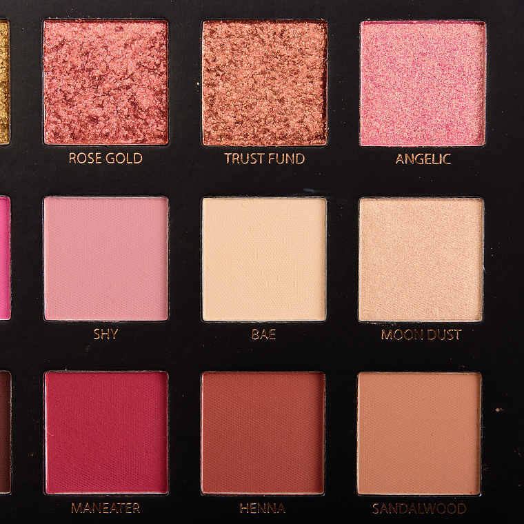
Huda Beauty Rose Gold Textured Shadows Palette
Huda Beauty Rose Gold Textured Shadows Palette
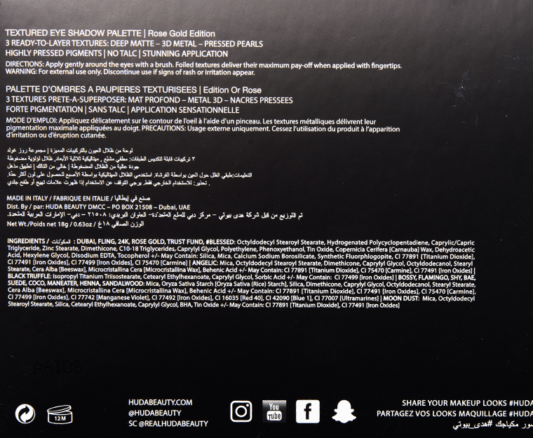
Huda Beauty Rose Gold Textured Shadows Palette
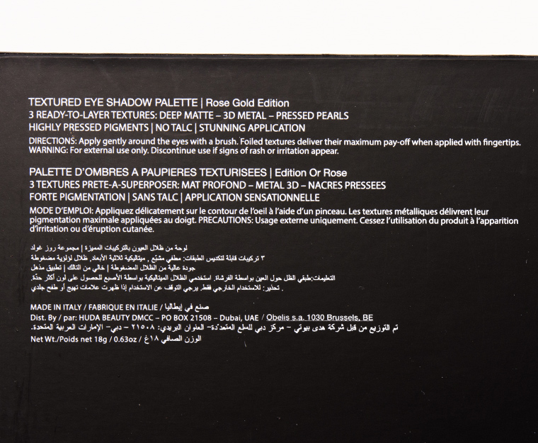
Huda Beauty Rose Gold Textured Shadows Palette

Huda Beauty Rose Gold Textured Shadows Palette

Huda Beauty Rose Gold Textured Shadows Palette
Huda Beauty Dubai Textured Shadow

Huda Beauty Dubai Textured Shadow
Huda Beauty Fling Textured Shadow
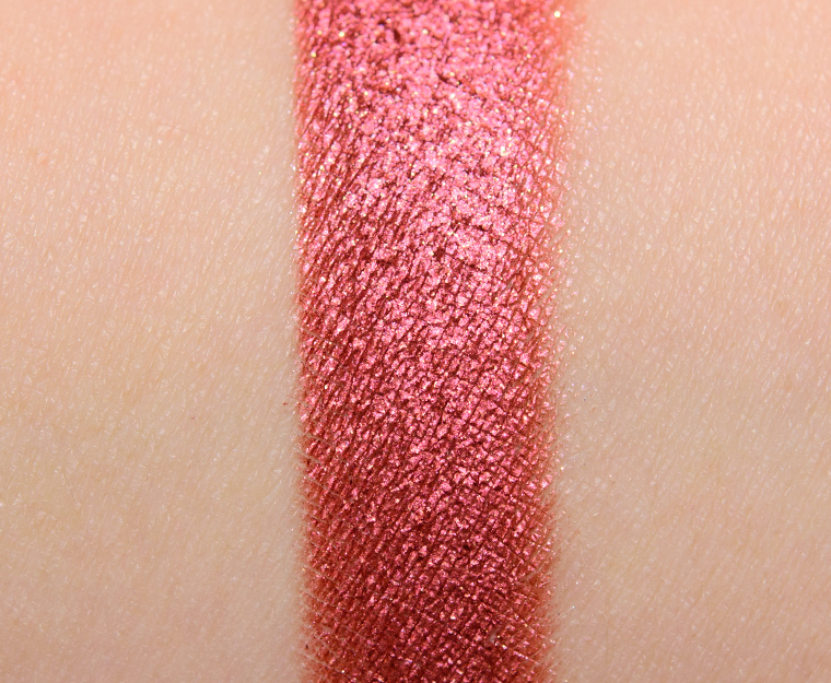
Huda Beauty Fling Textured Shadow
Huda Beauty 24K Textured Shadow
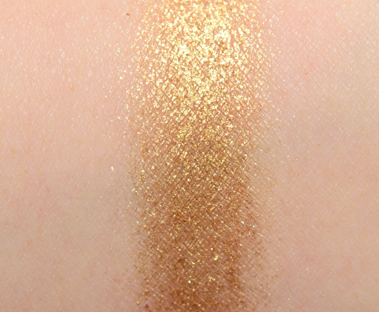
Huda Beauty 24K Textured Shadow
Huda Beauty Rose Gold Textured Shadow
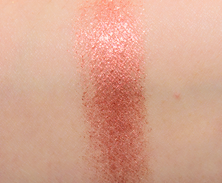
Huda Beauty Rose Gold Textured Shadow
Huda Beauty Trust Fund Textured Shadow
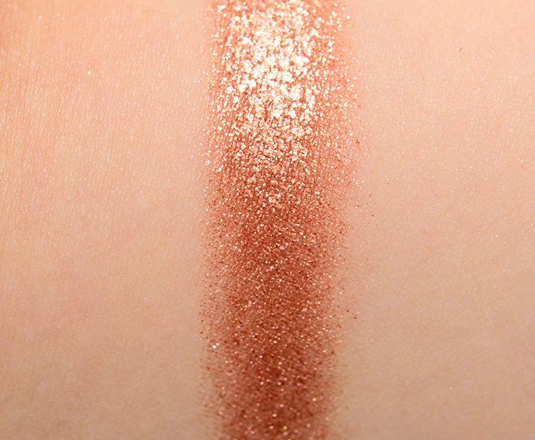
Huda Beauty Trust Fund Textured Shadow
Huda Beauty Angelic Textured Shadow
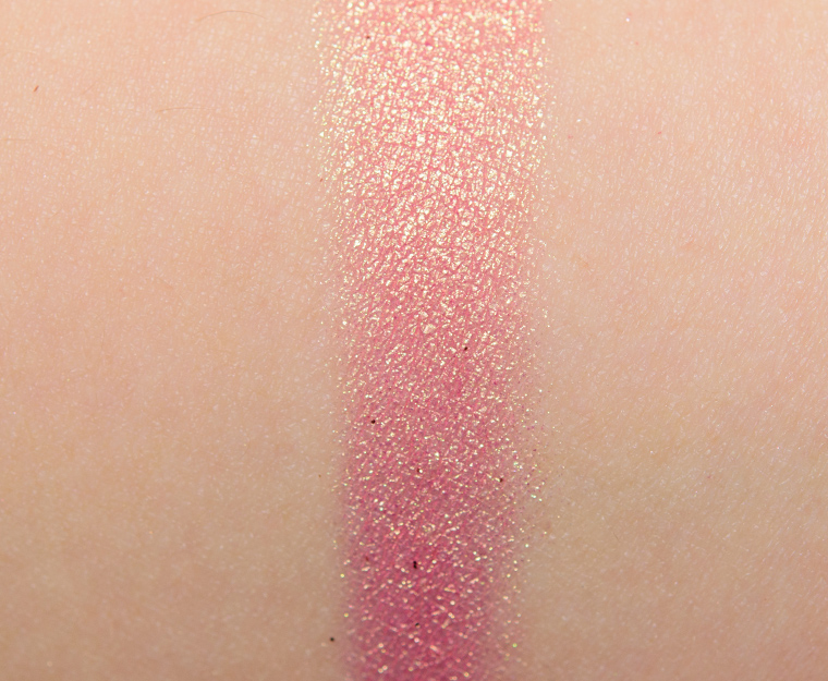
Huda Beauty Angelic Textured Shadow
Huda Beauty #Blessed Textured Shadow
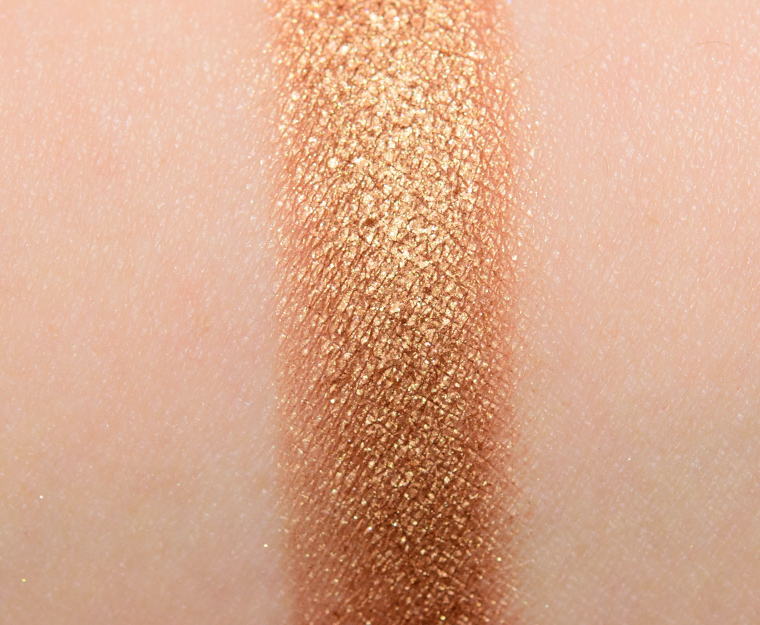
Huda Beauty #Blessed Textured Shadow
Huda Beauty Bossy Textured Shadow
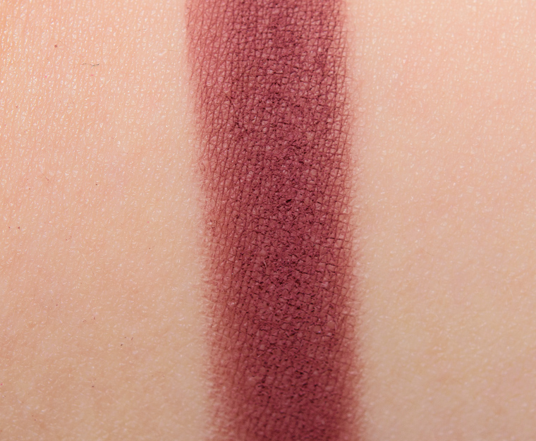
Huda Beauty Bossy Textured Shadow
Huda Beauty Flamingo Textured Shadow
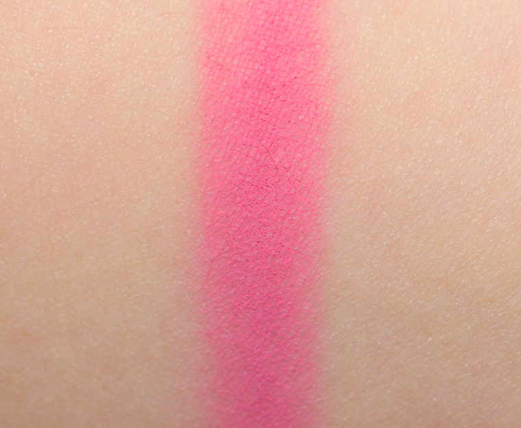
Huda Beauty Flamingo Textured Shadow
Huda Beauty Shy Textured Shadow
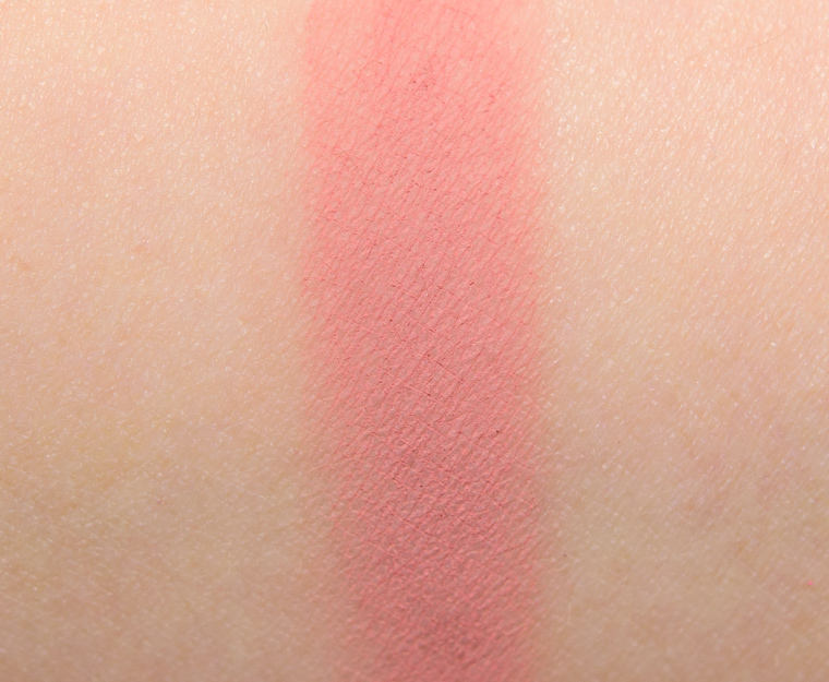
Huda Beauty Shy Textured Shadow
Huda Beauty Bae Textured Shadow
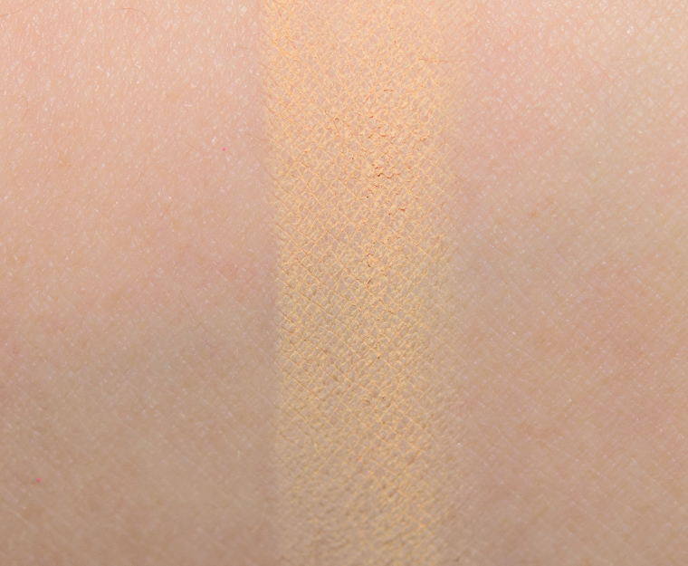
Huda Beauty Bae Textured Shadow
Huda Beauty Moon Dust Textured Shadow

Huda Beauty Moon Dust Textured Shadow
Huda Beauty Black Truffle Textured Shadow
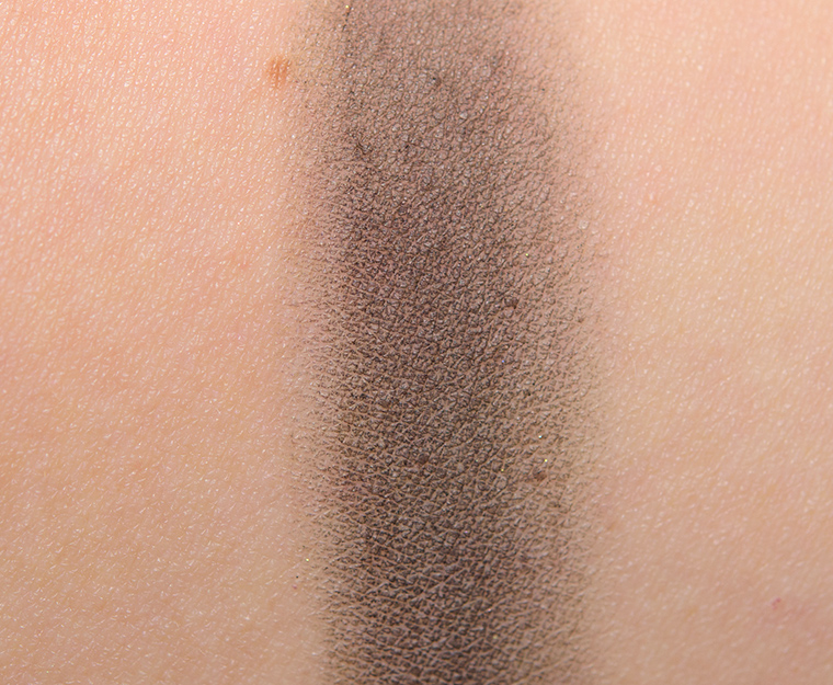
Huda Beauty Black Truffle Textured Shadow
Huda Beauty Suede Textured Shadow
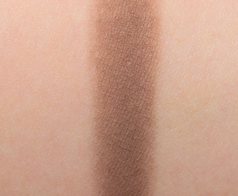
Huda Beauty Suede Textured Shadow
Huda Beauty Coco Textured Shadow
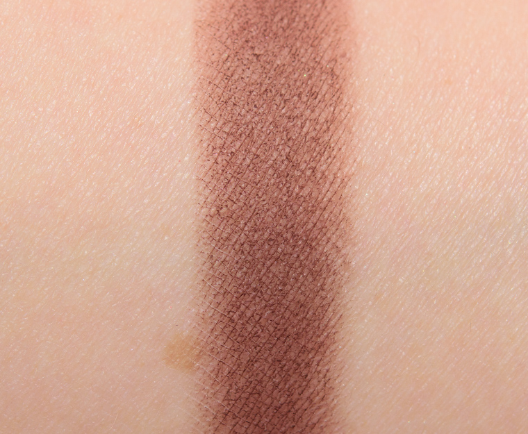
Huda Beauty Coco Textured Shadow
Huda Beauty Maneater Textured Shadow

Huda Beauty Maneater Textured Shadow
Huda Beauty Henna Textured Shadow
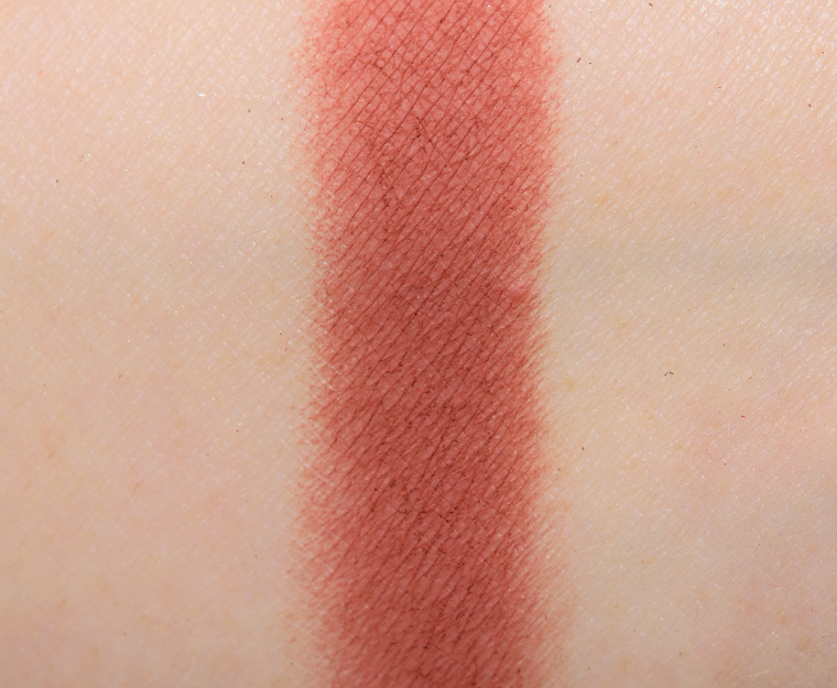
Huda Beauty Henna Textured Shadow
Huda Beauty Sandalwood Textured Shadow
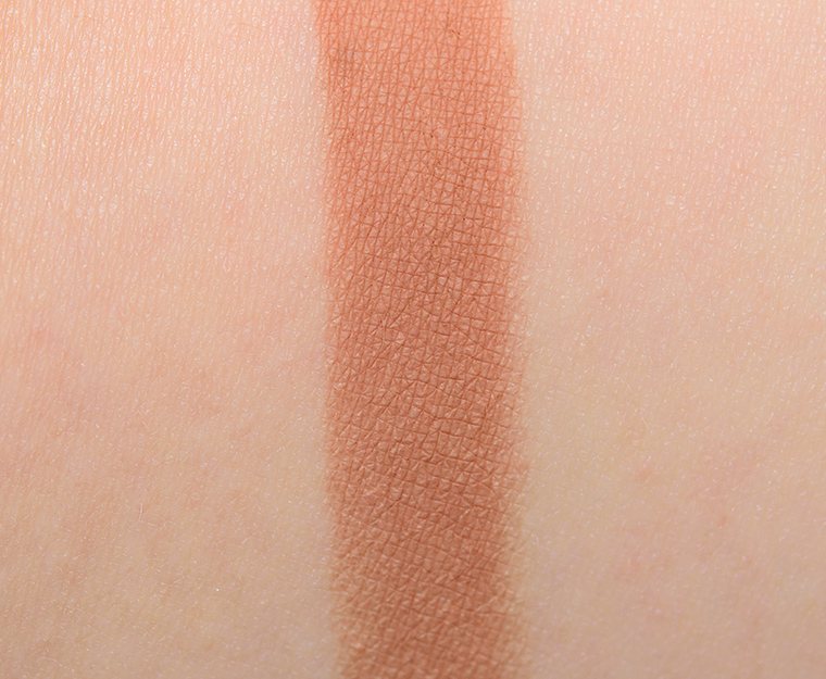
Huda Beauty Sandalwood Textured Shadow


I rather just have the eyeshadows with big photos of the swatches.
Can’t believe this performed so poorly! I was expecting a B range 🙁 So disappointing, could have been so great!
It is harder to use than it looks, I think! 🙁
I was also really interested in this one but some reviews in videos mention the chunky metal shades which isn’t my favourite after trying some of the Stila Foil eyeshadows. But the mattes to perform also this poorly is just sad. 🙁
So glad I fought the urge to buy this! Wow. With so many people scrambling to get it, I thought it had to be amazing. Apparently not so much. I easily have dupes for the shades in the palette anyway (I just like a palette over singles for the convenience and portability).
As to your slideshow or before and after question, I honestly have no preference. Typically I view your site on a desktop, although have on occasion viewed on my mobile. I’m in the habit of scrolling through to pick up the highlights of what I’m interested in. The first thing I do is jump to your rating. If it’s a product I was interested in and the rating is poor, I go back and see why you rated it poorly. Then I go and look at your swatches of the shades (assuming it’s a palette) that I am most likely to use. If those seem to do better, I consider buying. If you’ve rated something good, I skip through to get a sense of the tones (warm vs. cool) and how each shade swatched. For products I wasn’t interested in before your review, if you rated it good, I I go back and read why and decide if it’s something that makes sense to add to my collection based on your descriptions and swatches. That’s why it doesn’t matter to me how you alter the layout. I jump around in your posts anyway. 🙂
Hey Michele,
Thanks for sharing that insight! I appreciate you letting me know 🙂 One “no preference” vote counted!
I’m okay with either as well and I’m switching from phone, to iPad to desktop depending on when I’m reading. I’ve been satisfied with both versions and able to see what I need to about a shade or formula.
Thank you, Lea!
Yikes! Terrible! I was spot on with guessing your review though, lol! I remember saying it would be a C- or a D or something :P. I’m actually getting tired with these sorts of shades anyways! It seems that once one brand goes one direction, everyone else follows. There’s only so many red/pink/terracotta eyeshadows we need!
It does feel that way, doesn’t it? Like more so with this type of scheme than anything else in awhile, I think. It reminds me of the six months after the first Naked palette!
In this case it was Lime Crime eyeshadow palette that got the rust/red trend going over Urban Decay. But my favourite rust palette is still the Coastal Scent Revealed 2 palette as it was a dupe to the Naked 3 and Naked Basics but had extra room to add gold and red tone shadows in it.
it is so bland and boring, especially with people saying shit like “oh it is so perfect for fall”. So that is why brands are pushing pinkeye for almost a year now? Over it. I really miss the creativity the industry had. Everything is so uniform with this new wave of Youtube and Instagram 🙁
There are some not so great palettes floating around this autumn/ winter; this one is just plain disastrous!!! The initial swatches I think cued us in to this fact. They looked like their quality was horribly flawed. Patchy, clumpy, uneven.
Huda ought to feel ashamed of how much she’s asking for in price considering that: 1.) She’s a newcomer, 2.) Shoddy packaging, 3.) Crappy product. This palette is GARBAGE.
I was taken aback by the feel of the packaging, Nancy – it was just so cheap feeling, and I don’t feel like I’m constantly calling packaging cheap either!
You aren’t the first one to mention, or demonstrate, just how crummy and cheap the packaging on this one is, Christine. I watched a YT review on it, and the reviewer showed how awful it was. Hers had dings and crumpled corners! And it was brand new out of the envelope thingy it was sent to her in. Just shocking. Especially at this price point.
Rarely have you ever call out shoddy, cheap packaging. Except when doing so has been absolutely necessary. Here’s a vivd example of *why* we need to know!
Nancy, don’t be shy…tell us how you really feel! That palette is $83 in Canada so it’s even more infuriating that it’s such baaad quality (if there were a grade lower than F, I wonder if Christine would have given that!). Some of the shadows look so lovely in the pan although (I’m sure people are beyond sick of hearing it), all those pinks and reds make this a complete waste for me, even if the other shades had performed well. I do like Fling, however (well, I like how it looks in the pan) so I think I’ll search me out some dupes and also some ideas for how to use it for my colouring.
Christine, to answer your question about the site changes, I realize that I like whatever I get used to. In a few weeks, I will love this new set up because it will be what I’m used to (though I will admit, I am finding it harder to find reviews – and therefore the initial full reviews that you do – with this new set up; even when I search by brand first and then by type of product, it’s just a bit more of a “song and dance” to find what I’m looking for).
Is it finding reviews in the blog post or do you mean using site search?
Christine, it’s using the “Reviews” heading at the top (“Blog, Swatches, Dupe List, Foundations, Reviews, Community”). Used to be that if I clicked on “Reviews”, down at the bottom I could choose “brand” and then, within the “brand” (MAC, for example), I could choose “Makeup, Skincare, Tools, Fragrance” – if those were applicable, and then within “Makeup”, I could choose “eyeshadow”, “cream”, “powder”, “eye palette”, etc. (I’m sure I don’t have to explain all this to you). And I’m sure I can still do this; it’s just that it’s somewhat different and I take time to “adapt” when something is new and works or looks a bit different. I had a heck of a time with the previous “new” Dupe list because I was accustomed to the old one (which was so much less thorough and wonderful) so it took me a while to get used to and see the fabulousness of the new one. I’m sure it will be the same this time….I just have to get to know the “new”.
Hi Mariella,
What we did was try to make that easier, so that if you click to Reviews, you can “Browse by Brand” (or by Type) – so you can type in “MAC” (instead of clicking the letter or searching through a giant list!) and it’ll take you to the same MAC page as before. On the flipside, you can do “By Type” and select a category (or sub-category) and/or brand and price). I don’t know how big your screen is, but it’s right under the “know what you’re looking for” search field 🙂 Should be the second thing on the page!
First of all congratulations on new layout … been browsing from mobile and it was difficult for me to figure out …
the slide show was not friendly but the idea i really liked …
I somehow miss the old layout but this happens all the time so nothing to worry …
Anddddddddd the ratings …
you have a corner where I can hide myself ?? Or may be a pond or pool to jump in ??
THIS IS WHAT I PICKED TO “BREAK” MY 10 months old makeup ban ..
I want to make a 2 min silence
Hi Rashmi!
What mobile phone do you have? You can slide with your fingertip, tap once, or use the arrows left/right! Do none of these work for you?
Has your palette arrived yet?
So sorry you sprung. Maybe there are batch or country of origin issues, and you can make it work. I hope you can return it.
Annnnd just immediately took this out of my cart for the VIB sale! Thank you!
No problem, Natasha!
An easy pass for me. I don’t understand how products like this make it to the shelves with so much competition in the beauty market… :-/
I wish I knew! They made some interesting choices in formula for this one.
It’s really sad because I like her other product but this first foray into eyeshadows…. with such bad matte shades and new formula (more like pressing pigments which doesn’t always work pressed) is not the way to go.
What a disappointing palette, that is such a terrible black! How could they even let something like that go out? Also I enjoy slideshows for each shade (because I like reading the review with the swatch, just a personal opinion!) Some of the singles are sbolutely gorgeous, but not for that price point…I am glad I passed on this palette for the Rouge sale.
Great, thank you for the feedback! It doesn’t add (or reduce) any work either way, so it is really about what makes more sense as a reader!
A real mixed bag here, Christine! Looks like a definite miss, especially at that price point.
Agreed!
I saw this in store and my initial reaction was that it felt cheap. When I swatched the shadows I knew that this would be a flop.
It felt SO cheap in my hands 🙁
I’m not surprised. The palette’s reviews were dismal at sephora website.
True – when Sephora reviews are sub-4 stars, it isn’t good!
Especially when they withhold publishing some…but maybe they can’t put it in, when you call an eye pencil torture. My consumer comment on mufe shadows was up before I left the mufe page. Under 5 mins, seriously. You know they are skewed. They also wait to get some better ones, when the first ones are lousy. Pretty much cannot be less than average, 3stars for cumulative rating.
I wonder what their rules are, because I’m sure a lot of it is automated. It could be rules like how long the user’s been a user, whether it was their first review, whether they purchased it (like Sephora can track it to their account), or even including something like their helpful/unhelpful ratio on past reviews.
Thanks for the review Christine! I was waiting for your review anxiously. I did expect it to fare better though! Will you be reviewing the huda beauty liquid lipsticks?
Sorry, I don’t have any of those!
I love the slide show in theory but in practice since I usually read your blog off of Bloglovin I can’t see the pictures at all. For your previous post about the MUG highlighter the only picture I could see was one of the actual product, not swatch picture at all.
I know that doesn’t really concern you since it works perfectly fine on mobile but it’s just that I usually forget to check blogs if I don’t have them all in one place and will miss a ton of posts.
On another note, this palette seems god awful and your review confirms it. I’m not too disappointed since the colours are nothing unique (imo) and the price is very high for a newish brand.
Hi Laurence,
I’m not sure how it reads in Bloglovin’? Because I thought any click on a “post” always clicked through to the website. If I go to “My Feed” on my Bloglovin’ account, I only see snippets of people’s posts with an image + text and then tags. I do see photos for Temptalia posts, and it looks the same as it always did for me, and regardless of whether I click a post from Temptalia or another blog, they all direct me to the publisher’s full web page. I’ve never used Bloglovin’ on mobile – is that where you’re using it? Could you send me a screen shot at submit[at]temptalia.com?
I think I was able to get to something that is what you are talking about! But if you could let me know if you are primarily using Bloglovin’ on your phone, or is there an app, etc. that would be helpful. Thanks!
I’m using the Bloglovin app on my IPhone. Thats how I always read your blog. I’ll email you the screenshots so you can see 🙂
Great, thank you!
What timing! I just got this palette last night, swatched everything on my normal/dry arms with no primer. My mattes swatched much better than yours, but on the lid, I’m having trouble blending, might have to try a different primer, cream base, or brush. My metallic shadows swatched like yours, maybe a little better, but it’s tricky to apply –with my warm fingers, I pressed a very light layer on top of the mattes, otherwise, it can look very chunky and uneven. But the sparkle is so gorgeous (reminds me of the Chanel D’Illusion Ombres), and it looks very smooth on my lids. And OMG, the colors look totally stunning on my brown eyes! I didn’t see your review until now, but this morning, I used Bae (rated D-), Henna (C+), Coco (F) , then pressed Trust Fund (C) in the middle. It’s been 5 hours, and it’s holding up with WNW Fergie primer on my super oily lids, with some minor fallout from the metallic shade, but nothing too crazy. Will let you know if it holds up to 8 hours, although I prefer 10 hrs, since my days are long. I also swatched it next to my ABH Modern Renaissance palette, and I can see 4 or 5 colors that look similar, so not sure if you need both. Hands down, the mattes in ABH are far superior, but the metallics in Huda are more unique and stunning, and Huda has potential for dramatic, stunning combos. If I can get the C/D/F shades to perform, I think I can get the rest of the palette to work, since the colors are so gorgeous. But if not, I will return Huda and just add some City Color Shimmer Shadows to my ABH palette, and City Color is having 40% off sitewide sale for Thanksgiving.
Five hours isn’t bad, since I know you can have trouble with some formulas disappearing on your lids (even with primer), but keep us posted!
How do you feel about the packaging?
Yeah, for $65, I was expecting more from the packaging. The cardboard/plastic does seem kind of light and flimsy, but I’m not planning on travelling with this palette. I’m worried the flip lid will eventually fall off, but if I reinforce it now with some black duct tape, I think I will be ok. The colors are so gorgeous I’m willing to overlook some flaws. But for someone who does travel with this, I think they are going to have to wrap something soft around it (clothes, towel, foam) and rubber band it, so it doesn’t get all beat up.
LOL! You know it’s not good if someone is talking about duct tape for a $65 palette, though!
The colors are so beautiful–if I don’t have to use Superglue on my lids to get them to stick, I’m ok with some duct tape on the packaging LOL On the plus side, the palette is very light, thanks to the cheap packaging 😉 Some good news–with primer, the 4 shadows wore 8 hours on me, then started fading and creasing on the hooded lid, the unhooded lid lasted about 9 hours. BUT it was kind of warm and humid today, and I was running late this morning, so I was quickly slapping the shadows onto my lids, but if I take a little more care, I think I can stretch the wear to 9-10 hrs, which is pretty good considering how oily my lids are, and these are shades rated C/D/F. I’m going to test other shades and play around with different brushes/bases to see how it goes, but I’m cautiously optimistic I can make this palette work.
The Huda Beauty YouTube video about the palette (https://www.youtube.com/watch?v=bX_DFQ65pRY) also suggests using a brush dipped in mixing medium to apply the textured shadows, as an alternative to using your fingers. I just received my palette today, and plan to try that method (as well as using a sponge-tipped applicator to apply the matte shadows, and a brush to blend out the edges) – as I have found that to be a better method to use on matte shadows that apply “patchy” when applied with a brush. I’ve also discovered there can be a big difference in application between using a synthetic vs. natural hair brush. Because natural hair brush hairs have the cuticle (overlapping “scales,” like human hair – synthetic brush hairs are smooth), they tend to pick up and hold product better and transfer more of it to the lid. Of course, YMMV!
Dorothy, thanks for the tip! I will check out the video. Hope the palette works on you, the colors are gorgeous!
I think there are some serious QC issues here, with my batch being much better. For example, Black Truffle got an F because you had to use a metal spatula to scrape any product off of it, and the swatch is horrible looking. Mine swatches beautifully –super silky and very pigmented, one of the very best matte blacks I’ve ever swatched, and I swatch a ton of stuff, wish all of the other mattes were like this. Haven’t tried it on my lid yet, but it looks very promising. Will keep testing this palette and report back later next week.
I do think you meant 18, not 8 eyeshadows 🙂 I hate to correct you, I feel so pretentious, but it caught my eye.
Disappointed here because these shades are pretty much ideal for me. However I have Modern Renaissance and I do think it’s a pretty decent option for someone who wants this but either wants a cheaper price point or a (much!) better reviewed palette.
Fixed! So sorry!
Hiya Christine! I actually really like the slideshows for each shade right above the review. Also love the new look for the site!
Thank you for weighing in, Stephanie!
My $0.02: I really like the ones where the swatch slideshow is located with the review. When they’re all at the bottom I find myself scrolling back and forth between the reviews at the top and the swatches lower down.
Gotcha! That was part of why we moved them up, but I wasn’t sure about the two-photo slideshow being better! Thank you, Tracy!
I like having the swatches right next to the respective reviews. It’s easier to visually see what you’re describing in the review and takes away the hassle of “okay, which shade is this color, gotta remember the name and scroll way down until I find it.”
Also, this palette looks HUGELY disappointing.
Perfect, thank you for the feedback, Sarah! 🙂
100% prefer the slideshow!!!!! I like each shade to have all the info and photos together. Tried it on my phone and my desktop and loved it on both.
Appreciate the feedback, Olivia! 🙂
I personally like having the slideshow right along with the review of that specific shade. So I don’t have to scroll up and down to match the swatch with your review.
Great, thank you Ginny!
huh… this palette seems to be quite polarizing. i have seen some good and some bad reviews. Obviously YOUR review is gospel, Christine!!! I ordered this during the vib rouge sale so I got a discount and if i find it performs like you say it does, i will definitely be returning it to sephora. Such a shame because her lip liners and liquid lipsticks are great. I have not tried her lashes but they seem to be very well liked
Let me know how you like yours, Allison! I’m always curious 🙂
Everything else aside, I’d prefer a million stupid sex puns over anything called Trust Fund. Yikes.
I could see that! Though trust funds are often used in good ways 🙂 For example, I have money set aside and specific plans for disbursing it for Mellan (to ensure that he’ll be well taken care of, and nobody will feel financially burdened by him).
Would there be any way to make the slideshows smaller for just swatches? I’m on a standard 15″ laptop and the images the same height as my resolution – I actually have to zoom out in order to see a full image and/or get a sense of how the product looks outside of microscopes :/
Hi Tarzi,
The size of the slideshow is dependent on your resolution – we have different layouts based on how wide the device is. Unfortunately, it’s not just making one thing smaller, it would require creating another set of styles entirely (and then going through every element and page on the site to make sure they are showing properly for that size). We have four different versions of the site presently based on what typical widths are.
What is your resolution?
If this had performed I would have picked it up at full price, but the reviews have been terrible from everywhere. I’m going to get a couple of the dupes instead since this palette is exactly what I’ve been looking for lately. Have a good weekend, Christine!
A lot of people seem to have some trouble with the palette, though there are definitely a few who like it. I was actually prepared for something worse with the metallic eyeshadows – I wasn’t expecting the graininess of some of the mattes, though!
I am missing your photos of the ingredients lists. Just a personal thing with me since I can’t use anything containing carmine, so it helps me not crave something if I see right up front that carmine is on the list of ingredients.
Hi Kelly,
There is a photo of the ingredients!
I’d bet there’s a ton of carmine. Even if you’re not allergic, most people would gag at where natural, non-synthetic carmine comes from. One of the few things I’m not allergic to. Don’t forget to use cosdna for ingredient lists, though they usually aren’t totally utd with new releases. It’s a lifesaver for me. Realize I sound like a commercial for that site, but …..
This is so disappointing, especially considering the high price point. The packaging is ridiculously cheap. I’ve seen some reviews where people received banged-up palettes. Unacceptable, IMHO. ABH Modern Renaissance is the clear winner in my book. Just add a few sparkly singles; close enough.
Modern Renaissance, thus far, remains the winner in this type of color palette!
I don’t like this palette -too many epic fails, patchy mattes and similar shades.
The only colour I like is Dubai.
As far as your question is concerned, I think I would like the big photos of the swatches. Thanks Christine for giving us the choice.
Thank you for your input, Genevieve!
I kinda missing having a large photo of the swatches instead of a large photo of the eyeshadow itself. That’s probably because I’m lazy and don’t like having to click the swatch photo every time.
Also, I was so looking forward to this review-I had such high hopes for this palette, so thank you for saving me money.
You can click “show all,” which will make it so all the photos show up at the end of the post (like before) 🙂
I see a huge photo then a small photo and a small swatch under the huge photo. I do prefer to see swatches at the end. The slideshow is too big to load properly for sets like this otherwise. It just looks funny on my iPad to see the screen full of the product then a tiny repeat of the photo next to the swatch underneath. I like the old way with medium sized photos and swatches all in a row. I do like the slideshow of the product, packaging and look at the top of the review.
Hi Erika,
Could you let me know what way you view the site on your iPad? I’ll double check how everything displays, but it should show the large photo and then any photos related to it (including the one that is in full size, so you know where you are in the slideshow – obviously with two that’s more intuitive).
I view the iPad short side horizontal.
I love your site with the swatches and dupes and check it daily.??☄️?
I only REALLY like the first two shades, so even if this was acceptable quality. I’d still no buy it.
But I wanted to say, The reddish colours, with you hazel eyes are a BEAUTIFUL combo Christine!
Thank you, Shannon!
I love the new layout! Love the slideshow, love the bulleted dupes, and best of all are the swatches accompanying each shade review. It’s great to not have to scroll back and forth to compare description and swatches.
Happy to hear that it is easier for you to read the reviews now, Kate! Thank you!
Hey girlie, personally, I’m just happy there is someone I can trust with opinions on all these products because there’s a lot of ‘bought’ opinions if you know what I mean smh. If I had to choose, I’d have to say I like the way you presented this review just a tid bit more. I do everything on my phone (including going on your emails) It seems to load better on my cheap ass phone haha. Whatever you go with though, I’m still happy though…..Thank you for doing what you do cause I truly rely on your thoughts on beauty 🙂
This is a flat out disgrace. QC, approval of the product, mfg of product, pkging. It massively capitalizes on the rush to acquire LE, hyped offerings. Reminds me of when they put grit in nail polish a while back. And it’s actually only a tweaked derivative of what is currently available. This is not an auspicious start for Huda’s first BIG product (at least stateside.) At least Katherine has had some luck. Much as I like app, not going anywhere that requires 3 steps of make it work, to apply.
The look you did with this palette is gorgeous!!
I like the slideshow for the individual shades. I sort of miss having the grades for each color all listed together. Not sure if it would be possible to give an abbreviated overview (with tiny images of each color alongside) immediately after the palette’s total score, and then show each shade with the detailed grade breakdown (product, pigmentation, texture, etc) and slideshow with product & swatch.
I know you can’t please everyone. I appreciate all the work you’ve done with the site. BTW, your photos have always been A+! Thanks Christine! ?
My reaction might be biased since I’m the least supporter of Huda, but looking at the packaging alone gives me chills. How can they charge so much for a product that has such flimsy and cheap looking cardboard and plastic? It looks even worse than some much lower priced brands (even my BH Cosmetics palettes look so prettier and sturdier than this), not to mention the inconsistency in quality. Overall horrible palette that nobody should ever consider. There are simply so many greater palettes out there aesthetics and quality wise.
I had two palettes in my cart, The UD full spectrum and the Huda beauty one. After your review, I removed them both. Thank you for saving me the time and the money Christine. The new layout looks lovely by the way!
I am so happy that I decided to wait and see your review before purchasing this palette. My immediate reaction when I saw it on other sites was to order it immediately. Something told me to wait and after seeing swatches I knew it wasn’t going to be good but this is beyond bad. Thank you so much for saving me from this disaster.
Regarding the site, I love the slide show by the shade as it eliminates scrolling up and down and trying to figure out which shade you are talking about. I really love everything about the new site.
This just breaks my heart, because the colours in the palette look incredible. I’ve seen a few comments on Sephora and Instagram, and almost all of them say the exact same thing as you: the metallics are impossible to work with at all and the mattes are generally stiff. Sigh. Why do I never feel happy about not spending money?
The mattes look so horrible. The metallic shades are gorgeous but at this price the palette is probably not worth it.
Feedback on the multiple slideshow system here: It has my approval. 😀
I like what I get used to haha. I liked the old layout and I like this new layout. I love that this new layout has the slideshow immediately. I’m on an iPad and I used to have to click the read more type of button to see pictures. Sorry I’m a non vote. But I will say I wish you did more looks. Am I wrong I. Thinking you used to show perhaps three looks per palette? I only wear light makeup once a week, tho I have tons of makeup. And I’m always at a loss at how to pair colors and looks. So for me showing how what can be achieved with each palette is super helpful. Again congrats on an awesome site
I’m not going to bother commrnting on the palette.
As far as the layout is concerned, especially with 3 or more items, I really like the slideshow at the beginning. It helps me keep the product in mind that I’m reading about. The single photo at the end is nice but not required. When going through a big palette like this one, it is essential for me. I still do some back and forth looking at lippies and items where I would chose one or two.
I’ve use this noe on an Android phone and a Kindle Fire but haved gotten my laptop out to play lately. I also have a new Amazon Fire but haven’t played with that yet. I will let you know.
So far I’ve had no problems, only fun.
I use a tablet and this layout was much easier to view and put the names with the eyeshadows you are referring to. I have found that using a touch screen is always easier if I don’t have to touch the screen too much (it is a fact of life that I am always shooting off to linked pages when all I was trying to do was scroll up or down) sometimes I just give up and don’t even try to connect the name with picture if I don’t have a burning interest in making a purchase or finding a dupe. Anyway, this is super helpful for me as long as I am stuck on this android tablet, thanks so much though for either format you go with!;)
1. Dubai is gorgeous and I wish I could get it as a single! It’s the only shade I like here. 🙁
2. Is it just me or is this really similar to the new Natasha Denona palette?? :O
3. I like the new layout! I like where you get a preview of the palette images before you click in to the article, then you have the swatches on individual slideshows.
4. By the way… when you are on a product’s individual page, you don’t get the “read the full review here” link anymore. 🙁 I miss it, I’ve been searching for products manually now, been a pain.
Lots of things to say, apparently. 😛
Hi Zovesta!
Thank you for your thoughts! I would say it is a bit warmer and more red-toned than the Star palette but they are in the same type of range.
There is a “Read Full Review” button on the product pages – if there is no link, it probably means there’s no review. For instance:
http://www.temptalia.com/product/huda-beauty-textured-shadows-palette/rose-gold/
It is listed under “Editor’s Review,” which shows the rating and individual Glossover scores, followed by a button (with a black background) that says “Read Full Review.” If your display is wide enough, it will have a sidebar, it’s in the sidebar – and if you are viewing everything in one column, it is underneath the “about this product” portion (should be shortly after the photos).
Anything really, really old might not be interconnected (but then they wouldn’t have photos either), but all of the ones that had it before still have it now. We didn’t take that away.
Oh good, I see! I was used to the big purple button right in the middle. 😀 That’s a relief, I was worried it got lost in coding somehow. Thanks!
Questa palette l’ho appena comprata ( e per noi italiane è stato davvero difficile averla) e sulle prime mi piace molto. La userò e spero invece di avere un impressione meno negativa.
Buona giornata
I have just bought this palette (and for us Italian it has been difficult to have it indeed) her and on the first ones I like a lot it. I will use her and I hope instead of having a less negative impression.
Have a nice day
I absolutely LOVE the colors in the palette and some of the swatches look beautiful, but overall I was expecting more 🙁
concerning the question, i prefer the slideshows 🙂
it is obvious from the look you have done with this palette, how the color makes the lid appear thicker and uneven !
too bad this palette does not worth it
I love the pics and swatches above the review! Usually I find myself jumping from review to pics to review again so this is much quicker.
Also thanks for the review on this product. The colors are so gorgeous in the pan, but I have no time, talent or money for poor performing, hard to use shadows.
I don’t know what is wrong with me but I still want to buy this! 🙁 I have no colors like these, I live in a country with no Anastasia Beverly Hills, no Urban Decay, and shipping rates for Makeup Geek etc (I am in India). I have a lot of good mattes with me but no shimmers like these at all, I guess that’s why I am tempted to get this through a family or friend in Middle East. I am still very confused though, I was so hoping this performed better than this! Thank you once again for such a detailed review!
And coming to your questions I am loving the changes, I almost always view these on my phone, so I am loving the bullet points of dupes (please don’t scratch this idea, it’s a winner!) and the photos with the review of each shade is just perfect to really get the full impact of your analysis. And the slideshow is very functional as well. Loving the flow of the articles a lot!
Too bad this was such a miss, but — not my colors, anyway.
I *love* having the slideshows for the individual shades — no more scrolling up and down to read the description/view dupes/click on ‘love’ or ‘wishlist’ and getting lost in the process 🙂
Wow, this could have been phenomenal.
I know!
Sometimes I see the name of a product on here and I go “OH BOY HERE COMES THE ROAST.”
Aw!
I must say this is a bad one. It’s an easy pass. I do like how the shadows look in the palette, I did think it would be better, as I think I’ve seen some bloggers/youtubers really like it. Or maybe I dreamt it.
Even if this should be a batch problem, such a bad product should never leave the factory, imho.
It seems very hit or miss!
I really like slideshow in your home page because sometime I see only a swatches (in product that I don’t in to). However, when I clicked ‘continue reading’ I think it’s better to has no slideshow because it easier to just scroll down to see how eyeshadow look like in the pan and how they swatches. Hope you get what I try to say.
One more thing, I has have a hard time search for Anastasia single eyeshadows swatches or Urban Decay single eyeshadows swatches or Swatch of Colourpop Satin liquid lipsticks in one pages with their scores (I know you have these feature but it quite hard to search for it ) or it can easily search but I don’t know?
Anyway really love your review as always. And I quite addicted to your page lately.
You can click “show all” if you prefer them all in one page 🙂
If you are looking for swatches, that is what the Swatch Gallery is for – just click “Swatches” in the navigation and search by any formula you please.
Hi! I swatched this palette at Sephora last week and it looked great! However, it is sold out right now. I hate having to click to see a swatch and prefer your old format of just one picture after another going down the page. It is clear, simple and easily accessible.
Thanks!
Hi Diane,
Please click “show all” on any of the slideshows, which will put all of the extra photos at the end of the post, just like before 🙂
Hi Christine thank you for your review, I wanted to love this palette but most colors were hard to blend and chalky the textures one I used a flat brush but it was hard to get product on. Also it is made in China , I plan to return it i recieved Modern Renaissnace today and tried it on such higher quality
This palette is made in Italy, the knock offs are made in China. I think you got scammed :/
I love this new lay out Christine it’s beautiful. I’d like to see the swatches in the slideshow but with all the work you do for us if that’s too much this site update is enough. Thank You for all you do for us. Your one of the few bloggers that we can trust.
Thank you so much, Melissa!
The new layout is great! I think it would be good if one of the photos at the very top would be a photo of all the swatches for the palette together (either by you doing mini swatches of all the shades on your arm, or by just glueing mini versions of the swatch photos into one photo). Your site has the most detailed swatches online, but I also find that seeing the swatches of the whole palette next to each other is helpful for getting a feel for the palette.
Thank you so much for the feedback, Kara!
I bought this during the Sephora rouge sail (would never buy it without the discount) and I quite enjoy it so far I almost didn’t buy it because it rly does swatch terribly but I found that it’s easier for me to use than I thought it would be
I’m so glad it is working better for you than you thought, Cristina!
I have this palette I love it.I think that makeup artists are coming out with palettes that may not be for the average woman getting up and putting on a work look. I think that is why this and others are getting bad reviews. To achieve certain looks with dimensions of shimmer on this level you have to apply shadow differently.I think most people are not into it and that is completely ok. I think its just something people need to understand in reviews.These shades work best with the heat of your fingertip on the lid.
Hi Laralie,
If you read the review above, you’ll see that I mentioned I used the metallic shades with fingertips.
Great review! Too many shadows perform poorly to justify the price.
I think the pictures of the shade and the swatch should go side by side. That way, you can see the entire image along with the name of the shade, and the article isn’t so long. Makes it more user friendly 🙂
I swear I always look for your review before buying a product, because I trust your opinion a lot (you know your shit, let’s be honest), and the only time I didn’t I find out that the product that I just bought is horrible quality.
Well, too late now, I just gotta hope I’ll make this palette work out for me.
Try using a glitter adhesive and/or use the chunkier shades damp. I think it’s workable, and hopefully, you can enjoy it anyway! 🙂
After a great deal of indecision, I made the splurge and bought this as soon as it came back in stock. Whoa! Had not expected to pay so much for shipping and duty! I’ve only had it for a couple of days but am not experiencing any quality issues. It’s a lot of fun to play with, and I like the combination of colours and textures. I wear a LOT of eye makeup and today I had compliments on my eyeshadow, which rarely happens. It’s an indulgence, so what the heck? Way over-priced, but I’m glad I indulged.
Hi!! I was wondering if colourpop elixir is a dupe for henna (:
http://www.temptalia.com/side-by-side/?sbs_1_search=Colour+Pop+Elixir&sbs_1=259030&sbs_2_search=Huda+Beauty+Henna&sbs_2=263624