Huda Beauty Neon Obsessions Palettes | Swatches
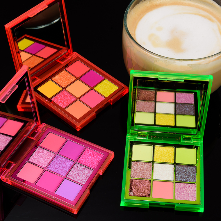
Huda Beauty Neon Obsessions Palettes ($29.00 for 0.45 oz.) just launched last week, and they’re centered around the brand’s previous Obsessions format but with a neon take. Each palette contains a mix of matte and shimmer shades with nine shades in each compact.
However, all three palettes have a two-part label that peels back and reveals that they are “not intended for eye area.” Many of the shades use red and yellow color additives that are permitted by the FDA (such as Red 6, Red 22, Red 40, Yellow 5, Yellow 6) for cosmetic use but are not permitted for “eye area.” Red 40, for example, is permitted for use in all cosmetics (no restrictions) in the EU (you’ll need to use the Colour Index Number, which starts with “CI”).


Christine and Team Temptalia: You rule for pulling together timely swatches for these latest releases ??
I’m passing on these. I don’t see myself reaching for them. I love the green though.
It was a photo finis! I normally write posts the day before (like 10PM, lol), but this post went up in real time… eight minutes later than normal posting time (2PM PST).
Will you post swatches of all the lipsticks too? Or do you only do huda eyeshaodows?
Sorry, this is all I purchased.
The neon green palette looks so disappointing!! I love the idea of it, but definitely not enough greens, and the shimmers look underwhelming. The other two palettes actually look pretty nice.
Agree with you. I so wanted the green one to be worth it and it’s not impressing me. Though the others really look good, they’re not in my color scheme at all. Boo hoo!
I was just debating these. These swatches are nearly all so gorgeous. I hope the review matches the visual. The only one I’m unsure about is the green one. I’m crossing my fingers and pulling the trigger on the pink and orange. The “not for eye use” concerns me but I guess not enough to pass on them.
The “not for eye use” is basically just legal jargon because the FDA hasn’t yet performed eye-use tests on some of the pigments. Tightlining with them may not be a good idea and people with sensitive eyes should avoid eye use altogether, but most people should be fine using them as eyeshadows.
The “Neon Green” palette doesn’t have any green in it except for two shades! (Sorta)
That’s disappointing that they aren’t eye safe! They should have to put that disclaimer somewhere prominent on the packaging. So people can clearly see it before buying!
Pink and Orange look fantastic. I’m not quite sure how I feel about the Green yet. The brightest green looks kind of separated, and the shimmers aren’t as diverse as they look in the pans. I’ll wait for reviews.
You rule Christine!!! Easy pass for me. I’m more of a neutral lover. To me some of these shades are just too close to the same color. If I was purchasing them I’d be disappointed I think…
I thought I would love these based on the name (but not buy them because they’re made in China), but they’re seriously disappointing! What’s with the actual dupes in a 9 pan palette and since when does brown belong in a ‘neon green’ palette? (For all my complaining though, I can see myself buying the orange and the green on the second hand market if they’re not too expensive.)
The orange is probably the only one that could work on me, I think? And I do love that one. However, it was the lime that I had all my hopes pinned on, which doesn’t quite live up to my expectations based on Huda’s own IG swatches. ?
I really didn’t want to like these, but I think I do! Life is hard. Thanks for the super fast swatches, Christine!
I think there is elements of sameness between all three palettes and definitely lots of repeats. Very suss about the eye colours not being suitable around the eye area….
I tempted by the pink, will probably ens up getting the orange, and don’t really understand the green. It’s like she chose neon green and then couldn’t quite go all in on it.
I bought the Ruby obsessions palette on an impulse and have been super surprisingly happy with it. The price is affordable, the size is perfectly compact and light, and the colors have pleased me more than expected. I think the pink has too much overlap with other stuff I own, but that’s why orange is what I’ll possibly get.
I am drawn to the Neon Pink palette but looking at the swatches, they colors all look so similar. Pass. I don’t get the Neon Green palette. There’s only like two green shades and the other shades seem kind of random. I’m not one to wear greens, so I will be interested to see the looks people put together with it. The big surprise for me personally is how much I really like the Neon Orange palette! All colors I would use, and orange tones tend to make my blue eyes pop. I definitely need to swatch that one in person!
Thank you so much Christine for getting these up so quickly! You rock (as always!)
I feel like they kinda shot themselves in the foot–the two pallets with pink have colours so similar, why would you buy both? I admit I’m kinda scratching my head with the green one. Thanks for getting the swatches done so quickly though, you really do rock!
(Christine I’m still not managing to receive email notifications)
Please give my tech guy time to respond to your email! 🙂 We are a small team (myself and my brother-in-law), so it can take more than a few hours for us to respond, especially if it’s a technical issue that we have to investigate, replicate, diagnose, etc.
My apologies, and thank you!
Are there dupes for shades between palettes? The Neon Pink #2 and #3 look so similiar to each other, and also look pretty close to Neon Orange #8. Neon Pink #4 (maybe even #6) also looks like Neon Orange #6. And then there are barely any greens in the Neon Green palette. These are pretty disappointing.
Wow, these look nothing like the official swatches. Especially the green one. I know they build them up in promo shots but… dang. And I know neons should be used with a white base, but the mattes here actually look great. But the duo-chomes that they advertised… sigh.
I just posted this as a reply to dzymzlzy and I post it anytime I mention the Urban Decay Electric palette, but I think I should post it as a separate comment here so everyone who’s worried can clearly see it.
The “not for eye use” warning on these Huda Neon Obsessions palettes, certain shades in UD Electric, and some other pressed pigment palettes is basically just legal jargon included on the packaging because the FDA hasn’t yet performed eye-use tests on some of the red pigments used-those same red pigments have been approved in Europe. Tightlining with them may not be a good idea (because tightlining takes the color inside the eye) and people with sensitive eyes should avoid eye use altogether, but most people should be fine using them as eyeshadows.
Just ordered the pink & green (current owner of ruby obsessions and emerald obsessions– as well as nudes pallette… Is it obvious I have a type? ?). They cannot come soon enough! I’m absolutely dyyying to play in them ? I’m not at all worried about how they’ll perform, as Huda pallettes have yet to disappoint. By looking at the swatches, I can tell that the different pallettes will compliment each other/ work well together, and I have some awesome ideas in mind already for pairing the pink and green.
Thank goodness none of these appeal to me. I hadn’t been interested even before your swatches, but the confirmation of my suspicion that they’re technically not GRAS for the eye area is a deal breaker. I don’t buy ColourPop’s pressed pigments for the same reason.
None of these is my “thing” at all. There are 2 shades in the “green” palette that I might wear (they’re not the brilliant green ones though) but I seem to have dupes for both.
These look beautiful and so fun! I am already envisioning many super bronzey looks this summer with neon pops in the corner or under the lash line. I’m slightly disappointed in the green one as well but i have blue eyes and lime greens and chartreuse colors look so amazing and blue eyes pop that I bet theyll look beautiful on the eyes. Some of the glittery swatched remind me of the ND Chroma crystals and appear kind of like top coats which could be pretty with colors in the other two palettes as well!
I must say this is a fail in therms of color scheme.The pink has almost all colors duplicated , you can hardly see any difference.
The green also, plus it is almost not green at all.
The orange is the only one i would get, if i needed any more shades
Guuuurl…..you were busy this weekend!
I still want the pink .I’m a huge fan of neons and brights .
Ok, an eye palette that has colors you can’t use in your eye area. Then where are you supposed to use it?
The green was so intriguing until I saw the swatches. And none are eye safe? Pass. :o( Sadly. Thank you for all the swatches!!
So, where is the green? Did she forget to put any greens in the green palette? No, not interested. I think the Pink and Orange look pretty and the performance based on swatches looks okay for those two but Green doesn’t look as good.
I am not concerned about the “not safe for eye area” in general because I know they are being used in other areas around the world without issue but still feel like that should be more prominently displayed. The majority of people who want the palette are going to buy it regardless of the disclaimer but for those that really do have a sensitivity, it needs to be fully disclosed in a prominent way. Anything else is careless, IMHO.
I just don’t understand palettes like these that aren’t intended for eye area!!! Lovely swatches though.
So glad to see your swatches! No longer interested in these and thank goodness, I probably have enough eyeshadow to last a lifetime.
I am baffled by the color choices in the green palette.
The neon orange calls to me but I don’t get along with her eyeshadow formula. Waiting for dupes!
Neon Orange is calling me so I’m hoping the formula is good. It’s on the lighter side of hot pink and orange that it works for me.
All three look very pretty. I think if I were to get one I would choose the orange. The green one doesn’t have enough green in it for me, and the matte pinks run a little too similar even though they are verrry pretty. Thank you for the always timely swatches Christine! I was interested to see what these would look like.
And Christine, really you’re working overtime!!! Thanks so much!!!!