Natasha Denona Glam Eyeshadow Palette Review & Swatches


Glam
Natasha Denona Glam 15-Pan Small Eyeshadow Palette ($65.00 for 0.67 oz.) is a new, seemingly-permanent eyeshadow palette with five matte shades and 10 shimmer shades (most being fairly metallic). It’s supposed to be a cooler-toned color story, though I found it was more neutral-toned to less warm-toned (relative to the brand’s other palettes) but wouldn’t call it truly cool-toned. The mattes tended to go on a bit deeper when applied than they appeared in the pan, which I find is not unusual for mattes from the brand.
The color story doesn’t seem as well-balanced as past releases, as it actually felt like at least one matte, if not two, would have made it more versatile, especially as shades like 332M, 334M, and 322K are quite similar and would function similarly, so you could have easily skipped two of those in lieu of a matte shade between 326CM and 325CM in depth, so something more medium-dark, and something between 325CM and 327CM – so something darker but not near-black.
One matte shade could have been more pigmented, and the formula itself just seemed a little more prone to darkening depending on natural oils and the like on the skin, but otherwise, the remaining 14 shades were pigmented, blendable, easy to work with, and long-wearing.
Every time I look at the naming scheme and how it’s arranged, it just doesn’t seem that user-friendly. I feel like if you didn’t know where to place colors, you probably would have trouble figuring out which ones to pair together! The reality is that someone who is newer to makeup is more likely to use a two or three shades in a look rather than several (inner corner, center eye lid, outer eye lid, crease/smoke/lash line, blend/transition, brow bone).
Below, I tried to rearrange it to better reflect five distinct trios with more of a gradient effect of light to dark, which made more sense to me and how I’ve tried to put together/share color combinations for readers that need help putting them together or are looking for additional inspiration. The base format was to arrange in columns that gave a trio of shades that could be used together, so they had more of a natural gradient with the shimmers and were arranged more tonally. It was also designed to work as trios diagonally, and you could also use two shimmers from a column and coordinate with any of the three mattes below it (so basically +/- left or right from the matte shade directly below the shimmers). This resulted in the left and right columns being slightly cooler-toned and the center columns (three and four, respectively) being warmer-toned.


I spoke at length regarding naming the lightest shade in the palette “Transition” here and why it’s disappointing that the default frame of reference for the palette is for placement for a lighter skin tone, which has historically been the frame of reference used within the industry as the exclusion of medium-dark and deeper BIPOC.
For those who felt it necessary to speak over deeper BIPOC on that post (and there were a surprising number of comments that violated our comment policy and didn’t get published at all) as well as on my Instagram post, I tried to explain why I feel it critical to try to create, encourage, or otherwise support forward-progress to reducing harm caused within the beauty industry. Whether that’s calling out a brand for cultural appropriation, poor shade ranges, or lack of thought when it comes to choosing or assigning names, they work to be an ally to lift up and support BIPOC voices on those issues.
It would be nice if makeup was “just for fun,” but the relationship people have with beauty is often complicated and nuanced – from the social standards attached to and propagated by the industry to the historic exclusion of BIPOC (especially deeper BIPOC) to the highly gendered terminology that is found everywhere (from marketing to labeling on websites) — and there are plenty of issues and baggage associated with participating or not participating in beauty/makeup! There is no shortage of ways it can and does go a lot deeper for some people.
I’ve always felt it is important and have tried to work toward making and ensuring that Temptalia is inclusive and welcoming. Whether that’s describing a shade as beige rather than “nude” or reminding someone that such-and-such color would be great for a different skin tone. I want readers to feel as welcome wearing little-to-no makeup to all the makeup to blue eyeshadow with blue lipstick and blue blush to brown eyeshadow with brown blush to brown lipstick. I want readers to have to deal with a few less microaggressions when they’re in my space or on my platforms.
If we can reduce the daily microaggressions that marginalized people experience, this is a good, worthwhile outcome. Why would you want to make someone, who is already going through trauma, feel worse in what they’d like to be “fun” or be an “escape”? We can’t always have a direct, immediate impact at a high level for “big” change, but we can all make smaller adjustments to our behaviors, from the words we use to how we treat others, for improvement.
For those who felt it necessary to say how “tired” or “bored” they are, or the ones who found it necessary to tell others to “shut up” (including me being told to shut up and review) about something that doesn’t bother you/impact you, I’d say to ask why it was more important to shut down someone’s feelings, why it’ was more important to dismiss, criticize, and invalidate the expression of someone’s feelings, rather than simply not engaging in a conversation. We can expect and want better at both a macro and micro level.
I’d love to be part of an industry where there was nothing to criticize, no brands to hold accountable, because the space was perfect, but it’s not, and I hope that I can be a small part of inching it closer and closer to being a better space while I’m here.
Top Dupes
- Charlotte Tilbury Diva Lights (Prime) (LE, ) is less shimmery, warmer (95% similar).
- ColourPop 305 (LE, $4.50) is warmer (95% similar).
- NARS L'Amour, Toujours L'Amour #2 (DC, $25.00) is less shimmery (95% similar).
- ColourPop Estrella (LE, $4.50) is lighter (95% similar).
- Pretty Vulgar All Nighter (PiP, ) is lighter, cooler (95% similar).
- MAC Bye Bye Bahamas (LE, $17.00) is more shimmery, warmer (95% similar).
- Melt Cosmetics Drunk Text (LE, ) is more shimmery, darker (95% similar).
- Tom Ford Beauty Naked Pink #1 (LE, ) is warmer (95% similar).
- NABLA Cosmetics Camelot (P, $8.00) is warmer (95% similar).
- Becca Moonstone (LE, ) is less shimmery, cooler (95% similar).
Ingredients
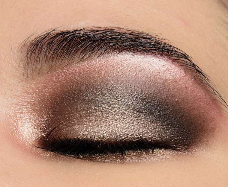
Look Using this Product

Glam
PPermanent. $69.00.

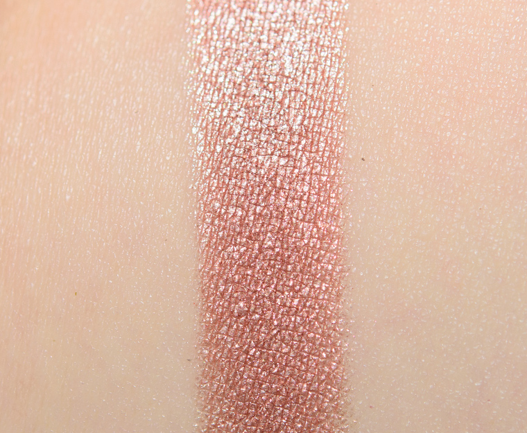


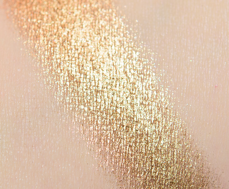
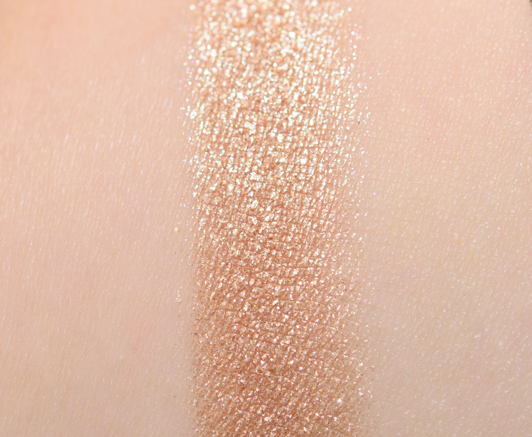
Glam (320M)
Glam (320M) is a medium, rosy pink with strong, warm undertones and a bright metallic finish. It had rich color coverage with a smooth, lightly creamy and moderately dense texture that was silky to the touch but picked up beautifully with a brush without being difficult to pick up. It applied well to bare skin, blended out with ease, and lasted nicely for eight and a half hours before fading a bit.
FURTHER READING: Formula Overview for details on general performance and characteristics (like scent).
Top Dupes
- Lisa Eldridge Love in Venice (P, $16.00) is warmer (90% similar).
- Stila Enchantress (P, $24.00) is darker, cooler (90% similar).
- Clionadh Linny (LE, $6.00) is darker, warmer (90% similar).
- NARS Firenze (P, $22.00) is warmer (90% similar).
- PIXI Beauty Metallic Rose (PiP, $20.00) is lighter, warmer (90% similar).
- ColourPop The Scales (LE, $6.00) is less shimmery, darker (90% similar).
- Kaja Ballerina Pink (PiP, ) is more shimmery, warmer (90% similar).
- Sephora Rose (LE, ) is darker, more muted, cooler (90% similar).
- BH Cosmetics Carli Bybel Deluxe Edition #6 (LE, ) is lighter, cooler (85% similar).
- PIXI Beauty Antique Rose (PiP, $20.00) is lighter, warmer (85% similar).
Formula Overview
$29.00/0.08 oz. - $362.50 Per Ounce
The majority of the brand's eyeshadows are quite pigmented, blendable, and long-wearing. The eyeshadows have improved over time, particularly with respect to longevity (without a primer). The original formula often creased on me within seven to eight hours, whereas the more current formula wears eight to nine hours with fading (instead of full-on creasing). The more matte finishes tend to be a bit more velvety, substantial, and less dry/powdery compared to prior iterations.
The metallic finish is often the creamiest, slightly denser in feel, but has excellent pigmentation, adhesion, and blendability. The sparkling shades can have some fallout, depending on how they're applied and how sparkly they are, so they sometimes work better with fingertips or a dampened brush; they can also run sheerer compared to other finishes.
Cream-Powders are the more unique formulation and tend to have firmer, almost stiff, consistencies and more semi-opaque, watercolor-esque coverage. They are longer-wearing, but they can take a few uses to learn how to use. This formula has also improved compared to when it first debuted--it is a bit more yielding now.
Browse all of our Natasha Denona Metallic Eye Shadow swatches.
Ingredients
Talc, Mica, Octyldodecyl Stearoyl Stearate, Calcium Aluminum Borosilicate, Diisostearyl Malate, Caprylyl Glycol, Ethylhexylglycerin, Silica, Tin Oxide, Ptfe, Zinc Stearate, Synthetic Fluorphlogopite, Calcium Titanium Borosilicate, Calcium Sodium Borosilicate, Aluminum Calcium Sodium Silicate, Alumina, Ci 77891 (Titanium Dioxide ), Ci 77510 (Ferric Ferrocyanide ), Ci 77491 (Iron Oxides), Ci 77492 (Iron Oxides), Ci 77499 (Iron Oxides ), Ci 77000 (Aluminum Powder), Ci 75470 (Carmine).
Disclaimer: Ingredient lists are as available by the brand (or retailer) at the time of publishing. Please always check product packaging, if it exists, for the ingredient list applicable to the product you're purchasing, or the brand or retailer's website for the most up-to-date ingredient list.
Look Using this Product
Glam (320M)
PiPPermanent in Palette. $29.00.

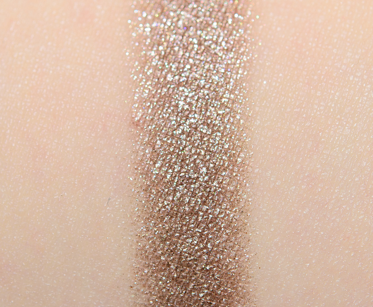


Glam (321M)
Glam (321M) is a light-medium, taupe-brown with neutral-to-warm undertones and a sparkling, metallic finish. The texture was firmer, slightly stiffer to work with but seemed to soften and become more yielding after a few uses. It had nearly opaque color coverage, which deepened as the consistency softened up. It applied better than anticipated as it seemed like other metallics in the palette in performance (blendable, not prone to fallout, etc.). This shade stayed on well for eight hours before fading noticeably.
FURTHER READING: Formula Overview for details on general performance and characteristics (like scent).
Top Dupes
- Make Up For Ever ME554 Gunmetal (P, $17.00) is more shimmery (90% similar).
- Sydney Grace Cliff Jumping (DC, $8.00) is more shimmery, lighter (90% similar).
- NARS Stud (LE, $25.00) is more shimmery, lighter (90% similar).
- Give Me Glow Lavender Taupe (P, $7.00) is more shimmery, lighter, cooler (90% similar).
- MAC Whirling (LE, $17.00) is more shimmery, lighter, warmer (90% similar).
- Moira Just Right (P, $7.50) is more shimmery, lighter, cooler (90% similar).
- Touch in Sol Aurora Taupe (7) (P, $18.00) is more shimmery, brighter, warmer (90% similar).
- Sydney Grace Tiara (P, $6.25) is more shimmery, warmer (90% similar).
- Give Me Glow Nirvana (PiP, $7.00) is more shimmery, cooler (90% similar).
- Sydney Grace Carmel Beach (PiP, $6.25) is more shimmery, darker, warmer (90% similar).
Formula Overview
$29.00/0.08 oz. - $362.50 Per Ounce
The majority of the brand's eyeshadows are quite pigmented, blendable, and long-wearing. The eyeshadows have improved over time, particularly with respect to longevity (without a primer). The original formula often creased on me within seven to eight hours, whereas the more current formula wears eight to nine hours with fading (instead of full-on creasing). The more matte finishes tend to be a bit more velvety, substantial, and less dry/powdery compared to prior iterations.
The metallic finish is often the creamiest, slightly denser in feel, but has excellent pigmentation, adhesion, and blendability. The sparkling shades can have some fallout, depending on how they're applied and how sparkly they are, so they sometimes work better with fingertips or a dampened brush; they can also run sheerer compared to other finishes.
Cream-Powders are the more unique formulation and tend to have firmer, almost stiff, consistencies and more semi-opaque, watercolor-esque coverage. They are longer-wearing, but they can take a few uses to learn how to use. This formula has also improved compared to when it first debuted--it is a bit more yielding now.
Browse all of our Natasha Denona Metallic Eye Shadow swatches.
Ingredients
Talc, Calcium Aluminum Borosilicate, Octyldodecyl Stearoyl Stearate, Mica, Diisostearyl Malate, Caprylyl Glycol, Ethylhexylglycerin, Tin Oxide, Ptfe, Zinc Stearate, Synthetic Fluorphlogopite, Calcium Titanium Borosilicate, Silica, Calcium Sodium Borosilicate, Aluminum Calcium Sodium Silicate, Alumina, Ci 77891 (Titanium Dioxide ), Ci 77491 (Iron Oxides), Ci 77492 (Iron Oxides), Ci 77499 (Iron Oxides), Ci 77510 (Ferric Ferrocyanide).
Disclaimer: Ingredient lists are as available by the brand (or retailer) at the time of publishing. Please always check product packaging, if it exists, for the ingredient list applicable to the product you're purchasing, or the brand or retailer's website for the most up-to-date ingredient list.
Look Using this Product
Glam (321M)
PiPPermanent in Palette. $29.00.


Glam (322K)
Glam (322K) is a medium, pinky-peach with moderate, warm undertones and a lightly sparkling, metallic finish. It was a lot less chunky and less sparkly compared to most of the Crystal finish shades. It had a lightly creamy texture that seemed to be more loosely-pressed compared to most metallics in the palette but wasn’t prone to fallout. The eyeshadow had nearly opaque coverage in a single layer, and it wore well for eight and a half hours before fading a bit.
FURTHER READING: Formula Overview for details on general performance and characteristics (like scent).
Top Dupes
- ColourPop Like Candy (LE, $4.50) is less shimmery, lighter (90% similar).
- Anastasia A5 (Norvina Vol. 4) (LE, $12.00) is more shimmery, lighter, cooler (90% similar).
- Phytosurgence Lunar Lightwave (P, $17.07) is more shimmery, warmer (95% similar).
- Charlotte Tilbury Bejewelled (Love Glow Prime) (LE, ) is more shimmery, darker (90% similar).
- Kaja Champagne Cream (PiP, ) is more shimmery, lighter (90% similar).
- Tom Ford Beauty Rose Prisme #1 (PiP, ) is lighter, warmer (90% similar).
- Ciate Blaze (PiP, ) is more shimmery, lighter (90% similar).
- Lisa Eldridge Cressida (P, $27.00) is more shimmery (90% similar).
- ColourPop Falling Up #2 (LE, $6.00) is lighter (90% similar).
- MAC Don't Burst My Bubbly (LE, $25.00) is darker, warmer (90% similar).
Formula Overview
-
The majority of the brand's eyeshadows are quite pigmented, blendable, and long-wearing. The eyeshadows have improved over time, particularly with respect to longevity (without a primer). The original formula often creased on me within seven to eight hours, whereas the more current formula wears eight to nine hours with fading (instead of full-on creasing). The more matte finishes tend to be a bit more velvety, substantial, and less dry/powdery compared to prior iterations.
The metallic finish is often the creamiest, slightly denser in feel, but has excellent pigmentation, adhesion, and blendability. The sparkling shades can have some fallout, depending on how they're applied and how sparkly they are, so they sometimes work better with fingertips or a dampened brush; they can also run sheerer compared to other finishes.
Cream-Powders are the more unique formulation and tend to have firmer, almost stiff, consistencies and more semi-opaque, watercolor-esque coverage. They are longer-wearing, but they can take a few uses to learn how to use. This formula has also improved compared to when it first debuted--it is a bit more yielding now.
Browse all of our Natasha Denona Crystal Eye Shadow swatches.
Ingredients
Talc, Calcium Sodium Borosilicate, Calcium Titanium Borosilicate, Octyldodecyl Stearoyl Stearate, Mica, Alumina, Diisostearyl Malate, Silica, Tin Oxide, Caprylyl Glycol, Ethylhexylglycerin, Ptfe, Synthetic Fluorphlogopite, Calcium Aluminum Borosilicate, Zinc Stearate, Aluminum Calcium Sodium Silicate, Ci 77891 (Titanium Dioxide), Ci 77510 (Ferric Ferrocyanide), Ci 77491 (Iron Oxides), Ci 77492 (Iron Oxides), Ci 77499 (Iron Oxides).
Disclaimer: Ingredient lists are as available by the brand (or retailer) at the time of publishing. Please always check product packaging, if it exists, for the ingredient list applicable to the product you're purchasing, or the brand or retailer's website for the most up-to-date ingredient list.
Look Using this Product
Glam (322K)
PiPPermanent in Palette.

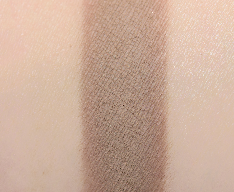


Glam (323CM)
Glam (323CM) is a light-medium, taupe-brown with neutral undertones paired with a matte finish. It had an incredibly soft, velvety texture–more substantial, so it had excellent color payoff without being too powdery–that applied evenly and blended out readily. The color lasted nicely for eight and a half hours before fading visibly.
FURTHER READING: Formula Overview for details on general performance and characteristics (like scent).
Top Dupes
- MAC Nippy Taupe Dusk (LE, $17.00) is cooler (95% similar).
- NARS Mahe #2 (PiP, $19.00) is lighter (90% similar).
- Sydney Grace Journey Home (LE, $5.25) is lighter, cooler (90% similar).
- MAC Tailor Grey (P, $23.00) is lighter, cooler (90% similar).
- Wet 'n' Wild Sweet as Candy #1 (PiP, ) is darker, cooler (90% similar).
- Sydney Grace Cold Brew (Deep) (PiP, $5.25) is lighter (90% similar).
- ColourPop Take the Lead (LE, $4.50) is lighter (90% similar).
- MAC Concrete (P, $17.00) is darker (90% similar).
- Anastasia Twig (LE, $12.00) is lighter, warmer (85% similar).
- Olivia Palermo Smoked Chestnut (PiP, ) is darker, cooler (85% similar).
Formula Overview
-
The majority of the brand's eyeshadows are quite pigmented, blendable, and long-wearing. The eyeshadows have improved over time, particularly with respect to longevity (without a primer). The original formula often creased on me within seven to eight hours, whereas the more current formula wears eight to nine hours with fading (instead of full-on creasing). The more matte finishes tend to be a bit more velvety, substantial, and less dry/powdery compared to prior iterations.
The metallic finish is often the creamiest, slightly denser in feel, but has excellent pigmentation, adhesion, and blendability. The sparkling shades can have some fallout, depending on how they're applied and how sparkly they are, so they sometimes work better with fingertips or a dampened brush; they can also run sheerer compared to other finishes.
Cream-Powders are the more unique formulation and tend to have firmer, almost stiff, consistencies and more semi-opaque, watercolor-esque coverage. They are longer-wearing, but they can take a few uses to learn how to use. This formula has also improved compared to when it first debuted--it is a bit more yielding now.
Browse all of our Natasha Denona Creamy Matte Eye Shadow swatches.
Ingredients
Synthetic Fluorphlogopite, Zinc Stearate, Dimethicone, Triethoxycaprylylsilane, Caprylyl Glycol, Ethylhexylglycerin, Hdi/Trimethylol Hexyllactone Crosspolymer, Silica, Ci 77891 (Titanium Dioxide), Ci 77491 (Iron Oxides), Ci 77492 (Iron Oxides), Ci 77499 (Iron Oxides), Ci 75470 (Carmine).
Disclaimer: Ingredient lists are as available by the brand (or retailer) at the time of publishing. Please always check product packaging, if it exists, for the ingredient list applicable to the product you're purchasing, or the brand or retailer's website for the most up-to-date ingredient list.
Look Using this Product
Glam (323CM)
PiPPermanent in Palette.

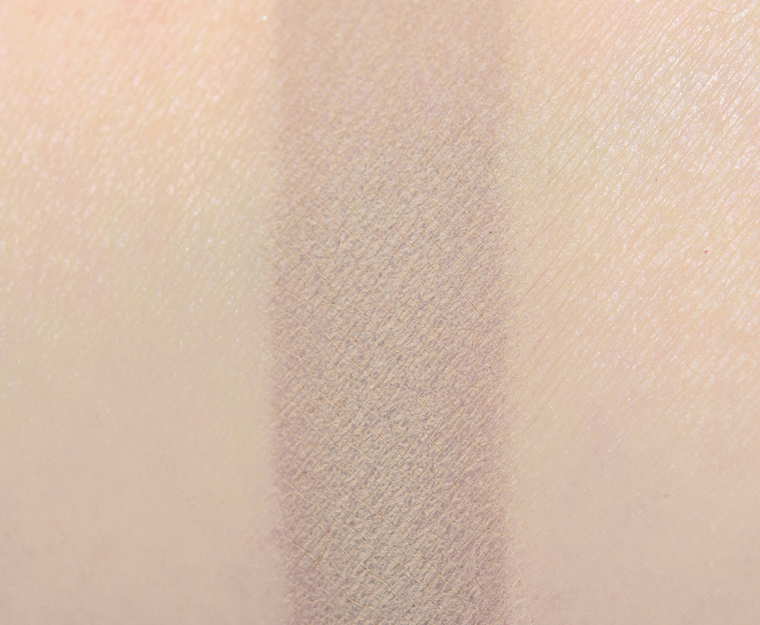


Glam (324CM)
Glam (324CM) is a very light taupe that had a warmer, beige overtone but darkened slightly and appeared grayer applied. There was a bit of unevenness (almost speckled) in that interplay of warmer beige/cooler gray when swatched on my arm but wasn’t noticeable when I applied to my eye and had blended it out. It had good color coverage with a soft, lightly powdery texture that was more substantial and velvety but wasn’t as top tier as the brand’s mattes have been in the last couple of years. It stayed on well for eight hours before fading noticeably.
FURTHER READING: Formula Overview for details on general performance and characteristics (like scent).
Top Dupes
- Sydney Grace Cold Brew (Light) (PiP, $5.25) is warmer (95% similar).
- MAC Naked Lights (LE, $17.00) is lighter, warmer (90% similar).
- NARS Kingston (P, $19.00) is lighter (85% similar).
- Natasha Denona Sculpture (226CM) (PiP, ) is darker (85% similar).
- Buxom Designer or Die (P, $12.00) is more shimmery, lighter, warmer (85% similar).
- Sydney Grace Legendary (LE, $5.25) is darker (80% similar).
- KVD Beauty Sarah (LE, ) is darker, cooler (80% similar).
- MAC Gutter Gal (LE, $17.00) is warmer (80% similar).
- Urban Decay Naked 2 (PiP, $19.00) is warmer (80% similar).
- Sydney Grace Moon Landing (P, $5.25) is darker, warmer (80% similar).
Formula Overview
-
The majority of the brand's eyeshadows are quite pigmented, blendable, and long-wearing. The eyeshadows have improved over time, particularly with respect to longevity (without a primer). The original formula often creased on me within seven to eight hours, whereas the more current formula wears eight to nine hours with fading (instead of full-on creasing). The more matte finishes tend to be a bit more velvety, substantial, and less dry/powdery compared to prior iterations.
The metallic finish is often the creamiest, slightly denser in feel, but has excellent pigmentation, adhesion, and blendability. The sparkling shades can have some fallout, depending on how they're applied and how sparkly they are, so they sometimes work better with fingertips or a dampened brush; they can also run sheerer compared to other finishes.
Cream-Powders are the more unique formulation and tend to have firmer, almost stiff, consistencies and more semi-opaque, watercolor-esque coverage. They are longer-wearing, but they can take a few uses to learn how to use. This formula has also improved compared to when it first debuted--it is a bit more yielding now.
Browse all of our Natasha Denona Creamy Matte Eye Shadow swatches.
Ingredients
Synthetic Fluorphlogopite, Zinc Stearate, Dimethicone, Triethoxycaprylylsilane, Caprylyl Glycol, Ethylhexylglycerin, Hdi/Trimethylol Hexyllactone Crosspolymer, Silica, Ci 77891 (Titanium Dioxide), Ci 77491 (Iron Oxides), Ci 77492 (Iron Oxides), Ci 77499 (Iron Oxides), Ci 77510 (Ferric Ammonium Ferrocyanide), Ci 42090 (Blue 1 Lake), Ci 77007 (Ultramarines), Ci 19140 (Yellow 5 Lake), Ci 75470 (Carmine).
Disclaimer: Ingredient lists are as available by the brand (or retailer) at the time of publishing. Please always check product packaging, if it exists, for the ingredient list applicable to the product you're purchasing, or the brand or retailer's website for the most up-to-date ingredient list.
Glam (324CM)
PiPPermanent in Palette.


Glam (325CM)
Glam (325CM) is a muted, medium-dark olive brown with subtle, warm undertones and a matte finish. It had semi-opaque pigmentation that was buildable to full coverage with a second layer. The texture was soft, slightly thinner and a little more powdery than other mattes in the palette, but it was very easy to work with as it was blendable and buildable without being prone to sheering out or having fallout. It wore well for eight and a half hours before showing signs of fading.
FURTHER READING: Formula Overview for details on general performance and characteristics (like scent).
Top Dupes
- NABLA Cosmetics Camelot (P, $8.00) is warmer (95% similar).
- ColourPop Nuts 4 U (LE, $4.50) is cooler (95% similar).
- Smashbox Greige (P, $22.00) is lighter (90% similar).
- ColourPop Taboo (PiP, $4.50) is lighter, warmer (90% similar).
- BH Cosmetics Carli Bybel Deluxe Edition #15 (LE, ) is lighter (90% similar).
- elf Cool Beans (P, $5.00) is lighter (90% similar).
- Sydney Grace Robert (Light) (PiP, $5.25) is darker (85% similar).
- ColourPop Funnel (LE, $4.50) is darker, cooler (85% similar).
- LORAC Vintage (LE, $19.00) is lighter, warmer (85% similar).
- ColourPop Henna (LE, $4.50) is darker (85% similar).
Formula Overview
-
The majority of the brand's eyeshadows are quite pigmented, blendable, and long-wearing. The eyeshadows have improved over time, particularly with respect to longevity (without a primer). The original formula often creased on me within seven to eight hours, whereas the more current formula wears eight to nine hours with fading (instead of full-on creasing). The more matte finishes tend to be a bit more velvety, substantial, and less dry/powdery compared to prior iterations.
The metallic finish is often the creamiest, slightly denser in feel, but has excellent pigmentation, adhesion, and blendability. The sparkling shades can have some fallout, depending on how they're applied and how sparkly they are, so they sometimes work better with fingertips or a dampened brush; they can also run sheerer compared to other finishes.
Cream-Powders are the more unique formulation and tend to have firmer, almost stiff, consistencies and more semi-opaque, watercolor-esque coverage. They are longer-wearing, but they can take a few uses to learn how to use. This formula has also improved compared to when it first debuted--it is a bit more yielding now.
Browse all of our Natasha Denona Creamy Matte Eye Shadow swatches.
Ingredients
Synthetic Fluorphlogopite, Zinc Stearate, Dimethicone, Caprylyl Glycol, Ethylhexylglycerin, Hdi/Trimethylol Hexyllactone Crosspolymer, Triethoxycaprylylsilane, Silica, Ci 77891 (Titanium Dioxide), Ci 77491 (Iron Oxides), Ci 77492 (Iron Oxides), Ci 77499 (Iron Oxides), Ci 75470 (Carmine).
Disclaimer: Ingredient lists are as available by the brand (or retailer) at the time of publishing. Please always check product packaging, if it exists, for the ingredient list applicable to the product you're purchasing, or the brand or retailer's website for the most up-to-date ingredient list.
Look Using this Product
Glam (325CM)
PiPPermanent in Palette.


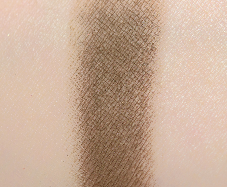
Glam (326CM)
Glam (326CM) is a light brown with moderate, warm undertones and a matte finish. It had nearly opaque color payoff that adhered well to bare skin and blended out easily without sheering out too quickly. The texture was soft, smooth, and substantial without being too firmly pressed into the pan. The eyeshadow lasted nicely for eight and a half hours before fading a bit.
FURTHER READING: Formula Overview for details on general performance and characteristics (like scent).
Top Dupes
- ColourPop Graded (PiP, $4.50) is darker (95% similar).
- Melt Cosmetics Mari (PiP, ) is lighter (95% similar).
- NARS Undressed (LE, $19.00) is darker (90% similar).
- Viseart Brioche (Warm Mattes #5) (P, ) is lighter, warmer (90% similar).
- NYX Tryst (P, $4.50) is darker, warmer (90% similar).
- LORAC Soft Taupe (PiP, ) is cooler (90% similar).
- ColourPop You and I (PiP, $4.50) is darker, cooler (90% similar).
- Wet 'n' Wild Mythicool Creatures #1 (LE, ) is warmer (90% similar).
- MAC Bling Mistress (LE, ) is warmer (90% similar).
- Sydney Grace San Diego (P, $5.25) is darker (90% similar).
Formula Overview
-
The majority of the brand's eyeshadows are quite pigmented, blendable, and long-wearing. The eyeshadows have improved over time, particularly with respect to longevity (without a primer). The original formula often creased on me within seven to eight hours, whereas the more current formula wears eight to nine hours with fading (instead of full-on creasing). The more matte finishes tend to be a bit more velvety, substantial, and less dry/powdery compared to prior iterations.
The metallic finish is often the creamiest, slightly denser in feel, but has excellent pigmentation, adhesion, and blendability. The sparkling shades can have some fallout, depending on how they're applied and how sparkly they are, so they sometimes work better with fingertips or a dampened brush; they can also run sheerer compared to other finishes.
Cream-Powders are the more unique formulation and tend to have firmer, almost stiff, consistencies and more semi-opaque, watercolor-esque coverage. They are longer-wearing, but they can take a few uses to learn how to use. This formula has also improved compared to when it first debuted--it is a bit more yielding now.
Browse all of our Natasha Denona Creamy Matte Eye Shadow swatches.
Ingredients
Synthetic Fluorphlogopite, Zinc Stearate, Dimethicone, Triethoxycaprylylsilane, Caprylyl Glycol, Ethylhexylglycerin, Hdi/Trimethylol Hexyllactone Crosspolymer, Silica, Ci 77891 (Titanium Dioxide), Ci 77491 (Iron Oxides), Ci 77492 (Iron Oxides), Ci 77499 (Iron Oxides).
Disclaimer: Ingredient lists are as available by the brand (or retailer) at the time of publishing. Please always check product packaging, if it exists, for the ingredient list applicable to the product you're purchasing, or the brand or retailer's website for the most up-to-date ingredient list.
Glam (326CM)
PiPPermanent in Palette.

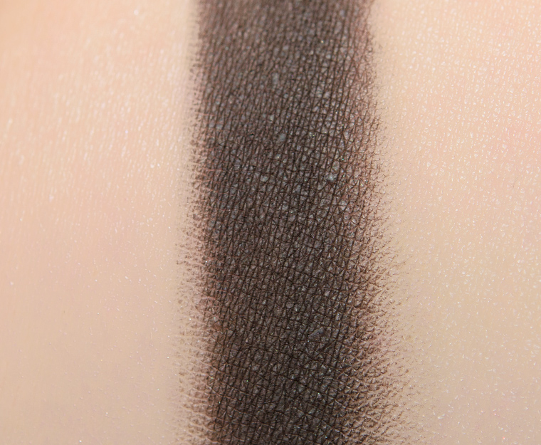


Glam (327CM)
Glam (327CM) is a blackened brown with moderate, cool undertones and a matte finish. The eyeshadow had a smooth, velvety texture that was dense and substantial without being thick or too firmly-pressed into the pan, so it picked up well with a brush and could be used with a lighter hand for more buildable, precise application. It had nearly opaque color coverage that stayed on well for eight and a half hours before fading noticeably.
FURTHER READING: Formula Overview for details on general performance and characteristics (like scent).
Top Dupes
- Give Me Glow Dirt Road (P, $7.00) is darker (95% similar).
- Marc Jacobs Beauty Everywhere (PiP, ) is more shimmery, warmer (95% similar).
- Buxom Unapologetic (P, $12.00) is darker, warmer (95% similar).
- NARS Coconut Grove (DC, $25.00) is lighter, warmer (95% similar).
- MAC Give a Glam (P, $20.00) is lighter (95% similar).
- Melt Cosmetics Rott #2 (PiP, ) is darker (95% similar).
- Pretty Vulgar All Nighter (PiP, ) is lighter, cooler (95% similar).
- Too Faced On the Grill (PiP, $16.00) is lighter, cooler (90% similar).
- Sydney Grace Daystar (Deep) (PiP, $5.25) is lighter, cooler (90% similar).
- Marc Jacobs Beauty As Well (PiP, ) is more shimmery, warmer (90% similar).
Formula Overview
-
The majority of the brand's eyeshadows are quite pigmented, blendable, and long-wearing. The eyeshadows have improved over time, particularly with respect to longevity (without a primer). The original formula often creased on me within seven to eight hours, whereas the more current formula wears eight to nine hours with fading (instead of full-on creasing). The more matte finishes tend to be a bit more velvety, substantial, and less dry/powdery compared to prior iterations.
The metallic finish is often the creamiest, slightly denser in feel, but has excellent pigmentation, adhesion, and blendability. The sparkling shades can have some fallout, depending on how they're applied and how sparkly they are, so they sometimes work better with fingertips or a dampened brush; they can also run sheerer compared to other finishes.
Cream-Powders are the more unique formulation and tend to have firmer, almost stiff, consistencies and more semi-opaque, watercolor-esque coverage. They are longer-wearing, but they can take a few uses to learn how to use. This formula has also improved compared to when it first debuted--it is a bit more yielding now.
Browse all of our Natasha Denona Creamy Matte Eye Shadow swatches.
Ingredients
Synthetic Fluorphlogopite, Zinc Stearate, Dimethicone, Triethoxycaprylylsilane, Caprylyl Glycol, Ethylhexylglycerin, Hdi/Trimethylol Hexyllactone Crosspolymer, Silica, Ci 77891 (Titanium Dioxide), Ci 77491 (Iron Oxides), Ci 77492 (Iron Oxides), Ci 77499 (Iron Oxides), Ci 75470 (Carmine).
Disclaimer: Ingredient lists are as available by the brand (or retailer) at the time of publishing. Please always check product packaging, if it exists, for the ingredient list applicable to the product you're purchasing, or the brand or retailer's website for the most up-to-date ingredient list.
Look Using this Product
Glam (327CM)
PiPPermanent in Palette.


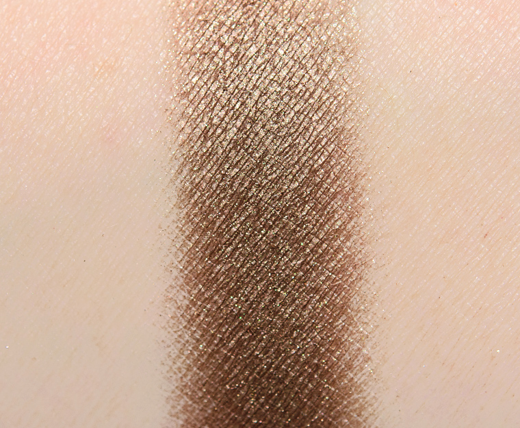
Glam (328M)
Glam (328M) is a bright, pewter gold with moderate, warm undertones and an intense, metallic finish. It had excellent color coverage that adhered evenly to bare skin and blended out easily. The texture was lightly creamy, dense but not overly thick, and picked up well with a dry brush. This shade lasted well for eight and a half hours before fading a bit.
FURTHER READING: Formula Overview for details on general performance and characteristics (like scent).
Top Dupes
- ColourPop Snow Flurry (LE, $6.00) is less shimmery, darker, cooler (95% similar).
- Sydney Grace Heart-dog (P, $6.25) is more shimmery, darker (95% similar).
- ColourPop Wench (LE, $4.50) is less shimmery, warmer (90% similar).
- Melt Cosmetics Kali (PiP, ) is lighter (90% similar).
- NARS Galice (P, $28.00) is less shimmery, lighter (90% similar).
- KVD Beauty Hairspray (LE, ) is less shimmery, darker, cooler (90% similar).
- ColourPop Mood Lighting (LE, $4.50) is less shimmery, warmer (90% similar).
- Auric Ego (Powder) (PiP, ) is cooler (90% similar).
- Tarte Flow (LE, ) is lighter, warmer (90% similar).
- MAC Too Good to Be True (LE, ) is less shimmery, warmer (90% similar).
Formula Overview
$29.00/0.08 oz. - $362.50 Per Ounce
The majority of the brand's eyeshadows are quite pigmented, blendable, and long-wearing. The eyeshadows have improved over time, particularly with respect to longevity (without a primer). The original formula often creased on me within seven to eight hours, whereas the more current formula wears eight to nine hours with fading (instead of full-on creasing). The more matte finishes tend to be a bit more velvety, substantial, and less dry/powdery compared to prior iterations.
The metallic finish is often the creamiest, slightly denser in feel, but has excellent pigmentation, adhesion, and blendability. The sparkling shades can have some fallout, depending on how they're applied and how sparkly they are, so they sometimes work better with fingertips or a dampened brush; they can also run sheerer compared to other finishes.
Cream-Powders are the more unique formulation and tend to have firmer, almost stiff, consistencies and more semi-opaque, watercolor-esque coverage. They are longer-wearing, but they can take a few uses to learn how to use. This formula has also improved compared to when it first debuted--it is a bit more yielding now.
Browse all of our Natasha Denona Metallic Eye Shadow swatches.
Ingredients
Mica, Talc, Octyldodecyl Stearoyl Stearate, Diisostearyl Malate, Caprylyl Glycol, Ethylhexylglycerin, Silica, Tin Oxide, Ptfe, Synthetic Fluorphlogopite, Calcium Titanium Borosilicate, Calcium Aluminum Borosilicate, Zinc Stearate, Aluminum Calcium Sodium Silicate, Alumina, Ci 77891 (Titanium Dioxide), Ci 77510 (Ferric Ferrocyanide), Ci 77491 (Iron Oxides ), Ci 77492 (Iron Oxides), Ci 77499 (Iron Oxides), Ci 77400 (Bronze Powder), Ci 77000 (Aluminum Powder).
Disclaimer: Ingredient lists are as available by the brand (or retailer) at the time of publishing. Please always check product packaging, if it exists, for the ingredient list applicable to the product you're purchasing, or the brand or retailer's website for the most up-to-date ingredient list.
Look Using this Product
Glam (328M)
PiPPermanent in Palette. $29.00.

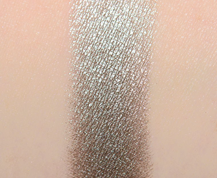


Glam (329M)
Glam (329M) is a medium grayish-taupe with neutral-to-warm undertones and a bright, metallic finish. It was richly pigmented with a smooth, creamy consistency that was dense but yielding, so it picked up readily with a dry brush (but could certainly be used with a fingertip or with a dampened brush for even more intensity). It wore nicely for eight and a half hours before showing signs of fading.
FURTHER READING: Formula Overview for details on general performance and characteristics (like scent).
Top Dupes
- MAC Full Orbit #3 (LE, $21.00) is less shimmery, darker (95% similar).
- ColourPop LA Baby (PiP, $4.50) is lighter (90% similar).
- Tom Ford Beauty Soleil et Lune #3 (LE, ) is less shimmery, lighter, warmer (90% similar).
- ColourPop Drama (LE, $4.50) is lighter, warmer (90% similar).
- Chanel Lame Acier (37) (LE, $36.00) is less shimmery, lighter (90% similar).
- Bobbi Brown Black Pearl (LE, $38.00) is less shimmery, darker, warmer (90% similar).
- MAC Mega-Moody (LE, ) is darker (90% similar).
- Give Me Glow Nirvana (PiP, $7.00) is darker, warmer (90% similar).
- Urban Decay Pistol (DC, $19.00) is less shimmery, darker, warmer (90% similar).
- ColourPop Ore (LE, $4.50) is less shimmery, darker, cooler (85% similar).
Formula Overview
$29.00/0.08 oz. - $362.50 Per Ounce
The majority of the brand's eyeshadows are quite pigmented, blendable, and long-wearing. The eyeshadows have improved over time, particularly with respect to longevity (without a primer). The original formula often creased on me within seven to eight hours, whereas the more current formula wears eight to nine hours with fading (instead of full-on creasing). The more matte finishes tend to be a bit more velvety, substantial, and less dry/powdery compared to prior iterations.
The metallic finish is often the creamiest, slightly denser in feel, but has excellent pigmentation, adhesion, and blendability. The sparkling shades can have some fallout, depending on how they're applied and how sparkly they are, so they sometimes work better with fingertips or a dampened brush; they can also run sheerer compared to other finishes.
Cream-Powders are the more unique formulation and tend to have firmer, almost stiff, consistencies and more semi-opaque, watercolor-esque coverage. They are longer-wearing, but they can take a few uses to learn how to use. This formula has also improved compared to when it first debuted--it is a bit more yielding now.
Browse all of our Natasha Denona Metallic Eye Shadow swatches.
Ingredients
Talc, Mica, Octyldodecyl Stearoyl Stearate, Diisostearyl Malate, Silica, Caprylyl Glycol, Ethylhexylglycerin, Ptfe, Zinc Stearate, Synthetic Fluorphlogopite, Calcium Titanium Borosilicate, Calcium Aluminum Borosilicate, Calcium Sodium Borosilicate, Aluminum Calcium Sodium Silicate, Alumina, Tin Oxide, Ci 77891 (Titanium Dioxide), Ci 77510 (Ferric Ferrocyanide), Ci 77000 (Aluminum Powder ), Ci 77491 (Iron Oxides), Ci 77492 (Iron Oxides ), Ci 77499 (Iron Oxides).
Disclaimer: Ingredient lists are as available by the brand (or retailer) at the time of publishing. Please always check product packaging, if it exists, for the ingredient list applicable to the product you're purchasing, or the brand or retailer's website for the most up-to-date ingredient list.
Glam (329M)
PiPPermanent in Palette. $29.00.

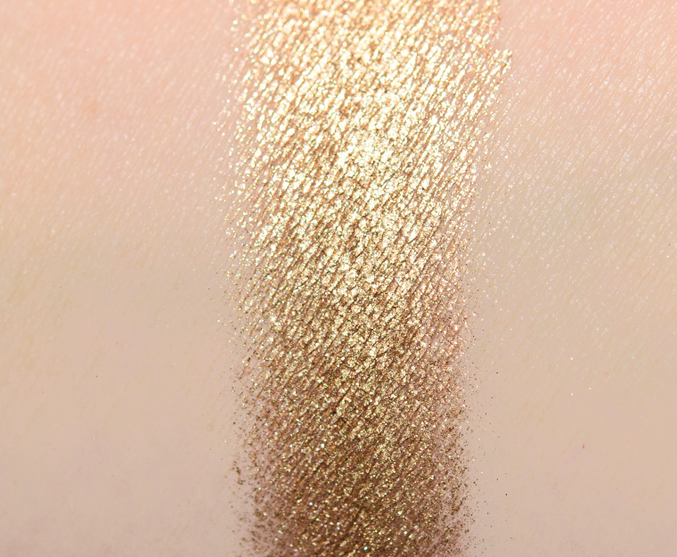


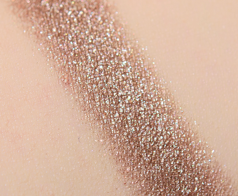
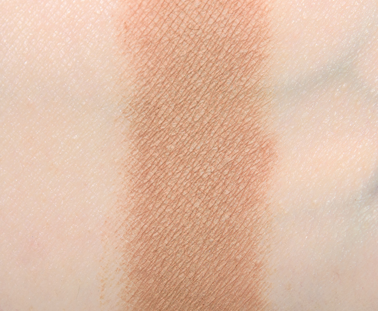
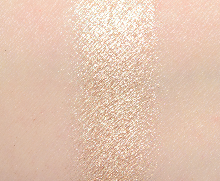
Glam (330M)
Glam (330M) is a deep gold with moderate, warm undertones and a lightly sparkling, metallic finish. The consistency was denser, slightly thicker, compared to other shades with rich color coverage achieved in a single layer. It picked up well enough with a brush but was a shade that had less fallout when applied with a fingertip. The eyeshadow stayed on well for eight and a half hours but had a smidgen of fallout over time.
FURTHER READING: Formula Overview for details on general performance and characteristics (like scent).
Top Dupes
- Give Me Glow 90s (PiP, $7.00) is cooler (90% similar).
- Pat McGrath Metallurgy (LE, $25.00) is lighter, cooler (90% similar).
- Sydney Grace Vanilla Bean (DC, $8.00) is lighter, cooler (90% similar).
- Urban Decay Blitz (DC, $19.00) is lighter, cooler (90% similar).
- Give Me Glow Glamorous (P, $10.00) is darker (90% similar).
- Anastasia Ember (LE, $12.00) is darker, cooler (90% similar).
- Pat McGrath Sinful (PiP, $25.00) is cooler (85% similar).
- Pat McGrath Palladium (LE, $25.00) is lighter, cooler (85% similar).
- Jouer Skinny Dip (LE, ) is darker, cooler (85% similar).
- NARS Kauai #1 (DC, $25.00) is darker, cooler (80% similar).
Formula Overview
$29.00/0.08 oz. - $362.50 Per Ounce
The majority of the brand's eyeshadows are quite pigmented, blendable, and long-wearing. The eyeshadows have improved over time, particularly with respect to longevity (without a primer). The original formula often creased on me within seven to eight hours, whereas the more current formula wears eight to nine hours with fading (instead of full-on creasing). The more matte finishes tend to be a bit more velvety, substantial, and less dry/powdery compared to prior iterations.
The metallic finish is often the creamiest, slightly denser in feel, but has excellent pigmentation, adhesion, and blendability. The sparkling shades can have some fallout, depending on how they're applied and how sparkly they are, so they sometimes work better with fingertips or a dampened brush; they can also run sheerer compared to other finishes.
Cream-Powders are the more unique formulation and tend to have firmer, almost stiff, consistencies and more semi-opaque, watercolor-esque coverage. They are longer-wearing, but they can take a few uses to learn how to use. This formula has also improved compared to when it first debuted--it is a bit more yielding now.
Browse all of our Natasha Denona Metallic Eye Shadow swatches.
Ingredients
Talc, Octyldodecyl Stearoyl Stearate, Diisostearyl Malate, Alumina, Mica, Silica, Caprylyl Glycol, Ethylhexylglycerin, Tin Oxide, Ptfe, Zinc Stearate, Synthetic Fluorphlogopite, Calcium Titanium Borosilicate, Calcium Aluminum Borosilicate, Calcium Sodium Borosilicate, Aluminum Calcium Sodium Silicate, Ci 77891 (Titanium Dioxide), Ci 77491 (Iron Oxides), Ci 77492 (Iron Oxides), Ci 77499 (Iron Oxides), Ci 77400 (Bronze Powder), Ci 77510 (Ferric Ferrocyanide).
Disclaimer: Ingredient lists are as available by the brand (or retailer) at the time of publishing. Please always check product packaging, if it exists, for the ingredient list applicable to the product you're purchasing, or the brand or retailer's website for the most up-to-date ingredient list.
Glam (330M)
PiPPermanent in Palette. $29.00.


Glam (331M)
Glam (331M) is a deep brown with subtle, warm undertones and a pearly sheen. It had excellent color payoff in a single layer, which applied well to bare skin with a smooth, even lay down of color that diffused easily along the edges. The texture was smooth to the touch, dense but not overly firm, and easy to work with. It lasted well for nine hours before fading visibly.
FURTHER READING: Formula Overview for details on general performance and characteristics (like scent).
Top Dupes
- ColourPop Icon (LE, $4.50) is less shimmery, lighter, warmer (90% similar).
- Sydney Grace Campfire (DC, $8.00) is more shimmery, lighter, warmer (90% similar).
- Pat McGrath Blitz Brown (LE, $25.00) is less shimmery, darker (90% similar).
- NARS Bayadere #4 (PiP, $19.00) is more shimmery, lighter, warmer (90% similar).
- Dior Celebrate in Gold #4 (LE, ) is less shimmery, cooler (90% similar).
- Lisa Eldridge Anais (P, $27.00) is more shimmery, lighter (90% similar).
- Estee Lauder Metal Saffron (LE, ) is lighter, warmer (80% similar).
- Givenchy Palette Ors Audacieux #2 (LE, ) is more shimmery, lighter, warmer (80% similar).
- Too Faced Biscotti (LE, $16.00) is more shimmery, lighter, warmer (80% similar).
- Sydney Grace Campfire (P, $8.00) is more shimmery, lighter, warmer (80% similar).
Formula Overview
$29.00/0.08 oz. - $362.50 Per Ounce
The majority of the brand's eyeshadows are quite pigmented, blendable, and long-wearing. The eyeshadows have improved over time, particularly with respect to longevity (without a primer). The original formula often creased on me within seven to eight hours, whereas the more current formula wears eight to nine hours with fading (instead of full-on creasing). The more matte finishes tend to be a bit more velvety, substantial, and less dry/powdery compared to prior iterations.
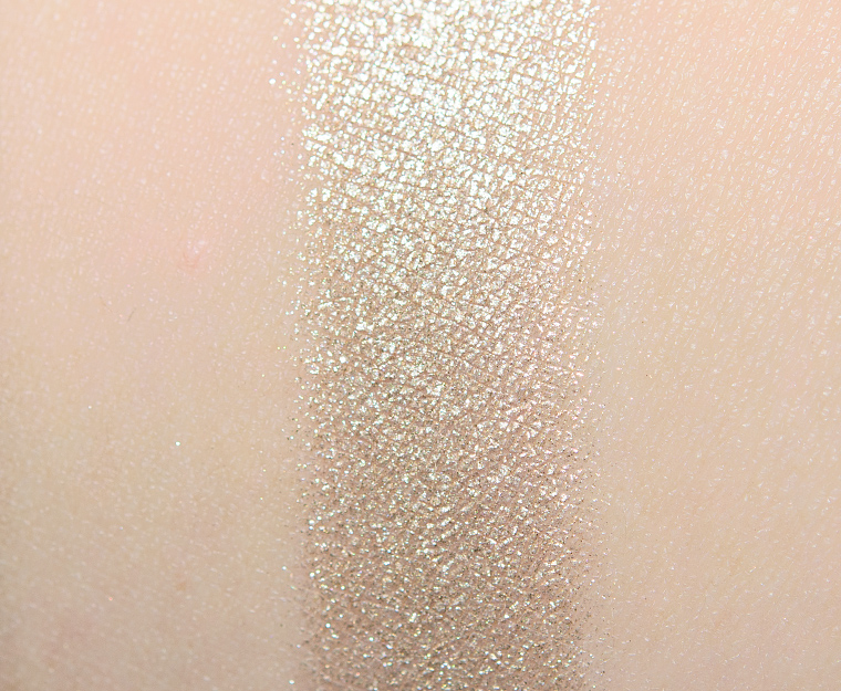
The metallic finish is often the creamiest, slightly denser in feel, but has excellent pigmentation, adhesion, and blendability. The sparkling shades can have some fallout, depending on how they're applied and how sparkly they are, so they sometimes work better with fingertips or a dampened brush; they can also run sheerer compared to other finishes.
Cream-Powders are the more unique formulation and tend to have firmer, almost stiff, consistencies and more semi-opaque, watercolor-esque coverage. They are longer-wearing, but they can take a few uses to learn how to use. This formula has also improved compared to when it first debuted--it is a bit more yielding now.
Browse all of our Natasha Denona Metallic Eye Shadow swatches.
Ingredients
Talc, Mica, Octyldodecyl Stearoyl Stearate, Diisostearyl Malate, Caprylyl Glycol, Ethylhexylglycerin, Ptfe, Zinc Stearate, Synthetic Fluorphlogopite, Calcium Titanium Borosilicate, Calcium Aluminum Borosilicate, Silica, Calcium Sodium Borosilicate, Aluminum Calcium Sodium Silicate, Alumina, Tin Oxide, Ci 77891 (Titanium Dioxide), Ci 77491 (Iron Oxides), Ci 77492 (Iron Oxides ), Ci 77499 (Iron Oxides), Ci 77510 (Ferric Ferrocyanide), Ci 75470 (Carmine).
Disclaimer: Ingredient lists are as available by the brand (or retailer) at the time of publishing. Please always check product packaging, if it exists, for the ingredient list applicable to the product you're purchasing, or the brand or retailer's website for the most up-to-date ingredient list.
Glam (331M)
PiPPermanent in Palette. $29.00.


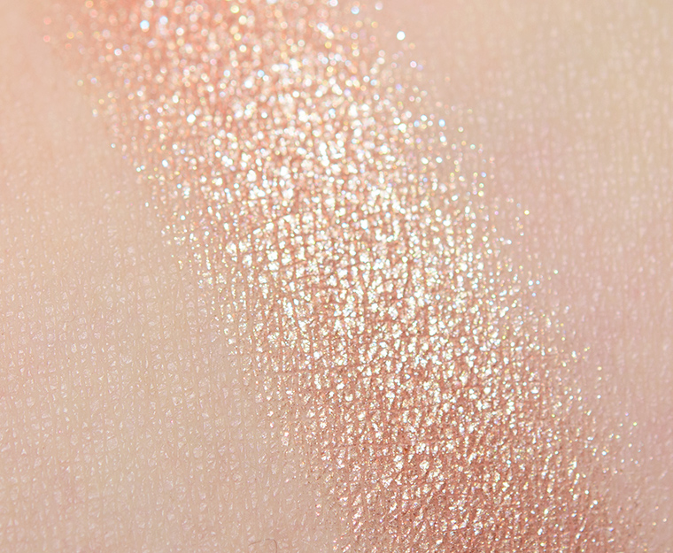
Glam (332M)
Glam (332M) is a light, peachy gold with moderate, warm undertones and a metallic finish. The eyeshadow felt soft, smooth, and lightly creamy to the touch, but it wasn’t too dense nor too firmly pressed into the pan, so it wasn’t a problem to use it with a dry brush (if preferred). It had opaque pigmentation that wore well for eight and a half hours before showing signs of fading.
FURTHER READING: Formula Overview for details on general performance and characteristics (like scent).
Top Dupes
- Tom Ford Beauty Chalet Lust #2 (LE, ) is darker (95% similar).
- ColourPop Famous (LE, $6.00) is less shimmery, darker (95% similar).
- NARS L'Amour, Toujours L'Amour #2 (DC, $25.00) is less shimmery (95% similar).
- ColourPop 305 (LE, $4.50) is warmer (95% similar).
- Tom Ford Beauty Naked Pink #1 (LE, ) is warmer (95% similar).
- Becca Moonstone (LE, ) is less shimmery, cooler (95% similar).
- Give Me Glow Cream Lace (P, $7.00) is more shimmery, darker (95% similar).
- Estee Lauder Blonde Gold (LE, $45.00) is lighter, cooler (90% similar).
- ColourPop High Tide (LE, $6.00) is less shimmery, cooler (90% similar).
- LORAC Cashmere (LE, $19.00) is cooler (90% similar).
Formula Overview
$29.00/0.08 oz. - $362.50 Per Ounce
The majority of the brand's eyeshadows are quite pigmented, blendable, and long-wearing. The eyeshadows have improved over time, particularly with respect to longevity (without a primer). The original formula often creased on me within seven to eight hours, whereas the more current formula wears eight to nine hours with fading (instead of full-on creasing). The more matte finishes tend to be a bit more velvety, substantial, and less dry/powdery compared to prior iterations.
The metallic finish is often the creamiest, slightly denser in feel, but has excellent pigmentation, adhesion, and blendability. The sparkling shades can have some fallout, depending on how they're applied and how sparkly they are, so they sometimes work better with fingertips or a dampened brush; they can also run sheerer compared to other finishes.
Cream-Powders are the more unique formulation and tend to have firmer, almost stiff, consistencies and more semi-opaque, watercolor-esque coverage. They are longer-wearing, but they can take a few uses to learn how to use. This formula has also improved compared to when it first debuted--it is a bit more yielding now.
Browse all of our Natasha Denona Metallic Eye Shadow swatches.
Ingredients
Talc, Mica, Octyldodecyl Stearoyl Stearate, Diisostearyl Malate, Caprylyl Glycol, Ethylhexylglycerin, Ptfe, Zinc Stearate, Silica, Synthetic Fluorphlogopite, Calcium Titanium Borosilicate, Calcium Aluminum Borosilicate, Calcium Sodium Borosilicate, Aluminum Calcium Sodium Silicate, Alumina, Tin Oxide, Ci 77891 (Titanium Dioxide), Ci 77510 (Ferric Ferrocyanide), Ci 77510 (Ferric Ammonium Ferrocyanide), Ci 77491 (Iron Oxides), Ci 77492 (Iron Oxides), Ci 77499 (Iron Oxides), Ci 77007 (Ultramarines), Ci 42090 (Blue 1 Lake), Ci 19140 (Yellow 5 Lake), Ci 77400 (Bronze Powder), Ci 77400 (Copper Powder), Ci 77000 (Aluminum Powder), Ci 75470 (Carmine).
Disclaimer: Ingredient lists are as available by the brand (or retailer) at the time of publishing. Please always check product packaging, if it exists, for the ingredient list applicable to the product you're purchasing, or the brand or retailer's website for the most up-to-date ingredient list.
Glam (332M)
PiPPermanent in Palette. $29.00.

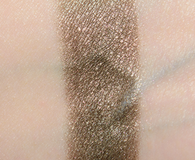


Glam (333M)
Glam (333M) is a darker, olive brown with muted, warm undertones and a pearly finish with a bit of larger micro-sparkle throughout. The texture was soft, a smidgen dusty in the pan, but it applied evenly without sheering out too readily, so it didn’t end up having any adverse impact to application. The eyeshadow had excellent color coverage in a single pass, which stayed on well for eight and a half hours before fading a bit.
FURTHER READING: Formula Overview for details on general performance and characteristics (like scent).
Top Dupes
- MAC Bye Bye Bahamas (LE, $17.00) is more shimmery, warmer (95% similar).
- Melt Cosmetics Drunk Text (LE, ) is more shimmery, darker (95% similar).
- ColourPop Nutty 4 U (PiP, $4.50) is more shimmery, cooler (95% similar).
- Milani Sweeter Than Chocolate (PiP, $5.99) is darker, warmer (90% similar).
- LORAC Graphite (LE, $19.00) is more shimmery, warmer (90% similar).
- ColourPop La Brea (LE, $4.50) is warmer (90% similar).
- Dior Moonlight #4 (LE, ) is lighter (90% similar).
- Give Me Glow Robot Girl (P, $7.00) is more shimmery, lighter, warmer (90% similar).
- Sydney Grace Cuppa Joe (PiP, $6.25) is more shimmery, warmer (90% similar).
- Coloured Raine Iconic (LE, $6.99) is more shimmery, lighter, brighter (90% similar).
Formula Overview
$29.00/0.08 oz. - $362.50 Per Ounce
The majority of the brand's eyeshadows are quite pigmented, blendable, and long-wearing. The eyeshadows have improved over time, particularly with respect to longevity (without a primer). The original formula often creased on me within seven to eight hours, whereas the more current formula wears eight to nine hours with fading (instead of full-on creasing). The more matte finishes tend to be a bit more velvety, substantial, and less dry/powdery compared to prior iterations.
The metallic finish is often the creamiest, slightly denser in feel, but has excellent pigmentation, adhesion, and blendability. The sparkling shades can have some fallout, depending on how they're applied and how sparkly they are, so they sometimes work better with fingertips or a dampened brush; they can also run sheerer compared to other finishes.
Cream-Powders are the more unique formulation and tend to have firmer, almost stiff, consistencies and more semi-opaque, watercolor-esque coverage. They are longer-wearing, but they can take a few uses to learn how to use. This formula has also improved compared to when it first debuted--it is a bit more yielding now.
Browse all of our Natasha Denona Metallic Eye Shadow swatches.
Ingredients
Talc, Mica, Octyldodecyl Stearoyl Stearate, Diisostearyl Malate, Caprylyl Glycol, Ethylhexylglycerin, Tin Oxide, Zinc Stearate, Ci 77891 (Titanium Dioxide), Ci 77491 (Iron Oxides), Ci 77499 (Iron Oxides).
Disclaimer: Ingredient lists are as available by the brand (or retailer) at the time of publishing. Please always check product packaging, if it exists, for the ingredient list applicable to the product you're purchasing, or the brand or retailer's website for the most up-to-date ingredient list.
Look Using this Product
Glam (333M)
PiPPermanent in Palette. $29.00.


Glam (334M)
Glam (334M) is a medium-dark peach with warm, muted orange undertones and a metallic finish. It had rich color payoff that applied evenly to bare skin and blended out well without emphasizing lid texture. The consistency was smooth, lightly creamy, and dense without being too firmly-pressed into the pan. It lasted nicely for eight and a half hours before fading visibly.
FURTHER READING: Formula Overview for details on general performance and characteristics (like scent).
Top Dupes
- ColourPop Estrella (LE, $4.50) is lighter (95% similar).
- Dior Terra #2 (LE, ) is less shimmery, lighter, cooler (95% similar).
- Charlotte Tilbury Diva Lights (Prime) (LE, ) is less shimmery, warmer (95% similar).
- MAC Feast Your Eyes (LE, $25.00) is more shimmery, cooler (90% similar).
- Too Faced Cherish (PiP, ) is lighter (90% similar).
- Cle de Peau Grounded (Right) (PiP, ) is less shimmery, lighter (90% similar).
- ColourPop Up Late (LE, $6.00) is lighter (90% similar).
- Too Faced Cookie Cutter (LE, $16.00) is less shimmery, lighter (90% similar).
- ColourPop Mycelium (LE, $6.00) is lighter, cooler (90% similar).
- Tom Ford Beauty Supernouveau #1 (PiP, ) is less shimmery, lighter (90% similar).
Formula Overview
$29.00/0.08 oz. - $362.50 Per Ounce
The majority of the brand's eyeshadows are quite pigmented, blendable, and long-wearing. The eyeshadows have improved over time, particularly with respect to longevity (without a primer). The original formula often creased on me within seven to eight hours, whereas the more current formula wears eight to nine hours with fading (instead of full-on creasing). The more matte finishes tend to be a bit more velvety, substantial, and less dry/powdery compared to prior iterations.
The metallic finish is often the creamiest, slightly denser in feel, but has excellent pigmentation, adhesion, and blendability. The sparkling shades can have some fallout, depending on how they're applied and how sparkly they are, so they sometimes work better with fingertips or a dampened brush; they can also run sheerer compared to other finishes.
Cream-Powders are the more unique formulation and tend to have firmer, almost stiff, consistencies and more semi-opaque, watercolor-esque coverage. They are longer-wearing, but they can take a few uses to learn how to use. This formula has also improved compared to when it first debuted--it is a bit more yielding now.
Browse all of our Natasha Denona Metallic Eye Shadow swatches.
Ingredients
Talc, Mica, Octyldodecyl Stearoyl Stearate, Diisostearyl Malate, Caprylyl Glycol, Ethylhexylglycerin, Tin Oxide, Ptfe, Zinc Stearate, Silica, Synthetic Fluorphlogopite, Calcium Titanium Borosilicate, Calcium Aluminum Borosilicate, Calcium Sodium Borosilicate, Aluminum Calcium Sodium Silicate, Alumina, Ci 77891 (Titanium Dioxide), Ci 77510 (Ferric Ferrocyanide), Ci 77491 (Iron Oxides), Ci 77492 (Iron Oxides), Ci 77499 (Iron Oxides), Ci 77510 (Ferric Ammonium Ferrocyanide Ci 77510), Ci 77007 (Ultramarines ), Ci 42090 (Blue 1 Lake), Ci 77742 (Manganese Violet), Ci 19140 (Yellow 5 Lake), Ci 77400 (Bronze Powder ), Ci 77400 (Copper Powder ), Ci 77000 (Aluminum Powder).
Disclaimer: Ingredient lists are as available by the brand (or retailer) at the time of publishing. Please always check product packaging, if it exists, for the ingredient list applicable to the product you're purchasing, or the brand or retailer's website for the most up-to-date ingredient list.

I’m grabbing this -looks like a great, neutral, cooler toned palette! Thanks for the swatches and review!
I just ordered it from Sephora this morning and I’m super excited. I generally go for brighter, bolder shades but I wanted to try something more neutral for once. This looks like the perfect palette for that!
I appreciate the depth of thought and grace with which you express the desire for a more open-minded beauty community. We don’t always have to agree, but we can at least try to see others’ POV and definitely be civil at all times.
That commenter telling you to “shut up and review [makeup]” on IG was absolutely appallingly rude. I’m sorry you had to put up with that. I appreciate your makeup reviews as well as your solid commentary on the problems in the beauty industry – I remember one of your first pushbacks, on the Guy Bourdin X Nars collection (can you tell I’m a longtime lurker?) and it was as eloquent and clear-minded as you are today. Thank you Christine.
Thankfully, that type of stuff does not deter or really matter – it’s almost so out of bonds that it’s amusing (in a cynical kind of way, I guess).
Guy Bourdin was definitely my first big “callout” I really remember clearly; I don’t know if it was a real callout but definitely a stand of some sort!
I had also come here to mention the Nars x Guy Bourdin post! I just wanted to see your swatches and review on this palette, but then I also got the treat of reading your well-put stance on how this palette and other releases can be more inclusive. It brought me right back to that post on Nars x Guy Bourdin and violence against women. These are truly some of my favorite posts of yours and I am so glad you continue to call out these harmful aspects of the beauty industry, Christine.
Thank you for the support, Nicole 🙂
Thank you for always being a vocal ally and showing up in such a classy, eloquent way. And great review, as always.
My pleasure, Adi!
The funny part here is the “transition” shade got the lowest rating and based on your system, that is performance based. Had you truly used your system and held this palette to task for what it was advertised for, I think it would have ranked lower. Having big eyes, none of these placement would have worked for me, even if I were paler. But the shimmers are gorgeous…I’m on the fence.
Part of me wishes you’d consider something at the top to tag your posts on industry in general. They were really good and deserve to be highlighted.
I’m in the Fab 50 crowd and can’t really read names when putting shadows so I tend to not care. I am quite desensitized to micro aggressions at this age when it comes to myself for other reasons. I get more jazzed up when witnessing it though, and this may be due to the fact my more Asian looking or darker relatives got bullied. Ironically my company reorganized and I’m the palest/“whites” person on the team and I knew them prior. They helped me when I had a boss who bullied me and I think this is the first time in my life where I’ve been part of a work dept where I won’t feel like I have to sharpen my wit to deal with fools.
I am very saddened anyone was told to shut up. I am always appalled when bloggers get criticized for what they put on their blog. Come on! It’s free and not YOUR content! I see this happen on food blogs.
I do suspect ND may rename this in the fashion she keeps changing/upgrading her line. I do think she deserves credit for her nude lippie line and is aware, with this being a misstep. I do think there are brands that cater to lighter skin tones but lack the quality of the MUA brands like ND or PML.
I’m curious though… I’ve seen where people are saying they can “rearrange” the colors. Does this mean actually moving them around? I know Viseart has done this and wish other brands would too.
Christine, you keep doing you. You do a bang up job and I adore your passion. It irks me to no end people can be nasty.
I’m likely closer to the skin tone that the majority of shades work as described, actually. Transition is a little darker than my skin tone (and cooler), but it was harder to photograph because it got almost lost on my skin tone, too.
Natasha Denona has had more inclusive palettes than most brands – like it’s not core to include a very light, matte beige in every palette (many palettes do not have a very light beige matte!), so I hope the brand will consider renaming (on future packaging runs) and/or at least think through their names a little more in the future.
Yes, ND’s palettes are magnetic and have little holes in the back of the palette so you can pop out the pans – just note that no pans are labeled, so if you pop them out and rearrange, it isn’t always easy to figure out which shade is which!
I can’t believe I didn’t know that about her palettes! I’m thinking I’m going to reorganize some of them! Thank you!
I’m one of those that look to colors, not names. They became even less important since I started needing glasses to read! I also came from the era where names weren’t used. I think it would be cool to name things kind of like foundation with a w, n, c (warm neutral cool), texture abbreviations for things like matte, shimmer, satin, etc, and then colors.
I also think it would be cool if she would create companion 4-5 pan transition/ base palette for different skin tones to go with her palettes. Even 3 pans would work. I have a friend who needs a cool taupes and grays and has a few singles that open up otherwise useless palettes for her. I actually use ND Camel palette for that. The “transition” shade in here wouldn’t work for me at all except maybe an outer brow shade.
No problem! You’ll just need a pin, needle, or part of a paperclip to push them through. I’d recommend doing it over a paper towel and labeling if you care about keeping any order to them for future rearranging.
Not all of her palettes can be rearranged.
Eegh. I got curious and looked on that other post. I’m so sorry you had to deal with that. I’m exhausted just looking at it.
Thankfully, I’m quite resilient from years of being on the internet, LOL!
The quality of this palette is indeed here, neverteless I think that something, exspecially in the colour story, could have been done better. Taking for a moment aside the whole question about the shades names (and as I told in other posts, I think ND has done a big false step here), there are some interesting shades across the mattes that are different from the usual mattes that you can find in the palette that are saturating the market. When it comes to shimmer, however I think that they are basically the same stuff seen everywhere beige, peaches etc… Not a real break out from the trend and from other nd palette. And finally, as Christine said, the shimmers are really too similar to be in the same palette. Regardless to indoubt quality, I don’t think that this delivers such an innovation ad it seemed at first glance
Sooo much to unpack here with this one. My goodness. For one thing, I know I’m not ND’s “target” audience for this palette being as it were, NC42 currently and NC35-ish in deep winter. Yet, it will take Herculean effort for me to talk myself out of buying this very beautiful palette come Sephora’s Rouge sale in November! Yes, I am miffed at that “Transition” shade being named as such. To my eye, it ought to have had an actual name instead of an eyeshadow position on my lid. Bone or Mushroom would have sufficed. This in fact would have been far more desirable had the palette followed her previous naming format. Transition is more of an odd browbone shade for my skintone, I guess. Might also work to diffuse my favorite HG browbone shade, MAC Orb, with one of these Crease shades for a major softening effect. Truthfully, I would probably never use it much at all. Anywho. That’s just my two cents. I’m not going to lose sleep over ND’s ridiculous new name game, though. But I’m not thrilled about it, either. Hopefully, she takes all of our collective thoughts on this to heart and goes back to using proper names for all future palettes.
Summed up my feelings well, Nancy! It’s not the worst thing a brand has done by any means, but it’s still worthy of bringing up, as it has been part of the conversation about the palette since it was announced and shown. I hope that the naming system gets tweaked or we get random names again!
Between the lack of real names with lid designations instead, certain ones telling you and other posters to “shut up” about those issues (how rude and ignorant of them!), man, has this palette’s release gotten me heated up!
*hugs*
Very well said, Christine! Thank you for speaking up. Do know that I always, always appreciate your integrity. ♥
Thank you, Ryou!
This is a pretty palette, I especially like the rosy tones… that said, I have dupes galore for this palette between ABH Sultry, ColourPop Going Coconuts and Nars Skin Deep. I’m sure that ND was probably trying something new, but I also hope that she isn’t so tone-deaf with her next release.
Thank you for the review but most importantly, thank you for taking a clear stand on how even something so small as a comment can have a big impact. In this world where people find it easy to be brutal when they can hide behind a screen, this is needed and refreshing.
Words have so much power!
One quick note – it’s not always BIPOC who have deeper skin tones. Anyone with a non-fair skin tone is excluded.
More inclusive would be “BIPOC and people..” or something:)
I will go research/do some googling (if you have anything for me to read, I’ll check it out, too!), as I understand BIPOC is non-white, and I’m not familiar with white skin tones ranging beyond light/light medium, which I’d say is around NC/NW25 (which is why I said deeper BIPOC, as BIPOC can be very light to very deep). I’m between light and light-medium, and I feel like the palette is geared toward about true light skin tones , so that’s why I used the term light leaning myself — I don’t think this palette is designed around the lightest or very light skin tones, though.
Another question – whether that derails or creates an issue with context of why it’s an issue (that deeper BIPOC have historically been excluded) because I think the context is definitely key to why it’s an issue!
Actually I kind of experienced this growing up in the 80s when I started getting into makeup. I couldn’t use mainstream eyeshadows (didn’t use foundation then), blushes unless they were dark which was rare (hello lipstick) and even hair care. (Curls differ drastically too).
I learned from drag queens and my deeper complexion friends how to get around it. But it wasn’t easy. One super underrated brand is Iman. I still follow them. Her eye shadow pencils are divine.
One thing that does happen to the “and people” side of the house is there isn’t a middle right now for those that aren’t “white” but not necessarily BIPOC. We used to use both sides and now it’s either/or. Add Asian or Middle Eastern to your mix and that throws in a huge curve ball. Colorings are different. I am super picky about foundation texture so when I find one I like, you’d have to pry them out of my cold dead hands. I say them because I buy at least 3 different shades. Not everyone can do that.
I think the comment refers to BIPOC interpreted as black and indigenous people of color, as opposed to black, indigenous and people of colour. I’ve heard both interpretations, which makes it confusing.
Gotcha!
There are many southern European/Mediterranean people with skintones deeper than NC25. Greeks, Italians, etc.
Those were some that I was thinking of, though googling photos that seemed to show more light to light medium primarily, but it can be hard to use random photos online since there’s editing, tanning, self-tanning, etc.!
With your rearrangement the palette is much more appealing and cohesive! The original shadow placement looks really random to me, like they used a random number generator…
It seemed a bit random to me, too! Like the mattes were one after another but split across two rows but then none in the final row?!
And now I have a problem. I want this now. I pulled out my Bronze palette and saw I could rearrange. I’m going to do this exactly like Christine said. I’m bookmarking this review.
I wish I had more options in the Bronze palette for transition shades that are matte except for one but would love to see Christine’s vision. Maybe ND should hire her on as a consultant. ?
How does this compare to UD’s Naked 2? Does anybody out there have both? This looks tempting, but I’m still a little on the fence although I’m not sure why. I bought ND’s Bronze palette and I adore it. I’m pretty neutral-toned so can shift towards either warmer or more neutral palettes.
I think it is similar to Naked2, just a lot better and richer – not necessarily darker across the board, but ND’s formula is more modern. The mattes run a bit deeper in Glam, and then there’s not much in the mauve/plum family (like Tease/Busted) from Naked 2.
I see, I’m keen on this palette too but since my mom still own her Naked 2, I hold myself a bit and try out Naked 2 shades instead.
I’m glad that the matte taupe shade in Naked 2 is in ND Glam too. Thanks for your very detailed review 🙂
Huh! At a glance, I thought it would be similar to the ABH Sultry palette, but the palette comparisons only show a few shades that are similar. I’m kind of torn because I feel like sultry is a bit dark/smoky on me. I was hoping this would be a little lighter but with the mattes darkening, I’m not sure anymore.
I think it is lighter than Sultry because of how many lighter shimmers are in it, but you can get pretty dark quickly since the lash line shade is quite dark but there’s not much between that and smoke.
Christine, your comments above are so well-stated and well thought out. I’m at a point in my life (age wise) where make is pretty much just for fun but looking around me in my own city and at my neighbours to the south and around the world, I realize that the beauty industry IS a huge industry and the images and language are meaningful (and hurtful or insulting) to a lot of people. So I commend you (not that you need my approval) for what you said.
Regarding the palette itself, as I suspected, I’ve got so many dupes for many of the shades (I haven’t looked thoroughly yet, though). But I LOVE how you’ve shown options for using/rearranging the shadows in a meaningful way. Bravo, YOU!
You, dupes for taupes? Surprise, surprise!
Thank you 🙂
I know – who’d have thought???
And thank you, Christine! Like others here, I’m both surprised and somewhat angered that you had to be on the receiving end of such rudeness. And I do think all of us need to say something when someone makes a rude, an inappropriate, bullying or other deliberately hurtful comment.
Very true, Mariella! What’s the saying? Be the change you want to see… if you see something, say something… but it’s all true – if we’re able to, we should try to say something. (Obviously, the caveat is that we also need to protect our mental health and can’t necessarily be fighting battles all the time, which is why if we, collectively, are working together, then people can rest when they need to knowing others, like allies in this instance, can help shoulder the work.)
I’ll be buying this when Sephora does their end of year sale.
It doesn’t hurt you to be sensitive to others. I swear the last few years have been disgusting with the amount of people I thought I knew turning out to be jerks. How does it bother anyone that we talk about inclusivity? God forbid we treat everyone equally.
This weekend was definitely eye-opening – it’s just a bit disheartening to see people who have never, or rarely comment, feel the need to shut down others when the end goal is really… greater inclusion, which benefits everyone…
I was so excited to finally see a more cool-toned palette on the market, but then sad to see shade names that dampened that enthusiasm with the door-slamming feeling of exclusivity. I really like how you rearranged the palette – this makes a lot more sense for me (as I tend to only use 3 shades max), and removes the labelling that endorses only lighter skin tones and western eye shapes.
On another note, I have only recently started watching beauty Youtube and it has been really interesting to me regarding warmth/coolness of eyeshadow shades. As someone with a pale yellow-green skin-tone, I’ve always regarded neutrals as grays, browns, and gray-greens, and gray-blues – sort of outdoor rock and leaf colors. In the last 7 years or so, palettes have become progressively warmer, to the extent that I’ve seen numerous people call the Natasha Denona Sunset palette a neutral palette. This mystified me, as intense reds, oranges, and yellows seemed firmly in the bright category! Even palettes like the UD Naked 3 (so pink) and Naked Heat (so warm) seemed like colored shadows, not neutrals. Watching more deeper-toned vloggers has shown me that these seemingly bright shades really do blend down to neutrals on deeper and warmer skin tones. It has been a really interesting insight – an orange, red, or yellow can sheer out to a neutral on someone, whereas a gray, even a deep one, which I originally considered a neutral, can look ashy.
Very cool to see how you’ve picked up more knowledge and seen how colors change based on skin tone! Sometimes, I’m still really taken aback by how drastic one shade can look on one skin tone to the next – even in brand swatches (the kind with three or four arms) or the way a bronzer will look on light skin (very warm) vs. deep skin (ashy). It takes a lot of learning and listening sometimes to see beyond what works for us individually.
Thank you so much for sharing 🙂
Your comment also brought something else to mind – Photoshop generated swatches on multiple skin tones. It is completely not enough to just show what a fully opaque “swatch” looks against a deeper “background.” People, and their skin, are not “backgrounds!” A totally opaque swatch with no blending at the edges, especially computer generated, will not really show how something looks on different skin tones – the blending or sheering out shows where ashiness or odd undertones will appear, and I so appreciate swatchers like you that don’t mask out the edges of their swatches to look “neat”. What good does a swatch do, if it doesn’t show a product blended, when that is how we use it in real life? How will someone see that even a deep bronzer on a deep skin tone will show dreaded, unnatural purple undertones if not formulated correctly? Those kind of pitfalls in formula are apparent in real life and can indicate that a brand went through the motions of making deeper bronzer or contour shades, but didn’t actually test them on actual humans with deep skin tones, or work with makeup artists to ensure that the products function well in practice, not just in theory. Video reviews really have changed the game in terms of clearly showing these formulation problems that have not previously been apparent to those of us with lighter skin tones until we started paying attention. Brands would be well served by having staff watch and follow deeper-toned reviewers and actively consult with makeup artists who work with deeper-toned clients to truly ensure their lines are suitable for *all* skin tones in real life.
It’s so true! Sometimes, I’ll see a comment about how people should be happy because the brand had 40 shades, but it’s not just literally hitting a magic number. It’s about being done well and more evenly – like beautyblender’s original range was numerous in shades available but the distribution was uneven and there were clear gaps in the range.
When a brand pushes inclusivity for one product, like a new foundation, I always look at the other foundations they have and whether those ever get updated to reflect a better shade range, along with what their bronzer, blush, highlighter, contour, etc. ranges look like.
Interestingly, the whole foundation range issue took a big step forward just in the last 15 years with the work of Black cosmetic chemist Balanda Atis at L’Oreal. She leads the brand’s Women of Color Lab and spearheaded the development of new suspensions of ultramarine pigment that allowed foundations to appear richer and deeper, with better undertone rendition (not overly red or ashy). I suspect that the massive increase is wide foundation ranges is a direct result of her work, though it has taken years for it to filter across brands. The True Match line launched in the mid-2000s is still one of the largest on the market with 45 shades in three undertones, stemming from her research and innovation. It speaks to the importance of large brands with R&D budgets establishing labs like this one and hiring scientists and cosmetic formulators of color to solve problems relating to pigments for people on the outer ranges of the complexion spectrum – and also to encouraging and celebrating STEM careers especially for young Black girls and women so they can take leadership roles that will help ensure more products are representative in the future. http://www.oprah.com/omagazine/this-woman-invented-a-foundation-that-looks-good-on-everyone
No doubt she had a massive impact on getting better matches for deeper skin tones!
This looks like a write-up specifically by L’Oreal: https://www.makeup.com/makeup-tutorials/expert-tips/beauty-industry-leaders-balanda-atis
It mentions that one of the high points was creating Lancome Teint Idole shade 555 for Lupita Nyong’o!
Thank you for mentioning this chemist. I am a beauty fanatic and have never heard of her. I’m off to learn more.
Thanks Christine for looking out for us and the greater good? it’s a pretty palette I love anything taupe! On my eyes!! It could be 50 shades of taupe I’d buy it.
Get mine tomorrow.
ND finally does more taupe but does a 180 on the names! It’s extra frustrating since it’s totally out of the norm for the brand to do it in the first place!
On first sight I fell in love with this. I’m not normally a neutral person. In fact I own 0 neutral based palettes. However, the shades I do love the most seem to be duped in Sydney Graces Enduring Love palette, which has the pops of colour that I enjoy the most (purples, teals), and I have enough golds/silvers/bronze metallic finish shades to be honest.
Think I might skip this and get the Sydney Grace Enduring Love instead when it’s back in stock.
Both are great palettes from a quality standpoint, so you can’t go wrong either way! Definitely SG if you don’t want to have extra golds/coppers on hand, though.
You’re a color genius! Love the rearrangements!!
After watching several look videos with this palette, I think I might want to snatch up the Dior Cashmere palette before it is sold out instead. I also have Viseart Theory palette in Cashmere, Naked 2, Make Up For Ever Artist-1 Nudes, and … well certainly too many other eyeshadows XD. This is a really stunning starter palette for people who love cool nudes. If I could go back in time, I wouldn’t have bought the Viseart palette, since I can’t use the two lightest shades in it, which is 1/3 of the whole dang palette.
On a personal note, I’m so frustrated that people went out of that way to go to your makeup blog and leave comments like that on them! I come here for the full person and your editorial voice. Love your honest opinions, and that you are never afraid to acknowledge the elephants in the room. It would be remiss if an honest editor didn’t acknowledge visible consumer backlash. Anyway, even the haters will keep coming back because you always have the best swatches and latest deals 🙂
Oh yes, MUFE Artist 1 Nudes! That is a fantastic palette that I have forgotten all about.
I agree – I think not acknowledging it is an issue since it was just one comment made out of 10,000, but it was a real-time conversation happening at launch and proliferated across social platforms! You can certainly frame it with less of an opinion, though the older I get, the more I feel the need to do what I feel is right as the least I can do as someone with marginal standing in the community.
Oh no! Don’t forget MUFE Artist 1 Nudes! (Though I can’t fault you for it since I realize you’re inundated with SO MUCH makeup ALL THE TIME!) For me, it’s an oldy but goody and the standard by which I judge all new “cool-toned” or taupe-y releases.
You do not have marginal standing, Christine. You are a bright, loud, positive voice in the beauty community. Your work is literally unparalelled. An inclusive foundation finder? YOU did that first and the industry followed. Amazing. Dupes so people with lower incomes, or people who don’t want to support problematic brands have a choice? You did that.
Your comments and ratings have weight. Don’t do that humble thing we women do. Don’t hide your light under a bushel. Stand in that spotlight. Own your place in the beauty community. Relish in it!
Thank you, Karen! My voice might carry some weight, but I wanted to make sure it was clear that I didn’t think that it carried all the weight by any means – since it still has to be supported by others in the community!
Thanks to both of you for reminding me about the MUFE Nudes You Need palette. That is one I should dig out and start using again! Kira, except for the Dior palette, I’ve got the others you listed and love them all. I was so sad to see Naked2 discontinued (and the original Naked which, while it was “replaceable”, was my go to travel palette…not that we can travel these days but still…).
That little MUFE palette is wonderful. Great taupes, and I also reach for it with copper and crimson shades lately to create lovely bronze eyeshadow looks!
I was also sad to see Naked 2 discontinued! Such a great palette. The new “Naked” palettes don’t seem very “naked” to me, and instead look like coordinated statement look palettes. Naked 1 and 2 were the ones I always recommended to beginners who were intimidated by makeup, but now I’m not sure what I’d recommend.
They discontinued Naked 2 as well? When? Why? And why have I missed that? It’s one of my old favourite palettes.
Don’t bother answering, this is just my initial chock and and disappointed screaming.
Maybe I too should try to find my Nudes You Need, I wonder where I’ve pit ot, haven’t seen it for a long time. Hmmm?!
🙂
MUFE Artist 1 Nudes… this is my favorite palette of all time, followed by Naked 2. I’ve been eying Viseart Theory in Cashmere too since I love nudes… but your comment has made me think that maybe I don’t need it. Thank you!
Thank you so much for such a detailed review, for someone more towards the deeper end of the spectrum, I’m undecided about this palette. The colours are beautiful however!
They are very pretty for sure!
ND should make a quint of the matte’s (or even throw in the pearly dark olive brown) bc that’s really what I’m after. I’m just not into metallics right now even though the finish makes sense for a “glam” theme. But like Christine said, it wouldn’t have hurt to take out one of the similar shimmers and throw in another matte or satin.
I think mentioning the shade names being implicitly marginalizing was important bc I’ve always seen this blog as inclusive. It would be weird to NOT discuss it with all the conversations happening around it. It would have been so much easier to call that transition shade “Stone” or something else instead. I’m still scratching my head over the intention of the shade names: was it supposed to make things easier? To have four shades in the same palette all called “center eye lid?” I am light-skinned and I’m not sure I’d use half the shades as directed.
That’s what I kept seeing – like why four center eye lid shades? Which would I use and when? With which outer shade? Do you really use the same crease color every time? Brands used to have look books included with their palettes, which often included where to put what, and those seem to have fallen out of favor (or perhaps just to cut costs, who knows!).
I loved those look books – they helped me when I was first getting started with makeup and feeling so unsure. It looks like Natasha was trying a spin in that vein.
Bring back lookbooks!
Well said Christine. You handled those offensive comments with such class.
Thank you, Ash! I sometimes struggle to find a balance between being generous but also being firm/clear.
So great to see this review! I just got the palette and can’t wait to play with it!!
What’s nice about Natasha’s shadows is that they’re numbered, so you can easily find them in other palettes to find repeats. I don’t mind it if there are a few repeats in a 15-shade palette. I’m lucky if I fall in love with even half the colors in any given palette. Most of the time, the colors are too dark or too warm for me. Or maybe the texture doesn’t suit me. But it doesn’t stop me from buying the palette.
I don’t think this palette is telling us “what to do”, nor is it racist, as some have implied elsewhere online because of the suggestion for the transition color. Personally I wouldn’t use that color for transition, as I prefer a beige. But I believe Natasha is trying to offer more functionality. It’s pretty clear that she’s trying to help the average consumer who may not know how to apply makeup perfectly and seamlessly each time. Probably the average consumer base varies from light to medium skin tones. Those of us who are fair or dark will be unable to use the guidelines suggested by the nomenclature but we can rearrange the colors as needed. Or just ignore the shade names, which I do anyway. Also, I already know that I will use some of the shades in a different way than their names, based on personal preference.
I don’t think I need to take it personally when a palette doesn’t suit me. There are literally thousands of other palettes to choose from – online, at least. If a palette looks cool but turns out warm, I’ll just use the shades in it that do suit me. If a palette is too dark (most are), I’ll use those shades in the outer corner and draw lighter shades from other palettes. For instance, most of Pat’s palettes are too dark for me but I’ve found ways to make them work. In fact, I have individual shadows for transition and blending shades because it’s rare that there is something light enough for me in the average palette.
As for shade names themselves – they vary from functionally useful (eg LORAC mauve) to useless (eg Pat McGrath Lazarus). We learn the name of the ones we really love (eg sextraterrestrial) over time but how many of us know all the names of the shadows in Biba? Or Modern Renaissance? Pat McGrath doesn’t even put names on her palettes. And how many of you care about the names if the shadows are great? Judging from swatches and shadows of similar tones and textures in Natasha’s previous palettes, as well as this review, this palette knocks it out of the ballpark and when the average person pops it on their eyes at Sephora, I doubt they’ll care all that much about which shadow is named what or where.
It’s possibly the most usable and interesting neutral palette released in 2020 and may even replace my Mothership1/platinum bronze go-to. Even if the transition shade is a too dark for me!
PS. Christine, your eye look with this is just stunning!
Thank you!
Great in depth review as always! I just got my palette in the mail today and immediately rearranged it lol. I’m really hoping Natasha will revamp her mono shadows that seem to be phasing out. I picked up several shades from Beautylish during their sale. But I want to see her release single shadows in the smaller size like the Glam palette, and offer various size empty magnetic palettes like a freedom system similar to Inglot and MAC. I love her formula but don’t purchase her palettes because I only like half of the shades. I would 100% purchase a customizable ND palette!
Did you do your own rearrangement or did you follow one of the ones the brand put up?
Yes, they seem like they’ve been discontinued, but I am not sure if they’ll return (it feels like palettes are taking over at mainstream brands!). Do you think you’d pay that much per shade to customize on your own, though? I think that’s the real issue is that for mainstream brands, they can offer you 15 shades for $65 but if you wanted them individually, it’d be like $120+!
As ND is phasing their singles out, Viseart just added them to their website. They now let you select singles from their 01 Neutral Mattes, 04 Dark Mattes, 08 Editorial Brights, 10 Warm Mattes, 11 Cool Mattes 2, and 14 Neutral Mattes 2, palettes. This would let someone custom-make the perfect neutral palette, or pops of color, that suit their own skin tone. The bad news is that they do not pro-rate the cost to be the same $80 as their 12-pan palettes, but rather $144. Someone should not have to pay nearly twice as much to have a tailored palette! I wish they could come up with a pick-12 option including an empty palette for a bulk price.
Thanks for reviewing this, and for striving to make makeup more inclusive and welcoming to everyone.
My pleasure, Charlie!
Damn. I’m sorry to hear that you have hd to make extra efforts to ensure your space! We should engage in conversation and dialogue and i appreciate your insight. Best to you!
Thank you, Raven!
As always, thanks for your thorough review, Christine. I’m sorry that some of the comments in the Sneak Peek post got so heated, especially the ones that were rude to you directly and the ones that blatantly spoke over BIPOC voices. You’re not just a makeup-reviewing robot!
While I’ve been waiting for a color story like this for a long time, I’m going to pass for now. Most shades are easily dupable, and I wouldn’t use the pinks (although just 2 pinks is better than most neutral palettes these days). If it ever goes on sale, I might consider it.
As others have expressed, I’m disappointed at how Natasha Denona handled the shade name controversy. How on earth does a brand as big as ND not focus test these things with a diverse panel first (to say nothing of how light-leaning the palette is to begin with, which I’m sure focus testers would have pointed out as well)? While I understand wanting to appeal to beginners, this was absolutely not the way to go about it.
I think a nice solution would have been to leave the palette unlabeled and include a sheet of labels with crease, inner corner, brow bone, etc. so that consumers could rearrange and label each shade (or skip the labels!) as they wish. Die-hard ND fans could even swap some of the shades out with shades from Bronze, Love, and similar-sized palettes. I think this would help consumers build an easy-to-use palette that is perfect for them, not a generic light-skinned person.
As a side note, even if their label choices were well-considered, I personally find the arrangement extremely confusing.
I hope ND follows this palette up with a neutral palette catered to deep skin tones (I’m thinking charcoals, gunmetal, sable, aubergine, maybe brick), but it would still be too little, too late. Deep skin tones should be equally included and not just an afterthought or a follow-up, but I suppose it would be better than being left out entirely. Definitely a step in the wrong direction, ND needs to do better next time.
Here’s hoping the next few palettes ND has on the roster have random names, but we shall see what comes for holiday…
I’m glad I’m not the only one who thought the arrangement was confusing! Just made it all the more frustrating.
Christine, I have been lurking on this site for YEARS, but this post prompted me to sign up so I could comment! I just wanted to thank you for being such a thoughtful voice in the beauty community. Every space should be inclusive, and I so appreciate you focusing attention on this issue.
(I also am on the fence about this palette, which I need like a hole in the head, but I will probably end up getting it!)
Thank you for the support, Jessica <3
I love the way you rearranged the colors! It makes more sense and is pleasing to the eye. However, the slightly obsessive side of me will fret over the misalignment of the labels! Oh, what to do?! If only I could remove the labels…
I’m waiting to purchase this from Beautylish later this month. I’ve grown tired of Sephora’s haphazard packaging and don’t want the hassle of returning a damaged palette.
LOL, maybe black Sharpie would color in the labels enough? Otherwise, perhaps make your own labels and stick them on…
I’m excited to have this. I hope this is the cool-toned neutral palette I’ve been looking for. I appreciate the shade names but will probably be rearranging into my own rows. I am still hoping that Pat McGrath comes out with a cool-toned neutral Mothership palette with taupes, greiges, pewters, slates and charcoals.
From your lips to PMG’s ears!
I love the way you rearranged the colors! If I get this palette (still up in the air – do I need more eyeshadow? Heck no. Am I a sucker for grayish taupes? Yup) I might pop out the shades and rearrange in the order you suggested! I always appreciate your thoughtful reviews and thoughts about the general culture surrounding makeup!
Glad that it helped, Colleen! 🙂
Great content, Christine. I’m not sure I would’ve realized the problem with the naming at first glance, so thank you for increasing my awareness. I know that you do not intend to vilify the brand, and I don’t either… but there’s so much makeup on the market (and in my cabinet already) nowadays I find it really easy to pass on something that rubs me the wrong way. Beauty is a big industry with real impact. “It’s just makeup” or “it should be fun, not political” is obviously a luxury not enjoyed by many, many people who deserve to be seen.
That’s a good point – there’s a lot of competition out there! Hopefully, ND will take greater care in naming going forward!
Thanks for your always thoughtful reviews and commentary, Christine! I don’t think that I’ll be picking up this palette, but I’m so glad to read your comments on the naming convention that ND chose for this palette. I know that some people feel like “make-up is fun” and we shouldn’t have these conversations. However, make-up should be fun for everyone and inclusivity is always important. Thanks, again!
I’d love it if makeup could solely be for fun someday! Ah, to dream 🙂
First of all, let me say how much I appreciate your analytical and evidence based reviews. They provide a solid basis on which purchases are worth our hard earnt coin.
Secondly, I completely agree with you regarding a number of points you raised in your introduction to this particular review. Thelma Plum, an outstanding Indigenous singer here in Aus. wrote about the effect of growing up in Australia without any ‘beauty’ role models in her thought provoking song “Homecoming Queen” about the lack of inclusiveness in the cosmetic and beauty industry as a whole. She summed it up perfectly. In 2020 the beauty industry, which generally considers itself to be avant garde, is not really so avant as it thinks it is. There is a long way to go.
Thirdly, I am appalled at the rudeness of those, who tried to still your voice on IG. People’s relationship to cosmetics is a complicated one, regardless of whether they wear makeup or not. Being civil is the very least we can expect or accept.
Now to the palette itself. I love it – I have very few dupes of the shades, so it’s going to be my second eyeshadow purchase of the year – hopefully it will arrive in time for my birthday in late November.
I never take any notice of the name of the shades, nor would I take any notice of the suggestions. Apart from anything else – without my glasses on I can’t see them anyway.
Thank you once again for everything that you do and for providing a civilised and inclusive community in which to express our love of makeup.
Fingers crossed you’ll receive your palette for your birthday, Genevieve! I am sure you will enjoy it.
Thank you! <3
I have been a reader of Temptalia for so many years and I felt deeply saddened by the infamous ‘shut up and review’ comment on IG. I must say I support you 100%, Christine. It doesn’t matter if makeup is only a superfluous and ‘fun’ part of our lives, or if this ‘transition’ shade name was an unintentional micro aggression by ND. Speaking of intentions – around 10 years ago, I made a silly remark to a gay friend who took it as a homophobic offense. I was trying to be fun and friendly, and show that, despite being a straight person, I could use a slur in a context of reappropriation because I was… well, an ally. (Yes, it was stupid of me. It is clear now, but it obviously wasn’t back then.). He was hurt and very vocal about it. I apologized, he eventually accepted my apologies, but I felt sad and embarrassed anyway. Another gay friend who witnessed the whole situation came to me and said “it’s ok, he over-reacted a little bit”. I guess he realized my intention was not to harm anyone an tried to make me feel better. I was confused at first but, in the end, I learned a valuable lesson. I never behaved like that again. I learnt that, as a non-LGTQ+ person, I must respect certain limits. It is not up to me to decide whether something should be offensive or not to someone else, especially someone who is impacted daily by problems that have never impacted me directly. Today I am grateful for having been called out. It certainly made me a less unpleasant person overall, at the very least. Back to the ND palette – I know for a fact that some BIPOC beauty content creators, although acknowledging the poor choice of the ‘transition’ shade name, did not feel personally offended by it, pretty much the same way one of my two of friends reacted to my silly remark back then. Similarly, I hope this whole debate might give an opportunity for some people to rethink their behavior.
Thank you so much for sharing, Alethea! I’m glad that you and your friend were able to communicate and move forward, even if took some time, but what I really love is that you are thankful for the experience and how much you learned from it.
Game changer. I never knew her palettes were magnetic. (Thank you Christine for answering my post). Seriously. I actually see me taking this palette and hopefully another one and switching up the ones I like and building a palette for the lighter shades and stuff I can’t use to gift to my niece who will be 15 in a year! I’m not a shadow name person but I can totally build use this labeling. (Simple marketing could have alleviated this as a suggestion but “wait, there’s more” with her explaining how she works these colors on different tones).
Well, I’m going to sit in my makeup/dressing room next weekend and build the perfect travel palette. I usually travel with my CameL palette, Gold and PML Bronze Seduction. I think I can get what I want with just rearranging this and the Bronze.
Thanks Christine for showing different layouts. I’d really love to see you “design more palettes” like this is you ever get time. I truly believe you should be hired as a consultant for stuff like this.
All of the full-sized palettes are removable, I believe. I think the minis are not – I am not 100% sure about some of the newer 5-pans!
unbelievable blunder of a huge brand like ND, in this time and age… I was tempted when first I saw the picture of the palette, but the way ND ‘excludes’ people here turned me off completely.
An “A”, but with darkening…boo hoo! This is the issue I have with the Bronze palette (no highlight colors because the lightest matte is still dark on me and too similar to the other orangey matte, and this occurs in several other of her palettes. it seems to me that her formulas after the original Star palette darken on me. I really like her palettes though and the formulas overall, just lighter mattes. I was hoping that this one wouldn’t do it. Hmmm, don’t know what to do now. As for telling people to “shut up”, that’s rude. I admit, that I don’t agree with everything concerning the debate, but we all should have an opportunity to discuss it “civilly.”
Hi Christine.
Thank you for the amazing review….. 🙂
Glad you enjoyed it!
Longtime appreciator of your meticulous reviews (rarely do I buy without your seal of approval first). In making the space you’ve created more welcoming and inclusive, I’m wondering if you’ve considered the beauty industry’s antiquated and often forgotten take on disability and accessibility of products from that standpoint. I did a quick search of your site on disability/disabled/handicap/mobility and didn’t find anything but I know these search bars don’t turn up everything. Just in this comments section, there’s someone talking about how they can’t read the names and there are so many people that can’t open popular products. Packaging regularly gets discussed in beauty reviews but rarely from this perspective. Disability unfortunately often gets left out of the diversity conversation with microagressions abounding and the beauty industry is no different (although, recently, there have been some main stream articles on makeup disruptors so hopefully change is brewing).
Could you share some of the microaggressions that you feel are ones that are regularly encountered? I haven’t seen readers bring it up very often, so I’m not certain what are the “big” problems are from those impacted (aside from what I might guess at). I know that Selena Gomez from Rare Beauty said in a stream (I believe) that the caps are rounded for her line to be easier to open.
Many of the shades are more neutral or even warm. I can see it’s cooler than most palettes but I have to say, love him of loathe him, the only TRUE cool-toned palette I’ve so far seen, with a variety of shades and finishes, is Jeffree Star Cremated. There’s simply no beating it if true cool tones is what you’re after. But I’ll be grabbing this because it’s stunning!
Cool-toned palettes:
– ColourPop Blowin’ Smoke
– Viseart Cool Mattes 2
– Viseart Chroma Theory Palette (discontinued but still available for purchase)
– Pat McGrath Mothership I Subliminal
Some of the new Dior quints are cooler-toned, too, but there are so many that they’re running together in my mind, LOL!
Woaw, people need to be respectful. We’re here in your space, so your rules applies here. After all, we can all act like adults and not feel the urge to press “post comment” when our opinion isn’t needed or useful.
Once again, I praise your self control when dealing with that kind of comments, you always have the right word to adress to this kind of profile
Thank you, Aurore!
I purchased this palette at launch knowing it would work beautifully with Safari and Biba and having overall great experience with the brand. It is so unfortunate it has turned sour after following up this morning on feedback and reviews . I understand the frustration and from a proactive standpoint trust this is lesson well learned moving forward. As someone with light skin, but aging hooded eyes, these placements are wonky for me as well. What was no doubt intended as clever marketing strategy clearly was not well thought out. More tragically is the fact many of these shadows look amazing on BIPOC skin and the label is alienating the audience. I appreciate and I am inspired by Christine and the Temptalia community’s thoughtful commentary. We all can do better and the only way that is achieved is by shining the spotlight on industry and our own personal actions and language which so desperately need to be addressed.
SO well-said!
Between PMG Platinum bronze, Viseart Cashmere, and Paris nudes- I don’t think I really need this palette but I may still get it.
How could I forget Tom Ford’s Nude dip as well??
I really like your rearranging of the palette! A lot of these shades are kind of similar one to another so I’m still chewing on whether or not to buy.
Thank you for the review, as always!
Just want to chime in with Wednesday’s comment – I too have hooded textured lids. It’s another reason I skipped Natasha’s placement “suggestions” (as per nomenclature) this morning, for my first crack at the palette. I got a gorgeous look and got several positive comments at work!
It’s close in tone to the cool-toned PMG Platinum Bronze (6-pan) and Mothership 1. Platinum Bronze gives me a purplish grey and a stunning bronze for my lower lashline, so it inches this out slightly. This is a beautiful cool-toned palette on my fair skin tone and shows up cool/neutral – as I was hoping and expecting.
I’ve also watched some reviews by darker bloggers whom @kinkysweat recommended and it looks wonderful on them. @Chris Luvs Luc has a gorgeous look. @It’s Lori’s Life used the same transition shade I did – the beige in the palette. She called it a “sexy eye”. Both treated this “controversy” as a non-issue. @kinkysweat got stunning looks that took a couple of minutes to construct. It’s looking quite “brown girl friendly”, as Alicia called it. Also, a wonderful palette to pair with a red lip. The quality and performance seems there across all skin tones and if my experience be any guide, incredibly user-friendly. It took me a fraction of the time I normally spend on my eyes to get a beautiful look.
This is going in my regular work makeup rotation!
I think I’m going to take the gold shadow and one of the pinks, the peachy pink one (322K) shadow, out and put my two favorites from the Bronze palette Rhodium and Deep Dive and be a happy camper with my own “cool-neutral” palette. I just am not a fan of the Bronze palette and even though I’m yellow-neutral. I really like orange (it’s my favorite color),but I can’t seem to get a great look out of it alone, so I figure I might as well take my two favs for it and really make the Glam palette even MOR glam for me!
Argh…the more I wait and look at this palette something tells me PMG is going to bust a move and I’ll regret that I didn’t wait. Sooooooo (biting my lip), I’m. going to try my hardest to wait some more. (Me planning how to avoid social media for a month more….). LOL!
While I appreciate and do somewhat agree with your point of view on this matter, with all of the insane stuff going on in the world right now I just want to stop and appreciate this for what it is-a beautiful eyeshadow palette. I refuse to take the joy out of looking at and using this by turning it into something political or controversial. Everything nowadays offends someone for some reason, sometimes it’s justified and sometimes it’s not. Makeup is my escape from all the bad stuff going on right now, I’m not going to let that be taken from me over something like this. I think this whole issue has been overblown -I mean, it’s an eyeshadow palette.
I’ll reiterate that neither you nor I get to tell someone how to feel, and nobody’s asking or expecting you to not purchase or not enjoy the palette. I reviewed the palette, didn’t I? Not once did I say do not purchase or to boycott the brand.
No group is monolithic, so even if you are in the affected group, you may not be bothered in any way, but your feelings do not =/= everyone’s feelings (and vice versa). If it doesn’t bother you, it’s cool; I don’t think it was the most egregious issue and said as much previously, but it was a poor choice. The push back on it, however, is a much larger issue deserving of the attention I gave it here. If I didn’t see so many people tone policing, putting down, and telling others to shut up or derailing/shutting down conversations, I would have merely referred readers to see my earlier post for a discussion re: the name.
I think you’re missing the point – I’m not asking you to care. I’m asking you to let OTHERS care if that is how they feel. If you wanted to say something like, “For me, makeup is my escape from the bad stuff going on right now, so I’m going to focus on the color story and enjoy it for that!” you would be speaking on your feelings without minimizing other people’s feelings. You could say something like “It doesn’t offend me,” and again, you’d be speaking about yourself without telling anyone else how to feel or minimizing their feelings.
The substance of your comment is really the reason why I’ve said more and more on this because everyone said they were listening, including brands, to Black/BIPOC (some brands were specific to Black people and some used BIPOC) — and yet, are they? We’re told they’re listening, but when some BIPOC speak up, they’re shut down by so many instead. Aside from the paragraph where I refer readers to my original commentary, the commentary on this post was dedicated to the disappointing number of people, often from the dominant majority, telling a minority how they can and cannot feel, what is and isn’t acceptable to push back on, etc.
My apologies Christine, if I have offended anyone. I did not intend to trivialize or minimize anyone’s feelings on this subject. I was simply expressing my own feeling. I am not telling anyone how to feel, simply expressing how I feel. You are telling me not to tell anyone how to feel, yet you are telling me what to say to express my feelings, which I am entitled to.
I appreciate your blog very much and have enjoyed following it for years, although I do not comment much, but I think it’s time for me to take my leave from it.
Take care!
Hi Gina,
I’m happy to have you share, and in my response to you, I even gave examples of how you could share your opinion in a way that doesn’t tell others how to feel/or minimize their feelings, but if those were not useful enough, I am happy to provide additional examples. Sorry to see you go!
Please don’t just “shut up and review!” I haven’t commented here for years but still read religiously. I too remember the Guy B comments and still appreciate them. While my patience is strained to the ultimate degree with people (including bloggers) who parrot pat phrases they likely don’t understand, I do appreciate a legitimate and articulate point – even if I don’t agree with it. I’m fine with inclusive being a metric for evaluating a makeup line or release. This site does reviews and the applicability of a product across a wide range of consumers seems both valid and needed. If something might not work for me, or as laid out format wise won’t, I’d like to know. Why should that be controversial. Now, if you tell me not to buy something because you don’t agree with the message….well…I can see where that might be too much (I can decide for myself, thank you). But I can’t find that in your review anywhere.
And, on a broader level, I will no longer buy makeup that makes sexual references. It’s so insulting that a brand would think that women would cluster over such cheap references and decide that buying something with such references makes them better. Ick. Notice that brands like Chanel NEVER make such references. Your influence? Maybe. If so, thank you for helping me draw a line in the sand and say no, even if the color is oh so pretty. I will not buy into images and marketing that cheapens women (and perhaps even demeans them).
Thank you for the support, Megan! 🙂
Sometimes you just have to know your limits/lines!
Christine. I’m here not just for your excellent reviews, but also for your thoughtfulness and integrity. Thank you.
Thank you, Sam!
First of all, the fact that you go beyond “just reviewing” is one of the reasons I admire you and have kept coming to Temptalia for years. Your posts are always well thought out and articulated.
I’m so sorry that nasty people have been leaving awful comments. If they’re coming on here or your IG for the first time solely to sh*t on your posts for equality in the beauty industry, than it’s likely they’re doing it in other forums, too. IMHO, they don’t want the status quo to change, and not just in regards to cosmetics, and they’re going to try to shut down talk about equality everywhere they can. As always, I’m in awe of how politely and rationally you handle those people.
I know you won’t let anyone silence you, and I’ll support you all the way.
Thank you, Rachel!! 🙂
Hi Christine,
As usual I catch up with your posts a few days after they appear, so I only get to address this now.
For me at this moment it’s not important how well this performs (great) and whether I’ll buy it or not (not sure, still working my way around how to use PMG Platinum Bronze and they’re apparently pretty similar). It is important, however, to appreciate how articulate you are and how you bring up and frame these inclusivity issues respectfully but firmly, and how you make sure this is a respectful and welcoming community.
THANK YOU for that and for all I’ve learnt from you on the topic, being generally quite unaware as a privileged white European who doesn’t have much exposure at all to other races and what they face on a daily basis.
Keep doing you!
Platinum Bronze definitely has some similarities to the more neutral/metallic shades – enough to create the vibes if you have some cooler gray mattes and the like already!
Thank you, Blanca!
I really want this palette, and I’m very happy with the amount of mattes it has. I fall in to the demographic that isn’t currently being catered to: neutral/cool/beigey palettes without pinks, pinky browns, or purples; less than half the palette be matte, and/or something with deep, jewel-toned metallics and shimmers. I’ve been waiting for ages for the tide of pink to roll back out to sea and bring new things. This release makes me excited to see what else the future holds.
I’ve been losing interest in makeup over the last year or two. Mostly, again, because it feels like companies have gotten lazy in playing it safe by catering to the pink crowd. But with “fast makeup” exploding, celebrity-faced companies sprouting up like weeds, and “influencers” pushing a handful of brands, things felt like they were getting crazy out hand, and yet “same-same” all at once. Now with the pandemic, economic uncertainty, exposure on how corrupt we as a whole have watched and participated in allowing our governments/systems to become…..things will be changing (hopefully for the better, but people have to get out there and make it happen), even all the way down the line to such a “frivolous” industry as makeup. I’m curious to see how things play out.
Have to hold onto hope that things will get better in the long-run <3
I still want this one minute and the next I don’t. I had hoped it’d be cooler, most shades are described as warm-ish in various degrees, though a few are cool toned. I had thought I would have close dupes for all the e/s in the palette, so far I’ve found one, but am going to look at all the dupes a bit later. I think I’ll just wait a bit, as it’s permanent I don’t need to get it immediately.
I’m so sad to read about the very rude comments you have got, Christine. It really angers me, just stop reading and move on if you have nothing constructive to add, I think, and that’s what I do, at least most of the time.
I often thank you for the reviewing and grading job you do. I also need to thank you for the very thought out texts you write about the more controversial sides of make up.
Thank you again for all the job you do, all the hours of testing, of writing and of thinking about makeup and all the aspects around it.
Thanks so much for being an ally and using your voice! I dunno…I just really appreciate you saying something. I am a deeper skin tone (fenty 470) and can attest to sometimes feeling left out or having limited choices with palettes. I’ve really loved that more companies are being more inclusive! Now I can throw more money at brands lol I have purchased the other three $65 ND palettes, but wasn’t sure about this one. I can’t decide if it will be too ashy on me. I think I may just not like how cooler tones look on me. But you’re review is making me think they are not necessarily “cool”. I’m still ambivalent lol I may get the mini!!
Both things could be true – could be a little ashy, because there are grayer tones (excluding the obvious lightest shade, but some shades may be more “intentionally” ashy since they are gray on purpose), but you may also may not like the end result. There’s a reason why warmer tones dominate the market!
Thank you, Shani!
Completely agree with both of your write ups, Christine! You are doing amazing, don’t let people discourage you!
To me, what this situation has highlighted is the need of BIPOC IN the rooms, in the decision making roles because this would have never bypassed them. It is understandable that some people don’t recognize their own internalized biases, so a single person saying ‚wait, this doesn’t work for my skin tone ergo cannot work for all skin tones‘ would have been enough to avoid this entire situation, maybe even opened some eyes that there is no such thing as a ‚normal‘ or ‚standard‘ skin tone.
To the palette: It’s beautiful and is joining my wishlist! I am still deciding between this, Tarte Tartelette in Bloom and ABH Sultry, which are about the same price in my country and would the be my first high end palette.
And if BIPOC are involved, they have to feel they can speak up, too! I think that sometimes companies have tokens but don’t create a culture where they really can speak up or push back 🙁
Definitely, that is so important!
Hi Christine!
First of all, I want to thank you for the wonderful way you have handled all this. I’m fairly light-skinned, but sometimes our skin fails to communicate our origins. Thank you for making me feel proud to be part of this makeup community.
I have a question. I just got the opportunity to get a Metropolis palette. Are these pans the same size. I would love to bring some of the blues and maybe even greens into this, and my understanding is they are all magnetized?
Thank you!!!
Yes, I believe so, except for the minis… possibly some of the five pans.
I have a feeling I’m gonna purchase this palette despite the lack of the mattes and true cool tones. Natasha Denona does what she is the most famous for, glowing products. When I think about her, glowing skin, shimmers, metallics, bold eye looks are here signatures. I fell in love with her work back then because of that. Somewhere I respect her work, she doesn’t seem like following trends, but passion. People want something different from her, I wanted too, but I just start to realize, she is not the one who wants to satisfy us, but the looks she believes in and loves the most.
I am a fan for ask the wonderful reviews you do and the information you share but my appreciation for you went to another level having read your post. Thank you for being a voice for growth. ❤️
Dear Christine,
I rarely ever comment, but this time I absolutely have to. I am white myself, and I am absolutely grateful for you to speak out in this way, very direct, yet with such grace and and eloquence. Kudos!
Thank you for showing this is not just makeup.
As for the palette, I’m on the fence. I like the colors, but it could be more cool-toned for my liking and I would’ve preferred to have more mattes in there.
I also agree with you in saying there is no need for three champagny shades, when another matte would have been a nice addition.
Thank you for bringing this to the mind space of us your readers. After reading your thoughtful commentary, and then switching on several large, white youtubers reviewing the same palette, I found myself. cringing at how often I heard “I just wish there was a matte shade that would match my white under eyebrow area”- it came across as incredibly entitled – as if if a palette is missing even one shade customized to their white skin, it’s a tragedy.