Glam
Natasha Denona 15-Pan Small Eyeshadow Palette


Natasha Denona Glam is a permanent eye palette that retails for $69.00 and contains 0.67 oz.
Jump to a particular section if you know what information you're looking for!
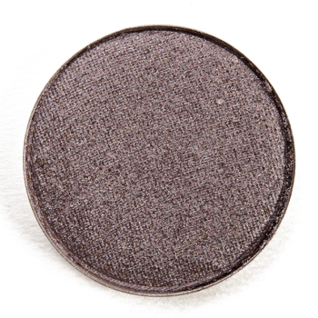
Natasha Denona Glam 15-Pan Small Eyeshadow Palette ($65.00 for 0.67 oz.) is a new, seemingly-permanent eyeshadow palette with five matte shades and 10 shimmer shades (most being fairly metallic). It's supposed to be a cooler-toned color story, though I found it was more neutral-toned to less warm-toned (relative to the brand's other palettes) but wouldn't call it truly cool-toned. The mattes tended to go on a bit deeper when applied than they appeared in the pan, which I find is not unusual for mattes from the brand.
The color story doesn't seem as well-balanced as past releases, as it actually felt like at least one matte, if not two, would have made it more versatile, especially as shades like 332M, 334M, and 322K are quite similar and would function similarly, so you could have easily skipped two of those in lieu of a matte shade between 326CM and 325CM in depth, so something more medium-dark, and something between 325CM and 327CM - so something darker but not near-black.
One matte shade could have been more pigmented, and the formula itself just seemed a little more prone to darkening depending on natural oils and the like on the skin, but otherwise, the remaining 14 shades were pigmented, blendable, easy to work with, and long-wearing.
Every time I look at the naming scheme and how it's arranged, it just doesn't seem that user-friendly. I feel like if you didn't know where to place colors, you probably would have trouble figuring out which ones to pair together! The reality is that someone who is newer to makeup is more likely to use a two or three shades in a look rather than several (inner corner, center eye lid, outer eye lid, crease/smoke/lash line, blend/transition, brow bone).
Below, I tried to rearrange it to better reflect five distinct trios with more of a gradient effect of light to dark, which made more sense to me and how I've tried to put together/share color combinations for readers that need help putting them together or are looking for additional inspiration. The base format was to arrange in columns that gave a trio of shades that could be used together, so they had more of a natural gradient with the shimmers and were arranged more tonally. It was also designed to work as trios diagonally, and you could also use two shimmers from a column and coordinate with any of the three mattes below it (so basically +/- left or right from the matte shade directly below the shimmers). This resulted in the left and right columns being slightly cooler-toned and the center columns (three and four, respectively) being warmer-toned.


I spoke at length regarding naming the lightest shade in the palette "Transition" here and why it's disappointing that the default frame of reference for the palette is for placement for a lighter skin tone, which has historically been the frame of reference used within the industry as the exclusion of medium-dark and deeper BIPOC.
For those who felt it necessary to speak over deeper BIPOC on that post (and there were a surprising number of comments that violated our comment policy and didn't get published at all) as well as on my Instagram post, I tried to explain why I feel it critical to try to create, encourage, or otherwise support forward-progress to reducing harm caused within the beauty industry. Whether that's calling out a brand for cultural appropriation, poor shade ranges, or lack of thought when it comes to choosing or assigning names, they work to be an ally to lift up and support BIPOC voices on those issues.
It would be nice if makeup was "just for fun," but the relationship people have with beauty is often complicated and nuanced - from the social standards attached to and propagated by the industry to the historic exclusion of BIPOC (especially deeper BIPOC) to the highly gendered terminology that is found everywhere (from marketing to labeling on websites) -- and there are plenty of issues and baggage associated with participating or not participating in beauty/makeup! There is no shortage of ways it can and does go a lot deeper for some people.
I've always felt it is important and have tried to work toward making and ensuring that Temptalia is inclusive and welcoming. Whether that's describing a shade as beige rather than "nude" or reminding someone that such-and-such color would be great for a different skin tone. I want readers to feel as welcome wearing little-to-no makeup to all the makeup to blue eyeshadow with blue lipstick and blue blush to brown eyeshadow with brown blush to brown lipstick. I want readers to have to deal with a few less microaggressions when they're in my space or on my platforms.
If we can reduce the daily microaggressions that marginalized people experience, this is a good, worthwhile outcome. Why would you want to make someone, who is already going through trauma, feel worse in what they'd like to be "fun" or be an "escape"? We can't always have a direct, immediate impact at a high level for "big" change, but we can all make smaller adjustments to our behaviors, from the words we use to how we treat others, for improvement.
For those who felt it necessary to say how "tired" or "bored" they are, or the ones who found it necessary to tell others to "shut up" (including me being told to shut up and review) about something that doesn't bother you/impact you, I'd say to ask why it was more important to shut down someone's feelings, why it' was more important to dismiss, criticize, and invalidate the expression of someone's feelings, rather than simply not engaging in a conversation. We can expect and want better at both a macro and micro level.
I'd love to be part of an industry where there was nothing to criticize, no brands to hold accountable, because the space was perfect, but it's not, and I hope that I can be a small part of inching it closer and closer to being a better space while I'm here.
Glam
PPermanent. $69.00.
Toggle between product photos and swatches of the shades included in this palette/set. Click on a shade for more photos and information.


Looking for something similar or to see what you have in your stash? Here are some of the top dupes for this product!


These shades are packed with the highest-quality ingredients to create buttery-soft textures that blend seamlessly for vibrant, ultra-pigmented, long lasting looks. The duo-chromes, velvety mattes, and sparkling metallic hues will elevate your senses and inspire you to create your very own radiant works of art.


