Dior Blue Garden Eyeshadow Palette Review, Photos, Swatches

Dior Blue Garden (031) Eyeshadow Palette
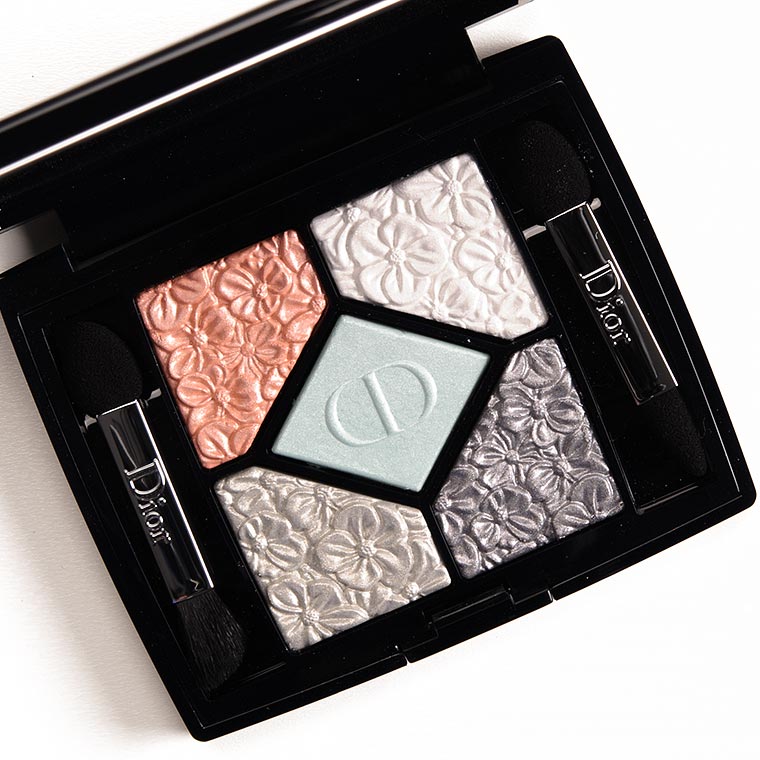
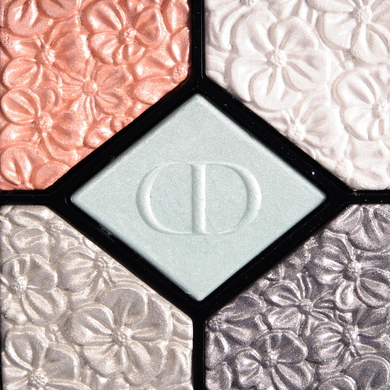
Dior Blue Garden (031) Eyeshadow Palette ($63.00 for 0.15 oz.) is a mix of white, silver, gray, blue, and orange. The orange is an interesting addition (certainly makes it more unique), but whether that’s a good addition or not is quite subjective. I couldn’t find anything online that described this as a wet/dry formula, but it felt like that to me, so I did swatch it both dry (left) and damp (right) for your viewing pleasure. The ratings are based solely on performance dry, though, which was disappointing across the board.
Blue Garden #1 is a light-medium, peachy-orange with warm undertones and a frosted, metallic finish. It had semi-opaque color payoff dry with a lightly dusty consistency that made it harder to build up as it would just sheer/fade as I blended it. This shade wore well for seven and a half hours. Viseart Pont des Arts (PiP, ) is darker (95% similar). Tom Ford Beauty Soleil d'Hiver #2 (LE, ) is less shimmery, cooler (95% similar). Disney by Sephora Splendid (LE, ) is darker (95% similar). Make Up For Ever I520 Pinky Sand (DC, $21.00) is warmer (95% similar). Pat McGrath Huetopia (LE, $25.00) is less shimmery, darker (90% similar). ColourPop Bonbon (LE, $4.50) is less shimmery, lighter, warmer (90% similar). Clarins Nude #1 (PiP, ) is cooler (90% similar). Dior Ambre Nuit #1 (LE, ) is less shimmery, darker (90% similar). Inglot J301 Pink Satin (LE, $10.00) is darker (90% similar). Anastasia Gem (P, $12.00) is less shimmery, darker (90% similar). ColourPop Sailor (P, $6.00) is darker, warmer (90% similar). ColourPop Glaze It (PiP, $4.50) is less shimmery, darker, warmer (90% similar). Too Faced XOXO (PiP, ) is darker, warmer (90% similar). MAC Sun Speck (LE, $17.00) is darker (90% similar). ColourPop Soo Good (LE, $4.50) is less shimmery, darker (90% similar). NARS Valhalla (DC, $25.00) is less shimmery (95% similar). NARS Virgin Gorda (P, $19.00) is less shimmery, darker, cooler (90% similar). ColourPop Cutoffs (P, $4.50) is cooler (90% similar). Charlotte Tilbury Pillow Talk Pop (Prime) (LE, ) is more shimmery, darker (90% similar). NARS Alhambra I (PiP, $19.00) is lighter (90% similar). Top 20 dupes listed, see the rest. See comparison swatches / view dupes side-by-side.
Blue Garden #2 is a bright, cool-toned white with a frosted sheen. It had sheer coverage when applied dry, though damp application seemed to go a long way with this one (almost opaque). The texture was powdery and hard to apply evenly to the skin. It wore well for six hours. Make Up For Ever D200 Crystalline Mauve Turquoise (DC, $21.00) is more muted (95% similar). Buxom Velvet Snow (LE, $12.00) is more muted (95% similar). Make Up For Ever ME122 Snow (DC, $21.00) is more muted (95% similar). Maybelline Too Cool (P, $6.99) is less shimmery (95% similar). Dior Precious Embroidery #2 (LE, ) is more muted (95% similar). Guerlain Les Nuees #2 (LE, ) is warmer (95% similar). Make Up For Ever ME122 Snow (P, $17.00) is more muted (95% similar). Tom Ford Beauty Ice Queen #1 (PiP, ) is warmer (95% similar). Make Up For Ever D124 Crystalline White (DC, $21.00) is warmer (95% similar). MAC Crystal Avalanche (DC, $17.00) is less shimmery (95% similar). NYX Frostbite (P, $6.00) is cooler (90% similar). BH Cosmetics Club Tropicana #14 (LE, ) is more muted (90% similar). MAC White (PiP, $21.00) is darker, more muted, warmer (90% similar). Sugarpill Ice Angel (PiP, $13.00) is cooler (90% similar). NARS Silver Screen #4 (PiP, $19.00) is less shimmery, warmer (90% similar). Smashbox Cosmic (LE, ) is cooler (90% similar). Guerlain Cygne Blanc #2 (LE, ) is warmer (90% similar). ColourPop Heigh-Ho (LE, $6.00) is less shimmery, darker, warmer (90% similar). Sephora Hologram (LE, ) is less shimmery, darker (90% similar). Lethal Cosmetics Overdrive (P, $6.00) is less shimmery, lighter, warmer (90% similar). Top 20 dupes listed, see the rest. See comparison swatches / view dupes side-by-side.
Blue Garden #3 is a muted, light bluish-white with a frosted finish. It had sheer pigmentation applied dry, so it was again, a shade that you’d have to use damp or with a good base (I’d reach for something thicker than regular primer). It had a dusty, thin texture that was prone to sheering out. The color was faded by the sixth hour of wear. Make Up For Ever ME202 Iceberg Blue (DC, $17.00) is more shimmery (95% similar). MAC Dark Energy #2 (LE, $21.00) is more shimmery, lighter (95% similar). Too Faced Joy (LE, $16.00) is warmer (90% similar). ColourPop Hot Copic (LE, $4.50) is darker, warmer (90% similar). Dior Blue Beat #3 (LE, ) is less shimmery, cooler (90% similar). Dior Parisian Sky #4 (LE, ) is warmer (90% similar). Smashbox Sky (P, ) is less shimmery (90% similar). Sephora Hologram (LE, ) is lighter (90% similar). theBalm A3 (LE, $16.00) is less shimmery (90% similar). Maybelline Hydrangea Hype (135) (LE, $6.99) is darker (85% similar). BH Cosmetics Foil Eyes 2 #22 (PiP, ) is more shimmery, darker (85% similar). Viseart Blue Diamond (PiP, ) is darker, brighter, cooler (85% similar). Dior Sugar Shade #1 (LE, ) is less shimmery, darker, warmer (85% similar). Sephora Sweet Dreams (17) (DC, $10.00) is less shimmery, darker (85% similar). ColourPop Daze (LE, $6.00) is more shimmery, warmer (85% similar). Sephora + Pantone Universe Citadel (LE, ) is darker (85% similar). Wet 'n' Wild Water (LE, $6.99) is darker (85% similar). Urban Decay Seattle (LE, $19.00) is more shimmery, darker, warmer (80% similar). Bobbi Brown Iced Blue (LE, $22.00) is less shimmery (95% similar). MAC Water & Ice #1 (P, $21.00) is darker (85% similar). See comparison swatches / view dupes side-by-side.
Blue Garden #4 is a light-medium, silvery gray with warmer undertones and a metallic sheen. It had semi-opaque pigmentation with a lightly dusty/dry texture that was hard to apply over bare skin. The color wore for six and a half hours on me. Marc Jacobs Beauty In Doubt (PiP, ) is less shimmery (95% similar). Smashbox Rock Icon (PiP, ) is less shimmery (95% similar). Sydney Grace Jingle Bells (DC, $8.00) is darker, cooler (95% similar). Chanel Tisse Ombre de Lune #2 (PiP, ) is lighter (95% similar). ColourPop Liberty (P, $6.00) is warmer (90% similar). BH Cosmetics Club Tropicana #11 (LE, ) is darker (90% similar). MAC Uninhibited #1 (LE, $21.00) is less shimmery, darker (90% similar). Chanel Mysterio (102) (P, $32.00) is warmer (90% similar). Make Up For Ever ME116 Silver (P, $17.00) is darker (90% similar). ColourPop Thickems (LE, $4.50) is less shimmery, cooler (90% similar). Too Faced Frosted Yum (LE, $16.00) is more shimmery, lighter (90% similar). Coloured Raine Diamond Jubilee (LE, $6.99) is more shimmery (90% similar). ColourPop Thingamabob (LE, $4.50) is cooler (90% similar). LORAC Steel Wool (LE, $19.00) is less shimmery, darker, more muted (90% similar). ColourPop Honeypot (P, $5.00) is cooler (85% similar). Urban Decay Sugar High (LE, $20.00) is darker, more muted, less pigmented (85% similar). BH Cosmetics Foil Eyes 2 #17 (PiP, ) is less shimmery, darker (85% similar). Sydney Grace Jingle Bells (P, $8.00) is less shimmery, darker, cooler (85% similar). Le Metier de Beaute Graphic (LE, $30.00) is darker, cooler (85% similar). Too Faced Ooh and Ahh (Right) (LE, $16.00) is lighter (85% similar). Top 20 dupes listed, see the rest. See comparison swatches / view dupes side-by-side.
Blue Garden #5 is a medium-dark gray with cool undertones and a frosted sheen. It had decent pigmentation with a lightly dusty consistency that was blendable but easily sheered out on the skin (harder to retain intensity). It started to fade after six and a half hours of wear. KVD Beauty Piaf (LE, ) is darker (95% similar). Sleek MakeUP Acid #11 (PiP, $9.99) is less shimmery, warmer (95% similar). Natasha Denona Quick Silver (09M) (PiP, $29.00) is more shimmery (95% similar). KVD Beauty Cathedral (LE, ) is darker (90% similar). Makeup Geek Mercury (DC, $6.00) is lighter (90% similar). Chanel Au Fil de L'Eau #3 (LE, ) is less shimmery, warmer (90% similar). Makeup Geek Tin Man (P, $12.00) is darker (90% similar). Tarina Tarantino Diamond Dusk #3 (DC, ) is darker, cooler (90% similar). MAC Cyber (LE, ) is more shimmery (90% similar). Milani Bella Gray (10) (P, $4.49) is less shimmery, darker (90% similar). Urban Decay Dark Cloud (DC, $20.00) is more shimmery (90% similar). MAC Tundra (LE, ) is more shimmery (90% similar). NARS Jardin Perdu (Left) (DC, $25.00) is warmer (90% similar). Bobbi Brown Silver (LE, ) is darker (90% similar). Tory Burch Beauty Stone Cold (P, ) is less shimmery, darker (90% similar). Anastasia Blue Flash (LE, $12.00) is less shimmery, lighter, cooler (85% similar). Make Up For Ever ME108 Steel (DC, $21.00) is darker, warmer (85% similar). NABLA Cosmetics Luxuriance (PiP, ) is more shimmery, lighter (85% similar). Estee Lauder Cyber Silver (LE, $24.00) is darker (85% similar). Marc Jacobs Beauty The Enigma #2 (PiP, ) is less shimmery, darker, warmer (85% similar). Top 20 dupes listed, see the rest. See comparison swatches / view dupes side-by-side.
Blue Garden (031)
LELimited Edition. $63.00.
Blue Garden #1
LELimited Edition.
Blue Garden #2
LELimited Edition.
Blue Garden #3
LELimited Edition.
Blue Garden #4
LELimited Edition.
Blue Garden #5
LELimited Edition.
Dior Blue Garden (031) Eyeshadow Palette
Dior Blue Garden (031) Eyeshadow Palette
Dior Blue Garden (031) Eyeshadow Palette

Dior Blue Garden (031) Eyeshadow Palette
Dior Blue Garden (031) Eyeshadow Palette
Dior Blue Garden (031) Eyeshadow Palette

Dior Blue Garden #1 Eyeshadow

Dior Blue Garden #1 Eyeshadow

Dior Blue Garden #2 Eyeshadow

Dior Blue Garden #2 Eyeshadow

Dior Blue Garden #3 Eyeshadow

Dior Blue Garden #3 Eyeshadow

Dior Blue Garden #4 Eyeshadow

Dior Blue Garden #4 Eyeshadow

Dior Blue Garden #5 Eyeshadow

Dior Blue Garden #5 Eyeshadow


Thankfully, this set of shades with the exception of the light orange hued one, would look thoroughly horrid on me anyway, I’m not let down. However, I do feel bad for those for whom these shades would’ve worked well on. Dior disappoints yet AGAIN. Almost to be expected at this point, LoL!
Phew!
Ugh, this is really depressing 🙁 Again, a gorgeous looking Dior palette that disappoints. First, the quality just isn’t there, 3 white-based shades that are hard to wear and will probably look the same on my lids (terrible), weird color combo, and the kit is dusty, dry, and sheer. I mean, people must be buying these horrible Dior kits because they keep cranking them out, but why?? Well, this low- buy for spring is turning out to be much easier than I expected!
I’m surprised there wasn’t at least one more contrasting shade!
I hate to say that I’m happy this got a poor rating…but I am. I had decided to cross this off my “Wish List” because I am trying to be careful about what I buy. I decided I have enough shades of blue. I’m actually not too surprised at your rating as I had seen a makeup artist’s “look” with this palette and it didn’t seem as if the shades were too vibrant. I do wish Dior would improve on their shadows as I like their palette concepts. The addition of the peach shade (had the shadows done well) would have given a lot of flexibility for different looks with this palette. I’m hoping some for the other Spring releases do better (crossing fingers for the YSL) as I’d like to add some more pastels to my collection.
Fingers crossed over here, too!
Dior always has the most gorgeous products that don’t perform (the lace inspired spring collection from a couple years back is still comes to mind.) 1000% in need of a revamp. #5 is quite pretty…albeit it is also quite dupe-able.
I’m surprised they have kept up this streak 🙁
The shades are all so light and frosty… It wouldn’t work for me at all!
The frost level/lack of contrast certainly makes it a less versatile palette!
Something is wrong. I can’t see the look.
Sorry, I didn’t include any photos of one! I try to include but sometimes I don’t have any (usually if I get distracted or have appointments).
This could have been a fun one, sadly it isn’t.
I wonder how Dior can keep putting put these actually quite bad eyeshadow palettes year after year. I wonder who buys them, maybe they have a lot of custumers who have always bought Dior, and can’t imagine any other brand.
Someone must buy them 🙁
I think it’s like you said: both do a poor job of making it clear what they are (or not). I think Bobbi Brown does a bit better (she does have a few finishes that are specifically sheer) than Dior, though.
Thanks for the info Marisa! Being a UD type gal, I could never understand the appeal of these sheerer formulas from Dior and Bobbi, but the explanation helps.
I agree Marisa! I don’t always want full on, opaque-eyeshadow, all over the lid, regardless of formula. I don’t look very good with heavy shimmery eye makeup, it has always aged me, I have always preferred a light shimmer wash. It takes on an ethereal effect, which gives me a wide eyed look that I love.
When I use makeup on myself and others, I think of it in the same way I use my art supplies when creating a project. Some oil paints are meant to be sheer due to pigment content and some are opaque. That alone does not define my standards, it just allows me many more ways to use them. The standard would be defined by other criteria like blend-ability, vibrancy, etc 🙂
I sold Dior for years, and yes they have loyal fans who always buy the limited edition palettes, often without even swatching them. They must just collect them…I know I’ve collected quite a few myself!) they also have customers who don’t see any problem with their dryer, more sheer formula – something they actually look for. They want sheer washes of color for subtle looks.
Thanks for the clarification, Bonnie!
No problem! 🙂
Wow. What a disapointment, but what a cool shade combo.
Dior remains a brand to be inspired by but often not worthy of purchasing from 🙁
Well said. I think I have some 20 y.o. Dior, but nothing more recent. My usual thought process now is, Well this is going to $^€¥, so let’s check the MUFE dupes, if anything looks promising. I used to think that I got out of Dior, when I got poorer, but it’s not so. It was before that, when quality fell and so many other brands superceded (sp?) them. You know, make up may have become like the cereal aisle, with overwhelming choices, but competition really IS a good thing. It drove the DS to up the game, spawned proliferation of HE and niche brands. Now, there really is little reason to buy stuff that sucks. Especially with you. There’s a lot of pan in my old Dior.. It seems that the European brands, especially those who are spin-offs of design houses, concentrate on presentation and packaging, rather than on performance. Embossing, ornamentation, floral designs, logos, brand associated or themed containers. You can tell some products blindfolded. Seriously. The problem is that it is a wrong focus. Make up is a performance game, possibly even more than a design game. It seems that the overriding US makeup game, since the loss of Kevyn (after all, he MADE us go there) is the search for the Holy Grail of neutral palettes. And it’s really a performance issue.
It’s interesting that you bring up the embossing – Dior is one of those brands that seems to do it almost every collection and tweaks the formula of a lot of things (like eyeshadow) with every other release – but why? If you have a good formula, it’s about new shades and textures, not changing what works. So why not take a step back and create a good formula that’s worth repeating? I used to really look forward to Dior’s powder products but now I’m surprised when they’re even just decent.
I totally like the peachy orange with the grayish blues. It could have been tied in better, like if the white had a gold shimmer, or was a lighter peach/beige.
Maybe a little more contrast? I feel like the grayish shades run together.
SOOO sad about this!!! I love the cool silvery blues with the peach, it’s really unique and beautiful. For some reason I expected better of this palette, the damp swatches are so beautiful! Christine, had this been called a wet/dry formula, how would it have scored?
Marginally better but not a lot. Damp helps, but some shades here were still on the drier side.
Ah, well money saved I guess. Looks like I’ll just be getting the two highlighters! (and maybe the Bleuette nail polish! Shame cuz it would’ve looked so good on with this palette!)
Such a pretty selection of colors, too bad they did not perform well. 🙁
I hear ya, Courtney!
Even if they’d performed better, I wouldn’t be interested in this because I find the colours just too insipid looking. But what the heck is wrong with the chemists et al at Dior? They CAN make some good shadows (Bonne Etoile and Golden Savannah were 2 good ones) but yet they persist in releasing mediocre quality eyeshadow palettes and at these prices, the quality should ALWAYS be spot on!
It is mind-boggling! I find it particularly interesting that they routinely change their formula from launch to launch (with the seasonal color collections).
I used to love the Dior quint eyeshadows and bought at least one from every new collection (since 1988!), but the quality has gone way, way down in the last couple of years. I really expect more at this price point.
Do you still buy one or have you been skipping lately?
The only lovely colour was the darker grey. The rest are just average. I don’t know why Dior put the orange into that quint. For true cool toned complexions (which I am presuming that Dior is aiming this palette at), the orange simply does not work at all. They could have made this palette into something really good, but I guess they did not want to copy their old Gris Gris colours – which is actually beautiful. Oh dear.
They should have done an updated take on Gris Gris!
Can we start a petittion? like ” Bring back the good days? ”
I just can’t….
If only!
It looks so pretty too! I love the color of the first one, time to find some dupes.
Hope you can find dupes, Kayle!
I really like the combination of shades and the beautiful flower print in the shadows themselves, but if I’m going to spend $63 on a makeup item, it would be a palette with many more colors (such as MUFE).
Makes sense 🙂
I expect much more in the quality department from Dior. So glad i can count on you for reviews. This pastel number would not have tempted me anyway. . . . . .
Me too, Lisa 🙁
How disappointing. I liked this the best out of the two 5 pans for spring and find the shades here really interesting. Lunch bag letdown again from Dior on their eyeshadows. It’s a sad and repetitive sentence.
It really is – it is getting old now.
Such a shame this didn’t perform better, it had such potential! You’d think that after all this time they’d figure out how to improve their eyeshadow formula! For the money it’s not worth purchasing.
It’s like someone who knows they’re wrong but refuses to admit it! I feel like they should just call a spade and spade and start marketing their products as sheer washes and be done with it.
Perhaps this should be sold “For Display Purposes Only”. 😉 I would really love to see a Dior palette perform well.
Ha!
Why does Dior insist on making quints where 3-4 of the 5 colors are light or light-midtones? Besides the issue with the lack of pigmentation, that is the most frustrating thing for me.
It must work for what they perceive is their customer base, unfortunately!
Awww, too bad none of the shades really deliver. That floral print is just toooooo pretty.
Agreed!
Another hard pass for me!