36 Neutral Eyeshadow Look Ideas for June 2020


For some, putting on makeup is more functional, but for me, it’s more about playing, which is probably why my love for eyeshadow has endured for over 15 years now. I love putting together color combinations, whether they’re “new” to me or old favorites with a twist. It’s relaxing to create these color combinations, and it allows me to revisit some previously-reviewed products, which is, hopefully, helpful to readers who purchased them in the past!
I thought I’d start by sharing 36 more neutral-leaning color combinations, and I’ll follow-up with 36 more colorful ideas for anyone looking for some inspiration this June! As always, these are ideas to inspire future makeup looks, so you don’t need the specific product(s) or palette; you can recreate using products you already own as well.
About This Series
Each look idea is centered around a “quad” of four shades with the expectation that one might bring in the appropriate brow bone or additional transitional shade based on skin tone. I know that I tend to use more like five or six shades in a typical look, but I think that four is a happy medium to give a good idea of the “core” color scheme of a look while giving you the ability to lighten/darken as desired. I have listed the colors in this order: inner lid, middle of lid, outer lid/crease, and crease/above crease.
You might see combinations that seem slightly repeated but placement will vary (e.g. a halo placement where the lightest and more shimmery shade is placed on the center) as placement can also create a different effect/look! You might also want to consider incorporating your favorite matte/shimmer shades (as applicable) to increase the versatility of certain palettes. Consider these ideas a jumping off point!
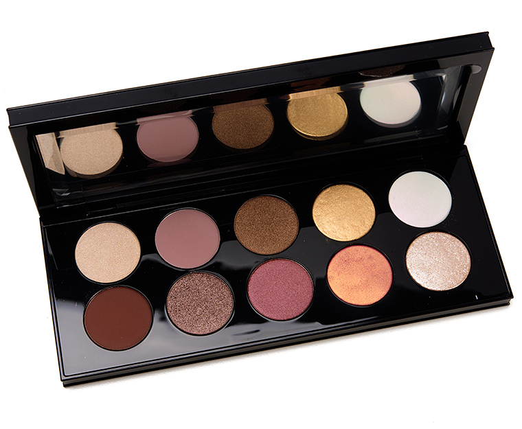
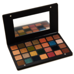
Natasha Denona Metropolis


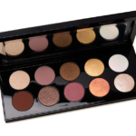
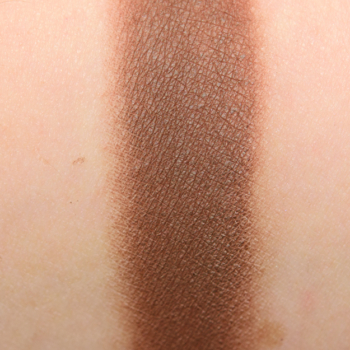
Pat McGrath Divine Rose


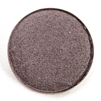
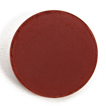
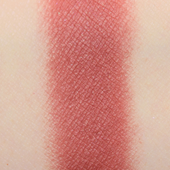
Astral Solstice, Refined Gold 002, Sable Bronze, Xtreme Mahogany
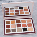
Natasha Denona Biba


Sydney Grace Eyeshadows


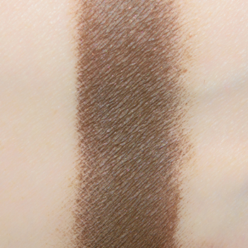
Pat McGrath Divine Rose


ColourPop Bare Necessities


Anastasia x Jackie Aina


Sydney Grace Eyeshadows


Natasha Denona Glam

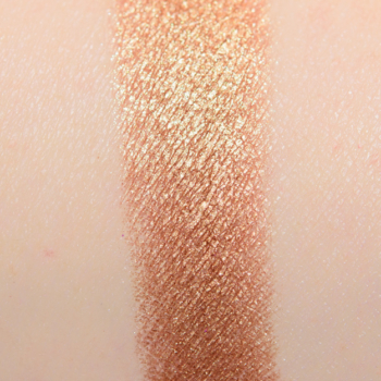


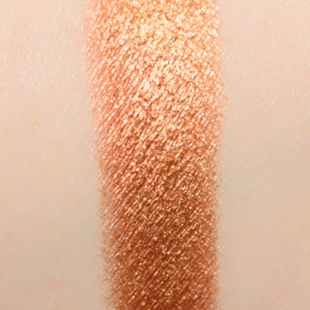
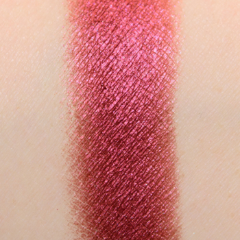
Golden Flesh (68M), Anjo (278M), Seed (224CM), Harlow (277CP)
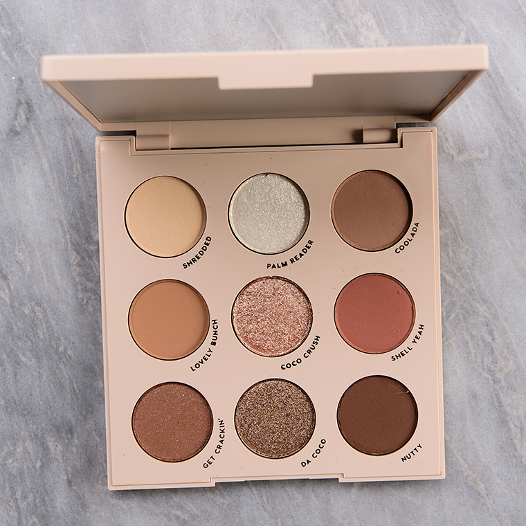
ColourPop Going Coconuts


Urban Decay Naked Honey


Sydney Grace Eyeshadows


Viseart Neutral Mattes Milieu


ColourPop Bare Necessities


Huda Beauty Nude Medium


Nude Medium #7, Nude Medium #2, Nude Medium #9, Nude Medium #4
Huda Beauty Nude Rich


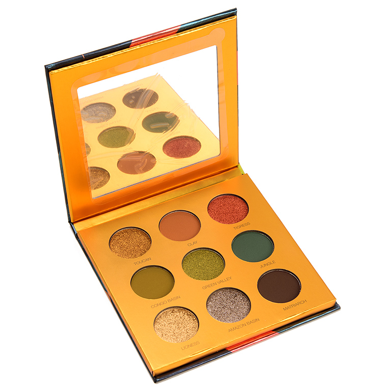
Coloured Raine Safari Raine


Natasha Denona Gold


Sydney Grace Raspberry Kiss


Huda Beauty Nude Rich


Sydney Grace Autumn's Reign


Wondrous Knight, Magnificent Chestnut, Amber Jewels, Supreme Harvest
Huda Beauty Nude Light


Natasha Denona Biba


Sydney Grace Eyeshadows


Genie in a Bottle, Arabian Nights, Chocolate Raspberry Fudge, Eastern Rise
Natasha Denona Biba


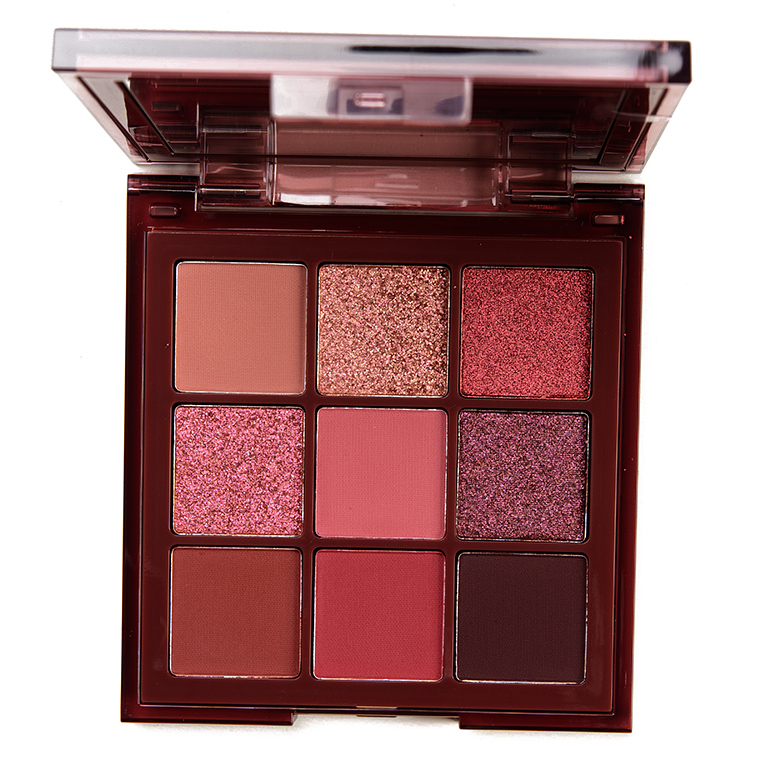
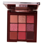
Coloured Raine Queen of Hearts


Sydney Grace Enduring Love (Deep)


Coloured Raine Queen of Hearts


Sydney Grace Eyeshadows


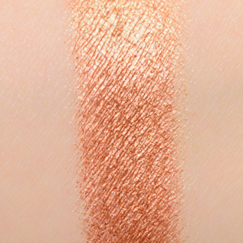
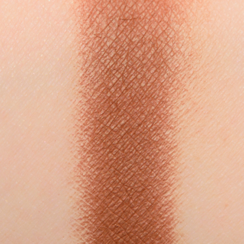
Pat McGrath Bronze Seduction


Natasha Denona Sunset


Sol (134CM), Horizon (127CM), Panjin (132CM), Vulcano (125CM)
Sydney Grace Eyeshadows


Natasha Denona Sunset


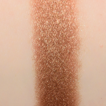
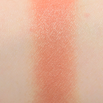
Mandarine (123DC), Bronzage (124K), Vulcano (125CM), Terra (129CM) (2018)


Beautiful mini palettes! Sydney Grace has a knack for getting me to hanker after tones I wouldn’t otherwise be drawn to. That Apricot shade is gorgeous.
Have you made up any 6-to-9 shade palettes just for fun? I’ve seen a couple of “curated palette” videos, where someone makes a spring palette or whatnot, and goes through a couple combinations possible with that. Those are fun!
Yes, I have! 🙂
These stunning quad selections are just perfect for our winter weather here. Thank you Christine. I am going to try Heart’s Full today. The Rhaspberry shade from my Burgundy Bar, Apricot from Soft and Smokey, I wouldn’t use a duochrome here – but probably Sandstorm. No mattes. Lovely!
Nice combos! I’ve noticed recently that I’m always drawn to combinations that put a pinky-brown right next to an olive-y or gold-y one, or a very greyed-down one right beside a brighter, saturated one. It’s a contrast within a set of neutral shades that I find quite eyecatching and exciting.
It’s awesome that you’ve figured out a type of combo that you like and why!