Huda Beauty Neon Green Palette Makeup Look Ideas (x8)


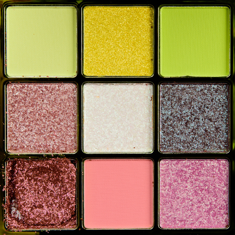


Huda Beauty Neon Green Neon Obsessions Palette ($29.00 for 0.45 oz.) is one of the least versatile palettes I’ve come across, given it has nine shades, but they are so light and mid-tone without enough contrast that I found it quite hard to use it cohesively. I think it might work better for certain skin tones and for someone who only uses one or two shades in a look. I’d say this is more my best attempt at creating eight different ways to wear it than eight great ways to wear it…
About This Series
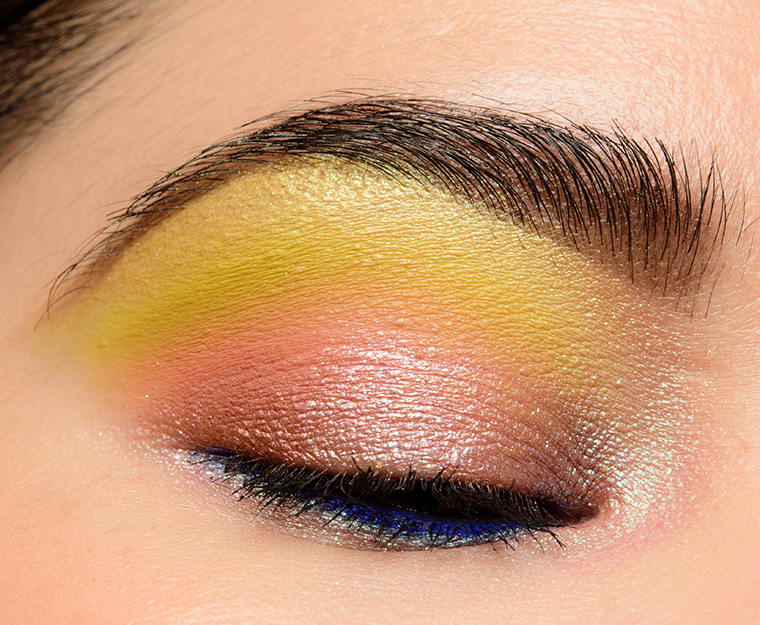
Each look idea is centered around a “quad” of four shades with the expectation that one might bring in the appropriate brow bone or additional transitional shade based on skin tone. I know that I tend to use more like five or six shades in a typical look, but I think that four is a happy medium to give a good idea of the “core” color scheme of a look while giving you the ability to lighten/darken as desired. I have listed the colors in this order: inner lid, middle of lid, outer lid/crease, and crease/above crease.
You might see combinations that seem slightly repeated but placement will vary (e.g. a halo placement where the lightest and more shimmery shade is placed on the center) as placement can also create a different effect/look! You might also want to consider incorporating your favorite matte/shimmer shades (as applicable) to increase the versatility of certain palettes. Consider these ideas a jumping off point!
Create a Color Story
Feeling inspired? Share your own color story using this palette or create a color story from scratch.
Huda Beauty Palette


Definitely NOT versatile on its own! Although, I do like it as a palette full of interesting duochrome shades with 3 lime green somethings. Still ought to have been done greener overall.
It’s interesting how often you need to use the slightly darker shades of #6 and 7 to anchor the eye looks. I don’t think that this one is as versatile as some of their other 9 pans.
But thank you for coming up with so many different kinds of looks to get the most out of the palette.
I think you meant to put the word Green rather than Orange in the paragraph heading.
That aside, you did a nice job offering options, despite the pa!ette’s shortcomings. The first time I saw this palette, I thought the top row was much too similar.