Natasha Denona Darya Diamond & Blush Palette Review, Photos, Swatches


Darya
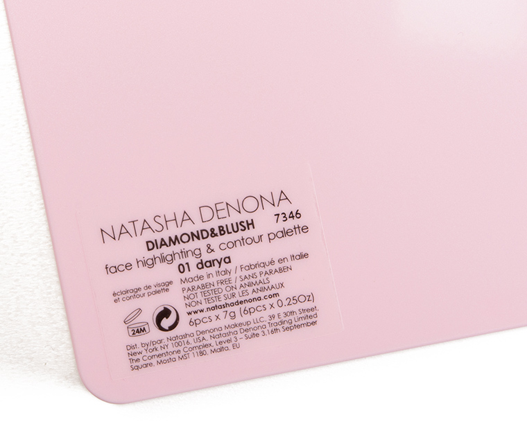
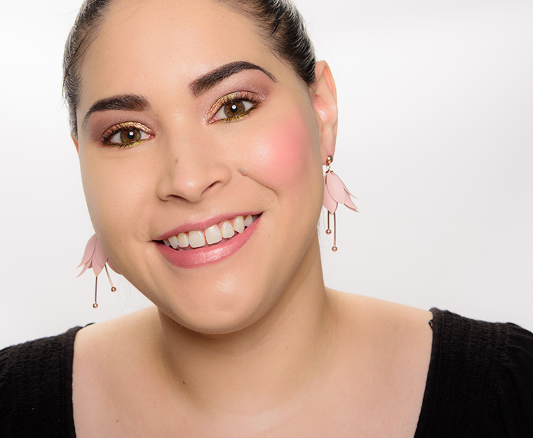
Natasha Denona Darya Diamond & Blush Palette ($89.00 for 1.50 oz.) contains six shades–two cream formulas, four powder formulas–in an assortment of finishes, textures, and shades. The palette is designed to be layered, though they can all be worn alone. I really enjoyed the palette, but I don’t expect it to be the most functional or practical purchase. The top row has a clear, plastic lid that is supposed to keep them from getting powder in them; and the third shade (on the right), while powder, is very dense, so there wasn’t any excess product kicked up when I used it.
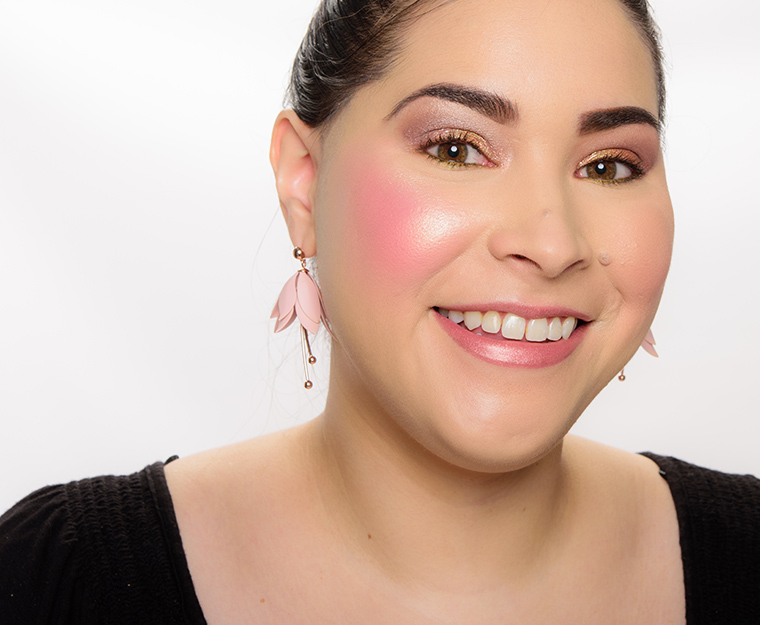
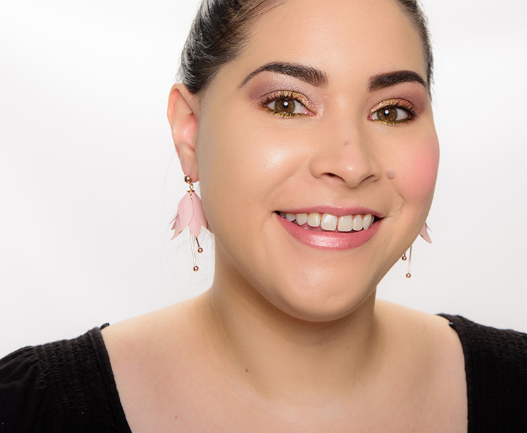
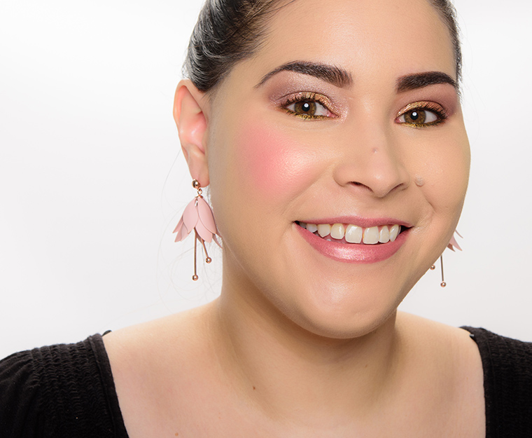
The palette really did yield an extremely high-shine, almost editorial-level finish on the cheeks that was dewy, luminous, but metallic and sparkly, too. I felt like I was beaming all day long, and I was happy to find that layering all six as the brand instructed actually lasted all day long, too. I’m fortunate to see and test a lot of products each year, and there was something about how the palette came together on the skin that made my heart go pitter-patter, which doesn’t happen all that often, so this will definitely be a palette I’ll keep in reach for those rare days where I’m not testing a new cheek color!
Looks Using this Product


Darya
PPermanent. $89.00.


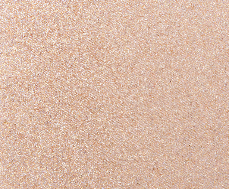
Light
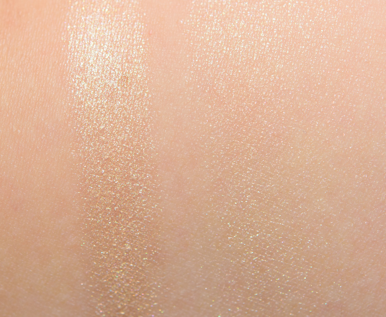
Light is a light, yellow gold with warm undertones and a soft, dewy sheen on the skin. It looked more pearly when built-up but when applied and blended out for more semi-sheer to medium coverage (the brand described the coverage as “buildable”), it yielded a glowing finish that was lit-from-within without being overly tacky on the skin. It did not dry down fully, but I didn’t run into issues with my hair (well, more likely dog hair!) sticking to my cheekbones. The brand recommended applying with a dampened sponge, which worked well for sheerer coverage, while fingertips or a stippling brush built up coverage a bit faster, though I’d say using the sponge yielded a smoother sheen overall (just barely). On me, it lasted for eight hours and applied well on bare skin and over foundation (without lifting my base up).
Top Dupes
- Becca Moonstone (DC, $38.00) is more shimmery (95% similar).
- Too Faced Happy Face (P, $30.00) is less shimmery, lighter (95% similar).
- Dior Universal (001) (P, $38.00) is less shimmery, cooler (95% similar).
- Givenchy African Light Gold (LE, $41.00) is less shimmery (95% similar).
- elf Champagne Campaign (P, $9.00) is less shimmery (95% similar).
- ColourPop Boujee Call (DC, $12.00) is more shimmery (95% similar).
- Tom Ford Beauty Reflects Gilt (LE, $50.00) is cooler (95% similar).
- Cover FX Sunlight (P, $34.00) is less shimmery (95% similar).
- NYX Crystal Glare (P, $6.99) is less shimmery (95% similar).
- Fenty Beauty Mean Money (PiP, $36.00) is less shimmery (95% similar).
Light
PiPPermanent in Palette.
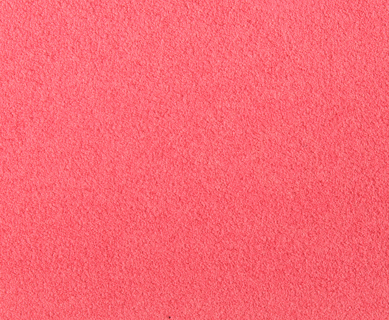


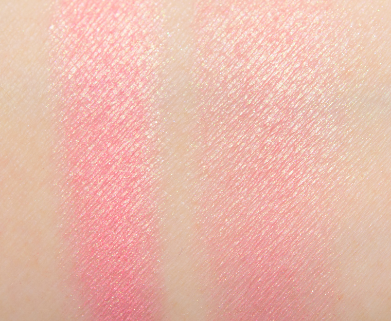
Pink
Pink is a bright pop of medium pink with subtle, warm undertones and a matte finish. I found that it looked more semi-matte or “natural” matte applied to my skin, as it looked very skin-like rather than flat or matte. It was richly pigmented and a little went a long way, so using a dampened sponge as the brand recommended actually worked exceptionally for applying even, buildable coverage that never got away from me. The formula was smooth to the touch, lightly creamy but not tacky or too slippery, so it sat well on the skin and dried down for the most part. The cream blush blended out easily on my skin with a dampened sponge, and it also worked well with a stippling brush, though I did prefer the sponge technique with this formula (and will likely try it more often with other cream products going forward!). The color stayed on well for nine hours on me before fading slightly.
(Note: I couldn’t find specific information about coverage, but the brand’s promotional swatches make it appear opaque, which I’d consider to be what they’re setting expectations as.)
Top Dupes
- Tarte Deco (LE, $29.00) is darker (95% similar).
- NARS Hot Pursuit (LE, $30.00) is more muted (95% similar).
- Chanel Tweed Evanescent (130) (LE, $45.00) is more muted (95% similar).
- ColourPop Swirled (P, $12.00) is lighter, less glossy (95% similar).
- Chanel Crescendo (250) (LE, $45.00) is lighter, cooler (95% similar).
- The Estee Edit Purr Pink (03) (P, $28.00) is darker (95% similar).
- Makeup Geek XOXO (P, $10.00) is lighter, more muted (95% similar).
- NYX Peach (DC, $5.00) is darker (95% similar).
- Chanel Vibration (270) (P, $45.00) is darker (95% similar).
- Estee Lauder Pink Ingenue (P, $34.00) is warmer (90% similar).
Ingredients
ISODECYL NEOPENTANOATE, MICA, HDI/TRIMETHYLOL HEXYLLACTONE CROSSPOLYMER, ALUMINUM HYDROXIDE, SYNTHETIC WAX, DIMETHICONE, POLYMETHYLSILSESQUIOXANE, CERA MICROCRISTALLINA (MICROCRYSTALLINE WAX ), CERA CARNAUBA [COPERNICIA CERIFERA (CARNAUBA) WAX ], TRIETHOXYCAPRYLYLSILANE, SILICA, SILICA DIMETHYL SILYLATE, PENTAERYTHRITYL TETRA-DI-t-BUTYL HYDROXYHYDROCINNAMATE, CI 77891 (TITANIUM DIOXIDE ), CI 77491 (IRON OXIDES), CI 77492 ( IRON OXIDES ), CI 15850 ( RED 6), CI 15850 (RED 7 LAKE).
Disclaimer: Ingredient lists are as available by the brand (or retailer) at the time of publishing. Please always check product packaging, if it exists, for the ingredient list applicable to the product you're purchasing, or the brand or retailer's website for the most up-to-date ingredient list.
Look Using this Product

Pink
PiPPermanent in Palette.
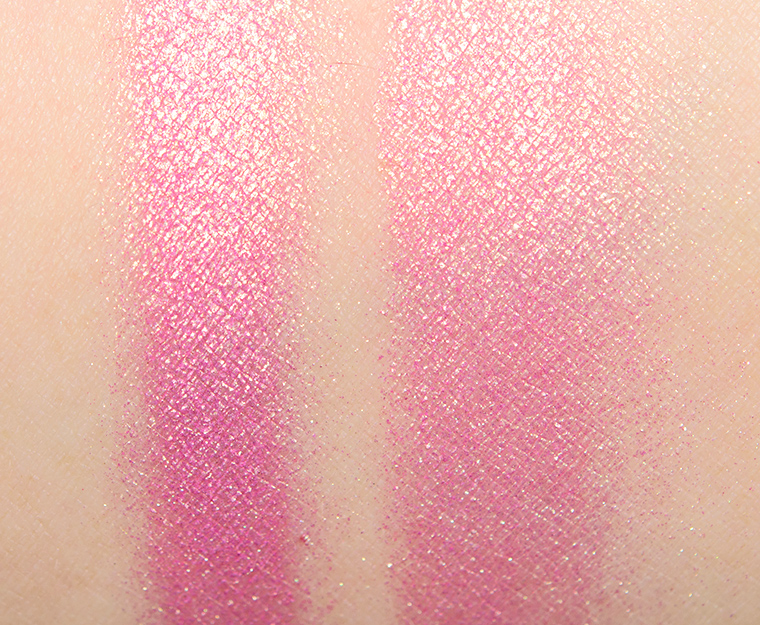
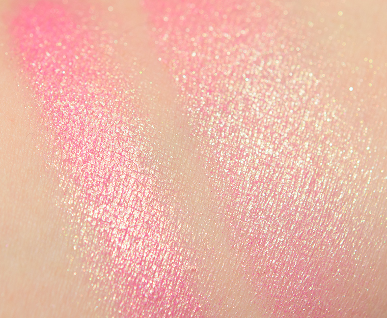


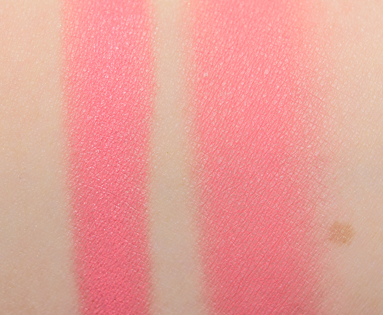
Pink-Champagne
Pink-Champagne is a medium, lavender pink with cool undertones and a strong, golden sheen that was metallic and lightly sparkly. It was extremely pigmented with a dense, smooth consistency that felt like a mix of cream and powder. The product blended out beautifully on my skin and yielded a ridiculous level of shine and reflection. I was pleasantly surprised that it did not emphasize my skin’s natural texture. It was the most complex shade in the palette, so I’d love to see it released as a single shade. The blush lasted for nine hours on me before I saw signs of fading.
(Note: I couldn’t find specific information about coverage, but the brand’s promotional swatches make it appear opaque, which I’d consider to be what they’re setting expectations as.)
Top Dupes
- ColourPop U Got Mail (LE, $10.00) is less shimmery, lighter (90% similar).
- Sydney Grace Pink Razz (LE, $9.00) is less shimmery, darker, cooler (90% similar).
- ColourPop At First Blush (LE, $8.00) is less shimmery, darker (90% similar).
- Too Faced Peach Pop (PiP, ) is lighter, warmer (90% similar).
- Sol Body Wild Orchid (LE, $12.00) is less shimmery, cooler (90% similar).
- Fenty Beauty Sangria Sunset (PiP, $36.00) is less shimmery, darker (90% similar).
- Moira Spicy Hue (P, $14.00) is less shimmery, darker, warmer (85% similar).
- ColourPop Prenup (P, $8.00) is less shimmery, darker, warmer (85% similar).
- Clionadh Aether (P, $12.50) is less shimmery, darker, cooler (85% similar).
- ColourPop GOAT (LE, $10.00) is less shimmery, more muted, warmer (85% similar).
Looks Using this Product

Pink-Champagne
PiPPermanent in Palette. $38.00.
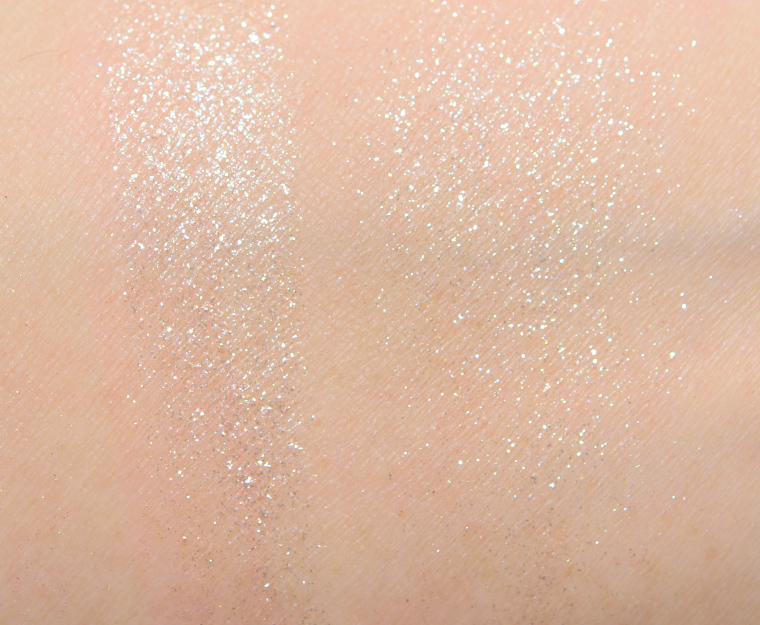
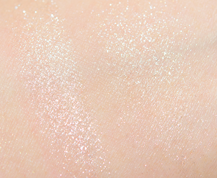


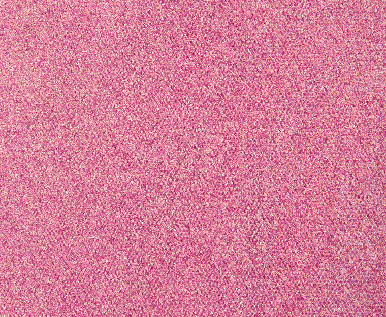
Icy Nude
Icy Nude is a light, golden beige base with larger white and champagne flecks of sparkle. The shimmery bits read more like sparkles than glitters on my skin, as the finish was shiny and sparkling but not dirty or sandy at other angles. It had medium coverage, which could be diffused for sheerer coverage or built up for semi-opaque coverage. Despite being rather glittery, the powder was fairly smooth and blendable with the sparkles dispersing evenly over my skin. There was some migration during the day but a lot of the product seemed intact after nine hours of wear, and when I layered it over one of the cream products, it stayed a little better.
(Note: I couldn’t find specific information about coverage, but the brand’s promotional swatches make it appear semi-opaque, which I’d consider to be what they’re setting expectations as.)
Top Dupes
- Urban Decay Oasis (LE, ) is less shimmery (90% similar).
- Too Faced Rainbow Strobe (LE, $30.00) is darker (90% similar).
- ColourPop Double Down (LE, $10.00) is darker (90% similar).
- MAC Born to Dazzle (LE, $26.00) is cooler (90% similar).
- Anastasia Wish (LE, ) is darker (90% similar).
- KVD Beauty Gold Skool (LE, $30.00) is cooler (90% similar).
- NABLA Cosmetics Ozone (P, $26.00) is less shimmery, darker (90% similar).
- Persona Laguna (P, $24.00) is less shimmery (90% similar).
- Melt Cosmetics Morning Star (P, $39.00) is less shimmery, cooler (90% similar).
- KVD Beauty Helix (LE, $30.00) is cooler (90% similar).
Looks Using this Product
Icy Nude
PiPPermanent in Palette.


Golden Pink
Golden Pink is a light-medium pink with warm undertones and a luminous, golden sheen. It was richly pigmented–as the brand’s powder blushes have been marketed in the past–with a smooth, silky consistency that wasn’t too dense nor too softly pressed in the pan, so I had no trouble picking it up with more feathery brushes and didn’t get a lot of powdery excess in the pan. The powder blended out beautifully on my skin and looked luminous without emphasizing my skin’s natural texture. It lasted well for almost nine hours before starting to fade.
Top Dupes
- NARS Divine (LE, $30.00) is darker (90% similar).
- MAC Sugar or Syrup (LE, $24.00) is less shimmery (90% similar).
- NARS Super Orgasm (LE, ) is less shimmery, darker, cooler (90% similar).
- Tom Ford Beauty Cool (Winter 2016) Highlighter (LE, $60.00) is darker, warmer (90% similar).
- Charlotte Tilbury Pillow Talk Medium-Deep #3 (PiP, ) is darker, warmer (90% similar).
- Giorgio Armani Eccentrico (LE, $88.00) is darker (90% similar).
- NARS Fervor (Left) (PiP, ) is less shimmery, darker (90% similar).
- Estee Lauder Bronze Goddess Blush (LE, ) is darker, cooler (90% similar).
- Smashbox Carnation (LE, ) is less shimmery, darker (90% similar).
- MAC Azalea in the Afternoon (LE, $29.00) is warmer (90% similar).
Look Using this Product

Golden Pink
PiPPermanent in Palette.

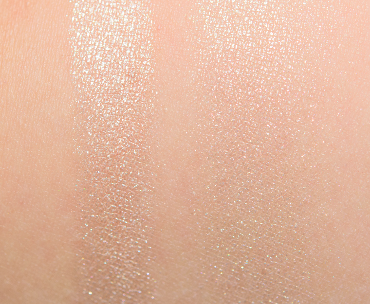


Light
Light is a light, golden beige with warm undertones and a metallic sheen. It had a strong shine on the skin with finer shimmer, which seemed to ensure that even with a heavier application, it did not emphasize my skin’s natural texture. It had opaque coverage with a moderately dense consistency that felt smooth to the touch, and it could be applied with a lighter hand for sheerer or more buildable coverage if preferred. The powder blended out easily on my skin and stayed on well for nine hours.
Top Dupes
- Natasha Denona Fair (01) (P, $38.00) is cooler (95% similar).
- Guerlain Electric Look #1 (LE, ) is darker (95% similar).
- Salt New York Pearl (P, $16.00) is less shimmery, cooler (90% similar).
- ColourPop Counting Sheep (LE, $10.00) is more shimmery, lighter (90% similar).
- MAC Climax (LE, ) is lighter (90% similar).
- Anastasia Starlight (DC, $28.00) is lighter (90% similar).
- MAC Rosy Glow (LE, ) is darker (90% similar).
- NYX Moonbeam (P, $6.99) is warmer (90% similar).
- Cle de Peau Delicate Pink (14) (P, $55.00) is less shimmery (90% similar).
- ColourPop Seismic (LE, $10.00) is cooler (90% similar).

…maybe I’ll save up. This is absolutely lovely.
It is gorgeous!
I didn’t want you to love this! Now I feel like I need it.
Do you have a few cream blushes and highlighters? Maybe try playing with combos and seeing if you can replicate the effect at home!
Ooh that’s a great idea!
Oh wow, this caught my attention before, but your review and thoughts really have me contemplating it.
ND did a nice job putting it together – I didn’t have low expectations but didn’t expect to love it.
I was waiting for your review. Now I’m going to purchase.
I hope you love it, Inge!
I’m not a big blush person. Having rosacea I spend most of my “makeup application time” covering red and the last thing I want to do is add anything that would call attention to it. Having said that….. I want to touch and poke and be swayed by these glorious little palettes sheerly for the fun. Though I cannot seem to find even the hint of an ingredients list online anywhere (my physical sephora stores don’t stock swanky brands like this). That rosacea skin? Yeah, also super sensitive and I will *not* buy a face product, no matter how hyped, without an ingredients listing. Why the f-bombs don’t companies make the listings accessible?? There are people with allergies and issues more severe than me and need to have that information before rolling the dice on a new product.
Unfortunately, I haven’t seen any ingredients posted for this one yet 🙁 Mine was sent in a press box, so no exterior/cardboard packaging – hopefully, maybe some fellow consumers will post pics of their boxes, though!
I so agree with this! I’ve got the exact same issues and need to know ingredients.
Z, I have my box.The ingredients are as follows:Glow Cream:Ethylhexyl Palmitate,Hydrogenated Polyisobutene,Polymethyl Methacrylate,Trimethylsiloxyphenyl Dimethicone,Mica,Cera Microcristallina,Isostearyl Neopentanoate,Silica,Synthetic Fluorphlogopite,Cera Alba,Copernicia Cerifera Cera,Tin Oxide,{+/-} CI 77891,CI 77491,CI 75470. Cream Blush:Isosetaryl Neopentanoate,Mica,Polyurethane 44,Aluminum Hydroxide,Copernicia Cerifera Cera,Candelilla Cera,Silica,Dimethicone,Triethoxycaprylylsilane,Tin Oxide,{+/-} CI 77891,CI 19140,CI 15850. Duo Chrome Highlighter:Calcium Sodium Borosilicate,Mica,Talc,Diisostearyl Malate,Dimethicone,Silica,Zinc Stearate,Isostearyl Neopentanoate,Polybutene,Tocopherol,Octyldodecyl Stearoyl Stearate,Isopropyl Isostearate,Caprylyl Glycol,Phenoxyethanol,Dimethicone Crosspolymer,Hexylene Glycol,Lecithin,Ascorbyl Palmitate,Glyceryl Stearate,Glyceryl Oleate,Citric Acid,Tin Oxide {*/-} CI 77891,CI 77491,CI 77492,CI 77499,CI 75470,CI 45410. Diamond Powder:Polymethylsilsesquioxane,Calcium Sodium Borosilicate,Dimethicone,Polysorbate 20,Zinc Stearate,Talc,Diisostearyl Malate,Caprylyl Glycol,Phenoxyethanol,Sodium Dehydroacetate,Potassium Sorbate,Hexylene Glycol,Tin Oxide {+/-} CI 77891,CI 77491,CI 77492,CI 77499. Powder Blush Octyldodecyl Stearoyl Stearate,Zinc Stearate,Isostearyl Neopentanoate,Polybutene,Talc,Mica,Isopropyl Isostearate,Caprylyl Glycol,Phenoxyethanol,Hexylene Glycol,Tin Oxide,Tocopherol,Lecithin,Ascorbyl Palmitate,Glyceryl Stearate,Glyceryl Oleate,Citric Acid,{+/-} CI 77891,CI 77491,CI 15850. Extreme Glow:Diisostearyl Malate,Dimethicone,Zinc Stearate,Isostearyl Neopentanoate,Polybutene,Octyldodecyl Stearoyl Stearate,Aluminum Hydroxide,Isopropyl Isostearate, Caprylyl Glycol, Phenoxyethanol,Dimethicone Crosspolymer,Hexylene Glycol,Talc,Mica,Tocopherol,Lecithin,Ascorbyl Palmitate, Glyceryl Stearate, Glyceryl Oleate, Citric Acid,Tin Oxide,{+/-} CI 77891,CI 19140.
Holy crap, thank you so much!!!
You rock! Thank you so much. I am allergic to lanolin and algae based ingredients so I need to see ingredients before I buy. Thank you so much!!
Your welcome❤️I’m allergic to sodium laureth sulfate which is in a ton of shampoo,body wash, and laundry detergents. So I’m always checking ingredient lists!
Wow!!! How wonderful! Thank you very much! Looking at the ingredients list, I already know I can’t use the cream glow base due to the palm derivative as a first ingredient–that will break me out. However, I am still tempted! Thank you again!
I’ve used mine every single day since it arrived. Definitely agree that it’s the kind of product that’s exciting and joyful to use. I’ve tried it on tones NW-05 through NC-50 so far and it looks amazing on everyone. The products layer together in such a unique way. The love put into the palette is apparent.
Also while every shade is stunning the Pink-Champaign duo glow is above and beyond.
Happy to hear it’s working well for you and those you’ve tried it on so far! 🙂
That’s definitely the pan I’m swooning over..
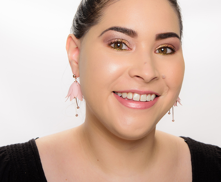
Still not convinced that these palettes would work for me, but your earrings are adorable Christine!
Thank you!
Just bought this today! I’ve been waiting on your review before taking the plunge and you’ve definitely convinced me it’s worth it!
Fingers crossed!
This palette is so beautiful!!! If I was in a better position financially right now I would buy it!
It is a beauty!
Gorgeous shades and I like the different textures for layering purposes. It must be special if you are going to keep it!
I thought it was really cool how it was designed to be layered, and they made sure to include a how-to on layering everything together (I’m not sure if this is included in purchased palettes, but I know it is on her site).
Wow, I’ve never been so compelled to purchase something of hers but the high marks are definitely reason to put this on my “treat myself” list!
I really enjoyed using this one! Keep us posted if you ever try it, Indya.
The palette seems very beautiful and good value, although higher end. And the two pinks look quite similar and I am having trouble understanding why they are both there or what the difference is.
For six cheek colors (they are quite large) from a brand that prices their eyeshadow palettes as they have, it actually seemed reasonable… which I know is a strange thing to say about ND. Definitely a splurge, though.
I’m assuming you mean the cream blush and the powder blush? Per the brand, the idea is to layer – I would think for better longevity, as I know a tip I’ve heard (and have used!) is to put a cream blush on and use powder to lock it in place all day long. For me, though, I don’t mind since the cream blush is mostly matte and the blush ends up looking lighter/brighter and shimmery on. In the other palette, Citrus, I think the two beige/gold highlighters are too similar to have both in it, so I can totally get where you’re coming from.
Thank you, Christine, and I agree about the value proposition in this palette. What I am trying to figure out is whether or not it is too warm for me. And the three coolest shades are the two corals, for each of which I own a dupe– and the lavender shade which is to die for. So I am trying to figure out whether any of the other three pans might be doable for a fair olive/neutral complexion. Any way, first world problems. Thank you for the great review and your responses.
Aw, I feel like if you already have dupes for some shades, it won’t be worth it! Maybe see if you have a pink blush that you could layer a gold highlighter over to replicate the lavender shade?
Thank you, Christine. One of the many great things about this blog — too many to enumerate– is that you are honest and support your readers in doing what is right for them, rather than product pushing. You model that it’s okay not to buy something. Another blogger I sometimes read gushed over the pigmentation and creaminess of a new eye shadow product from a brand I like a lot, but whose eye shadows have been really poor in recent years, And it’s a shame because their old formula was wonderful. I got a chance to try the product myself, and could not get it to show up at all on my eyelids. Terrible formula. This is a high end brand and frankly, drug store brands are better. Because in this and other sites, people are encouraged to share how a product works for them, I commented, while also adding the wish the brand would return to the old formula. This blogger would not publish the comment. In fact, there were no comments on that blog. And the blogger’s branding is that they are knowledgeable and honest in their reviews! Thank you for creating a space for honesty and making the choices that work.
How strange! Ultimately, as long as the comment isn’t focused or pointed at me and saying I’m being dishonest, I was wrong, etc. and is just in the vein of someone else’s sharing their experience, the more the merrier. Products are definitely your mileage may vary! I have friends who love a product, and I’ve tried it and have no idea why they love it so much, and other times, they’ll love a product for the reasons I don’t like it at all! I think we all have different priorities, too, or how much we’d ding or lift something up for something – like one person’s “drying” lipstick might feel murderous on their lips and to someone else it’s “tolerably drying.”
We’re on the same wavelength. I want that darn lavender shade. I think the layering would keep it cool enough with the blushes. The icy nude beige simmer shade looks doable. I’m light neutral olive leaning cool. I hate that I want this argghh
Well, Wwendy, I guess I will fess up that I tried the palette. It was fun to play with. And the icy lavender and nude beige shimmer were my two favorite pans — just like you correctly identified. And even though it was glittery, I actually used the latter to set my concealer– and give my dark circles a lift and it worked pretty well for that. Granted that I don’t work from an office and can pretty much please myself when it comes to makeup. The reason I did not make it a keeper was the pinky corals. I am sure that I don’t have to explain to you that balancing act around pinky corals with our skin tone. I find a very wide color range of blush colors I can wear– nearly all pinks, roses, plums, mauves, some reds– and even apricots, peaches, and certain golds (like Chanel Elegance) better than some pinky corals which bring that green undertone up in a sickly looking way. And this turned out to be a pinky coral that I would rarely reach for — even though the formula was fun— given all the other blushes I have. I actually wonder whether the blush color in the other palette might have been better, although all the bronze colors would have been wasted so no point in that. Also being fair as well as having a long oval face with high cheekbones, I have very little need for highlighter although it was fun to experiment. If my face shape was different and needed that sculpting, I might have felt it was worth it.
Hey Alison: Thanks ? so much for your input. You just saved me from myself. I almost never wear coral blushes and as much as thar lavender shade is killing me, I cannot remotely justify on one pan (maybe two with that h/l shade we talked about) alone. Appreciate your detail too. I completely get the raising of the green factor.
Christine, do you think the blushes in particular can be more sheer with a light hand? The palette looks beautiful but I’m worried the colours will be too strong for my pale skin.
I think Pink-Champagne is pretty pigmented and harder to apply with a very light hand (I think it can be done… just might take a few tries to figure out the balance in technique/tool), but the cream blush and Golden Pink powder blush are definitely doable with a lighter hand.
The model the brand used for this shot (with Darya) is fair: https://www.instagram.com/p/BeJXKg1gfu2/?taken-by=natashadenona
Awesome, thanks for your help! Looks like a fun palette to work with 🙂
I think this is really lovely, and something that I might consider more closely after I finish out and declutter some other items in my collection. That being said, I’m curious to see if the other palette wears as well, or if it’s more editorial – this seems to be designed to be the more wearable of the two.
The yellow-green shade in Citrus does have greater impact on the look than the one here (since it is more differentiated)… I like it but I imagine it will be less liked by some.
I’m glad to hear it’s part of the permanent collection! Will you also be reviewing the citrus one?
A masterpiece! Totally wrong for me, but I envy those who will rule in this palette.
Pink-Champaigne is giving me all the spring feel-goods! Like just a breath of fresh air.
As for the entire $89 palette? I do love it, my low-buy already has that Jeremy Scott boom-box e/s palette on my probable “buy” list, though. If it sells out or reviews poorly, then this could be “it” instead!
Pink Champagne is absolutely stunning, I do hope she releases it as stand alone, I’d totally buy it! I just can’t justify the whole palette.
This is gorgeous! I also like that it’s very much the Natasha Denona “look,” like she stayed very true to her own aesthetic in terms of finish and performance. I’ll definitely consider this, maybe when a Sephora VIB sale comes around?
I love the pelette, so so beautiful, but it is very expensive for me. Maybe for my birthday
Ah, crap. Now I’m going to have to get it. Luckily, I don’t have anything like this in my collection, so I’m excited to save up for it!
Does this have any fragrance in it, did you notice? Such a beautiful palette but if it is fragranced it will just set my face on fire unfortunately.
I didn’t notice anything, but I can barely smell presently.
This looks beautiful! I have to ask though, where are your earrings from? I love those too!
Ted Baker!
I just love how this looks on your skin, price is steep but it seems to be quiet a unique blush palette and probably worth it.
I saw MichellesEverydayGlamour do a YT review on this the other day and she fell in love with the shine and sparkle, glad to see you liked it too Christine. It is beautiful, hopefully it’ll be permanent and I can pick it up during the next VIB Sale!
I think i’m missing something. What does “editorial-level finish” mean? It looks like shiny plastic on the cheek.
The type of makeup you’d see in a magazine photoshoot – something that might not be “everyday” but is more high-fashion.
So you didn’t find it repetitive in practice? When I look at it, I worry that it will get boring. (The two powder highlights seem pretty similar, along with the right hand powder and the cream highlight.)
For me, the finish of the two on the skin was different enough between the highlighters in this palette with the more glittery one looking almost silvery-white-cool on me vs. the more metallic one which was a bit warmer. I felt like the glittery one didn’t transform underlying color as much as the metallic one (partially color but also the opacity/texture).
The cream highlighter is a lot more subtle vs. the powder highlight (Light), so again, for me, the finish is different enough that I’d use them different functionally – hopefully that makes sense!
I did find that the two powder highlighters in the Citrus palette to be a little too similar, though.
Thank you, that is really helpful!
I love my palette SOOOOOOO much.. after using it as the ONLY makeup on my face( eyes, cheeks, lips) after a week I had to force – FORCE myself to set it aside and try out a limited edition Laura Geller Baked Gelato highlighting set. Thank god for ‘Pixie Pearl’ ( another hard to put down but very small n LE set from Geller) If it wasn’t for french fizz and pixie pearl I probably would’ve panned Darya by now!!
I think all of these shades are stunning!!! Wow!
I wish this wasn’t so expensive! I LOVE IT!
Honestly, I was skeptical. Did I need more blush & highlight? Especially at this steep price? No. But I did end up ordering Darya and i’m so IN LOVE with it, its not even funny. It blends and builds beautifully. I buffed the cream blush into the skin, over the foundation (and powder), then I applied the powder blush on top. And then I went in again with damp sponge into the pink cream to highlight the high points on my face. It just looks so glowy, wet and gorgeous. Probably the best palette I own right now. Oh and the packaging? STELLAR.
Sorry if I’m repeating, Christine, I did read through the comments below but did not see reference to these questions.
I purchased Darya (a tad steep at $115 CND, but alas) on your *pitter-patter* reco, and I love it!
However, when using a damp sponge for the cream, I found it moved my Tarte Rainforest of the Sea foundation around a bit (I could see it clearly in my simple human mirror, although it wasn’t as evident in a regular mirror). So, did you use more of a tap and roll motion or a stippling or dotting motion?
Also, I notice the uber-fair model on the site and instagram has the Darya on her eyes (and looks like lips) as well–did you try it on your eyes?
If so, how did it fare?
Thanks!
More stippling/lighting tapping it onto my cheeks, no rolling.
I did not try it on my eyes, sorry!
Thanks!
I suspect I was moving the sponge too much. I want to try it on the eyes next!
oh man i really wish pink champagne was available to purchase individually, i swatched it at sephora and pictures really don’t do it justice (altho your pictures are lovely!!) it’s so beautiful!
Curious, could the diamond be used as an eye topper? I haven’t completely figured out how to tell if something designed for the face is eye safe.
I’m not sure.