16 Eyeshadow Color Combinations to Try for Spring
While beauty might be heading into summer–the sign of new bronzers marks the start of summer!–it’s really the spring season! Pops of color can go a long way to brightening one’s day, whether it’s an item of clothing, some decor, or one’s eye makeup. I was thinking more in the lines of “pastel with pop” when I came up with these color combinations–something more workable and friendlier to more skin tones than true pastels (which can be inconsistent in quality and harder to work with, just in general). Hope you find something that catches your eye enough to try!
About This Series
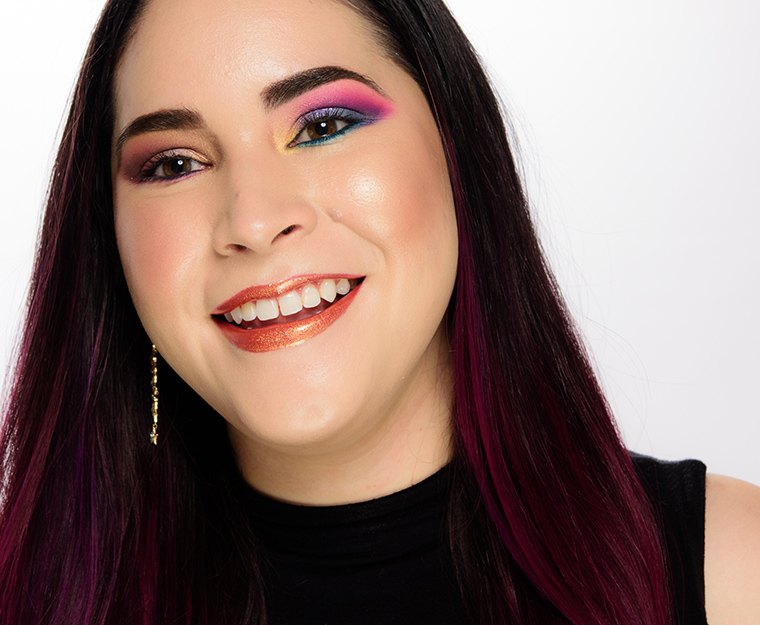
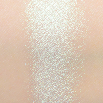
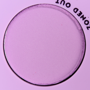
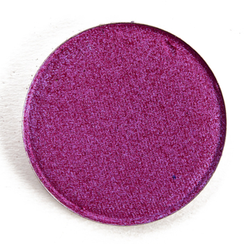
Each look idea is centered around a “quad” of four shades with the expectation that one might bring in the appropriate brow bone or additional transitional shade based on skin tone. I know that I tend to use more like five or six shades in a typical look, but I think that four is a happy medium to give a good idea of the “core” color scheme of a look while giving you the ability to lighten/darken as desired. I have listed the colors in this order: inner lid, middle of lid, outer lid/crease, and crease/above crease.
You might see combinations that seem slightly repeated but placement will vary (e.g. a halo placement where the lightest and more shimmery shade is placed on the center) as placement can also create a different effect/look! You might also want to consider incorporating your favorite matte/shimmer shades (as applicable) to increase the versatility of certain palettes. Consider these ideas a jumping off point!


Create a Color Story
Feeling inspired? Share your own color story using this palette or create a color story from scratch.
Natasha Denona Love
ColourPop Mint to Be
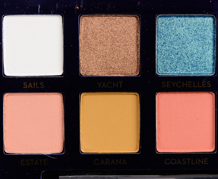
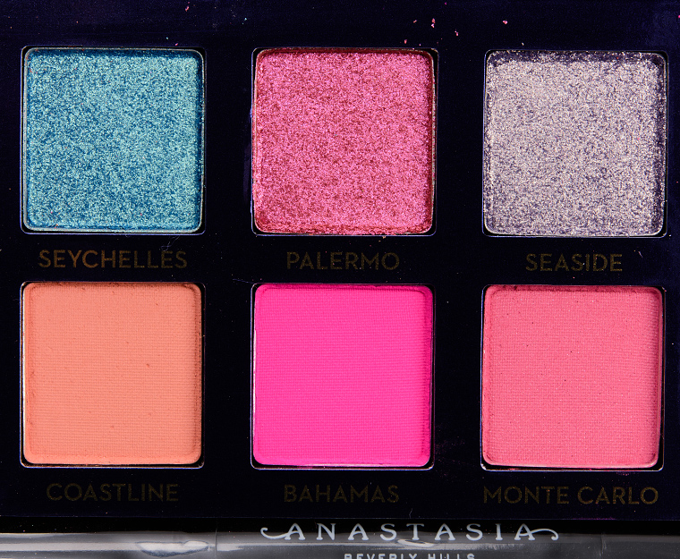
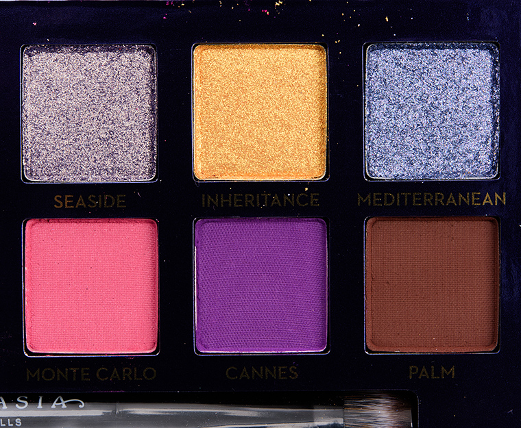
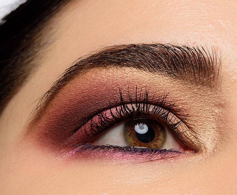
Anastasia Riviera
Sydney Grace Eyeshadows
Sugarpill Fun Size
Sydney Grace Eyeshadows
Anastasia Riviera
ColourPop Mint to Be
Sydney Grace Eyeshadows
Sydney Grace Eyeshadows
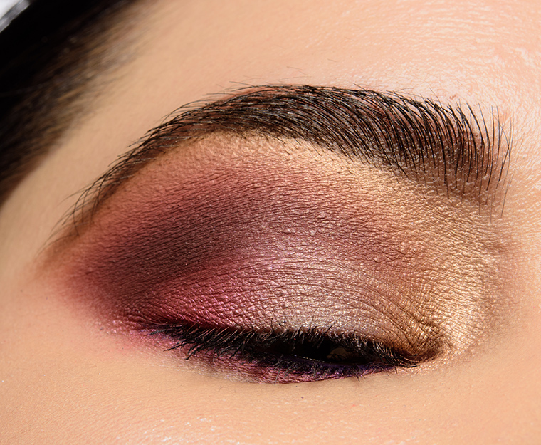
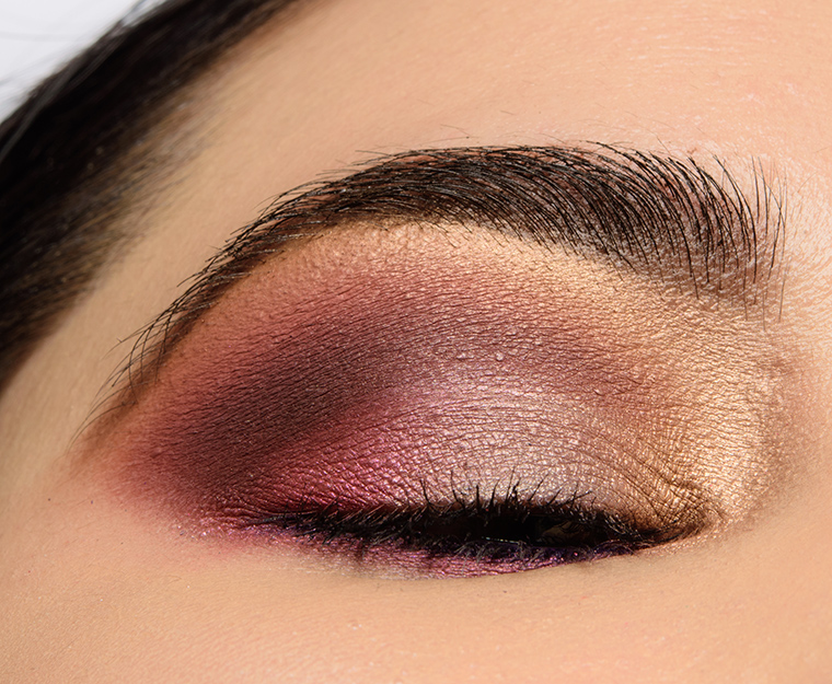
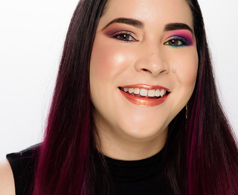
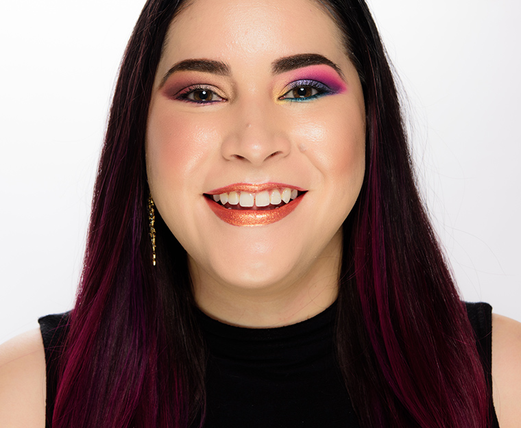
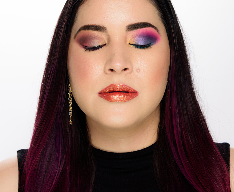
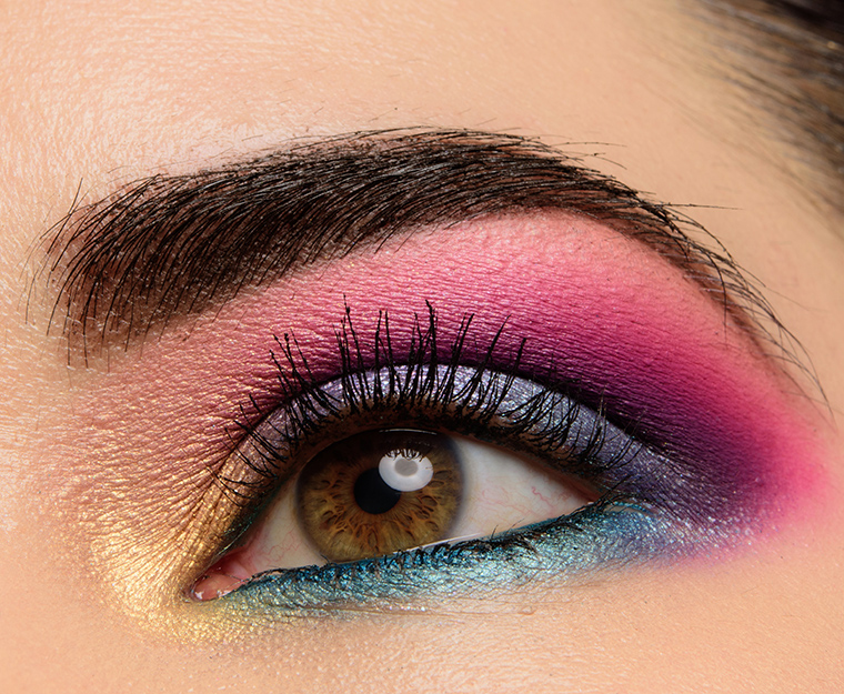
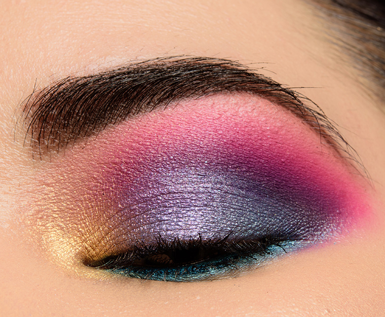
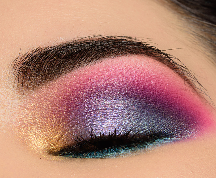
Viseart Boheme Dream
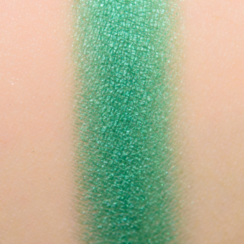
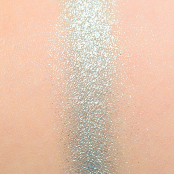
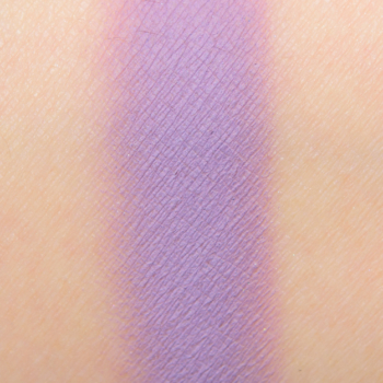
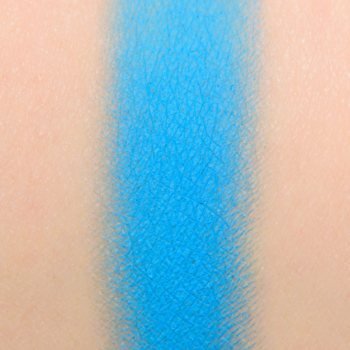
Boheme Dream #2, Boheme Dream #6, Boheme Dream #11, Boheme Dream #10













Christine – what a lovely supply of looks to try out during this quaratine. All of these Sydney Grace shadows are tempting me back to their site.
How sunny and bright are these combinations to try during this difficult time? They are so vibrant and full of colour. Thank you.
Thank you for these! They couldn’t have come at a better time, because I’ve been stuck in a bit of a slump with my makeup. Just haven’t been feeling very inspired lately due to being cooped up in the home all the time. Maybe these will fuel my creative streak…let’s hope so anyway!
Hope you get hit by a wave of creativity, Nancy!
You’re torturing me again with these gorgeous SG and Colourpop shadows, Christine! I’m not a pastels kinda gal (I’m pastel enough!) but these look so pretty.
Good thinking, because a mask doesn’t cover the eyes! Loving the SGs, natch, and always find a few to haul. I had momentarily forgotten about Coy….. (Sigh) There are some fun combos here, even the ones i don’t normally gravitate to. You can deduce your comfort zone by which quad already has 3 or 4 in your stash! We all need a bit of inspiration about now. I found a photo of a B&T dachshund with a mask on. I’m putting it at my register at night job, labeling it something like ‘Jussi says: mask when you must.’ Everyone stay healthy.
Thanks!! Inspires!
I just love this post!!!! You are so creative!! I have been wearing makeup for 30 years, and I still don’t have the ability to open 6 palettes and pull complimentary colors! Yikes. I am so impressed with your obvious talent!!!:):)
Check out this post I did with arranging some ColourPop palettes, but you can also see how I divide up a larger palette to start to “see” color combos – you can do this with any palette you own but it can be a great way to start “seeing” them!
https://www.temptalia.com/11-ways-to-build-your-own-palette-colourpop/
I’m so glad I found this post! I am so inspired. How do you know what blush/lipstick to go with the eye shadow?
It’s really experimentation, I think, especially because you can do a really bold green look and find that one shade goes better vs. a softer green look. Most people find using warmer tones together to be an easiest starting place, but you can definitely use cool and warm to contrast against each other, too.
I’ve been having fun with these, mixing and matching from different palettes. I have Riviera and Fun Size but I’ve even been trying out substitutions with those colors. These look ideas are some of my favorite things that you do because I learn so much!