Palettes I Wish Existed | Recreating with Singles (A Follow Up!)
Okay, okay! I’ve put together some ways to get the vibes of the palette mockups I posted yesterday.
I pulled from Sydney Grace’s catalog if I could, since they’re more affordable and have a very robust singles range (compared to ColourPop’s, which always feels like 50% discontinued at a given moment!). In that process, I noticed that Sydney Grace has gaps in deeper, richer mattes, especially outside of taupe/brown, not nearly enough in the platinum/pewter camp, and where are all the richer teals?!
If one of the color stories I created caught your attention, and you have a decent collection already, here’s how I would approach recreating with what you have…
- Identify the colors that standout. These are the ones drawing you in, and then you’ll want to think about if you have anything similar. The other shades are often “grounding” or help to build out the story. Possibly you’ll discover that you have 75% of the shades but there’s one or two more standout shades you’re missing–then obtaining a single or two might be totally reasonable.
- Think about the “look” you’d wear, and then just recreate that look (likely a narrower set of shades!) rather than the whole “palette.” You can also do this by looking at each row or column.
- Try clicking on one of the shades I’ve shown to recreate and then look to see if you have any of its dupes!
Pat McGrath Dream Palette #1: Enchanted Forest

In Enchanted Forest, here’s how I would have described each dream color:
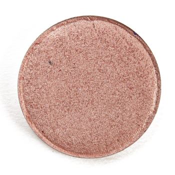
- Warm beige with subtle, peach-to-green shift, pearl finish
- Medium-dark, taupe-brown with neutral-to-warm undertones, matte finish
- Medium-dark green with subtle, cooler undertones and warmer, golden sparkle and subtle green pearl, metallic finish
- Medium-dark pewter with highly reflective sheen, metallic finish
- Bright, mint green with subtle, warmer undertones and a mix of blue and pink pearl (possibly shift), sparkling finish
- Muted, deep green with moderate warm undertones, matte finish
- Medium olive green with muted, warm undertones and an intense sheen, metallic finish
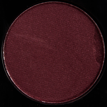
- Muted burgundy with subtle, warm undertones, matte finish
- Rich, true teal, slightly cool-leaning, with smooth, reflective sheen, metallic finish
- Sparkling gold duochrome, green-to-teal shift, sparkling, metallic finish (it’s basically VR Fire Opal, maybe a smidgen lighter)
In terms of products that are permanently available, shades 1, 4, 5, 9, and 10 were harder to get a 1:1 replacement. I was surprised at how lean permanent teal eyeshadows are–someone produce 10 shimmery teals, stat!
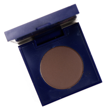
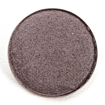
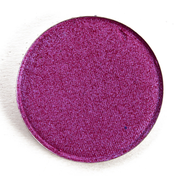
Sydney Grace Eyeshadows


Single Eyeshadows


Pat McGrath Dream Palette #2: Subversive Odyssey

In Subversive Odyssey, here’s how I would have described each dream color:
- Warm golden peach base with strong pink-to-gold shift, pearl finish
- Brighter plum, subtle warm undertones, matte finish
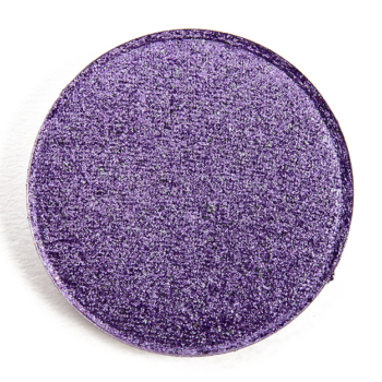
- Sparkling, medium purple with subtle, warmer pink undertones, sparkling, metallic finish
- Bright, richer minted green with pale gold sparkle, metallic finish
- Light, very cool-toned blue base with pink-to-gold shifting sparkle, metallic finish
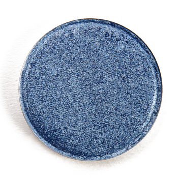
- Rich, deep blue-teal with moderate, cool undertones, matte finish
- Medium-dark green with subtle, warm olive undertones, sparkling, metallic finish
- Deep, purple-taupe with cool undertones, matte finish
- Vivid, medium-dark violet purple with smooth, reflective sheen, metallic finish
- Transparent base with green-to-gold shifting sparkle, sparkling finish
Sydney Grace Eyeshadows


Single Eyeshadows


Pat McGrath Dream Palette #3: Vintage Rose

In Vintage Rose, here’s how I would have described each dream color:
- Light beige with iridescent pink and violet shift, satin-to-pearl finish
- Muted, medium-dark taupe-brown with subtle, cooler undertones, matte finish
- Darker purple with subtle, warm undertones and reflective, smooth sheen, metallic finish
- Brighter, lighter purple with warmer, pink undertones and faint blue and gold pearl, metallic finish
- Light, grayish-lavender with neutral-to-warm undertones with lighter, gold-to-pink shifting sparkle, metallic finish
- Deep burgundy with subtle, warm undertones, matte finish
- Dusty, medium-dark pink with muted, warm undertones and a reflective sheen, metallic finish
- Deep plum with subtle, warm undertones, matte finish
- Rich, reddish-plum with intense sheen, metallic finish
- Bright, light-medium pink base with cooler undertones paired with golden shift, metallic finish
Sydney Grace Eyeshadows


Single Eyeshadows


Natasha Denona Dream Palette #1: Woodlands

In Woodlands, here’s how I would have described each dream color:
- Medium, bluish-aqua with subtle, cool undertones and flecks of gold and iridescent teal pearl, metallic finish
- Light-medium taupe with subtle, warm undertones, matte finish
- Medium, muted grass green with subtle, warm undertones, matte finish
- Medium green with subtle, warm undertones and warmer, golden shimmer, metallic finish
- Deep taupe with warmer, olive and gold flecks of shimmer, metallic finish
- Rich, deeper berry with subtle, cool undertones, matte finish
- Light-medium gold base with gold-to-green shifting shimmer, pearl finish
- Dark copper with muted, redder undertones, matte finish
- Light-medium brown with moderate, warm undertones, yellow-peach leaning, matte finish
- Medium-dark purple-taupe with subtle, cool undertones, satin finish
- Medium-dark olive green with moderate, warm undertones, matte-to-semi-matte finish
- Muted, dark blue with strong, cool undertones (almost leaning purple), matte finish
- Bright, medium blue-aqua with subtle, cool undertones and barely-there gold pearl, satin finish
- Deepest forest green with neutral-to-cool undertones, satin finish
- Medium-dark emerald green with subtle, warm undertones and reflective sheen, metallic finish
Single Eyeshadows


Natasha Denona Eyeshadows


Natasha Denona Dream Palette #2: Neon Lights

In Neon Lights, here’s how I would have described each dream color:
- Intense, dark purple with cooler undertones and bluish-violet shifting pearl, reflective sheen, metallic finish
- Neon, medium-dark coral with warmer, more orange undertones, matte finish
- Bright, purple-berry with pinker undertones, reflective sheen and faint iridescent pearl, metallic finish
- Bright, medium purple with neutral-to-cool undertones paired with flecks of blue-to-teal sparkle, metallic finish
- Muted, medium green-teal base with golden pearl, pearl finish
- Deep gold with warmer, olive undertones paired with pink-to-peach shift, metallic finish
- Deep berry-red with subtle, cool undertones, matte finish
- Vivid, deep coral-red base with flecks of violet and pink pearl, metallic finish
- Medium, warm lavender with pink undertones, matte finish
- Medium coral, leaning slightly pinker in base, paired with peach-to-gold shifting pearl, metallic finish
- Deep purple with subtle, warm undertones, matte finish
- Bright, medium-dark green with neutral-to-cool undertones, matte finish
- Rich, deep blue-teal with cool undertones, matte finish
- Medium, rosy mauve with warm undertones, matte finish
- Deep red with subtle, warm undertones, highly reflective sheen, metallic finish


these are GORGEOUS! You’re gonna inspire a lot of creativity ahead of the Christmas in July sale. Your eye for color is awesome. I love your original palettes!
I ? love this! These are all great ideas and some excellent tips. Thank you so much!
2 questions: I’ve always wondered if there is a way to save favorite posts like this one, and also to be able to sort swatch gallery by alphabetical order.
Sorry, you can’t sort by alphabetical order. You can save any post to your browser by bookmarking it! Each Color Story can be saved to your profile.
Thank you for doing this, Christine!
These are all stunning but I NEED neon lights!
These are amazing! I’m going to see if I can find dupes in my own stash and play around with some colours I don’t usually reach for but have them in my collection for whatever reason.
Your color curations are always so amazing! I love and would scoop up the first palette without a doubt. Shade #9 which you describe as teal is one I have always seen as a deep true emerald – it is so hard to find shadows like that. The best ones I have tried are Jubilee and Pat McGrath Supernova. In your colourful ND palette, if the taupe shade replaced the second shade in the first row, that would make for such a beautiful mini. I know she has done Tropics as “her take on pastels” a few seasons ago but I really wish she would do a true pastel palette
Wow. These are amazing and I would buy every single one. How did you create the special shades for PMG?? Super great, well done.
I manipulate all of the colors through Photoshop from a base photo (so a clear photo I’ve taken of a PMG palette or a ND palette to start) – changing saturation, hue, light/dark, etc.! 🙂
Simply gorgeous Christine – your eye for colour and what works together is inspiring. I love your suggestions, they are really helpful for when I want ‘something different’ than my usual on my eyes.
This is just breathtaking. I’m sure if you look outside the window, Sydney Grace is banging on your door right now to get a collab going! Haha. Now you’re definitely making me want to put together a SG palette! Well done! <3
Aww, thank you!
Christine, for SG’s shimmers, do you find a preference for pressed pigments over the pressed powder formula or vice versa or do you feel generally the same about them>
I feel the same about them; the Shimmer formula is less metallic, so it has its place in the line, IMO.
Thanks so much!
Another one I missed, I need to hunt around the site more! this is great!!!!! I remember seeing the post on the ideas of these palettes, but not this. Thank you sooooo much Christine! This takes time and effort! You’re so excellent in this!
No problem! 🙂