MAC Fall Colour Pigments Swatches, Photos, Reviews
MAC Fall Colour
MAC Fall Colour: Pigments
MAC Fall Colour Pigments ($20.00 for 0.15 oz.) include four limited edition shades and one permanent repromote in the MAC Fall Colour Collection, which debuts in North America on September 29th, 2011 and will roll out internationally in October. These include: Blue Storm (rich metallic blue), Emerald Dusk (deep yellow blue with white pearl), Golden Olive (high frosted green-gold), Magenta Madness (intense neon blue-pink), Neo-Orange (intense neon salmon), Starless Night (deep black purple with light purple pearl), Tan (muted pinky brown bronze), and Violet (vivid bright violet purple).
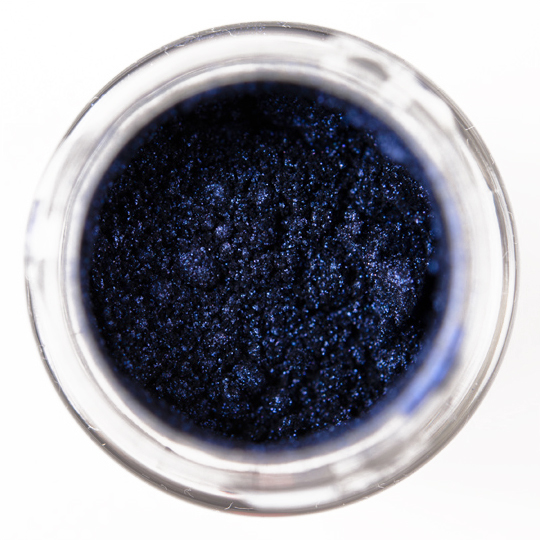
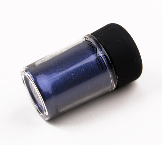
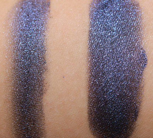
- Blue Storm is a dark navy blue with a purplish tint and silver sparkle. It gets a little darker and more cohesive when used damp as compared to dry. This shade has come out before, and yet I don’t have the original version (I’m at an utter loss as to why). It is similar to Givenchy Lune Mordoree. It’s not as dark as MAC Later.
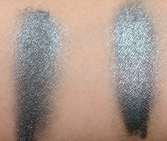
- Emerald Dusk is grayish blue with green-teal shimmer. When dry, it has a dustier look to it with less sheen, while when used damp, a silvery metallic sheen comes to the forefront. The color is similar to Urban Decay Hijack and Bare Escentuals Vapor.
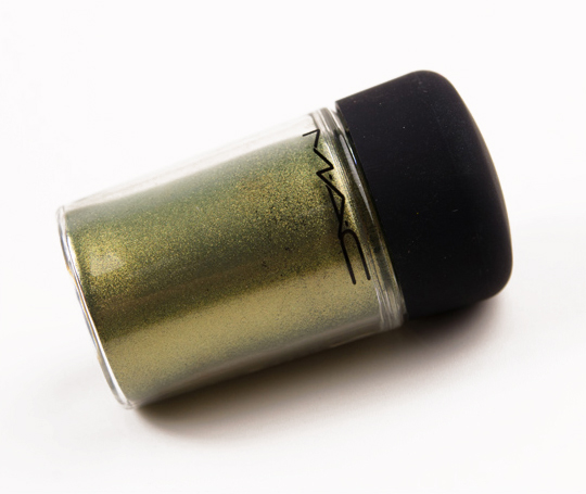
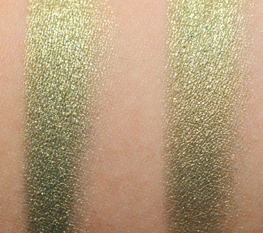
- Golden Olive is a medium grassy green with a hint of olive but mostly golden shimmer and sheen. This (along with Violet) were some of my very first pigments. I looked through the gallery but didn’t feel anything was very similar (and I couldn’t think of anything).
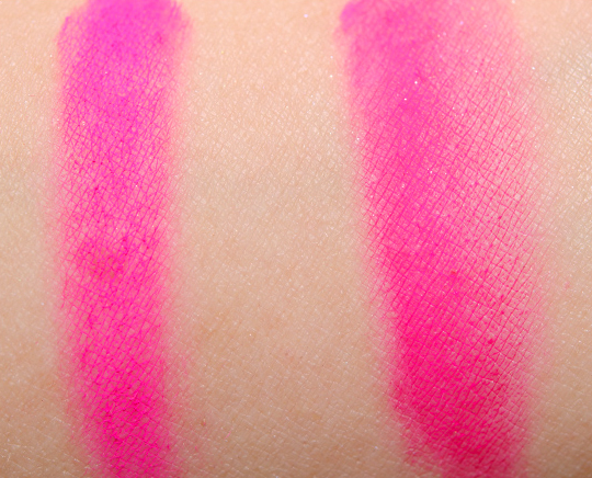
- Magenta Madness is a neon fuchsia pink. It reads more fuchsia than magenta to me, though I wouldn’t debate you on that ’til the death. This shade is not to be used in the eye area per MAC’s safety insert. Inglot #362 is pinker, while Make Up For Ever #75 is closer but darker. MAC’s Neon pigments take a fair amount of work, and I can see why they’re a pro product. It’s better mixed with other base products (e.g. creams, mixing mediums, etc.) than applied straight to the skin. It has a matte finish, so it ends up looking chalky just swatched dry. The texture is silky soft–very finely milled–but it means it can look patchy when applied damp.
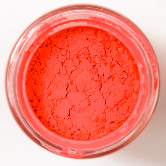
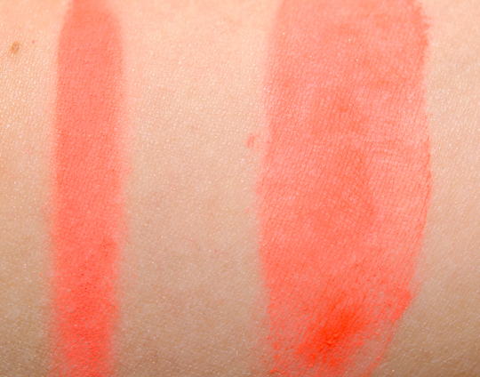
- Neo-Orange is just shy of being a full neon orange. It looks rather dusty and softened when applied dry to the skin. This shade is not to be used in the eye area per MAC’s safety insert. The texture and issues with this shade are the same as Magenta Madness (see above). Make Up For Ever #5 is very close but in an easier format.
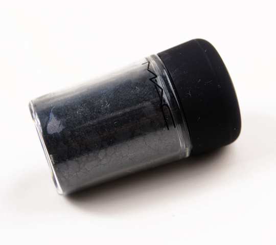
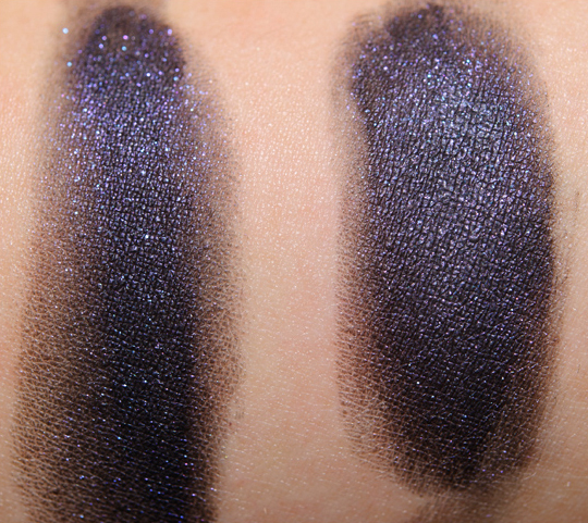
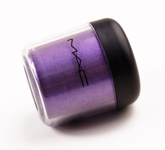
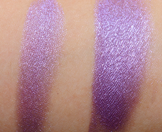
- Starless Night is a violet purple over a blackened-purple base with silver and blue sparkle. It does well applied dry (binds together nicely) but takes on a more cohesive look when used damp. It’s similar to MAC Imaginary, if it were over a black base. It also reminds me of a purpler MAC Later.
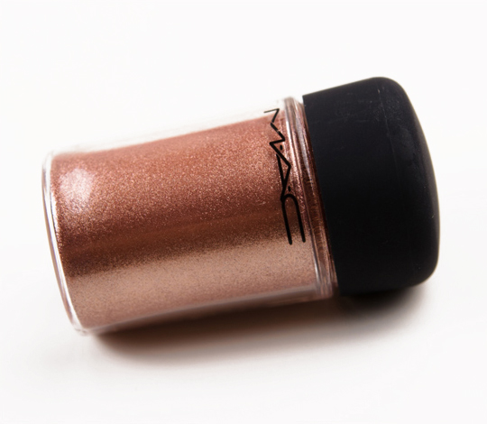
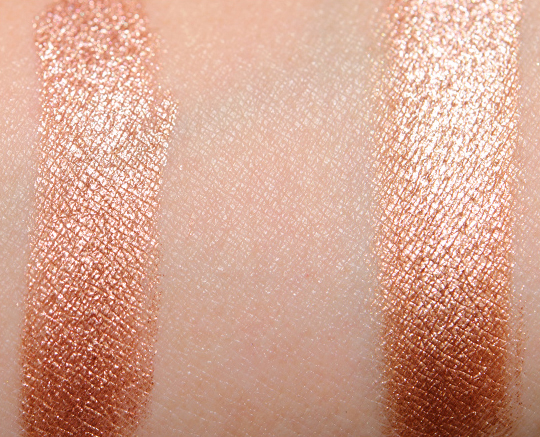
- Tan is a warm, red-toned medium brown with a gilded champagne shimmer-sheen. It looks more metallic when it is used damp. Wet ‘n’ Wild Comfort Zone and Urban Decay Blaze are similar.
- Violet is a softened violet purple with subtle red undertones and a frosted finish. Like Golden Olive, it was one of my first MAC products. Urban Decay Delinquent is darker. Urban Decay Ecstasy is less red-toned. Inglot #441 is more intense.
I have a soft spot for pigments, personally, as they were the product that made me fall in love with makeup. I prefer them with MAC’s Water-Based Mixing Medium (or 1/3 glycerin + 2/3 water for a DIY version) and have often used them as an eyeshadow base. There are only two new shades here and one more that is a repromote (so perhaps new to some); the rest of the shades are available permanently (Magenta Madness and Neo-Orange only at PRO stores, though currently available online to all!).
If you like pigments, the three new/limited edition shades (Blue Storm, Emerald Dusk, and Starless Night) are good and the latter two are reminiscent of the texture and formula of the Alice + Olivia pigments. The two neon shades (Magenta Madness and Neo-Orange) require more patience and likely better mixed with mediums/bases than alone. Pigments are technically multi-purpose products, which means you can use them on eyes, cheeks, lips, hair, nails, body, etc. (though some shades have safety restrictions). If you’re wondering where one might use the two non-eye safe shades, think cheeks or lips!
According to MAC, pigments “[contain] ingredients to help [them] adhere to the skin … easy to blend and long-lasting.” The way I review products is much, much more transparent to you as well as me (I have over fifty different characteristics I look at, though not all apply to each product). Nowadays, I try to be careful to read exactly how a brand describes their product/formula, because then I know what it’s supposed to do and then can review based on that. As much as I may like pigments, and I’m so used to using them with mixing medium, it’s almost mind-boggling to use them over bare skin! I’m also surprised MAC doesn’t mention using these wet/damp or with a mixing medium.
The majority of colors do not apply intensely if you use them dry over bare skin. If you dampen the brush with even water, you’ll get a much better result. I also find that if I just use them damp over bare skin, they tend to fade a little (on me) after eight hours or so with minor creasing. I have no trouble with creasing or fading even after twelve hours if I use mixing medium instead of water. I have no problems with wear (whether dry or damp) if I use it over an eyeshadow primer.
MAC Fall Colour Pigments Swatches, Photos, Reviews
MAC Blue Storm Pigment
MAC Blue Storm Pigment
MAC Emerald Dusk Pigment
MAC Emerald Dusk Pigment
MAC Golden Olive Pigment
MAC Golden Olive Pigment
MAC Magenta Madness Pigment
MAC Magenta Madness Pigment
MAC Neo-Orange Pigment
MAC Neo-Orange Pigment
MAC Starless Night Pigment
MAC Starless Night Pigment
MAC Tan Pigment
MAC Tan Pigment
MAC Violet Pigment
MAC Violet Pigment











I’m a huge pigment fan… I always skip non eyesafe shades, though.
I somehow knew that Starless Night pigment would be a great match for Imaginary PP. Already have Tan and Blue Storm so I must snatch up Starless Night.
hate how mac have reformulated most of their pigments. they used to be intense PIGMENTS, now they’re boring loose powders.
Blue Storm looks magnificent! But the last thing I need is another blue. 🙂
Damn – I was really hoping the Army-Greenish pigment would have been more darker than that (almost camo colored). I’m also not impressed with the payoff on ‘Neo-Orange.’ The rest are gorgeous. I particularly like Tan, Emerald Dusk, Blue Storm and Starless Night. Oh god, that’s almost $100 in just pigments, sadly, with the price, I’ll have to skip and find a cheaper dupe!
Thanks Christine!
When you’ll be able to swatch the lipstick shades?
I can’t wait for them ^_^
The limited edition pigments are on my list. The colour is beautiful, and Golden Olive looks like the eyeshadow counterpart to Chanel’s Peridot.
I love tan, starless night and golden olive . OMGOD but emerald dust is to die for.
i love Starless Night!!
i’m new to pigments. would you just apply them like eyeshadows?
besides the dupes listed, is there any eyeshadows that are similar to this shade? i absolutely love the color
I couldn’t think of any!
You can apply them like eyeshadows!
Great swatches Christine! 😀
i wish Blue Storm was permanent…:(
Thanks for your daily,hard job!
Kisses from Italy! 😀
Golden Olive is gorgeous! I feel like I have seen it before in some WnW palette though for some reason… o_o
Oh, nevermind, I was thinking of the green shade from the WnW Comfort Zone palette. But that color is a little sheer. ._.
when will these be available at pro stores? do you have the lipglasses and MSFs yet?
Do you know if Violet is close to Inglots AMC e/c #73 ? Magenta Madness looks like a must have. =:0)
I don’t think I have it! 🙁
emeral dusk it’s amazing!!!! I hope it will suit my warm undertones!
I bought Magenta Madness earlier this year. The package that I purchased didn’t have an insert advising against use in the eye area. That explains a lot! It’s a frustrating color to work with.
I think they started printing the info on the box itself now!
Blue Storm and Emerald Dusk is gorgeous!!!! I’m now thinking about getting them. Blue Storm would make a great combination with Imaginary paint pot!
Christine, do you happen to have Bell Bottom Blue pigment? If so, how does Blue Storm compare?
I’m trying to narrow my list down so much, but these are all so pretty! I have Later pigment, but Starless Night looks so much better in the dry swatch. I don’t think that I need it, because I usually use them wet anyway. Emerald Dusk has made it’s way on to my list though. I don’t think I have a dupe for that one!
I’m taking it for granted that all the rest are permanent, so I will acquire them over time. My permanent wishlist never gets much attention though, as there’s always so many LE items that I want!
I believe Bell Bottom Blue is lighter and bluer!
Thanks Christine! I’m heading to the store today, and will take some of my stash with me to compare.
I always end up with so many shades that are almost the same, and look the exact same when used in application.
These look gorgeous!
The only colors that I really like are the permanent ones (which I already own). Oh well, money saved.
which colour is the permanant repromote?!
Please read the post FAQ – it is listed very specifically!
This is horrible, I want almost all of them. lol
I remember seeing a similar eye pigment from a different brand that wasn’t safe for the eye. I always wonder what they’re for though… Can anyone share?
Wow! I want them all!! Besides the orange and magenta.. lol
Wow – amazing colours! ♥
Violet and Olive are GORGEOUS
Amazing colors! Thanks for the very intersting posts…as always
OMG I want them all except Magenta Madness, Neon Orange and Tan. 🙂
i NEED starless night & violet!
I’ve never used a pigment before, but these are gorgeous! I WANT!
I have magenta madness, and I was told it was eye and lip safe by the MA. Either way, I didn’t react, so it doesn’t matter too much. Mine also looks a lot more even than yours applied.
Oooh, Emerald Dusk. Gotta get it!
Do you think Starless Night is different enough than Later to warrant owning both? Is one easier to use than the other?
Thanks a bunch! <3
They’re the same in texture to me, and I don’t think you need both.
Starless Night looks amazing, but I feel like I have something similar to it already in the Urban Decay black palette.
Blue Storm also looks similar to UD’s “Goddess” eyeshadow.
I think that I am going to get 2 Blue Storm pigments. I missed this the first time around. I hope that this pigment is as pigmentation as the old blue storm pigment from the zoom lash collection.
Hi there,
in your opinion, is Starless Night pigment comprable to Barry M Dazzle Dust in Petrol Black? Thank you.
I don’t have that, sorry!
I definitely identify with you on pigments… they introducted me to makeup! How do the new style pigments compare to the old ones? Is the texture and formulation the same? I only have older pigments so I’m a bit hesitant on these new ones. What are your thoughts?
These are more of a matte finish – they’re not as frosted.
Can Hyper Violet be used as a liner? Or will it come off too sheer since it’s a paint pot?
Starless night is so pretty!
I want it all!!!! <3
Is Blue Storm pigment similar to Naval Blue Pigment? Is Magenta Madness pigment safe for the eyes?
Less dark, less blue. It’s not.
I just wanted to tell anyone who is considering buying Blue Storm: I just did a side by side swatch of it with Naval Blue and then checked in three different kinds of lighting and mine are IDENTICAL. DO NOT BUY Blue Storm if you have Naval Blue. I will be returning mine immediately.