7 Ways to Create Your Own Fall Palettes
Last week, I posted part one and part two of different color combinations for some fall-look inspiration.
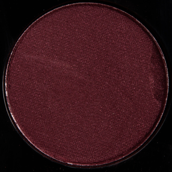
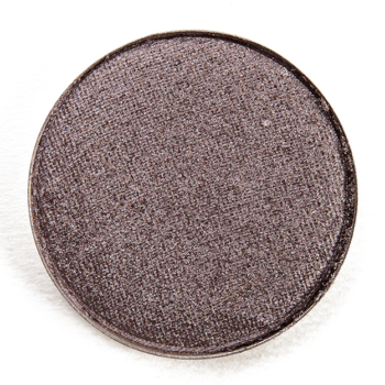
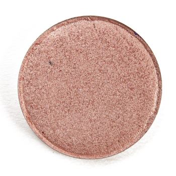
In the spirit of all things autumn and eyeshadow palettes, I wanted to share some custom palette ideas for the season — it’s definitely more challenging (and pushes me creatively) when it it’s about creating a much larger, cohesive color story. I don’t know if there’s every a time where I’ll be over greens and muted neutrals. Here are seven color stories I’d have loved to have seen released! I ended up doing digital mockups through Photoshop first, and then going through and finding real shades that fit what I was envisioning.
Remember — the purpose here is inspire you to pull out some of the shades you already own. There’s absolutely NO WAY! I would ever recommend or expect that one goes out and purchases all these single eyeshadows. ?
About This Series
Each look idea is centered around a “quad” of four shades with the expectation that one might bring in the appropriate brow bone or additional transitional shade based on skin tone. I know that I tend to use more like five or six shades in a typical look, but I think that four is a happy medium to give a good idea of the “core” color scheme of a look while giving you the ability to lighten/darken as desired. I have listed the colors in this order: inner lid, middle of lid, outer lid/crease, and crease/above crease.
You might see combinations that seem slightly repeated but placement will vary (e.g. a halo placement where the lightest and more shimmery shade is placed on the center) as placement can also create a different effect/look! You might also want to consider incorporating your favorite matte/shimmer shades (as applicable) to increase the versatility of certain palettes. Consider these ideas a jumping off point!


I’ve been playing with the idea of putting together my own take on a smokey, moody autumn e/s palette, but am daunted at both the idea of ordering from several different brands, plus the cost will likely be prohibitive. First two I’ll order from will be Sydney Grace and Clionadh. After them, Give Me Glow and JD Glow. Perhaps Give Me Glow and SG instead? I’m just not sure. But it will contain olive greens, olive browns, pale gold, plum, taupes, mauve, greigey pewter.
What I would do is kind of think about what shades “pop” the most to you – what do you feel are the most central shades to creating the vibe you’re after, and then what shades do you feel like you don’t have at all to get there – then those would be the ones I’d think about first. JD Glow, Give Me Glow and SG are most readily accessible; Clionadh is actually going to close on Friday for a month (to move to a bigger location, catch up on orders). For mattes, I’d go SG myself, but shimmers are lovely from all three.
These are beautiful, intriguing, and compelling color stories. I always love seeing what combinations you create because they both both bust the usual trends while still being very approachable.
Thank you, Kimberly!
Buffy, Herky Bird, Levy, Fairy Acid, Troops, Thunderbird, Sol are a few that really jump out at me. I know that SG also has a few great khaki/olive mattes to ground the shimmery olives, or so I think I remember.
SG is definitely the easy rec to go if you are looking for greens!
These are all beautiful! Under the Stars is my favorite. I enjoy that seasons can have many interpretations, not just one standard – i.e, autumn ain’t just about the pumpkin colors. My version (cool-toned) has many dusty rose/pink colors, mauves, and soft grays and browns.
I totally agree, Lauren!
These are really beautiful Christine and thank you so much for putting this collection together. They provide so much inspiration for me to get out different palettes and try shades that I wouldn’t normally use as the pop of colour or on the lower lid. A lot of the shades above that I do like, I already own their dupes.
So glad to help, Genevieve!
I bookmarked this page. I’ve depotted several of my palettes and so I have singles I can easily rearrange and work with some of these color stories for a while. The “Verdant Forest” actually made me teary-eyed a bit bc of the wildfires. Thanks for giving me that idea!
The wildfires are so brutal 🙁
I agree with what Kimberly said -beautiful and intriguing color combos here! Sometimes I do get compliments on my eye looks being creative but I definitely don’t have your skill at matching putting colors together. I’m also grateful this post reminded me of how great UD Thunderbird is -I may wear that today!