Sydney Grace x Temptalia: The Origin Story


Readers have always been incredibly supportive and encouraging, routinely suggesting I should collaborate with various brands, and while there have been a few opportunities over the last decade, they haven’t felt right or been aligned for me. For the last couple of years, though, I’ve felt a much stronger desire to create something, which might be obvious as I’ve shared several various dream palettes.
I have an ongoing love affair with eyeshadow (it was what made me fall in love with makeup), and any brand I worked with would have to be able to do great eyeshadow–I would have to feel confident that the quality of anything we worked on would be high. After a conversation in the Temptalia Discord in late 2019, I had that last push I needed to try and make my dream of creating palettes a reality!
Sydney Grace was a brand that immediately came to mind as a potential partner as they have fantastic eyeshadow formulas, and as importantly as having a good formula is that their formulas were also consistent and reliable. I asked Sydney Grace if they’d be interested in collaborating with Temptalia on a collection in November 2019, and they were! We started to discussing what a collaboration would look like in January of last year, which is when I had the audacity to pitch three eyeshadow palettes. 😁
For information on availability, pricing, list of shades, etc., please check out the official launch post here. I’ll be sharing lots of content between now and the launch date (June 18th), including a breakdown of each shade, the meaning behind the names, the development process with respect to each shade, along with comparison swatches and pulling dupes (from the larger database, as I do for anything I review), and sharing looks. There’ll still be reviews and regular content going up for those totally uninterested in the collaboration.
How did I first discover Sydney Grace?
Temptalia readers raved regularly about their eyeshadows in comments on the blog! I keep an eye for regular mentions of new-to-me brands from regular readers, which is often how I find and add a new brand to the review roster! I ended up purchasing 70 of their single eyeshadows in September 2018. I didn’t get around to actually photographing and swatching until November 24th, 2018, which was part of Small Business Saturday. The first product I tested and reviewed was the Autumn’s Reign palette (which I also purchased) — and I was thoroughly impressed.
As I tested more of the shades from my initial purchase, I continued to be as impressed and reached out to the brand to inquire about getting product samples sent for the remaining eyeshadow singles in their range (they have a ton). (Whenever I consider reviewing a smaller, more “indie” brand, I prefer to purchase initially before establishing any professional relationship.)
Why three palettes?
I just felt I had three strong directions I wanted to explore, and I found it impossible to commit to a single one. Part of this is the result of loving both color as well as neutrals and knowing that there are readers who tend to only wear more “wearable” kind of shades and others who are totally exhausted by neutral palette releases. I didn’t want to do anything halfway, though! I didn’t want half neutrals and then pops of color either. The themes I wanted to explore were:
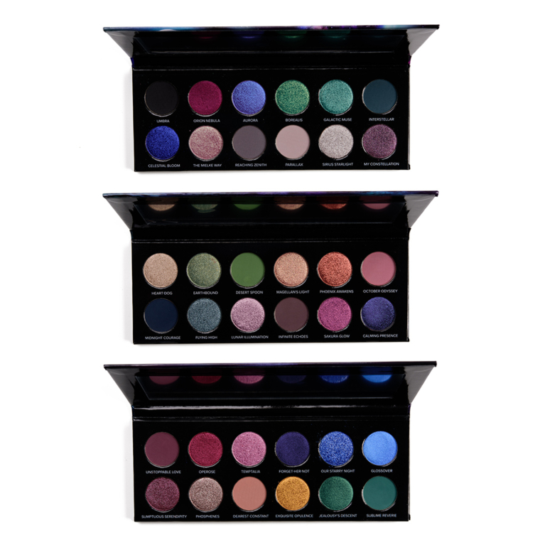
Space because space is awesome… and there’s just something about it that inspires colors, textures, and names. I envisioned the theme being cooler-toned with more teal/purple with a pop of red and plum.
Grungy/earthy neutrals because we see so many orange- and red-toned, warmer neutral eyeshadow palettes. I envisioned dirtier, more desaturated, and slightly darker neutrals that were less focused on brown but leaned into neutral-adjacent tones like taupe, green, and plum.
Jewel-tones because I have always, always loved jewel-toned eyeshadows. They have so much depth and vibrancy without being neon. I find that jewel-toned colors are often more “wearable,” and I envisioned this as being rainbow-like in composition but not neon–just rich in rainbow hues with depth and dimension.
What was my approach to the color stories?
It’s consistent with how I approach color stories I’ve shared on the blog, whether as four-shade color stories or dream palettes: bring your own browbone & transition shades. First, these are often dependent on skin tone, so a matte, light beige might be great on lighter skin tones but totally unusable by deeper skin tones. This is true with transition shades, too, to some degree, so I focused on more mid-depth and deeper matte eyeshadows.
Second, the target audience includes Temptalia readers and beauty enthusiasts throughout the community but you kind of have to be in the know, which means you likely have a few favorite palettes (or curated palettes of single eyeshadows) that you already love and use regularly. I don’t want to give you something chaotic; I want there to be a method to the madness that may inspire and push one into an unusual direction but visually comes together.
When I initially mocked up palettes, I did them quickly and wasn’t as concerned with the placement of the shades–I certainly didn’t agonize over the placement at that point–as it was more about establishing the theme, the vibe, and kind of colors/textures I was after. For the final placements within each palette, I absolutely agonized. I have a dozen different digital arrangements for each palette, and once I had pressed versions to play with, I rearranged multiple times and applied them swatched in a row until my swatching arm literally bled. (Don’t do that! Too far!)
I wanted each row to make sense, but I also knew that you’d likely see it swatched somewhere in one long row of 12, so that had to not be visually jarring either–the arrangements I had settled on mid-way through I felt confident about until I swatched in one long row and did not like the outcomes. I looked at quads, trios, duos, and sextets, too. I placed the mattes strategically as anchors in an L shape with two mattes per row or two mattes for each half the palette (primary sextet).
What was the process like?
Heather, who owns Sydney Grace and has been the person I’ve worked with throughout the process and is the one doing the translating of my words and pictures into real product. Initially, I provided digital mockups of each palette (which included 10 shades), and then I indicated what formula (matte or shimmer) it should be in along with a verbal description of color, undertone, and finish. I also provided links to swatches of shades that I felt were “in the ballpark,” and if Sydney Grace had something, I’d reference that and describe the directions to make it different.
I received the first color samples in late March, and you know I ripped open that box and went to town swatching. There was a lot of ooh-ing and ahh-ing because I went shimmer-heavy on all three of my original mockups, so it was like a kid in a candy store of pretty, sparkling eyeshadows. I was really impressed by how close I felt Heather was to so many shades–like a lot of shades were 90%+ close. There was a sense of relief that she got it, we were in sync, and wow, maybe this will actually work out. All of the eyeshadows started their lives as loose samples, which is more efficient when it comes to creating shades initially.
I probably provided an excessive amount of feedback, but I set up spreadsheets to keep track of the shade, what version we were on, whether it was ready to go or how it needed to be changed. I had knee-jerk feedback from initial swatches, which I wrote out as I went through the color samples, but then I applied and worked with the shades into actual looks to get a better idea of how everything would come together and whether anything was missing (a LOT! was missing). I added my thoughts and how a shade needed to change to the spreadsheet, and I provided any top-level, more generally-applicable feedback when I sent the spreadsheets over.
Around this point, it was necessary to add more matte eyeshadows to the palettes to make them more cohesive, but I couldn’t forego any shimmers (no, seriously, it was like parting with one’s children), which is how each palette went to 12 shades. The plan was now for four mattes and eight shimmers per palette.
I received the second set of color samples in late May 2020, and more shades started to come together close enough to be considered ready for pressing. I repeated the same process as I did with the first set: initial playing and swatching of shades, comparing the different versions, and then testing them out together in combination.
There’s actually not a whole lot that I do in-between receiving color samples. I’d pull out the compositions and go over them every other month or so as part of a revisiting process. If I put together any dream palettes and shared on the blog, I’d go through and consider feedback from readers–what resonated, what didn’t–and see if I was incorporating those concepts into what I was actually working on, too! When Sydney Grace said they’d let me keep working on a color until I was 100% happy with it, I took them SERIOUSLY!
The third set of color samples came in mid-October 2020, and it was the first time seeing the shades pressed (which can change finish, texture, and payoff!). It was at this point that I had to finalize shade names and placements so that they were ready to be printed on packaging (and once it’s printed, there’s no take-backs, though I could obviously move COLORS around if I didn’t mind the names getting switched).
The fourth set of color samples came in early January 2021–12 shades–and eight were approved. The fifth set of color samples came in in late January 2021–four shades–and three were approved. The sixth round came in mid-February 2021 with another 12 shades but only four were approved. The seventh round arrived late February 2021 with 10 shades and three that were approved for production.
In early March 2021, the eighth round of color samples came in–18 shades–and I approved another six of them. By mid-March, we decided to offer a light and deep version of each palette with two of the matte eyeshadows having a light and deep version, which added six more shades into development. Five of the shades I had originally incorporated are the Deep versions, with one becoming the Light version (Infinite Echoes); so we developed five new, light versions and one, new deep version. Infinite Echoes (Light) was an original vision shade, but we developed a deeper, richer shade with a bit more warmth in response to feedback after it was tested on darker skin.
The ninth round of color samples arrived late March 2021–another 18 shades to test–and six more were approved. It was at this point that we started to send finalized (on my end) shades to someone with darker skin for testing before those shades could go into production. Based on their feedback, we revised one shade to be richer and deeper overall (Infinite Echoes (Deep)).
The tenth round of color samples arrived late April 2021–12 shades to go through–and 10 (!!) were approved with additional shades to be sent off for testing on darker skin before going into production. While the feedback on the shades included in the Deep versions determined how we moved forward, I also had all the Light versions sent for general feedback on how well (or poorly) they did on darker skin as a reference point. The last two shades in progress were certainly close–one to go back to a prior version and amplify the finish and the other required continued adjustments to the texture/press.
The last round of color samples came in during mid-May 2021 and included four options for the last color to be approved. I shared some of the deliberation process with readers on Instagram, and ultimately made my final selection based on what I felt worked best with the palette itself.
For clarity, not every round of color samples included new samples for every single shade in progress (like the fourth, fifth, and sixth rounds were by palette). I thought it’d be fun to share some of the shades that came together more quickly and which ones were tweaked (seemingly) endlessly:
- Least iterations: Heart-dog, Infinite Echoes (Light), Celestial Bloom, Galactic Muse, Orion Nebula, Dearest Constant, Forget-Her-Not, Jealousy’s Descent
- Most iterations: Magellan’s Light, Umbra, Unstoppable Love (Deep), Flying High, Midnight Courage, Temptalia, and My Constellation.
The packaging arrived at Sydney Grace’s HQ in mid-May 2021, which meant that they could start to fill the palettes. Once they spent a few days filling them, they were able to have a better idea of how long they needed to fill the initial amount for sale and we were able to set a date. Thankfully, the process of pressing the individual eyeshadows had been on-going, so they had the majority of the shades pressed and ready to be put into its corresponding palette, which helped the timeline!
What inspired the names?
I had a lot of the shade names done late March 2020, and when it came time to finalize (in October 2020), I revisited and changed a few. My approach was to have names that were personal but wanted most to flow and seem more “generic” as I didn’t want the names to read like one, long inside joke. A few names came about because they suited the palette’s theme and/or were cool words as I’ve always loved interesting and unusual words (it’s a thing). I also had to make sure that they weren’t all an ode to Mellan 😏
How did the artwork get created?
From the beginning, the idea was to do create three individual compositions that formed one, larger composition (if you had all three), which is also known as a triptych–this idea really is credited to my husband! Naturally, we envisioned a galaxy scene at the top (for Quintessence) that comes down to a horizon line (for On the Horizon) and originally, we were thinking to do a reflection of the horizon scene with a bit of galaxy influence for the final scene (Radiant Reflection).
One of the harder parts about the collaboration process was syncing up with an artist on the artwork, and knowing that there was a particularly strong vision for the end result, I ended up roping my husband into doing the artwork at the 11th hour. My husband worked on the first two panels on his own, and then we worked side-by-side for a couple of days to really compose the second and third panels. He’d hand off the file to me for minor tweaks (like adjusting colors), and then for larger tweaks, he’d get the file again.
We originally aspired to incorporate a cherry blossom tree in the On the Horizon artwork, but we couldn’t manage to find the right balance between real and artsy that still worked with the rest of the palettes, which is how we ended up going for a mega moon instead (a silhouette of Mellan was always going to be a thing!).
For Radiant Reflection, my husband felt like a reflection wasn’t good enough as a standalone image, and he suggested going underwater instead. It ended up coming together well, as it continued on with the more surreal look and feel while yielding a better standalone piece of art for Radiant Reflection.
As we made minor tweaks, we added the canis major constellation to Quintessence (which includes the star, Sirius, and there’s a shade called Sirius Starlight in the palette) and a “hidden” dog at the base of the waterfall flowing over the mirror in Radiant Reflection. From afar, the dog may look like more water, but if you look closely, there he is, sitting patiently! I’m really happy with the outcome, but it is totally my vibe–moody, surreal, and my favorite colors–so that was a given. I just hope that it appeals to some and is tolerable for the rest 😜
Ohhhh…I love all the thoughts and notes behind what you created and love that you created the art with your husband. Thank you for sharing the behind-the-scenes with us.
Thanks a lot, Sandy! 😀
Beautiful 🥰 Congratulations Christine and Sydney Grace.
Thanks, Carla!
This will be epic. I truly believe these will be better than Pat, and far more affordable. Earthy/grungy is my pick, despite absolutely no need for more e/s.
High praise!
Congratulations on this. I cannot wait to try one!
Thanks, Lisa!
I’m so unbelievably excited for these palettes. Finally, the queen of eyeshadow herself has a collab befitting her status! 😀 Seriously I’ve been following for so long, it’s such a good pairing between influencer and brand. Congratulations on such a beautifully designed release. <3
Thank you, Karen! 😀
They are the most beautiful eyeshadow palettes I’ve ever seen. These colors really speak to me and I can’t wait to get and start using all 3!!! I am impressed by the meticulous and thorough process of creating these, but that is just what I would have expected from a Temptalia collab! Congratulations on the launch!!! I’m beyond excited.
I’m so glad to hear it, Adrienne! I’ve been so nervous! Thank you 🙂
I couldn’t have said this better myself! These are just simply STUNNING!! I am just so completely blown away by the colors and how they are laid out. I normally struggle with coming up with placement ideas and that is not the case with these. I see Christine’s ideas arranged in trios or quads. There is no guess work on my part. I has been laid out beautifully! I am just so impressed. This is going to be fantastic!
Thank you so much for this look behind the process. I going to get them all!
My pleasure, Jess! Thank you!
I have never been more excited about a collaboration! I loved hearing the backstory. I can’t wait to add this amazing collection to my almost 200 shades of SG shadows and pigments. Congratulations!
Wow! You are quite the SG collector, lol! Stay tuned for the comps 😉
Excellent job! You’re always so thorough and creative. I knew you’d create a fantastic collection. They look beautiful. Can’t wait to get the collection! Congratulations Christine!!
Thank you so much, Denise! 🙂
I wish all collabs came with this much explanation, thank you so much for sharing it all! The palettes look beautiful and while I may not be able to afford all three I will definitely be able to narrow it down to one…definitely be able to narrow it down…I’m positive I’ll be able to pick just one…
Really think it’s so interesting to hear about the process – even if it has to be at a high-level! I love hearing about why someone chose a shade color, not just a name.
So much blood (literally), sweat and I’m sure some tears, considering the timing, went into the creation of these palettes. I’m floored by that, to be perfectly honest! So much deep meaning in the names, themes and especially the artwork. It is a work of pure devotion to quality and love for your many readers. 💜
Aww, thank you so much, Nancy!!
The shades look amazing and I’m looking forward to trying them myself in a few weeks. Thank you for taking us through your process of putting together a palette
My pleasure, Renee! Thank you for reading 🙂
This was a really interesting read. Thank you for sharing. It sounds like you literally put blood, sweat, and tears into these palettes. They sound incredible.
Thank you so much, Rachel!
Soooooooo beautiful! This is so exciting!
Ah, that was my first reaction to the pictures only, and now that I have read your blog post here, I feel like you are giving a beautiful, personal gift of yourself to your loyal readers and the world. It’s very touching. I only wish I’d come upon this site sooner! And now I need all three palettes!
Thank you so much, Jo!
Thanks, Jo!
Uh oh. I want all of them! These are really great! Love all the care and work you put into this collab it really shows in the end product. Congrats!
Aw, thank you, Disco Cats 😀
As a long time reader of your blog Christine, I’m over the moon for you! I look forward to getting your emails every day and I would definitely look forward to these palettes ❤️
Thank you so much, Maria <3
Great job! I can’t wait to see it.
Thanks, Jeannine!
They look awesome Christine. I love that you went for it with rich colors, and yet they are still approachable. It’s very you.
I definitely feel like looking at the three is… me!
Oh, Christine. These are GORGEOUS. Love hearing the thoughts behind it. Plus, the devotion to Mellan…love it. Plus, it comes out on my birthday, so excited for that. So beautiful.
Happy early birthday, Tara!
Thank you!
I loved reading about the development of this exciting collaboration! Kudos to you for pitching Sydney Grace! That’s the kind of chutzpah I need in my life–could you maybe bottle some of that and add it to the three-palette bundle I hope to get into my hot little hands soon????? Seriously, congratulations–I’ve been a lurker on your site for ages and am really so appreciative of all the work you’ve done here. Thank you and CANNOT WAIT TO BUY THESE PALETTES!!!!! (I’ll totally wait, but you know what I mean.)
ALSO have to mention that there are a bunch of “spacey synchronicities” around me this year, from your collaboration with SG, to a nail polish/nail art YouTuber I’ve gotten into (Kelli Marissa, who’s done some collabs around space and galaxy themes), down to a “Moons and Stars” planner I’ve bought for 2021-22–I kind of like to think that makes the vibe for 2021 a “reach for the stars” thing. 🙂
Yes, let us treat 2021 as a Reach for the Stars moment!! Sometimes, the way I look at asking/pitching is – if done respectfully, there’s rarely harm in asking, so shoot your shot as they say 🙂
Thank you so much, Mina!
These look amazing Christine and thank you for sharing how they came about and the processes involved. I cannot wait to see them in detail and I am sure they are going to be spectacular.
Congratulations Christine!
Thanks so much, Genevieve! You are too sweet!
Wow, what a lot of work has gone into this collaboration and l liked hearings the detail. I am very excited for you.
Thank you, Marla!
I am so happy for you Christine and of for the rest of us to be able to enjoy your amazing work!
Thanks a lot, Brenda <3
not gonna lie, I am not an eyeshadow person, I don’t know how to use it but I am definitely buying one of your palettes. you have my utmost respect christine.
Aww! Thank you, Bridget. You can always support just by engaging in the content like you’ve done here – don’t buy any if you aren’t going to use it! <3
Congratulations Christine! I’m looking forward to trying these. I think it’s probably the most well thought out palettes ever, and how awesome that your husband helped create the artwork!
Thoroughly enjoyed reading this background post, I’ve always been curious about the product creation process. Bravo!
Thank you so much, Susan! 🙂
I’m so excited for this and the palettes are all stunning! Congratulations on a very well deserved collab!
Thank you, Brooke <3
This was super fascinating to read, especially since I’ve been photoshopping together my own palette concepts! I’d love to read more about how each shade was tweaked and adjusted over time in future posts!
Done and done!
Lmao whoops I hadn’t seen the more recent posts yet! Also I forgot to say, I hope your arm is doing better now!
Definitely better 😀
I love the behind-the-scenes look into this process. I can tell this was a true labor of love that reflects your love of makeup and your meticulous, detail-oriented nature. As a Type-A person, this post really makes my internal organizational geek very happy, lol.
I wish more people would share the development process or what shades were harder to get to! I find it fascinating myself, so I am glad others enjoyed it!
What an interesting read!
Thank you so much for sharing the background story of this col-lab. It’s so interesting to follow an artistic process.
You and your husband are amazing. I love the colour stories and I absolutely love the artwork, I still want it as a poster, not a huge one, just the same as the three palettes put together.
I will buy all three, and the single as well. I would love if the shades that are made in a deep and a lighter version also come as singles. I will get the light palettes but think some of the deep shades would be a great complement.
Anyway, thanks again for sharing this story!
Thank you so much, Helene! 🙂
I love the color stories. I am very proud of you! I just wish there were some transition and crease colors.
Thank you!