Sydney Grace x Temptalia: Light vs. Deep Versions + Visualizing & Comparing All the Shades
One of the questions I’ve been asked the most is whether someone should get the Light or Deep version of a palette, so I thought I’d discuss the differences and hopefully provide some insight/ask the right questions to help you dial in whether the light or deep version is more suitable for you, assuming you’re looking to purchase one.
As always, if none of the palettes would be something you wear, please do not buy to “support” me. Engaging with the content I post, reading Temptalia in general, and sharing content (whether about my palettes or something else) are money-free ways to support. I’ve also provided comparisons to existing Sydney Grace eyeshadows and pulled dupes for every single shade, so you can compare against products you already own (through the Vanity feature).
Here are some posts that might be useful, prior to reading through this one!
- Quintessence | Everything You Want to Know (and More)
- On the Horizon | Everything You Want to Know (and More)
- Radiant Reflection | Everything You Want to Know (and More)
- Behind-the-Scenes of the Collection (“Origin Story”)
- Official Launch Information
Here is a preliminary list of questions you should ask yourself when debating between the Light and Deep versions:
Will you mostly use the palette on its own or are you willing to pull in shades that you may need for your specific skin tone?
The more you lean into using one palette and one palette only, the more you should select the palette that has shades that work for your skin tone and would provide the closest crease/transition kind of shades you’d want. This likely means Light palette for very light to medium skin tones and Deep for medium-dark and darker skin tones.
For lighter skin tones, do you prefer less-intense, lighter looks?
The Deep versions are darker, richer, and more intense–deliberately so that they work on deep complexions, and while lighter skin tones can absolutely wear them, it may feel like only smokier/darker looks can be achieved. This is easily solved by incorporating your favorite go-to crease/transition shades or pairing with another palette you have, but not everyone wants to do that.
Do you have dupes of the lighter / deeper shades respectively?
If you would use all the light and deep shades, what offers something new(ish) compared to what you already own? If it is a dupe, is it a shade you’d use often or prefer in this formula/finish?
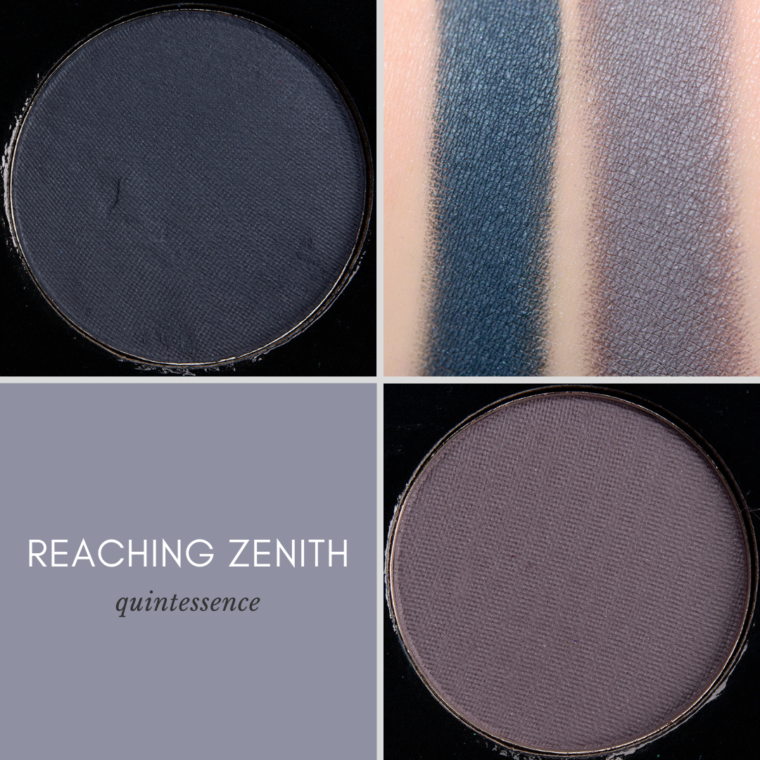
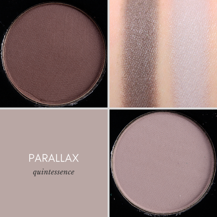
Should I get the Light or Deep version of Quintessence?
Let’s do a little discussion of the shades!
Parallax (Light) is the lightest shade from the entire range of shades developed for the collaboration. Generally, those with darker skin tones will find this shade less usable (potentially not usable at all). Parallax (Deep) works on dark skin and works well on lighter skin tones as well.
Reaching Zenith (Light) is cool-toned enough that it can be a little ashy on darker skin tones but is more workable. Reaching Zenith (Deep) works well on different skin tone depths but has more contrast between it and Interstellar on darker skin tones than lighter ones.
- Parallax (Deep) is the “most dupable” of the four.
The Light Palette is most suitable for someone who has a very light to medium skin tone, likes more lavender/taupe shades, and finds there is enough depth/smokiness already from the inclusion of Umbra (matte black) and Interstellar (matte teal). With the Light version, you mix Interstellar and Reaching Zenith (Light) together to get something similar (but slightly greener) to Reaching Zenith (Deep).
The Deep Palette is most suitable for medium-dark and darker skin tones, anyone who uses less light-toned mattes or prefers less lavender-based taupes, or someone who is lighter in skin tone but will pair with their go-to neutrals/transitions.
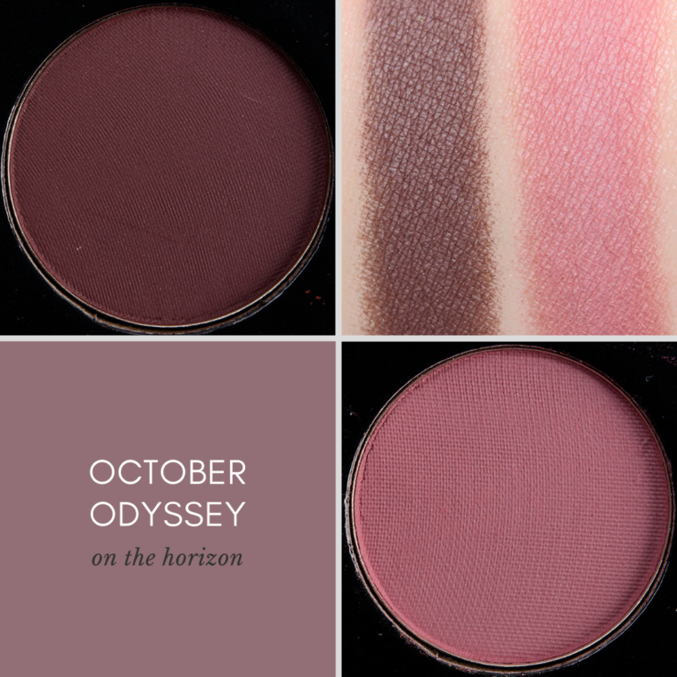
Should I get the Light or Deep version of On the Horizon?
The Light versions are both significantly lighter than the Deep versions.
October Odyssey (Light) is more of a mid-tone pink compared to October Odyssey (Deep), which is darker, more of a plum-tinged brown. However, both shades work on light and dark skin tones but would likely function differently as the Light version would be more of a transition/blending shade on darker skin tones.
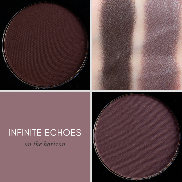
Infinite Echoes (Light) is cooler-toned and lighter, not as deep as Midnight Courage, so it is more of a mid-tone in the color story; it is also cool-toned enough that it can be a little gray/ashy on darker skin tones (workable but not ideal). Infinite Echoes (Deep) is one of the deepest shades in the entire collection of hues with enough warmth to read well on deeper skin tones. The contrast between Infinite Echoes (Deep) and October Odyssey (Deep) is more noticeable on darker skin tones than it is on lighter skin tones.
- October Odyssey (Deep) is the “most dupable” of the four.
The Light Palette is ideal for someone who want to create really smoky, neutral looks, finds Infinite Echoes (Deep) (matte deep brown) to be intimidating or feels like they’d have to use such a light hand, and often uses mid-tone pinks in their looks.
The Deep Palette is ideal for someone who wants darker, deeper matte shades and doesn’t need light and mid-tone mattes (or will pull their go-tos to pair with the palette). For those with darker skin and who don’t find they typically like cool-toned taupes, Infinite Echoes (Deep) will give you more satisfaction.
Should I get the Light or Deep version of Radiant Reflection?
Of the three palettes, Radiant Reflection was the one designed specifically to pair with the palettes you already own. The other two palettes were developed to standalone more, though I always envisioned them adding to what people have and working with the slew of neutral palettes already in existence… because if you’re a Temptalia reader, I feel like it’s safe to say you have at least a few palettes (or plenty of singles).
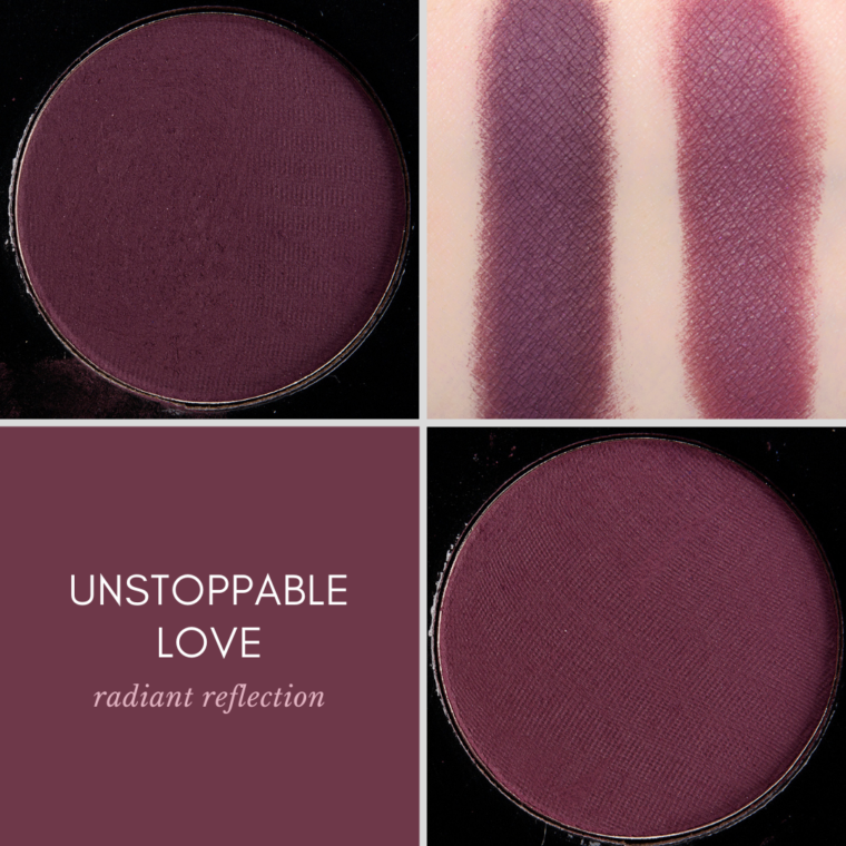
The difference between Unstoppable Love (Deep) and Unstoppable Love (Light) is the smallest of all the Deep/Light relationships, though the differences translate more on certain skin tones; the Deep version is darker, more saturated, and a little cooler-toned. The richness of the Deep version helps it retain more saturation on deeper skin tones. Both versions work on lighter and darker skin tones, so it would definitely be a preference for depth and tone.
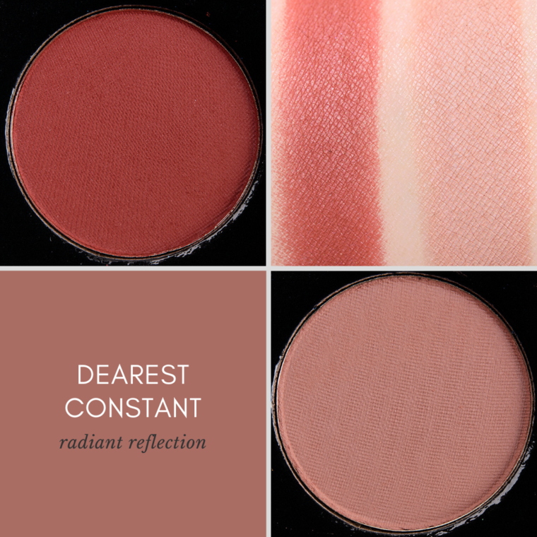
Now, the difference between Dearest Constant (Deep) and Dearest Constant (Light) is much more significant. They are intended to function more as transition and blending shade for their respective skin tones in a sea of brighter, more colorful hues. Deep skin tones may be able to use the Light version as a blending shade with a lighter hand but it is not an ideal color.
- Dearest Constant (Deep) is the “most dupable” of the four.
The Light Palette is for the person who really needs the lightness that Dearest Constant (Light) gives to the overall color story; this is really the most differentiating feature between the two versions. Unstoppable Love (Light) is less intense than the Deep version, but they function similarly, but if you’re someone who likes less saturation, then the Light version may pull you in a little more.
The Deep Palette is my preferred pick for most people (except as noted in the above paragraph) as I think that the copper coloring of Dearest Constant (Deep) really works to create a true vivid rainbow of hues.
Should I purchase the set? Are there repeats?
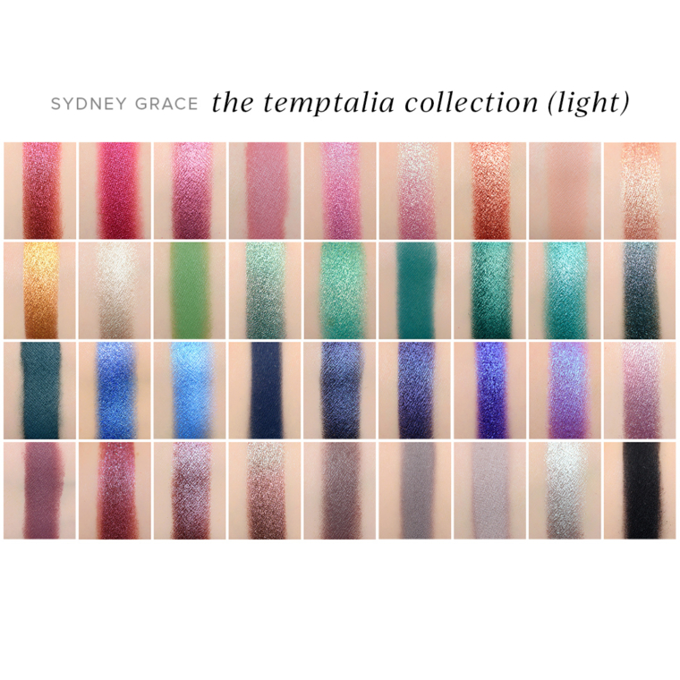
There are no repeats between the three palettes, including if you mix and match (by getting a Light version of one palette, Deep version of another, etc.). Throughout the process, I compared and contrasted shades from the three palettes to ensure there wasn’t overlap. You can see the next two images for a visualization of what it would look like to own all 36 shades from the Deep trio or all 36 shades from the Light trio in rainbow-order.
I wanted all three palettes to work together as a mega-collection! But let’s breakdown some of shades within certain color families:

Reds: Orion Nebula has a lower sheen and is more of a raspberry red, so cooler and pinker, whereas Operose is warmer with more of an orange/copper base and a more intense shimmer finish.

Metals: These aren’t really similar, but I felt like Heart-dog/Sirius Starlight merited a comparison – so I also threw in Phosphenes. Phosphenes is the darkest of the three and much browner in comparison to the other two. Heart-dog is warmer with a smoother sheen and is yellow/goldish. Sirius Starlight is almost a grayish-lavender/lavender-taupe with a little bit of beige to it and is the most sparkling of the three.

Greens: Earthbound is darker, cooler-toned, and much, much more muted compared to Borealis, which is significantly brighter with a stronger, golden sheen.

Teals (Mattes): Interstellar is darker, grayer, and more blue-based than Sublime Reverie, which is brighter, more of a mid-to-dark teal with subtle green. Midnight Courage is darker than both and significantly more blue-based.

Teals (Shimmers): Galactic Muse is significantly lighter and is a blue-based teal compared to Jealousy’s Descent, which is much, much darker and is green-based (more of an emerald green than a teal).

Plums: My Constellation is cooler-toned, brighter, and more reflective–more like an eggplant, purpler–than Sumptuous Serendipity, which is much warmer, darker, and redder overall. Sakura Glow is significantly pinker, perhaps a little more like a muted berry than a plum, though I think it’s a truer plum than most on the markets (which tend to be warmer).

Purples: Calming Presence is darker and bluer with a stronger sheen compared to Forget-Her-Not, which is lighter and more violet with a satin-like sheen. These two are the closest shades between the set of 36, and I went with that because I still felt they differed enough and were the kind of colors that are hard to find (so I wanted to put them out there!). Celestial Bloom has some bluish-violet flecks, but it doesn’t have the kind of shift as Aurora, which is much, much lighter and has a pinker base in comparison to Celestial Bloom.
That being said, if you rarely wear some shades, like say green, teal, or blue-based purple, having so many may feel like there’s overlap! I can see the nuances and differences in depth, undertone, and finish, but if you never wear teal, then having too many shades you won’t use often enough won’t make sense.
There are certain color families, like bluer purples, cooler greens, teals, and so on that I think are underrepresented in the plethora of eyeshadow, and they are the kind of shades I love and have found tend to draw readers in (through various color stories, singles reviewed, etc.), but there’s probably a reason why we don’t see them over and over again (not everyone likes ’em!).
And please don’t buy all the Light and all the Deep versions! The expectation is that most people will purchase one of the three palettes, and we provided Light and Deep versions to address the needs of different skin tones but not to encourage purchase of a set of both. For those who buy a set of three, I wanted to ensure that they did work in concert together and have them come together with the triptych artwork as a bonus treat.




This was very helpful. I was undecided if these colors were similar to what I have but remarkably not! Once you break it out by depth and tone, they are each unique. The shades that immediately spoke to me were Aurora and Celestial Bloom. Now Forget me Not is very unique to what I don’t have. I still have a few more days to decide but I gotta get something from you, the queen of comparisons! If you say there are no dupes within each shade within this collection then I believe it. Congratulations and I really love the art work. I didn’t get the Natasha Denona Circo Loco so I have this perfect opportunity now. Thank you.
Thank you so much, Nan! I am glad this helped you figure it out.
Thank you SO much for this breakdown of light and deep. I have been on the fence about which way to go, and this helped tremendously. I cannot WAIT to get my hands on these!
What direction are you going in, Jess? 🙂
I think I’m going to go light with all three!
What gets back is that I think I want all the deep versions of it… but I also really want October Odyssey hahaha.
May they one day release singles of the light/deep shades!
The one palette I couldn’t decide between the Light vs Deep was Radiant Reflection but seeing your notes, I think I’m going to go Deep on all 3 palettes. I find that even the deeper shades that exist in my collection don’t reach the amount of depth you have achieved in some of the darker shades. Like the darkest brown I own is practically mid-toned compared to Infinite Echoes!
Thank you for this helpful post!
I’m so glad it could help you decide between Light and Deep for Radiant Reflection, Cynthia!
I was surprised that Infinite Echoes (Deep) is now one of the darkest browns in SG’s range! Like it is deep!
I agree with your reasoning here Cynthia! It’s what I think I’m going to end up doing as well.
Yes! I need some proper depth that isn’t a black eyeshadow in my collection,
Thankyou so much for this indepth analysis of the light and deep palettes. I already had leant towards the light version of a palette, with most likely the Horizon one.
I always find your posts like this so informative.
I’m so glad you enjoyed the post, Genevieve!!
This breakdown was so helpful, thank you!!! I’ve been trying to decide dark or light for each palette since the reveal and this post helped me choose! <3
What direction did you go, Rachel?
Quintessence dark
On the horizons dark
Radiant Reflections light!
I was going back and forth comparing on my own, so I’m happy to have finally figured everything out!
Very nice! Thank you so much for the support, Rachel!
This post was so helpful in picking between the light and deep versions! I knew I was going light on On the Horizon. I thought deep on Radiant Reflection, because I love that copper color. By when I really looked at the color combos, I thought realistically I will wear this palette a lot more if I get the light and pop that lighter version in the crease. My job is pretty conservative and too many colors could be overboard! On Quintessence I was also torn because I love the deep Parallax! If it’s released as a single I’ll get it. But again, I saw more work looks with the light version given my light-medium skin tone. I know I could bring other transition shades in, but I’m a klutz and it’s risky to juggle palettes! So, the decision is made!
I loved reading about your thought process, Adrienne! It makes so much more sense to go for the version you’d wear the most, especially for what you need (like work).
In a perfect world, we’d all have a lil’ quad of the perfect skin-toned mattes!
Actually, my favorite aspect of this whole release is YOUR thought process. These palettes are very cerebral, being thought about on absolutely every dimension. I cannot believe you kept up these blog while these labors of love were being created.
Thank you so much, KJH! <3
I second this – how could you manage the creation of all this super-thought through shades and placings while you kept the blog going?
Christine, I’ve been reading for a very long time (not so regularly the last few months since I gave birth to our first daughter last December) and I’ve always been amazed by all the objectivity you bring. I’ve made better purchases by always checking Temptalia first, and now I can’t wait to get my hands on all three of these!
I love the deep version of Unstoppable Love and October Odyssey but I will be getting the three light versions that work much better for my skin tone. I hope they get to Scottsdale in time for my friend to bring them when she comes to Europe on the 26th! Fingers crossed.
It did take over a year to do, and with the pandemic, I felt like releases were actually a little slower/more in drips and drabs, so it worked out!
Thank you!! 🙂
I’m uber fair (one step from totally transparent) and I prefer the deep version of all of the shades EXCEPT Reaching Zenith – in that case I prefer the light version as I personally reach for grays more than dusty teals. But that’s a personal thing that I doubt many others would agree with. I’m also someone with a substantial collection at this point and own more “every day shades” than I could ever use in my life thanks to all the “complete palette” releases over the last five years. Companion palettes all the way!
Every time I see Celestial Bloom I swoon a little. It’s just beautiful.
I’m loving that you are very light but are drawn to the darker versions! I heard from another reader who felt the opposite – that they were so light that the deep wouldn’t look good at all!
You know what’s going to be the best? We will get to add YOUR palette(s) to our vanities! (<3 On HERE <3 and in real life! 🙂 )
Aww <3
This is the help that I needed to make my final decisions. As usual your in-depth comparisons are immensely helpful.
So glad to help, Brenda!
Oh gosh, it’s so hard not to want all three, even if I already have more than I’ll ever use, just because the colors are so different than what’s out there. I think I want all three light palettes, though I have a lot of mid tone pinks after I went overboard with Pat McGrath last year. Still, I’m nervous about the deep version and my pale skin.
Is there a particular Deep shade that makes you more nervous? You can definitely mix and match, so at least there’s that, but the light ones are all lovely. Can’t go wrong from my standpoint, ha 🙂
Oh gosh, it’s so hard not to want all three, even if I already have more than I’ll ever use, just because the colors are so different than what’s out there. I think I want all three light palettes, though I have a lot of mid tone pinks after I went overboard with Pat McGrath last year.
PMG does love her pink, lol!
I’m now so glad I didn’t give in to FOMO and “only” got the mega mthrship palette from PMG last year and none of the pink ones.
Because I’m sure getting these three!
Thank you for all the work on this post (and the palettes in general). This is starting to help me make up my mind a bit more. The problem I have with the light vs. deep (since I’m lucky enough that both will work on me) is that usually one of the colors really speaks to me on a visceral level in the light and the other on the deep. Not just here but pretty much anytime SG does a light/deep variation on a palette or mystery bag. I had this same issue with last year’s Xmas in July mystery bags and Enduring Love palette.
In Quintessence, I’m drawn to light Parallax but deep Reaching Zenith. But you’ve helped me realize that Interstellar will probably be sufficient for me because I don’t wear blues often so I’m going Light.
In On the Horizon, I’m very drawn to light October Odyssey but also very drawn to deep Infinite Echoes. I feel like I’m leaning towards light because my pull to light October Odyssey is a hair stronger and I’d be okay with light Infinite Echoes more than deep October Odyssey.
In Radiant Reflection, I’m stuck. I feel extremely pulled towards deep Dearest Constant but light Unstoppable Love (even though the differences there are a bit more subtle, I feel the pull to the light). But since the differences are that subtle on Unstoppable Love, I feel like I should get deep even though you said Dearest Constant deep is more dupeable and I do have one of the dupes. My head says light but my heart says deep.
That’s interesting how the split between light/deep always has you torn! I could see that – and you can see that for you, that occurs even when it is more of a lighter vs. deeper option a la Unstoppable Love (rather than being more different like Dearest Constant).
I will be curious what you end up deciding, Lucie! Keep us posted if you figure it out 🙂 I love hearing about the decision-making process!
Thank you so much for this post as I had been torn between choosing the light and deep versions. Now I know!
I will be getting Quintessence in Deep and Radiant Reflections in Light!
Perfection, Alexa! Thank you so much. I hope you love them!
I already knew I’d go with the light versions on all three. However I love the deep Unstoppable Love, Infinite Echoes and October Odyssey a lot. These are the ones making the decision hard. I hope I can somehow dupe them, but doubt it, so maybe if there are others like me, SG might consider releasing them as singles in the future.
I know I’ve hardly ever used blue and these days rarely use green, but these greens and blues are another story, they make me want to push out of the pink/purple/grey comfort zone I’ve found myself in. These palettes makes me want colours and more colours! I am sure it’s because the shadows are cool leaning.
I so enjoy all the posts about the palettes (and the single). So much fun to read about the creative thought process and all the work put into this release.
I think if the launch is successful overall, SG would be more open to producing singles of the light/deep shades!
Thank you for sharing your thought process, Helene! Love hearing what is drawing someone in / what is making them hesitate.
<3
Thank you!
Thank you for this post! I pretty much had it figured out for each, but this solidified it. What’s fascinating to me is how comparing similar shades side-by-side really brings out the differences. I used your tool for that to look at some of the shades in Tiny Marvels vs. yours, and what looked like a dupe in my mind definitely did not in practice! Even though I’m light skinned, I gravitate towards the darker shadows, so I’ll be getting deep in Radiant Reflections and On the Horizon, and light in Quintessence because I would use the lavenders more than the teals. Can’t wait to get these and start using them! I told my husband, it’ll be like the day after Christmas once I actually get them – the excitement of anticipation will be over, but I get the new excitement of actually being able to create looks!
Aww! I can’t wait for you to try them out, Rachel. Thank you so much 🙂
Argh! When you see it this way, now I prefer the deep! LOL!
Aww!
Thank you for the thoughtful explanations. I had all ready made up my mind as to which versions of each palette I want (deep for RR and light for the other two) and these comparisons confirmed my choices.
What I most appreciate is the objective way you have explained the collection, not as a sales pitch, but more as an expression of your role in its development and its importance to you on a personal and professional level, without focusing on the marketing of it as a product.
There are way more blue/teal colors here than I will probably even be comfortable wearing, but, maybe I can figure out ways to incorporate them with other colors. That being said, those and the purples are what attract me to these palettes, because those colors rarely make it into palettes, except as token “cool complementary* colors. I am excited that these are more cool leaning and colorful in general.
Thank you, Nikki! I’m so glad you’ve enjoyed all the content I’ve shared about the palettes and that it hasn’t come off as too much marketing.
The one way that can be really nice to incorporate a color you aren’t as comfortable wearing is as eyeliner, but you could also try layering some of your favorite purples with the blues or some of the warmer hues with the teals (to make them greener if green is more up your alley!).
Thank you for the suggestion. I have downturned eyes that are slightly to moderately hooded, so I have to be careful that eyeliner doesn’t overwhelm the small visible lid space I have. But, maybe I can start doing a colorful lower lashline. I usually don’t do lower lashline because the comer tends to migrate and give me dark spots, but maybe I just need to use primer.
With some shades, you might be able to get away with just applying and diffusing more to the center rather than the edges, which may help with any migration! 🙂
I’ve been pursuing and browsing your photos, swatches, and descriptions ad-nauseum and I think I’ve finally narrowed it down to:……the deep version of all three palettes! I’m olive/warm light-medium (winter) more medium in summer. Cool tones such as lavender-based taupes often make me look “unhealthy” so I gravitate toward warm/neutral. I have a slew of neutral transition shades I can work with to use with the darker palettes so I don’t think I’ll be missing out on anything by going full-on deep. Can’t wait!!!
Great picks, Dinah! 🙂 So glad you have some great neutral transitions that will work with them to make them perfect for you! Thank you!
I am so excited for this collection! I’ve been looking at it, wondering why this felt so spot on, exactly the kind of palette I want. I realized that Temptalia was one of the first websites I found when I started wearing makeup. I’ve followed you since I was in high school, and your blog has influenced my preferences and tastes. I’m just so thrilled that this collection feels so spot on Temptalia, I absolutely can’t wait to play with it!
Aww <3 Thank you so much, Maggie! I appreciate it!
Hi Christine! I love that you gave us blue-purples and so many variations on colorful shades. I am having so much fun and love you guidance to so many combinations. You are the sweetest!
You are too kind, as always, Bren! Yay for blue-purples!
I need these like a hole in the head but the sumptuous galactic color story and the overwhelming amount of thought you put into these is just irresistible
Aww <3