Swatches: Makeup Geek Power Pigments

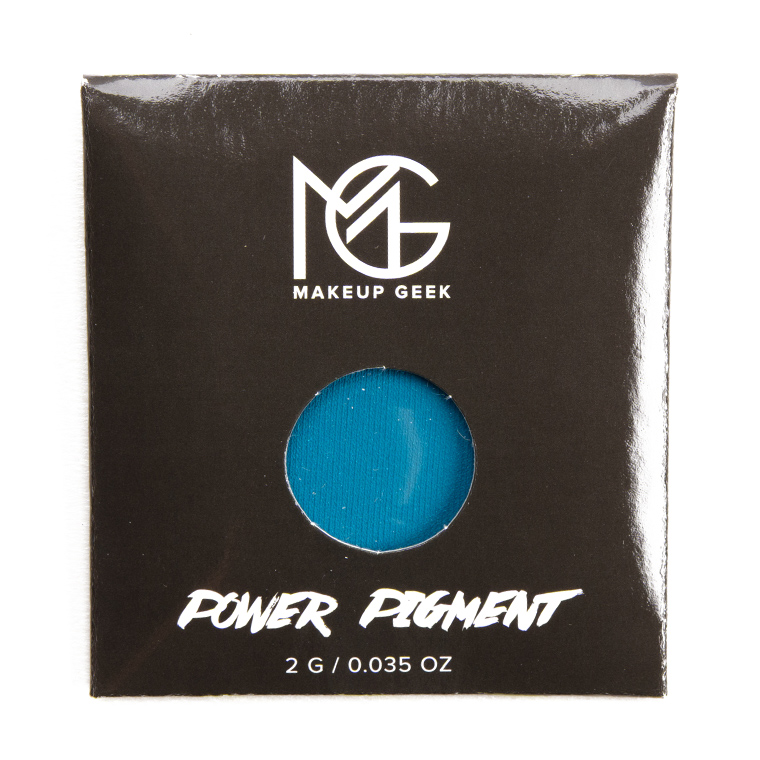


Makeup Geek Power Pigments ($9.00 for 0.07 oz. oz.) is a new powder eyeshadow that will be available today, May 3rd. There are 10 shades in the range, which are swatched in this post.
P.S. — Makeup Geek has confirmed the weight is 0.07 oz. and that the labels are wrong.


One of the most obvious comparisons will be between these Power Pigments and Sugarpill eyeshadows becasue they are both bold, bright and beautiful colors. I actually have low hopes for these new products but if they are granted an B+ or above from you then maybe I will consider. Sugarpill is discontinuing products so fast these days that bold colors lovers like me can be a little bit discouraged.
These are way too bright for my neutral-loving face! Lol
Judging by the swatches, Potential, Indestructible and Invincible seem to be poorly named. Dedicated is very patchy, too.
For people who love this but on a budget. I think the better choice is getting Viseart Editorial Brights. It is 12 pan for $80.00. Better value and quality. This would be $90.00 if you got all 10.
I am not impressed with some of these swatches.
Or the Nyx brights, for a more budget buy. I think maybe Rachel got that one. Or the UD electric, that is still hanging around on some discount sections. Some of these swatch abysmally. Kind of surprised the green looks so good.
Viseart is Not eye safe unfortunately they list it as a “color correcting” palette. Makeup geek doesn’t have on their website whether theirs are eye safe or not which is shady but if you write them privately they will claim they are.
From the swatches, these don’t look impressive at all. The bright/bold Sugarpill and Inglot shades that I bought long ago are more pigmented and this has been done ten times over (and better) since then. I don’t understand why Marlena would go through the hassle of trying to compete when you’re releasing products of lesser quality. It doesn’t seem like she has a real quality control department that will provide honest feedback.
Yep. And even the labeling is incorrect. Once again, it seems like another rush to release something half-assed. It looks sloppy and desperate. ?
Transform sure looks nice!
The green and pinks seem nice, but if I could only get one, it would be the green. The blue and purples don’t look promising, I’ll stick to my Juvia’s place eyeshadow palettes for those colors. Looking forward to your review!
Quite the mixed bag.
Well, that last row took quite the turn, eh?
Those purples HURT to look upon, they’re so bad! Indestructible: destroyed. Invincible: are you serious? Dedicated: dedicated to awfulness!
Others have said it first, but I do concur that these look like Marlena decided to copycat Sugarpill’s STELLAR Brights, but failed on several shades.
I agree that there are some hits and some misses in this collection, however is it fair to say she copied Sugarpills brights when Colourpop came out with their Festival Collection about a month ago? That featured quite a few bright shades I had my eye on. Too bad I’m on a shopping ban for now 🙁
With Colourpop releasing amazing shadows at $4 a pan, I dont see how MG can justify pricing these at $9. Especially when some of them look patchy.
I completely agree!
I would look like a clown in all but maybe one, pretty colors but not on me!
Are these the same sized pans as MUFE or Inglot?
Completly agree with everyone’s sentiments – most of these are not good! Why do companies put out poor products that they must know can be beaten in quality and price by their competitors?
Also I’m always on the lookout for a really pigmented blue, but it’s seems harder than hens teeth to find one and Indestructible is another in a long line of fails here. Is there something to do with the colour blue that makes it so hard to produce as an eyeshadow?
It can be very hard to tell from swatches how these will perform on the lid. Pigments differ from regular eye shadows since they are, well pigments and not a mix of filling material, moisturisers and pigments that normally constitutes a regular eye shadow. Pigments in general are drier in texture and will give off more fall out. But they can pack a punch on the lid when you build them up slowly by packing them on with light patting motions. Imo what separates a good pigment from a. It so good one is therefore not swatches but more how well they sit on the lid and how opaque they can be built up and if you can blend them at all with another eye shadow.
It will tell more therefore if Christine will provide pictures of where she has used them creating one of her all amazing looks…:)
Matte blue pigment is extremely dry in texture always, but there are good ones that can be built up well and bad ones that just dissipates when you add more or try to blend. That is what makes the most difference. All matte cobolt blue pigments will generally swatch dry however imho…
I wonder however why Makeup geek chose to make these square instead of their regular round…? Makes it harder to store them nicely together with their regular shadows…
I definitely believe these are searching bad but will be killer on the lid. Especially if a tacky white base is put down first, I believe you can strongly build the pigment on these. I’m really thinking of purchasing the whole bundle since sugarpill has been discontinuing quite a few of their shades I really wanted.
Ah, no – these don’t really look appealing at all. They might be cheap, but they look cheap too.
Phyrranyx already compared these to Sugarpill and Viseart Editorial Brights making these look really bad actually. I don’t know what MUG has been doing nowadays but their floundering quickly.