MAC Indigo Blend Studio Sculpt Shade & Line Eyeshadow Review, Photos, Swatches
MAC Indigo Blend Studio Sculpt Shade & Line
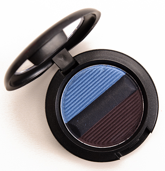
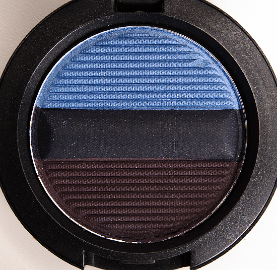
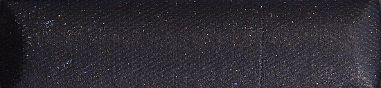
MAC Indigo Blend Studio Sculpt Shade & Line ($21.00 for 0.06 oz.) contains blue and purple eyeshadows with a navy blue eyeliner. The Studio Sculpt Shade & Line Eyeshadows can be used wet “for a defined look with super-saturated colour” or dry for “medium buildable coverage.” I continue to struggle with getting these to perform well or readily; the textures are drier, while the eyeliner shade is so stiff and dry, it never wants to apply evenly or blend out. I am, however, surprised that once applied, finessed and blended until your hands hurt, the eyeshadows stay in place for a solid eight hours.
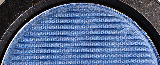
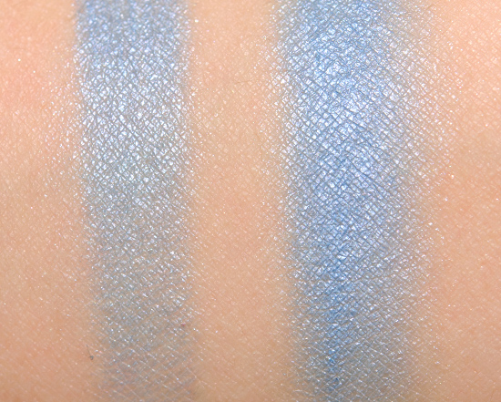
Indigo Blend #1 is described as a “soft, clean sky blue.” It’s a light-medium, pastel blue with a white,f rosted finish. Applied dry, it had sheer color payoff that was a bit powdery and prone to blending out to nothingness. Applied damp, it was semi-opaque, but the color didn’t apply evenly. Dior Rivage #1 (LE) is darker. Wet ‘n’ Wild I’m His Breezey #4 (P, $2.29) is less frosted. Sephora Collection Sweet Dreams (17) (P, $13.00) is lighter. MAC Moon’s Reflection (P, $15.00) is darker. MAC Dimensional Blue (LE, $19.50) is darker. L’Oreal Infinite Sky (P, $7.99) is darker. Chanel Destination (LE, $36.00) is darker, cream product. See comparison swatches / view dupes.
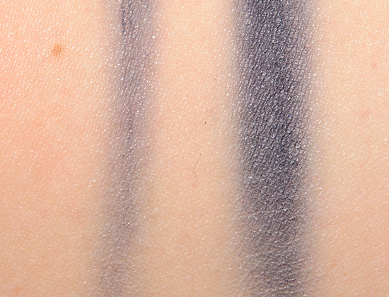
Indigo Blend #2 is described as a “deep blue-teal.” It’s a blackened, navy blue with a satin finish. The texture was dry and stiff whether used with a dry or dampened brush–with the worst application being with a dry brush, as trying to extract color out at all required scraping off the top layer. Once I get it on the skin, it does stay well, at least. It’s just a total pain to apply, blend, and so on, whether I tried using it as an actual eyeliner or as an eyeshadow. Wet ‘n’ Wild I’m His Breezey #3 (P, $2.29) is similar. Laura Mercier Deep Night (P, $23.00) is more muted. bareMinerals Maven (LE) is similar. MAC Naval (LE, $15.00) is lighter. Inglot #332 (P, $6.00) is brighter, lighter. See comparison swatches / view dupes.
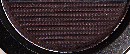
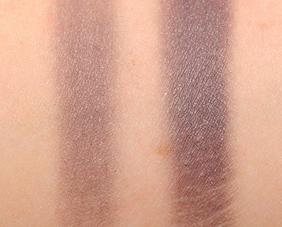
Indigo Blend #3 is described as a “deep plum.” It’s a muted, cool-toned, plummy purple with a satin finish. It had sheer color payoff when applied dry, and it was semi-opaque when applied with a dampened brush. The texture was rather dry, a little stiff, so it was a challenge to work with. MAC Eggplant Blend #2 (LE) is similar. bareMinerals Starry Night (LE, $14.00) is lighter. MAC Pinkluxe #5 (P) is more shimmery, brighter. NARS Arabian Nights #1 (LE, $24.00) is more shimmery, darker. NARS Demon Lover #2 (P, $24.00) is cooler-toned. MAC Dynamic Duo 4 #2 (LE, $15.00) is brighter. MAC Spellcaster (LE, $15.00) is similar. MAC Stay Sultry (LE, $15.00) is darker. MAC Indian Ink (P, $15.00) is similar. Make Up For Ever #79 (P, $20.00) is similar. See comparison swatches / view dupes.
Indigo Blend
LELimited Edition. $21.00.
Indigo Blend #1
LELimited Edition.
Indigo Blend #2
LELimited Edition.
Indigo Blend #3
LELimited Edition.
MAC Indigo Blend Studio Sculpt Shade & Line
MAC Indigo Blend Studio Sculpt Shade & Line
MAC Indigo Blend Studio Sculpt Shade & Line
MAC Indigo Blend Studio Sculpt Shade & Line
MAC Indigo Blend Studio Sculpt Shade & Line
MAC Indigo Blend Studio Sculpt Shade & Line
MAC Indigo Blend Studio Sculpt Shade & Line
MAC Indigo Blend Studio Sculpt Shade & Line


These Shade & Lines are just as terrible as I anticipated. :s
There was a part of me that was hopeful, but I wasn’t too surprised 🙁
I was hopeful too 🙁 But I knew better and waited for swatches!
Thanks Christine <3
Yikes! Another flop-a-roo! MAC really is tarnishing its own reputation with all these sub-par products. No great loss with this one, though, since the shades are all highly dupe-able. But it leaves me shaking my head in wonderment. I can’t help thinking that MAC is taking a leaf out of lululemon’s book and taking a highly respected name and market leader reputation and trashing it all on its own, thinking that the reputation alone will blind people to disappointing quality.
It’s like, it’s hard to imagine someone going, “These are horrible, let’s release them!” but then I find them so poor performing that I can’t imagine releasing them thinking they were decent/good?
Urgh, god, this is baaad. :/ It seems I was right in my bad feeling about this collection. So far, they’ve all been kind of stiff and patchy, hard to work with. I feel like Mac’s ability to create something that is quality and has the functionality of a compact is seriously lacking and has been for a little while. I wish they would get it together, these are so disappointing.
They seem to be missing more often than not (at least for me) when it comes to quads, palettes, trios, duos, etc. The only palettes that were pretty good were the $100 neutral ones.
That… that just makes me sad.
Seems to be the way with blues… gotta go in with low expectations.
Wow I can’t believe the rating! The light blue is very pretty, but the other two need some help.
They do!
The shades themselves are nice! But that liner esp looks terrible! 🙁
It was 🙁
They are getting worse?? *eyeroll*…
Playground is up on website. Had to grab a few chromagraph pencils and lipstick goodies. I also nabbed the Ebony trio because of that damn grey eyeshadow. I feel kinda dirty and pathetic buying it.
Playground..Playland..you know what I mean 😀
LOL! I hope the gray ends up being worth it 😉
Oh..that’s horrible..lol.
I know 🙁
A weak, frosted blue like that reminds me of the days of bad drugstore makeup!! So sad!
Right? Just reminds me of Wet ‘n’ Wild’s recent blue trio that was awful… except that was $3.
…
…
You know, I actually read the scores for this through my fingers when I opened the post. I think MAC and Dior need to go over into the naughty corner and think about what they’ve done to a perfectly nice colour like blue.
What makes it worse for both brands is that the actual shades themselves are so beautiful! It’s just the execution that’s so offensive…
You know, with Dior, it’s not a total surprise since a lot of high-end brands cop out on the bold shades, but MAC is supposed to be known for them, so there’s no excuse for it! Not that I really excuse Dior, though.
Yikes… the blue ones are the worst in terms of pigmentation. Lightly pigmented blue just looks so bleh around the eye!
I know 🙁 I think lighter blues when powdery look chalky, too!
Dag a D+ . MAC can do better than this!!
We know they can!
Why is the collection horrid?! I was excited to pick up two or three shades but the reviews put me off. I really really want them but nah :'(
I wish I knew!
Crying again.
It was a painful formula to review – so negative 🙁