MAC Fashion Flower Eyeshadows Swatches, Photos, Review
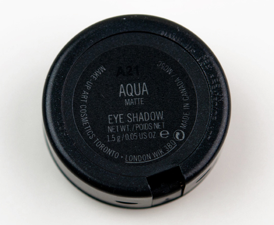
MAC Aqua Eyeshadow
MAC Fashion Flower: Eyeshadows
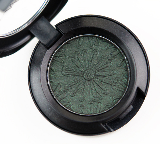
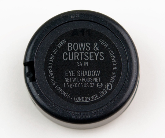
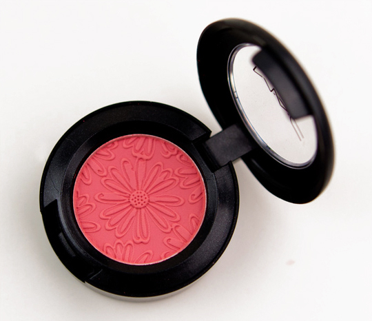
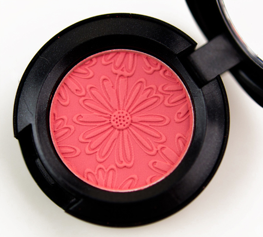
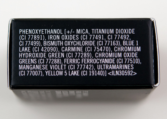
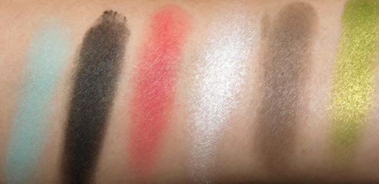
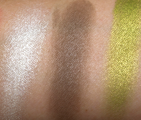
The collection features six shades of Eyeshadows (each $14.50 for 0.05 oz.) — three are limited edition, while three are available in the permanent range; though, all of the editions in this launch are imprinted with the flower design, while permanent editions will be normal. The six shades include: Aqua (aqua blue), Bows & Curtseys (metallic hunter green), Free to Be (bright true coral), Fresh Daisy (frosty white yellow), Groundcover (mid-tone warm grey), and Lucky Green (frosted mid-tone lime).
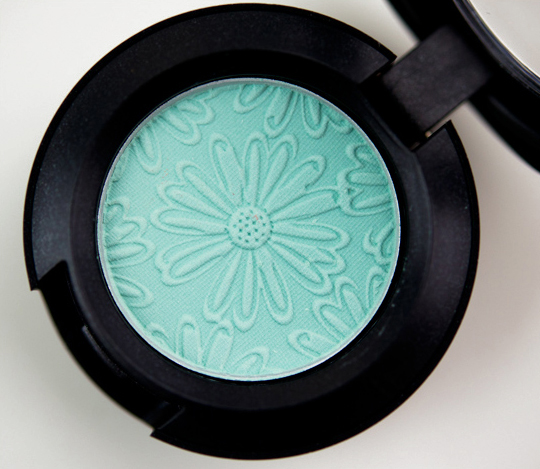
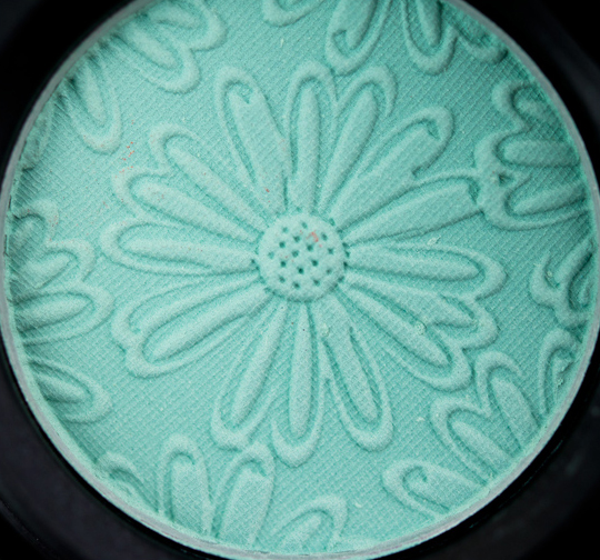
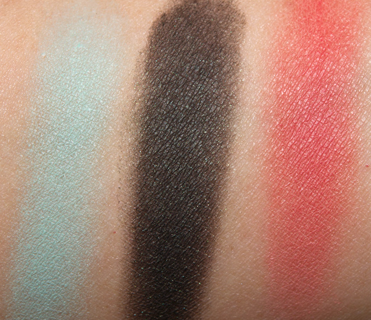
- Aqua is a bluish aqua with a matte finish. This is a permanent shade but I felt like it was a little less pigmented here than my permanent pan.
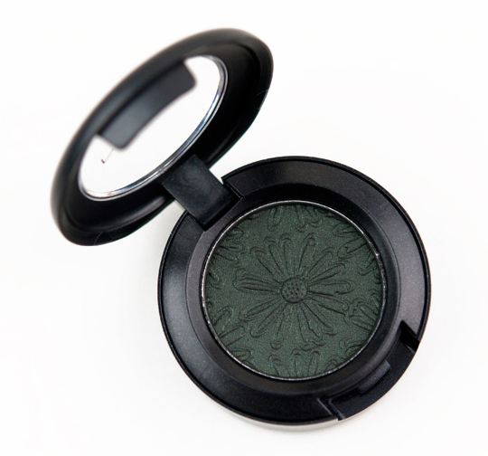
- Bows & Curtseys is a blackened forest green with bluish shimmer. It looks nearly black when swatched on my arm with the green being hinted at as the color plays with light. When I wore it in a look (albeit with a sheer green base), it seemed to pull out the forest green more. This has a satin finish.
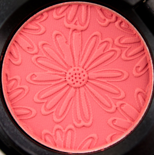
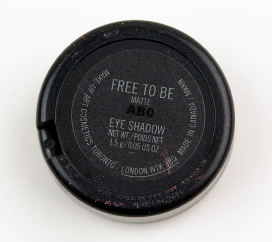
- Free to Be is a medium-dark coral-red with a matte finish. This is a permanent shade, but I felt like it was a little less pigmented here than my permanent pan.
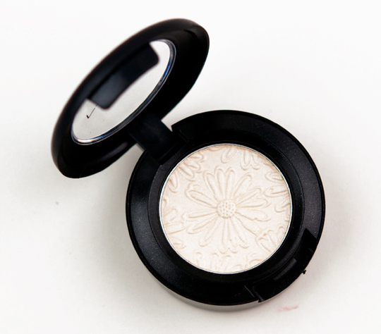
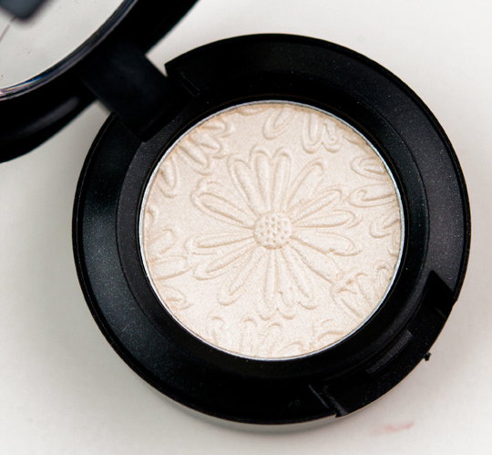
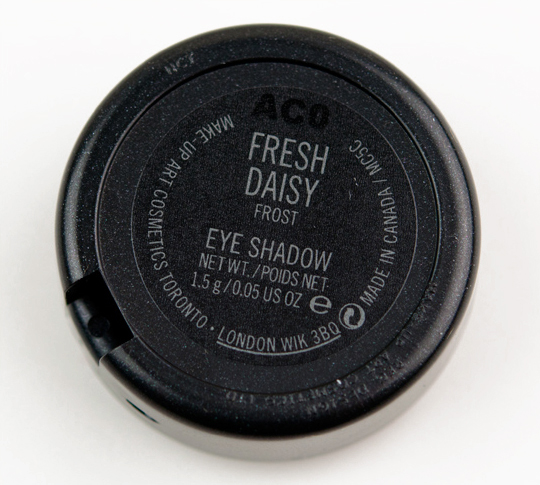
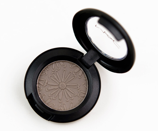
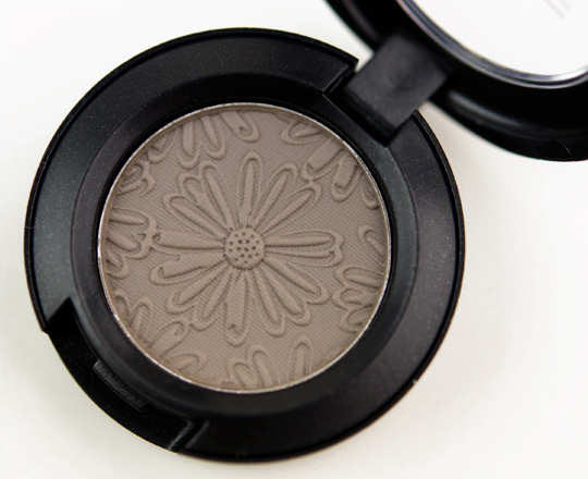
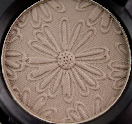
- Fresh Daisy is a very bright white with only a hint of warmth. It has a frost finish, but it really looks rather metallic. I tried to wear it as a highlighter, but it’s too frosted and stark on me–I imagine it would be more appropriate on someone with a lighter skin tone. It is, however, very pigmented.
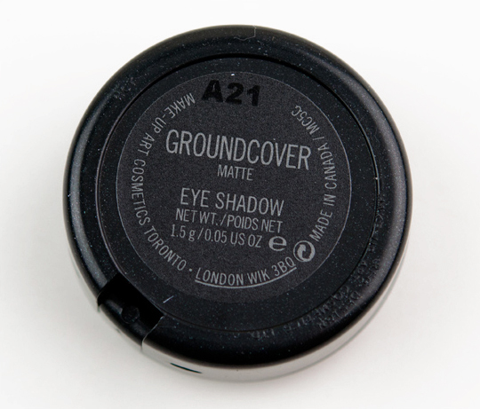
- Groundcover is a matte, taupe-ish brown gray. It is nicely pigmented but lacks the buttery texture that makes mattes easier to use.
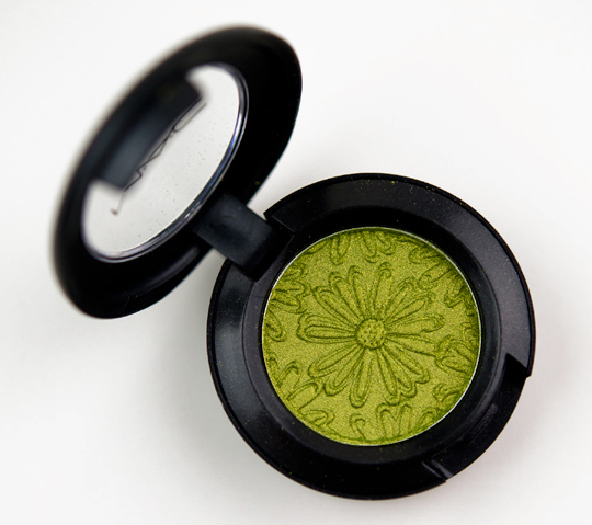
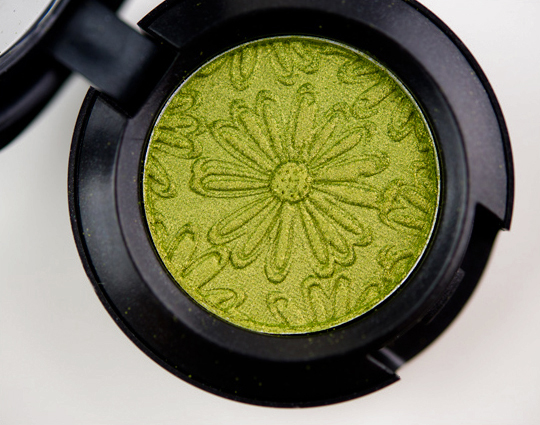
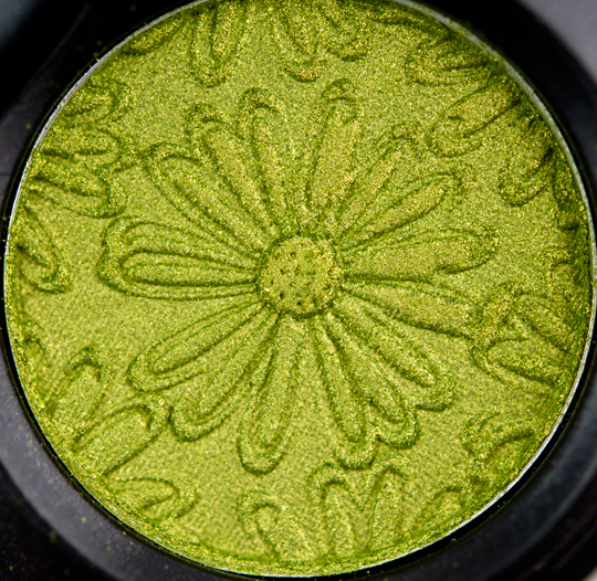
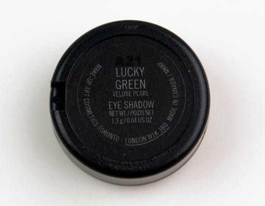
- Lucky Green is a bright, chartreuse-shimmered grass green with strong yellow undertones. It has a veluxe pearl finish. This is a permanent shade. It’s one of my favorite colors, because it is so pigmented and soft.
MAC Fashion Flower Eyeshadows Swatches, Photos, Review
MAC Aqua Eyeshadow
MAC Aqua Eyeshadow
MAC Aqua Eyeshadow
MAC Aqua Eyeshadow
MAC Bows & Curtseys Eyeshadow
MAC Bows & Curtseys Eyeshadow
MAC Bows & Curtseys Eyeshadow
MAC Bows & Curtseys Eyeshadow
MAC Free to Be Eyeshadow
MAC Free to Be Eyeshadow
MAC Free to Be Eyeshadow
MAC Free to Be Eyeshadow
MAC Fresh Daisy Eyeshadow
MAC Fresh Daisy Eyeshadow
MAC Fresh Daisy Eyeshadow
MAC Fresh Daisy Eyeshadow
MAC Groundcover Eyeshadow
MAC Groundcover Eyeshadow
MAC Groundcover Eyeshadow
MAC Groundcover Eyeshadow
MAC Lucky Green Eyeshadow
MAC Lucky Green Eyeshadow
MAC Lucky Green Eyeshadow
MAC Lucky Green Eyeshadow
MAC Aqua Eyeshadow
Aqua, Bows & Curtseys, Free to Be, Fresh Daisy, Groundcover, Lucky Green
Aqua, Bows & Curtseys, Free to Be
Fresh Daisy, Groundcover, Lucky Green




Sometimes i feel like i have too much MAC eyeshadow!…but i might have to spring for Free To Be and Lucky Green
lol I feel the same way!!! yet exactly the two you mentioned look like musthaves.
Ahh, Lucky Green! I so want to get it this time, missed out last time.
I love golden green!
It’s permanent! 🙂
Would you say Lucky Green is similar/same as Sweet and Punchy?
Much greener!
Nice! Although I expected more “flowery” colors since it is a flower-inspired collection.
Thanks for the swatches! How similar is Groundcover to Copperplate in your opinion?
Groundcover is browner.
I am SO wanting Bows and Curtseys (was this not also in Tartan Tales or was it another product of the same name?) and also Groundcover (I always go for the neutrals!!! But these look gorgeously gorgeable!) Sad to hear that the matte texture of Groundwork is hard to blend but the colour is so “me”.
Bows and curtseys was in the 6 twists of tartan Xmas 2010 palette. Although it look really dark the picture. On my dark skin tone, you really see the bluish understone
The only one I really like is Free To Be and I would rather get the permanent version if it is more pigmented. I’m don’t care much for the imprint… it will go away with use anyway.
Plus you can buy it in the pan for cheaper! 🙂
Okay, I just checked back and Bows and Curtseys was, indeed, in the Tartan Tales release, as part of an eye shadow palette but, OMG…THIS current B&C looks like that previous one on steroids and with a hefty blood transfusion! So much more intense, dark and pigmented!
I so want groundcover and lucky green. I love the flower design
I wonder because MAC puts out so many collections, that their new eyeshadows are worse in quality than the ones in the permanent line? I think the quality is going down. 🙁
Bows&Curtseys and Groundcover will be mine!
Those are my picks as well.
ditto
Thanks for the swatches! How does Groundcover compare to French Grey? I have a huge dip in my FG, and I want to find a dupe, pronto!
Sorry, I don’t own French Grey!
Christine may not have FG, but I do. And I brought my palette with me to the counter just for this comment.
French Grey is way browner, but Groundcover and Apres-Ski are so similar that I’m considering returning Groundcover. They’re both matte and Groundcover may be a smidgen browner than Apres-Ski, but the later actually applies smoother. I swatched at the counter and saw it, but purchased anyway because I wanted to test with UDPP underneath.
Since I have all three here, I can post/send a pic once there’s some daylight. MUFE 110-115 for reference.
Wow, that is so nice of you! Thanks so much! I do own Apres-Ski and i LOVE it, but on my skin, FR is slightly cooler. Looking forward to your swatches!
I usually bring color palettes when eyeshadow shopping to avoid buying dupes, but I saw you ask about French Grey. I know it’s not a common color, so I thought I’d check it out.
I upload it @ Specktra (tomorrow) and post the link here.
Hi-Res Swatched
Hi-Res In-Pan
Groundcover is going back to the store…
Haave mercy!
I own and love both French Grey and Smoke & Diamonds, and kind of want Apres Ski, taupe fiend that I am.
I was going to go for Groundcover, but after seeing the comparison photos, I don’t know if I’ll bother.
Why didn’t MAC bring back Seedling with this collection?
I was hoping they would!
Knew I should have swatched Smoke & Diamonds:
S&D vs. Apres-Ski/Groundcover Hi-Res
S&D is much more grey and has a totally different finish. Just don’t end up with both Apres-Ski and Groundcover!
Thanks SO MUCH for all the comparisons and swatches! They were so helpful!
Thanks for sharing the swatches!! Are the smoke & diamonds / Apres ski, LE? I don’t see them on MAC website??
I bought groundcover & bows & courtseys today..haven’t tried them on yet, but will compare groundcover to my french grey..if its similar, then I’ll be returning groundcover! I’ve been looking for a nice satin greyish brown for so long, but haven’t found one I love yet!
You’re welcome Bridget and Sheryl! Anything to help other eyeshadow-junkies out!!
All the shadows are LE. French Grey is far more brown than Apres-Ski/Groundcover and has a different finish. It’s just Apres-Ski and Groundcover that are pretty much duplicates of each other. And I’m assuming they called it “Groundcover” for this collection because things like skis do not work for the whole “spring and flowers” imagery of this collection.
MAC just doesn’t have a dupe of Apres-Ski/Groundcover in their permanent collection, just like Christine said in her review of Chill way back in 2008.
So, it’s just a matter of owning Apres-Ski or Groundcover. Then again, as you can tell by the pics, I have very fair skin with no yellow undertones (the veins on my inner wrist are blue bordering on violet) The slightest color — and difference, for that matter — always shows up. Whether or not the same colors work as dupes for you personally is dependent on your own complexion.
Yes! Swatches! Thanks for doing these!
O my gosh, it’s so pretty! I want to have Lucky Green!
The flower design is adorable. I already have Aqua, Free to Be and Lucky Green, but I like Groundcover and maybe Fresh Daisy.
The flower imprints are just too cute!
Lucky Green is gorgeous, but it looks like it might be a dupe for Kat Von D’s Long Distance. What do you think?
Sorry, I don’t have that!
It’s part of the Truth palette.
To my eye, they look very similar. Lucky Green seems to have a bit more depth and is a hair more green, but they’re close. I’ll have to check out Lucky Green myself at the MAC store, but I think this is a fair dupe.
I don’t like to weigh in on anything I haven’t seen myself, but thank you for sharing the link!
The flower pattern on these is nice. I love Free to Be and Groundcover. Lucky Green is gorgeous however I doubt I’d ever use it.
Are the permanent shades pro shades? I don’t recognise them
I know for sure Free to Be and Lucky Green are available at freestanding stores, Aqua may be PRO only. All three are available on MAC’s website.
Aqua is listed under Limited Edition on the MAC website…
It’s permanent at PRO 🙂
Cute! Fresh Daisy might just find itself on my to-buy list. How would you compare that to the WnW “I’m Feeling Retro” highlight shade?
They seem pretty similar!
Ooooh! I LOVE Groundcover!
Groundcover is calling my name, but since I just recently got Urban Decay’s Shakedown, and already own MAC Copperplate, I’m really not sure I can justify the purchase of another matte taupe.
I literally could not force Shakedown to fit into my browns/golds” eyeshadow drawer; I had to store it elsewhere. Not a good sign! 🙁
My, my, my…what a gorgeous peridot green. I love it!
Gah! Free to be, lucky green and fresh daisies. Want!! 🙂 I don’t have any coral colors.
The flowers look so juvenile… but I do have Lucky Green already and it’s awesome.
do you think the lack of pigmentation could just be due to the pattern? i remember for the rose romance collection beauty powders that after you get past the top layer with the rose pattern that the powder became more pigmented.
I wondered that myself too. If, perhaps they have to somehow change the formulation of the matte eyeshadows in order to get the product to form into the pattern shape.
I think I own every one of these colors as an Urban Decay color. Course would have to compare to be sure. They are lovely though and Lucky Green is striking. I noticed you were sporting it in your lip swatches. 😀
You say Aqua and Free To Be look less pigmented? I wish mine were that pigmented! I must have gotten a bad lot because those two colors are by far the worst eyeshadows that I own. Both look like I tried to draw on my lids with hard white chalk.
Aqua can sometimes be chalky-looking depending on what you pair it with, but Free to Be hasn’t given me any problems! (Just used it today, actually!)
What do you think about Groundcover as an eyebrow shade for an NW15 girl with dirty blonde hair? 🙂
It might be too gray, actually! Have you tried Omega?
Do you think i can wear free to be as a blush? I think the color is so pretty..
Maybe!
I’ll have to pass on the eyeshadow.. They seem a little bit common/dupeable… I really love the flower design though(:
I hate the embossing. Pbbt. Florals are icky. The only limited one I like is Groundcover, but how hard is it to find a matte taupe (without a weird flower on it)?
Bows and Curtsey look so pretty but it swatches black 🙁
I absolutely love florals!!! the pattern in these products is gorgeous.. I much prefer the pattern rather than tacky packaging they have been coming out with lately!
I would love to know how Fresh Daisy eyeshadow compares to the old MAC Pollen eyeshadow. I’ve almost finished my Pollen and can’t seem to find a super close dupe! Thanks!
Far too white!
The flower print is so cute! Unfortunately the only one I would want is Lucky Green, which I already have.
I loved lucky green eyeshadow….
while I like aqua and groundcover, I might just end up skipping both
oo0o0o0oo I am loving these! Love the flower design! Free to be and Aqua are on my wishlist =)
hi christine
how does aqua compare to haunting and lucky green to sweet&punchy? tks!
I don’t have Haunting, sorry!
It’s much greener than Sweet & Punchy.
how similar is Bows and Curtseys to Urban Decay’s Loaded from Book of Shadows 3?
Much darker, less pigmented, less smooth.
Does anyone know what “veluxe” means? This is a new term to me. Oh, and Lucky Green looks delicious!
Any dupes of Groundcover in BB or Urban Decay Naked Palette?
Not in the Naked palette, and I’m not familiar enough with Bobbi Brown’s permanent eyeshadow line unfortunately 🙁
Thanks for the review and the swatches 🙂
How close do you think Groundcover would be to Copperplate? I already have Copperplate and it is a Matte2, so a very nice blendable texture.
TIA
It’s a lot browner!
Mmmmm, like them all!
shoot.
it looks my wallet is going to be dead. I want all of these!
OMG Lucky Green is so pretty!!
Can you do a look with Free to Be? I love it but wouldn’t know how to wear it!
Please click on the tag for Free to Be or do a quick search for “Free to Be” using our search field in the sidebar, and you should see several looks I’ve done show up!
Oooooh – was thinking of purchasing white jeanius before it disappears from the net. Do you think that fresh daisy is a better quality eyeshadow?
Yes, it is!
Another collection, I will be passing on.
Is bows & curteys similar too humid.
It’s not like Humid at all, IMO.
Bows and Curtseys..does it look green at all…on your eyes..?
It looks so nice in the pot…yet such a plain black shimmer swatched eh…? thx for doing that..!~
I would have been so disappointed to buy it…to receive it..and it be that color..
When I wear it, it did, but it is pretty dark in the pot!
So.. free to be and lucky green –are they the exact consistency as the originals…?
You know when you get an eyeshadow with a print on it..it sometimes comes off chunky-ish..like its not as smooth..Is that the case here..?
Thank you!~
Lucky Green was fine, but I think I mentioned that I found both Aqua and Free to Be to be stiffer.
Christine,
The rubenesque paint pot brings out the forest green in bows and curtseys as well! And bows and curtseys is gorgeous!
How’d you get groundcover to be so pigmented?! When I swatched it at my MAC stores, I got little to no pigmentation at all! Is it suppose to be used wet?
Were you first to swatch? Once testers get used a few times, especially if they’ve been swatched with fingers, the oil from fingers can build-up and make the eyeshadow hard to use.
Yikes! I sure could not use the coral on myself as an all over lid color. However for years I have known to take my blush shade of the day and just barely touch it over my already done eyes to give me a blended look so I don’t have a big separation between face ‘units’ of color. It works really well for me least with the shades of blush I tend to go for.
Personally, I have so many eye colors, I am taking a hiatus from buying more until I do a big clean out again of what I have and find is sleeping in my stash!
is fresh daisy similar to femme fi, i really love femme fi, and ive gone through 2 now and sadly it is limited editon.
Hey Christine! When you swatched these shadows, were they chalky/powdery? I saw them today at my local mac counter and while some of the shades were pretty.. they were hard to transfer from pan to hand (for swatching) as well as eyelid. But when I look at your photos, they look so vibrant. I asked the MUA there and she was like ” Yep, they’re chalky and don’t pick up color.” So when you swatched these, I was like whoa. Did you just appy with more force?
I didn’t have any issues with chalkiness, though Free to Be and Aqua were harder on the initial surface than their permanent pans (at least, compared to the pans I have).
Is groundcover similair to like a virgin from Too Faced ?
I don’t have that shade, sorry!
The aqua looks so lovely, but on – it would be what is described as a ‘wash of colour’ – or washed out! Even after several layers, it was hardly there. Would have loved it to have the same intensity it did in the pan!