MAC Art of Powder: Street Art Eyeshadow Palette Swatches, Photos, Reviews
MAC Street Art Eyeshadow Palette
MAC Art of Powder: Street Art Eyeshadow Palette
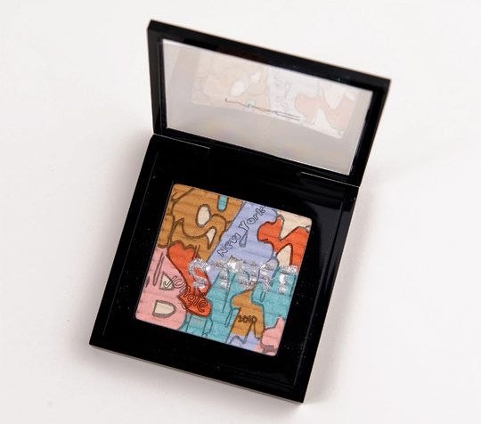
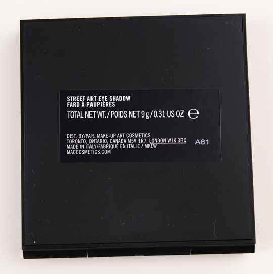
MAC Street Art Eyeshadow Palette ($38.00 for 0.31 oz.) is one of three limited edition specially designed compacts from the Art of Powder Collection, which launches on September 29th, 2011 (North America) and October 2011 (International, at select locations). The palette contains a hefty amount of product; an eyeshadow quad retails for the same amount but contains 0.20 oz. on average.
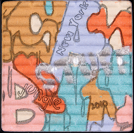
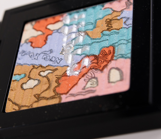
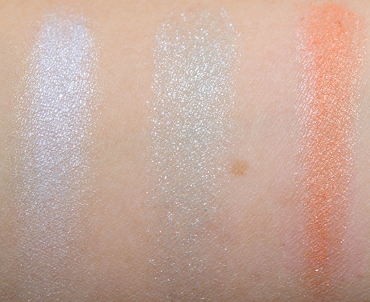
After testing this palette, I just can’t say the quality is there. It’s the design that will sell this product; it’s more for collectors than it is for someone who is after quality eyeshadow. There are six different shades (tan, beige, periwinkle, orange, turquoise, and pink) but I was only really able to grab distinct swatches of five (the beige was difficult to get individually and then to get to show up was another story!).
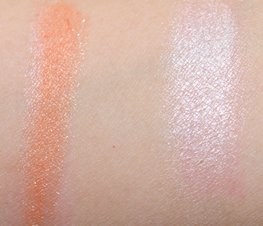
The tan shade is a gold shimmered orange-tan that applies very sheerly and not as smoothly as I would like (or expect). One of the better performing shades was the periwinkle shade which is more purple than periwinkle, but it depends on the lighting; it reminded me a fair amount of Digit. Despite the appearance of intensity in the palette, the turquoise shade is incredibly sheer with a slightly roughened texture (it’s not rough or gritty, but it’s not smooth); it’s like the palest teal with silvery shimmer. The orange shade was better, as it was much more pigmented but was dusty; it’s a slightly muted orange with a subtle satiny sheen. The pink shade worked the best, as it applied smoothly and with good color payoff; it’s a yellow-toned light-medium pink with a near metallic finish. There is also a beige shade that disappears against my skin and suffers from sheerness and some powderiness.
Undeterred, I wore this on my eyes (it’s what I wore in several of the photos for the Posh Paradise Mattene lip swatches), and the fall out was incredible. I went with something short and sweet, so I used the purply-periwinkle shade on the lid with the turquoise shade in the crease. The texture is rather dry and doesn’t work well on its own (I figured I’d test it with a base on one eye, without on the other). Even with a base, I had a ton of glittery fall out and really had to pack on the color to get decent color payoff and evenness in color. I tried twice with a base – once with NARS Eyeshadow Primer Potion and the second time with MAC Nubile Paint Pot (using the pink, tan, and orange shades). The second combination had less fall out (but the shades had less shimmer) but took a fair amount of color-packing to get the vibrancy in the palette.
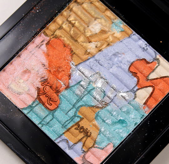
It’s a shame to see such a design-intensive palette perform so poorly. It really is art, because the best thing to do with it is to admire it from afar. Undoubtedly, it will still sell out because of the design alone. The good news is all of the colors go through to the bottom based on digging around each shade to see how deep it went. The only part that is an overlay is the silvered shimmer-sheen that goes across the middle. You just can’t have problems with wear (fall out, minor fading, unevenness), pigmentation, and texture and come out on top.
MAC Art of Powder: Street Art Eyeshadow Palette Swatches, Photos, Reviews
MAC Street Art Eyeshadow Palette

MAC Street Art Eyeshadow Palette
MAC Street Art Eyeshadow Palette

MAC Street Art Eyeshadow Palette

MAC Street Art Eyeshadow Palette

MAC Street Art Eyeshadow Palette

MAC Street Art Eyeshadow Palette

MAC Street Art Eyeshadow Palette
MAC Street Art Eyeshadow Palette
MAC Street Art Eyeshadow Palette
MAC Street Art Eyeshadow Palette
MAC Street Art Eyeshadow Palette

MAC Street Art Eyeshadow Palette
MAC Street Art Eyeshadow Palette
MAC Street Art Eyeshadow Palette
UGH knowing me it’ll suck me right in once I see it in stores…
The orange color looks fabulous though, they didn’t look too horribly unpigmented..are the swatches single application?
I use a brush or spatula to dislodge the color, then I turn it upside down onto my arm and blend and swatch out with my finger. It doesn’t get any more pigmented than what you see here 🙁
I can’t help, but laugh. Wow, this is DEFINITELY a collectors item for sure. I cannot believe that was all the color that came out of that. I’m going to pass on this even though it was something I really wanted even if the pigmentation sucked…I just have so much other stuff to buy on my wishlist. Disappointing.
MAC just needs to slow it down a bit and come up with better quality items, instead of busting out three collections in a 2 months period. Very disappointing!
Brenda is so right! I think at this point it’s overkill with the collections. I would much rather wait a few months for a collection with amazing quality than have back to back collections that are a waste of money.
That’s why I wait for reviews to come out before I even decide if I am interested or not. half of these collections are flops (big bounce, art of powder, and in my opinion Semi precious) so I wait until I see a product review that tells me that it is worth getting. We all thank you Christine.
I agree! I’m not impressed at all with the Art of Powder collection. I expect more for the money. Shame.
Exactly, I ALWAYS wait for Christine’s reviews. Their on point, and honest.
I am right there with you Brenda. Christine’s reviews are the ONLY place I go for a review.
Yes! I did NOT get the appeal with Semi-Precious. I loved Quite Cute, though.
This! Such poor quality and mediocre products for these prices shows that they are focusing on drawing people in with the designs but missing the quality. Bright colours and patterns can’t mask poor quality.
Ohh…sorry to hear that it performed so poorly. Guess they put too much focus on the cool design and not on the product itself.
The Design is beautiful! 😉
i had really low expectations for this palette when i first saw it and unfortunately, your swatches confirmed them. i think other companies have handled design and application at an even 50/50, giving us the best of both worlds (like maison lancome blush) but mac really dropped the ball on this little guy. i’d rather see a new collection once every 6 months with awesome, mac quality products than a new collection every few weeks that are a huge disappointment.
So sad. MAC had a great idea with this. Maybe they can rethink their game and recreate a much better palette for the future.
Curious, did you try using it as a highlighter at all? With the crap color payoff and just a while lot of shimmer it seems like it might work to just sweep a brush across the whole thing and use it like a glittery body shimmer or face highlighter.
It’s SO pretty I don’t want to give up on it! LOL!
I didn’t, but I had plenty o’ glitter all over my face from the fall out.
LOL! I hear that 🙂
exactly what I expected from this palette unfortunately… and wow, two crappy eyeshadow reviews in a row! 🙁
Not only do they look unpigmented, but they also look glittery. =( The design looks gorgeous, but the compact looks cheap. I will have to check it out in stores to see it in person.
Wow… What a disappointment. 🙁 I never really saw myself buying this but I still wanted it to be good. You know…
It’s so beautiful in the pan, but even if the pigmentation had been there, I would probably still pass. I would find it a pain to pick up each colour, without accidentally getting the other colours involved.
A collector’s item for sure!
I don’t find this palette to be very appealing. This graffiti design is off the mark–I’ve seen better designs on the street. It’s just…uninspiring.
I know these are brand spanking new… but the fact that they have “2010” featured in the design makes me feel like they’ve been sitting around in a warehouse for a year.
I noticed that originally, but given that MAC works 12-24 months in advance, I assumed the actual design was created by the artist earlier in the process.
Wow, an F? I guess this is better to look at than use.
I honestly can’t help but laugh at MAC sometimes. When they’re great, they’re great. But when they’re awful, they’re really awful. It makes you wonder how much better this could have been if it was maybe more thought out and worked on like the design was. It’s a shame to put effort into making something look nice, only for it to not work well.
On one hand, I really want this because it looks so amazing, but with such terrible payoff it seems pointless. I’d love to have it as a piece to keep, but I don’t think I have the cash to splurge on something that wouldn’t get used 🙁
Christine, how do you have guts to go smashing into the design like that?! I’d probably be crying whilst doing it!
Honestly, it’s more like this moment where you’re daring the product to go all the way through and not just be an overlay. I’m totally not bothered by it! 🙂 That’s what happens after you blog for five years, I guess!
Um… EW? Why in the world would you make a product THAT expensive and THAT cool-looking, but have the quality be so terrible? That’s really sad. I hope the rest of the line is better.
i was pretty sure that you would rate these an F when i saw the swatches…
Even IF the eyeshadows were well pigmented this product would still be a nightmare to work with. Designs in eyeshadows, while a neat concept and are certainly beautiful to look at, are always way too annoying to work with. This is no different than the Semi-Precious collection or anything of that style. The colours are pretty overall, but as soon as you try to use them swirled together, they look like a hot mess. OR, try to use them individually and you end up with cramped hands while swearing bitterly at your brush because it’s too big and picked up the adjacent colours beside it.
Wayyyyy too impractical.
I know I’m gonna wind up buying it despite the lack of quality. xD
I thought I’d be all over this, but in all fairness, the design isn’t that pretty, it has nothing on the Chantecaille palettes and Guerlain powders. And now I’ve seen how bad quality it is, I’m definitely not buying it.
Geez, if Wet n Wild can come out with eyeshadow palettes 50 times more pigmented than this for a couple of bucks, why can’t MAC at least create these sorts shadows to have *decent* payoff?
The only reason why that will sell out is because there are only 10 made.
The street art concept is cool, but too bad about the actual pigments. ]:
And it’s annoying having those shadows right next to each other. I’d think I’d muddy the colors. x3
One of the silliest palettes they’ve done.
WTH is going on with MAC lately? It’s like they don’t even bother anymore.
It’s an amazing idea but poorly executed. Thanks Christine for you review, you save us a lot of money!
I find the design so unattractive and the colors offensive in combination. I know art is often in the eye of the beholder, but really?
what color does it have when you mix them all?
It’s so annoying how they do this…why not just put the design on the packaging and include a corresponding quad? I imagine it would be an even more valuable collector’s item like that!
This is sooooo disappointing 🙁
I might get it anyway since I normally blend colors… I’ll see how it looks in a store. Disappointed that all the colors look silvery, but not otherwise disappointed; I expected this.
I would rather have one amazing collection every few months than 5 crappy collections a month.
Very disappointing!
I’ve never appreciated graffiti on walls and I’m even less likely to want it in my makeup. This is one ugly palette and with poor performance…it’s a major fail. Liberty of London and Pret a Papier are the last two collections from MAC that impressed me. And those were many collections ago!! It’s just as well because I’ve been able to branch out and explore other brands like Chanel and Illamasqua!
Im so disappointed in the 3 items from this collection, they are so gorgeous i had such high hopes for them. Im so glad your blog exists or i would waste so much money! lol
even if it’s bad, it’ll still be cool to have one
Honestly I think its really ugly…that creme orange color is nice but the whole thing is just not very well executed..The art looks very juvenile and it looks like they literally took five minutes to draw it and that’s it.
I don’t get it, MAC does a blogger’s collection but apparently seems totally out of touch with what bloggers and customers have to say about their products, I could get better quality from a drug store!
The idea of this is lovely, the street art concept admirable. It is ashame the quality lacks but i feel mac has two types of customers…collectors and artists and regardless of the impractical; fairly unusable product that this is, this item will sell out. In estee lauders books as a large company this will be deemed a winner.
The only way to prevent this quality being accepted the collectors would need to stop collecting unusable products…which we all know is never going to happen.
I suppose us artists (who ironically this was aimed at) will need to sit this one out and hope for a reasonable next collection.