Archived Post
Laura Mercier Watercolor Mist Eye & Cheek Palette for Spring 2015
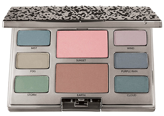
Laura Mercier Watercolor Mist Eye & Cheek Palette
Watercolor Mist Eye & Cheek Palette ($58.00) (Limited Edition)
Decorate the eye with sateen watercolor-like finishes with a flush of color to the cheeks. Calm, serenity, balance- let them surround you. The mood is quiet and relaxed. The look is effortless and discrete.
- Mist
- Fog
- Storm
- Sunset (Cheek Color)
- Earth (Cheek Color)
- Wind
- Purple Rain
- Cloud
The colours in this palette all look so muddy and dull. Maybe it’s the photo; maybe it’s the products themselves but this has no appeal to me at all, especially as a “Spring” palette.
LOL! You should see the photos on Bergdorf – they’re super oversaturated (I think that they didn’t save it in the right color profile, so they all went crazy bright and saturated). I’m curious which is what (my guess is it’s this one, more muted, but probably looks a little less faded in person).
So I just had to go look at the photos on Bergdorf – oh my, that’s hilarious! It looks like a completely different palette! I do actually really like how yours looks though, and I can kind of see how the muted shades reflect watercolors. It looks really wearable!
I actually think they look very nice. Toned down and wearable.
The description of “watercolor-like finishes” makes me worry that they might be very sheer.
I looove pastels so very much. Interested to see how this swatches.
It’s so refreshing to see a colorful palette!
I really don’t like this kind of colors,not bright,not dark 🙁
The spread on love/leave seems fairly even at this point. This looks very spring like, but pastels are a total no go for me..shudder.
As someone with a darker complexion than “tan,” I only expect ashy pigmentation from this palette.
The only use I’ve ever found for pale or light shades, with my limited knowledge of makeup, is as a inner corner or brow bone highlight but even then certain colors are problematic.
I do remember that Laura from Buy Now Blog Later reviewed some pastel single eyeshadow shades from Laura Mercier. Laura recommended that they would be suitable for teenagers, albeit an expensive alternative for someone dipping their toes into color cosmetics. My only complain is that this palette might only suit lighter complexions, even for a younger demographic.
I feel like Mist, Purple Rain and Cloud all pretty much look the same here.
Hmmm, this looks very interesting…..so rare to see such muted pastel colors in a kit. I like how they did all colors (no more neutral palettes with 20 shades of brown, please ) and so cool-toned (as opposed to all the warm-toned palettes we’ve been seeing). And I love the names, so spring-like and peaceful. Is that rain drops on the cover? The kit looks very muted, and I think it would look more eye-catching if they threw in a couple of lighter, satin pastel shadows (pink, champagne gold). I’m interested in seeing some swatches.
Seconded!! when I first saw this palette I was all: ‘OMG WAT IT’S ACTUALLY COOL AND ACTUALLY NOT A NEUTRALS PALETTE GIMME’. It also has the fake raindrop thing that I *love* with a fiery passion for some reason. I really hope that this turns out well, because I think it’s one of the more unique and interesting palettes to come out for a while. I think I might have to contrive a way to get it for that reason alone, but I think that I could make the colours work well on my vampire complexion. I can definitely see how others might have reservations, though!!
I agree! I can’t wait to see swatches! I can see myself loving this! I am very fair so while I like color, I prefer a softer look. It’s nice to see pastels that don’t look like an Easter egg!
I agree!! It’s so rare we get cool palettes! And I am digging the soft colors. I think they are going to be really lovely for Spring.
Love the eyeshadow colors, but really don’t need the cheek colors. Without the cheek products and maybe minus $20 I’d go for it. Maybe I’ll wait for swatches and see how it performs to see if it might be worth springing for anyway.
Haven’t been quite so taken with a palette, in a while. Wow, it’s incredibly beautiful. Hope, very much, it performs!
Remember like 2 or 3 weeks ago when spring color collections came up and we were talking about muted, “overcast” pastels?
Did I ever tell you that I have powers of manifestation?
You’re welcome 😉 LOL
Still… this is interesting to see because I can’t really tell if it’s exactly what I was thinking of when I was talking about it but the names sure sound right don’t they?! 🙂
LOL, yes, I remember that string about wanting to see overcast, muted, misty pastels and I was like what the hell are they talking about??? I always think of pastels as light, bright, and cheerful. Then I saw these subdued, moody pastels with the raindrops, and I thought OH, someone must be psychic! It’s either that, or the Laura Mercier people are reading this blog and granting Temptalia’s wish for a muted, overcast spring palette
Lol
I think it’s pulled straight from a Monet painting for this palette. The shades are all muted watercolors rather than pastels. I have shades like this but I love seeing it in a palette for a trend!
Is it just me or does this look the Pantone shades of the year all in one palette sans marsala.
LOVE THIS. its so monet “water lilies”. please review it
The gods have answered my prayers for a dusty pastel palette!!! I just hope it lives up to my expectations.
Hmmm…i’m nw15 so I can pull off muted pastels but I wish there was more variety instead of two greens and two blues which are fairly close to each other in tone.i’ll wait to see swatches.
These are pretty colors and very soft…but not for me I’m a neutral gal…
I think this palette would be gorgeous, lots of toned down subtle colours that could be used on an every day basis. The swatches will be great to see.
I really don’t know how I feel about this palette…might have to wait until seeing swatches to know if some of those shades are as similar as they look.
I kinda love this (but I’m also very pale). I have no idea how I’d make these greyed-pastels work with my too-bright clothes. Maybe if I had Olivia Pop’s muted wardrobe. (One can dream, haha.)
This is 1980 in a box. Except worse. Not tempting me in the least.
I’m pretty interested in this. I think a solid dark brown,black,or real dark gray(even better) instead of cheek color or added would be nice. But,as many comments noted,this is nice when probably 99% of people who wear makeup own a neutral palette,or too many!
The cheek products look beautiful, but the eyeshadows look like a potential fail, especially on darker, warmer skintones!
These look so pretty. I prefer these kind of pastels for the eyes over the Jordan almond colors one usually sees for Spring. I just hope Mist, Cloud and Purple Rain aren’t too similar. Put a bright coral or pink lip with these, and the look would be beautiful.
I’m really interested in this one. I have light green eyes and think these shades may just work for me (hoping).
I can see this palette as a compliment to other palettes. Might be usable as transition colours. I don’t think I could use only this for a look.
It will be interesting to see how the shadows swatch.
Absolutely love it, although it does remind me of the 90s for some reason…
Perfect! Exactly as I described in the “Whst would a spring collection look like” and I’m loving it! 😀
This looks like pretty Pastel eye shadow palette to me.. but the colors might look muddy on me 🙁 !!
LOVE this palette so much!! SO complimentary to my hazel eyes. I pretty much mix all the colours on the lid and my lids look so stormy and cool. Pair it with just mascara – such a modern look. The colour pay off is amazing and the powders are so creamy. Favorite palette of 2014 or 2015.
Oh my, it’s pastel, it’s muted and its matte.
I’m Just afraid it’s too cool toned or too sheer on me