Giorgio Armani Rose Popillia (30), June Beetle (31), Gold Hercule (32) Eyes to Kill Intense Eyeshadows Reviews, Photos, Swatches

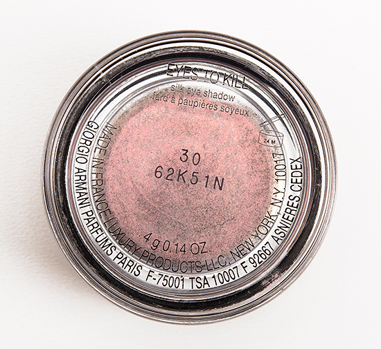
Giorgio Armani Rose Popillia (30) Eyes to Kill Intense Eyeshadow
Giorgio Armani Kaleidoscope Eyes to Kill Intense Eyeshadows ($33.00 for 0.14 oz.) include six, limited edition hues. This post features three of them, as I haven’t yet tested the other three for wear yet. The consistency of these seems like a pressed powder initially, but the powder is not fully pressed, so it loosens as you sweep your applicator across it, so it is really a tightly packed loose powder–ultimately, easier to use than a true loose powder. If you apply them with a damp brush, the intensity and color stays throughout the wear, unlike some products that initially go on intensely but fade quickly. These are rated for 24-hour wear, which is beyond my testing limits, but I did wear them for 14 hours with no fading or creasing (both without a primer and with a primer). The texture seemed more finely-milled than past iterations of the ETK Intense formula, and all three were easy to blend and smooth out on the lid. Two of the three were somewhat sheerer when I initially swatched compared to many others I’ve tried (but I had no trouble building to opaque color when I applied to the lid). Gold Hercule performed the best out of the three.
Rose Popillia (30) is a smoky, plum and gold shimmered mauve. It looked warmer, lighter in the pot, and then swatched, a very smoky, grayish purple base comes out. Applied dry, it’s semi-sheer, and then applied damp, it’s slightly more pigmented but not fully opaque. On the lid, it can be layered and built up to opaque color. What made this shade difficult to dupe is really how multi-faceted the shimmer looks. Dior Constellation #5 is warmer, more plum. Clinique Lavish Lilac is more plum. theBalm rem is warmer, more purple. Urban Decay Rapture is more purple. MAC Tendersmoke is more plum. See comparison swatches.
June Beetle (31) is a cool-toned, green-tinged blue over a bluish-violet base. It has a frosted, slightly metallic finish. Applied dry, it was semi-sheer, and them applied damp, it was semi-opaque. Like #30, it could be built more to full opacity on the lid but required some layering. Maybelline Icy Mint is lighter, cream. Bobbi Brown Iced Blue is lighter, cream. MAC Dimensional Blue is less nuanced. L’Oreal Infinite Sky is darker, bluer. Chanel Destination is more muted, cream. See comparison swatches.
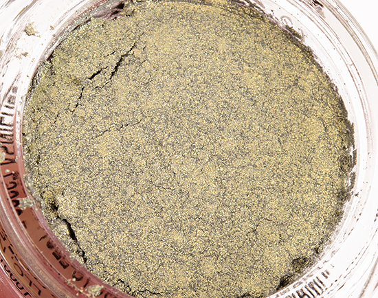
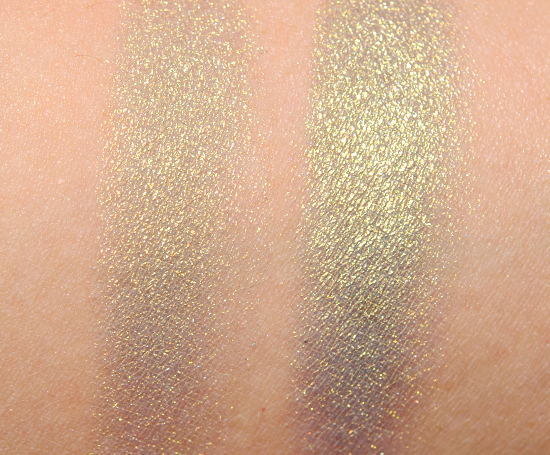
Gold Hercule (32) is a golden, medium green with strong yellow undertones and a smoky plum duochrome–you can see around the edges it takes on a plummy coloring. The other shades are certainly complex and interesting, this one felt like the truest duochrome of the three, as you could really see how it changed at an angle. Applied dry, it had semi-opaque color payoff, and then applied damp, it was fully opaque. Urban Decay Jealous #2 is greener, warmer. theBalm Runaround Rebecca is darker, cooler-toned. Urban Decay Mildew is darker. MAC Unsurpassable is slightly darker. MAC Spread the Wealth is somewhat warmer, cream. Guerlain Coup de Foudre #1 is darker. See comparison swatches.
Rose Popillia (30)
DCDiscontinued. $33.00.
June Beetle (31)
DCDiscontinued. $33.00.
Gold Hercule (32)
DCDiscontinued. $33.00.
Giorgio Armani Rose Popillia (30) Eyes to Kill Intense Eyeshadow

Giorgio Armani Rose Popillia (30) Eyes to Kill Intense Eyeshadow
Giorgio Armani Rose Popillia (30) Eyes to Kill Intense Eyeshadow
Giorgio Armani Rose Popillia (30) Eyes to Kill Intense Eyeshadow

Giorgio Armani Rose Popillia (30) Eyes to Kill Intense Eyeshadow

Giorgio Armani Rose Popillia (30) Eyes to Kill Intense Eyeshadow

Giorgio Armani June Beetle (31) Eyes to Kill Intense Eyeshadow

Giorgio Armani June Beetle (31) Eyes to Kill Intense Eyeshadow

Giorgio Armani June Beetle (31) Eyes to Kill Intense Eyeshadow

Giorgio Armani June Beetle (31) Eyes to Kill Intense Eyeshadow

Giorgio Armani June Beetle (31) Eyes to Kill Intense Eyeshadow

Giorgio Armani June Beetle (31) Eyes to Kill Intense Eyeshadow

Giorgio Armani Gold Hercule (32) Eyes to Kill Intense Eyeshadow
Giorgio Armani Gold Hercule (32) Eyes to Kill Intense Eyeshadow

Giorgio Armani Gold Hercule (32) Eyes to Kill Intense Eyeshadow

Giorgio Armani Gold Hercule (32) Eyes to Kill Intense Eyeshadow
Giorgio Armani Gold Hercule (32) Eyes to Kill Intense Eyeshadow

Giorgio Armani Gold Hercule (32) Eyes to Kill Intense Eyeshadow

GRose Popillia (inner lid), Gold Hercule (middle of lid), June Beetle (outer lid)

They all look so pretty!! I do however think I need o broaden my colours so the blue 1 is intriguing 😀
I’ve had bad experience with EtK eyeshadows in the past, but Rose Popillia and Gold Hercule look so amazing that I might order them anyway!
I like the color of Gold Hercule, but I think with my skin tone this might register as “couple day old bruise” when a bruise looks mauve and yellow. It’s interesting to look at in swatches though.
I love the nuances in this trio of Armani ETK’s. I think rose popillia has to go on my wishlist.
Hi Christine,
Is June Bettle at all like Mac Tropica (from Tropical Taboo). Your switch of June Bettle looks like how Tropica would look on my hand.
Thanks!
Hard to say, because my Tropica looks purple! Here is what mine looked like: http://www.temptalia.com/mac-bossa-blue-caribbean-cha-cha-cha-dare-to-bare-time-to-tango-tropica-mineralize-eyeshadow-review-photos-swatches
Gold Hercule is pretty!
I have these three and favor the pink shade. It’s interesting to see how these shades swatch differently on your skin tone. I’m NC45 and the Gold Hercule comes across chartreuse on me.
The EtK formula is one of my favorites so, it wasn’t hard to pull the trigger on Rose Popillia!
I’m curious, do you have anybody who’s helping you with the testing?
I mean, you have so many products to test!
In my head you go around with different looks in each eye every day to maximize your time.
Or maybe for these particular products you just had the same look, but one with primer and one without?
If you were to try everything individually and in different ways (no/primer, dry/damp etc.) you would only be able to review a couple of products per week (or you would only able to wear each product for a short period of time).
Every time I see a new post, I think about the way you must be organizing yourself. I admire your persistence. 🙂
Hi,
Temptalia is written, swatched, photographed, etc. by just me 🙂 Depending on the product and how long I have to test, I will either do one eye without primer and the other with primer (but the same products) or else one eye with one set of products and the other with another – and yes, I leave the house like that all the time. I don’t usually test both dry and wet on the lid – I usually pick the best performing method and go with that. I do the same with blushes (one on each cheek). I try to test at least two lip products per day, but it can depend on the formula and color (some stain, some are really short-wearing, some are really long-wearing).
So yes, I usually do go around with two different eye looks 😉
I often picture you going out on errands either forgetting you’re wearing two very different looks or just not caring (I wonder how often people would notice, to be honest). I guess sunglasses would help a lot but I think about the many times in a day I run out to places – the library, drug store, grocery store, etc. so it must really limit how you can use your time (unless, as I say, you are at the point where you’ve stopped worrying about it!)
I don’t really care – honestly, I don’t. I live in a fairly small town, and no one’s actually asked me or been like, “Wait… you’re wearing… what?” If anything, it opens a door to, “I test makeup!” and it can be a nice conversation. Generally, I try to make the two somewhat coordinated, but it depends more on what I have to test than that, but if I have two earth-toned palettes to try, then I can wear them together and they’re not drastically different.
If people notice, all have been too kind to say anything. Last weekend, I wore two more drastically different eyes (Sugarpill’s ElektroCutes on one eye), and I actually had several people ask about my makeup and what I was using. I don’t even know if they noticed anything except the neons, LOL! My local Starbucks knows what I do, so I don’t think it surprises them at all 😉
Thanks for doing that for us!!!!
it has been a LONG time since any beauty product has made me gasp but gold hercule is… amazing.
Ditto!! Such a stunner!
I’m a huge fan of Armani’s little pots of wonder, so I’m excited to see what these are like. Although it’s more neutral, I’m quite smitten by Rose Popilla. It reminds me a little of Mac Vex- not that they’re the same, but like they’re cousins.
There was a small mistake I caught for your description for Rose Popillia:
“Applied dry, it’s semi-sheer, and then applied DRY, it’s slightly more pigmented but not fully opaque. On the lid, it can be layered and built up to opaque color.”
I think you meant “damp.”
Thanks, Jenny!
These are so pretty, but out of my price range. I may have to splurge on one of them though.
Wow, love the look you’ve created with these! Gold Hercule is especially stunning- it’s the perfect mermaid shade 🙂
If they weren’t so expensive, I’d totally scoop up all three. That DUOCHROME!
Yay, I was hoping you’d review these! Thank you! 😀 My hunch upon seeing the promo image was correct, I certainly am most drawn to #30 and #32. I’m getting better, lol.
didn’t like the swatches, but love the eye makeup you did at the end! love love love
Ong this are beautiful!!! Want them!!! So different!!!
Hi Christine,
Which one has a longer staying power – ETK or Chanel?
I am thinking of investing in some, so far ETK swatches are to die for.
ETK for me, but Chanel usually wears quite well – but ETK is more consistent for me.
thank you!
I got Gold Hercule and thought it was actually very one-dimensional. It looked very similar applied to my Inglot 412, not much duochrome at all. My Rose Popillia looks more interesting and duochrome/unique. I returned Gold Hercule, too bad because I was hoping to love it 🙁
These are all really interesting shades, especially the first and third. The first looks quite different than I was expecting from the pan. The amount of shimmer is just a bit much for me though
Wow that blue is amazing and unique
Rose Popillia looks like my favorite Fyrinnae shadow! I’ve been waiting forever for the pressed version to be available…might spring for Rose Popillia instead.
So preeeeettttyyyy. They are all one colour in the pot though instead of a speckled lookI thought that was a really pretty way to have them so it’s a shame if they stopped that
WOW I love the Rose Popillia shade! Might have to get that one……….
Rose Popillia looks like an exact dupe of Fyrinnae Serendipity (nee Te Amo)
Do we know when it will be available (in Europe for me) ? I love Gold Hercule.
I don’t! 🙁
Ohmygosh, all of these are so beautiful and the look you created was divine! Why do these have to be LE?!
OMG Gold Hercule! That shade is absolutely amazing.
SO PRETTY!
i love what you do, you have no idea how much you impact my budget since there are things i would buy but first ck your feedback on things, Thank God for your site <3
Aww, thank you Johanna!! <3
wowwwwwww these are so beautiful!! i don’t think i can talk myself out of one of these.. or these 3!
Rose Popillia and Eyes to Kill Intense #27 , i think it would be an excellent combo.
Three of these colors are now sold out. Rose Popillia since Sunday, Gold Hercule since thismorning