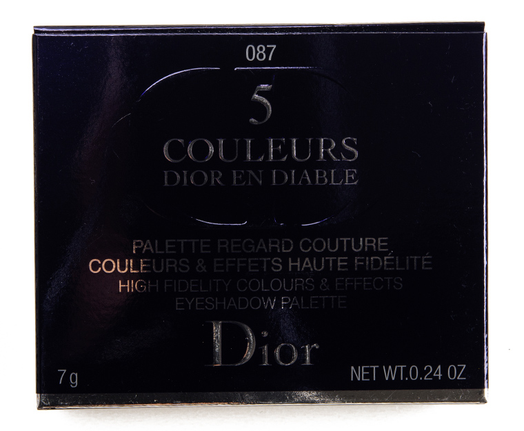
Dior Volcanic High Fidelity Eyeshadow Palette Review & Swatches


Volcanic
Dior Volcanic High Fidelity Colours & Effects Eyeshadow Palette ($63.00 for 0.24 oz.) is a new, limited edition palette featuring five shades. The color combination was more on the unexpected side, so it was fun to try pairing much warmer tones with cooler silver/gray shades. Most of the shades had good pigmentation and longevity with easy application as they went on evenly and blended out nicely.
Ingredients
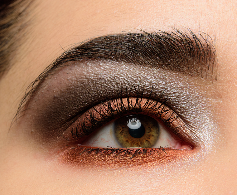
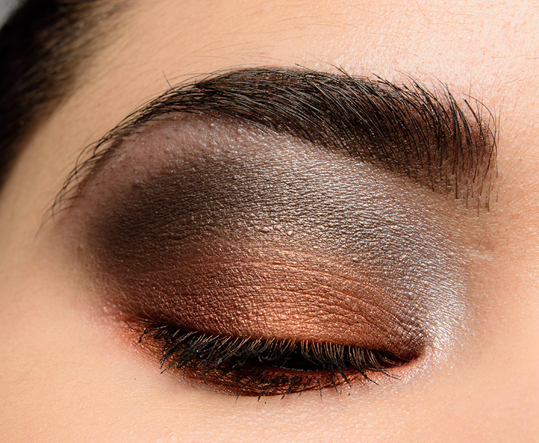
Look Using this Product

Volcanic
LELimited Edition. $63.00.


Volcanic #1
Volcanic #1 is a medium brown with soft, warm undertones and a satin finish. It had opaque pigmentation with a soft, smooth consistency that wasn’t dusty or powdery but wasn’t too firmly-pressed in the pan either. The eyeshadow applied well and blended out easily along the edges. It wore well for eight hours on me before fading slightly.
Top Dupes
- Dior Coral Canvas #3 (LE, ) is less shimmery (95% similar).
- Dior Sugar Shade #5 (LE, ) is more shimmery (95% similar).
- Anastasia NYC (LE, $12.00) is more shimmery, darker, cooler (95% similar).
- Too Faced Peppermint Mocha (LE, $16.00) is darker (90% similar).
- Make Up For Ever S606 Pinky Earth (P, $17.00) is more shimmery (90% similar).
- Urban Decay 180 (LE, $19.00) is more shimmery, darker, cooler (90% similar).
- Jouer Cinnamon (PiP, ) is more shimmery, darker, cooler (90% similar).
- Wet 'n' Wild Rose in the Air #2 (PiP, ) is more shimmery, cooler (90% similar).
- Chanel Affresco #8 (LE, ) is more shimmery, darker (85% similar).
- Tarina Tarantino Night Hopper (DC, ) is more shimmery, lighter, warmer (85% similar).
Look Using this Product
Volcanic #1
LELimited Edition.

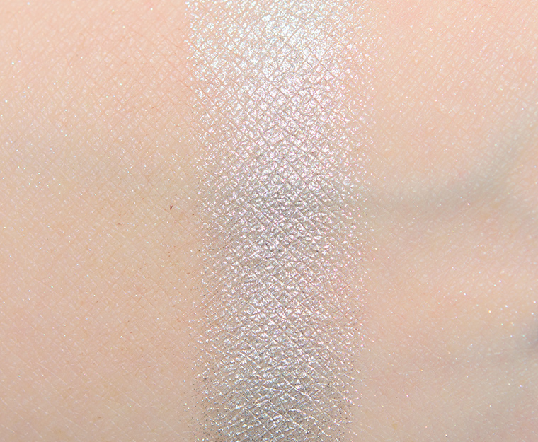


Volcanic #2
Volcanic #2 is a bright, light silver with subtle, cool undertones and a frosted finish. The pigmentation was nearly opaque in a single layer, while the eyeshadow had a smooth, slightly denser consistency–it still applied easily with a brush but didn’t have any fallout or dustiness in the pan. It stayed on well for seven and a half hours on me.
Top Dupes
- KVD Beauty Moonshine (LE, ) is more shimmery, darker, cooler (95% similar).
- Clarins Midnight #1 (PiP, ) is cooler (95% similar).
- Melt Cosmetics Indica (PiP, ) is more shimmery, darker, cooler (95% similar).
- Guerlain L'Heure de Nuit #2 (DC, ) is more shimmery, lighter, cooler (95% similar).
- NYX Tin (P, $6.00) is more shimmery, darker, cooler (95% similar).
- Make Up For Ever ME202 Iceberg Blue (DC, $21.00) is more shimmery, lighter, cooler (90% similar).
- Make Up For Ever D118 Platinum (DC, $21.00) is more shimmery, cooler (90% similar).
- Chanel Tisse Ombre de Lune #2 (PiP, ) is more shimmery, darker, cooler (90% similar).
- Guerlain Les Aquas #4 (P, ) is more shimmery, darker, warmer (90% similar).
- Sephora Cassette (LE, ) is more shimmery, cooler (90% similar).
Look Using this Product
Volcanic #2
LELimited Edition.


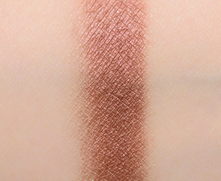
Volcanic #3
Volcanic #3 is a slightly muted, medium-dark orange with warm, reddish undertones and warmer, golden shimmer. The color payoff was fantastic with rich, even color adherence to bare skin in a single layer. The texture was soft, smooth, and blendable without being too softly nor too firmly pressed in the pan. It lasted nicely for eight hours on me.
Top Dupes
- Urban Decay Independent (LE, $19.00) is less shimmery (95% similar).
- NARS Taj Mahal (LE, $19.00) is less shimmery (95% similar).
- Dior Mirror Mirror #1 (LE, ) is darker (95% similar).
- Smashbox Torch (LE, ) is more shimmery, warmer (90% similar).
- ColourPop Floaties (LE, $4.50) is more shimmery, lighter, brighter (90% similar).
- ColourPop Let Me Pass (LE, $6.00) is warmer (90% similar).
- ColourPop So Nectar (LE, $4.50) is more shimmery, lighter, warmer (90% similar).
- Make Up For Ever ME734 Tangerine (P, $17.00) is more shimmery, brighter (90% similar).
- Make Up For Ever Flicker (LE, ) is more shimmery, warmer (90% similar).
- Glaminatrix Soda Pop (P, $8.04) is more shimmery, warmer (90% similar).
Look Using this Product
Volcanic #3
LELimited Edition.

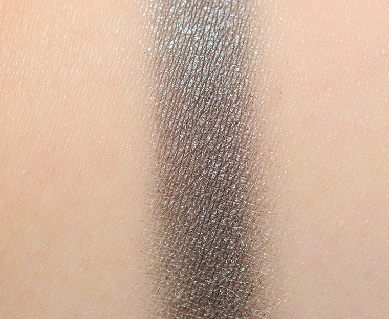


Volcanic #4
Volcanic #4 is a medium gray with subtle, cool undertones and a satin finish. It had medium, buildable pigmentation with a smooth, denser consistency that felt a touch dry, though it wasn’t dusty or powdery. The eyeshadow wore well for seven and a half hours on me before fading noticeably.
Top Dupes
- Tom Ford Beauty Silver Screen (LE, $36.00) is more shimmery, cooler (95% similar).
- NARS Pyrenees (P, $19.00) is more shimmery, darker, cooler (95% similar).
- Viseart Cool Matte #8 (PiP, ) is more shimmery, darker, cooler (90% similar).
- MAC Catch My Snowdrift (LE, $17.00) is more shimmery, darker (90% similar).
- KVD Beauty Filthy (LE, ) is more shimmery, warmer (90% similar).
- Too Faced Chimney (LE, $16.00) is darker, cooler (90% similar).
- Pretty Vulgar Darkside (PiP, ) is more shimmery, cooler (90% similar).
- Dior Smoky Canvas #1 (LE, ) is less shimmery (90% similar).
- MAC Well Past Midnight (LE, $17.00) is more shimmery, darker (90% similar).
- MAC A Waft of Grey #3 (PiP, $21.00) is more shimmery (90% similar).
Look Using this Product
Volcanic #4
LELimited Edition.

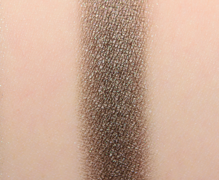


Volcanic #5
Volcanic #5 is a medium-dark taupe with subtle, warm undertones and a pearly sheen. The eyeshadow had opaque color payoff that applied evenly to bare skin and blended out easily along the edges. The texture was smooth, dense but not stiff, and easy to work with. It stayed on well for eight hours before fading a bit.
Top Dupes
- Clarins Brown #3 (PiP, ) is more shimmery, darker, warmer (90% similar).
- KVD Beauty Fawn (Define) (LE, ) is darker, cooler (90% similar).
- Chanel Silver Screen (822) (LE, $36.00) is more shimmery, lighter, warmer (90% similar).
- Dior Jungle #3 (PiP, ) is less shimmery, darker, cooler (90% similar).
- Pat McGrath Substance (PiP, $25.00) is more shimmery, darker, warmer (90% similar).
- Dior Moonlight #4 (LE, ) is more shimmery, lighter (85% similar).
- Chanel Tisse Gabrielle #1 (PiP, ) is more shimmery, lighter, cooler (85% similar).
- Chanel Tisse Gabrielle #4 (PiP, ) is more shimmery, cooler (85% similar).
- Zoeva Nostalgic (PiP, ) is more shimmery, lighter, cooler (85% similar).
- Milani Sweeter Than Chocolate (PiP, $5.99) is more shimmery, warmer (85% similar).
What a unique color combo! I’m kind of feeling it. I wouldn’t spend $63 on this palette, but I might see about creating something similar out of colors I already have 🙂 It’s nice to see brands get a little more creative.
I was thinking the same thing! The color combo is so interesting, will definitely have to shop my stash for similar colors.
I love this combo of warm and cool, and the look you did with it, Christine.
This one caught my eye right away when I saw it in the display. It’s not a combination I would have thought of, but I find it works in an unexpected way.
It’s so refreshing to see an unusual colour combination like this in an eyeshadow palette! Although I won’t be purchasing it, it is definitely a source of inspiration to shop my own stash and create a similar look.
This looks really interesting and different and certainly fits in with the “Volcanic” name. The funny thing is that while I like the look of this from a creative standpoint, I would just never buy a 5-pan with these shades in it – #2 and 3 are really not for me and there is no decent highlight type shade which is something I like, even in a smaller palette like this. And yet, I’m strangely drawn to it.
I find this quint to be far more interesting and diverse than yesterday’s offering. Love the cool toned shades and the quality was much better. I would have preferred a copper shade than the bright orange, but I can see how they work together. Lovely eye look Christine.
In our collective sea of eyeshadow palette boredom, this little gem pops up! Basically, if you ask enough times, it shall be done. Not exactly sure how on earth I would wear this, I only know that I want to!
Interesting color story. I wonder how many looks I could get using this palette. I like the look you did with it. Dior makeup and me usually get along well. Love their highlighters and I own several of their eye shadow palettes.
I like the “fire and ice” color combination quite a bit. Interesting choice.
I’m really not feeling these Dior palettes.
I guess I’m the lone boring one here ?
No, you’re not the ‘lone, boring one’ at all – it’s just that this is a more innovative palette we have seen from Dior for a long time. I would not purchase it because of those bright orangey shades and I have enough dupes of the silvery ones.
I don’t generally like Dior’s palettes either.
Love this palette finish. Looks like leather. I love the burnt orange color. I was disappointed in the only other Dior palette I have purchased.
I love this palette!! It is so unusual, warm and cool tones that works well together. I’m going to purchase this!!!!
An interesting palette. I love that you used the shadows in your look also in an unexpected way. I would have automatically gone with the greys around the eyes and the copper/chili/browns in the crease for transition. So clever!
Fascinating. Barely duped at all. Just the diverse opposites (oxymoronic, much?) that I really like. I haven’t gotten any Dior in two dog’s ages….
I don’t want it, but I’m happy to see something a little out of the ordinary.
Wow, I love this color combination. It’s like the color version of sweet and salty.
Beautiful and fun.
Wow, this certainly looks Volcanic!! It’s been so long that I’ve seen such a unique looking color combo in a palette. Yay, looks like the creative juices are finally flowing at Dior, my wallet is trembling in anticipation of what they will come up with next!
This looks amazing on you. I’ve been burned by Dior shadows in the past, so I am hesitant.
I am so not into Dior but omfg this color scheme is speaking to me ! Time to hide my wallet I suppose…
Interesting! I will look in my collection to recreate this palette!
I don’t think I’ll ever be capable of spending that much money on a 5-eyeshadow palette, but that look you created there is absolutely stunning, Christine!!!
When I see these colors I think old lady (with some pop) look. They do look good individually, but right now in my life, these colors just seem drab (even though I know they are peppy).
I love the oppositional color story and the look you did! Nice job! Inspires me to play with those colors in my stash
What you did with this… truly amazing! When I saw your eye look, I was certain this palette would contain at least one and possibly three must-have shades (inner corner, inner crease, outer crease). Then I saw the swatches and almost laughed; they are nothing special. Nice, but easily duped in a large stash. It’s what you did with them that was so artistic, not the colors themselves.
You’ve genuinely turned yourself into a cosmetic artist over the years. This is what has always happened to me when I look at pro work and the instructions provided: I think either they’re lying to me about what they used, or they have some kind of magic wand that they wave over the product I own to change regular ol’ makeup into an array of colors I can’t picture. You have done that several times over the years (in particular with Armani eye tints and Dior shadow combinations, actually), but lately you do it in almost every look, especially with the blush/highlighter pairings you use.
Now I can find product reviews and MUA-level artistry on the same site. Saves time!
Thank you so much, Emily! 🙂 You are too kind – really means a lot to me to hear it!
Wow! Your brown eyes really pop! Looks very couture. This and the Chanel quad a couple of years ago are my favorites on you — ever.