ColourPop Love Struck Pressed Powder Highlighter Review & Swatches

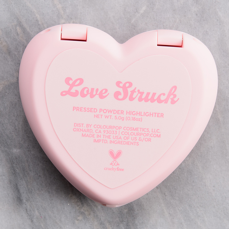
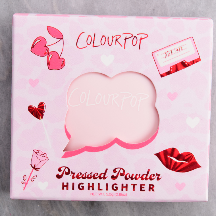


Love Struck
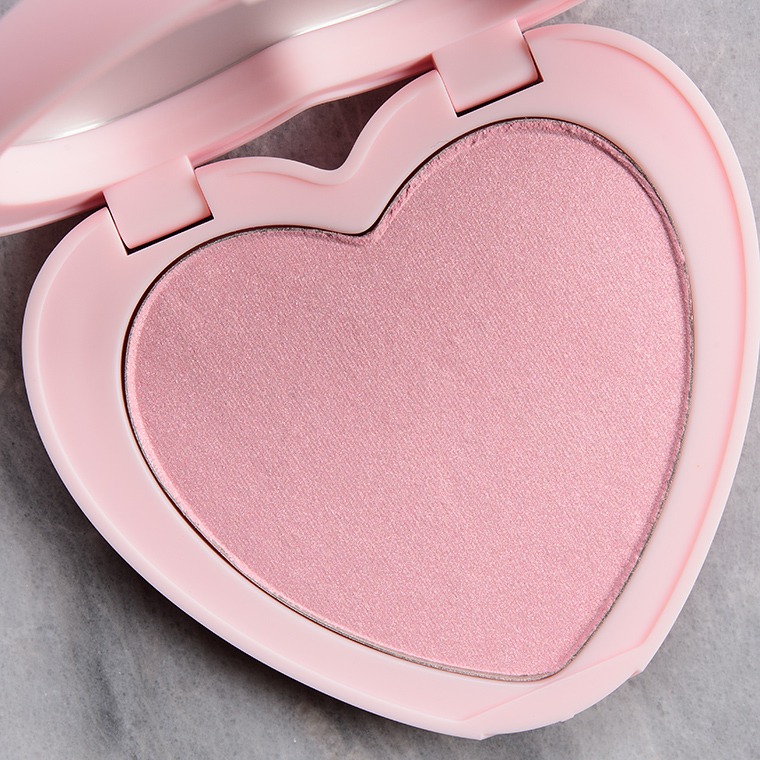
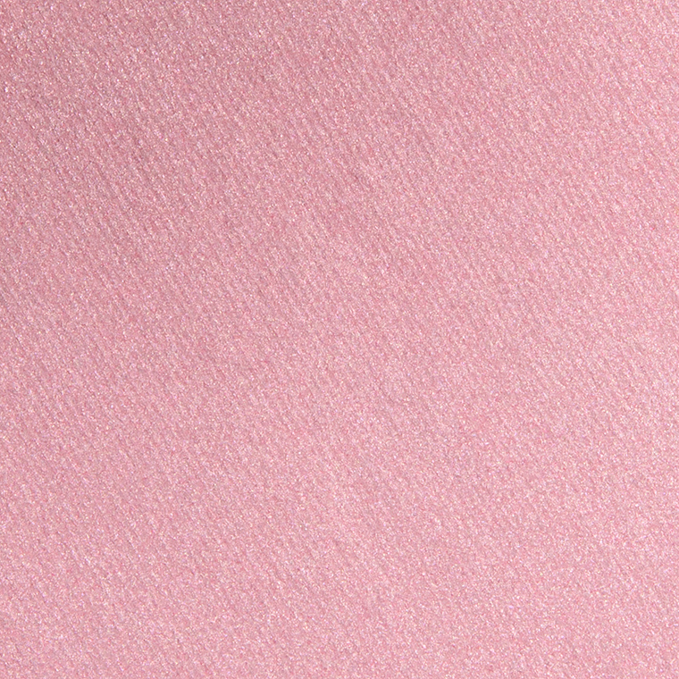
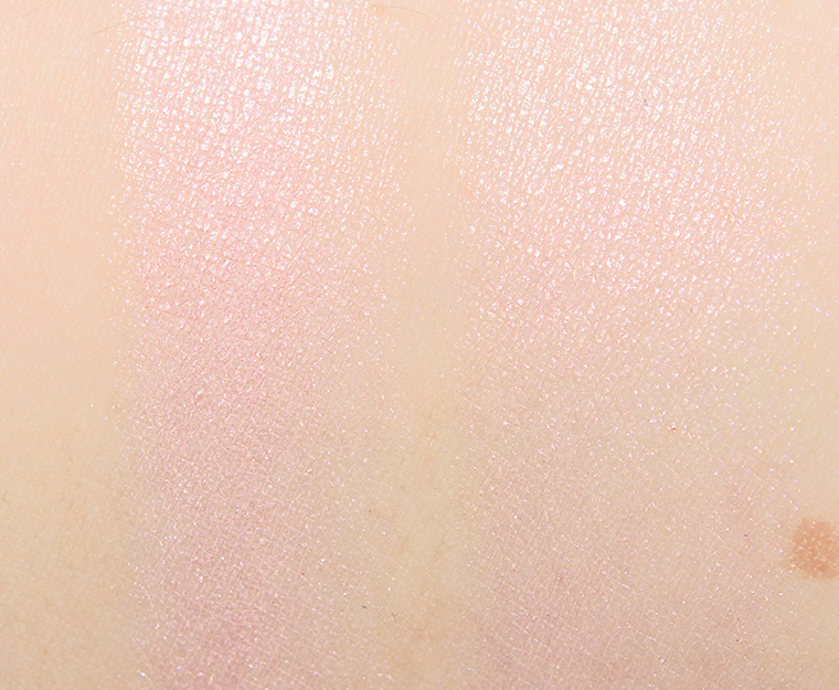
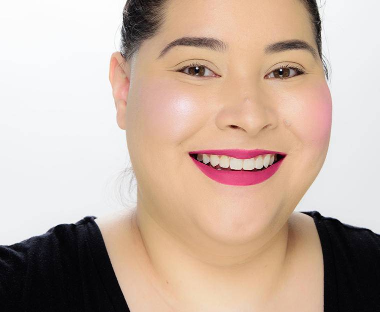
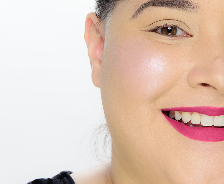
ColourPop Love Struck Pressed Powder Highlighter ($8.00 for 0.23 oz.) is a very light pink with moderate, warm undertones and a metallic sheen.
- Semi-opaque coverage, buildable (slightly more pigmented than marketed)
- Smooth, moderately-firm but not stiff
- Picked up evenly with brush and blended out well
- Seemed slightly frosty/have whiter pearl
- Long-wearing (8 hours before fading)
FURTHER READING: Formula Overview for details on general performance and characteristics (like scent).
Top Dupes
- Sydney Grace Arctic Moon (P, $8.00) is more shimmery, lighter (90% similar).
- Clionadh Ohm (P, $12.50) is more shimmery, lighter (90% similar).
- Lethal Cosmetics Flux (P, $18.00) is cooler (90% similar).
- Chanel Rosy Light Drops (P, $50.00) is lighter, less pigmented, cooler (85% similar).
- Huda Beauty Frosted Kiss (LE, ) is lighter, cooler (85% similar).
- Tarte Worthy (LE, $29.00) is more shimmery, lighter, cooler (85% similar).
- Milk Makeup Pink (LE, $30.00) is more shimmery, cooler (85% similar).
- bareMinerals Whimsy (P, $29.00) is more shimmery, lighter, cooler (85% similar).
- Giorgio Armani Pink Pearl (7) (P, $44.00) is lighter, cooler (85% similar).
- Urban Decay Aura (P, $26.00) is more shimmery, lighter, cooler (80% similar).
Formula Overview
$12.00/0.21 oz. - $57.14 Per Ounce
The powder highlighter is supposed to have a "high-shine" finish with "high colour intensity." In general, ColourPop's pressed highlighter powders have a smooth, moderately dense texture that was soft enough to be picked up easily by a brush but not kick up any powder in the pan. The formula was semi-opaque to opaque but easily sheered out for less shine and coverage if desired. There were a few shades within the range that emphasized my skin's natural texture slightly but most did not. The wear ranged from seven and a half hours to nine hours.
Browse all of our ColourPop Pressed Powder Highlighter swatches.
Ingredients

So beautiful in the pan but SO frosty on the cheeks!
With a fan brush and a light hand, I could see myself using this pale, icy pink and really loving it with a fuchsia or rosey pink blush. On the other hand, I do believe that I would love either Charlotte Tilbury Pillow Talk Glow or Rare Beauty Mesmerize better due to their warmer pink. 🤷🏻♀️
I bought this shade and it arrived smashed but I’m not disappointed as it pulls quite warm on my vampire pale skintone. I bought it because it’s described as a pale silvery pink, which is exactly the type of shade I prefer, but I need to stop relying on CP descriptions as they’re often notoriously inaccurate, as this one is. The base is pale pink but the warm undertone and gold shimmer gives a sickly cast to my skin. I didn’t notice any white pearl, just gold.
I have a strong cool undertone and can’t wear champagne or gold highlights, even if pale, as warm tones make me look sick. Maybe one day I’ll learn to stop basing purchasing decisions on CP descriptions.
Aw, I am sorry! I feel like so often cool-toned products are like, barely cool-toned or only cool-toned relative to how warm products can get.
You’re absolutely right. It’s so rare to find truly cool toned products and brand photos and descriptions are often inaccurate so buying online is a risk for someone like me who doesn’t wear warm tones.
ColourPop is notorious for claiming products are cool toned when they’re clearly not, like Stone Cold Fox, Flutter By, That’s Taupe and Making Mauves. When you reviewed the Stone Cold Fox palette, you listed the majority of shades as warm toned, which they definitely were. That was a palette of warm rosy colors and a few pops of cool grays and silvers. That’s Taupe is less overtly warm but it’s not cool toned. I’ve recommended Sydney Grace Coffee Talk to those looking for a true neutral and cool toned option to That’s Taupe.