Byredo Makeup Launches October 1st


Release Date + About the Launch
“Ultimately, beauty is subjective – Byredo Makeup had to reflect that.” — Ben Gorham, Creative Director & Founder
“I wanted to create a sense of freedom in the way we approach using Makeup but also in the way we communicate the products.” Isamaya Ffrench, Makeup Artist & Collaborator
Five core products for eyes, lips and cheeks.
Now online at Byredo, 10/7 other retailers, pre-orders now at Saks
Editor’s note: Reader Kira brought it to my and readers’ attention that the name “Tokio Rose” is problematic. She was kind enough to expand on the history and why it is an issue here. There is a general overview on Wikipedia, too, which was helpful in learning about this term. From reader Kira:
In our American history textbooks in high school, we learned about American wartime propaganda and how Tokyo Rose became a derogatory icon in the American imagination. When I studied East Asian studies in school, it was interesting to learn how the interactions between US soldiers and Japanese after the treaty was signed really shaped a lot of modern stereotypes and prejudices that persist to today — like the interactions between soldiers and sex workers, and how that completely twisted the meaning of the word “geisha” (who are not sex workers, just performers/old-timey party hostesses!), and contributed to the sexualization of Asian women (often this is what people are getting at when they complain that Asian cultures are being exoticized).
Products in the Launch
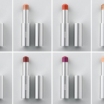
Lipstick, $42.00 (New, Permanent)
Sumptuous levels of colour saturation, ultra-gliding and easeful application. The lipstick is either satin or matte, dependent on the shade. A satin finish to reflect the light and expand colour – with a vegan formula. A matte finish to absorb light and intensify the colour. In its silver-gold bi-colour metal casing, the form of BYREDO LIPSTICK echoes bamboo – weight and precision are utilised to feel good in the hand. The slim-line stick contained within is sealed with a satisfying magnetic click.
- La Flamme Striking orange with a touch of black (Matte)
- Red Armchair Iconic red (Matte)
- Commuter Natural pink nude (Satin)
- Dancehall Queen Rich and dark pink (Satin)
- Divorce Orange-red (Satin)
- Earth Dust Pale nude with yellow undertone (Satin)
- Tokio Rose Warm vivid pink (Matte)
- Reunion Orange-brown (Matte)
- Red & Blue Red with blue undertones (Satin)
- China Plum Intense purple (Matte)
- Semi Formal Shocking pink (Satin)
- Lascaux Deep and dark burgundy (Matte)
- Solid Ground Pink-nude with earthy tones (Matte)
- Worship Her Warm modern brown (Matte)
- Subtropical Vivid cold coral (Satin)
Colour Stick, $30.00 (New, Permanent)
The universal product. A multi-use stick to be used all over the face. Buildable coverage that is easy to apply and combine with other BYREDO COLOUR STICKS to contrast or enhance. Housed in silver metal, the slim stick with curved bullet tip is designed to be used easily, quickly and instinctively while eschewing ultra-perfection; the intense colour is blendable with fingers or brush. The Colour Stick comes in finishes aligned to corresponding shades, encompassing lightweight dewy, matte and creamy textures suitable for cheeks, eyes and lips.
- Flower Play Transparent, delicate pink
- Great Sands Nude-brown with shimmers
- Babi Gentle coral
- Chin of Gold Gold glitter
- Kumato Soft metallic khaki green
- Ancient Shimmery warm dark brown
- Mesolithic Slightly metallic pink-plum
- Vienna Very transparent gold
- Ultramagnetic Glittery purple-blue with iridescent reflects
- La Scene Metallic bronze
- Destroyer Dramatic black
- Sauce Ultra-glittery vivid orange
- Sick Pink Deep pink
- Purple Stinger Transparent blue-purple
- Kinda Blue Glittery deep ocean blue
- Medium Blue Metallic and intense aqua blue
Eyeliner, $40.00 (New, Permanent)
Perfect intensity in a single stroke with a high-precision applicator. Smudge and transfer proof with humidity resistance, 99.2% ingredients of natural origin. Vegan formula. Whether bold or fine lines, they stay true for twelve hours. The eyeliner is housed in a distinct green container, inspired by nature yet abstracted and futuristic in feel.
Mascara, $45.00 (New, Permanent)
Defining and buildable to enhance and sculpt the lashes from the root. 85% ingredients of natural origin. In its striking, curved red container; abstract, totemic, and ergonomic the BYREDO MASCARA is as much a treasured object as a beauty tool. Its short, precision silicone brush can be used to reach lashes individually, enhancing and sculpting to apply mascara quickly and easily.
Lip Balm, (New, Permanent)
Clean and conditioning: a sumptuous formulation for performance and kindness. 99.8% natural, ultra hydrating formula, smooth and gliding. One single coat is enough for hours of comfort. In its distinct curvilinear, anthracite metal casing – echoing the lipstick – weight and precision are utilised to feel good in the hand. The slim-line stick contained within is sealed with a satisfying magnetic click.
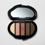
Syren Eyeshadow 5 Colours, $TBA (New, Permanent)
- Victory Metallic silver-gold
- Charybdis Metallic ultra-violet
- Scylla Metallic neon-chartreuse
- Melody Light pink with glitter
- Odyssey Metallic denim blue
Corporate Colours Eyeshadow 5 Colours, $TBA (New, Permanent)
- Letterhead Pearly luminous light ivory
- Eraser Pearly fresh rosy beige
- Pushpin Warm matte red clay
- Manila Shimmery dark khaki
- Stylo Shimmery dark brown
Sciomancer Eyeshadow 5 Colours, $TBA
- Ginger Hussy Iridescent metallic orange
- Electric Love Metallic electric purple
- Blue Marionette Vibrant sparkling blue
- Karma Metallic deep green
- Silver Gutter Top coat, black and silver glitter
The packaging definitely looks…unconventional. Hmmm.
Anyone else find the bendy looking tubes for the lipstick, mascara and eyeliner rather unsettling and nausea inducing? Or is it just me?
The 5-pan e/s palette does look interesting for autumn. That is, if it’s any good in action and wear. I am digging the rich jewel tone and earthy mattes. But can put together my own via SG, I’m sure.
It made me feel dizzy, haha! I was looking for a similar comment . Agree that the palette has pretty colors for fall.
Not just you – interesting and sculptural but not what I want in my lipstick tubes!
LOL! Yes, the packaging is a little unsettling but fun if you’re into displaying cosmetics! But not very practical: storage would be an issue. The formula would have to be really something else for me to bother with storing it.
I’ll pass. Not my style at ALL.
Im over 50 so I dont go crazy with those wild otters shades or placements.
At first I thought the photo was taken with a fish eye lens, then I realized it was the package design. I liked it at first but the more I look at the picture the more my eyes feel unsettled. Maybe when you only have one or two pieces in a drawer, makeup holder, or purse the effect isn’t so…strange. On a positive note, I do see a few lipstick shades that look promising, although I’m not wearing much lipstick these days 🙁
Nancy, Yes!
Also, if I think about applying the lipstick, what bothers me is that it seems that the bend will force the user to use the lipstick when oriented only certain ways. Plus if not careful, it looks like the cap could damage the lipstick if put back on the wrong way.
Those curved packages would be annoying for me because they wouldn’t fit in my organizers (and specifically for the lipsticks they would take up more space in a pocket or small purse). I have one Fenty gloss that is too big for my regular organizer and it bothers me that it sits out by itself. Innovative formulas grab my attention more than innovative packaging, because at the end of the day I want my packaging to be practical and they don’t need to be statement pieces. Maybe these are innovative formulas as well. We’ll see! Those multi sticks (I think the second photo is those) look to come in some pretty colors.
May I just say….. I love it. I LOVE the wiggly wonky packaging. I hope the formulas are decent!
Me too!
I actually love the design as well, though difficulty with storage, especially for the overstashed, is a concern. My question is, is there a standard cylinder inside the wavy outside? One would think so, as a wavy bullet could not advance. That could make for a tube that is much wider and heavier than you expect, even given the pix. I wonder about the ‘why’ behind dislike. Is it perceptual? Is it functional? Is it associative? Is it the impracticality? Is it experience with ‘odd’ shapes that do not perform well? Does it give the impression that they will tip over, since they seem to lean? Or is it a discomfort, like the ABHCB palette, that wreaked havoc on those readers with trypophobia?
Terrible lipstick tube design. Eye shadow pan colors look interesting though.
These images are so uncomfortable to look at.
Exactly my thoughts, Jessica! Looking at them literally made me feel a bit sick to my stomach.
Thats exactly how I felt looking at them. Like they physically make me ill. Nothing against the products, the pics are just unsettling for sure
I worked in the medical field too long. All I can think of with those curved packages is the ads on TV for “Do you have Peyronie’s disease?” The colors remind me of Fenty’s, and I love her Shimmer Match Stix and other stick products. Will stick with Fenty.
Obviously pieces to be displayed, rather than stored. They look like a sculpture garden and get a plus for packaging from me. This is edgy, sleek, and stark…somehow anti-Louboutin. Practical, hell no. Most of us are working on consolidating stash and practical storage, not pieces that stand like a mini Stonehenge. If i had enough horizontal free space, I’d love these. But I’d swear like a drunken sailor when they all fell over like dominoes, when I reached for one.
Oh, and I’ll bet they’re overscented…..
Interesting shapes for makeup. I like the lip stick tubes, unique and easy to find. Not feeling the Gumby headed mascara, lol. Love the look of the eye shadow palette! Still haven’t brought any Byredo perfumes yet.
…so who is going to tell them red lipstick isn’t “unconventional”?
well that quite interesting packaging
I also wonder if you can only cap the lipstick one way…and either way, what a pain. Either you have to fumble around to get it back on just the right way, or you misalign and have a tube curved at the bottom AND the top.
Certainly a show piece—one lipstick would look gorgeous sitting on a mirrored tray next to a glass perfume bottle, a pink powder puff, and a single flower bud in a vase—but I don’t live like that anymore. [LOL]
Yeesh. Nope on the funhouse packaging. Feels like an odd mismatch with the very clean and uniform design of the fragrance bottles.
Funhouse packaging ?
Wow how absolutely stunning are these silver- gold lipsticks! I’m gonna have to get at least one
I hope the lipstick shades are as good as they look, not quite sure about the packaging, but we will let Christine try them first and trust what she thinks.
The eyeshadow palette does look quite vibrant, but I wonder about the first shade – the rest of the shades are definitely cool toned, but the browny shade looks quite out of sync.
I want the Colour Sticks to be good! It seems like the price will be on par with Laura Mercier, and if the quality is similar, they’ll be a slam dunk.
Wouldn’t that be great? Some of those colours are amazing.
Definitely agree with everyone who feels a little unsettled by those lipstick tubes. The color sticks look interesting though! Hopefully they are of decent quality.
I LOVE the packaging! Can’t wait to see the lippies! Does anyone remember the E.Arden/Robert Lee Morris collection or am I the only one that old? This reminds me of it.
I LOVE the packaging! Can’t wait to see the lippies! Does anyone remember the E.Arden/Robert Lee Morris collection or am I the only one that old? This reminds me of it.
I own 3 Byredo perfumes and they have a clean simple packaging and bottles. The lipsticks and mascara packaging don’t seem to fit that vision. They look more like Ikea. LOL, The price range looks good not over the top like By Kilian another perfume house moving into makeup.
I will be interested in what Christine thinks of the range.
Uuuuhhhh
I can’t wait for your review!
“Tokio Rose” – wow, what an incendiary name. I am completely turned off by this brand, and can’t see my view changing on that.
I was unfamiliar with this until you left this comment, and then one Google made it very clear why —
Need to keep reading but wanted to drop the most basic of info: https://en.wikipedia.org/wiki/Tokyo_Rose
If you have the time + desire to share more for those, like me, who weren’t aware of this term, I’d greatly appreciate it – or pointing to any resources! Thank you, Kira!
Oh yes, will do! I am bad at knowing what is generally known, and wasn’t sure how you felt about outside linking since it would put more work on you to be directed all over the internet, but will definitely do so in the future! In our American history textbooks in high school, we learned about American wartime propaganda and how Tokyo Rose became a derogatory icon in the American imagination. When I studied East Asian studies in school, it was interesting to learn how the interactions between US soldiers and Japanese after the treaty was signed really shaped a lot of modern stereotypes and prejudices that persist to today — like the interactions between soldiers and sex workers, and how that completely twisted the meaning of the word “geisha” (who are not sex workers, just performers/old-timey party hostesses!), and contributed to the sexualization of Asian women (often this is what people are getting at when they complain that Asian cultures are being exoticized). “Ginger hussy” also makes me feel uncomfortable. I don’t know if the founder is of Asian ancestry, so it makes me even more uneasy since the brand doesn’t address this in these materials.
I think when links are not advertising/promotional in nature but for education or providing sources for arguments, that’s totally valid to do!
Thank you for taking the time to share more with me/readers, Kira! This has been really helpful, and now I wish I hadn’t ordered anything from Byredo this morning! ?♀️
Their approach to makeup still looks like it could be informative! Look forward to your vicarious swatches as always. I often find things to add to my wishlist by checking your dupe list ?!
Byredo are also famous for their perfume G***y Water, which is itself a pretty serious racial slur against a group still facing genocide.
The makeup and perfume are potentially lovely, but multiple racial slurs is pretty alarming.
Yes, that’s an appalling name. And to casually stick it on a piece of makeup? Yikes.
Thanks Kira for raising the issue of the TR name and thanks for highlighting that.
Beyond that, I like innovation and creativity but can’t help but feel the packaging here is done to show off how trendy they are rather than tied to a real design innovation. At the moment, this will be a pass for me.
Nothing really grabs my attention beyond the obvious “look at me, I’m avant garde!” packaging. The eyeshadow palettes are ok, but that picture of the girl’s eye covered in red lipstick just makes her look like she has some terrible infection. I’ll be interested to see your review, but I can’t imagine I’ll be getting anything.
I’m so glad someone said it! That pic of her eye definitely looks like she has some horrible eye infection. It doesnt make the makeup look good at all. I can’t wait to read the reviews for these products either
Another brand not doing its due diligence when researching names for their products. I am not sure why the brand decided “Tokio Rose” would be a good name for a lipstick, as it has a variety of connotations that are far removed from the truth.
Thank you Kira for bringing this matter to our attention and I am personally past being interested in a brand who uses cheap and demeaning names for their products.
No that you. I won’t be participating in this.
I don’t like anything thing from this company and with the awful design I don’t feel encouraged at all.
I find this quite interesting. I like the perfumes, though I have only one, I always stay at the Byredo counters to try a new or untried scent.
I like the lipsticks, packaging and all, pity that one of the names was ill thought of, and maybe it is time for brands to do more research into the names they chose. To me, an oldish European the name made me think of a lovely rose bush. I am grateful for all educational texts, I like learning. Maybe brands should do like MUFE and just have numbers, though I find numbers easy to forget.
I like the Colour Sticks and find two of the palettes interesting.
I hope you’ll review some of these products, Christine, as you had already put in an order.
The pictures give me a headache. There’s edgy and then there’s trying too hard. This is trying way too hard.
Those lipsticks are deeply unsettling lol. It feels like I’m staring into a fun house mirror.
Nothing about this look appealing to me, from the weird packaging to the color stories to the creepy promotional image to the tacky use of Tokyo Rose as a color name… especially at that pricepoint.