Natasha Denona Camel Eyeshadow Palette Review & Swatches


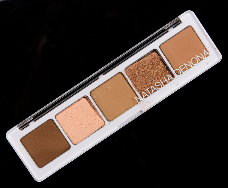


Camel
Natasha Denona Camel Eyeshadow Palette 5 ($48.00 for 0.40 oz.) is a new, neutral palette that features three matte finishes and two shimmery shades. It’s a warmer-toned palette, though it had more muted, yellow undertones across the mattes that made it less typical. Frankly, the tones seemed exactly like what I’d expect to see from palette called “camel!” The five shades worked well together, and I felt like it was easy to get a very diffused and blended crease/transition area with the gradient of mattes. The two shimmers are quite different, so they can create their own gradient by blending the two together. The only “downside” to the palette was that Dune was described as sheer and wasn’t, so that was why the rating dropped.
Looks Using this Product


Camel
PPermanent. $48.00.

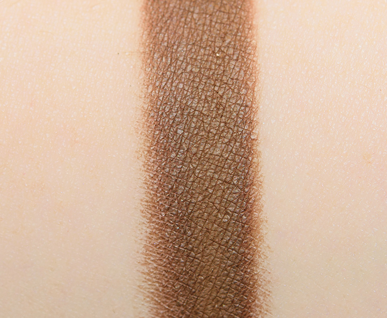


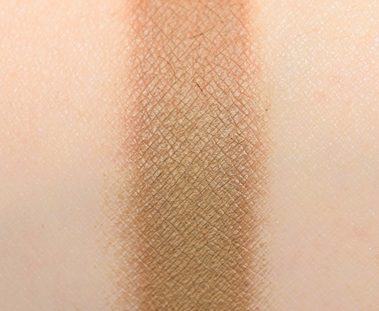
Arrosto (185CM)
Arrosto (185CM) is a medium-dark brown with subtle, yellowish undertones and a matte finish. It was more “yellow” but muted, which gave it a more neutral-to-olive tone to my eye. The consistency was smooth, velvety, and substantial without being too powdery, though I noticed the color applied a bit darker in places when I swatched it. I didn’t notice this when I worked with it on my lid, though. It had good color coverage that blended out nicely and stayed on well for eight and a half hours on me.
FURTHER READING: Formula Overview for details on general performance and characteristics (like scent).
Top Dupes
- LORAC Unedited (PiP, $19.00) is cooler (95% similar).
- Natasha Denona Shea (LE, ) is cooler (95% similar).
- Tarte Dreamer (LE, ) is darker (90% similar).
- Tarte Heartbreaker (LE, ) is warmer (90% similar).
- Pretty Vulgar Nest Egg (PiP, ) is lighter (90% similar).
- LORAC Bedrock (LE, $19.00) is lighter (90% similar).
- Urban Decay Funky Town (LE, $19.00) is lighter (90% similar).
- Sephora Roasted Chestnuts (302) (P, $9.00) is warmer (90% similar).
- Anastasia Chai (LE, $12.00) is darker, more muted, cooler (90% similar).
- Urban Decay Dare (LE, $19.00) is lighter (90% similar).
Formula Overview
-
The majority of the brand's eyeshadows are quite pigmented, blendable, and long-wearing. The eyeshadows have improved over time, particularly with respect to longevity (without a primer). The original formula often creased on me within seven to eight hours, whereas the more current formula wears eight to nine hours with fading (instead of full-on creasing). The more matte finishes tend to be a bit more velvety, substantial, and less dry/powdery compared to prior iterations.
The metallic finish is often the creamiest, slightly denser in feel, but has excellent pigmentation, adhesion, and blendability. The sparkling shades can have some fallout, depending on how they're applied and how sparkly they are, so they sometimes work better with fingertips or a dampened brush; they can also run sheerer compared to other finishes.
Cream-Powders are the more unique formulation and tend to have firmer, almost stiff, consistencies and more semi-opaque, watercolor-esque coverage. They are longer-wearing, but they can take a few uses to learn how to use. This formula has also improved compared to when it first debuted--it is a bit more yielding now.
Browse all of our Natasha Denona Creamy Matte Eye Shadow swatches.
Ingredients
Synthetic Fluorphlogopite, Zinc Stearate, Dimethicone, Triethoxycaprylylsilane, Caprylyl Glycol, Ethylhexylglycerin, Hdi/Trimethylol Hexyllactone Crosspolymer, Silica, Mica, Tin Oxide, Ci 77891 (Titanium Dioxide), Ci 77491, Ci 77492, Ci 77499, (Iron Oxides).
Disclaimer: Ingredient lists are as available by the brand (or retailer) at the time of publishing. Please always check product packaging, if it exists, for the ingredient list applicable to the product you're purchasing, or the brand or retailer's website for the most up-to-date ingredient list.
Looks Using this Product
Arrosto (185CM)
PiPPermanent in Palette.

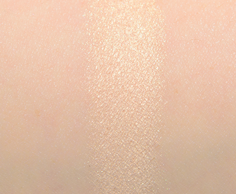


Dune (186S)
Dune (186S) is a light, yellowed peach with warm undertones and a hint of pink sheen. It had nearly opaque pigmentation, though it was described as “sheer.” The texture was more loosely pressed in the pan, so it had some fallout when applied with a dry brush, but once on, it adhered well and blended out well. This shade wore well for eight and a half hours on me before I noticed faint fading.
FURTHER READING: Formula Overview for details on general performance and characteristics (like scent).
Top Dupes
- ColourPop Lace Up (PiP, $4.50) is more shimmery, lighter (95% similar).
- Make Up For Ever I520 Pinky Sand (P, $17.00) is more shimmery (95% similar).
- Too Faced Coconut Sugar (PiP, $16.00) is darker (95% similar).
- Urban Decay Blaze (PiP, $19.00) is darker (90% similar).
- Viseart Beloved (PiP, ) is more shimmery, lighter (90% similar).
- Smashbox Straight Up (PiP, ) is darker (90% similar).
- MAC Diamond Butterfly (LE, $17.00) is more shimmery (90% similar).
- KVD Beauty Lovestruck (LE, ) is lighter (90% similar).
- Natasha Denona Queen (262M) (LE, $29.00) is more shimmery, cooler (90% similar).
- ColourPop Besos (LE, $4.50) is more shimmery, lighter (90% similar).
Formula Overview
$29.00/0.08 oz. - $362.50 Per Ounce
The majority of the brand's eyeshadows are quite pigmented, blendable, and long-wearing. The eyeshadows have improved over time, particularly with respect to longevity (without a primer). The original formula often creased on me within seven to eight hours, whereas the more current formula wears eight to nine hours with fading (instead of full-on creasing). The more matte finishes tend to be a bit more velvety, substantial, and less dry/powdery compared to prior iterations.
The metallic finish is often the creamiest, slightly denser in feel, but has excellent pigmentation, adhesion, and blendability. The sparkling shades can have some fallout, depending on how they're applied and how sparkly they are, so they sometimes work better with fingertips or a dampened brush; they can also run sheerer compared to other finishes.
Cream-Powders are the more unique formulation and tend to have firmer, almost stiff, consistencies and more semi-opaque, watercolor-esque coverage. They are longer-wearing, but they can take a few uses to learn how to use. This formula has also improved compared to when it first debuted--it is a bit more yielding now.
Browse all of our Natasha Denona Metallic Eye Shadow swatches.
Ingredients
Mica, Zinc Stearate, Dimethicone, Octyldodecyl Stearoyl Stearate, Caprylyl Glycol, Ethylhexylglycerin, Tin Oxide, Ci 77891 (Titanium Dioxide), Ci 77491, Ci 77492 (Iron Oxides).
Disclaimer: Ingredient lists are as available by the brand (or retailer) at the time of publishing. Please always check product packaging, if it exists, for the ingredient list applicable to the product you're purchasing, or the brand or retailer's website for the most up-to-date ingredient list.
Looks Using this Product
Dune (186S)
PiPPermanent in Palette. $29.00.


Safari (187CM)
Safari (187CM) is a muted, medium greenish-brown with subtle, warm olive undertones and a matte finish. It had excellent pigmentation with a smooth, velvety consistency that wasn’t too powdery nor too firmly pressed in the pan. The eyeshadow applied easily to bare skin as the edges diffused with little effort while it maintained its intensity and coverage. It lasted for eight and a half hours on me before it faded slightly.
FURTHER READING: Formula Overview for details on general performance and characteristics (like scent).
Top Dupes
- Anastasia Birch (LE, $12.00) is lighter (95% similar).
- ColourPop Chicana (PiP, $4.50) is darker, cooler (95% similar).
- Sephora + Pantone Universe Cocoa Brown (LE, ) is darker (90% similar).
- Marc Jacobs Beauty We'll See (PiP, ) is darker (85% similar).
- MAC That Somebody (LE, $17.00) is lighter, warmer (90% similar).
- Tom Ford Beauty Mink Mirage #2 (PiP, ) is brighter, warmer (90% similar).
- Viseart Grande Pro (Vol. 1) #8 (LE, ) is darker, more muted (85% similar).
- Chanel Affresco #2 (LE, ) is darker (85% similar).
- Natasha Denona Lodge (283CP) (LE, ) is lighter, brighter (85% similar).
- LORAC Brown (LE, $19.00) is darker, more muted, cooler (85% similar).
Formula Overview
-
The majority of the brand's eyeshadows are quite pigmented, blendable, and long-wearing. The eyeshadows have improved over time, particularly with respect to longevity (without a primer). The original formula often creased on me within seven to eight hours, whereas the more current formula wears eight to nine hours with fading (instead of full-on creasing). The more matte finishes tend to be a bit more velvety, substantial, and less dry/powdery compared to prior iterations.
The metallic finish is often the creamiest, slightly denser in feel, but has excellent pigmentation, adhesion, and blendability. The sparkling shades can have some fallout, depending on how they're applied and how sparkly they are, so they sometimes work better with fingertips or a dampened brush; they can also run sheerer compared to other finishes.
Cream-Powders are the more unique formulation and tend to have firmer, almost stiff, consistencies and more semi-opaque, watercolor-esque coverage. They are longer-wearing, but they can take a few uses to learn how to use. This formula has also improved compared to when it first debuted--it is a bit more yielding now.
Browse all of our Natasha Denona Creamy Matte Eye Shadow swatches.
Ingredients
Synthetic Fluorphlogopite, Zinc Stearate, Dimethicone, Triethoxycaprylylsilane, Caprylyl Glycol, Ethylhexylglycerin, Hdi/Trimethylol Hexyllactone Crosspolymer, Silica, Mica, Tin Oxide, Ci 77891 (Titanium Dioxide), Ci 77491, Ci 77492, Ci 77499, (Iron Oxides).
Disclaimer: Ingredient lists are as available by the brand (or retailer) at the time of publishing. Please always check product packaging, if it exists, for the ingredient list applicable to the product you're purchasing, or the brand or retailer's website for the most up-to-date ingredient list.
Look Using this Product
Safari (187CM)
PiPPermanent in Palette.

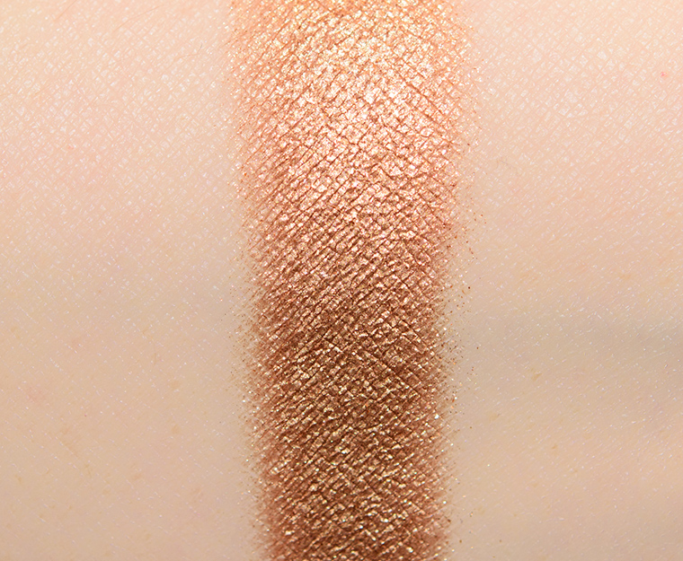


Copper Stone (188M)
Copper Stone (188M) is a rich, medium bronze with warm undertones and a metallic sheen. It had rich, opaque pigmentation that applied evenly and smoothly to bare skin. The texture was dense but not too firmly pressed in the pan, so I didn’t have any issues picking up the product on a typical, dry brush, but the finish was more reflective when used with a dampened brush (as expected). It applied evenly, blended out easily, and stayed on well for nine hours on me.
FURTHER READING: Formula Overview for details on general performance and characteristics (like scent).
Top Dupes
- ColourPop Auburn (LE, $4.50) is more shimmery, cooler (95% similar).
- MAC Dazzle Style (P, $18.00) is more shimmery (95% similar).
- Glaminatrix Temptation (P, $8.04) is darker (95% similar).
- Pat McGrath Bronze Devotion (PiP, $25.00) is cooler (95% similar).
- Too Faced Tiger's Eye (LE, $16.00) is less shimmery (95% similar).
- Huda Beauty Topaz #6 (LE, ) is less shimmery, cooler (95% similar).
- Guerlain Gold Palette #5 (LE, ) is more shimmery (95% similar).
- Dose of Colors Sunglow (LE, ) is cooler (95% similar).
- Tom Ford Beauty Honeymoon #2 (PiP, ) is darker (90% similar).
- Anastasia Gilded (LE, $12.00) is warmer (90% similar).
Formula Overview
$29.00/0.08 oz. - $362.50 Per Ounce
The majority of the brand's eyeshadows are quite pigmented, blendable, and long-wearing. The eyeshadows have improved over time, particularly with respect to longevity (without a primer). The original formula often creased on me within seven to eight hours, whereas the more current formula wears eight to nine hours with fading (instead of full-on creasing). The more matte finishes tend to be a bit more velvety, substantial, and less dry/powdery compared to prior iterations.
The metallic finish is often the creamiest, slightly denser in feel, but has excellent pigmentation, adhesion, and blendability. The sparkling shades can have some fallout, depending on how they're applied and how sparkly they are, so they sometimes work better with fingertips or a dampened brush; they can also run sheerer compared to other finishes.
Cream-Powders are the more unique formulation and tend to have firmer, almost stiff, consistencies and more semi-opaque, watercolor-esque coverage. They are longer-wearing, but they can take a few uses to learn how to use. This formula has also improved compared to when it first debuted--it is a bit more yielding now.
Browse all of our Natasha Denona Metallic Eye Shadow swatches.
Ingredients
Mica, Calcium Sodium Borosilicate, Octyldodecyl Stearoyl Stearate, Zinc Stearate, Hydrogenated Polycyclopentadiene, Caprylic/Capric Triglyceride, Dimethicone, Talc, Hydrogenated Palm Kernel Glycerides, Isododecane, Caprylyl Glycol, Ethylhexylglycerin, Silica, Hydrogenated Palm Glycerides, Tin Oxide, Ci 77891 (Titanium Dioxide), Ci 77400 (Bronze Powder, Copper Powder), Ci 77491, Ci 77499 (Iron Oxides), Ci 75470 (Carmine).
Disclaimer: Ingredient lists are as available by the brand (or retailer) at the time of publishing. Please always check product packaging, if it exists, for the ingredient list applicable to the product you're purchasing, or the brand or retailer's website for the most up-to-date ingredient list.
Copper Stone (188M)
PiPPermanent in Palette. $29.00.

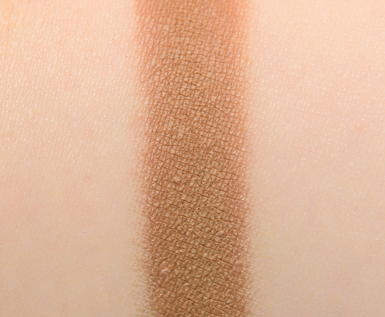


Zand (189CM)
Zand (189CM) is a medium brown with warm, olive undertones and a matte finish. The texture was soft, smooth, and blendable with a touch of powderiness in the pan, but it had substance and applied well to bare skin without sheering out too readily. The pigmentation was opaque, which applied evenly and wore well for eight and a half hours on me.
FURTHER READING: Formula Overview for details on general performance and characteristics (like scent).
Top Dupes
- Urban Decay Zone (LE, $19.00) is lighter (95% similar).
- Sephora + Pantone Universe Cocoa Brown (LE, ) is darker (95% similar).
- Sephora + Pantone Universe Carob Brown (LE, ) is lighter (95% similar).
- Viseart Toffee (Dark Matte #1) (PiP, ) is darker (90% similar).
- Anastasia Fawn (P, $12.00) is warmer (90% similar).
- MAC Cork (P, $17.00) is lighter (95% similar).
- Stila Warm Honey (LE, $18.00) is lighter (90% similar).
- MAC Soba (P, $17.00) is more shimmery, lighter (90% similar).
- Marc Jacobs Beauty Seeking (PiP, ) is cooler (90% similar).
- Make Up For Ever S638 Mocha (DC, $21.00) is warmer (90% similar).
Formula Overview
-
The majority of the brand's eyeshadows are quite pigmented, blendable, and long-wearing. The eyeshadows have improved over time, particularly with respect to longevity (without a primer). The original formula often creased on me within seven to eight hours, whereas the more current formula wears eight to nine hours with fading (instead of full-on creasing). The more matte finishes tend to be a bit more velvety, substantial, and less dry/powdery compared to prior iterations.
The metallic finish is often the creamiest, slightly denser in feel, but has excellent pigmentation, adhesion, and blendability. The sparkling shades can have some fallout, depending on how they're applied and how sparkly they are, so they sometimes work better with fingertips or a dampened brush; they can also run sheerer compared to other finishes.
Cream-Powders are the more unique formulation and tend to have firmer, almost stiff, consistencies and more semi-opaque, watercolor-esque coverage. They are longer-wearing, but they can take a few uses to learn how to use. This formula has also improved compared to when it first debuted--it is a bit more yielding now.
Browse all of our Natasha Denona Creamy Matte Eye Shadow swatches.
Ingredients
Synthetic Fluorphlogopite, Zinc Stearate, Dimethicone, Triethoxycaprylylsilane, Caprylyl Glycol, Ethylhexylglycerin, Hdi/Trimethylol Hexyllactone Crosspolymer, Silica, Mica, Tin Oxide, Ci 77891 (Titanium Dioxide), Ci 77491, Ci 77492, Ci 77499, (Iron Oxides).
Disclaimer: Ingredient lists are as available by the brand (or retailer) at the time of publishing. Please always check product packaging, if it exists, for the ingredient list applicable to the product you're purchasing, or the brand or retailer's website for the most up-to-date ingredient list.
All of the promo pictures have looked so taupe/cool toned. Happy to finally see pictures that I can trust to be true to the actual undertones of the palette.
Beautylish’s photos show it very warm-toned (actually, warmer and darker – our product photos are more similar, but the swatches they have are darker) – when you contrast Beautylish’s swatches with the brand’s they look like TOTALLY different palettes!! ?
Italian reader here: LOL @ the name of the shade “arrosto”, which is the word for roasted meat in Italian! 😛
I guess I won’t be looking at that shade the same…
Nice, but so “dupe-able” and considering this is $61 here, I’ll be digging through my stash. I can see this being a real “backbone” palette, though, for someone looking for a good work and travel palette if that someone doesn’t already have a shed-load of neutral palettes and shadows.
I agree that it is a staple kind of palette – for the right person who doesn’t already have plenty of go-to neutrals – I think, perhaps, if it had incorporated green shimmers, it might have come off more interesting generally.
Christine, the addition of at least one shimmery olive-hued green would have made this palette so much more appealing! I believe this is what makes Chanel Empriente du Desert such a gem.
I don’t know if I’d want to travel with anything from ND. Everything I’ve ordered online has shown up smashed to bits. I’d love to take my Lila palette when I travel but it’s just not worth risking it.
It is a lovely quint! When I saw the brand’s promo pictures and the name and the fact it was announced as a cool toned palette… I was puzzle! Haha
Your swatches and description of the shades make more sense for a ” camel” palette ! Less exciting for me personally though. The row of browns and beiges with an olive undertone in my viseart grande pro palette satisfies me already!
Yeah, the colors just seemed very… true-to-camel in color. The cooler-toned swatches that are floating around look stunning but not at all representative of the palette in person to me!
I would totally have ordered this palette presented in the promo pictures! Especially if it had a green shimmer as you suggested in one of your replies ?
Thanks for the comparison to the Grande Pro palette. I’ve been eyeing this one, but now I can stop. You saved my wallet, Marie-Estelle!
Especially now that viseart expends their slimpro format. It is perfect to avoid repurchasing shades again and again !
This would be the ideal neutral palette for making my blue eyes *BLUE*. Good travel palette too. The only color I think I have a dupe for is Copper Stone. Hmmmmm…
I feel like we definitely don’t see as much in this type of neutral as we could – I feel like a lot of what I was thinking would be dupes (mustardy browns) ended up looking much richer/brighter/deep yellow in comparison.
Now I can absolutely see a true “camel” toned palette as opposed to the pics on IG showing swatches that veer in another direction entirely! If I didn’t feel that I must have dupes around here, I would be more inclined to go for this.
The difference between reality and expectations was quite severe!
I know this has been mentioned before but I just don’t understand why they put two shades that are nearly identical (Safari and Zand) in such a small palette.
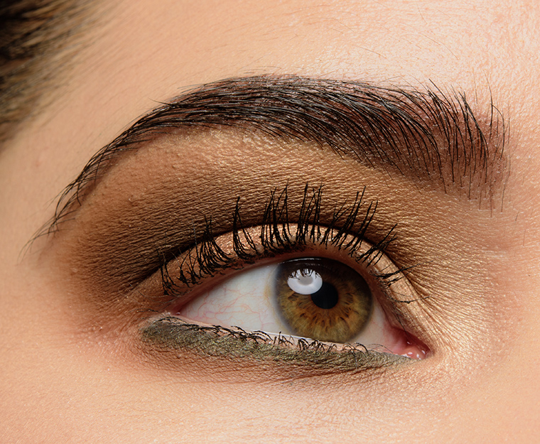
The undertones are further apart – Safari is greenish in comparison to Zand, which appears deeper and warmer – like I wouldn’t consider them dupes of each other, but I can certainly see including a different hue altogether or making one deeper/lighter for greater versatility in the palette. You can see it in the look I did with this palette – Safari is placed above the crease, and in the closed-eye shot, it has a more olive appearance. Contrast with my lower lash line (best seen in the open-eye shot) where Zand is next is applied below the green eyeliner and looks like a more typical warm brown.
Until you girls were talking about ‘Zand’ I didn’t realised the shade was called like that… It means ‘Sand’ in Dutch!
I had the same thoughts as Lea, but now I see what you mean Christine. Definitely a more unique quint then it appears to be at first sight.
If you are looking for select warm toned neutrals, this is the palette for you – no wasted shades. A really cohesive little palette and Copper Stone is my favourite shade.
Gorgeous eye look Christine.
Thank you, Genevieve!
I don’t know anymore what ‘neutral’ and ‘warm’ means. I see the terms used incorrectly (imo) ALL the time. Even to What I consider to be cool shades. What happened to the color wheel with such descriptors? Are the only pinks that are cool either fuschia and magenta? That’s crazy! And now yellow-based shades are cool? And what the heck does neutral meanl? Semi-cool? Semi-warm? How about nondescript word salad? I’m to the point where I ignore the descriptive data altogether. So much of it is misleading and just flat out incorrect.
Neutral means a balance of cool and warm undertones, and since undertone is a spectrum, it can range from very warm to very cool, so similarly something can be closer to neutral than cool/warm but lean in one direction. Cool pinks are usually bluer, whereas warm pinks have yellower undertones. For example, purples that lean bluer are cooler than purples that lean more pink – same with lavender.
I’m not sure where I said any of these shades were cool-toned (all five are categorized as warm-toned), though – I described this as a warmer-toned palette, but the undertones are more muted, so they don’t appear as strongly warm-toned as other shades that may seem similar at a glance.
Most definitions in the world of makeup aren’t written in stone; there are several correct uses for the term “neutral.” It’s pretty traditional to call tones that could be considered skin tones or near-skin tones “neutral” — they could be warm or cool, doesn’t matter. I think the definition now also includes “artistic” neutrals, which are colors that are approaching gray, including gray. And as Christine said, it can just mean “neither warm nor cool,” as in a neutral red. It’s not that there’s a right or wrong definition, only context. You could have a “warm neutral” skin brown, which could no longer be called neutral as it became more saturated and approached orange (or yellow, etc.). You could have a “true neutral” gray that wouldn’t be found anywhere except on a corpse. Or you could have a “neutral” blue that’s greener than the sky, but bluer than arctic ice.
Understand. I guess if there are “neutal’ colors, to me they would be the 3 primary colors. But, I don’t think muting one of them makes it a neutral. Nor do I think adding black or white to one of them makes it a neutral. What I’m saying, to be blunt, is that the term ‘neutral’ is like the term ‘beautiful’ — both are very subjective. And describing a warm color as being cool or visa versa is a misrepresentation, imo. Then further describing them as a neutral warm or a neutral cool is nonsensical to me.
Examples:
1 – To a cool toned lady, grays or grayed shades are ‘neutrals’. To a warm toned lady, browns or browned shades are ‘neutrals’.
2 – A warm rose. (Oxymoronic to me.)
3 – A cool coral. (Ditto.)
4 – A neutral rose. (Nonsensical to me.)
5 – A neutral coral. (Ditto.)
These descriptors are word salad to me. I agree with you that descriptors are very subjective. I guess that’s why someone invented the color theory.
Not sure how the yellow tans would look on me, weirdly this shade of lipgloss looks good on me but at this price point I don’t feel like experimenting. I would like to try one of her palettes. Maybe this new one will interest me.
I was just thinking this would be a great companion palette to my ND 5-palette no. 9 (with the pretty neutral golds and olive green).
Oh, nice idea!
I love this and can imagine keeping it in my purse for times when I need to create and easy pretty look. It might be my first ND purchase, since everything else I’ve wanted from the brand has been $100+ and I can’t spend that on one item.
Do you think that these shawdows are different then the shadows in the new Gold palette? I’m trying to decipher if owning both would be overkill… I’m a huge ND fan but I’m trying to cut back on all my eyeshadow palettes!! Lol