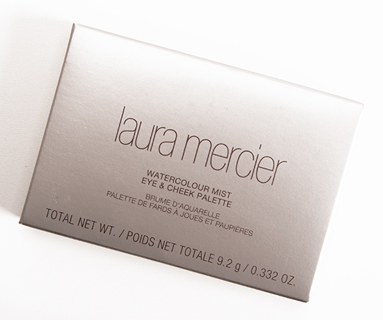
Laura Mercier Watercolour Mist Eye & Cheek Palette Review, Photos, Swatches
Laura Mercier Watercolour Mist Eye & Cheek Palette
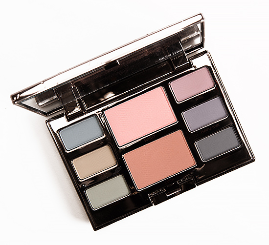
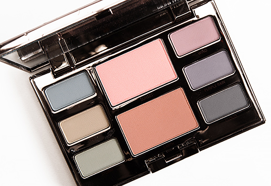
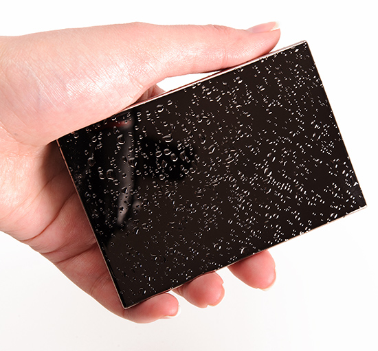
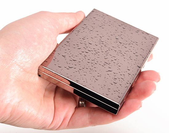
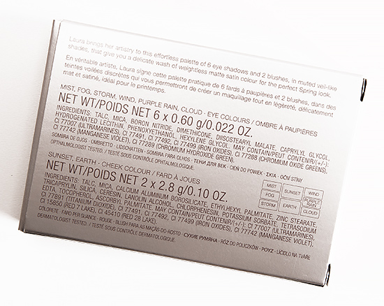
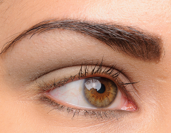
Laura Mercier Watercolour Mist Eye & Cheek Palette ($58.00 for 0.332 oz.) contains six eyeshadows and two cheek colors. Everything about this palette was a disappointment. It’s a bit like wearing a bunch of faded, barely-there eyeshadows that just make your natural lid look muddied, dreary, and powdery. Both cheek colors were stiff and required a spatula to scrape off color to get anything to show up in a swatch, but I couldn’t get either to visibly appear on my cheeks. The eyeshadows are very soft and powdery, and unfortunately, most of them blend away to poor versions of themselves in practice. I was a bit surprised, because it swatched better than anticipated, but it was a mess trying to use this. The only way to salvage it would be use to a white, tacky/creamy base. The only nice thing about this is the packaging, which has “water’ droplets on the exterior (exactly like MAC’s Alluring Aquatic collection).
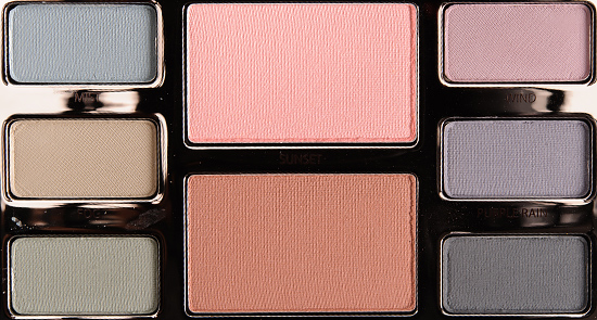
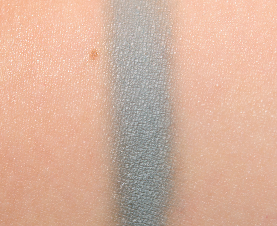
Mist is a muted, light-medium green-teal with strong gray and cool undertones. It had a satin finish. It had decent color payoff but was so soft that it sheered out to semi-sheer coverage. It was noticeably faded after five hours of wear. See comparison swatches / view dupes.
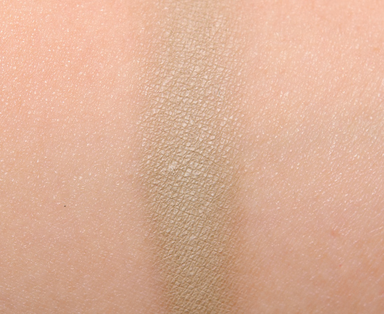
Fog is a light-medium, khaki green with subtle, warm undertones and a satin finish. The texture was soft yet powdery enough that it tended to blend away to a rather sheer, faded color applied to the lid in practice. It wore well for five and a half hours on me. See comparison swatches / view dupes.
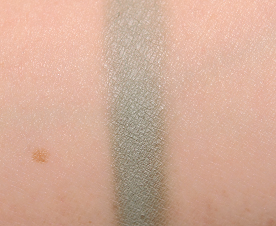
Storm is a muted, overcast green with subtle, warmer undertones and a satin finish. It had semi-opaque color coverage but was prone to sheering out to a very faded, sheerer version of itself. It only wore well for six hours on me. See comparison swatches / view dupes.
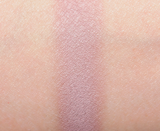
Wind is a soft, muted pink-lavender with hints of gray and a subtle, warmer undertone and a matte finish. The color payoff was mostly opaque, but it had a somewhat powdery texture that made it difficult to keep at that intensity–it wanted to sheer out almost instantly. It lasted for six hours on me. See comparison swatches / view dupes.
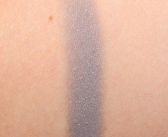
Purple Rain is a cool-toned, purple-gray with a semi-matte finish. It had so-so pigmentation with a soft texture that was somewhat powdery. It was faded within six hours. See comparison swatches / view dupes.
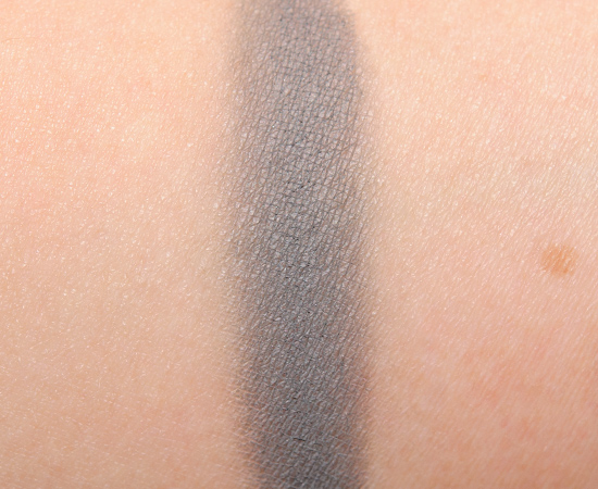
Cloud is a muted, medium-dark gray with cool undertones and a matte finish. It was powdery, semi-sheer, and lasted a mere five hours on me. See comparison swatches / view dupes.
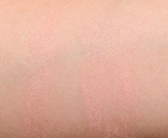
Sunset (Cheek Color) is a pink-peach with subtle warm undertones and a satin finish. I had to chip away at the pan’s surface to dislodge product with a metal spatula, because the surface was so firm and hard that it nearly felt like plastic. What I managed to scrape away ended up being chalky, powdery, and dry. I couldn’t get it to show up on my skin tone, but I did see a slightly chalky cast in person, though it seemed to disappear nearly instantly, because it was gone less than an hour later. See comparison swatches / view dupes.
Earth (Cheek Color) is a medium-dark reddish brown with a satin finish. It had a similarly hard surface that required scraping to get any product out of it for swatching. It was powdery, dry, prone to fading, and incredibly difficult to blend on the skin. See comparison swatches / view dupes.
Watercolour Mist
LELimited Edition. $58.00.
Mist
LELimited Edition. $22.00.
Fog
LELimited Edition. $22.00.
Storm
LELimited Edition. $22.00.
Wind
LELimited Edition. $22.00.
Purple Rain
LELimited Edition. $22.00.
Cloud
LELimited Edition. $22.00.
Sunset
LELimited Edition. $24.00.
Earth
LELimited Edition. $24.00.
Laura Mercier Watercolour Mist Eye & Cheek Palette
Laura Mercier Watercolour Mist Eye & Cheek Palette
Laura Mercier Watercolour Mist Eye & Cheek Palette
Laura Mercier Watercolour Mist Eye & Cheek Palette
Laura Mercier Watercolour Mist Eye & Cheek Palette
Laura Mercier Watercolour Mist Eye & Cheek Palette
Laura Mercier Watercolour Mist Eye & Cheek Palette
Laura Mercier Watercolour Mist Eye & Cheek Palette

Laura Mercier Mist Eye Color
Laura Mercier Mist Eye Color

Laura Mercier Fog Eye Color
Laura Mercier Fog Eye Color

Laura Mercier Storm Eye Color
Laura Mercier Storm Eye Color

Laura Mercier Wind Eye Color
Laura Mercier Wind Eye Color

Laura Mercier Purple Rain Eye Color
Laura Mercier Purple Rain Eye Color

Laura Mercier Cloud Eye Color
Laura Mercier Cloud Eye Color

Laura Mercier Sunset Cheek Color
Laura Mercier Sunset Cheek Color

Laura Mercier Earth Cheek Color

Laura Mercier Earth Cheek Color
Laura Mercier Watercolour Mist Eye & Cheek Palette
Laura Mercier Watercolour Mist Eye & Cheek Palette


I love the idea of this, but the execution is so disappointing. The packaging is so pretty!
The packaging is the nicest part!
That is a major ouch there.
I was excited for others to get a palette like this, but with my 252 palettes from Coastal Scent there are a number of these de-saturated shades in it. 😉
Or you could take a brighter shade and sweep beige over it, haha.
Or grey, these are very de-saturated tone. 😉
good idea! 🙂
I remember being super excited for this palette when the pics came out.
Then I saw Dustin Hunter’s review and completely lost any and all interest – such poor quality product in such a tiny compact for $60?! Criminal!
I still am bummed about it though, because I love the concept. I may go dupe hunting instead!
Go dupe hunting for sure!
Oh my. This looks so terrible. Yikes!!
It is bad!
Hi Christine,
I have this palette and I am really loving it. I use it without any white base and it shows perfect on my eye lids, which are deeper than my complexion. I also like the idea of moodier pastels, like a rainy spring day, very pretty and unique. I am wondering if your product had worse quality than mine and was from another batch.
Glad you like yours!
Disappointing!! The colors look so pretty just inside the palette, I wish they had performed better for you.
Same 🙁
I wonder if the “watercolour” means those are supposed to be worn wet? Although I’m not sure how the wet thing would work for the blushes.
I didn’t see anything about using them wet, and given the finish (more matte), you’d probably harden the surface if you used them wet!
What a bummer! My eyelids are dry so these would look horrible on me no matter what.
That too 🙁
ugggggh this is horrible! My wallet loves you, though, for saving it from this mistake!
No prob, Evelyn!
Yikes! Thanks for saving us $58 for a palette you can’t even see!
Glad I could help!
I absolutely love Laura Mercier products but I’m so sad that these don’t blend well because I love shadows that blend all that harshness away.
It’s really not the brand’s best at all.
Oh JEEZ! I was so looking forward to this palette too since I’ve fallen rather madly in love with the textures of Laura Mercier’s eyeshadows in her Artist palettes. As you said, the swatches aren’t bad, but when I see them on your eyes I can’t figure out what’s what. What a disappointment!
(However, thank you so much for reviewing the palette, you just saved me the splurge!)
I don’t LOVE all of her eyeshadows, but these are definitely some of the worst from her I’ve seen – Artist Palettes have been better!
Oh dear.
Such a sad palette.
Ugh wow, you’re right: the palette looks miserable on the eyes! I wonder if a primer would help (which I systematically wear because I don’t have a choice), but then again the colors don’t really speak to me to begin with anyways.
Something like NYX Milk would help, but NARS Smudge Proof/UDPP wouldn’t, because there’s not enough for the product to adhere to – it’ll be better but not great.
WOW! Just… wow.
🙁
This is crazy! I don’t understand why they released this. Their artist palette from 2013 is fabulous and one of my favorites. I hope they’re not going down the Bobbi Brown palette road.
Probably should have known better given LM is best at neutrals 🙁 (Much in the way that BB brights were poor.)
the funny thing is, like you said, they swatch quite well so after I read your review i’m thinking “huh.. that is odd” but then they barely showed up on your lid! overall, the colour selection isn’t appealing to me either. I don’t know what they were thinking when they were coming out with this palette. I mean is there a NEED to bring out new products just for the sake of bringing out new products?
After swatching, I didn’t think it was going to great, because I could tell there was enough powderiness there that applying to bare skin was probably going to be difficult… I just didn’t think it was going to be THAT bad.
what a shocking difference between swatch and application. such a shame cause I love LM shadows but this is a definite pass!
All in the texture 🙁
Ew. That looks awful. Even if the quality were good, just looking at those colors makes me sad. lol
I like the colors themselves – very quirky and surprisingly more unique!
Ouch! At least the package was pretty. I guess a decoration is about all is good for.
That’s about it!
Oh, no! I see you bought this yourself. I had swatched these in store, and they were absolutely horrible. I was rubbing and rubbing my fingers across the shadows and could only get a little bit of pigment to show up. The blushes were even worse, was like rubbing plastic. Thinking I got a bad batch, I even went to another store to test another kit -same thing. So sad. Absolute worst kit I’ve come across – you have better luck buying makeup at the dollar store. I loved the fog/mist theme and the droplets on the packaging are so beautiful, but the product should never have made it to market.
The blushes were BAD. It was actually pretty funny how stiff and rough the blushes were compared to how soft and powdery the eyeshadows were.
In photos this palette looked quite pretty. But after seeing in real life, its dull and boring. I usually love Laura Mercier palettes, but the last few have missed big time. Have gone for the new By Terry Eye Design Palettes instead.
I think some of the promo photos going around were wrong :/ There were some that were more accurate, but then some were extra punchy.
Christine that explains a lot.
Wow, this is such a bummer. I love Laura Mercier products and wasn’t expecting something like this. I can’t believe they’d let such crap hit shelves!
I just feel like nobody wore this!
That’s a shame. I never have luck with her products, even the ones everyone loves. Just one line that doesn’t work for me
That sucks 🙁
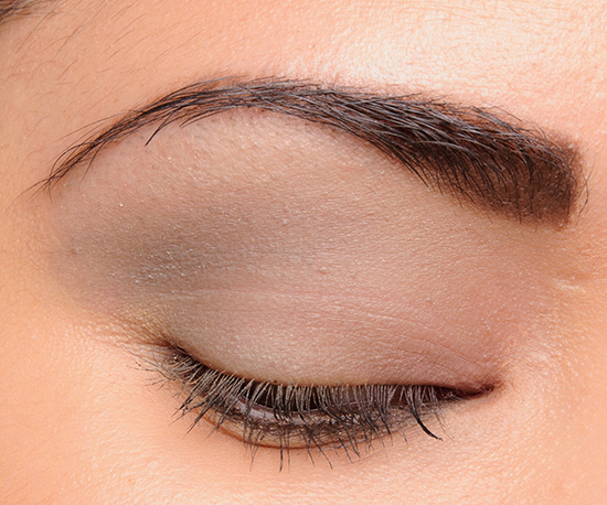
Which colors are used in the eye look? It looks like you just used the grays, correct?
I used all but Wind in the look in the post!
OMG, I can’t believe you used 5 of 6 shadow colors and there’s barely anything showing up on your lids! I thought you had used only 1 color. This might win one of those most disappointing products prizes.
I thought this palette was so pretty when I first saw it, but I was also quite disappointed because it didn’t seem to be suitable for darker skins. I don’t feel so bad now since the quality isn’t there, lol.
Phew!
Eek, they look so muddy 🙁
If they retained their color on the lid, I think they could have worked, though certainly not the easiest palette to combine together 😉
OUCH! This review breaks my heart, this palette looked so pretty when I saw it at the store. I’m glad I passed on it!
Phew!
A shocking review for this label. No disappointment here since this palette is not my kinda thing, but Wow… really unexpected results for LM.
It looked cool to me, but I had a feeling it wasn’t going to be A material… didn’t think it was going to be F level bad, though.
I’m sorry, Christine, but I’m hoping you got a “dud” because I ordered this when I saw all those lovely, muted colors. I can’t resist cooler, gray based shades and these are about the closest to pastel as I get. It seems like a nice, albeit safe, change from all the nude and natural palettes, but I am crossing my fingers that it performs better than the one you used.
I hope you like yours!
This is definitely a palette for the fairest end of the spectrum-which isn’t a *bad* thing!-, and with a bot of primer/base I’m quite certain the shadows would perform much better, as they look like they swatch well… I also think it was designed to use a single shade as a wash, as they are all in the same tonal range. That said, I’ll still likely skip this one, since the cheek shades don’t suit me, but I do really like the eyeshadows.
Like any poor product, there are always ways to make it work better, but it doesn’t change that it’s a poor performer, IMO!
wow! Certainly expected more from this brand! The colors are so interesting- too bad they were a total fail! Maybe LM should recall this and re formulate! Thank you for the review and saving us money!
No prob, Cindy!
How awful! And it barely shows up on your lid. At that price point…wow. This review is a perfect example of why what you do it so helpful! I was eying this palette then got super busy and forgot about it. Thankfully so, it now seems.
Appreciate the honest review. Too bad you bought this one.!
Yep, it was the type of eyeshadow that you’d pat on, even carefully, then work on another shade, and then it’d be immediately faded by the time you finished with the second color!
I can see it…looks like you barely have anything on…
I don’t know if you remember, but a while back in your “Temptalia asks you” feature, you asked what people would really like to see in a Spring collection. I said that I really wanted some eye shadows that were misty, like watercolours, instead of the usual pastels. So when I saw this, I was beyond excited. It was EXACTLY the sort of thing I’d been hoping for. So to say I’m disappointed is a major understatement.
SO, SO poorly executed.
So glad I didn’t order this one. You saved me a trip to return it. Thanks Christine!!!
No problem!
Oh noes 🙁 The packaging looks so pretty! But that’s not all that counts unfortunately.
Indeed!
I am not surprised by this at all…when the Laura Mercier rep in my store and I saw this for the first time, we both thought ‘What was she thinking?!?!’
It looks like a childs’ makeup palette from the ’80s…and performs like it too.
I love the concept of the colors personally!
I think the SAs were too embarrassed to even sell this kit. One of them had it tucked all the way in the back on a shelf, the others didn’t know about it, or tried to steer me to other products. They must not like dealing with all the unhappy customers and returns.
How bizarre.
It’s what happens when texture is very soft and feels like it has a lot of filler :/
The packaging is beautiful, but the quality of those shadows and cheek colors is terrible. It makes me sad when high end brands put out something that under performs this much. For $58 I expect a lot more.
I don’t know how this made it through testing 🙁
Wow. I almost grabbed this last week when I was at Nordstroms. Talk about a dodged bullet! Shame because it’s so pretty.
Phew! 🙂
Even IF the quality has been present in this palette, it’s like they’ve confused “Spring” with “dull, drab and washed out”. These colours are just depressing looking!
I loveddddd that gloomy, rainy day quality though!
I live in the American Northeast, and our spring is generally one long series of rain showers, so this was spot on as far as I was concerned. 😛 I thought it would look particularly fetching on cooler skin tones.
Ha – to me, that’s all the more reason for pretty, bright, “hopeful” colours. I’m in Canada – we have freakin’ blizzards in March but that doesn’t mean I don’t want Spring collections to look like there’s light at the end of the snow-drifts!
first thought “Oooh, pretty!!” then saw the words “disappointing” and thought “sigh, really?” then “dupe shopping!!!!” lol. Saves my budget!! Thanks Christine!!
No prob! 🙂
How disappointing! I love the idea of watercolour makeup, light washes of subtle colour that are really wearable. It’s such a shame about the textures as the palette looks so pretty.
The texture just ruined it 🙁
wow! usually when you give something an “F” you still manage to create a look that is at least decent. this looks truly awful! i don’t mind sheer/translucent eyeshadow, but this is just bad. i think i could rub chalk on my eyes and it would look better:D
Haha, it was so opposite this time!
I’m not very experienced, but I don’t understand how it swatches reasonably decent, but just muddies up like that on the lid! I’ve had my colours blend together before, but not so much so that they were that unrecognisable! Weird!
The problem is that they don’t stick well to the skin itself, so when you started to brush or blend them, a lot of the powder just flies right off the skin!
I kinda wanna say, I knew it!
Years ago, I bought a NARS eyeshadow trio, with grey, shimmer green and shimmer cool-toned pink in there. That grey one gave me the same feeling that”my natural lid look muddied, dreary, and powdery.” That was a huge lesson learned and made me become cautious about pastel colors.
Pastels can be tricky!
This definitely confirmed my suspicions. I almost, almost got this palette but I had this feeling it would not end well. When I was shopping the early Spring releases back in late December/early January, I saw it and was intrigued at first. Of course there were scarce reviews up so early, one that I saw was kind of positive but I could tell from the photos that hmmm, I wasn’t too sure…. thank goodness I listened to my instincts! 🙂
Phew!!
oh wow! I will for sure be passing on this it is safe to say.
Wish I did 🙁 LOL!
You should take it or send it back! A company should know when their product is bad so they can learn from their mistakes or they are going to go out of business eventually. You will be helping them out and it’s your right as an American consumer Christine. (;
As a regular customer, I totally would, but since I’m a full-time blogger, I don’t feel right about it.
I respect that decision. I hatee returning! I get embarrassed for some reason.I have a ton of stuff I have been putting off returning. I almost have to pep talk myself beforehand. Its ridiculous because I obviously keep a ton more than what is returned!
You shouldn’t!! If they have the return policy, you should return 😀
Oh Lawd NO! If this looks this awful on you, and literally just about everything ALWAYS looks great on you, Christine, I cannot even begin to imagine how horrible this would be on me because my skintone is darker than yours, and these wouldn’t even show up on me except to make me appear to have not slept in over a week! Yikes!
It was such a cool concept!
This is a real shame, I would love some of these shades for spring if the quality was even decent! And I often love Laura Mercier eye shadows, even if some of them are a bit subdued for my taste! Too bad! I’m going to check out NARS Kamchatka and MUFE M110 for sure.
I really liked the subdued quality of the palette as a whole, as they were more unique shades relative to what’s out there… but alas, it was not to be.
D: That is horrible! I like the concept but the execution is totally not there. I always get super sad when I see you give a low grade to something so expensive because you’d think with money comes quality. Unfortunately, that’s not always the case.
Exactly! Concept is interesting but execution was a mess!
This is pathetic pigmentation is I ever saw it! How can a company like Laura Mercier do this to their customers!? It makes me mad.
There’s no point in having six shades if they all look the same applied 🙁
Thank you always for your honesty! Wow these swatch beautifully but I haven’t seen you give such a low rating before!
My pleasure, Brenda!
Heartbroken. I was really excited about this one. But if you can get a good look from it, no one can. These would probably turn muddy on me.
*can’t get a good look (sorry)
With enough helpers (white base/colored base), maybe someone could, but it’s such a PITA.
I’m not willing to go through that much trouble for a palette that costs this much.
I had high hopes for this palette. But a def pass for me.
Great review as always 🙂
Good call!
Ye Gads! How can a company that makes such fantastic caviar sticks for the eyes get it so wrong with this! (Although to be honest I’d never have been tempted because its got such a dreary selection of colours anyway. Makes me go Meh!)
What a shame…
I’m surprised they could come up with such an interesting concept (many shades were harder to dupe) and just totally blow it on the execution.
Hehe, I still want this palette so badly!! It’s probably lucky that LM isn’t easily accessible here though, as I’m not really in a financial position to just buy a palette for the ‘concept’ at the moment 😉
It’s a shame the execution is in such contrast to the concept/packaging. I wish high end makeup was the kind of thing that reliably went on sale, because then I would totally get this as a collector’s piece! The *colours* of purple rain, cloud and wind are just so lovely… SO FRUSTRATING! 😛
LOL! Your time (and money) would be better spent trying to build your own!
No, no, no. The shadows look very sad to me. There’s enough sadness in the world that I don’t need to wear it on my eyes.
Aw!
Wow. I am really, really glad I didn’t get this! I was tempted, but it’s much more desaturated than the colours I normally wear, so I was on the fence as to whether it would be interesting to play with because of that, or if it would just sit in a drawer. Now I know it isn’t worth the money.
I applaud your valiant effort to get enough applied to your eyes to even show up. That is so not the behaviour I would expect from a Laura Mercier eyeshadow, can’t believe these are SO bad. 🙁
It was sooooo disappointing. I really liked the concept of overcast pastels/shades, but they performed so poorly!
Super disappointing.
Agreed!
i’ve been so on the fence about this one but now for sure I wont bother. thank you! BUT maybe if it goes on sale I’ll reconsider…hahaha
I don’t even think it’s worth it on sale 🙁
What a shame …abysmal quality but thanks for the review because I won’t waste my money!
Happy to help, Lisa!
Too bad, the colours are really pretty!
They are!
What a shame! These are beautiful shades together. Maybe I can find some dupes and make my own version.
I bet you could!
What a shame – I love subdued colours like this sometimes – but there is no excuse Laura Mercier! No matter how lovely the packaging is -the product has to be really good.
The colours in the swatches look insipid and boring. I really dislike matte finishes like this.
I can tell by your eye look Christine that very little of the colours reached your eyes.
Thank goodness we have you to help us save some money.
It’s such a shame – they have decent pigment, but the texture just ruins it.
Yikes!
I personally love the idea and didn’t love the execution when I swatched it. I’m just surprised to actually see an F.
Glad to know it’s not just me.
Glad I saved my money for Guerlain and Tom Ford this season.
Glad it wasn’t just me, too, Laura!!
Bummer, are you going to return it?
Nope! I try not to return products unless they’re damaged (then I usually exchange).
wow, is 2015 going to be the year of expensive dud palettes?
Shhhhhhhhh! I don’t want that!
I’ve been consistently disappointed by LM eye shadow palettes and individual shadows. purchasing is no longer a consideration, no matter how tempting the colors look!
The recent iterations have been less impressive :/
So sad. LM really has had some great spring collections in the past. FE the Orchid and Marekesh collections– were great. Hope they find their way back to greatness soon!
Let’s hope so! 😀
Except for the Earth-toned blush, this palette would be my dream palette, colourwise. I was so happy to see that a brand would release these kind of colours, and even all in one set 😀 But I saw these kinds of blue tones recently in fashion photos, so perhaps we can hope they’ll become a trend for 2015 and other brands might follow suit. I would take an UD-palette with cool-toned depressing rainy-day-pastels anytime! ;))
It would be great if UD did something! I’d love to see someone with a better formula try it.
Yes, absolutely 🙂 MAC would be fine, too 😀 (if they did it right, though).
I know when I was a kid, watercolor paints sometimes did not have the best pigments. I think they did take the word “watercolor” too literally. (Color is washed away!) Thanks for the review and sacrificing ugh… $58 and a few hours to test before throwing the palette against the wall.
It’s funny, because I actually have a lot of watercolor art all over my home, and you can still get rich, vibrant colors out of watercolors. If anything, I would have expected these to have really good blending to create diffused, gradients of color and layer/blend well with each other… but not wash away, lol.
Wow the payoff on the lids is horrible. I expect more from Laura Mercier although the pastels in this palette never appealed much to me.
Right? Really sad!
Coming from Laura Mercier, this is very very disappointing… except for the bank account lol. Anyway,the idea was very good and the camaïeu well chosen.
At least the bank account is happy 😉
Ouch. That is unfortunate. Looks like a layer of chalk 🙁
LOL!
At first I was like “say it isn’t so” !! I think this palette is so beautiful and the swatches look good, but .. your attempt at an eye look sort of says it all.
Monica.
Haha! A photo is worth a 1,000 words!
That’s incredibly disappointing 🙁 The idea of this palette is beautiful.
However, the Expression Palette in the Lise Watier Spring 2015 collection could be a decent alternative. I’ve been looking up reviews, and it seems to have considerably better pigmentation. Not sure if the brand is Canada-only, though!
http://www.lisewatier.com/ca_en/collections/expression-spring-collection/palette-expression-eyeshadows
Thanks for sharing, Jenna!
A shame about the rating, but seriously, when you posted the question a month or so ago about what spring palettes we’d design, THESE are the colors I was talking about (at least as far as the eyeshadows, and assuming they had been pigmented and performed well, and … well, you get the idea). Kind of neat to see that someone who supposedly knows what they’re doing designed something I was imagining. 🙂
It is cool to see the concept on the market! If only it was half-decent, lol!
The colours wouldn’t really be my cup of tea even if they were good quality, but I absolutely adore the packaging!!
The packaging was nice!