What brand has the best packaging?
I’ve always loved the look and feel of Burberry’s beauty packaging, though they don’t have a strong presence, so sometimes I forget about them entirely. I tend to… ignore packaging in a lot of ways; like it’s the last thing I really look at or get drawn to.
— Christine
Overall, I love the sheer elegance of Chanel’s packaging. But there are others that are favorites…
Estée Lauder’s Pure Color Envy Lipstick packaging is gorgeous. I love the weight of it and the magnetic cap. I also love Clinique’s Dramatically Different Lipstick because the silver tube is so vintage-looking and iconic. Guerlain Rouge G lipsticks are beautiful, but the packaging is too thick and heavy, and I rarely reach for them. Benefit’s silver industrial-style brow product packaging design is probably very divisive, but I like it, though I can imagine many people probably don’t.
One of my favorite packaging designs is purely from a utilitarian point of view: Dior Backstage Cool Neutrals Eye Palette. The packaging design is not pretty or elegant, but the case is sturdy, solid, and compact. It wastes no space between pans and closes securely. (I love the shades inside, too, except for that stupid waste-of-space primer).
Can we do least favorite packaging next? 😉
I’m one of those people that dislikes Benefit’s wand like packaging. It’s not even industrial silver in my opinion, it’s poor quality cheap plastic silver. 😆 If they wanted to go the `industrial` route, they could have done it better.
Still love their brow products, but if they could get Gimme Brow back in the classic packaging they had first…
Agree with Clinique and Guelain Rouge G. I truly love those covers and they are very heavy!
Pat McGrath! I adore the art on her palette packaging, and the weight of the lipsticks remind me of the quality of the product (and the price I paid!). Her products are the ones I keep out on my vanity because they feel like pieces of art in and of themselves.
Yes! I love the luxe look of the black lacquer and heft of the packaging for the lipsticks.
I just look at functionality, really. But I detest packaging that is bulky (like lipsticks too large for plastic lipstick holder slots or huge eyeshadow palettes), dysfunctional (like pumps on moisturizers that clog or let in air (creating “plugs” all the time), cheap or wasteful.
My favorite packaging might be Chanel. It’s generally uniform, high quality, and I like the black x white. The glossy finish doesn’t get dirty. Or! My favorite might be no packaging — I love it when you can buy a cheaper “refill” version, like eyeshadow singles from MAC. I can just put those into a Z palette.
My CT Darling palette (and the only CT I have) gives me the most joy in its packaging. I’m engrossed in finding a beautiful way to store my singles, because Z Palettes, while I’m sure they’re functional for pros, ain’t cute for personal use and I’m petty and I love pretty things. There are magnetic palettes on Etsy but I may take a stab at making my own using bookbinding techniques. I also love my Lisa Eldridge lipstick’s magnetic closure.
Magnetic closures on lipsticks are the best! The ones I have are by Estée Lauder, NARS, and Armani.
Lauren, check into the Salt New York palette. Its beautiful. SaltNewYork.com.
Hourglass for class and functionality. UD and Sugarpill for fun and frivolity. And MAC LE collections for beautiful designs.
`Best packaging` is such a broad term. For me it’s not just a matter of aesthetics, it’s also a matter of being practical / functional / durable and also sustainable.
For example, I consider MAC a `best packaging` case. It’s not the most beautiful, but personally I like the classic all black vibe, I prefer an uniform look to my collection, rather than mismatch colorful items. It’s also durable packaging, I never had issues with any MAC packaging, and my current custom made palette (the hardware itself, not the eyeshadow refills) has withstood almost 4 years of daily use. Also, they have the Back-to-MAC recycling program, with makes it even better.
Aesthetically wise, I do like the Hourglass line… except those sharp refillable lipsticks. It’s very classy, durable and functional.
Charlotte Tilbury has beautiful packaging, especially for the lipsticks and the bronze & glow duos. Functionally, I don’t like her packaging for the glow wands.
Hourglass also has consistently beautiful, minimal packaging. Their caution mascara was beautiful. I did think the Ghost palette looked cheap, but the concept was good.
1. Chanel
2. Chantecaille
3. Pat McGrath
I love the sleek and timeless look and feel of Chanel. Just feels classic.
2. Chantecaille has beautiful packaging and fits the theme of whatever philanthropic program they are supporting.
3. I love the art work on Pat McGrath although I don’t love the actually cardboard packaging on the small palettes. They don’t open all the way and that is frustrating when actually using them. I think if I tried to force them open the cardboard would damage the art.
I don’t have any PMG palettes, but cardboard palette packaging not staying open drives me crazy with my ColourPop palettes. I usually balance something on the lid that isn’t heavy enough to force it all the way open, but is just heavy enough to keep it open so I can use it.
*Pat McGrath: The quality is high and durable. The lips on the lipstick tubes are cute but are still classy. The eye palettes’ cardboard sleeve artwork are always amazing. The plain black palettes are very sleek and attractive, but they show fingerprints.
*Urban Decay: I don’t find their designs as unique as they used to be, and the quality is not as high, but they still have some nice packaging. Naked Honey’s packaging is gorgeous and sturdy, for example of a newer item. Their LE collections usually have cool looking packaging.
*TheBalm: I love their purposely cheeky, retro-kitsch artwork. They are great about having separate lids on palettes for cream and powder products.
*Too Faced: They can be super fun and cute, but they also have some more “serioius grown-up” looking stuff. The quality is usually very good, as well. I’ve never had the lid come off one of their lipsticks or have anything break in my bag or suitcase.
*Tony Moly: The cutest of the cute, functional, and durable.
Guerlain for me, hands down. Especially, but not solely, their LE meteorites.
I love the Kiss Kiss lipstick packaging.
Worst is NARS blush – the hinge breaks really easily and the black finish looks dirty.
The packaging doesn’t really make any difference to me, so I don’t notice it. It’s the product that counts.
Chanel and Tom Ford – sleek and elegant
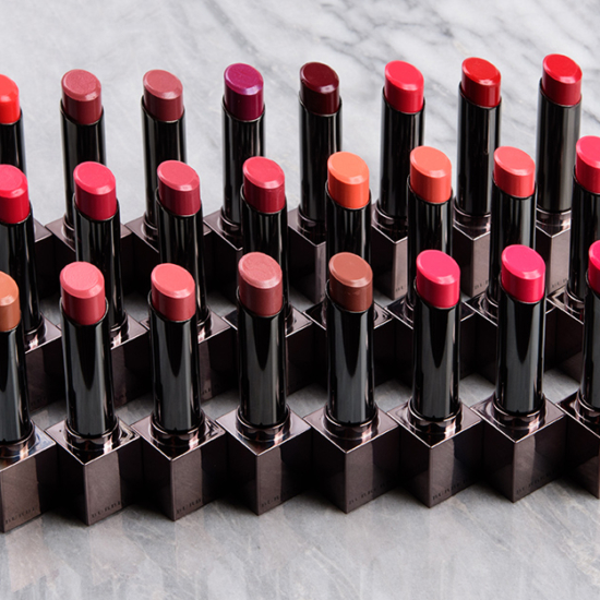
Pat McGrath – luxe and and has a nice heft to it
MAC – their LE collections packaging is usually quite pretty or noteworthy in some way
As far as receiving something in the mail/shipment packaging – opening a package from Tom Ford or Chanel feels like I’m opening a very special Christmas present!
I truly love the elegant classy packaging design of Tom Ford, Victoria Beckham, Estée Lauder x Victoria Beckham, Burberry, Kjaer Weis and to some extent Marc Jacobs. I wish I like all of their products and they work for me so I’d have the perfect excuse to buy them only. But at the end of the day, performance over aesthetic. ?♀️
Fan of Chanel. Very simple and classic lines and design. The lipstick cases are elegant, although the click lipsticks sometimes get caught. The perfumes follow the same design and the bottles are all uniform and line up nicely too. I love the history of it too. In 1954 when Gabrielle housed the lip colour in a rectangular tube, a replica of the iconic Chanel No 5 slim bottle, it changed how Chanel packages it’s makeup products. Chanel also reserved a compartment in her 2.55 quilted handbag for the lipstick; a design feature that remains in the bags today.
I think most brands have some good packaging and some dumb packaging (UD is a perfect example but they’re hardly alone). Oddly, Lise Watier – a smallish Canadian brand – has some packaging that looks very much like Burberry’s – dark grey and darker grey, very subtle and spare.