Wet 'n' Wild Bright Idea Color Icon Eyeshadow Trio Review, Photos, Swatches
Wet ‘n’ Wild Bright Idea Color Icon Eyeshadow Trio
Wet ‘n’ Wild Bright Idea Color Icon Eyeshadow Trio
Wet ‘n’ Wild Bright Idea Color Icon Eyeshadow Trio ($2.99 for 0.17 oz.) include shades of yellow, green, and pink. It is a limited edition trio as part of the summer Dream Weavers Collection. It’s available at local drugstore retailers, but not all have them and some sold out quickly of their stock so you might have to hunt around your local area for a displayer.
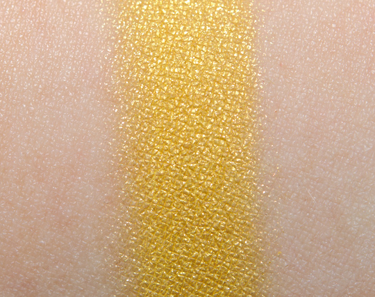
The Browbone shade is a sunshine yellow with a frosted finish. It has great color payoff with a dense texture that’s soft and smooth. It’s a little more golden and muted compared to MAC Bright Sunshine, but they are still rather close; it is also comparable (just a little darker) than MAC Double Feature #1.
The Crease shade is a cool-toned, medium grass green with a pale gold shimmer-sheen. It’s a fun shade, because the base color is cool-toned while the overlying shimmer is considerably warmer. The pigmentation is nice, and the texture is soft so it applies smoothly on the skin. It’s much lighter compared to Wet ‘n’ WIld Earth Looks Small From Down Here as well as Urban Decay Graffiti.
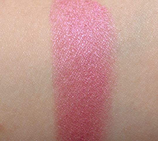
The Eyelid shade is a medium-dark pink with a hint of fuchsia iridescence in the finish. It’s the worst performing shade of the three–not fully pigmented so it applies unevenly (see the patchiness on the left portion of the swatch). The texture was a bit dry and not as dense as the other two shades. The color is similar to Milani Pink Twice. Make Up For Ever #83 is brighter and pinker.
Side note: While I appreciate the concept of identifying which colors go where, I don’t really see the labeling working in this particular trio. This set of colors is hard enough to wear together, let alone with bright yellow all over the brow bone. It could certainly work for a particular look, but overall, it’s a little much. None of this affects the rating, but it’s something I’ve seen more and more brands do. I think it takes away from some of the usefulness of guiding buyers on how to use a certain product. From a more creative stance, I appreciate the interesting pop of green amongst the other two colors (I would have expected copper, brown, or orange).
Wet 'n' Wild Bright Idea Color Icon Eyeshadow Trio Review, Photos, Swatches
Wet ‘n’ Wild Bright Idea Color Icon Eyeshadow Trio
Wet ‘n’ Wild Bright Idea Color Icon Eyeshadow Trio
Wet ‘n’ Wild Bright Idea Color Icon Eyeshadow Trio
Wet ‘n’ Wild Bright Idea Color Icon Eyeshadow Trio


Wow! Very bright colours, not sure whether I’ll be able to pull them off… But they’re great for Barbie-themed parties 🙂
Ugh, I hate that my local drugstores never carry limited edition collections. One day I drove around to 6 different ones and came up with nothing!
I’m glad I’m not the only person who was driven to do this! I wound up overpaying on nonpareilboutique.com.
same here….
same
i like the green shade n if i get it in wet n wild single eye shadows i might buy it..but together all three of them..i don’t think i can pull it off:)
A bright yellow on your brow bone… haha seriously? I honestly can’t imagine someone wearing all 3 shades together… I mean for a themed party, go for it. But everyday? Nooooo thank you!
But I will say Wet N’ Wild has some very pretty pigmented eyeshadows. Pretty impressed.
Iawtc
I really would like to see a look done following the instruction on the palette. Do you think you can try to post one? Just because 90% of these palettes simply have UGLY color combinations. Who on Earth would wear those colours together? o.O
Sorry, I do not plan to do a look with this!
Well, I think I know the reason 😛
this color combination really reminds me of the shiseido tropicalia palette, but you didn’t criticize the color combo then, i wonder why the change of heart?
It’s not the combination of colors – it’s that they’re labeled in a particular way. I’ve also criticized Lancome for labeling their 5-pan palettes when some of those shades would likely not work well as highlighters. I don’t remember Shiseido labeling their eye trios to be used in a specific manner. Wet ‘n’ Wild has labeled their eyeshadows very prominently with the words browbone, crease, and eyelid emblazoned across each shade. There is no change of heart – I have no problems with the color combo! As I said very clearly in the review, I like it from a creativity standpoint. I think you may have misunderstood my comments. 🙂
I like this trio, but the colors aren’t very vivid. You really have to build them up to get good color payoff.
This pallete is so pretty but not really that wearable for me.
I’m more of a neutral girl.
This is the only one out of this collection that I was really, really yearning to have. Stupid selective drugstores 🙁
That is a very unique green. 😮 I have seen nothing like it!
Heh, back in like 1987 I had a L’Oreal trio with almost these exact colors and I wore the eye shadows in vertical stripes on my lids: yellow at the inner corner to brow, fuchsia middle to brow, and green outer corner to brow. And I had the matching yellow nail polish which made my hands look jaundiced. I wish I had a pic, it was so obnoxiously 80s.
One word: Ew.
Your swatches make them look very pretty, but these colors are too cool-toned and over-the-top for me. I do like wearing color on my eyes, but I lean more towards dark colors, such as forest green, eggplant purples, etc. I’m not a huge fan of bright eyeshadows.
those colours would look horrendous if you used them how they suggest haha XD
this is the only trio i wanted from this whole collection and i couldn’t find it anywhere near me and looked in five different stores. 🙁
Urgh, how I want the palette so badly! Sadly I don’t think they have the limited edition in Canada =(
Very good point about the “wearability” of the yellow as a brow bone colour and wearing all three together as suggested by the manufacturer. I rarely use the the guides with items such as these, but I do think it may be a bit of a deterrent for some (as in seeing where the bright yellow is suggested to go and thinking “No way!!|)
I never use palettes how they’re labelled, and I LOVE bright, fun colour, but while I could use a good yellow, the other two colours are really too cool for my skin tone.
I would still buy it and just use the colors separate at different times. You could use the yellow on the lid with a soft brown in the brow bone area. You could also use the green on the lid with a soft brown in the brow bone area. For the highlights I would use maybe ricepaper by Mac.
I get tired of driving all over town trying to hunt these down. If I decide to get it I think I will find a site that has the trios that I have been searching for and just place an order online. It is probably cheaper for me to do it that way because I drive up way too much gas searching for these products.
cute
love this! I totally love wet n’ wild ever since they started coming out with these awesome kits
Who in their right mind would use a bright yellow as a highlight. I can’t even.
This is almost the same (in the pics, anyways)to a Shiseido trio that came out a year or two ago. I found a picture of the Shiseido one in a magazine I still had around.