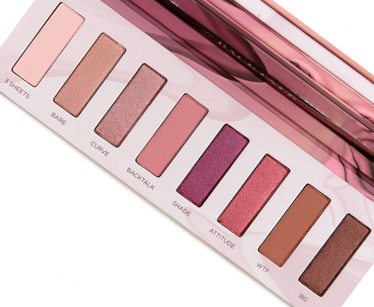
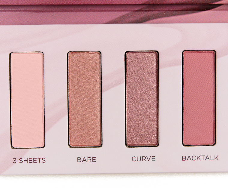
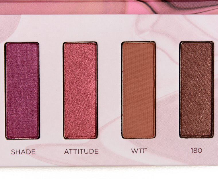
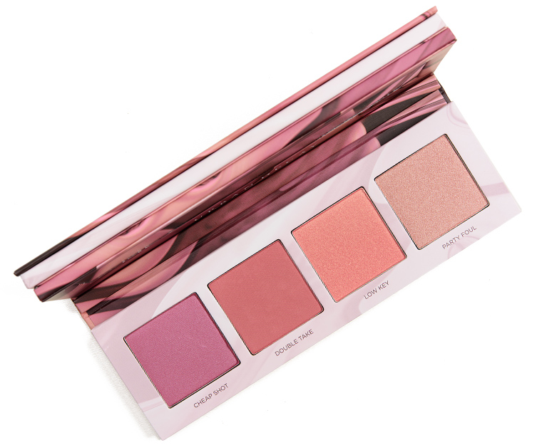
Swatches: Urban Decay Backtalk Eye & Face Palette

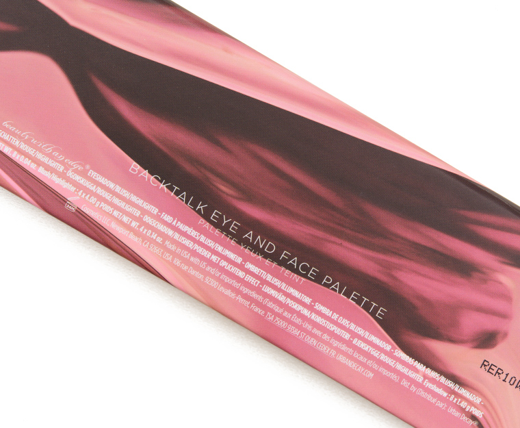
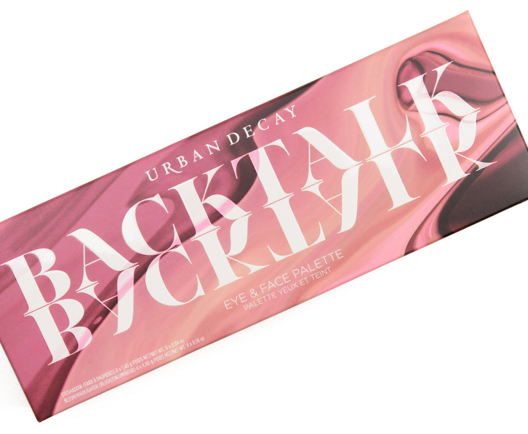
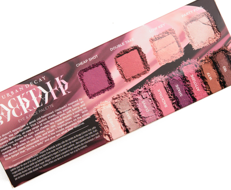
Urban Decay Backtalk Eye & Face Palette ($46.00 for 0.88 oz.) is a new, limited edition rose-toned palette that includes eight eyeshadows and four cheek colors with a removable mirror insert that sits between the two halves of the palette (and is held in by magnets). Here are swatches!
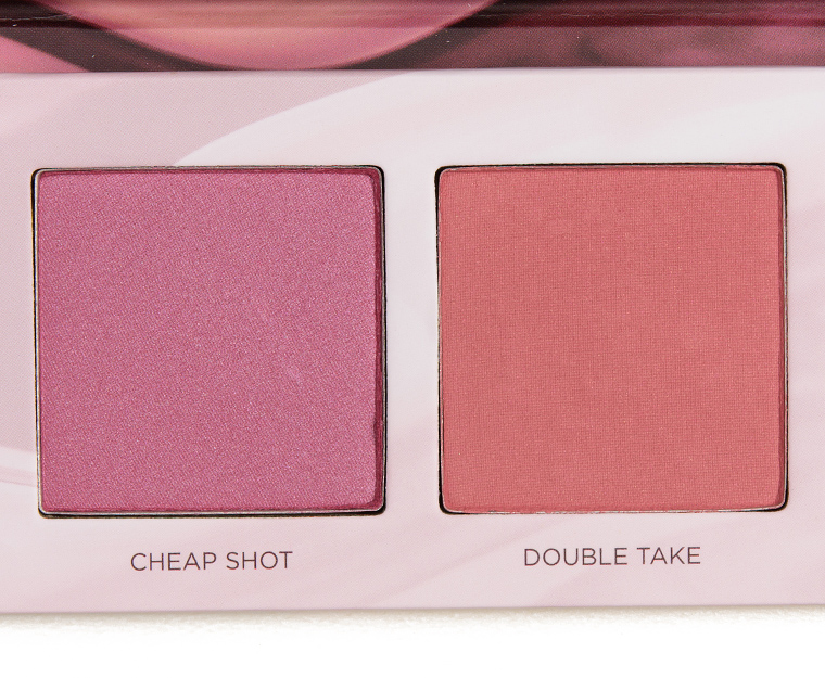
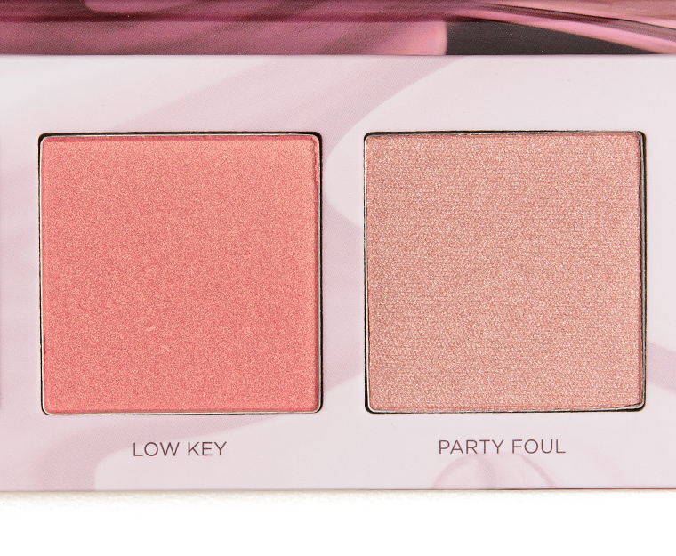
Backtalk Palette


Urban Decay Backtalk Eye & Face Palette
Urban Decay Backtalk Eye & Face Palette
Urban Decay Backtalk Eye & Face Palette
Urban Decay Backtalk Eye & Face Palette
Urban Decay Backtalk Eye & Face Palette
Urban Decay Backtalk Eye & Face Palette
Urban Decay Backtalk Eye & Face Palette
Urban Decay Backtalk Eye & Face Palette
Urban Decay Backtalk Eye & Face Palette
Urban Decay Backtalk Eye & Face Palette
Urban Decay Backtalk Eye & Face Palette
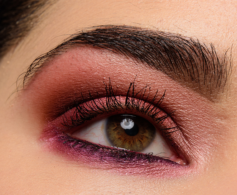
Urban Decay Backtalk Palette | Look Details
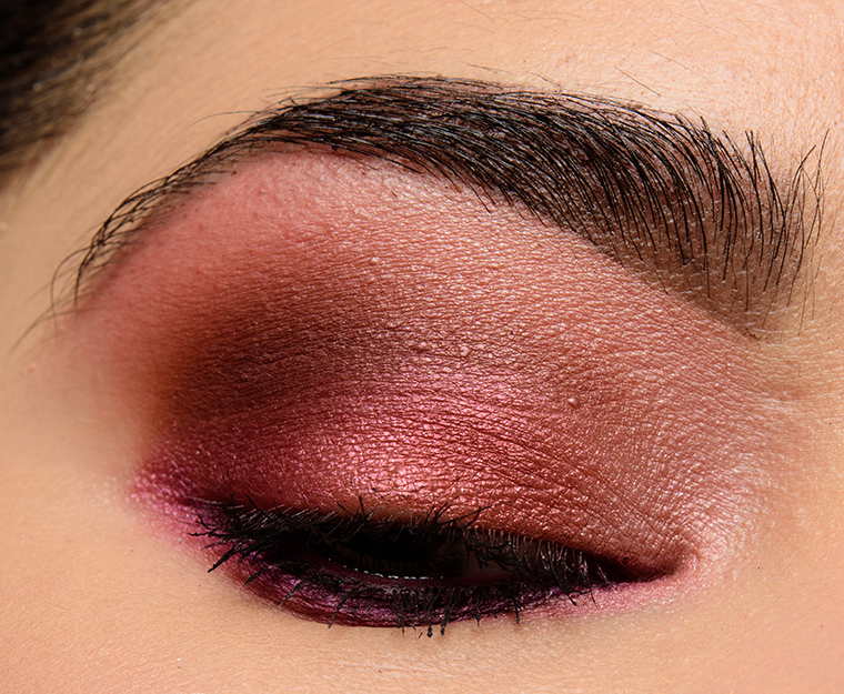
Urban Decay Backtalk Palette | Look Details
Thanks. I made the infrequent mistake of ordering w/o your review. It should arrive soon…one never knows w/laser ship in my area. Courtney/Phyrra has a review up, in case anyone is interested. Not stellar, but not dreadful. This is warmer than expected, but cooler than most of the red/pink/brown stuff out there already. Kind of expected a more mauve look overall. And it does not look church lady to me at all, lol.
Exactly.. warmer than expected. Sigh
Urban Decay just doesn’t excite me anymore, but this looks pretty enough. Just not so pretty that I want to run out and buy it.
At first glance, I was not very impressed by a palette of pinks. I think pinks have the potential of making your eyes appear tired looking. Also, naming one of the shades WTF?? Not very classy.
It’s pretty tame compared to, say, DTF. Or Gash. Urban Decay isn’t really into keeping things classy.
I understand how you feel about the choice of shade names but given that this is Urban Decay it does make sense. Urban Decay is known for their wild color choices with equally wild shade names. If you remember, they had a shade in one of the many Vice palettes called “DTF” and a single shadow named “S&M”. If this was any other brand I myself would be like WTF? lol. But with Urban Decay it’s kind of expected. 🙂
I do agree with you in regards to pink shades ability to make a person’s eyes look tired. It really depends on the shade of pink and how the eye look is executed. Skin tone also plays a huge role. I’m very white – literally the lightest shade of foundation across all brands. So light that sometimes even the lightest shade is still too dark *cough* Smashbox *cough*. I’m always picky when it comes to wearing pink shadow because it sometimes just does not work. I find that brighter, blue based pinks work best for me. There are some shades in this palette that are very pretty and I think they could work well as a highlighter. This is definitely one of those palettes that I need to see in person to really form an opinion on.
Yes..reds and pinks look horrible on me as they make my eyes look like I’ve been crying and rubbing them raw for days. I really do not get the appeal.. Maybe they can look nice on certain skin tones but certainly not mine.
Just looking at the name of the brand “Urban Decay” kind of tells you right there that they aren’t going to have sweet, ladylike, pc or classy shade names which was refreshing at a time but lately they bore me
Such pretty colors. I will await your review and the dupes. Reviews so far have indicated the colors are kind of dry and lacking in pigment you’d expect for the price.
No offense, Urban Decay. But after two years of these warm reddish palettes– this seems like been there done that. Especially when other brands are breaking out into different color schemes, which you were wisely doing during this protracted trend.
I’m a little disappointed.. we don’t need two very very similar shadows in one palette. Curve should be replaced with something a little more interesting! The brown shade, 180, should’ve been more rosy. I might still purchase this palette but I’m not too sure.
Maybe this will start a new trend -rose toned palettes?? The colors are beautiful!
Looks quite pretty but I am concerned that overall the palette is a little too light. Some of the shades don’t seem to have enough variance to distinguish them from others in the palette. Looks like they could have had a couple of deeper tones to make a little variety. Having said that, I think it looks lovely and since I am going to Sephora next week I will try and see it in person.
Nope…just nope for me. There are 2 shades in this one that I might wear but they’re probably similar to shades I’ve got in other palettes.
Bare and Curve look the same.
It looks really pretty, and had it been at Ulta I probably would have bought it on impulse. But since it’s a Sephora exclusive and I have no local Sephora to see it in person, I’m passing. Looking at swatches, my Buxom “Dolly’s Wild Side” palette is close enough for the eyeshadows, and I’d really only want one or two of the blushes/highlighters.
Great to see a palette that’s not mostly orange- or rust-toned, with no red or stark white or black. I hope this is the start of many more cool-toned palettes.
I was hoping this palette would be cooler toned. Oh well…money saved.
Dang it. I was expecting this to be much cooler and more purple. This is more of the reddish berries and browns we’ve seen before. I want dusty mauves and deep violets and smutty taupes.
Oh well, money saved.
Ooh, mauves, deep violets and taupes? Sign me up! I wpuld buy that palette in a heartbeat. Especially if the taupe is shimmery!
Got to have a shimmery taupe!
I’ve been mucking about with the Inglot Freedom palette builder on Beautylish and it’s quite a lot of fun picking out shades that complement each other – I always tend to go for the taupes first!
Dusty maybes, cool rosy pinks, violets and cool taupes are exactly what I was hoping for! I’m actually a little mad that we got this instead of that. Urban Decay has so many warm toned palettes already, what was the point of making a mauve/pink palette that’s warm too? People who want that already have Naked 3.
Argh dusty MAUVES not dusty maybes. What does the iOS autocorrect have against the word mauve? It tried to hijack the word taupe too!
Like many, I was expecting cooler mauvey, plummy, purple tinged shades that still gave a “naked” palette effect. This runs warmer than anticipated. I could absolutely wear these shades without any problems, but I wish that UD hadn’t put Curve and Bare in the same palette (because, duh, same shade pretty much!), and they ought to have included a true plum instead of WTF (and WTF is up with using this as an e/s name?!?).
I haven’t purchased this yet surprisingly. Urban Decay palettes used to be my favorites. I would buy them reviews unseen. The last 2 I purchased reviews unseen were Naked Heat and while it’s a good palette I just don’t used it daily and Heavy Metals which I do enjoy. Their most recent palettes seem to have hit the sale section sooner than their palettes normally do. Troublemaker,Distortion,and the whole Kristen Leanne collab are on sale. I did not buy any of these. They just haven’t been drawing me in like they used to. This is a pretty palette and it is aesthetically pleasing but I’m still very undecided on it.
It’s pretty and I do love pinks, but I think i’d need at least a little more variety. I could probably pair it with my Dose of Colors Marvelous Mauves for some cooler looks. The blushes also look pretty. I’ll wait for the reviews here and then think about buying it on clearance.
Like many here, I was expecting this palette to be more cool and mauve instead of having warm pinks. It looks like Naked 3 part two with some blushes. It’s still very pretty, but not what I was hoping for.
I saw this in Sephora and was surprised how brown and coppery it looked. Oh well, not my color palette either way. Plums are tricky for me.
The swatches look quite decent and the shades more subtle than Heat. But the names of some of the shades leaves me shaking my head…really UD……
Now that I look at these swatches more carefully, I agree with everyone saying it’s warmer overall than they expected. WTH? It’s like companies can’t quite let go of the warm browns. They need an intervention.
Still might pick this up, but only on sale.
I like the colors unfortunately this performed terrible on me. No matter what primer I used in less than 2hrs the eye shadows faded! I even tried using MAC Fix+ ! The blushes are ok .Was super disappointed, and returned.
I’m very much a sucker for these colors, but I’m sticking to my no buy. They would have to entice me with much more!
Mixed feelings about this. I really want to love it enough to buy it, but I heard that the shades run way warmer than Naked 3, and that the palette feels more like peachy toned than the mauve-berry it seemed to be.
I purchased this the evening it released, and even though the swatches look a bit warmer than I expected, overall I think I’ll enjoy it. And if not (the highlight shade may be too dark) I guess I’ll return it. I *rarely* return anything (like maybe two products a year or so). Fingers crossed it’s true love <3
Oh look. Another warm palette from UD. Not sure why people are surprised. Naked 2 and the Gwen Stefano palette were both pushed as being cooler and they just weren’t. UD just seems to have no interest in making cool palettes
Ive had it a couple of weeks (my sephora put it out early). I think I enjoy the blushes much more than the shadows but overall like these colors with my coloring.
I really wish I’d waited for your swatches and review before I ordered! (I ordered it basically immediately when it was released because it’s the first UD palette that’s appealed to me in well over a year, maybe two years!) but I’m thinking that was a mistake. How annoying that they included two shades that look identical! That alone seems to point out how little effort was put into doing this right.
I’ve been wanting more pink e/s, so I grabbed this online the day it launched. I should have it tomorrow. I have a few younger cousins (college age, so they’re dead broke) with coloring similar to mine that will race to grab it if I decide that I don’t want to keep it, so worst case scenario I’ll score family points and ‘have’ to shop for more pink e/s. Which we all know I’m going to do anyway, but ya know, a girl can hope – right? Right! 🙂
I was interested in this palette from the promo pictures on UDs IG but your swatches show a lot more yellow-y/ orangey undertones which just look really weird on my skin tone. I’d also rather a smaller palette with no cheek products for less money, might go buy Lime Crimes sugar plum eyeshadow palette instead.
I got this palette a few days ago and had a chance to try it. I found it VERY disappointing, especially in comparison to other UD palettes I have. First of all, I find the pigmentation to be quite poor – I had to put on many layers for the colors to even show up on my lids ( my complexion is quite fair). The ones that performed the best for me were WTF and 180, i.e. the browns, which required about only 3 layers to show up. Bare and 3 Sheets were the worst in terms of buildability. In terms of blendability, all the shadows were not that bad, although not stellar, either. Even though many people find Bare and Curve to be nearly identical, I don’t. Bare for me is just that – bare – didn’t show up on my lids at all (including the glitter). Curve is much more pink, while Bare is basically beige for me. I bought this based on different pre-launch photos of the colors and company description (and because I needed some pinks shadows), but in person I find that the colors are actually way more peachy and when I put them on, they turn unmistakably orange. Someone even remarked how orange my eye makeup looked. Backtalk is not very close in color to it’s lipstick inspiration. The lipstick Backtalk is way more pink and cooler in tone than the shadow. That said, the eye shadows lasted much longer on me than I anticipated (about 6 hours without noticeable creasing and even without a primer), especially the orange hued ones. As for the blushes – meh. Nothing to write home about either, in my opinion. I also found the pigmentation to be lacking and the product felt chalky and a bit too compressed in the pans. Overall, I’m disappointed and may return this palette, unless someone else in the family will want it.
It’s almost like they’re doing what the video game industry does – Show us a bunch of pre-launch photos that look GREAT and then stress how we need to buy it RIGHT WHEN it comes out and then we get it and it’s the biggest disappointment and they’re already rolling in our wasted cash. Ugh.
That’s marketing for you… sigh. They’re not rolling in my cash anymore – I returned this palette. I just couldn’t justify keeping something that I was having a hard time using and was not satisfied with . Sadly, I find that a lot of cosmetics went down in quality in the past 2-3 years.
I literally just received my palette in the mail about ten minutes ago and I was so excited that I tore right into it. The very first thing I tried was the blush double take and it is absolutely stunning with my coloring (neutral/leaning slightly warm and mildly copper dark blonde hair) but I’ve been super disappointed with everything else. I feel like I have to really dig into the powders to even pick anything up. I’ve just been fooling around so I hope when I sit down to really do a look I’ll like it more. Also, the removable mirror in the middle is a cool concept but now I can’t get it to stay in and the palette doesn’t want to stay closed and I’ve tried turning the mirror in every direction to get the magnets going in the correct direction but it’s not happening.
You created a beautiful eye look with this palette, not sure these colors would work as well on me, reds and pinks don’t usually.
This looks much much warmer than I thought it would be. I was thinking it would be more mauvey and cool toned judging from the IG pictures pre launch. This looks more like a warm peachy/red palette. Again. So many of those. Pass.
Awaiting your review of this palette. Isabella has totally trashed it. She is quite disappointed.
I wish I had waited to order this until the review, and even your swatches… But I love Urban Decay too much and this one looked good in pictures. The swatches are terrible and I most likely will be returning this to Sephora. You can barely see the colors when swatching onto the hand. And the mirror is so incredibly stupid, you can’t open the thing to use the eye shadows without it falling out of it’s groove. I’m disappointed. This could be so much better but the quality is just not here.
I like it but I’m not sure I love it. BUT I do like the “usability” of it between travel and an all in one solution for powders.
Bare and Curve swatch here almost identically, it would have been nice if they’d dropped one of those and included like a deep burgundy or a dark purple. Sigh.