A Rainbow-Inspired Palette to Dream About | Mega Edition
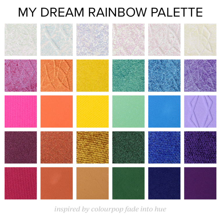
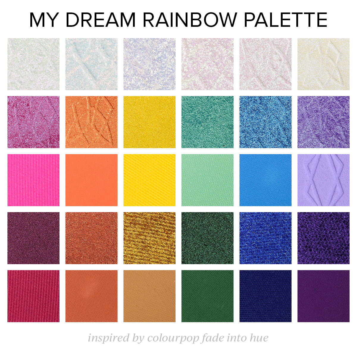
Rainbow palettes are always fun, and though 30-pan palettes are daunting, I was inspired by ColourPop’s Fade Into Hue palette (their take on rainbows) to put together what I envisioned as a rainbow palette at this scale that would grab my attention–I’m really more into smaller color stories (like 10-15-pan palettes), but it’s always fun to challenge myself to think beyond that!. I had a concept for each row, but I did use existing products from the get-go (instead of doing a digital mockup) so if something catches your fancy, it DOES, in fact, exist!
Here’s how I wanted the palette to work out:
- Iridescent/Sparkling Top Coats: The first row was designed to be a row of iridescent/sparkling top coats that could be used wet/dry, individually or layered over other shades to lighten/brighten. Did I cheat by going for all Clionadh Multichromes? Probably. I definitely wasn’t envisioning Multichromes – just more iridescent or duochrome with a translucent base.
- Duochromes: The second row was all about more mid-depth duochrome shades for each color family.
- Brighter/Mid-depth Mattes: The third row was about brighter and more mid-depth matte shades that would coordinate with the shimmer shades selected for each color family. These would be more “typical” for inclusion in rainbow-inspired palettes!
- Deep Shimmers: The fourth row was designed to offer deeper, richer shimmer eyeshadows for each color family. In a real dream scenario, these would be more satin-to-pearl in finish, almost working as a psuedo-matte as well as a shimmer (and would play particularly well with the first row). I didn’t want to create a digital mockup and then pick real versions, so I just stuck with what does exist in permanent ranges.
- Deeper Mattes: The fifth row was selecting deeper mattes for each color family that would support the shimmers and contrast with the mid-depth mattes. I think with a rainbow-inspired palette with so much color that part of playing is to layer and create in-between shades.
See below for the shades in each column (which is by color family, effectively!):
Dreaming in Rainbow


Dreaming in Rainbow


Dreaming in Rainbow


Dreaming in Rainbow


A Rainbow-Inspired Palette to Dream About | Mega Edition

A Rainbow-Inspired Palette to Dream About | Mega Edition
I love this concept! There’s such a good variety of finishes and depths of color. I also like that someone could easily just buy the 5 shades in their favorite color and make a nice small palette. I might just do that with the greens 😉
Definitely feel like finish + depth are often lacking in larger rainbow palettes – all matte can be fun, but it’d be nice to get a mix!
This is the most perfect rainbow palette I have ever seen ever.
🥰
I like your idea of dividing rows by textures and the colums by hue, this is genial! Hope someone who creates palettes is reading this blog for inspiration! Regarding the rows,I’m in love with your choice of textures! Regarding the columns, personally I don’t reach so often for fucdia/reds and yellows. Thus my ideal palette has a row of warm toned green (olives, charteouse, grass greens) instead of the yellows (whereas the 4th row should be reserved to cool toned greens, like teals, aquas emeralds…) Instead of the reds/fucsias my ideal palette has hues between blue and violet (i.e. something between the 4th and 5th row, like perwincles). Ok so maybe it my rainbow ideal palette will end to be not a real rainbow, not including yellow and reds… Let say a 3/4 rainbow
LOL! Introducing the 75% Rainbow!
This is what I wish the CP version actually looked like! So much nicer, and NO pressed glitter crap.
The pressed glitters have always confused me. They are not deemed as eye safe yet they are included in an eyeshadow palette?! They just need to stop including them and sell it as a separate product for people who like to use glitter on their face or are willing to use it on their eyes knowing the risk.
I LOVE how this was put together. I typically do not care for rainbow palettes simply because there often feels to be repetitive shades. This concept feels really fresh and interesting having the topper shades to transform the looks and the duochromes that fit into each color of the rainbow. This makes me even more excited to see your upcoming Sydney Grace palettes.
I’d buy in a heartbeat!
Have you checked out the Morphe collab with Lisa Frank? Now that is a pretty rainbow palette. I think it is mostly matte but you can always layer a topper over the matte to add texture, shine, frost, or glitter. Given your perfect palette, I think you should do a collab with Morphe!!!
If only there was a link to just quick purchase your curated palette exactly as-is without all the shopping around at different sites to build it! 🤣 I’d buy it in a hurry!! (Even knowing it would cost a small fortune!)
HAHA! Yeah, this would be quite the price palette!
WOW!!! So freakin BEAUTIFUL! I would spend good money for a palette like this 😍
How beautiful and colourful is this latest offering from you Christine. I love how the colour stories work together and this is truly inspiring.
Oh Christine! I really can’t wait until your collab with SG is available because this shows what we can’t wait for!!
🙂
God, this is the stuff of my dreams.
Yes, that’s the rainbow palette that I would grab without hestitation! Colourpop’s one lacks depth so much. I was actually expecting to see Clionadh and Fyrinnae here.