Pat McGrath x Bridgerton Part 2 Collection Swatches
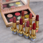
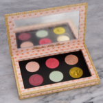
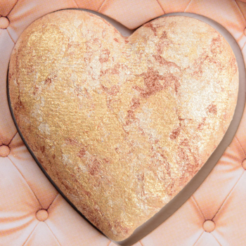
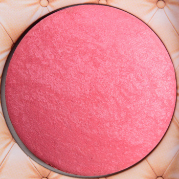
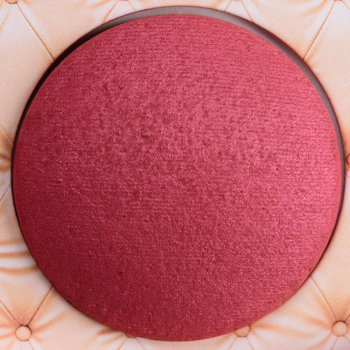
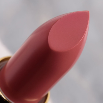
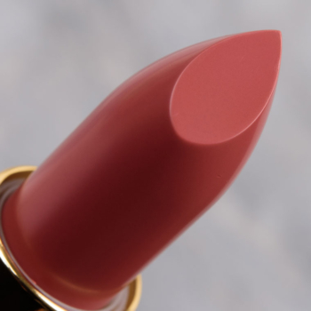
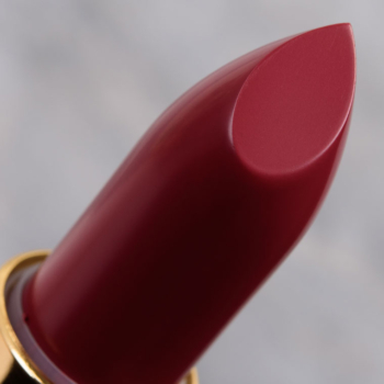
Pat McGrath x Bridgerton Part 2 Collection is a follow-up to the previous Bridgerton collection, and this collection includes seven new lipsticks in a new formula (SatinAllure, which is definitely not like LuxeTrance), two loose face/body highlighters, an eyeshadow palette, and a blush palette. I wish I could have had swatches up sooner, but my order just arrived late last week! 🙁










Ooh! Look forward to hearing more of your thoughts on the SatinAllure formula!
The only thing that comes to mind is pink, pink and more pink. I’m not a huge fan of the brand in general but isn’t everyone tired of pink??
YES, I’m so sick of PML’s pink overload! And yet, I oddly just ordered Nars Unrated Eyeshadow Palette, which does have several pinky shades, but at least those go with the overall theme of that palette. Since when does baby silvery blue, deep olive-lime and those pinks go together? It just looks discombobulated!
Some of the lipsticks look nice (depending on their finishes…if there are creams or satins, I’d be interested) but all those pink eyeshadows AGAIN. I can tell you right now, Genevieve won’t be loving these (except Forever Charmed!) and I feel much the same! To my eye, the palette doesn’t look all that different from her earlier Bridgerton palette(s).
Quite right Mariella on all of your comments – especially about the pinks. Not quite sure what a baby blue shade and an olive shade have in common – but there you go.
I know the dupes aren’t up yet but I’m willing to bet that both you and I have dupes galore for that olive shade (the only really eye-catching one for me and, I’m guessing, for you too).
I was curious whether I would feel any regret having not purchased anything from the collection. I am good with my decision and appreciate the swatches.
Its almost annoying that the blush colours in the blush palette look so good as I absolutely detest the packaging… 😩
Could it be any more hideous?
Agree. The blush palette packaging is impractical. Too bad because the colors are pretty.
Depending on how well these review, I may very well get Infatuation and Negligee lipsticks. 😍
The eyeshadow palette looks like one rather peculiar consortium of shades, so I don’t know about that. 🤔
I am really interested in Negligee and some of the other lipsticks! Not a fan of the whole pink eye shadow thing, but the look you’re wearing in the lip review pages is really beautiful!
I have the first bridgerton palette…I wish I didn’t want the second. I am so upset they are so similar but the formula in the first is so nice, and the special shades are certainly different…
I would be interested in your opinion of the lipsticks. The eyeshadow palette is too pink for me. Hopefully this pink obsession retires sometime soon, but it is saving me money. I looked through everything of hers on the Sephora site to see if there was something that my 20% off would tempt me and there really wasn’t anything calling my name.
I just got the Venusian peach lipstick. It’s really nice, kind of lip a balm-lipstick hybrid? Very moisturizing. However….the packaging is much lighter than any of her others. The bow is so dang cute but the packaging itself feels cheap 🙁
I love her lipsticks, I have too many to count. I know quite a few people don’t like the lips on them. I thought the bows were really cute for a change. It’s interesting that she’s changing the packaging to a cheaper lighter case from the older more substantial one. I usually equate a heavier case to a luxe brand.
The packaging is cute but I think the bows will make the lipsticks difficult to store. Sad to hear it’s lighter weight. I like so many of the colors from this collection.
You’re right about the storage I never thought about that, they obviously didn’t neither.
I would grab Infatuation and Darling Dandy. They are gorgeous. I made a hard and fast rule years ago to never but Limited Editions. I learned my lesson with many Tom Ford lipsticks that were LE and I fell in love with them.
Yep, it’s a weird assortment of shades that really don’t seem to work together. I just don’t know what Pat was thinking of when she designed this palette.
It also looks identical to the first palette and many of the other she has put out recently.
As for the lipsticks – we’ll see!
I bought the eyeshadow palette, the blush palette, and three of the blue-packaged lipsticks, and it all came in last week. I have the first collection too.
The lipsticks are wonderful. I was expecting tons of pigment like the Mattetrance, but these are satiny soft and have more of a medium pigment. I love the formula and hope she releases more shades in it.
The blush is super pigmented; a little goes a long way. Love the colors. I think the round box is cute but it’s bulky and totally impractical and I hope I don’t scratch the raised blushes putting the lid back on.
The eyeshadow palette is a bit of a puzzler. Why these shades? The palette looks like the first one but does have differences. There is no medium depth shimmer like in the first one so it’s hard to know how to put the colors together, although I have some ideas from Pat’s Insta. The aqua blue metallic is very nice and less sparkly than Regency Blue from the first palette. I’m actually wearing shades from both palettes today and I find the second palette is a nice addition to the first one.
But having watched season 2 of Bridgerton, I wonder why she didn’t do a purple theme – many of Kate’s dresses ranged from deep purple velvet to light, shiny lavender, and I would have been very excited about a palette centered around those colors. Such a palette still could have included the greenish gold that’s in this one and the whole thing would have been obviously different from the first palette, with fewer pinks, and have been more indicative of Season 2.
I can get the frustration with the color story, but I don’t agree with all of the hate/dislike of this collection wholesale. For me, I’ve got every palette she’s ever come out with. This one and the first one are, in fact, quite different IMO. The thing with these two palettes is that one shade on its own might look a certain way, but, when combining or using colors like regency blue over your shadow, it completely changes the look. This is no different. Pat sends emails with “how to” create all of these different looks and best wear the palette. Not to mention what she posts or tags on social. This is like when everyone trashed huetopian dream, saying it was too much like the divine rose palettes. There were plenty of differences there, as well, which I don’t think people appreciated as, without owning the palette yourself, you can’t necessarily appreciate those differences. Or create the looks she intends.
It’s not my fave palette of hers, but I do like it. I hate the blush container and I don’t like the heart shapes. I love the negligee bullet that I bought, and do not mind the redesign on packaging.
Blushing Delights caught my eye immediately, but seeing your swatches I know I won’t purchase. I adore Budding Romance, but hopefully I have a dupe. Champagne Venus does nothing for me.
However listening to some of your readers and the looks of this new lipstick formula, I am more intrigued by them. I do not like her mattetrance lipsticks.