Natasha Denona Gold Eyeshadow Palette Release Date + Official Swatches

Natasha Denona Gold Eyeshadow Palette
Release Date + Collection Info
Products Available
Gold Eyeshadow Palette, $129.00 (Permanent)
- Lime Chrome Golden apricot with a green duochrome
- Python Deep teal
- Sparks Sheer vanilla gold
- Aria Warm pink beige
- Cava Sheer champagne
- Aurora Peacock blue
- Dijon Rich mustard
- Oro Warm gold
- Log Dark brown (Igneous from Sunset)
- Varis Medium brown
- Brass Green-toned gold
- Sandstone Cool yellow beige
- AlchemistCool bronze gold
- Teak Medium brown
- Aurum Cool gold
Natasha Denona Gold Eyeshadow Palette

Natasha Denona Gold Eyeshadow Palette
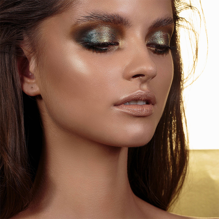
Natasha Denona Gold Eyeshadow Palette
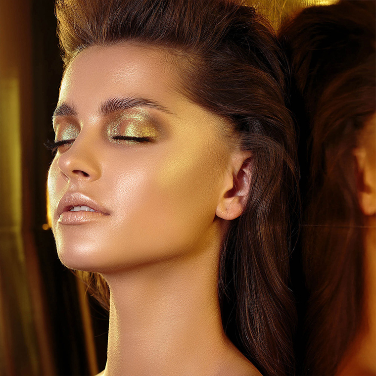
Natasha Denona Gold Eyeshadow Palette
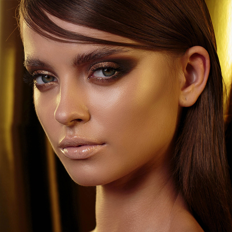
Natasha Denona Gold Eyeshadow Palette
Maybe it’s my work monitor but a lot of these colors look really similar. It’s very pretty but I feel like either cutting out several shades (and reducing the size/price) OR swapping our some of the samey samey golds with a more diverse color scheme would make this palette go from “pretty” to “beautiful”.
ND has been trying to make concealer lips happen lately (remember the promo shots for Safari?) and I am NOT HERE for it.
Yes, the concealer look made the model’s lips look 50 years older than her face! Agree with this feeling one note…one very close note. But, if it’s your thing, gradient and haloed eyes are going to be a cinch.
I definitely think lips need to be a different color from the skin around them! 😀
I don’t think I’ve ever seen colors on the lips of a Natasha Denona model. She goes for those ghostly nudes.
Yeah, she does. I understand why, but agree that they don’t have to be “ghostly” nudes. I very much do heavier eye makeup looks with slight cheek color and nude lips, but since I’m MAC NC 37ish (medium yellow-neutral, mixed Afro-American-European), death-like nude doesn’t cut it for me (and most people I think). I need ever so slightly peachy-pink in mu nude colors. That said, the ghost nude look is one that many like and if they can work it, then why not. Not just me.
$129 for a palette full of very same-y looking shades? No thank you.
I will never learn….i have never used Sunset palette and yet, i will likely buy this…..and never use it.
Save your money for something that you’ll use 🙂
Wow, is it because the colors don’t go well on your skin-tone? If that’s not it, try Christine’s recent combos she gave for ND’s Sunset palette. You can do sooo many things with it. At least, I find I can.
I usually love Natasha Denona palettes, but I feel like I either have all these shades in another of her palettes or I would not use them. Or both. Easy pass, here.
Wait- that first promo photo shows creasing.
The ~promo~ photo. Shows ~creasing.~
WOW, thank you for pointing that out! Crazy, how does that make it to published?
It certainly does look like creasing!!!
I agree. I cannot believe. That first look is horrible. I mean so much creasing. What did she do with her formula again? So weird.
Yes, I’ve noticed that too! The creasing is so obvious that I wonder if they left it visible intentionally or someone has just missed it?
So funny. Creasing is the first thing I saw and my main takeaway from the first look.
Yeah, that’s an “Oooops” moment! Sad too, because I don’t experience that with her shadows, so it could make one wonder on the formulas here. Hmmmmm….
Which is sad bc doesn’t she advertise her formula as “Buttery-smooth, breakthrough formula blends easily with no fallout, fading, or creasing”?
I noticed that, too! It looks so oily and flakey at the same time!
Her OG shimmer formula in the 28 pan palettes is incredible, but since she changed the formula, they’re just like any other brand and sooooo not worth the price. It’s borderline insulting the price she charges for average shadows.
Fighting myself on this one… so many similar shades, but it’s so pretty!!! Any word on whether this is permanent or LE? Hoping it will still be around for Sephora Nov VIB sale 🙂
What a nice change from RED!!!!
I have to second that!
I honestly would like to have the first row across. She should have made that as a holiday five pan and called it a day. This palette is just too similar to purchase.
Oh my gosh, I agree, I would absolutely LOVE just those top shadows. Especially if they swapped out the top left with the bottom left, which is a more interesting gold to me. I think I’ll build a little palette based on this scheme in my Z-palette with singles tonight! I have singles that are similar to most of those colors already.
Yep! I 100% agree about that switching of the two shades.
That’s probably what will happen, so I may have to wait for that (and again, hope I can’t dupe them).
If I go by the arm swatches on the 3 models, this appears to be more differentiated shades once these are applied to medium and especially deeper skintones. Then, the nuances between shades becomes more noticeable. Still, I feel as if I probably have a dupe for each and every shade in it. Not as floored by this as I was Lila or Sunset.
If I wore warm tones, and if I loved all shades golden, and if I had a spare $129, then I’d scoop this up and have no regrets. Just pulling out this lovely and admiring it will be fun for many. As it is, however, I fail all ‘ifs’ and hope those who buy it really enjoy it. It’s beautiful.
A lot of these shades will look similar on the lids
H’mmm.
At first glance, the palette looks really lovely and perfect for the festive season. On second glance, a lot of the shades seem very similar, though it’s interesting that the last shade, aurum looks distinctly different on each skin tone.
I am not a fan of the caked on foundation and highlighter paired with glossy concealer lips – I get that it’s meant to show a dramatic eye for the sake of the palette but I just don’t love the aesthetic they’ve got going on here. Didn’t like the safari one either and this seems like more of the same, only shiny instead of matte.
I love the Lila and PMG Mothership, and even ND mini palettes because they are so cute and fit so well in my make up bag! But this one doesn’t thrill me. It seems like my favorite brand are all churning out eye shadow palettes at a record pace this year. Just like they churned out highlighters last year! I wonder what 2019 will bring??
A blue, green, purple, deep forest eye shadow palette, that’s what I’m hoping for!
Lovely shades, but I think this one is going to look better on darker skin tones. Pass for me. It’s nice to the greens and golds, though.
This one has my full attention! I just signed up for the first alert with Bueatylish, and given the price and my low buy status, I will be getting it from Beautylish because I need to break up the payments. Natasha Denona is one of my favorites.
The palette looks really pretty. But even so, I’ll have to pass on it. I don’t like to wear warm color eye shadows. They tend to pull orange on me. I prefer cooler toned shadows. I actually like her 5-pan and mini palettes better. I think I’ll go get the mini star palette and/or the camel 5-pan palette instead. Hopefully they’ll still be around when the Sephora VIB sale hits in November.
Love the theme, but I agree with the rest of the comments here – too many very similar shades. But I still like this.
Thankfully, a palette with an easy ‘no’.. These shades would be so awful on me.
The two columns on the left would make for a gorgeous palette in themselves – so pretty! Otherwise I agree, too many similar shades at least for my habits. I hope there are dupes for those six…
I’ve never bought a ND palette before, but this might be the first one. I have a major weakness for greens and golds. I really love this.
The swatches look gorgeous! I can’t resist a gold eye shadow palette. Pretty sure I’m getting this baby.
I can immediately see 4 identical eyeshadow pairs within the same palette. Is Natasha gone crazy releasing this kind of redundant overpriced item? Or maybe we, the consumers, are crazy, for buying it. In any case, my money won’t be going to support a lazy unimaginative product such as this. Not sorry.
Oh Gosh!!!!!! Excited!!!!! It’s so beautiful, but I know I’ll be duping a lot of these, boo hoo. So here’s my hope, an A- rating minimum and less than five dupes, and it’s mine. 😉
Had to reply to myself, I can’t do it. It’s pretty to look at and I don’t even have to wait for the rating, I KNOW I have too many of these colors. I’m crying inside, but I have to accept it.
Oh, last comment, but I forgot to say this, as pretty as it looks, it could have used at least four more “colors” (other than gold), say in the green or mauve/violet areas (I know would have been a tad trippy, but still unique)
While this is beautiful for the holidays, its a hard pass for me. I can’t see myself using this palette beyond the holidays, and I’m done on warm palettes. Now if this were a more silvery, taupy, pewter, cool greys and mauvey grey palette I would fall hard…… – I’m just ready for cool tone palettes and no more warm tone gold palettes. (Although, I just bought her large STAR and mini STAR palettes and I love them). But there are some cool toned colors in both palettes.
I’d fall over from shock if someone did that palette of colors. What?: No red, rust, orange, mustard yellow, gold, bronze and teal? Are there any more shades of these colors left to create? Meanwhile, the other 1/2 of the color wheel is almost totally neglected! Sheesh!
Ok so I will walk this comment back and state for the record that I bought this palette. I’m waffling back and forth, but I think I will keep it. Should have never bought it to try to make up my mind because once its home, its hard getting it back to the store! Some cooler golds would be nice but it is beautiful…. but I stick to my former comment that beyond Xmas, I doubt I will use it until the next holiday.
That’s interesting, I was thinking that it’s a warm palette with golds and therefore more spring/summery. But maybe the blue/yellow combo makes for a Xmas green and more festive looks… I’m right on the edge of buying this thing. I LOVE the Star palette – have had it for 1.5 years, used 2/3 of those days in some capacity (including highlight, contour, blush…), and have hit pan on 3 and just today 4 shades. It’s absolutrly brilliant palette, although didn’t get great reviews here. The 28-pans however were a disappointment for the price and kept me from getting the Sunset, Lila, Tropic, and Safari palettes. I’m very tempted with this one but already have golds, that green gold is in the Mothership Bronze Seduction (V), and how often am I really going to wear teal ?♀️But it’s stunning, can’t deny. Maybe I’ll grt it at the VIB sale. Enjoy your palettes!!
The reason I like “Yes, Please” so much more than ND Sunset is Colourpop got rid of most of Sunset’s dupes, paring it down to essentials (or at least something closer). I’m really surprised that this is so whole-hog in the other direction. Spreading them out all over the palette doesn’t make the colors different, just more difficult to compare.
Too many similar tones on light and medium skintones. There are a lot of comments that this is a warm palette, but speaking as someone who definitely exists in the warm end of the range, I see five colors I’d call cool, three neutral, and the rest warm; guess that makes it half-warm. We all have very different takes on what constitutes “warm” and “cool” I think.
way too same almost same , close colours. I dont like that matte mustard colour either. Just my opinion I dont there is anybody that can pull off where orange, yellow, terracotta colours. Gold can be toned down to be cooler colour. For this price no way for me with the selection. I really expected a lot more from ND this holiday season. i will buy some of the new Nars xmas palettes or some more Pat Mcgrath.
It’s a beautifully selected and laid out palette, however I have not found Natasha Denona’s formula to be even remotely close to the quality the price tag demands. Pass.
These colors look absolutely stunning. Can’t wait for the review!