Natasha Denona Coral Eyeshadow Palette for Fall 2019
Release Date + Collection Info
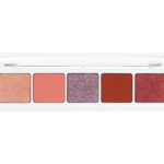
Natasha’s legendary saturated pure color pigments in the ultimate palette for autumn! This user friendly palette is combined with 5 multi use coral shades allowing you to create a selection of looks, varying from a classic daily look to a sparkling glam eye look. This 5 pan palette contains Natasha’s iconic dazzling duo chromes, metallic and creamy mattes made out of mineral pearls allowing you a smooth and long lasting application.
August 3rd
Products Available
Coral Eyeshadow Palette, $48.00 (Permanent)
- Lola (244M)
- Dakota (247CM)
- Abalone (246DC)
- Lyria (245CM)
- Kai (248M)


“Ooohs and aaahhhs” despite having these kinds of shades a million times over. I really like Abalone thrown into the mix. It give it something a little different.
That one caught my attention too!
Wow, that’s pretty. I may have to buy it just to have a shade called abalone!
Kind of confused how this is a coral palette? Aside from the first two?
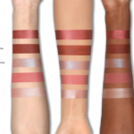
If the swatches are accurate — big “if” these days, I know — the shades look more coral than they do in the pans, or at least they do on my monitor. I always like to see Christine’s swatches for real accuracy, though.
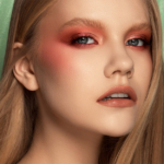
Re: what I was saying today about the brands: I hope that Natasha Denona, as a woman and beauty creator, thinks beyond the stereotypes of ageism, and diversifies the promotional campaigns and images for her products, with pictures of women of all ages. Stop using a 16/ 18/20 year-old as your image for a launch.
I’m in my mid-30s and I want women in their 30s, 40s, 50s, 60s, 70s+ to be represented. They are as beautiful and as interesting as the one in this picture, if not more. I went through the pictures in the “Gallery” , “Get The Look” and “Video” sections of her website and it is unacceptable. You can do so much better, Natasha Denona.
Nicole, you expressed it much better than I can or did. With all the talk of “inclusiveness” in makeup, the one group that seems to be ignored is the woman over 40 (heck, it looks like the woman over 30 doesn’t count either!).
Yeah, so much for the talk about “inclusiveness” in makeup and women supporting each other! We will all be 50, 60, 70+ if we are lucky, I might add. There’s no escape from it. Avoiding talking about it and about ageism, doesn’t make this process slow down or makes us younger. Starting with 25, our skin is in decline (collagen production, elasticity etc.). It is not so noticeable in the beginning, but we all embark on that path. When I was 15, being 30 seemed so far away. Well, bad news: time flies so fast, especially in today’s stressful world. Valuing women who reached the age of our mothers and grandmothers = valuing us.
Also, when you think that many of us in that “upper age group” have more “disposable income” to spend on cosmetics than women in their younger years (who are just setting out on careers or sacrificing to raise young children, buy a home, etc.) it seems foolish to overlook us.
It’s truly silly how little major beauty brands use older models!
Indeed, Kira!
Oh, this is so beautiful, but I can’t justify buying it.
I believe Natasha’s Denona 5 pan mini palettes was cheaper.
This is not a mini!
Love it, but also think I have close-enough shades. I thought the five pan palettes were usually around $25?
That is for the mini 5-pans; this is a regular-sized 5-pan palette — that’s why it doesn’t say Mini in the product name! 🙂
I don’t know who that model is but, seriously, she looks to be about 13 years old! I recall reading a few years ago that some cosmetic companies were going to start using models more of the age of their customers or at least use a range of ages including models who might be above 30! (and I’m not talking about the occasional Linda Evangelista or Lauren Hutton appearance or famous women like Helen Mirren). A coral-based palette has no appeal for me whatsoever but I really do sit up and take notice when companies use older women in their campaigns.
I’m really excited about this. I’m actually really glad I skipped on the Cranberry palette because this one is much more up my alley. Definitely grabbing during a sale.
I love Abalone and Kai, but I tend not to get excited about coral and copper shades on me. Beautiful looking palette though!
The lilac color is the only one I’d want so easy pass.
Is this that much different than Sunrise? I’m looking at my Sunrise palette, which I love and kind of comparing to online swatches from the Coral palette and not sure I can justify owning both. Thoughts?
My thoughts exactly! These are Laurel, Morgan, Aster, Jasper and Azalea. Maybe in Coral palette metallics have mor colour – in my Sunrise Aster and Azalea are more kind of toppers, they don’t look as much gorgeous on naked lids as they do on top of matte colours.