NARS Parallel Universe Eyeshadow Duo Review, Photos, Swatches
NARS Parallel Universe Eyeshadow Duo
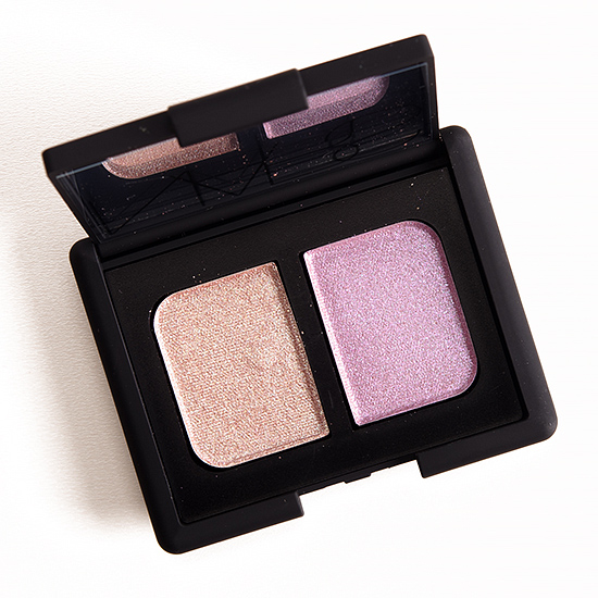
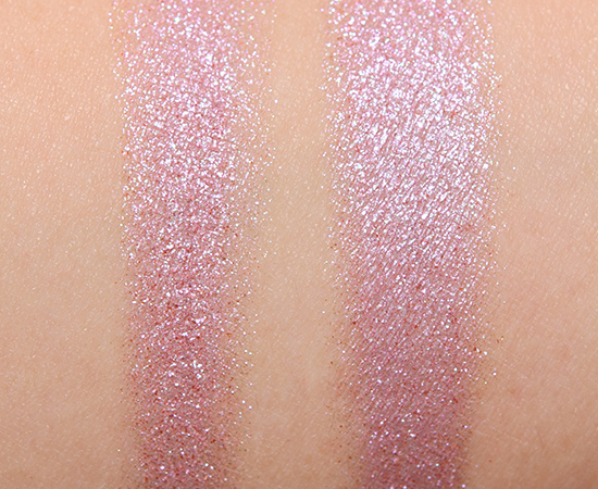
NARS Parallel Universe Eyeshadow Duo ($35.00 for 0.14 oz.) is a mix of a light rose with copper sparkle and pinky-lavender with violet and teal sparkle. Both shades are jam-packed with sparkle, so there is fall out while they are worn, and I would suggest a lightly tacky base or glitter adhesive to combat it. If you love your sparkle, don’t mind a slightly sheerer look, then you may really like these. They have a lot of the same downfalls as we’ve seen with similarly sparkly eyeshadows, so while they’re definitely pretty on, the formula itself isn’t perfected. I think they could also work well layered over cream eyeshadows and bases.
Parallel Universe (Left) is described as an “iridescent pink lilac.” It’s a brightened, light rosy pink with copper and teal flecks of sparkle and shimmer over a more metallic finish. This is a tough color to truly capture, because there are teal flecks that sparkle but seem to get lost entirely in photos. Instead, coppery-red flecks dominate in photographs but sit in the background in real life when there’s a fair amount of light coming into wherever you are, while in dimmer light (say walking down a hallway during the day, so there’s some natural light but little direct or flooded light), the red flecks take centerstage. The color itself isn’t really a duochrome (I tried angling my arm to capture the flecks, but the base color doesn’t shift). The texture is soft, lightly powdery, and I tried using it both wet and dry. NARS’ eyeshadow formula is touted as wet/dry, though I don’t find that true with all their finishes (e.g. mattes), but it seemed to be fine to use a damp brush with this product. It had semi-sheer pigmentation applied dry and was more sparkly with less of the base color coming through, and it was prone to fall out during application and wear. When I applied it damp, it was smoother and more pigmented, but it appeared lighter as the brighter base color was more noticeable; it was also easier to apply to the lid. I had seven hours of wear out of this shade before it creased. I can see this being a really pretty, sparkly wash of warmth over the lid for those who like one-and-done shades. bareMinerals Rose Gold (P, $14.00) is darker. MAC After Dusk (P, $16.00) is darker, less metallic. Tom Ford Beauty Enchanted #2 (LE) is less wamr-toned. Urban Decay Provocateur (LE, $18.00) is lighter.MAC Mineral Mode (LE, $21.00) is darker. MAC Rose Light (LE, $32.50) is cooler-toned. Giorgio Armani #29 (LE, $33.00) is less sparkly. Too Faced Mauvelous (LE) is similar. Get comparison swatches / compare dupes side-by-side.
Parallel Universe (Right) is described as an “iridescent violet.” It’s a light-medium lavender with subtle, cool undertones and a mix of copper and teal sparkle. Applied dry, it had semi-opaque pigmentation that tended to sheer out more readily as the eyeshadow didn’t bind as much with itself, so it had a drier, more powdery appearance on the skin. Applied damp, it was smoother with a higher, more reflective finish and was easier to work with on the lid without losing intensity. On me, it showed signs of creasing after seven hours of wear and had some fall out over time. Maybelline Hibiscus Heartbreak (125) (LE, $6.99) is less sparkly, cream. Giorgio Armani #14 (P, $32.00) is warmer. Make Up For Ever D926 Blueberry (P, $21.00) is darker. Illamasqua Charm (P) is warmer, less sparkly. MAC A Party of Pastels #3 (P, $21.00) is less sparkly. Kat Von D Arcadia (LE) is cooler-toned, less sparkly. MAC Tropica (LE, $21.00) is cooler-toned, less sparkly. L’Oreal With a Twist (LE, $7.99) is darker, cooler-toned. Urban Decay Grifter (P, $18.00) is cooler-toned. NARS Marie-Galante #1 (LE, $24.00) is cooler-toned. MAC Amethyst (P, $21.00) is lighter. MAC Kitschmas (P, $21.00) is less sparkly. Get comparison swatches / compare dupes side-by-side.
Parallel Universe
LELimited Edition. $35.00.
Parallel Universe (Left)
DCDiscontinued. $25.00.
Parallel Universe (Right)
DCDiscontinued. $25.00.
See more photos & swatches!
NARS Parallel Universe Eyeshadow Duo

NARS Parallel Universe Eyeshadow Duo

NARS Parallel Universe Eyeshadow Duo

NARS Parallel Universe Eyeshadow Duo

NARS Parallel Universe Eyeshadow Duo

NARS Parallel Universe Eyeshadow Duo

NARS Parallel Universe Eyeshadow Duo

NARS Parallel Universe Eyeshadow Duo
NARS Parallel Universe Eyeshadow Duo

NARS Outer Limits + Parallel Universe Eyeshadow Duo, Sephora My Boyfriend’s Jeans Eyeliner

NARS Outer Limits + Parallel Universe Eyeshadow Duo, Sephora My Boyfriend’s Jeans Eyeliner


Myeah, it didn’t excite me in the sneak preview and it doesn’t excite me now. I mean, it looks alright. But I’m not blown away by it.
They had such promise!
This product is so pretty! Might budge and give NARS products a try!
How fun! 🙂
These are really pretty. I am pretty bummed on this ! But, too much $ to mess with fall out for me. IMO, at this point in cosmetics technology, this is not acceptable for a higher end brand. I’ll dupe it with MUFE artist shadows and save myself the fall-out hassle.
I wish they were more pigmented dry with a thicker consistency overall so everything would hold together better!
I’m sort of relieved this isn’t very good (and way to sparkly for me), they looked like the most tempting from this collection.
Shame though!
I really wanted it to be better!
Still find it baffling that they call it lilac. It looks bronze! Maybe it’s one of thoe ‘need to see it person’ deals. The fallout remains a deal breaker though
In some lighting, I totally get the lilac, and in other lighting, it’s not really there.
It looks like the kind of colour that could read lilac on my skintone.
I’ve noticed a lot of colours that read more bronze on some like Christine, turn a lot more pink and cool toned on me. Does look closer to pink than lilac though.
Oh man, the colors are sooo pretty, but I was afraid about the fallout from your preliminary swatches. Why, NARS? Why do you do this to me?
Yep! Lots of fall out 🙁 It always amuses me when you have to go to another brand for the best fix (glitter adhesive).
I think this one is a definite pass for me. I do not mind layering shadows over a cream base to pull heavier than sheer coverage, if I want it, but light super sparkly shades are a particular nemesis of my partially hooded eyes.
I feel like it ended up looking prettier in the pan than in practice!
Noooo! This was the one thing I really wanted to get. The colors are so pretty in the pan.
I hear you 🙁 I think they’d be cooler over a colored base.
It looked so pretty. With that rating is am easy pass though.
It had promise!
I was hoping for a texture simular to Kauai, so this is a huge disappointment!
Me too! I almost thought it might come close when I saw it initially, but as soon as I disturbed the surface, I knew it was too soft!
If this is still hanging around after a while I’ll pick it up, but if it’s gone before I get a chance to to (I have other products I really want!) I won’t be heartbroken.
I’ll be curious if you end up trying it!
Aw. I mentioned in the Sneak Peek that I was looking forward to this review. Kind of disappointed now.
Aw, sorry! 🙁
I’m so glad that this didn’t perform very well because I was so close to buying it… but I’m currently on a spending ban. So, hooray!
Yayyyy!
Well darnity darn. I was actually jumping up and down on both legs when I first saw pictures of this collection but as it turns out, with your review, I think I just saved myself a bunch of money. It’s a pity though, I really thought it all looked promising. And I own the Kauai duo and I thought, wow it looks similar and it could have been so nice. But I can’t handle fallout. Not for Nars price!
Yep! It did look like the texture/feel was going to be like Kauai to me, too, but nope 🙁
The colors look like a weird pairing in the pan but they’re both beautiful and seem to work well together. It’s too bad the lighter shade doesn’t perform too well
They do work well together!
These sound very much like I feared they would be from your first post….a less than eye-catching base and glitter that goes wherever it wants. I’ve enough of those disappointments in my collection not to want to add to it. But I can see the teal glitter you were speaking of in the swatch on your arm. I might not have noticed it had you not mentioned it but I was looking for it and could, indeed, see it (very slightly)l
You were right on the money, Mariella! These needed a denser base, I think, to hold that sparkle with the actual eyeshadow color so you could get more out of it (with less work).
Hmm, while I was interested in this at first, I don’t know if I can deal with so much unruly sparkle….
It gets everywhere!
I’m so disappointed. These are much more sheer and chunky glittery than what I anticipated. I’m not digging the swatches.
There’s definitely a dryness to them that makes it harder for it to combine and really smooth out. It doesn’t even really seem chunky in terms of feel, but the sparkles lift from the base, so they become more visible, I think.
If Nars put as much into the formula as YOU did on its description, these would be A+. Seriously, your write up of the left shade belongs in some award category. It’s major insight on a difficult-to-describe product. So far, this whole offering looks embarrassing to put one’s name on. Nars has as many misses as hits, these days.
It’s always interesting to me when you can see a brand get it really, really right like NARS did with Kauai… and yet despite it selling well and getting raves all over the place, we haven’t really seen a lot of eyeshadows with a similar texture and feel since.
I wouldn’t give it a pass if it had fall out, but the least it should do is hold together and have some good pigmentation – just eyeshadow basics right there.
When I first saw the promo pictures I thought it looked very much like the Kauai duo. I couldn’t have been more wrong, lol! I don’t like sparkly eyeshadow that much so this duo is clearly not for me.
Oh, definitely not one for you, Lulle, unfortunately! 🙁
It’s a pity these aren’t better, but your dupe swatches just made me put MUFE Blueberry on my wish list.
Blueberry is delicious 😉
Oooh, do want!
Yay!
No thanks. For $ 35, I don’t want my face looking like a disco ball
lol!
I think these colours could be layered to create the sparkly look, if that is what you are going for. Again, it looks lovely on you – especially by adding Sephora’ My Boyfriends Jeans eyeliner. It really makes the look.
They’re best layered, particularly over a base!
I am so glad I saw this review. I absolutely love a good sparkly eyeshadow and these colors are perfect for spring so I would have snatched this right up and been so disappointed. Thanks for all your hard work and saving me some money 🙂
No problem, Susie!
Darn, I wanted this to be better!
You & me both, Erin!
Aww…so pretty in the pan!
I hate fallout and can’t do that much sparkle, so passing on this duo.
Good decision!
I looks so pretty in the package. They do look pretty applied as well, but I just can’t deal with fall out during wear. So this is a no for me, and a yay from my wallet 🙂
Fall out is so annoying!
Looks like I’m on the disappointment train with everybody else! These initially looked like great summer it’s so hot I don’t have the will to blend eyeshadow. Just a pretty one and done wash, maybe over a color tattoo if its under 110 that day. I feel so sad face 🙁
Aww! I totally understand. At this price point, too, it should be really easy to use!
I am so so in love with this – didn’t think I would care much for this duo, instead, despite the bad rating, I feel like I would get so much use out of the two shades, even if I had to put a little more effort during application.. so gorgeous!
Hopefully you love it anyway! 🙂
It’s a shame with the massive glitter fall out. But still, the colours are sooooo pretty!