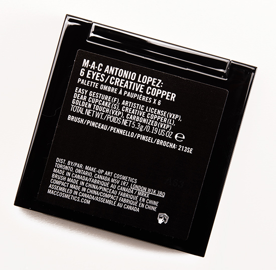
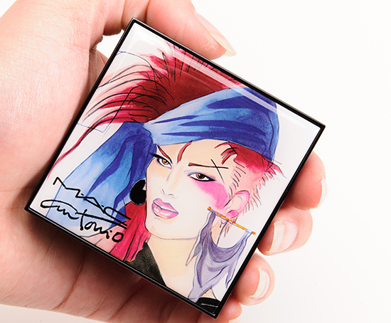
MAC Antonio Lopez 6 Eyes/Creative Copper Eyeshadow Palette Review, Photos, Swatches

MAC Antonio Lopez 6 Eyes/Creative Copper Eyeshadow Palette
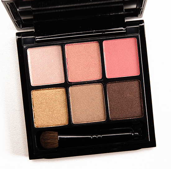
MAC Antonio Lopez 6 Eyes/Creative Copper Eyeshadow Palette ($43.50 for 0.19 oz.) is a new and limited edition palette that launches in-stores on September 12th. It contains six eyeshadows with a warm-toned theme. This palette is decent to good, though it’s not perfect and at the price point, you can find better-performing products. If these are the types of colors you’d wear often and see yourself really reaching for this palette often, I think you’d probably still enjoy it. For one or two shades, though, it is less likely to be worth it. These shades performed well enough to be worn alone without too much issues–most of them made it to eight hours of wear with minimal fading, though the Lustres had some fall out, which is par for the course with that finish.
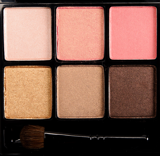
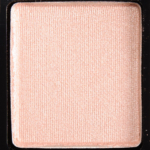
Easy Gesture is described as a “pale warm beige [with a Frost finish].” It’s a light peach with slight beige tones and a soft, frosted finish. It had good color payoff and was easy to blend out on the skin. LORAC Nude is more beige. LORAC Champagne is warmer, more beige. Urban Decay Skimp is less frosted. Urban Decay Sellout is warmer. MAC Orb is less frosted. See comparison swatches.
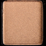
Artistic License is described as a “mid-tone frosty pink gold [with a Veluxe Pearl finish].” It’s a warm, peachy-pink with a golden sheen. It had decent color payoff but is somewhat sheer. It could be softer, more buttery, for a Veluxe Pearl. Urban Decay X is similar. MAC Dynamic Duo 1 #1 has a less pronounced golden sheen. MAC Expensive Pink is more orange, darker. Chanel Intuition #1 is pinker. See comparison swatches.
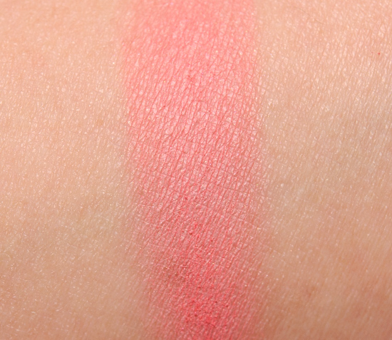
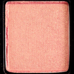
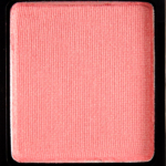
Dear Cupcake is described as a “mid-tone coral pink [with a Satin finish].” It’s a light-mediu,, pink-coral with a mostly matte finish. It was powdery, and it had semi-opaque color payoff. It is a repromote. MAC Rose is pinker. MAC Free to Be and MAC Early Bird are both more coral, less pink. Chanel Rose Favorite is darker, pinker. See comparison swatches.
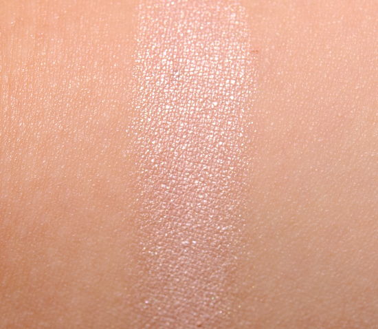
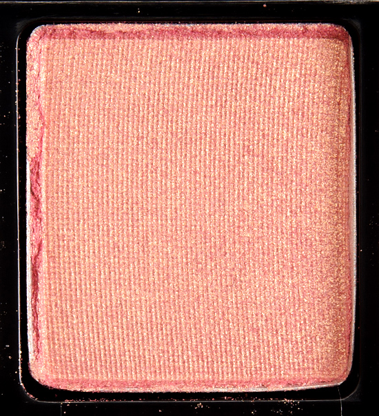
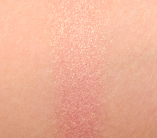
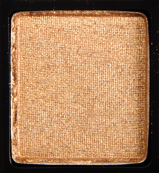
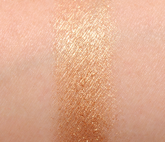
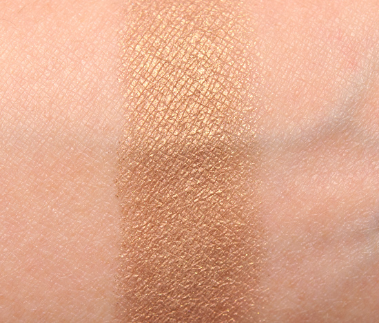
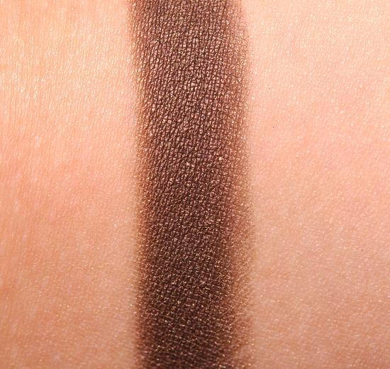
Creative Copper is described as a “sparkling true gold [with a Lustre finish].” It’s a medium-dark, brown-toned gold with copper sparkle. It had semi-opaque color payoff, but it had a Lustre finish, so it had chunky sparkle/glitter that sat on top and didn’t bind well with the underlying color. MAC Brownluxe #3 is more orange, less sparkly. theBalm Manic Maribel is slightly more coppery. Urban Decay Limelight is very similar. Urban Decay Penny Lane is more copper. MAC Retrospeck #2 is less sparkly, warmer. MAC Amber Lights is browner, less sparkly. MAC Up the Ante is browner, cream. See comparison swatches.
Golden Touch is described as a “tarnished taupe [with a Veluxe Pearl finish].” It’s a medium-dark, warm-toned brown with a golden sheen–but there’s a mutedness to it that I see as a “taupe” tint. It had good pigmentation, and it had a soft, blendable texture. Bobbi Brown Golden Bronze is darker, cream. Maybelline Downtown Brown is warmer. bareMinerals Schmooze is similar. Edward Bess Cosmic Bliss #2 is also similar. Urban Decay Suspect is more taupe. MAC Cactus Thorn is similar. MAC Patina is more taupe. Benefit Thanks a Latte is less warm-toned. See comparison swatches.
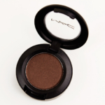
Carbonized is described as a “deep warm brown [with a Veluxe Pearl finish].” It’s a dark brown with warm, reddish undertones and a pearly sheen. It had nice color payoff and a soft, blendable texture. MAC Divine Decadence is lighter, warmer. LORAC Sable is more matte. Urban Decay West is more metallic. MAC Life’s Luxury is a cream product. MAC Make Your Mark is lighter. See comparison swatches.
Easy Gesture
LELimited Edition. $17.00.
Artistic License
LELimited Edition. $17.00.
Dear Cupcake
LELimited Edition. $17.00.
Creative Copper
PiPPermanent in Palette. $17.00.
Golden Touch
LELimited Edition. $17.00.
Carbonized
LELimited Edition. $17.00.
MAC Antonio Lopez 6 Eyes/Creative Copper Eyeshadow Palette
MAC Antonio Lopez 6 Eyes/Creative Copper Eyeshadow Palette
MAC Antonio Lopez 6 Eyes/Creative Copper Eyeshadow Palette
MAC Antonio Lopez 6 Eyes/Creative Copper Eyeshadow Palette
MAC Antonio Lopez 6 Eyes/Creative Copper Eyeshadow Palette
MAC Antonio Lopez 6 Eyes/Creative Copper Eyeshadow Palette

MAC Antonio Lopez 6 Eyes/Creative Copper Eyeshadow Palette

MAC Easy Gesture Eyeshadow
MAC Easy Gesture Eyeshadow
MAC Artistic License Eyeshadow
MAC Artistic License Eyeshadow

MAC Dear Cupcake Eyeshadow
MAC Dear Cupcake Eyeshadow
MAC Creative Copper Eyeshadow
MAC Creative Copper Eyeshadow

MAC Golden Touch Eyeshadow
MAC Golden Touch Eyeshadow

MAC Carbonized Eyeshadow
MAC Carbonized Eyeshadow
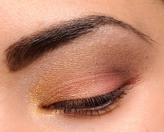
Creative Copper (inner lid), Artistic License (middle of lid), Dear Cupcake (outer lid), Golden Touch (crease), Carbonized (crease)

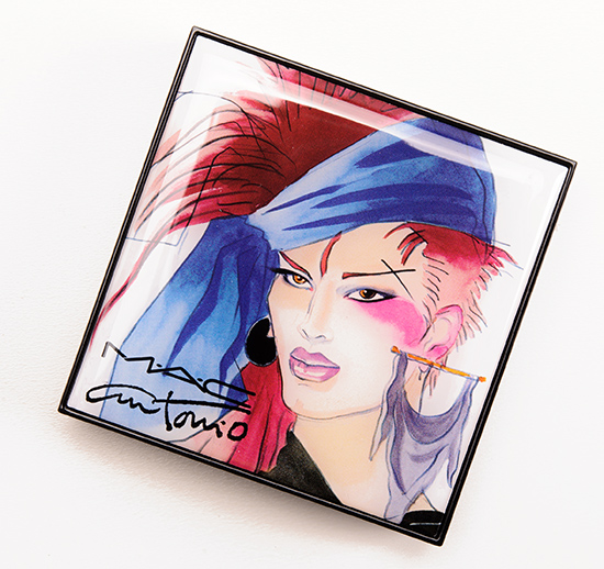
Beautiful palette not sold on the cheesy 80s style illustrations though…
I’m right there with you. I pretty much opting out of this collection. No more than one or two of the shades on any of the palettes really grabs me, and I don’t want to look in my kit to see this artwork on a regular basis. Nearly every shade is near dupeable anyways IMO.
Yeah I think the LORAC pro palette is a pretty good match though this palette really is tempting me. This is probably one the nicest things from this collection but yeah, can’t get over the illustration thing.
This reminds me of the NYX Nude on Nude palette.
Also, none of the colours are actually copper… H’mmm…
Ditto the Teal palette – none of those actually looked “teal” and only 2 of them were even remotely close to teal. Oddly, though, I liked the “non-almost-teal” shades best.
This one actually seems kinda nice. I already own two of the shades, though (dear cupcake and carbonized).
Boo!
I actually really like this. Don’t need it though. I’m not into the artwork either.
Thank you so much Christine, I always wait for your reviews.
I really like this palette, I hope I can get my hands on this one.
To me, this is screaming out to be worn with brown eyed beauties!
I was thinking it would work best for those with blue or green eyes. As someone with brown eyes, these shades don’t seem to do anything for me…
liking the palette, the artwork kills it for me though! shame…
I like this, but some of the swatches, like Creative Copper, would give me pause. Maybe I’d get the mirror from this collection, as I liked the illustration of that the best.
I actually quite like the artwork, but I’m not sold on these just yet.
Love the golds! May get this one, waiting for the review.
Beautiful colours!
The packaging on the inside reminds me too much of Bobbi Brown’s. Which isn’t very creative since both brands come under the same big company. The colours are gorgoeus though, for everyday.
look that is created with this is beautiful
Nice to see Carbonized being trotted out again (if they’re going to persist in inflicting Carbon on the unsuspecting public, it’s nice that they put a good repromote in one of these!)
I’m not a fan of pink eyeshadow but the gold shimmers in “Artistic License” does weird things to my heart *_*
How does artistic license compare to paradisco? They seem similar to my eye, but I don’t have either in front of me.
Paradisco is a bit darker!
I love that palette! Those colors are my favorite!
Great palette!
I wish Dear Cupcake was sold on its own.
Love this palette!
Love the look you created, Christine!
This palette is actually very pretty! I’m such a sucker for neural shadows and this is right up my alley. The pinks really make it stand out. Love it!
Beautiful colours! However, I’m not a fan of the packaging either.
I hate to be so mean..but I really really quite despise this collection; the artwork, the cheesy eyeshadow combos. This is the only palette I would remotely consider, but it’s still a huge pass due to the packaging. Ugh!
These colour are up my alley being so fair, but begin a TheBay exclusive I’m not sure when I’ll/if be able to pick this up in person.
This palette looks perfect, definitely will be purchasing when it arrives here! Beautiful.
you always do the prettiest eye looks!!! 🙂 thanks for the review!!!
Thanks, Karen!
How does this palette compare overall to Archie’s girls caramel sundae. I feel they look like very similar palettes and I don’t want to own both if they are both the same. Thank you
At a glance, they do seem similar, but I think the tones/finishes are a bit different. If you want to make sure you have two very different palettes, then I’d skip, but they aren’t dupes!
I’ve noticed many comments on other posts have been approved but mine from last week is still waiting.
Haven’t had enough time to sit down and look up the information I need to answer your question yet! Sorry, Nikki! I have about 100 questions pending right now to answer 🙂
I’m sorry I didn’t mean to be a pain I was just thinking maybe my comment got buried since I know you get a lot!
It’s here! I promise. 🙂 I’m hoping to have a chance to power through outstanding comments tomorrow or Friday! Thank you for your patience!