Dior Dulcinee (324) Eyeshadow Palette Review, Photos, Swatches

Dior Dulcinee (324) Eyeshadow Palette
Dior Dulcinee (324) Eyeshadow Palette ($60.00 for 0.21 oz.) is new and limited edition for spring–and exclusive to Nordstrom. The colors look bolder at a glance than they perform on the eye. The darker, mint green looks more like a wash of very pale aqua green on the lid, even though I tried to pat and pack it on. Even the purple shade didn’t seem to hold up well; it just sheered out quickly and looked faded from the get-go. If you’re after a very, very soft, pastel-driven look, you may enjoy this palette. If you wanted the colors to look and perform exactly as they do in the pan on the eye, you’ll be disappointed. Overall, the eyeshadows lasted about seven hours before starting to fade (from what they looked like initially).
Dulcinee #1 is a pink-tinged beige with a frosted, metallic finish. It had fairly good color payoff, and the texture was soft and smooth. Guerlain Les Tendres #1 (LE) is similar. LORAC Nude (P) is warmer. theBalm Promiscuous Pearl (LE, $16.00) is similar. MAC Phloof! (P, $15.00) is also similar. MAC Star Crystal (LE, $32.50) is darker, less metallic. See comparison swatches.
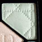
Dulcinee #2 is a pale, pastel green with a pearly, golden sheen. It looked cool-toned in the pan, but it has a strong golden shimmer that makes it look more like a yellowed green. It had good pigmentation, and it applied smoothly and evenly on the skin. Tarina Tarantino Wonderful #4 (P) is darker. Disney by Sephora Atlantica (LE) is brighter, darker. MAC Zestful (LE, $19.50) is similar. Dior Blue Lagoon (374) Eyeshadow #5 (LE) is also quite similar. See comparison swatches.
Dulcinee #3 is a glittering, sparkly silver with neutral undertones and a metallic sheen. It’s semi-sheer–mostly just something you’d use to layer glitter over another shade. This is the purpose of the center shade in these types of Dior palettes. The texture has an almost wet feel to it, and it adheres better than some other glittery eyeshadows. I had minor fall out after seven hours of wear. There’s no shortage of similar sparkly silver shades — see comparison swatches.
Dulcinee #4 is a medium-dark, subtly warm-toned, purple with a satin shimmer. It had so-so color payoff, but it sheers out quite quickly, and it doesn’t build up, so it looks more like a light purple on the lid. Too Faced Candied Violet (P) is cooler-toned, darker. Too Faced Jingle All the Way Eyeshadow #6 (LE) is cooler-toned. Tarina Tarantino Poppycock (LE) is brighter. Dior Constellation (864) #4 (LE) is brighter. theBalm Lavish Latoya (LE, $16.00) is cooler-toned. theBalm rem (P, $16.00) is warmer, smokier. See comparison swatches.
Dulcinee #5 is a blue-leaning, light-medium aqua with a satin finish. It seemed like it had decent pigmentation when I initially swatched it, but it blends and disappears very quickly on the lid! I’d apply it, then apply another color next to it, and it would look MIA after a couple of minutes. The texture was somewhat powdery as well. Disney by Sephora Blue Oasis (LE) is bluer, darker. Sugarpill Mochi (P, $12.00) is darker. MAC Sky Blue (P, $15.00) is bluer. Inglot #367 (P, $6.00) is greener, darker. Inglot #345 (P, $6.00) See comparison swatches.
Dulcinee (324)
LELimited Edition. $60.00.
Dulcinee #1
LELimited Edition.
Dulcinee #2
LELimited Edition.
Dulcinee #3
LELimited Edition.
Dulcinee #4
LELimited Edition.
Dulcinee #5
LELimited Edition.
Dior Dulcinee (324) Eyeshadow Palette

Dior Dulcinee (324) Eyeshadow Palette

Dior Dulcinee (324) Eyeshadow Palette

Dior Dulcinee (324) Eyeshadow Palette

Dior Dulcinee (324) Eyeshadow Palette

Dior Dulcinee #1 Eyeshadow

Dior Dulcinee #1 Eyeshadow

Dior Dulcinee #2 Eyeshadow

Dior Dulcinee #2 Eyeshadow

Dior Dulcinee #3 Eyeshadow

Dior Dulcinee #3 Eyeshadow

Dior Dulcinee #4 Eyeshadow

Dior Dulcinee #4 Eyeshadow

Dior Dulcinee #5 Eyeshadow

Dior Dulcinee #5 Eyeshadow

Dior: Dulcinee #1 (inner lid), Dulcinee #5 (middle of lid), Dulcinee #4 (outer lid),
Dulcinee #3 (middle of lid), Dulcinee #1 (brow bone), Urban Decay Deep End
Eyeliner (lower lash line)

Dior: Dulcinee #1 (inner lid), Dulcinee #5 (middle of lid), Dulcinee #4 (outer lid),
Dulcinee #3 (middle of lid), Dulcinee #1 (brow bone), Urban Decay Deep End
Eyeliner (lower lash line)


Bummer. Glad I waited on this. The colors are so pretty, but at this price I exect top quality product!
I had a feeling it would under-perform, but I was sooo hoping it would surprise me!
Based on your past Dior reviews, I thought it might too which is why I held out!
Dior does some things quite well, why they can’t get eyeshadow right is a mystery.
It’s weird – sometimes they knock it out of the park, and then other times, they just miss!
These are all very pretty, on their own, but the problem I have with this sort of palette is when applied, all the shades tend to run into each other. Still, if I didn’t have a ton of “transforming” shadows, I’d pick this up in a heartbeat. I love putting shades like these over a dark base, or using just one as an all-over wash with neutral contour shades.
It’s weird, because in the pan, they look a lot more contrasting, but on, they’re really faded.
Even the swatch of the purple seems it would break it up a bit… I love the “ethereal”look of the shades on their own, though! These are the only types of pastels I can pull off.
Funny, now that you mention transforming shadows, I think ELF’s transforming palette is about as differentiated in color as this one is when worn.
It’s too bad the Dior shades aren’t quite as distinct when worn as swatched.
This palette looks so inviting and the colours are so beautiful! It’s unfortunate that the application didn’t translate well 🙁
I know! So pretty in the palette.
Not my colors at all, so I am not too heartbroken about the bad rating this received. Still a shame though.
Phew!
Dior should try harder, especially when they’re charging $60. I’m disappointed. And I’m sorry you wasted your money, Christine. :/
LOL!
That #5 looks so pretty on the pan… 🙁
Christine, could you recommend any better-performing mint green/aqua eyeshadow? (Other than Sugarpill Mochi–I already have it)
Mochi is really the only one I can think of 🙁
Try Illamasqua! Their shade “Burst” seems closest to what you’re looking for 🙂 They do seem a little pricey, but they’re quite a generous size and I’ve never encountered an ill-performing Illamasqua shadow 🙂
Ugh, this rally looks like tones of white…
Thanks for the review.
My pleasure, Sara!
I thought when I saw this palette that there might be issues… Pastels seem to be something that a lot of brands struggle with (to be fair, they are difficult, but as others have said, at this price point…)
It is a pretty palette to look at, though!
Definitely true – pastels are hard to do, though I wish brands would stop putting them out if they’re no good, lol!
Ah I made my way to Nordstroms to swatch this and I liked it but didn’t love it… definitely something I’d wear a white base under (brightening pearl primer by BE) I am on the paler side so that helps but still on the fence…
Any favorite spring color / pastel-y palette that you love? I was just thinking about how I don’t really have any pastels, so this Dior palette initially attracted me… but I am not sure its worth the price!
Yes, I think a white base would definitely help this palette out a lot!
There’s no palette that just stands out. It’s possible that none stand out just because on my medium skin tone, pastels have even more of a challenge to meet!
It’s pretty, but at that price point, one wants something with a little more oomph
I just wish they showed up on the lid more like they do in the pan!
What a shame that it’s so disappointing because it looks so pretty and who could resist that name?
I had a bad feeling about it, but it was too pretty to pass up and at least try!
I almost bought this! Are you also reviewing the one with the greys (the non-Nordstrom)? I like sheer pastels..not sure on this one…but really love seeing the swatches and review. Thanks!
I did purchase the one at Sephora, not sure if there are any others floating around!
Interesting! I thought the one at Sephora had grey in it and that the Nordstrom one was all pastels. I was really intrigued but the whole Marie Antoinette concept so was looking at the collection online. I could be wrong though…sometimes online pictures vary by site…with the pixelation not being so great in online photos. Too bad you didn’t like it better. So many of the spring shadows I keep seeing are maybe a little too sheer…oh well…saves me money….Thanks!
All pastels look like muted shade of grey on me. I thought that was because mine were not expensive but I guess money doesn’t guarantee colour either.
Pastels seem like a hard type of color to do for a lot of brands, at all different levels of price!
Sad 🙁 I’ve been looking for a nice, good quality pastel palette for a long time now and I thought this one looked promising. I probably wouldn’t have spent $60 on this, anyway. Sigh, it seems like nobody ever does really great pastels…
It does seem to be a challenge for most brands 🙁
It looks very pretty on you, but it seems like this is about the only look you could get from this palette. Seems like Dior LE’s are hit or miss 🙁 Thanks for the review, I’m glad I waited!
No problem, Jenn! 🙂
Christine, did you use a primer with that eye look?
No, I didn’t! I very rarely show anything with primer – if I do, it will call it out 🙂
I had a feeling this won’t look as great swatched. Dior is still my favourite brand but pastels is not their forte. I find that many of their pastel powder shades tend to under perform.
I agree, @Kami! Dior can do amazing eyeshadows… but they seem to miss a lot with pastels.
I do enjoy a wash of color, but a $60 price tag is way too high for so much sheerness…it´s disappointing because the color combination in the pan is very pretty!
I know! I love me a good aqua…
#5 is beautiful and my favourite colour, but yeah, as a whole, the palette is meh.
Especially on 🙁
These always looked like they were going to be wishy-washy and similar, so you’ve confirmed my fears!
Sorry to do so 🙁
I always love the way pastel palettes look as a whole, but I know I would never get any use from the colors.
Especially not when they all look the same applied!
A different take on this: While I can appreciate a sheerer shadow, particularly in a pastel shades since I think these look far less garish than if these were full on pigmented shadows, I do think they possess a certain level of sophistication. That being said,the little to no differentiation between colours in the palette, begs the question of owning 5 shadows that look almost the same. Maybe these would work really nicely as layering shadows. I wonder what they would look like on top of darker versions in the same colour family. That sheerness could make them work and help someone who doesn’t typically wear pastels to pull off a pastel look without being too washed out.
Thanks for sharing your take on it, Wendy 🙂
So disappointing! The colors look so pretty in the pan. I guess in a way I’m relieved though — I do not need to spend $60 on another eyeshadow palette, especially one that’s sub-par.
Phew!
No way Jose.. For the price to be 60.00 I expected a better color pay off..
Yes, it should be better at this price point – there are no excuses.