ColourPop That's Taupe Collection Swatches
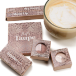
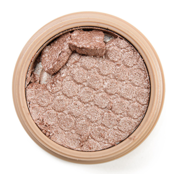
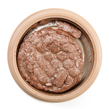
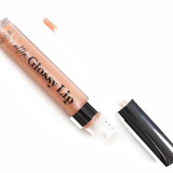
ColourPop That’s Taupe Collection is a new launch that debuts later this morning at 10AM PT. The collection includes an eyeshadow palette, two Super Shock Shadows (mine came as a duo; not sure if they’ll be available individually), two Super Shock Cheek highlighters, and two lipglosses.
P.S. — You can use code TEMPTALIA for 10% off your ColourPop orders, generally (a few exclusions, e.g. some collabs).


MORE nudes?! WHY Colourpop?
Colourpop got me into makeup, but because of their shoddy quality this year and all these nudes nudes nudes, I’ve been giving more high-quality brands a try and have been using and enjoying those products more than “fast makeup” brands. Everything from Colourpop this year, after the pastel collection and a couple pieces of the Wild Nothing collection, have been incredibly easy passes.
I so relate to this!!!! I used to love Colourpop but really got turned off by the bombardment of releases!!! Now I have a hard time even being interested in what they release. It’s like ColourPop is the kid who gets in trouble and ruins recess for everyone else.
Glad I saw these first. I was initially interested in this but seeing that a couple tones lean kind of olive, a color I don’t go for often, I think I can pass.
I wish I could get my hands on Colour Pop from a Canadian retailer. They have so many things I’d love to try. ?
The super shocks are repromotes. I do like Koosh and own that one. I wish this was more cool toned taupe, but CP threw in their ever present warm tones that I just don’t need in every dang palette. This appears to be a bit cooler than Going Coconuts, but I feel like there is over lap between the two (especially how it would look on the eye). It also kind of gives me Naked 2 vibes, and since I rebought that palette this doesn’t have a place/fill a gap in my collection. I do appreciate the micro glitters didn’t make an appearance here and these are nice colors and I love the 9 pan format.
I do like the two lip liners that were put out with this set, Cool BFF & Ashton. I think I’ll probably get Cool BFF because it seems to be lighter and cooler than all the other liners I’ve seen CP come out with… and that fits a big ol gap in my collection!
Seriously, what is with the warm tones?? I was so excited about this until I clicked on the swatches. I love my Naked 3 and Dior cool palettes but it would be nice to have some other options.
I wanted to comment, but saw yours first and I have exactly the same thoughts! I was so exited to see (an affordable!) cool palette. I’ll check out the lipliners!
I think there’s enough overlap between this and Going Coconuts that I don’t need to pick it up, even though the overall color story is appealing. The Super Shocks look nice and I’ve heard that these are cult favorite shades, but it seems like every reviewer I’ve seen post them has had them arrive all shrunken and dried up or cracked…what’s up with that? Was there a quality control issue with the PR packages?
The palette looks beauuutiful, cold blooded is the exact kind of shade I love for a one-and-done kind of eyelook
If you like taupes I recommend the Zoeva En taupe palette, it’s beautiful and has a similar shade to this one, only leaning a teeny bit green as well as this lovely taupy color! And the rest of the shades are so much better than this palette 🙂
My drop dead fave?????. I’d save that one, in a fire, after excusing the dogs!
Rescuing?
I like this collection. Call me an old ass basic bitch but I have fully swung back around to wanting more brown palettes. Just not pink browns or red browns. Brown brown, please. On a personal note the eye palette could use one much darker shade and I’d be all over it.
I saw an ad for this on FB and immediately came here to look for swatches, LOL! Have to say this collection has a few shades that seem to pull surprisingly warm for what is supposed to be a cool palette. I’m not sold on it.
Nah, me neither, I’m so ready for a cool toned palette!
It’s pretty, but I don’t need it. I like the snakeskin print on the packaging. Although much warmer than this collection, it would have been nice if they had re-promoted Snakebite to go with the snake theme.
I agree. Snakebite is my favorite gold ever.
Oh man, their quality is really slipping. That palette has some of the most lackluster shimmers I’ve seen in a long time. The mattes look okay, I suppose.
However, perfect opportunity to replace my drying up Koosh! I like its accompanying shade, too.
I had 2 Kooshes. They were blinding and platinum. Scary on . No taupe whatsoever, but maybe my skin cancelled it out. One dried, the other one given away. This one does not look like the same animal.
Ritz looks so sad!
I have more than enough neutrals and cooler shades tend to give me funny undertones so I will happily skip this… Out of Quartz looks interesting but I just received Sandstone this morning, so I will have fun playing with that 🙂
I’m actually into it, kinda a cheaper alternative to ND Glam, but would want to compare it to my Flutter By palette first
I like it, but I like everything neutral, especially eyeshadow palettes haha!
I’m glad that the glosses are more different from each other than those in the coral collection were, at least on behalf of the people who bought them. Koosh and Ritz are pretty, but Slated seems a bit lackluster,
Every picture and every swatch of this collection I was seeing was entirely different colors and it was driving me crazy because sometimes it looked very cool sometimes it looked very warm and most of the time it looked entirely not taupe. Thank you! Now that I can see what it actually looks like, yes its boring but its the kind of boring I want. I love these tones. I doubt I’ll buy it just because I’m finally gonna take the plunge and try PMG’s eyeshadows with one of those quads coming out tomorrow but maybe if this is still around next month I’ll grab the palette. Also like the slightly cool slightly gray tone of the one lip gloss.
I LOVE these colors/tones for Eyeshadow!!!
The Taupe eyeshadow palette is a very welcome departure from all the numerous pink themed palettes we have seen for quite some time. I like the colour story and it seems to be more cool toned than lots of their others. The Snake Eyes duo looks lovely too – especially Koosh.
Hopefully, one day, the brand will add to their Lux Lipstick range.
I am really drawn to this collection…like I want the majority of these products. Taupe is my favorite…boring as that seems. I’m a pale redhead. So hair is red and warm but skin is pale with cool undertones. I hope to find it at Ulta tomorrow since I have a day off work. ?
Mattes look fine but light shimmers (my core lid shades) look weak.
Well thank you so much for the swatches! When I got the newsletter from CP 2 days ago, I almost ordered the whole collection out of excitement to get a cool christmas 😉
Now at a better and second look…. maybe not so much. I find the too many colours to be leaning warm and the swatches are underwhelming.
I’ll pass on this one.
I kinda like it. Rock Steady and Pebble Beach look like colors that would go well in my crease. Something I didn’t realize I would ever need until realizing all the pink-toned “crease shades” being released in palettes is horribly unflattering on my skin tone.