ColourPop Hello, In a Pickle Super Shock Shadow & Daddy Pressed Pigment Reviews, Photos, Swatches
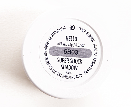
ColourPop Hello Super Shock Shadow
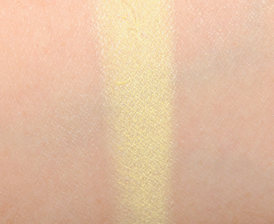
ColourPop Hello Super Shock Shadow ($5.00 for 0.07 oz.) is described as a “soft pastel yellow in a matte finish.” It’s a brightened, light yellow with a white base and matte finish. It had semi-sheer pigmentation and had a drier texture that tended to pill. It didn’t feel dried out per se in the pot, but it just didn’t have the same blendability or slide of the majority of the range. I couldn’t get the color to go on completely smoothly, unfortunately. It started to crease after eight hours of wear. ColourPop One & Done (LE, $5.00) is more beige. Makeup Geek Mirage (LE, $5.99) is darker. NARS Misfit #1 (P, $24.00) is darker, more beige. Get comparison swatches / compare dupes side-by-side.
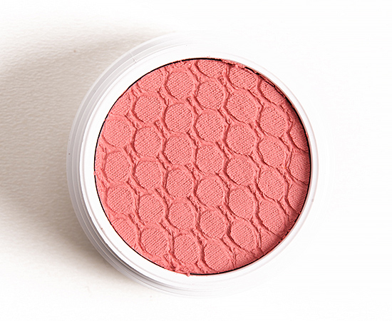
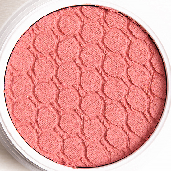
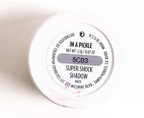
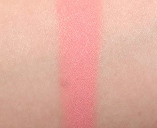
ColourPop In a Pickle Super Shock Shadow ($5.00 for 0.07 oz.) is described as a “pastel coral pink in a matte finish.” It’s a softened, light-medium pink-coral with warm undertones and a mostly matte finish. It had semi-opaque pigmentation that went on evenly, but it was a little drier in how it looked on the skin where it almost balled up in places and wasn’t as blendable. It wore well for nine hours before creasing. Hourglass Monochrome #3 (P) is lighter. Make Up For Ever S800 Grenadine (P, $21.00) is slightly darker. Chanel Palpitation (104) (LE, $29.50) is darker, cooler-toned. Chanel Quadrille #3 (LE) is slightly darker. MAC Early Bird (LE, $16.00) is brighter, darker. MAC Dear Cupcake (LE, $16.00) is pinker. Get comparison swatches / compare dupes side-by-side.
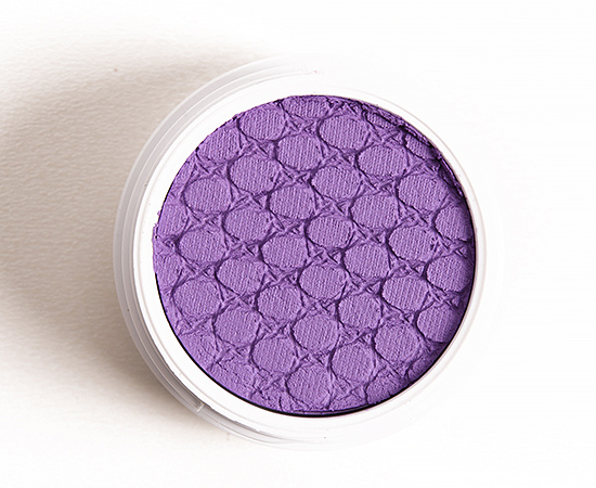
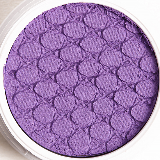
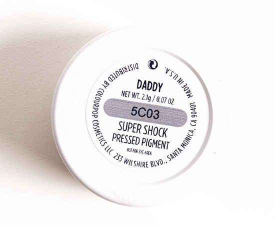
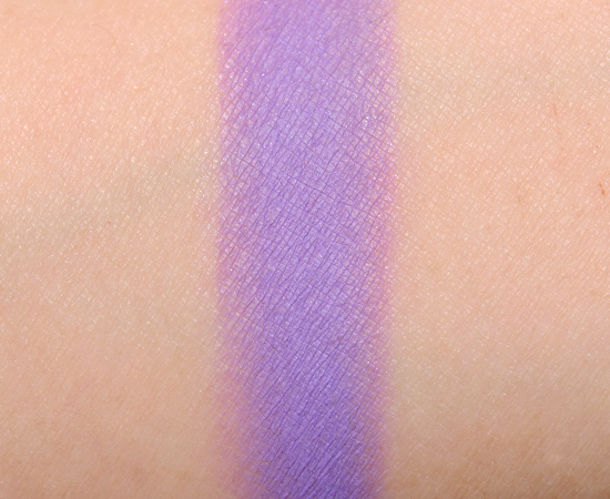
ColourPop Daddy Super Shock Pressed Pigment ($5.00 for 0.07 oz.) is described as a “cool-toned vibrant violet in a matte finish.” It’s a lightly brightened, medium-dark purple with cool undertones and a matte finish. It had decent pigmentation but wasn’t fully pigmented. I didn’t realize this was a Pressed Pigment (which means it is “not intended for use in the immediate eye area”) until I went to write up the review–it just didn’t seem vibrant enough to make me double check–so I went back and swatched/tested it as a blush as well (after having mistakenly used it as an eyeshadow). As a blush, it was fairly blendable but doesn’t feel quite as velvety and easy to use as the actual Super Shock Cheek formula. It lasted for eight and a half hours on my cheeks. ColourPop Liaison (LE, $5.00) is darker. Maybelline Painted Purple (P, $6.99) is cooler-toned. Inglot #379 (P, $6.00) is darker. Get comparison swatches / compare dupes side-by-side.
Hello
LELimited Edition. $6.00.
In a Pickle
LELimited Edition. $6.00.
Daddy
PPermanent. $5.00.
See more photos & swatches!
ColourPop Hello Super Shock Shadow
ColourPop Hello Super Shock Shadow
ColourPop Hello Super Shock Shadow
ColourPop Hello Super Shock Shadow
ColourPop In a Pickle Super Shock Shadow
ColourPop In a Pickle Super Shock Shadow
ColourPop In a Pickle Super Shock Shadow
ColourPop In a Pickle Super Shock Shadow
ColourPop Daddy Super Shock Pressed Pigments
ColourPop Daddy Super Shock Pressed Pigments
ColourPop Daddy Super Shock Pressed Pigments
ColourPop Daddy Super Shock Pressed Pigments
ColourPop Daddy Super Shock Pressed Pigments
Hello, In a Pickle, Daddy (not eye safe!), Sephora Eccentric Diva Eyeliner
Hello, In a Pickle, Daddy (not eye safe!), Sephora Eccentric Diva Eyeliner


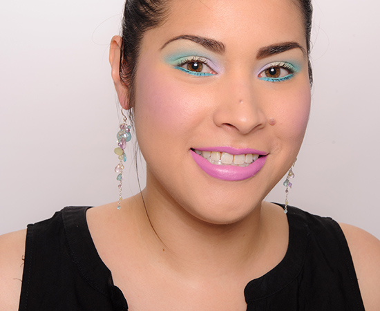
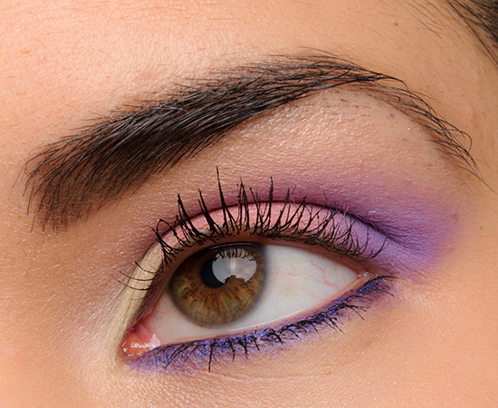
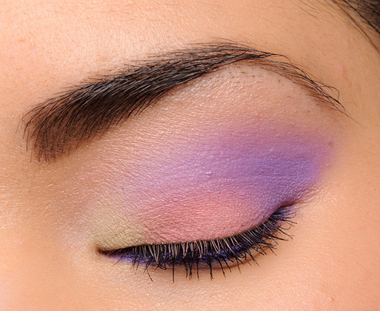

Cute eye look! Very Easter-y 🙂 I probably wouldn’t pick these shades myself though. I prefer the flashier shades 🙂
It is!
I wonder why pastels can be so tricky to execute? I feel like yellows & greens especially are rough across the board compared to other shades.
I think it’s the base that a lot of pastels have to share!
Oh, bummer! I had Daddy on my buy list, but I didn’t realize it wasn’t eye safe. It’s so pretty on the eye. Thanks for the heads up.
Same! It didn’t seem THAT bright/vibrant so I didn’t even think twice!
Dang Daddy seems like such an odd shade to not be safe for the eyes.
Right? I was really surprised!
I really love Daddy. I use the “not eye safe” ones on my eyes, anyway. I haven’t had an issue, so I’d go for it. It might make a pretty blush for dark skin tones, though.
It is a really lovely purple!
Wowsas!That’s a bright and cheery look! You wear it well. 🙂 I don’t understand why they are potting shades like “daddy” with the eye shadows and then saying they are not eye safe. Is that just a CYA thing do you think?
LOL! I wasn’t expecting to shoot any cheek photos, and I was like, “Here goes…”
It’s definitely a CYA thing, but I have no idea of *exactly* why (my guess is a dye) and/or what the worst reaction is.
Yeah, I would have done the same. I would probably just have overlooked it actually. But, in your line of work, I understand you have to put that out there. I actually just ordered their new purple blush on a whim in my order on Sunday. I forgot the name of it and am being to lazy to look it up now. I like the way daddy looks as a blush and a shadow on you. It’s kinda that 80-90’s vibe that seems to be rolling back around. Although,I’m not sure if i got to rock that full on back in the day, if I should be partaking in that again. Whaat did I say, those were some good times, you know I’m gonna play some! In fact that whole look you did there, reminds me of how my older sister wore her makeup in the 80’s. I was really not wearing makeup until the mid to late 90’s. But,it is totally the look! 😀
The older I get, the more annoyed I am by the little things like that, because I think it straddles an ethical line. The warning is there, so it is not hidden, but it is also not prominent enough and I feel it is very easy to overlook or miss. ColourPop isn’t the only brand who does it – almost every brand who puts out neon products seems to do something similar. I remember when I was testing Urban Decay’s Electric palette, and the ONLY reason I found out is when I was cropping the back of the palette to get the oz. off of it for my review – after having worn it three or so times. How many people really read the label on the back of the palette? Yet everything about these products says “use me on your eyes!!!! but no, don’t!”
Haha! I hear ya..I use UD ‘s Electric palette ONLY on my eye area,lol! It is unethical. But , they get away with it because they can. Their comes a time in your life when you get even older and you realize you have to cover your own a$$ in this world full of CYA’s.
The reason the warning is so small is because, in every other country (Canada, EU, South Africa), those pigments are entirely legal. There really is no more risk in using this product on your eyes than in any other. ‘Neon’ pigments have not been tested by the FDA for the eye area. It’s not that they tested them as harmful, the FDA just hasn’t gotten around to it yet.
Hey Alex,
The thing is – I am in the U.S., the brand is in the U.S., and until it IS safe by the FDA, it should be obvious, but more importantly, the product doesn’t specifically state that it is neon dyes that are making it unsafe. I’m not an ingredient wiz, so I can’t tell at a glance if there are other things in it that might also make it inappropriate for eye usage. (With some products, this has been clearer, e.g. MUFE Artist Shadows, UD Electric, Sugarpill Elektrocutes but not always.) Some people may find the FDA less credible vs. EU, whereas others may defer to FDA – but the point is really that you have to make the decision yourself, knowing the facts as they stand, but nobody else can or should make that decision for you. 🙂
As far as I’m concerned, when big brands like UD and MUFE enter into the neon market in the U.S., then they should be pushing the FDA to test and approve them.
I got my pastels from Colourpop in the mail and Hello wasn’t as dry as yours. In fact they seemed more damp they the rest of the formula’s. Still semi opaque and powdery but more workable.
Oooh, lucky!!
This look is super Easter 🙂
Haha! Yes, definitely.
I have been looking for the perfect pink blush with warm undertones and in a pickle looks exactly like what I’ve been looking for. Christine do you have any suggestions for warm toned pink blushes like ‘in a pickle’?
http://www.temptalia.com/swatch-gallery?sg=193361,190611,189804,159856,155024,112564,107926
Wow, Christine, your review saved me from a big Colourpop mistake again! As previously mentioned, I had a Wish List of their new pastels idling in my cart, & as a purple LOVER, Daddy was at the top of the pile! I have sensitive eyes, so I don’t think I should risk putting these “NSF” eye-area pigments on my lids. I think they should just put the pressed pigments in a category of their own, instead of confusing us (me). I’m interested in trying their new purple blush, but I would be really bummed if I bought this for my eyes & could only end up using it on my cheeks. Thanks for saving me from being heartbroken!
I was very surprised to see it as a Pressed Pigment when they now have an actual blush formula (because the easiest non-eye use is going to default to blush!). Glad I could help you! 🙂
Your spring eyeshadow game has been so on point!
LOL! Thanks, Jessica. The look was fun, but I’d definitely normally pair it with a different blush, lol!
Reading the names together sounds like a really posh English girl calling her father to get her our of trouble. Hello, In a Pickle Daddy, mind swinging down to the police station to rescue me?
LOL!
Haven’t been following ColourPop super closely but Hello is the only color from them I can recall you giving a grade below a C! Judging by how few dupes there are it seems like pastel yellow is a difficult color to formulate in general for all companies, so I won’t hold it against them.
An aside: I really love when you review indie makeup Christine! I want to get into supporting indie/lesser known brands but I often hesitate to trust blog/youtube recommendations for them because I feel like there’s more incentive for paid promotion with these smaller companies that rely on word of mouth. I’m always happy to see indie products show up on Temptalia because I really feel like you always remain impartial, and your letter grading system is such a great way to quickly gauge a product’s quality.
Actually, thank you for your blog format in general! I LOVE getting a quick glance in the glossover, then going back to read the full review post for products that catch my eye with their letter grade. Saves so much time in my busy day!
It is true – yellow is tough, especially one as pale and pastel as this one. It seems like a brighter yellow (and if it’s shimmery, even easier) is easier to do.
So glad I’ve been able to help, and you find the format so useful, GG 🙂 Thank you!!
LOVE LOVE LOVE you eye looks here!!! gorgeous!!!
Thanks so much, Karen!
Wow Christine, I really dig the eye look you came up with. I’ve ordered Daddy some time ago not knowing it wasn’t eye safe. I mean seriously, why package this as an eyeshadow if it isn’t safe to use on the eyes? -.- Maybe I’ll use it in the crease or in places where there’s absolutely no chance that it runs into my eyes…
Yeah, I feel you, Nicola! I had NO clue at all 🙁