Chantecaille Spring 2013 Collection

Chantecaille Spring 2013 Collection
Inspired by runway trends and BLOOM’s passionate commitment to ban shark finning, Chantecaille created the Save the Sharks Palette. Worn with the Lip Chic Rose Délice, the look fuses on-trend colors with the freshness of the ocean.
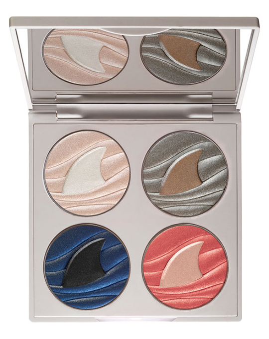
Save the Sharks Palette ($83.00)
Features three eye shades: Great White, an all over white sandy beige, Grey Reef, a glistening sandy grey and Black Tip, a deep ocean blue. Includes Sea Anemone Cheek Shade, a golden coral color that is universally flattering on all skin tones, inspired by the underwater gardens of the tropical seas. Passionately committed to saving our sharks, the BLOOM Association has successfully orchestrated a top-level ban on all Hong Kong Luxury Hotels from serving shark fin soup. 5% of proceeds from the Save the Sharks Palette will be donated to the BLOOM Association to ban unregulated shark fin trade.
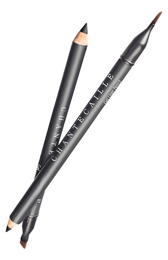
Gel Liner Pencil ($33.00)
- Hematite
- Jet
- Espresso
- Bronze
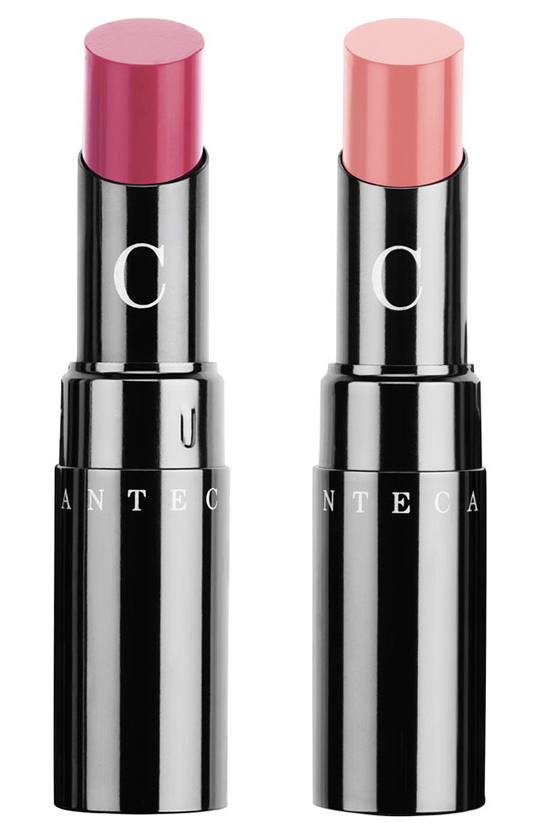
Lip Chic Lip Color ($35.00)
- Daphne
- Rose Delice
Luminous Gloss ($34.00)
- Framboise
- Pink Melon
Availability: Now @ Nordstrom
See more photos!

pretty lip color. that model looks weird in a bad way :/
I agree. I can’t put my finger on it (photoshop gone crazy?) but there is something very odd/off about this photo.
I am all over supporting this cause but I’ve found Chantecaille to be ridiculously tightfisted about the percentage they actually pass on to these causes that they exploit in order to sell product. So many other companies *really* put their money where their mouth is when it comes to charity. This is pure tokenism. Shame on you Chantecaille. It’s either pure profit, or genuine fund raising. This just seems painfully exploitative.
Actually, 5% gross on the signature product of the release doesn’t seem like tokenism to me. The palettes are what everyone wants, right? It’s not like they can do 100% gross like MAC Viva Glam (which is truly awesome, but only a few items out of their gigantic catalogue).
I don’t know; I guess it’s a matter of opinion. But I’ve always liked the donation palettes; the product is usually fantastic, the retail price is high (which means the 5% is significant) but the quantity is generous, the designs are iconic. Sure, it doesn’t take the place of a REAL charitable donation, but it’s still a neat idea for a high end cosmetics brand, no?
That is a great point. I glossed over that when I read the description at first. It works out to a measly $4.15 of an $83.00 palette. Ridiculous that with such a high price point they aren’t donating more, compared to other brands that charge less and do more for causes they support.
Also to echo others here, that photo of Ms Chantecaille is horrid. It’s fine to have the family be the face of the brand, but only do it if that face sells. I find the image more off putting and scary than I do appealing. Her face just looks overly angular, too sharp and hollowed to be attractive or even pretty. It’s either a case of a photographer taking a bad shot, someone picking that bad photo, or someone not accepting they needed to just hire a regular, non family, model for the job.
I want to chime in. Once I thought it is 5% of the price but actually it is 5% of the profit, which is of course far less than $4. I like the way it is made for awareness though, it is also as important as the $$$
Usually I don’t like writing negative comments but as much as I like this brand, I think they should change the model. Her bony asymmetric face doesn’t make me want to buy the look. 🙁
Is it just me or does that model look rather weird? I think it’s the pointy jaw that looks out of place and the stretched-looking skin near her ear.
On a more make-up related note, this collection looks almost the same as most of the other Spring collections. The sharks are a nice touch, but not really a stand-out. Boring.
this model looks anorectic or at least very unhealthy. I don’t like it. It’s very sad and unfair that Chantecaille uses this kind of look to promote their collection.
I totally agree!
Personal opinion incoming. ^^ I find Olivia Chantecaille has looked much better in previous commercials. This one does not make her look her best in my honest opinion. It’s too bad because the products used look very nice.
I agree totally. She looks gaunt in this photo. It doesn’t look like she is wearing any of the shadows from the pallette except for the lightest shade maybe, and it’s not accentuating them as much as her $70 mascara is!
Yeah, I looked up pictures after I read this. She is very beautiful, but this photo is just odd. Too retouched I think. It doesn’t really look that much like her.
If you watch the “Making of” on the company website you will see the lady in question is really skinny. You can even see the bones in her chest area. So sad. Maybe she has a health problem?
OMG! That’s Olivia Chantecaile?!? She looks so different!
I love the shark fin design on the palette!
Agreed! I think it’s stunning. I haven’t bought one of these since Les Dauphins, but I think I might have to splurge on this!
I understand from another source that the gel liner shade released in this collection is a silvery taupe called Geode, not yet available. I have already purchased the Rose Delice lip chic– it’s a bright rose. i prefer last spring’s Sunrise (coral pink) and 2012 winter Nocturne (rosy pink) as they are not as bright but I think Ill get used to it later, when my skin is less “dead of winter” pale. I also have the Framboise luminous gloss, which is exactly like its name, bright raspberry , and I really like it. It is opaque and not sticky!
The model and makeup in this image are beautiful, but the person who did the retouching after should be smacked. They completely erased her jawline to the point that it looks very unnatural. It makes her look gaunt. I can’t believe they would let that slide. Disappointing.
I think the model would look a little better with more professional looking makeup. Her eyeliner looks like it was drawn on by a little kid with a navy blue crayon :/ Otherwise this collection has pretty colors for spring.
That model scares me!
This is a great cause and the colours look pretty, especially the eyeshadow palette. I think the promotional pics have an angular,otherworldly, almost dreamlike quality deliberately.
What the heck is going on with the model’s ear?! What awful Photoshopping. Totally ruins an otherwise pretty image.
I caught the ear too. Really bad photoshop job! Ranks up there with one of the worst photoshop gone wrong pictures I’ve ever seen.
I am interested in seeing the palette swatched though. The colors look beautiful.
The model looks like a goddess. An alien goddess.
LOL, I totally agree to that one.
LOL
Not only is the angle of this picture dreadful (as others here have mentioned), but they didn’t make good use of the palette for her eye look. And the liner application looks dreadful. If you’re going to upper and lower tightline, why not do the waterline too? It’s just amateurish.
This image is so bad, it might pressure the brand to change spokesmodels (I’ve never loved her – it’s the founder’s daughter, right? – but I appreciate her classic look, and the family aspect of the branding). This would be a sad way to go. 🙁
Holy sh*t, what happened to this face? Why does it have this wird triangle shape? Uuugh, looks nasty and somehow disturbing Oo
The way that model looks… I don’t know, I can’t quite put my finger on it but something (or more than one something) is off… Goodness, I hope it’s just the photo or photo editing :/ Not what would appeal to me to look into the brand though.
Oh my gosh , she looks incredibly skinny with a bad photoshop job
I actually think that was with photoshop ” improvements” but I’m no arbiter of haute beauty. I don’t ” get ” Cara Delevigne or Karlie Kloss. I’m way old school with my Christie Turlington and Jessica Stam and cannot for the life of me figure out the algorithm used to decide these things.
I don’t know whether Olivia Chantecaille has an eating disorder or this is overzealous retouching, but having known people with anorexia, the gauntness of her face is unsettling. It’s difficult to focus on the colors in the promo image when she looks so thin.
I can’t even focus on the product, the models face/ear is so disturbing!!
Agree! The model looks skeletal, very disturbing.
Oh my… I can’t help but think whoever released this picture is trying to exact revenge for something and will be subsequently fired. It truly is an unflattering photo in nearly every way. Definitely distracting from the product.
I have seen swatches on other blogs, and the colors are beautiful, however this picture, does not do it any favors.
I really like the colors but umm…wish they’d release a better picture. Also, I don’t really like the ultra sharp eyeliner, it’s just very unflattering and makes eyes look smaller.
Isn’t the purpose of the leading ad to make the consumer to aspire to the look and, to this end, buy the product? Well, I won’t spend a penny on any product that will make me look like… that. Especially given the prices.
An human being without pores nor expression in her face *seems legit*
I am hoping this photo will give Olivia Chantecaille a moment of pause. She has been the model for her family’s brand forever and it is glaringly obvious that she is struggling with some sort of eating disorder. There is a “Spring Look: Behind the Scenes” video on Chantecaille.com and she looks skeletal. So, I’m not sure this photo is too far from her actual look. I personally love the Chantecaille brand and that they try to give back. But, it seems they may to turn some of their attention to Olivia’s health. This photo should have never been used to promote the Spring Line. Wake up Chantecaille. When the talk of your new line is how strikingly unhealthy and thin your model looks, it’s time to refocus.
I just went and watched the video and you’re right! The photo is not a bad shop job; she’s just that skinny! This is horrifying. I could see every rib through her shirt while she did that video shoot. Poor woman needs serious help.
After reading everyone else’s comments, I’m so glad I’m not the only one thinking how gaunt she looks! Does the company/products no justice I’m afraid.
You just described my truly feelings…..I also thought I was the only one….
I felt compelled to google this model in a vain hope that I would discover she was was advancing in age and this was an epic photo shop fail that was valiantly attempting to erase any signs of aging. No, to my udder shock. NY times shows a picture of Oliva, gorgeous at 39. This picture makes her 10 times uglier than she really is. Should have left her untouched.
photo
is
totally
creeping
me
out
since everyone else has already mentioned the strange (possible?) retouching, I won’t. But I do wish they had smudged her eyeliner a bit or tightlined or something. It looks a bit too sharp and just obviously drawn on. I am very curious about that Gel Liner Pencil, though. It sounds really unique and pigmented and smooth (apparently, I got all that out of just the name :P). Also those gloss shades look gorgeous!
You are a brave one that can get past that picture. While it’s obviously bad photoshopping, it’s hard to hold any interest in a product that is associated with that look.
I don’t know what’s going on anymore. For the price of that line, you’d think some more deep thought and visual mastery would go into an ad like that. Aside from Angelina Jolie, aren’t they selling to real people?
She looks like plastic surgery gone wrong. The face looks stretched.
While I appreciate that Chantecaille chooses to use an older model (although 39 is not really “old”), I am rather concerned by her painfully thin appearance. After reading the previous comments I watched the promotional video and Olivia Chantecaille looks, in my opinion, unhealthy. It’s worrisome.
And they are holding up this ill woman as someone to try and emulate. Makes me think of Margherita Missoni.
Good thing I am not the only one who thought that she looks terrible.
Just from looking at other photos of her online… she has lost a lot of weight. Sometimes as women age they have issues with losing fat in their face and it gives a very gaunt appearance, but after seeing the video of her… she looks ill.
Freaked out when I saw this picture…. Scary as hell!! Eyeshadow quad looks fun tho….
Wow. Worst promotional picture ever. HIDEOUS. I’ve always walked past the Chantecaille counter…looks like I’ll just keep on walking past it this season too. This model (who I believe is the daughter of THE Chantecaille) looks so…masculine to me. She looks like Benedict Cumberbatch in drag (which I think really just insults Mr Cumberbatch who is quite a striking gentleman…)
The model in this photo looks so odd and gaunt… and the makeup doesn’t really look so great either… the products look beautiful in the photos, I don’t think this look does justice to their potential…
The promotional picture was just off…And turns me off from buying the products.
Maybe if the promo photo wasn’t a side image. She looks painfully too thin, and kind of sick. Which really bothers me.
This model is awful and it doesn’t look like they used any of the shadows on her or any real makep, just looks so photoshopped. This mkes me shy away from buying their cosmetics, as psychologically I’ll feel like this is the look we can achieve with their collection. .
I rarely comment but I HAD to chime in with everyone else here – The model looks like a victim of server malnourishment! She looks sickly and skeletal and I was shocked and confused that this is the kind of image a company chose to promote their products. I can’t even focus on the product because I am so disturbed by the model. She may in reality be healthy (I don’t know her personal situation), but using her for advertisements is just not okay.
aside from the woman herself, the promo is done with such awful makeup. That liner looks like the tattooed eyeliner that old women get. How odd.
My thoughts exactly.
Chantecaille has never really impressed me, and most definitely not with this look… I am thin too but look at how her brow bone is jutting out, this is not healthy, I feel really sorry for her.
What happened to the woman in the photo??? OMG, I rarely leave comments but I’m sorry, I actually looked at the description to see whether it was a collection which had to be in favour of people with eating disorders!!! Crazy decisions….unless she was photoshopped to look like an alien on purpose! Wow…..
Sorry, I am still not over it. I can’t stop looking at the model- all the Google images show her looking, well, a lot more human than this android version. Bad photoshop job.
Is a matter of perception but certainly the image of Olivia Chantecaille is disturbing and distracting from the main purpose that is promote the Spring Collection.
The photo doesn’t want me to try anything from this brand and that’s a shame. Bad photoshop job or bad health, either way is sad.
I’m agreeing with everyone, if she is sick and it certainly looks that way they made 2 mistakes, first that makeup line is the most undesirable line looking that on her. second if that is supposed to look like yet another anorexic model then definitely dont support this makeup line, until we stop giving them money for these looks it will not stop women from destroying their natural beauty trying to fit this sickening image.
Here! Here! A woman after my own heart 🙂
To actually comment on the makeup collection itself, I absolutely adore sharks and I wanted so badly to support this collection by buying the palette. But the reviews are so absolutely horrible, I can’t convince myself to spend $83 on crappy products when I could just give that money directly to the sharks.
I’ve looked up other photos of her and this might just be a photoshop fluke. She’s actually quite a beautiful woman and it’s a shame that the picture takes away from product.
She looks annorexic AND I don’t want to look like her. Horrible and scary campaign.
Like others have already pointed out, the model looks sick, way to thin!