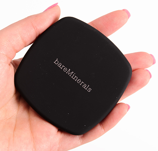
bareMinerals Comfort Zone Ready Eyeshadow Quad Review, Photos, Swatches
bareMinerals Comfort Zone Ready Eyeshadow Quad
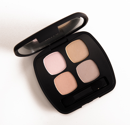
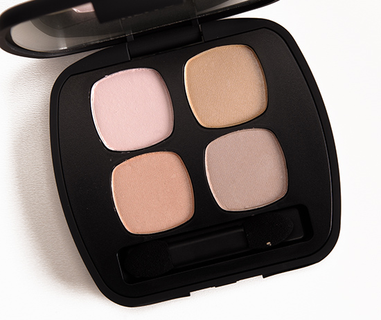
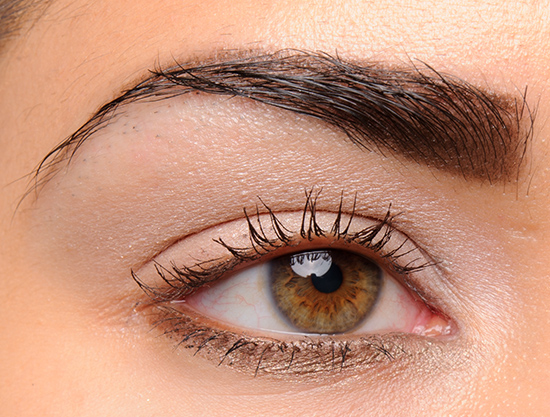
bareMinerals Comfort Zone Ready Eyeshadow Quad ($30.00 for 0.17 oz.) is a QVC-exclusive palette that features four, more neutral-themed shades. I wish there was at least one more contrasting, darker shade in this, because the light-medium nature of all four makes them run together on the lid. The quality is fairly good, though not a slam dunk (and many of bareMinerals’ quads are), but I don’t think this is as versatile as it could be–I tried a few different pairings/combinations, and they were all very similar once applied. If it’s the type of look you wear all the time, I think it would be worth checking out, but if you want to have a few combinations at the ready (ha, ha), this one might not be the right match for you.
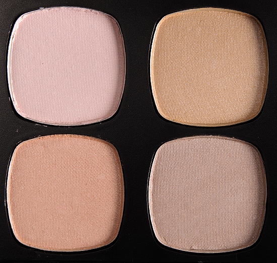
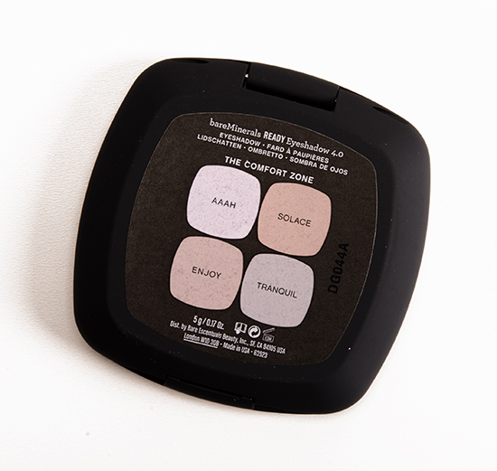
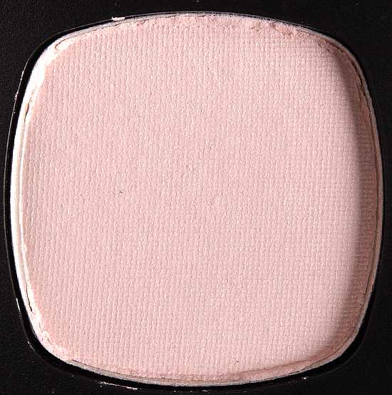
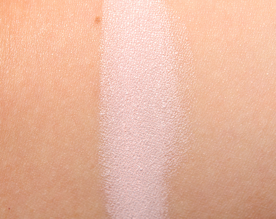
Aaah is described as a “blushing ivory.” It’s a brightened, light pink with cool undertones and a matte finish. The texture was incredibly soft, finely-milled, and buttery without being powdery with intense color. It wore well for ten hours on me before fading. MAC Flounce (P, $15.00) is darker. Too Faced Powdered Sugar (LE, $16.00) is warmer. LORAC Light Pink (P) is darker. theBalm Matt Chung (LE, $16.00) is similar. NARS Douce France #1 (LE, $24.00) is similar. Benefit Pinky Swear (P, $20.00) is darker, pinker. See comparison swatches / view dupes.
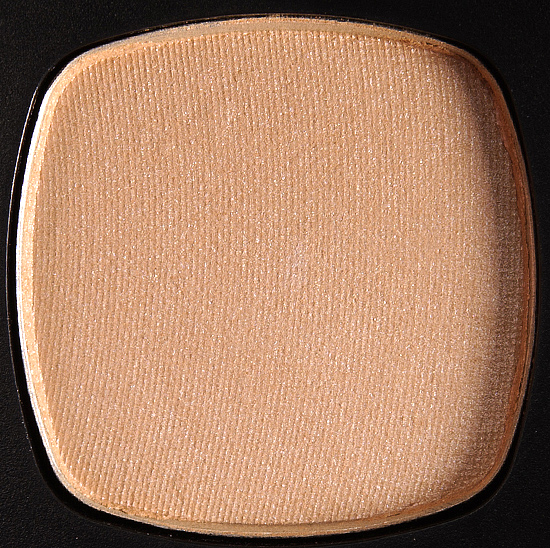
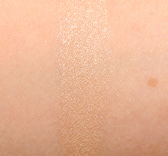
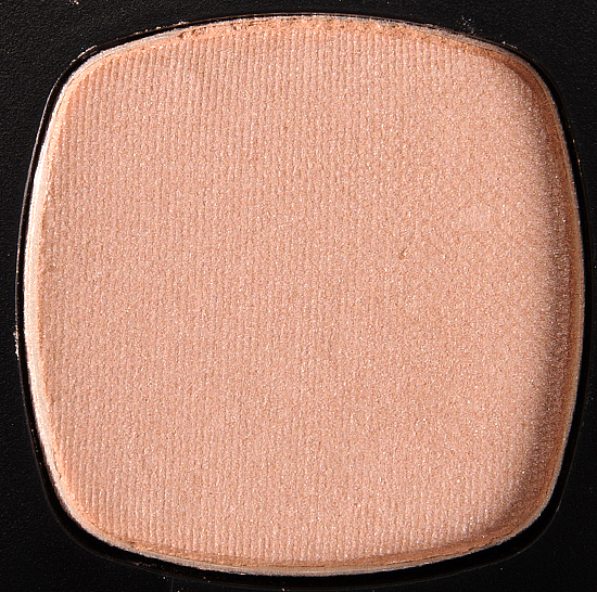
Solace is described as a “honey-beige.” It’s a muted, yellowed beige with a satin finish. It had good color payoff, while the texture was soft and smooth. On me, the color lasted for ten hours. theBalm #29 (P, $6.50) is lighter. Burberry Pale Nude #3 (P) is much lighter. See comparison swatches / view dupes.
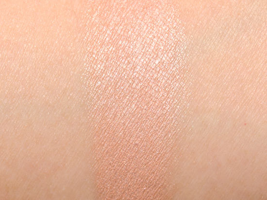
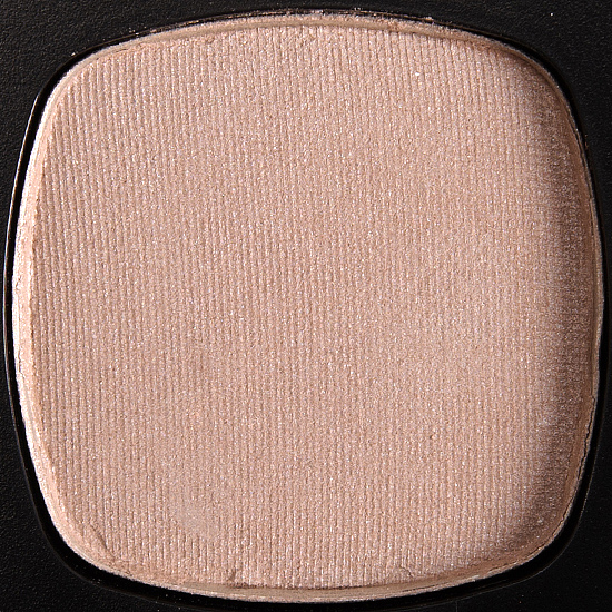
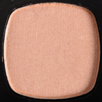
Enjoy is described as a “rosy nude.” It’s a muted, light-medium peach with a satin finish and warm undertones. It had good pigmentation, and while the texture was blendable and soft, it was slightly powdery. This shade showed signs of fading after nine hours of wear. theBalm #4 (P, $6.50) is more shimmery, pinker. Too Faced Spike the Punch (LE, $16.00) is lighter. MAC Her Cocoa #2 (LE, $15.00) is similar. bareMinerals Peace (P) is similar. See comparison swatches / view dupes.
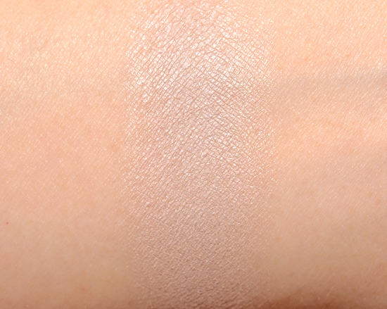
Tranquil is described as a “soft stone.” It’s a light, gray-leaning taupe with a satin sheen. It had decent color payoff, but it was sheerer than the other shades. The texture was soft without being powdery, while the color lasted for nine and a half hours on me. Dior Rivage #2 (LE) is cooler-toned. Tom Ford Beauty Ice Queen #3 (P) is cooler-toned. See comparison swatches / view dupes.
The Comfort Zone
LELimited Edition. $30.00.
Aaah
LELimited Edition.
Solace
LELimited Edition.
Enjoy
LELimited Edition.
Tranquil
LELimited Edition.
See more photos & swatches!
bareMinerals Comfort Zone Ready Eyeshadow Quad
bareMinerals Comfort Zone Ready Eyeshadow Quad
bareMinerals Comfort Zone Ready Eyeshadow Quad
bareMinerals Comfort Zone Ready Eyeshadow Quad
bareMinerals Comfort Zone Ready Eyeshadow Quad
bareMinerals Comfort Zone Ready Eyeshadow Quad
bareMinerals Comfort Zone Ready Eyeshadow Quad
bareMinerals Comfort Zone Ready Eyeshadow Quad
bareMinerals Comfort Zone Ready Eyeshadow Quad
bareMinerals Comfort Zone Ready Eyeshadow Quad
bareMinerals Comfort Zone Ready Eyeshadow Quad
bareMinerals Comfort Zone Ready Eyeshadow Quad
bareMinerals Comfort Zone Ready Eyeshadow Quad
bareMinerals Comfort Zone Ready Eyeshadow Quad


I like it!
Yay!
It almost seems like this could be used as an alternate for Naked Basics if you want something slightly warmer!
A pass for me thought. 🙂
Or if Naked Basics seems too dark!
Meh, this does nothing for me. The colors are all too light and blah. It needs a deeper shade for the crease.
I agree! One darker shade would have been great.
I agree! Odd that they didn’t include a darker, more contrasting shade.
It would have made this a lot more versatile!
I love the Bare Minerals quads etc so it’s disappointing to see these shades are all so similar (and that the formula isn’t up to past quads)– though I could see how someone who needs a “barely there” look might like this. Though now that I have popped over to the QVC site, I do see they have an 8.0 palette that I want!
Which palette is that?
The Affair to Remember palette! It’s described as an “essential palette of forever flattering plum, blush, lavender, and gilded rose is supremely romantic and exquisitely versatile.” Sounds pretty and looks pretty, though I haven’t watched the presentation video.
I watched the presentation on QVC, and I think the idea with this palette was to offer four “base” -type shadows in one palette—the idea being that the base shadow is always applied all over the eye and used up first in a palette, and we always wish there were more of that shade (Too Faced and Kat Von D. recent palettes being good examples of companies recognizing this concept that we need more of the base shade). I don’t think they intended for all four shades to be used together for one look. But you always make anything look good! 😉
Weird that they would leave out a shade that would work for medium or darker skin tones as a “base” shade!
Well, exactly…..
4 base shades….or 4 *highlighting* shades?
Regardless, a toast shade would have made it perfect. 🙂
I think even one really great neutralizing shade with a satin finish would have been another great option to have as well.
I have to wear light-ish colors being so fair, but even I would like a toast shade in this compact. These 4 shades are too similar for me to get much use out of this.
Looks like a lovely palette! I’ve heard really good things about bareMinerals’ eye products.
Glad you like it!
I quite like this palette, but I wish there was a darker color in it
Agreed!
I like the aah shade. What a nice pink.
It’s nice!
Just a little info: this quad isn’t QVC exclusive, it will be available in BareMinerals boutiques in July! I have actually already picked one up at a boutique!
That’s great news! I didn’t receive a press release from bareMinerals, and nobody else has it except QVC!
It’s also available at ULTA.
I was going to get this awhile ago but I figured I didn’t need a palette of just lid/highlight colors. They’re pretty but I don’t need them.
I wish bareMinerals sold shades separately, because a quad of highlighters isn’t so convenient!
I would love to build my own palette of ready shadows! One can dream 🙂
This palette definitely needs a darker shade!
Looks great! I hope it does well for those who are faithful to bareMinerals and in need of neutrals!
these could be workhorse shadows I guess. I’m usually laying down a base in a paint pot in somewhat similar tones so pass.
These are all pretfy, but I’m with you in wanting just one darker shade!
I’ve never tried any BareMinerals products but these eyeshadows look so buttery smooth! It looks so promising on warmer skin tone – love it!
All of the colors are rather light but I still like this palette! The colors are pretty!
I actually laughed out loud when I saw this. I can understand that your base colour can really change how the final eye looks but to not include a dark ‘crease’ shade is just silly @_@
I like three of the four shades (I think Aah might look a little too chalky on me), but my favorite part about this might be the names of the individual shades! 🙂
hmmm. I wonder what Wet n Wild will think about the name?? Does the cosmetic industry have rules about things like same names of products (any trademarks, etc)??
Finally a neutral palette that I can skip yaay lol! Thanks for the review Christine. These shades will probably just look ashy /disappear on darker skintones:s What are you wearing on your lower lashline here Christine?That – me likey!
I was ready to condemn this as ‘just another’ neutral palette, but it seems that it’s comparatively unique given the paleness of the shades. It’s good to hear that they apply readily enough, but I think they might be a little too ready to run together for me to consider this a palette to have at the ready….
😛 sorry, couldn’t resist after i saw your pun!
I have heard a lot about bare minerals products but have never given a try to them.. they are hard to find here in India !
Gorgeous palette!
I agree with you. I would like to buy this If they have a darker color instead of AAAH (dark brown or something) I don’t like pink tone on my eyes 🙁
I might get this as a highlight palette.
This is now available at bare minerals boutiques!
This is just gorgeous!!!
I feel like they should have marketed this as a transition shade palette.
I like this because it’s something I could easily reach for those mornings I have 5 mins to get ready, but still want to look nice and have options. All of these would be easy to swipe on quickly, a couple strokes with a blending brush, and eyeshadow is done! Easier than have a million different options with my large palettes or searching for a single eyeshadow during my morning rush!
I love The Comfort Zone! The inner fold-out paper says: “These go-to base tones are the ultimate versatile staples for your eyeshadow wardrobe. Wear alone for a soft base, layer with your favorite colors for added dimension, use to highlight inner corners of eyes or brow bones- the effects are endless, and effortlessly striking.” I gravitated towards this palette because I typically prefer wearing neutral eyeshadow, but most days I just want a quick bit of color without having to spend time coloring my crease and blending. I find that these colors really brighten and draw attention to my eyes, which helps to tie my entire look together. For special events like a date or a girl’s night out, I just use a soft brown from another palette (The Enlightenment Duo: either Guru or Namaste) to sweep into my crease for a bit of extra oomph! Overall, I really think “The Comfort Zone” is a great stand-alone product as it has become my go-to everyday eye palette.