Anastasia Norvina Vol. 3 Palette (September 2019) - Updated 9/24


Release Date + Where to Buy
Anastasia and Norvina just announced the final installment in the Norvina palette series, Volume 3, which arrives at Sephora on September 26th online and in-store. The palette will be available exclusively at Sephora, per the brand’s Instagram.
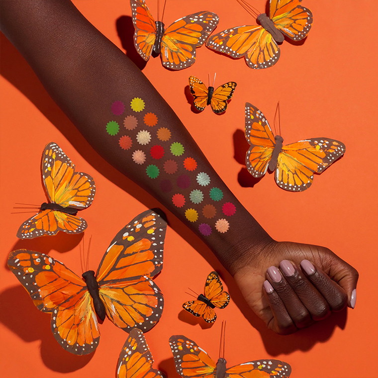
This palette contains 25 professional pigments in oversize pans to offer limitless possibilities. It includes a wide range of bold, vibrant, autumn-inspired colors with high pigment. It’s perfect for the artist who wants the ultimate color collection and for the makeup fanatic who is ready to take their makeup creativity to the next level.
9/26 online and in-store
Products in the Launch
Anastasia Norvina Vol. 3 Pigment Palette, $60.00 (Limited Edition, Sephora Exclusive)
A2, A3, A5, B3, B4, B5, C2, C3, C4, D1, D2, D4, D5, E1, E2, E3, and E5 are not intended for use around the immediate eye area.
A1 Matte chartreuse yellow
A2 Matte vibrant orange
A3 Matte harvest pumpkin
A4 Fresh green with a silver sparkle
A5 Matte intense red-orange
B1 Metallic aqua
B2 Matte jade with a gold sparkle
B3 Matte hot flamingo pink
B4 Matte royal fuchsia
B5 Matte light apricot
C1 Metallic sparkling white wine
C2 Matte candy apple
C3 Matte baked cinnamon
C4 Matte mulberry
C5 Titanium teal with a gold sparkle
D1 Matte warm cider
D2 Pale peach with a gold sparkle
D3 Matte true lime green
D4 Metallic orange with a gold sparkle
D5 Peach nectar with a gold sparkle
E1 Matte shamrock green
E2 Matte merlot
E3 Matte vibrant coral
E4 Matte dandelion yellow
E5 Metallic magenta with pink iridescent shift
Ouu this is the one I think I will be the most interested in. Vol 1 caught my attention, but I couldn’t get over the layout. I didn’t like Vol 2 as blues and greens aren’t really my thing. Oranges and fall tones I can definitely get behind!
Your review of Norvina 1 is dated September 4. It’s the 23rd, and Norvina 3 is announced? 30 pans. 90 pans in less than 30 days? Does anybody else think ABH is following the CP model, and could not keep up the breakneck pace? Actually, it turns me off. Now I know these could have been in development for five years, but somehow 90 pans in 30 days seems like ‘make hay while our sun shines.’ They may be on a roll, but cachet and exclusivity are built on hard to get. The more limited the production, the more sought after it becomes. Something is off about ABH cranking it off as if their product came from Claire’s and was made on the cheap in the PRC.
The palettes were delayed – they were originally intended for spring, summer, and fall (respectively) from what I’ve read on Norvina’s socials!
That’s what I get, for not keeping up with (read, eschewing) social media. That’s actually good to know, that they were intended to be seasonal. Much better!
Stooooooooooooooooooooop
I’m with Holeigh. How freaking self-obsessed do you have to be to name not 1 but 4! Pallettes after yourself. Cringe.
I knew it! I just knew in my heart that Norvina wasn’t done yet, and was just waiting for this announcement. Crazy, huh? No, I’m not a psychic or anything, this was based on a combination of understanding color theory, where each palette had gone color wise previously, plus a gut instinct.
With the context of color theory in mind and the number of eyeshadows released… I also have the `hunch` that is set geared more towards make-up artists, building a set going across seasons and color schemes. They could end-up selling it as a bundle in the end… the question being on which volume will they stop. 😆 Color is unlimited, but how much is too much/enough? 90 shades? 120 shades? 150 shades?
Let’s hope that this it, Ana Maria! Yikes, 3 already, but I’m willing to bet it stops at 4 for an even number. Just a feeling.
Yea, it didn’t feel “over”. Hopefully this is the last installment but if there’s one per season, then there’s one more in the wings.
They’re all such hideous monstrosities and abject failures in the color story, layout, and practical departments.
And now let’s talk about what we really think.
EVERYTHING you just said, Valerie!! The layouts on these turn my stomach with how randomly they appear strewn within each palette. Very unattractive and yes; hideous.
I would love to actually see videos / tutorials from actual make-up artists using this palettes and showcasing how they play with the layout and the colors, how they pair and group, how they get looks from this apparent (or not) chaos. Most regular make-up enthusiast and the standard `first impression` YouTube influencers would just be overwhelmed by the amount of shades only.
Thank you! I’m glad I’m not the only one who thinks they’re hideous.
I’ve been playing with color as an abstract artist for nearly 40 years and have tremendous tolerance for color and tone combinations. I’ve seen incredible works from friends with unexpected color stories. I’m an avid consumer of the visual arts. So from a practical artistic perspective, the 3 color stories are just so utterly random. I wouldn’t have an issue with it, but for the fact that this isn’t just about art but function also. It renders a palette nonfunctional if there is no rhyme or reason to the color combinations. If I were a MUA, I’d want some type of order so I can find what I’m looking for quickly. If I’m a consumer, I probably want a different type of order, but still something that makes sense. Otherwise, what is the point of a brand-curated palette? I’d be better off just curating single shadows into a palette in a way that makes sense to me.
I don’t mind the number of shadows at all – I love (and own) all of the ND 28-pan palettes. They all make sense and have their own type of order.
But this? I just couldn’t think of another way to express my disappointment (bordering on disgust) with this series from ABH. I haven’t had that type of reaction to makeup before and that’s probably because brands really go out of their way to make palettes visually appealing and coherent. These 25-pans doesn’t make sense from a consumer and branding perspective. But if ”controversy” was the ultimate aim, then goal accomplished. People talk more about things they don’t like than about the things they do. ABH may not sell many of these eyesores but if it got the brand more social media buzz without too much of a hit on brand loyalty, then it was probably worth it for them.
As a fellow painter, THIS x100000! Well stated!
Oh god, please let this be the last installation in her exploration of this theme!!! Each palette has lessened my love for the brand significantly… -_-
My eyes bugged out when I saw vol. 3. I didn’t think vol. 2 was even out yet. This is much too much! I don’t care if it was leaked or “leaked,” just slow down a bit.
I really dislike the random, scattered layout. It seems like ABH is more concerned with making the palette pretty to look at, rather than making it user-friendly. No temptation here at all.
Totally agree. The layout of all of these is such a turn-off, it makes me actively angry, lol
Yea it feels like a “let them eat cake” messaging from the brand. The worst part is maybe they’re right: people will buy it regardless.
You know how sometimes something is so ugly that it’s memorable and sticks in your brain and maybe even becomes cute? The cognitive dissonance between what you are used to and what you’re getting instead is so bad that you end up resolving it in favor of what you know. I’m having a similar experience with this, a sort of “maybe I’m missing something” moment.
I just looked again. No. Nope. Didn’t miss anything. Still ugly af.
My inner conspiracy theorist wonders if they aren’t scattered this way so we can’t see how many dupes there are between the 3 palettes. Pulling up images of the 3 side by side there’s a lot of similarities between the oranges, the greens and the pinks.
It would be so great to line up all the similar shades across the color spectrum into a grid – I bet you’re right.
Checked out the pics on their IG page. Happy to see some great transition shades in this palette!
I don’t follow ABH or Norvina on social media, but I’d be very curious to know what’s their logic behind these 3 back-to-back releases… I mean… creatively wise… I don’t care about the marketing stuff.
I’m seeing brands exploring nowadays odd marketing campaigns just to see if they work and people give them more money. 😆
On one hand, I’m like dang, slow down! On the other I suppose seeing all 3 so close together one could could choose which if any are appealing to them, and if you don’t like any, then money saved. I’m not sure which I like best. i think there are colors in all 3 that I’m very drawn to, and others I could do without. I wish at least one were a little more purpley. The vol 1 seems to contain the most purples, though most seem to lean more warm, pinky. I just want an all purple, mostly cool toned palette.
Same here…give me some more cool-toned purples!
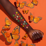
That promo picture is beautiful btw, I love that Norvina herself was the model.
This is my favorite out of all 3 Norvina palettes. I love that the shades are colorful yet still wearable. I probably wouldn’t reach for 3 or 4 shades (mainly the matte greens) so I can see myself getting a lot of use out of this. I also love that there’s no unnecessary matte white and black shades! My biggest complaint is that there’s a lot of repetitive shades not only between the palettes, but within the palette itself. The shades C4 and E2 and to a lesser extent C3 and D1 and A5 and C2 are super similar. There also seems to be at least 2 yellow-ish shades in all of the Norvina palettes. I don’t mind since I don’t have very many yellow shades in my collection, but I can see how an ABH collector will be turned off by the repeat shades. I own 7 ABH palettes and I know I’ll never hit pan on any of the black shadows (i.e. Noir, Beast, etc). I don’t plan on getting the first two Norvina palettes, but this one looks tempting.
I love the butterfly patterning, and the butterfly-themed promo shots. And I see a few colors I like in here — but not enough to justify a $60 palette since I almost never wear orange shadows.
(I realize the irony of this, since my profile pic is an orange eyeshadow look!)
Easy pass for me. Most of these colors look garish on me.
Norvina.
Norvina what are you doing.
Norvina stahp.
I love the butterfly promo pix and packaging. I think this palette is really pretty, though still a bit chaotic (nothing is as bad as Vol. I, though!). It’s not something I’ll need, but it would be nice for a MUA.
I totally think BLACK is necessary in all palettes no matter the brand. Not Stark white but definitely a neutral off white for blending….
I guess we’re the opposite lol I don’t like a solid black shade in a palette because you get them a ton in other palettes & I’m picky when it comes to black. I only use specific brands because I know I like their formula & that it’s a super dark pitch black. White tho I definitely go through a lot of because I use it for a base to make colors bolder.
I know a lot of people feel that way, and having shades like that definitely make sense for a MUA’s palette. I’m allergic to some blacks, and have them in lots of palettes, so I don’t mind if a palette doesn’t have one.
Promo picture + butterflies on the lid + the shades = “spring” inspired, imo.
If this palette is made in PRC as well (as are Vol. 1 and Vol. 2), it would be disappointing and it’s an easy pass for me.
This one appeals to me the most of the 3 because it has more neutral shades! It can be more of a standalone palette. Might pick this up…
My head hurts
Wednesday, so does mine. The chaotic layouts, the vomiting out of one after the other rapid fire, the seeming dupes within each of the 3, the size…..?
2 matte lime green, 2 matte mint, 2 matte yellow, 2 matte burgundies, 2 matte caramel tan, 3 matte oranges, 2 shimmery peaches… the amount of close replication in this palette is staggering. I admit to the promo shots are pretty but it looks like more style than substance to me…
I agree and maybe that’s why they have chaotic design– so no one will notice the duplication.
This looks pretty too! I’m looking forward to Norvina 2 because of the blue shades. So far I love how all three of the palettes look! I get along great with ABH eye shadows and love the bright pretty color schemes of these palettes.
I really don’t like it when a palette is ‘exclusive’ to a particular store… it makes it difficult for those interested to access it.
I’m guessing the retailer I somehow backing it financially, or has some sort of quid pro quo agreement with the brand. It’s probably the reason certain retailers get products so far ahead of others.
Wow! I didn’t even look at the palette, just went straight to the comments. After reading Christine’s, about the delay in production, I am less worried about these releases. I like the theme of this and wish it were also available at Ulta (so I could use my points on it), but I will just pick it up during the November sale. This one looks autumnal, but I wish the greens were not so bright and were deeper or not there at all.
Wha…why in the world release these all so quickly?! Gah, it overwhelms me. I think the thing I hate the most about these Norvina palettes is the BRIGHT plastic the palette is made of, that surrounds each shadow. None of them have been neutral, and I need a good neutral tone around the shadows in order to visually decipher the shadow. I despise these palettes for that reason. It hurts my eyes and brain so. f’n. much.
I love a lot of these colours based on the swatches, but the layout and the palette background colour on which the shadows sit are just a giant 100% NO!
That’s an excellent point I keep forgetting to make. The background color (orange on this case) throws off color perception. That may work in art but not makeup. There’s a reason nearly all palettes have a black background color – it’s so you can accurately perceive the true color, which is important if you care about what you’re putting on the lid.
I feel badly for Christine. She has had to swatch no less than 5 (3abh, Nd, viseart) massive palettes in a matter of what, 2 weeks?!
“Feel bad”?!?!?!? Oh no, no, no… I couldn’t imagine someone whom loves makeup and loves to play in it, why would one ever ever feel sorry for someone that amazingly gets to play in new amazing gorgeous makeup?!?! There is no no way that could ever be possible!!! Hahahaha
**teasing..I know sometimes words on a screen dont get the right vibes across so wanted to add this**
My eyelids get raw with some glitter or metals textures… can imagine what it’s like going through this increased volume of shadows, let alone photograph everything, find dupes for everything, and post the reviews. Just seems like a lot.
If ANYONE on this earth thinks these are geared towards actual makeup artists, then you don’t watch enough YouTube ????these palettes could be good quality but they look like a big steaming hot mess. Its not at all laid out properly for it to be anything but a cash grab due to some big dollar deals that ABH apparently has with investors. This is absolute nonsense and influencers are pushing these to their targeted audiences. This is bordering on being side show circus material due to the shilling and dropping new palettes every week. I dabble in makeup and in the city I live in, I know hundreds of artists and they are all generally giving these palettes a strong side eye. Im not for one moment buying into the story of the releases being screwed up somehow. The timing is awfully suspish?♀️?
Ok investor cash grab makes more sense than social media attention, esp given odd release and timing.
Very interesting. Thanks for the information.
Really prettt palette . I’m debating on which of the Norvina’s would work for me . I like this one but I love Volume 1 and Volume 2. Can’t wait to see your swatches .
hmm, it somewhat reminds me of ND Metropolis…