What information do you wish retailers made more readily accessible for color cosmetics?
I wish all retailers shared ingredient information at point of sale, but I’d also like them to describe shades with color descriptions, like “red with cool undertone.”
— Christine
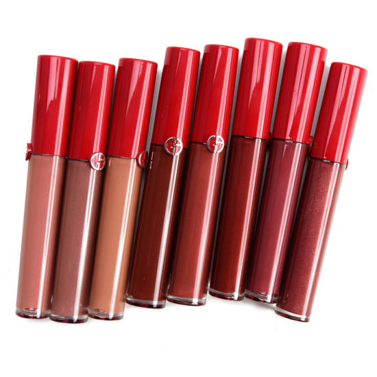
I really wish online retailers had better quality pictures and more real swatches for color cosmetics. I’m tired of many brands showing just a set of arm swatches for eyeshadows or lipstick, while it’s obvious they simply copy pasted the color on top of an arm. I like that some brands started adding pictures of color cosmetics applied on the eyes / cheeks / lips of multiple skin tones. But if an website like Temptalia can have good quality swatches and pictures, I can’t see why retailers can’t do it; they clearly have more money and people, theoretically they should do better.
Besides the things Christine mentioned, I would like to see cosmetic brands also sharing a warning on ingredients, just like the food industry. Like we have warnings on product that contain wheat, soy, milk or other potential allergens (or contamination is possible during manufacturing), I would like to see warnings on common allergen in cosmetics.
I whole-heartedly agree, Ana!
Agreed about ingredients!
Also wish brands would be more transparent about if colors sold in what is clearly meant to be an eye shadow palette are not eye safe. And no just calling it a “pressed powder palette” isn’t good enough, what specific shades are not eye safe needs to be stated online and marked on the product, and it needs to be easy to find, not like several Huda palettes where it was under a sticker that you couldn’t remove until after you bought it!
The issue you’re going to run in to is that powder eyeshadows in palettes ARE EYE SAFE (plastic glitter isn’t, so keep an eye out for PET or polyethylene terephthalate. Colourpop frequently puts pressed glitter in their palettes and only includes a tiny baby warning about it on the outer throwaway packaging) in other countries. The only real issue is that some of the really saturated colors can stain the skin. That’s all. Staining. Not like PET which can cut skin and eyeballs. Do not be fooled in to thinking America has the highest standards for anything, there’s probably a decade or more of backlog shit that could have been approved years ago. The FDA in America is very, *very* slow to approve the same things here that were already approved overseas
Allergy WARNINGS! Especially for certain very problematic ingredients like carmine, sodium saccharine, beeswax, etc. And when I say “warnings”, I mean in bold lettering that is very easy to find, not super small lettering that is quite difficult to see, much less decipher! No one ought to have to go through the very painful ordeal of a severe allergic reaction because there is no CLEAR warning in the product ingredient list or elsewhere. This is something I am quite vocal and passionate about because I have endured it myself. And, as I was going through it, I had NO idea what was happening to my eyes until I called the Ulta store where I had 5 days prior purchased Too Faced Chocolate Bar palette only to be asked by the store manager if I had a sulfa allergy, to which I answered “yes, I do”, at which she said that the palette had sodium saccharine in it and that this was a sulfa. I’ll admit, I was gobsmacked because I had NO idea that it was!
It would be really helpful if online sites also provided the finish of the product, i.e. matte, shimmer, metallic, etc. It’s not always apparent from photos.
Whether the company engages in animal testing.
As someone who was recently looking for foundations, both online and instore, I just wish that brands would indicate whether their shades had pink, neutral or yellow undertones so that I could make an informed decision about the foundation in question.
Such basic information is vital when purchasing a foundation – since many testers have disappeared due to the pandemic. Most times, not even the MUA knew how light a shade was or even had access to a basic list descrbing the shade names and their undertones. Shade names are useless and it is much easier for all concerned to have a numerical system in place.
The best part of purchasing L’Oreal’s True Match foundation is that this information is easily available, right on the bottle.
Ingredient lists is the biggest issue I see. How can people avoid allergens/irritants if they don’t know they’re in there?
INGREDIENTS, accurate color undertone descriptions, FULL INGREDIENTS LISTINGS
One more time for fun….A FREAKING FULL INGREDIENTS LISTING, YOU GUYS, YOU HAVE TO LEGALLY GIVE IT TO US, STOP BEING WEIRD ABOUT IT. SOME OF US HAVE SERIOUS ALLERGIES OR SKIN CONCERNS!
Ok…I’m done. Ingredient listings are one of my favorite things you offer to us.
Exactly Right! Every monitor reads color differently. They can show swatches all day but unless they describe it we are clueless. We need to at least know if it’s a warm or cool color!
As a person w celiac disease i wish brands would properly share allergy info. Sooo many times they claim u can just give ur doctor the ingredient list of a lipstick and he or she will tell u if its gluten free. Are these companies nuts??? Do u really think a medical doctor knows cosmetic ingredients ? Do u really think my derm is informed about my auto immune disease ? And do u really think they are sitting around waiting for me to send them 10 makeup launches per week to review the ingredient lists for? So frustrating. Especially for lip products!