ColourPop You're Golden Palette Swatches


ColourPop You’re Golden Palette is a new, mega-sized palette that launches tomorrow, May 27th, at 10AM PT. The palette includes one pressed glitter (Rum Season), but the rest are eyeshadows. Here are swatches of all the shades!


Another neutral palette with a few pops of blue. 😴
Do I need this? No. Will I order it anyway? Yes.
There’s something about that pop of blue amidst all those neutrals that gets me every. single. time.
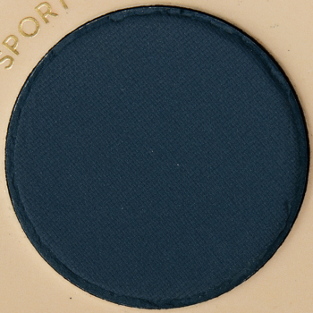
The bright coral, deep teal, and light aqua shades are interesting additions, as far as “neutral with pops of blues” goes. If CP had traded a few more of the (redundant) neutrals for a bright aqua matte, a silver shimmer, a medium seafoam matte, and a neon tangerine matte, this could have been a neat palette.
I am so all over everything these shades these days. I know this is ho-hum for many, but I’m working on my decor for my new digs and my accent colour is paprika. I love this colour story because it is jives with everything that is speaking to me both in terms of makeup and in terms of decor and mindset. I’m way behind the curve in figuring out how wonderfully I can actually wear these colours.
I saw others saying this looks like an extension to the Dream Street palette and after seeing the swatches I have to agree. I still have that palette (although like with all my CP palettes at this point I’ve rearranged everything and broken down palettes into singles palettes to get rid of shades I don’t need) and have to agree. In the promo pics there were two colors I liked, but sadly turns out one is a pressed glitter so honestly there is only one shade here I have that doesn’t look like the rest of the CP I’ve got.
For someone who likes bigger palettes like this and doesn’t have a lot of CP already there are some pretty colors, but so many repeats that I don’t feel will give any depth to a shadow look and tend to appear the same on the eyes. I love my 9-12 pans, but if a big one like this had non overlapping shades that spoke to me I wouldn’t say never… but I need variety and the ability to create different looks if I’m going to have 30 shades in one palette.
This kind of reminds me of the BH Cosmetics BFF Alondra and Elsy Shadow Palette (20 Color Shadow Palette).
It figures that Rum Season, the one shade that looked so fun, is a glitter. CP and their stinking glitters! It never stops!
Makeup.just.for.fun’s swatch comparisons def made me save money on this one and the swatches here are still doing the same 😂 there’s a few shades I’m interested in but not enough to justify buying this. Plus I’m sure there will be plenty of dupes, colourpop included among those, so I should be good
This palette is not necessary for me. Gold is pretty but the rest of the shades don’t really seem cohesive with a Golden theme. It looks like a mish-mash of gold with other colors. 😴😴😴
Coulour Pop can come out with whatever they like, I’m sooo not interested unless they do a 10-pan minimum Groovvy Grape palette that received an A or A+ (and with at least 5 to 6 violet-purple hues. That’s what I would have expected from the The Prince collection by UD, but they bombed, so maybe PMG will do such a palette (or SOMEBODY!). I know purple and deep violet-blues are hard, but please someonnnnnnneeee. LOL!
Another mega Palette with a bunch of similar shades… how hard would it be to put in other shades like deep green, burgundy, teal, etc.?