Estee Lauder x Victoria Beckham Saphir Orange Vif Eye Duo Review, Photos, Swatches


Saphir Orange Vif
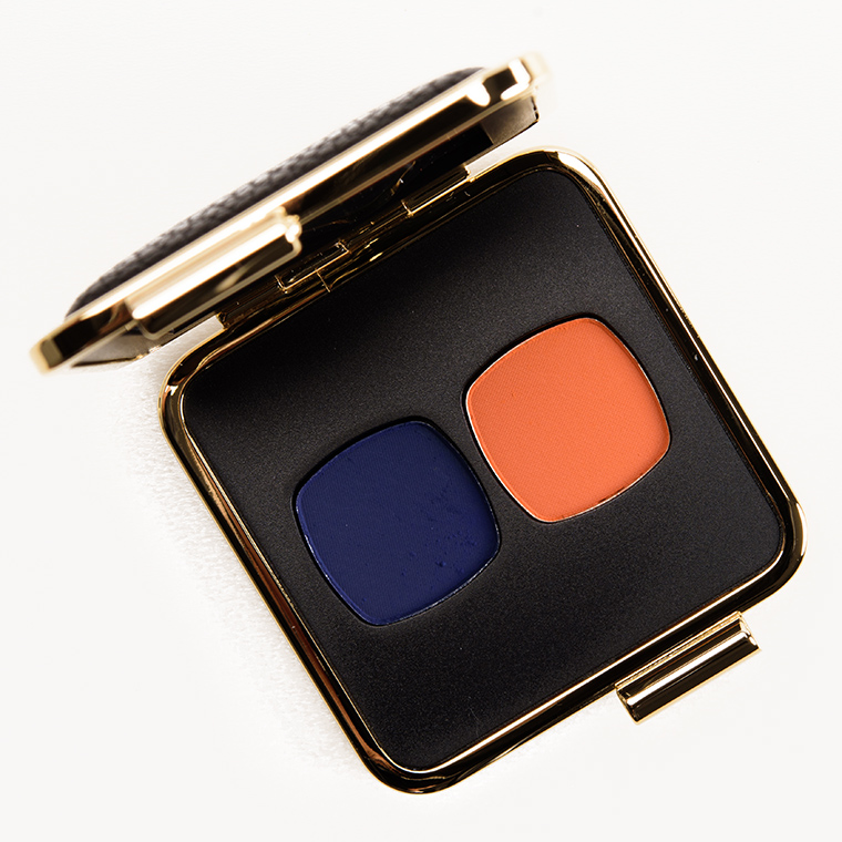
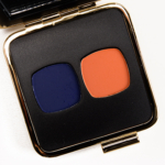
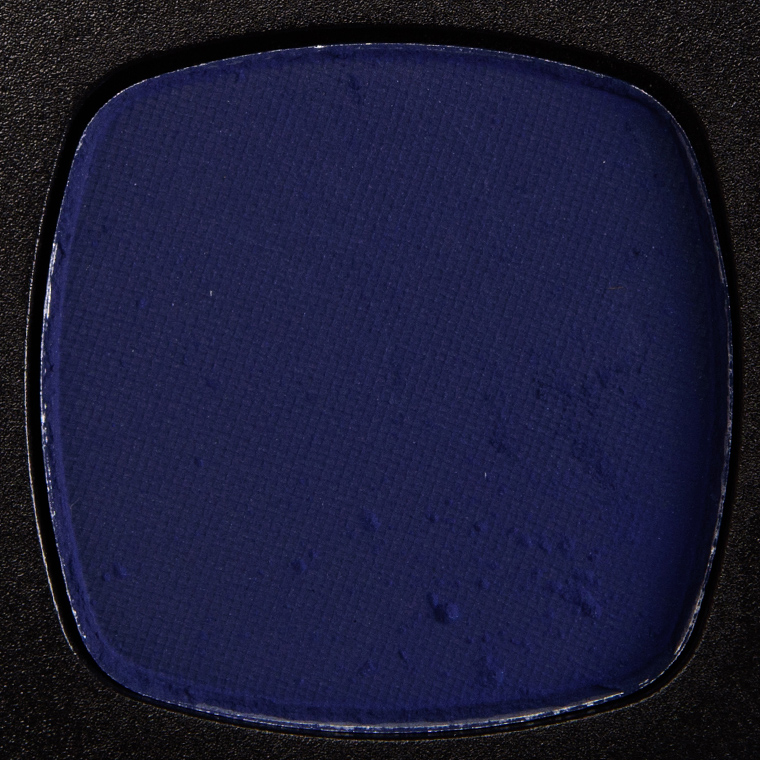
Estee Lauder Saphir Orange Vif Victoria Beckham Eye Duo ($60.00 for 0.06 oz.) is a bold duo featuring a deep navy blue and a brighter, medium orange both with more matte finish. They appeared quite matte in the pan and swatched, but there were very, very fine micro-sparkles in Saphir and quite possibly Orange Vif but was so hard to detect by eye–I only saw the flecks really come through in the look I did. For the price point, they aren’t high enough quality; they are trickier to use, and the two together do not blend together particularly well as Saphir gets patchy as it layers over Orange Vif. There are only two shades, so shouldn’t the two blend nicely together?
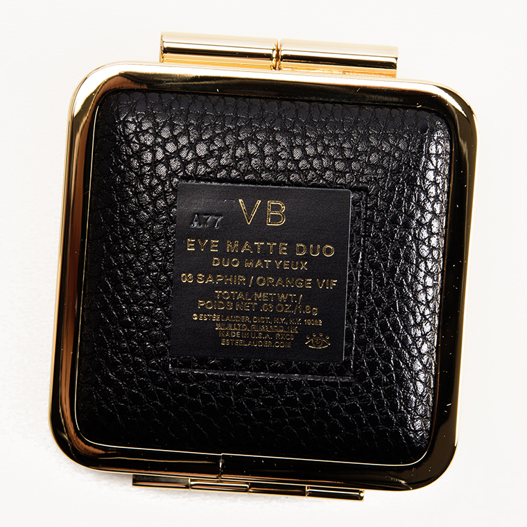
The duo contains a bit less than the average full-sized eyeshadow (0.05 oz. and these are 0.03 oz. each), despite the compact being more substantial in size. I also had to be careful as the mirror was so heavy that the palette would not stay flat on the table unless I had the mirror angled slightly over the eyeshadow pans to keep it from tipping.
Top Dupes
- KVD Beauty Devil (LE, ) is cooler (95% similar).
- Juvia's Place Zulu #1 (LE, ) is brighter (95% similar).
- bareMinerals Maven (LE, ) is lighter (95% similar).
- NARS Persia (P, $19.00) is lighter, cooler (95% similar).
- KVD Beauty Analogue (LE, ) is lighter (95% similar).
- ColourPop You Got It (PiP, $4.50) is darker (95% similar).
- MAC Farasha (LE, $17.00) is darker (95% similar).
- Makeup Geek Dynamic (P, $9.00) is lighter, cooler (95% similar).
- Zoeva Through the Window (PiP, ) is lighter (95% similar).
- ColourPop Merryweather (LE, $4.50) is darker (95% similar).
Ingredients
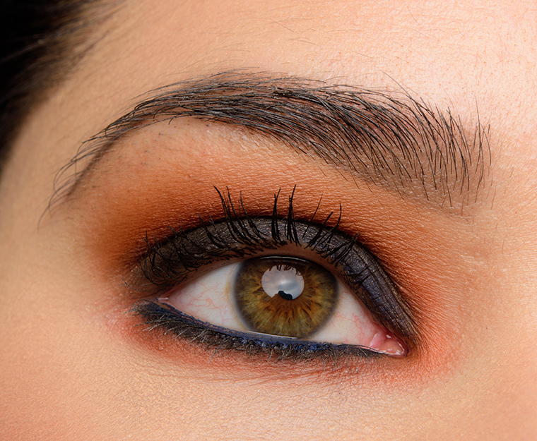
Look Using this Product

Saphir Orange Vif
LELimited Edition. $60.00.
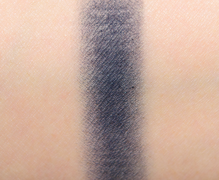


Saphir
Saphir is a muted, deep navy blue with cool undertones and a matte finish. There were very faint, micro-sparkles in the powder that were visible in a macro photograph but less so in person, though it did not look truly matte either–almost semi-matte to satin. The consistency was rather stiff, which made it more difficult to pick up with a brush, blend out, and apply–it was best applied patted and packed on and then using a clean, separate brush to blend out the edges. The edges of this shade turned darker and appeared patchy as I tried to blend it with other shades.
Top Dupes
- Inglot #321 (P, $6.00) is darker (95% similar).
- bareMinerals Maven (LE, ) is lighter (95% similar).
- ColourPop Merryweather (LE, $4.50) is darker (95% similar).
- NABLA Cosmetics Zodiac (PiP, $8.00) is darker (90% similar).
- Inglot #389 (P, $6.00) is darker (90% similar).
- Guerlain Beaugrenelle #5 (PiP, ) is lighter (90% similar).
- Tarte Inked (LE, ) is darker (90% similar).
- MAC Switch Me On (LE, $20.00) is darker (90% similar).
- Tarte Midnight Kiss (LE, ) is darker (90% similar).
- Giorgio Armani #02 (P, $32.00) is lighter, cooler (90% similar).
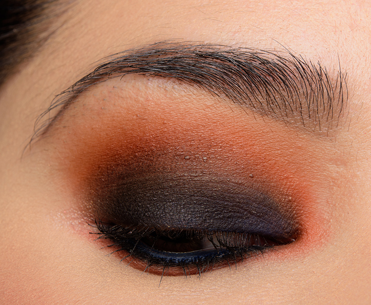
Look Using this Product
Saphir
LELimited Edition.

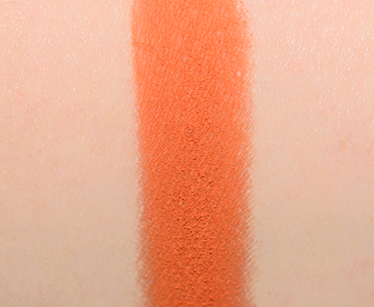


Orange Vif
Orange Vif is a rich, medium-dark orange with a matte finish. It had excellent pigmentation, though the texture was on the powdery side so there was powder that kicked up in the pan and some fallout during application if I wasn’t careful. The color darkened slightly over time, but it wasn’t overly noticeable–more that it wasn’t as vibrant on as it appeared in the pan. It wore well for seven hours before turning patchy.
Top Dupes
- KVD Beauty Devil (LE, ) is cooler (95% similar).
- ColourPop You Got It (PiP, $4.50) is darker (95% similar).
- KVD Beauty Analogue (LE, ) is lighter (95% similar).
- MAC Farasha (LE, $17.00) is darker (95% similar).
- NARS Persia (P, $19.00) is lighter, cooler (95% similar).
- Zoeva Through the Window (PiP, ) is lighter (95% similar).
- Makeup Geek Dynamic (P, $9.00) is lighter, cooler (95% similar).
- Juvia's Place Zulu #1 (LE, ) is brighter (95% similar).
- ColourPop Bratty (P, $4.50) is lighter, warmer (85% similar).
- Coloured Raine Gloaming (PiP, ) is cooler (90% similar).
Wow, this new collection is so bad!!! I literally shuddered when I saw that picture of the blending…girl if you can’t blend these no one can. My wallet is very happy right now because I was very drawn to this duo!!!
They’re not easy colors to blend together (orange and blue), but the way it went so splotchy was impossible to correct!
Well d*mn. I hope the black and cream duo perform better. Somehow I didn’t notice how little product is included for the price so there’s a good chance I’ll be returning that one before I even open it. It’s too bad because the colors would have been amazing together. I’ll take this $60 and buy the Huda Desert Dusk palette instead. 🙁
I’m sure you have plenty of dupes for beige/black, though!
I probably have a drawer full!! 😀
That color combination looks really cool, but the eyeshadow is just another recent dud by Estee Lauder. :-/
Yeah, the color combo is very bold, and I think it’s neat that they went for it, at least!
$60? Seriously? For that? It’s just plain ugly. Looks like football team colors.
I think you did an amazing job of making it look nice on your eye, Christine!
To each their own – I loved the color combo myself 🙂
I loved the color combo on Christine !
nna said, “I loved the color combo on Christine !”
Fair enough; makeup is completely subjective.
While I can’t truthfully say that I “loved” the shadows on even her, I do think she applied and wore these colors as well as it is humanly possible to do.
However, she has the considerable advantages of being a skilled makeup professional *and* an attractive young woman whose skin and features can support just about any makeup look.
For many of the rest of us, though, these look like an easy pass.
Why don’t we all donate $60 to Harvey relief, instead?
I’m sure many readers are capable of making beauty purchases while also being charitable 🙂 There’s no need to make it an either/or choice!
Christine said, “I’m sure many readers are capable of making beauty purchases while also being charitable ? There’s no need to make it an either/or choice!”
That was not my intention.
In my world, and I imagine just about everyone else’s, there are a limited number of dollars coming in every month, and we distribute them among our various needs and wants.
If for some reason expenses are reduced in one area, that translates to more funds to put toward something else, or into savings.
I just meant, essentially, that these shadows present such an absence of temptation to me that I will certainly not find myself dropping $60 on them in a weak moment, so that’s $60 of my budget that, if I choose to spend it at all, can go for something else.
BTW, I *have* donated to Harvey relief, and, rather ironically, paid a premium price for Stila “Rain” eyeshadow, because I just can’t find a dupe.
I’m just coming from a place where I don’t want any reader to feel like they can’t buy (or not buy!) something – everyone has that choice and shouldn’t feel pressured or guilted either way 🙂
Totally cool that you’re not into it or that the value isn’t there for you!
Football team jersey really sums up the garishness of this pairing!
I must agree with Mariella.
It’s rare for me to be completely turned off by *any* makeup product, but this does it. I’m boycotting Estee Lauder and most of its brands because of their animal-testing policy, but even if I weren’t, this would be an effortless skip.
I really can’t imagine a less flattering color combination for my green eyes.
This is almost like an April Fool joke in September!
I’ll spend my money on high-quality plums and taupes from companies like Inglot, ABH, Makeup Geek, and Jane Iredale; thank you.
Christine said, “Totally cool that you’re not into it or that the value isn’t there for you!”
That dums up my feelings quite well, thank you!
As I said in an earlier post, if these were good-quality matte plummy grey-taupes from a cruelty-free company, I very well might tweak my budget and shell out $60, if NYX or Makeup Geek didn’t offer dupes!
If someone feels similarly about blue and orange shadows, by all means, enjoy!
This collection has turned into a collective insult to all us makeup lovers intelligence! I mean, really; $60 for utter crap?!? Really, Estee Lauder?!?
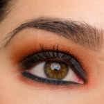
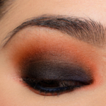
The only semi *nice* thing I have to say is to Christine for being such a trooper and consummate professional in dealing with this mess! Oh, and making a pretty fierce smoky eye out of these somehow. That owing to talent, not product performance, because one can clearly see where these 2 shades refused to meld together and blend nicely!
{Rant over}
I really wish they applied better!
Well-said, Nancy! This is what I meant the other day about it seeming like they thought everyone would be climbing over one another to get these because of the Victoria Beckham “exclusivity” (and trading on how good and how sought after last year’s VB release was) so they didn’t give a fig about the quality! And you are absolutely right about the praise Christine deserves for battling on through with products like these!
I feel like this palette wasn’t thought through very well. When you have a duo, the shades should go together. Blue and orange are complementary colors–so when you blend them, they’ll get muddy unless you add another shade between the two. And too bad about the formula–even if someone didn’t care that these shades are a little funky together, they could have at least been a nice addition to a collection!
I think you can blend them (these types of color) a bit, but the formulas have to be really, really stellar to give you just enough room to blend but you definitely wouldn’t get a perfect gradient!
These 2 colors would be very hard for me to wear together, and for $ 60, both shadows need to score an A. And I can’t believe they skimped on the amount of product too! So far, this 2nd collection has scored very poorly, especially considering how high the prices are.
I agree – at this price point, they should be As!
I just LOVE the look you created — and with difficult to blend shadows! They should change the name to Saphir Orange “WTF” since the quality does not seem to warrant the price tag.
Seriously, Christine, you should do a YouTube tutorial on eye shadow application. You create beautiful eye looks, even without using upper lash line eyeliner.
I loved the idea, even if the execution wasn’t there – would definitely wear the combo again!
That eye look though….I think it’s the most beautiful eye look on you Christine ! I love the contrast between the deep navy blue and the orange; it makes your eyes pop. Such a disappointing performance (again) from EL x VB collection. I’m grateful for the dupes for that deep navy blue 🙂
I’m glad you have dupes 😀
It really is absolutely stunning on Christine. Total inspiration!
Too bad the product isnt up to par, but this look is giving me ideas! Nice work 🙂
I wish the duo performed better!
I love the packaging. Really bold to put this orange in a 2 pan eyeshadow palette let alone those two colors together. I’m hoping the singles and the eye gloss do better…
Oh, yeah, it was a very bold move!
Me too. I love my Eye Metals from last year so hopefully Blonde Gold will live up to those same standards. I’m very intrigued by the eye foils too (disclosure – I bought all of these items, including the duo reviewed here….if is a beautiful combination!) What a shame that quality has been so much lower than last year’s so far..,I don’t suppose it’ll affect sales in the end.
No. Just no. What a colossal fail.
I wish they worked better!
They seem to be plucked directly from the MAC Chromat palette (which I have) anyway.
I honestly can’t think of anything I need less than blue and orange eyeshadows, unless it’s a giant swarm of June bugs, maybe.
Hahahahaha! Perhaps really bad blue and orange shadows? 😉
Not worth the money for these ratings but easily dupable:)
Thankfully!
This whole collection has been so disappointing so far. I can’t believe they let some of these product pass through heir quality control. First the 4-eyshadow palette, now this one… thanks for reviewing these. It’s really helpful even if the grade is a downer.
No problem, Priscila!
You did an exceptional eye look, Christine, given the texture and shades. Thank you for reviewing these items so we can make informed decisions.
Thanks, Tracey!
Two colors in a palette that could easily fit four? Not for me, thanks.
I love this color combo, and am really loving the look you created…but wow, the performance is shockingly bad. On a selfish note, I’m relieved this collection seems to be a fail. I had my eye on his duo, the eye foils, the blush and the black cassis lipstick, but I think I’ll be saving my cash. The packaging is lovely, but at these prices I expect stellar products. I’ll save myself for the new Tom Ford boys (and girls), and see what other goodies come along. I love F/W launches, I feel almost a “first day of school” anticipation!
I’m with Nancy T. – really, Estée Lauder ? It’s ridiculous to pay $60 for eye shadow because it has VB’s name attached to it . The ratings in this line so far are more than abysmal. Easy easy pass.
What the freak!!! Did they figure the beauty community doesn’t care about quality?
Very dramatic and from that point, I can admire the not so usual pairing. But I can’t admire the quality for the price point. I think you did a great job of pulling together your eye look regardless. It’s interesting on you as you rarely wear super dark shadows on your mobile lid. This pairing intensifies your eye colour.
How disappointing. I really love the look you created though. I wish I was better at blending but I just cannot get the knack of blue and how to wear/blend it so I don’t look like I have a bruise. And I love orange eyeshadow. If these were more blendable, I would have splurged and figured it out because the blue/orange combo is so nice.
This is disappointing. I suppose the formula problems will be consistent across each duo – I bought this one along with the Noir / Vanille duo yesterday. The combination here is quite unusual to me and I was hoping it would do better. I really hope that you get a few pieces to review that aren’t complete duds, Christine!
There is nothing about this duo I like – the shade combination, the matte finishes and the ratings. And I am seriously wondering why anyone would purchase this mistake – very difficult shades to work with.
And if you have trouble with it Christine, you can bet that we will too.
At least it didn’t get an F? :/
I think the look is stunning, but definitely not something I would wear. Curious to know from a technical layering standpoint – did you apply the blue first to the lid, then layer the orange on top in the crease, or did you do orange over the lid and crease and then add the blue on lid?
Wow, I can’t believe how poorly this collection was executed this time around! It makes me wonder if Estée Lauder just mailed it in rather than manufacturing quality products. I also wonder if Victoria Beckham had much input on this release. I can’t imagine she’d want her name associated with such a poorly performing collection of products.
Wow, I can’t believe how poorly this collection was executed this time around. It makes me wonder if Estée Lauder just mailed it in rather than manufacturing quality products. I also wonder if Victoria Beckham had much input on this release. I can’t imagine she’d want her name associated with such a poorly performing collection!
I figured this one wouldn’t be great but I really love your eye look. Will have to recreate…
That eye look is pretty spectacular, for such a shocking grade. Major bummer for VB, but awesomely inspired by this!
How do you go from a really well-received first release, to this? Is that common? Do they need to cut costs do badly?
Made In USA.
Well now that’s interesting. I think you look captured the esthetic Ms Beckham was going for (sultry, smoky, edgy) but unfortunately Estee Lauder seems to have botched the formulation & performance of the product.
This is not a color combo I would have thought to put together, but I actually like it quite a bit. It’s definitely bold, and would be great for a night out. Luckily, I have several dupes.
Is every new eyeshadow doing the Subculture patchy / not blending crap now?
Guess I’d be better off with MAC’s Chromat, then.
Surprisingly I like the color combo on eyes quite a bit. I’m not sure I could pull it off. Maybe blue and peach.