Wet 'n' Wild A Regular at the Factory Color Icon Eyeshadow Trio Review, Photos, Swatches
Wet ‘n’ Wild A Regular at the Factory Color Icon Eyeshadow Trio
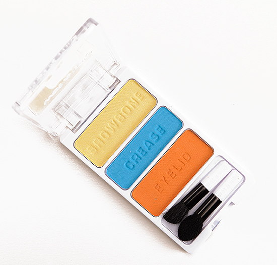
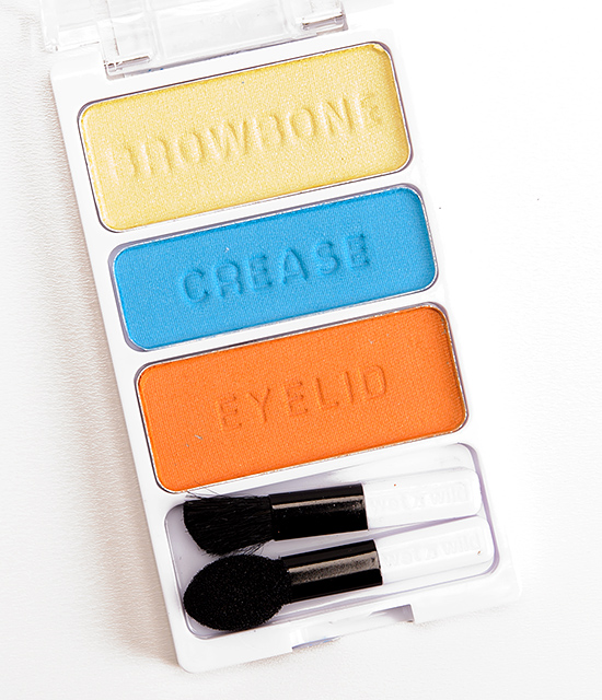
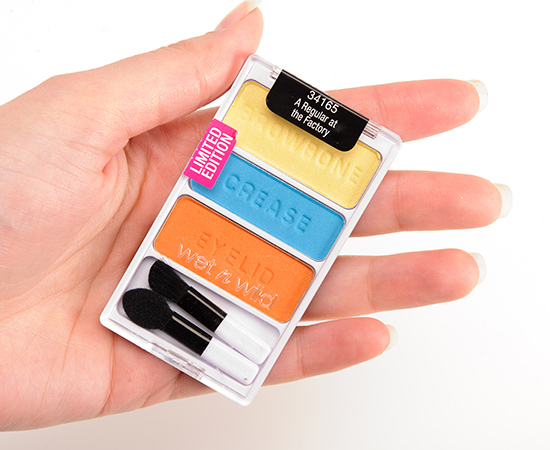
Wet ‘n’ Wild A Regular at the Factory Color Icon Eyeshadow Trio ($2.99 for 0.12 oz.) is a limited edition palette for summer, so you’ll have to hunt around your local drugstores for this one (I’ve yet to spot any of the Pop Art displays in my area, which means it hasn’t arrived yet or it has already sold out!). This was one of the “better” trios I tested, though it was still underwhelming, due to the incredible powderiness across the shades. These absolutely need to be worn over a primer, because they are prone to fading and creasing–they lasted a mere four hours before fading significantly without a primer–and even over primer, they didn’t last beyond eight hours. They’re powdery, easily sheered out (but harder to build up), prone to fading, and really do not show why Color Icon eyeshadows were so coveted when they first debuted. (And Color Icon is a formula touted as highly pigmented and long-wearing.)
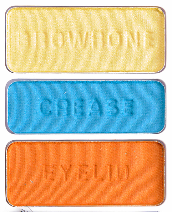
A Regular at the Factory #1 is a muted, light-medium yellow with a mostly matte finish. This shade was powdery, slightly chalky, so it was prone to sheering out when applied. It’s best to pat and pack it on and only blend the very edges as necessary. NARS Misfit #1 is less yellow. Make Up For Ever #102 is lighter. See comparison swatches.
A Regular at the Factory #2 is a medium, cyan blue with a matte finish. It had so-so color payoff as it was powdery, so the color didn’t bind well together, which gave it a slightly uneven appearance. Again, pat and pack on the eyeshadow to maximize the color and minimize the fall out–and if you have a slightly tacky base, even better. NARS Mad, Mad World #1 is darker. Milani Olympian Blue is much darker. MAC Electric Eel is slightly darker. Make Up For Ever #72 is similar. Make Up For Ever #118 is lighter. Inglot #371 is very similar. See comparison swatches.
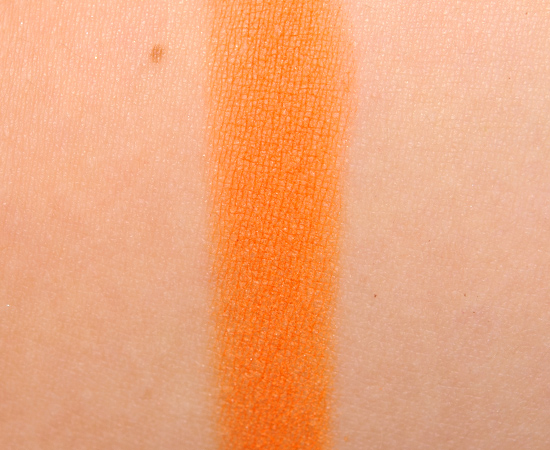
A Regular at the Factory #3 is a brightened, medium orange with yellow undertones and a mostly matte finish. It had fairly good pigmentation, and it was the least powdery of the three. Fyrinnae Pyromantic Erotica is more shimmery. Disney Rajah is darker. Illamasqua Vulgar is slightly lighter. See comparison swatches.
A Regular at the Factory
$2.99.
A Regular at the Factory #1
DCDiscontinued. $2.29.
A Regular at the Factory #2
DCDiscontinued. $2.29.
A Regular at the Factory #3
DCDiscontinued. $2.29.
Wet ‘n’ Wild A Regular at the Factory Color Icon Eyeshadow Trio
Wet ‘n’ Wild A Regular at the Factory Color Icon Eyeshadow Trio
Wet ‘n’ Wild A Regular at the Factory Color Icon Eyeshadow Trio
Wet ‘n’ Wild A Regular at the Factory Color Icon Eyeshadow Trio
Wet ‘n’ Wild A Regular at the Factory #1 Eyeshadow
Wet ‘n’ Wild A Regular at the Factory #1 Eyeshadow
Wet ‘n’ Wild A Regular at the Factory #2 Eyeshadow
Wet ‘n’ Wild A Regular at the Factory #2 Eyeshadow
Wet ‘n’ Wild A Regular at the Factory #3 Eyeshadow
Wet ‘n’ Wild A Regular at the Factory #3 Eyeshadow





Apart from the yellow I think the swatches look fine as far as color intensity goes, but you said they fade, and that’s a real shame.
I got all six when they came out and they were all a huge miss for me. Probably one of the worst makeup purchases I’ve made. I splurged for the sugarpill pro palette and its a million times better. Of course, I didn’t expect the same quality at this price point, but I was hoping for better considering other wet and wild palettes. The six pan palettes that they discontinued had amazing mattes in them.
Yeah, it’s a real shame – I know that it’s only $3, but if you end up never reaching for it, still a waste! 🙁
Agree 100%. My first WNW e/s purchase and I was like WOW.. is THIS what everyone is raving about? They were a powdery, chalky mess, even with a primer. I did my makeup in the morning and by the time I got to work half of the shadow on my lids was practically gone. And this was WITH a primer! I had to walk around the rest of the day like that. They’ve put me of off buying another WNW e/s product again.
IT’S HUNGRY FOR PRIMER! NOM NOM NOM! That’s how I felt. I was like, wait, what? No, really?
LOL! Really! You know it’s bad when an e/s can’t even stick to a primer for a few hours. I kept packing it on and packing it on and it was like no ma’am, I do not wish to stay on your eyelids!
I went on ebay a couple weeks ago to get a backup of the Lust 6-pan. The way I wear purples, even if it takes me forever to go through the first palette, I’ll be so happy to have the second when I want it!
I bought these. Wasted money. They don’t look good on. I think Christine was being generous with the c- grade.
This was one of the better of the six trios that came out – the others were much lower!
are you going to review the red black and white palette
from this collection too? 🙂
I’m not sure – I have about 2,000 photos of products to edit/crop/review… and that’s not including the 1,000 already edited and just need to be written up. I didn’t like any of them really, so the reviews are kind of redundant so we’ll see.
No need Christine. They were terrible from top to toe. I’m actually considering throwing them away, that’s how bad they were. I don’t want them taking up space I could be using for good makeup.
Aw, red, white and black are the colours of my national flag, too bad the quality is not good. Our Independence Day holiday is coming up, could’ve given them a shot 🙂
Not a fan of the colors, but they definitely are very Warhol-y which is fun
These shades don’t really draw me in, even before the C rating.
Even if these all had A+ ratings, they are SO not my sorts of colours that I’d pass on them.
Even with a Warhol-esque idea in mind, these seem all over the place. I still have a 6-pan palette, since it didn’t get much use. It’s mattes are pretty nice but this looks awful! What happened, WnW? Their core palettes seem to be better than what they’ve put out lately.
What is going on with WnW as of late? Why the sudden drop in quality and payoff? Not happy to see this at all.
I got all but 1 of the palettes and I love them. I didn’t find anything wrong with them.
Where do you think this palette’s name comes from? Judging by the colors and the name it seems to me inspired by that “We Can Do It!” poster from World War 2. Just a thought.
Andy Warhol I believe is the inspiration!
I just love the color combination. Sucks that the quality isn’t too good anymore. Wet n Wild shadows used to be excellent quality. Seems like all their new palettes have been receiving bad reviews. Hopefully they go back to the old formula