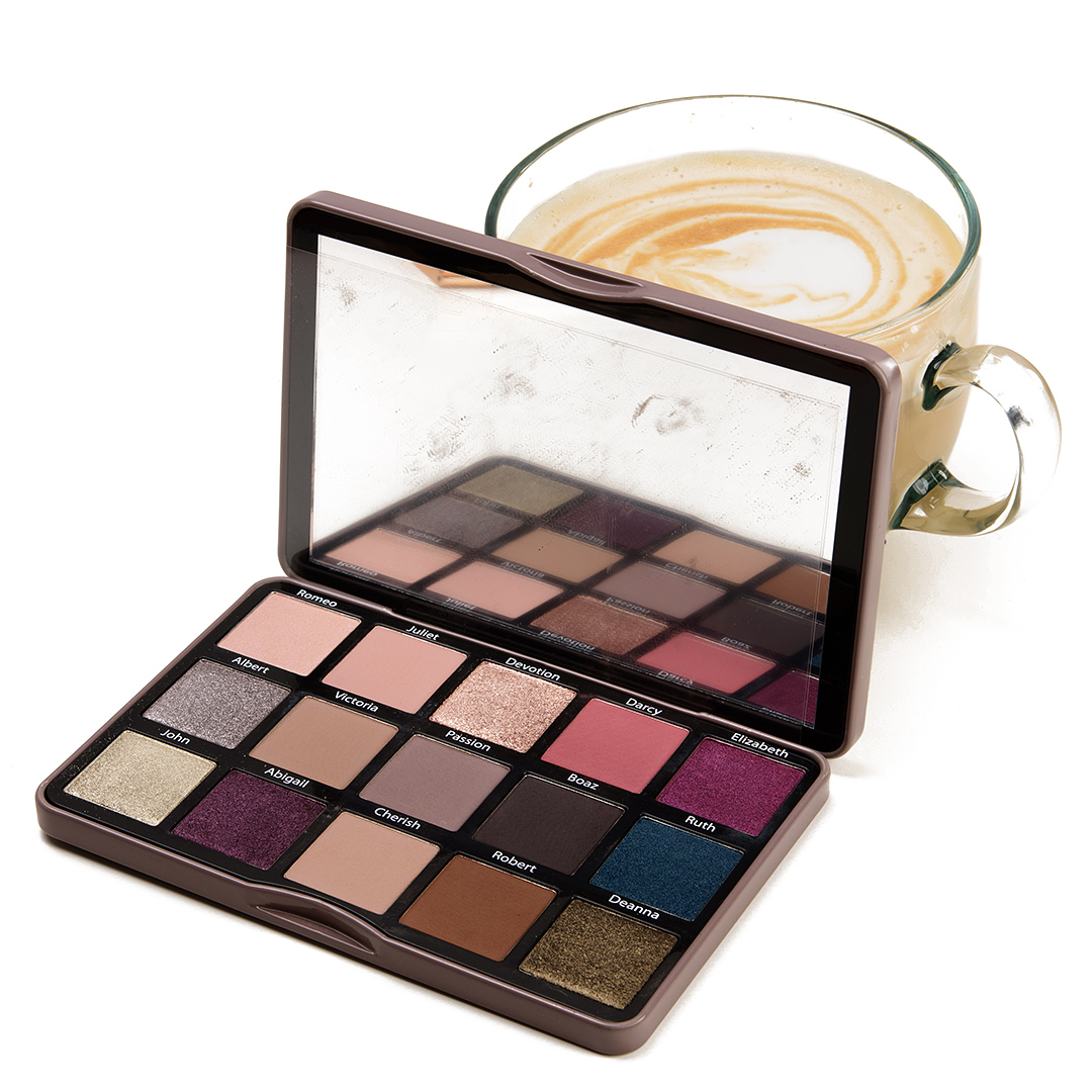
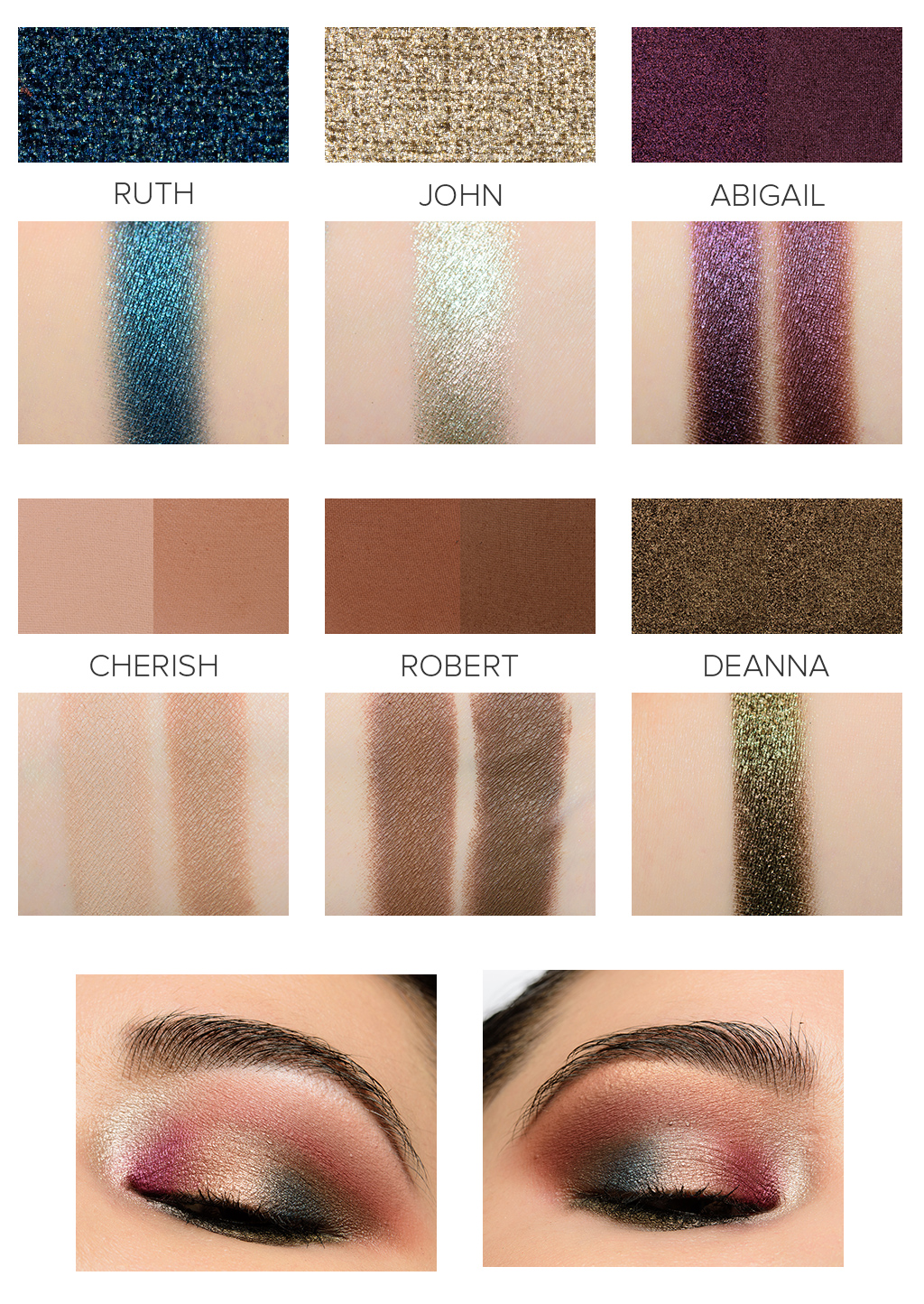
Sydney Grace Enduring Love (Light) Eyeshadow Palette Swatches

Here are swatches of the Sydney Grace Enduring Love (Light) Eyeshadow Palette ($52.00), which launches on January 13th. If you click on any shade that’s marked as ShadeName (Light), you’ll see a side-by-side comparison against its counterpart in the Deep version of the palette. I personally found some additional differences between the two palettes than the mattes and Romeo. Brief notes:
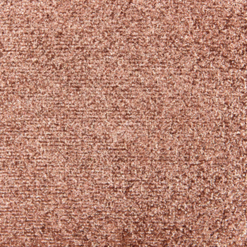
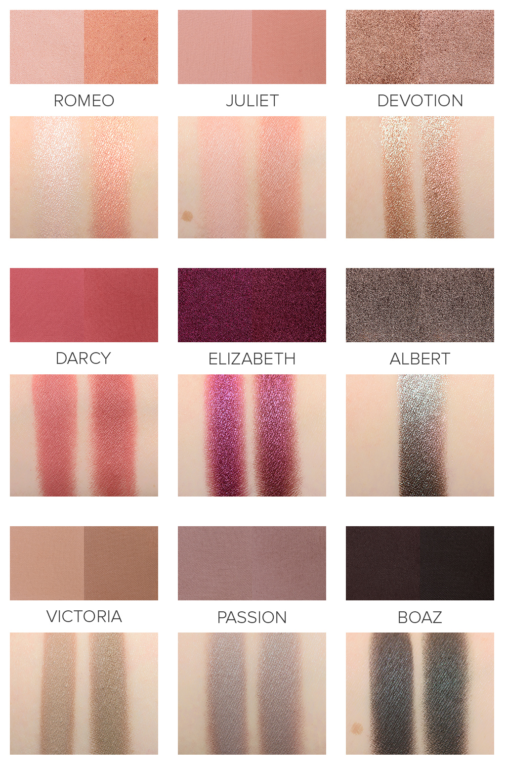
- Romeo (Light) is the shade that differs the most; it is a very pale, warmer pink with a reflective sheen compared to a light-medium peachy-orange found in the Deep palette
- Juliet (Light) is a pale pink with warm undertones as opposed to a rosy brown
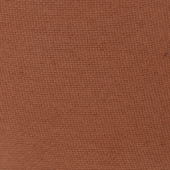
- Devotion (Light) is slightly darker and more golden compared to the rosier, cooler version in the Deep palette
- Darcy (Light) is one to two shades lighter, slightly less warm-toned
- Elizabeth (Light) is a brighter, slightly more shimmery, and cooler-toned
- Victoria (Light) is a few shades lighter than the Deep version
- Passion (Light) seemed slightly lighter but was hard to tell once applied and blended out
- Boaz (Light) is slightly cooler-toned and a smidgen lighter
- Abigail (Light) is a richer, cooler-toned purple with more shimmer
- Cherish (Light) is a light-medium beige with warmer undertones rather than a soft, golden brown
- Robert (Light) is a few shades lighter and slightly warmer than its Deep counterpart
- Albert, Ruth, John, and Deanna didn’t seem to have any differences when I looked at them swatched side-by-side
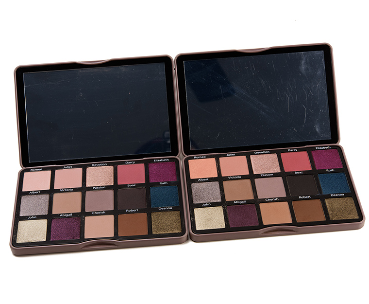
Enduring Love (Light) Palette


Sydney Grace Enduring Love (Light) Eyeshadow Palette Swatches
Sydney Grace Enduring Love | Light vs. Deep
Sydney Grace Enduring Love | Light vs. Deep
Sydney Grace Enduring Love (Light) Eyeshadow Palette Swatches
Thank you (as always) for this comparison! I actually think this is a great concept for a pair of palettes. I would probably buy the Light version and I feel like the lighter mattes will work much better for me. I would be curious to hear what those with medium-deep skin think of the Deep palette. I wish there were just a couple less matte shades and a couple more neutral shimmers. Otherwise, this is nearly my perfect palette.
Wow. With the exception of Darcy these are all super wearable for me.
I like Romeo and Juliet better in the Deep version, but I think this version is going to work better for me. I wish Passion were a little lighter, but SG’s shadows blend well, so I’m sure I can just use a light touch. I like Elizabeth and Abigail better in this version.
I’m torn. I like both palettes, there are some deeper versions I like more than their light counterparts, but overall, I think the light palette might work better for me.
There was a bundle they offered a couple of years ago, the Taylor bundle that had light and deep options, and then they had an option for everything, light and deep (15 eyeshadows total instead of 12), which I have. I will only buy one palette, but I feel like I would like to have the options with the other.
The two purples in this palette look nicer than the two in the Deep version! It’s a gorgeous palette for NC30 and lighter. A stunner. However, I do believe this palette runs a smidgen too light for me.
Decisions, decisions. FYI, the comparison feature does not work on iPad, nor does the shade to shade comparison, in the ‘compare any two swatches’ feature…yet. The palette comparisons come up, but only as whole palettes. I’ll try with the laptop later. I’m sure we Apple users will be able to make individual shade by shade comparisons, when they are all entered into the overall data base. The light seems warmer than the dark, from my memory. The taupes in the dark are everything..cooler, iirc. Another (set of) superb offering(s) from SG.
Hi KJH,
Compare Any Two Swatches works fine for me on Desktop/PC/Chrome, Desktop/PC/Firefox, iPhone/Safari, iPhone/Chrome, iPad/Safari, iPad/Chrome, iPad Pro/Safari, iPad Pro/Chrome. Palette vs. Palette which shows both palettes side-by-side, and that worked for me as well, but it will not show actual dupes yet since those are not yet done.
Are you referring to dupes? Dupes are not in – those go in when I actually write the review as it is the most time-consuming portion of the review so it is not something I can do quickly in time for a sneak peek (the whole point being to get them up immediately). All of the palette’s shades are already in the database – there’s nothing more to add on my end.
It would be most helpful if you are able to provide a screen shot since I’m unable to replicate the issue after trying multiple devices + browsers! Thanks!
When I brought this post up on the laptop, which had just updated, at the top of the post, there is a box for each shade, with the shade name, and the light and dark swatches.. I’d send the screenshot, but I’m listening to the Shrink Next Door on that iPad. all six hours. Iol. If I the iPad displays the same way when I open it up again, i’ll send deets and a screenshot. Now, to figure out why this computer says Investigation Discovery as the site ID. Apple is next in line behind Comcast, for evil empires.
Definitely send me a screen shot – I can’t quite puzzle it out or figure out what you’re seeing that isn’t working so a screenshot would definitely help me!
When you click on the swatch of one of the shades, the last swatch shows the comparison between the two palettes except for the four shades Christine mentions that there is no difference Albert,Ruth, John and Deanna. I’m on iPad and it swatches work. Once you click the last swatch, you see the comparison. ?
I always appreciate your swatches! Whenever a beautiful palette like this comes out I’m able to use your swatches to match my favorite colors to my singles to recreate my own version!
I am so confused.. the shade names are the same and everything looks.. identical to the Deep version. Maybe on a laptop the differences are more apparent??
Did you read through my list that went shade by shade in how they differed? Romeo is pink in the Light version and orange in the Deep version – not even remotely in the same family at all! There are a few that are quite different and others that are closer… I went through in detail in the post and as I mentioned in the post… you can click any shade to see a side-by-side comparison. These are just comparisons of the first two and are very different to my eye.
I prefer the Deep version. Despite being quite fair, I really don’t care for pink eyeshadow and would rather not purchase any more palettes with so many shades I simply won’t use.
This is so helpful – thank you!
Thank you Christine for doing the comparisons for us – very helpful in determining which palettes would suit the best.
I find that the mattes in this version are lighter, but some of the shimmery shades are not. I find that I am drawn more to the deeper version, but the multitude of neutral mattes is off putting to me.
I’m confused…
I like the idea of light and dark versions of a palette, but I don’t understand giving completely different colors the same name. And then making some colors only a tiny bit different, if at all?
Thank you for the swatches, Christine. They’ve helped clarify the difference between the two.
When I saw the dark palette, I was certain I’d want the light palette. Now, not so much. Sydney Grace shadows are great quality, but thought all of the light palette colors were going to be lighter, not a portion of them.
The idea is that the Light palette is for lighter complexions, and some of the lightest shades do not translate well on deeper complexions (like they turn ashy/chalky), so in order to ensure that deeper skin tones can use all the shades in the palette, those shades have been adjusted more and I would guess others that were more mid-tone didn’t require as much adjustment compared to starting with a light beige. The deeper palette runs slightly warmer, so it is possible that Boaz reads slightly darker and warmer to complement those adjustments.
Sydney Grace’s Instagram showed which shades were different, though I did experience three additional shades that seemed a little different (not night and day) on top of those seven, and also showed that Darcy/Passion/Boaz weren’t super different!
Thanks, Christine. I think this palette is going to be a pass for me, although I can see many purchasing & enjoying. The Sydney Grace singles I’ve purchased in the past have excellent pigmentation and wear.
I have to say – I love that you included an eye look comparing the colors from both palettes. It’s easy to see on your eye what, if any, differences there are in the colors when creating a look. I’ve been doing well on a low-buy for 2 years now, but your swatches make me want Deanna as a single!
These are so pretty! I really like how both palette variants retain the same overall cool-toned feel despite the slight variations. I wish Abigail was the same in both palettes, I love the tone of the Light version, but prefer Devotion and Cherish in the deeper version. And thank you for putting in the work to show side by side comparisons, I feel it illuminates the differences a lot more than some of the Instagram pictures they had.
My only one critique of these palettes/launch is I wish they had gotten professional models so that we could see swatches on a variety of tones prior to the launch. I assume that likely would’ve been pricey but I think it would’ve gone a long way to illustrate the differences. Either way I am anxiously waiting for tomorrow!
I know I saw a note that swatches were forthcoming on deeper skin tones, and I just went back to see if they were ever posted, but a recent post said that they hadn’t received the swatches back for deeper skin tones yet. It definitely would help, though, since colors can vary drastically based on skin tone alone.
It’s actually incredible just how differing they can look based on the base; if you go look through a lot of promotional swatches that many brands share… sometimes the colors are night and day!
I saw that too! And I agree, that the colors can definitely change based on skin tone. I think it would’ve been nice if they had hired someone just to make sure they knew it would come out ahead of time (if I read the post right it was another influencer they sent it to), but for an indie brand, I respect that it might not be financially feasible and it doesn’t dampen my excitement of the palette 🙂
You know, I just made my first Color Story and now that I look back at this palette, I’m thinking Sydney Grace and I have the same thoughts for moving into Spring, not pinky and Easter egg like. I’m torn…do I remain fall-like or bring in the pops of color???
And as much as I wanted to purchase this because of Sydney Grace’s quality (and it would have been my first palette from them), I think I’ll have dupes galore. A shame if so, so I definitely have to wait and see.
Disappointing that the two palletes are so similar.
She should have made another palette with other shades. A waste, imo.
I don’t think there was any intention for someone to purchase both palettes but to offer two versions so that those with darker complexions could have more usable shades across their skin tone vs. 3-4 lighter shades that might look ashy/gray (and very light) but not two drastically different palettes!