Swatches: Sephora Colorful Eyeshadows (2018)

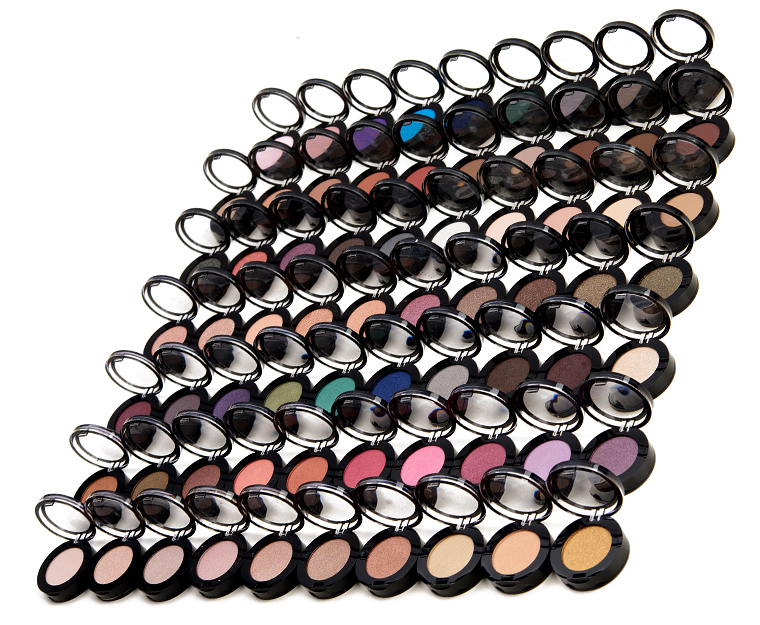

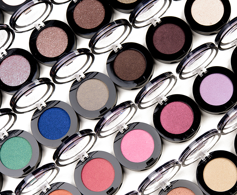
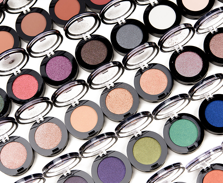
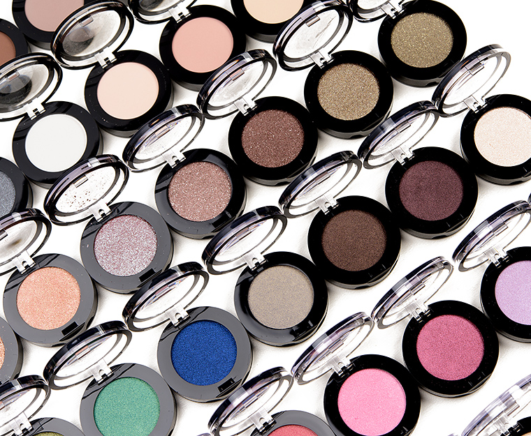
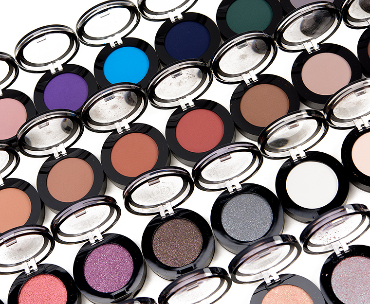
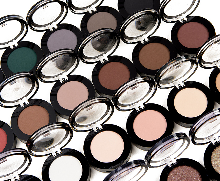
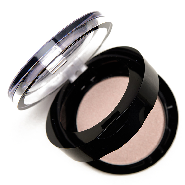
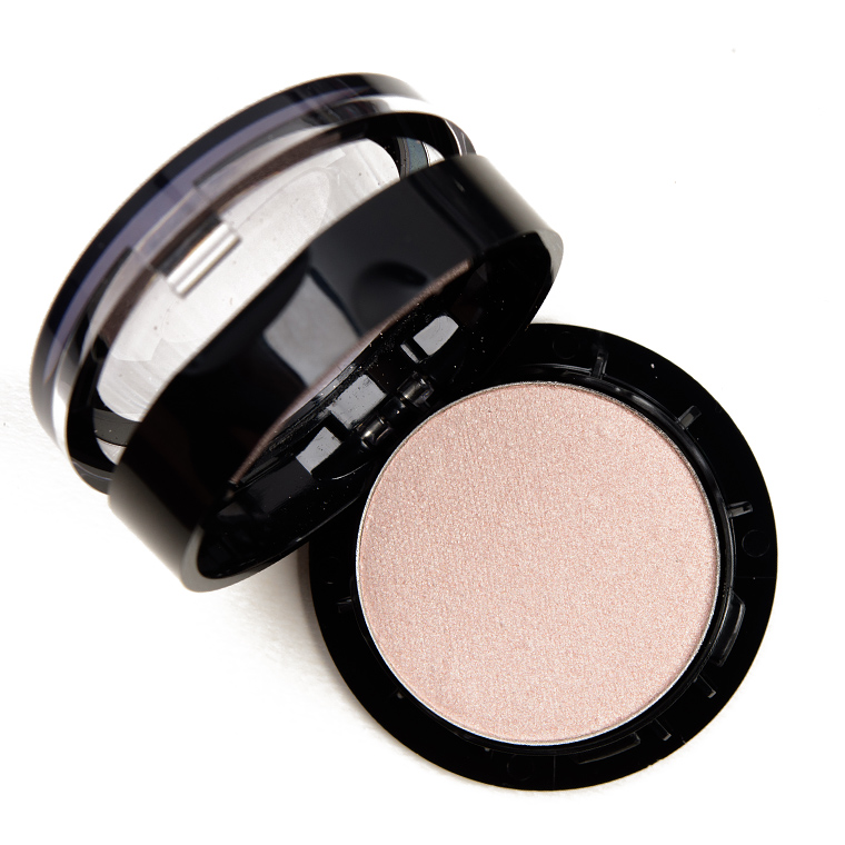


Sephora Colorful Eyeshadow ($8.00 for 0.042 oz.) recently went through an update and makeover. It now features a range of 80 shades (77 were available when I bought them, and then eight of the 77 I bought arrived broken due to poor packaging on Sephora’s part, so I don’t have all the shades swatched) with three finishes: glitter, matte, and shimmer. The eyeshadows are smaller–0.042 oz. compared to 0.07 oz.–with a price drop from $10.00 to $8.00 (but it is more expensive by the ounce, $142.86/oz. originally and now $190.48/oz.). The eyeshadows have a top “tier” where the clear lid lifts up and reveals the eyeshadow, and then there’s a “bottom” tier where if you lift from the bottom, it reveals the pan of eyeshadow sitting atop a plastic insert for easy removal (it is held in by the plastic rim from the top tier not a magnet).
And I guess we can give Sephora kudos for calling a patchy purple “Very Bad” to begin with? Here’s hoping it at least performs a bit better on the lid but we’ll see…


Wow! These look pretty bad on the whole. That’s a shame.
I had hopes, as the other S product reformulations were going pretty well, but these swatches basically represent what we whine about frequently: patchy, uneven mattes and non-adhering, non-incorporated glitter particles. I get the change in size/price, despite that not being to the consumer’s advantage (never is. Watch what happens with candy downsizing…) Why not a sleeve option or the old compact/smaller, or same size with thinner (less) product? The old one just required a poke. This is making the compact bulkier, to make the product seem bigger than it is, seem equal to the old one. Shadow godets are one place where standard sizing makes sense.
Whoo! That’s a lot of swatches, Christine! Great job for getting them out so quickly, and thanks for all the hard work.
It could just be me, but the majority of these don’t look like they swatched very well. I do like “Catch the Moon” strangely enough–something about the very light grey with a golden twinkle that catches my eye. LOL! I loved your comment about “Very Bad.”
Some of these look nice but overall fairly disappointing. It’s sad, it looks like they’ve discontinued Be on the A-List, which is hardly a unique shade but it’s one of my go-tos for a simple, flattering look, and the quality is there.
Pretty much. There are very few ‘continued’ shades. And anyone who draws a comparison to mufe would be correct. Change in sizes, formula, price. In S’s case, from ‘sometimes surprisingly good’ to ‘seldom hitting the “fair” mark.’ Prob will try some of the grays anyways, like Catch the Moon. Hopefully these apply better than they swatch. Agree with you: they had some classics, like A List, Snakeskin Dress, etc by which they were known. Signature shades, if you will. Dumb as a marshmallow to discontinue those. It negates the consumer’s belief that there is a CORE to the Sephora collection. And core is the competency from which the rest of the products flow and evolve.
Very well said.
Quality looks all over the place but I see a few I like!
Yes, this is exactly what I think. A few very useful transition shades and two or three of the really bright ones look like they might be worth it.
Dark island and dark ocean. There is only a dark yellow missing for my complete happiness.
Your comment on Very Bad made me laugh out loud! There appears to be lots of splotchiness going on with this line.
Omg, that shade “Very Bad” speaks for itself!
And it looked so pretty on my phone’s screen, too. ? At least I have some halfway decent dupes in my stash.
Ohhh nooooo. These look bad! I have a couple of the original shades and they were actually pretty great. Lucky Penny used to be one of my favorites, and now it looks so flat and basic.
Considering what Colourpop is putting out for $5 a shade, these seem pretty awful for the price! I’ve never been impressed with their shadow and these swatches aren’t helping to change my mind!
Absolutely agree, and you can almost always catch a deal of making your own 4 shadow palette for 12 bucks. CP being cruelty free is also a huge reason I’ll continue to support the brand.
This is disappointing considering I was impressed with Sephora’s Lip Stories and hauled their metallic palette during the sale (I have yet to play with it). I was hoping they were moving their in-house brand towards more hits than misses.
With the exception of Surfin’ USA, these look really awful.
LOL at “Very Bad!”
Never before has an eyeshadow had such a perfectly descriptive name!
Most of them look so patchy or just lacking in the pigment and saturation department. There are a few that I may just have to get, though. Glazed Donut and Sunset At The Beach.
The best moment? Seeing the swatch of Very Bad while sipping my coffee!!!! Just use your imagination for that pictorial, LOL! ☕??
I had a few from their old version and they were chalky, powdery and not pigmented…I hope they have improved but I didn’t see anything I really like. Very Bad is aptly named! 😛
I really liked Sephora’s “old” shadows and was sad to see them being phased out. I fear that, like MUFE, this reformulation isn’t an entirely good thing (I wonder if they’re made by the same company/in the same plant; it wouldn’t surprise me and I need to look at the backs of the pans just to pique my curiosity). I did a quick swipe of a few of these last week and some were good (Jump Into the Mud and Bonfire) and Glitter Dress, which looked lovely in the pan and which swatched beautifully for you, Christine, was awful for me. I wonder how much the “duplicated” shades – Girls Night Out, Roasted Chestnuts, etc. – look like the original shades. Finally, these look much harder to de-pot; the originals were designed to be easy to remove from their cases and that was one of the many things I liked about them.
The pans just lift right out of the lower tiered part of the compact… no depotting necessary – nothing difficult at all about it!
That’s good to know as it wasn’t possible to tell from looking at the photos and in the store, the tester pans had all been put into their little spots in the display. I like being able to move and re-group shadows especially when I’m travelling.
None of that is coincidence. Both S and MUFE are LVMH companies, and they undoubtedly have both a finance team and a creative team that report to the same corporate overlords. So, you will see similar strategies by both houses, natch.
I see a couple that I like but overall nothing to get excited about here. I will probably pick up 2 or 3 after checking them out in person to make sure the colors suit me. I love Catch The Moon.
Makes me wonder if any of these apply well.
Wild Island and Surfin USA are the only ones I am interested in. These really seem like a step back in the Colorful line… Last release swatched so much better.
Good lord those are some bleak swatches Dark Ocean looks absurdly different from the pan! There is high quality across majority of brands in all budgets Sephora has no excuses because these look worse than the giant makeup sets released for preteens during the holidays by non-brands.
Some look OK, most look fairly mediocre and What Happens In Vegas can stay there, as far as I’m concerned. The glitter shadows seem to have some texture issues…
Jeez I feel bad for you having to test all these less-than-stellar shadows Christine. There’s only like 5 of them I’d even consider buying based on how they swatch. And even then, why bother. There’s much better out there for cheaper. It just begs the question: why did Sephora even bother with these?
Decided to do a ‘science experiment.’ Going to take a used tube of primer, an expendable brush, and the hue switching pan to the store display, and see if the ones I like play better with primer, and how they play with each other. If I like how that works, will adopt the practice. I’ve done that with blush before. Quite disappointing , all in all. The CP alternative is usually better, both for l/s and e/s, at present, not even considering the better price. And CP is like New England weather, if you don’t like what you see, wait a minute….
Wild Island looks super unique! And stadium fever is looking nice too. Thanks for the swatches
OMG, 90% of these look so-so or terrible 🙁 Maybe even worse than when MUFE reformulated their shadows. So glad I picked up some of the old Sephora shadows while they were on clearance
Hmmm – the glittery ones look poor and the mattes are pretty patchy. A very mixed bag here. But Girls Night Out is still a stunning shade of gold.
Overall these look worse than the original ones they are replacing. That’s an odd business move – let’s update the product with a worse formula. ?
Oof! Not good!