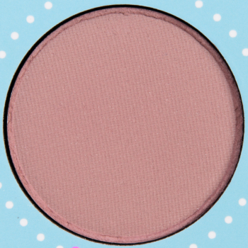
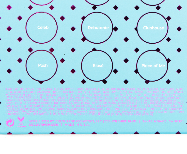
Swatches: ColourPop Fame Palette

ColourPop Fame Pressed Powder Shadow Palette ($22.00 for 0.56 oz.) is a new 16-pan palette that is supposed to be a cool neutral palette (I’d say it’s neutral-to-cool but a few shades looked warm-toned to my eye, even if they were less warm-toned than the usual variations!). Here are swatches!
ColourPop Fame Palette


ColourPop Fame 16-Pan Eyeshadow Palette

ColourPop Fame 16-Pan Eyeshadow Palette

ColourPop Fame 16-Pan Eyeshadow Palette

ColourPop Fame 16-Pan Eyeshadow Palette

ColourPop Fame 16-Pan Eyeshadow Palette

ColourPop Fame 16-Pan Eyeshadow Palette
ColourPop Fame 16-Pan Eyeshadow Palette
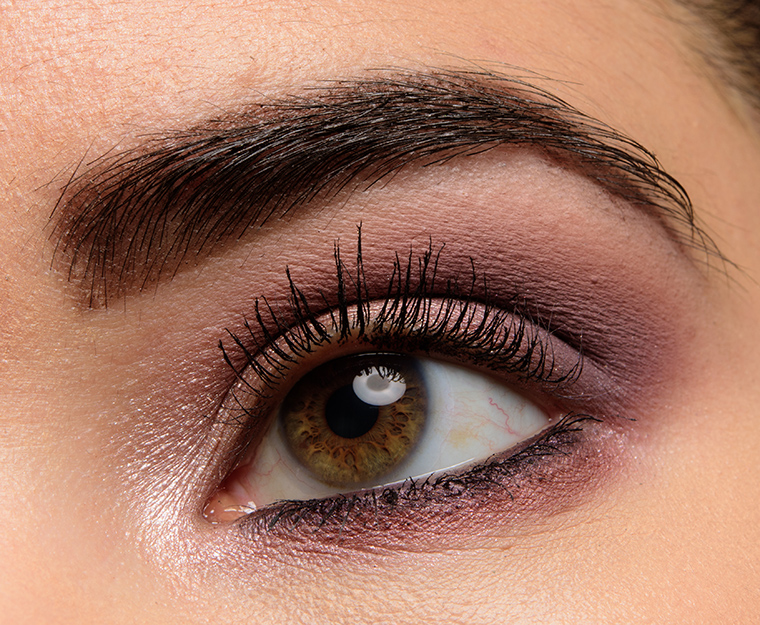
ColourPop Fame Palette | Look Details
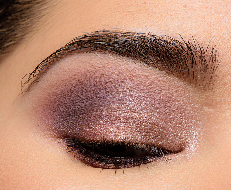
ColourPop Fame Palette | Look Details
Their first Cool toned palette and the swatches are not impressive. Why is it so hard for companies to get Cool tone palettes, right?
Also, Shayla palette excluded, all their very recent palettes are starting to look a like.
I think the problem is getting purple/pink pigments that are not an allergy problem for most people, as well as finding ones that are relatively stable (don’t fade quickly).
Thank you thank you thank you! This one looks good!!!
Blasé seems appropriately named. I like the looks of the others more than I anticipated I would. This is going on my “maybe” list.
Definitely neutral to cool… I guess it’s a start? There seems to be a lot of very light similar shades; may not be great for deeper skin tones.
My slightly warmer-toned skin might make them lean that way, but I was trying to look at the pans themselves, not just swatches, when I made that assessment. Shades like Extravaganza, The Most, Dazzle, and Privy… I just can’t see as anything but warm-toned? They are rosier instead of really strong peach/orange/yellow.
Definitely warm, but no so warm that I think someone with strong cool undertones like me might still be able to pull them as at least neutral.
Curious to see how it applies in practice!
I’m torn. Some of these are really pretty, but the first half looks very repetitive.
They all still look warm to me except for Celeb, Blasé, and maybe Piece of Me. But of course it’s not the super warm burnt orange and sunset colors of late.
Some color redundancy for sure, but I can already tell I’m going to get a lot of use out of this palette. Mine should arrive today!
Not real friendly for darker than medium skin tones, cooler than average (while not cool…I’d say more cool-friendly) and pretty one note. But it is my current note, so probably a yes. Since I am an old lady, think I’m allowed to opine that this is kind of an old lady palette. Nothing daring, not highly colorful, not too much glitter, on the muted side. Pretty inoffensive and zero drama. If I were younger, I’d find this fairly boring! (And I thought Backtalk was semi-old lady…).
I’m curious to see this on deeper skin tones!
Repetitive mid and light tones. Still, it’s a palette that straddles warm and cool which works very well for me. At this price point, I’d be tempted, but I think I can easily dupe. Will check out more thoroughly before I decide
This shade range is absolutely perfect for me! I definitely don’t need it, but if it rates at least a B+ (which it might not, given that there are some iffy swatches), then for only $22 I might just have to get it.
I definitely don’t need another neutral palette in my makeup collection at this point, but glad there’s a cool(ish) one! And a reasonably priced one, since it’s Colourpop.
I’d say that half of the shades run quite cool, the other half looks neutral to my eye. The eye look you did does appear solidly cool-toned. These shades look great with my eye color, with the exceptions of Blasé and Debutante. Same shades don’t do my overall coloring any favors, though. Not sure how I feel about this one.
I recently responded on ColourPop’s IG and on a YT that although this palette is cooler toned that most of the last 100 palettes released, it is still not completely cool toned. There are definitely some neutral/warmer toned shades. I think my biggest concern and why I responded is that they chose to do a very blah, boring and predictable “cool” toned palette. Most of these shades have little or no distinction between them being similar in tone and depth. There are many beautiful, more interesting cool toned shades out there, greens, blues, pinks, greys, etc. You get the picture. There also needs to be some distinction in depth and tone of shades. Finally, some of the swatches look iffy. I think I have dupes of pretty much all of these shades so an easy pass for me.
Well said!
Blasé and Piece of Me look a bit rough, but if they could be help by primer or used wet, this would make a nice basic neutral palette for fair skin. Half the shades do look like they lean warm.
Wow this looks really good! It’s a hard pass for me because it’s cool-toned, but it’s a pretty palette.
This is cooler toned that it appeared in promo photos, but still not really what I would call a cool toned palette. Oh well, I have no interest in palettes anyway. I hope that people who have been yearning for a cool toned palette enjoy this though. Hopefully, Colourpop is more creative with cool tones in the future!
This totally should of been a 12 pan palette. The swatches are alil iffy but its a no for my skintone anyway. Their next one should be full on cool tone and w/rich shades.
Cool toned does not mean wishy washy pinks, vanilla shades and a taupe or two. Not really impressed at all.
This was not the cool-toned palate I was looking for. Some of these are so warm, and so many look like dupes of each other. And some of the coolest shades have the worst swatches. Guess my money is saved.
The danger with cool toned eye shadows: if you over do it, you can look dead/tired/sunken. I am really appreciating the balance of neutral shades in this palette. They are definitely neutral-warm, but I think that is what you want in a transition shade. You want the pops of colour on your lids to do the talking – in cool tones. Your supporting colours definitely need to run neutral, and somewhat warm (I’d argue) to give ‘life’ to the area. As a super pale person – this palette is perfect for me. A few folks have said it already: the current orange-brown trend for transition shades … sigh. They look so pretty!! I want them to look nice. But I end up looking super muddy, no matter how soft a hand I use *cough* modern renaissance *cough*.
The real shame is releasing it ahead of summer. I feel like they could have gotten more traction in the fall. I am gearing up to update my stash with summer vibes… so I am really ho-humming about this purchase.
I look tired and sick in those warm, orangier and red shades while the cooler tones make my eyes pop.