Stila Little White Lies Collection for Spring 2019 (Updated with Stila Apology)


Release Date + Collection Info
Stila launches their magically transformative Little White Lies collection featuring a twist on their Liquid Eyeshadow and Heavenly Highlighters.
11/5 for Ulta Platinum members, 11/10 online, 12/26 in-store
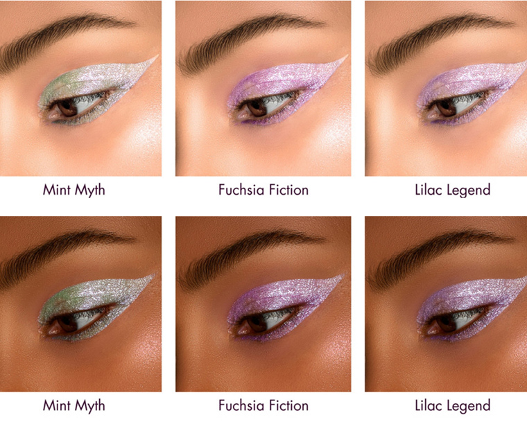
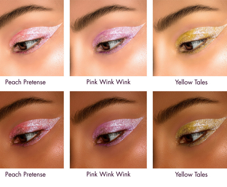
Editor’s note: In pulling and readying photos for the new launch, I noticed that the “swatches” of the products on the eye appear to be using the same model for both light and dark-skinned swatches. As the images were the same size, I had them in the same Photoshop document as two separate layers, and when I cropped and then toggled one image layer off to save the second image, I noticed that it appeared to be the exact same image except the skin tone (and other areas, like the whites of the eyes) had been drastically altered.
It’s bad enough that the actual “swatch” on the eye appears to be the same photo just digitally altered to change the color from photo to photo (which effectively nullifies the usefulness of the swatches to begin with) but not bothering to hire a second model? This is Stila. This is a brand that has been around for a long time and is sold in major retailers like Ulta and Sephora. Little White Lies Collection? Seems appropriately well-named. This is what we call pandering to diversity but really not understanding why diversity and representation is important from a big picture view but even down to the fact that products can look different on different skin tones. Just another day of doing the least to earn customers’ trust, I guess.
Update on 11/7/2018 at 7AM PST: Stila posted an apology on Twitter on November 6th around 10AM PST as well as Instagram. I’ve posted it below via embedded Tweets.
(1/3) We apologize that an unapproved image which was not reflective of the brand or collection was recently featured. It was a creative mistake and we acknowledge it was a mistake on our part and should not have happened. The final campaign did include two models – pic.twitter.com/TiPEDwRJqI
— stilacosmetics (@stilacosmetics) November 6, 2018
(2/3) images from photo shoot above – which is what should have been released. Over the next few days we will be sharing a full range of images from the campaign that truly reflect what we stand for. pic.twitter.com/dPtglkkV3U
— stilacosmetics (@stilacosmetics) November 6, 2018
(3/3) As a brand we support all ethnicities and skin tones to celebrate individual beauty and apologize if our creative was not representative as such. pic.twitter.com/RlfOMCi1WF
— stilacosmetics (@stilacosmetics) November 6, 2018
Products Available
Little White Lies Liquid Eyeshadow, $24.00
A shimmering white liquid eye shadow…with a secret. Stila’s magically transformative Little White Lies Liquid Eyeshadow begins in a veil of white then transforms into the prettiest of pastels that twinkle and glow. There are two sides to every story and it’s the same with Stila’s trickster, transformative technology. At first glance, the formula contains luminescent pearls that appear white. Each pearl has a colored fluorescent core, that when blended, transforms the appearance of the entire shimmering formula to its hidden core color. Like Stila’s other non-transfer, sparkling liquid eye shadows, this new formula has a refreshing feel, smooth color laydown, and skin conditioners for a comfortable feel.
- Fuchsia Fiction White to fuchsia twinkle
- Mint Myth White to mint twinkle
- Pink Wink Wink White to pink twinkle
- Yellow Tales White to yellow twinkle
- Lilac Legend White to lilac twinkle
- Peach Pretense White to peach twinkle
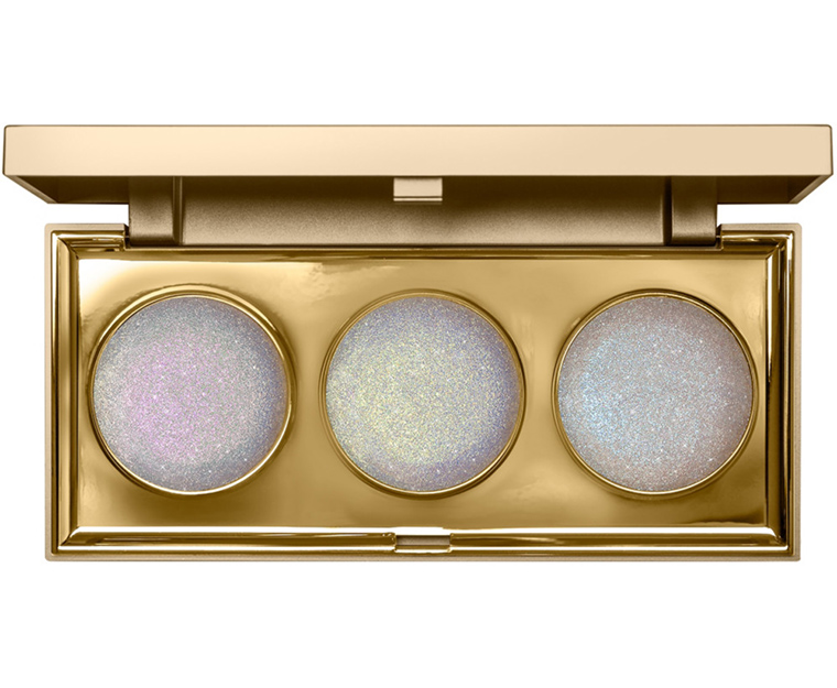
Little White Lies Heavenly Highlighting Palette, $45.00
Stila’s divine Little White Lies Heavenly Highlighting Palette with a twinkling trio of seemingly similar shades holds a secret. When applied, each shade magically transforms from white to varying pastel-bright…what a delight! Like Stila’s award-winning Heaven’s Hue Highlighter, the bouncy-to-the-touch hybrid cream/powder texture melts into skin for a lightweight, ethereal glow. The seemingly white base is actually translucent and each barely tinted pearl particle contains a colored luminescent core. When blended on skin, the pearl flips to its shimmering underlying color. The effect is three different multi-dimensional shades that glisten, gleam, sparkle and twinkle on skin as it catches the light…and that’s no lie!
- Pink Wink Wink White to pink twinkle
- Yellow Tales White to yellow twinkle
- Silver Tongue White to silver, multi-color twinkle
I was so stunned that they used this video of the swatches, too. The swatches of the highlighter palette in particular look so POINTLESS, and all of the swatches seem to pull at the model’s skin in a way that’s unattractive. Why not just shoot a second video?
Boy you are not kidding. This is horrible. How lazy just to photoshop the color on the same model. Of course we’ve seen this before but this is just wrong. You are right: these colors are going to look different on every skin tone. I hope people call them out on this. I know I’m going to send them an email!
Wow. Not only are they pandering, this seems totally gimmicky. It kinda looks like they took a powder “transforming” product and put it in liquid form. I’ll be curious to see what they’re like IRL, because obviously
Btw, I always appreciate your editorials. You don’t editorialize every product so when you do it’s much more meaningful.
Oops, hit post too soon. Oh well.
Wow, after reading you note. I can see exactly what you’re talking about. That’s really upsetting. I think I”ll be passing.
They even chose an original picture with a patchy spot by the eyelid.
Totally would have missed the lie of this campaign if you hadn’t pointed it out – thank you! This really isn’t right for anyone to do, and especially given the recent controversies of companies photoshopping lighter models darker (CP, Becca, etc.) instead of hiring dark-skinned models should have been MORE than enough to convince Stila not to take this (backwards, offensive) approach, beyond how unethical and ignorant this practice is in general. Won’t be getting any money from me 🙂
How do you know they didn’t use a darker-skinned model for the original, and actually lightened the second image…?
Good call, which is exactly what they reported/purported they did. I still think it’s computer generated. Who believes a word that any of them say? It’s all puffery, fluffery, for copy, and photoshop for images.
How stupid can you be? If it is a gimmick to justify the name of thise line it is a bad one. In times where everybody is talking about inclusiveness you don’t want this kind of situation.
I just purchased their Heavenly Hue highlight palette a week or so ago, and I love it. But it will probably be the last time I purchase from Stila. I would rather you not swatch on a darker skin model than to lie about it.
“Pandering to diversity” is so right. Thank you for calling them out!
They took the laziest route possible in their “effort” to appear inclusive. Very off-putting and just so L-A-Z-Y. I thoroughly detest the use of photoshop and the like for this purpose. I won’t even call it pandering, per se, as much as total lack of effort and/or willingness to pay 3 DIFFERENT models of light, medium, and dark skintones! This feels lazy and cheap to me.
Lazy and cheap is right! Photoshop is a tool, not a complete method of work.
I wish it were as simple as laziness. IMO at minimum, the error reflects the culture of their “creative” group, and possibly of the larger organization. Anyone working for the brand who thought this was acceptable – and in particular, anyone *who signed off* on the creative and thought this was acceptable – should be held accountable, and Stila needs to immediately address the mismatch between their organization’s stated values and what they’re actually doing. This is not only misleading, it’s a STUPID business move. Stila’s market includes people of many different backgrounds, and it is really dumb to pitch only to a particular section of the market. So it’s a double error: both ethically shady AF and disappointingly short-sighted.
Oh thats funny, before I read your comment on them using photoshop, I said “mm, thats not real.” And I switched between the two photos again and could tell that it was off. But now I look again and can see they just darkened the skintone. PASS. Thanx for your commentary.
This isn’t the first time they’ve done this! Its become such an obvious and blatant thing, and it infuriates me. Stila isn’t the only company guilty however. This is just as bad as using false eyelashes in a mascara ad. I wish there was some sort of department that regulated this sort of thing. If you can’t use fake food to advertise for your food product, why should you be able to use edited and enhanced photos to advertise for cosmetics?
Ah, but fake food is totally used. Food stylists use non-food product all the time. Frosting hasn’t been frosting in probably three decades! It has been known to be shaving cream…..
Why am I not shocked by this? LOL
I am sorry but fake eye lashes in an advertisement for mascara is not half as bad as this. In a mascara ad you know you are being tricked.
This is the brand pretending to be inclusive because they see it as a ‘trend’ in the beauty community. Inclusivenes is not a trend. It is the new reality. If the marketing department from Stila thought they could get away with just photoshopping a darker skin under their swatches, they are wrong. It’s not how it works anymore.
Upvote, ouineque! You’re right.
“For Spring 2019”???? Yeesh! I love seeing what’s coming up around the seasonal corner, so to speak, but could they not wait til we’re a bit closer to the season in question? I’m in Canada and we still have to get through winter so I wish companies would save all this “Spring” stuff for a while!
Yeah, and if you look at the two “models” for Yellow Tales, the actual skin tones are yellow-er than for the pink and purple shades, which makes it very obvious to me that the skin tones and swatches are all edited. They very clearly took one photo and just edited the colors on all of them, and the skin tones got toned with pink, purple, or yellow accidentally as well. So insulting, and I really don’t buy that Stila can’t afford to hire a second model to take a few measly photos when small indie brands do it all the time.
Makes you wonder what the original photo looked like, LOL.
/Christine drops mic.
GREAT post – I hope they see this and apologise to those who they hurt by this stupid, lazy marketing! Oi, shame on you, Stila! You’ve been around forever, and while all of these brands should know better, somehow it’s particularly grating to see this tone deaf nonsense from a brand that’s had at LEAST few decades to get it right – READ THE ROOM, Stila, because this was tacky as all get out. I used to use their products back in the 90s, haven’t in some years though. This makes me glad I haven’t, to be perfectly frank.
Wow, just wow…not good wow :-/ Great catch, Christine! I’m worndering if they are making up for their litte ‘shortcut’ in the still photos by using a woman of color for the videos. I’m sure I have dupes in my massive collection. I have several palettes with several transformer shades. I dropped my Kat Von D transformer palette in the toilet. I was sad but not sad enough to drop another $32 to replace iit. Sephora Pro Editorial palette 1 has them (top row) and I like them as well if not better.
I think both the videos say Ulta, rather than Stila, IIRC. Worked 10 hours, 2 jobs, so may not be right.
Oh enough. Stop making everything racial. The point comes across regardless. I am a women of color and I can see what the product would look on me JUST FINE.
As always, I welcome discussion and differing view points but please speak for yourself instead of trying to speak over others by negating the validity of my or anyone else’s thoughts on the subject matter. If you had simply said, “I am a woman of color and I can see what the product would look on me just fine, so this is sufficient for me,” you would be speaking for yourself and adding to the discussion rather than trying to stifle it as your actual comment aimed to do.
I feel like a big reason Christine’s blog is so useful is that she is a person of color and we can see what products look like on her with her consistent lighting and photography, and knowing what her skin color looks like (which is similar to mine). I often cannot tell what products will look like on me based on images used to market makeup, because they are so doctored. I am thankful when she takes the time to call out deceptive advertising practices, and think of her blog as a consumer-oriented blog as opposed to yet another public relations mouthpiece.
Judy, I hope you see this. In spite of my thoughts that Stila is lazy and deceptive with their advertising, I see the point that you were trying to make about EVERYTHING being made racial/blue wave these days. I don’t think the new collection looks very good at all, but get it if you like or want it. And, don’t be intimidated when you are put down for expressing your opinion about such product or the general political environment/trends. >:-(
Everyone is welcome to express their opinion so long as they do it in a way that fosters discussion instead of attempts to stop it, and readers are expected to follow the rules in our comment policy – the same standard that all users are held to. I let her comment go through in its original form but reminded her to adhere to our rules and where/how her original comment went against them (and how it could have improved).
They didn’t even bother to do actual swatches, they digitally replaced colors after one photo. So no, you couldn’t see how it would look just fine – you saw a lie. And if the product pulls one way or another based on skintone, you wouldn’t know.
Nice work, and thank you for pointing that out. I saw immediately that the model just seemed to be in the shade; from my perspective the swatch is also just duller on the darker toned picture. What sloppy work.
Sometimes I am not the most observant of viewers, which is funny because professionally I had to be, but I didn’t notice anything in the photos until I read your editorial, Christine. I then asked my daughter to look and see if she liked any of the shades and she immediately said, “Mom they used the same model and just changed her skin tone.” She is multi-racial so she is much more sensitive to these types of issues. Hence, our boycott of Tarte since their foundation debacle. I love the Stila Glitter and Glows and their liquid lip formula is one of the better ones for me. I won’t be purchasing from this collection but probably wouldn’t anyway as these appear to be very white based. Stila will feel this shortcut!!
This hits you like a 2×4 between the eyes, when you see twelve of the same eye in two different skin tones. I would not be surprised at all that the ‘model’ was not a real person at all…simply a computer generation. How about some REAL Stila people, from all races, genders, ages, and job descriptions? In trying to keep the photos uniform, they have succeeded in creating totally ersatz imagery and offending EVERYONE. To try to say something positive, if any current brand were able to create this product satisfactorily, Stila would be it. But for 2019, they shot themselves in the foot with photoshop.
You noticed it too, KJH! It doesn’t even look to be an actual human model, but a computer generated “person”. Her face has a strange flatness to it. Nothing about it looks real at all. It’s a cyborg, or the like, I’m thinking.
Does anyone find the idea of a white-to-irridecent shift idea a little redundant? Immediately when I saw these, I thought of KVD’s Alchemist palette, which achieves this very effect (powder eyeshadows appear white in the pan and shift green, blue, pink, and purple, respectively). UD attempted the look with their Distortion palette, albeit to a lesser degree. I love Stila’s Shimmer and Glow liquid formula, but the white-to-color shift just seems a little “been there, done that.”
P.S. I’m not trying to side-step the diversity issue, which is super significant and should be addressed. Just noticed the color situation and wanted to comment.
Not to mention that this has been around since the late 70s or early eighties. I remember that some readers confessed to having that old Dior quad…..from when they were linear., not square..that had only this type of shade. Guess I’m all set!
I have a Max Factor quad from around 1987, LOL! What’s really funny is the collection was actually called… “White Lies” (there were lipsticks, as well, and I think nail polish)…
It was immediately obvious to me that it was the same model. I’m glad you pointed this out and spoke out against it. Good for you.
What the hell, Stila?
I’m so thankful you call this kind of stuff out! How insulting to the customer :/
So not impressed with Stila over this one – what a shambles, and the brand really thought no-one would notice their deceptive practices. Not good enough Stila.
Thank you Christine for bringing this to our attention.
They seem to me that both were digitally generated so there is no real model here behind these pics?
I’m with you. That way they have to pay no one. It’s computer generated, not a real person.
Right? Bad decision on their part! Trying to save on the models (of any color) they are in the middle of a PR disaster. Oh well, I am sure they will learn some lesson blah blah /s
I didn’t even thought of that! That seems very plausible
Thank you Christine for pointing this out. Stila should know better. Use real models with real skin, of all colours. It’s past time to do that for all brands.
Also, on another note (and based on the above): this might be considered inaccurate or misleading representation/illustration imo.
Pandering? It makes you wonder WHO signs off on these ad campaigns ? It seems like something an intern would catch.
Obviously there is a huge markup in makeup(why all the celebrities see it as a money grab.
I don’t think it’s racist but definitely racially insensitive tho something marketing executives would be watching for?
Good call Christine. They seem to make a lot of catalogs utilitarian nowadays but I don’t find it visually appealing.
Janine,
But these are “unapproved” images! ::eye roll::
Even the apology is a half-effort.
Holly_guess they are going with the white lie theme huh?
In a market that is so jam-packed full of brands clamouring for the consumer dollar, why give people a reason to boycott you? Anyway, those fake swatches just look yucky.
It’s so sad that they don’t perceive what their marketing errors can do to their reputation.
As a Polynesian/Latina woman of color, I will be passing on principal alone…
That is really disappointing! As a woman of colour, I’m actually kind of offended as it seems that stila couldn’t be bothered to use a different model to showcase how the swatches would actually show up on deeper skin tones. This will be a definite pass for me, and I may actually boycott stila products because of this.
*sigh* I’ll be passing. I was turned off when I realized they eyeshadows were digitally changed, but I didn’t immediately catch that both “models” were the same. That is so lazy. How hard is it to hire 3 models and do different eyeshadow swatches?
Funny that they called this “Little White Lies”…seems more like big, glaring lies to me! It was immediately obvious that they used not just the same model, but the same exact photo for all skin tones, just tweaking the colors in Photoshop. That’s so insulting to the consumer!
Besides the lousy marketing job, I think these are all unflattering and ugly.
Thank you Christine for pointing this out. This is a racist practice, pure and simple. Do I not deserve to see make up modelled on my skin tone. Just shows how people of colour continue to be devalued.
Oh my. I looked at the pictures before I read and though so many things were wrong with them. It’s totally obvious they not only used the same shot of all the swatches and digitally changed the colour, but the model had their skin altered to look darker (or lighter). The brows are a dead giveaway.
very disapointing
Thank you so much for bringing up the issue of brands not hiring WOC to swatch their products. It drives me crazy when it’s obviously a white woman who’s just been darkened up a bit. Pat McGrath consistently has diverse models for her product swatches and it make me more inclined to purchase her products.
It’s insulting that brands keep doing this and keep thinking they can get away with it. Thank you for calling them out on this Christine and feel free to be even more blunt about it!
Am I the only one seeing that the arm in those swatch videos is completely fake?
Soooo, digital blackface. Real classy Stila. Hard pass. On everything and anything they sell now.
I think they are saying that they used a black model for both images, and that one version was lightened. The white model got dropped, I believe.
I’m a day late but Stila posted an apology and explanation on their instagram. Allegedly they did shoot two separate models but for some reason instead of releasing the images of both(which the eyeshadows were still digitally recolored for each image so…still bad)someone decided to photoshop their model with a deep skin tone white, which just as bad as if it had indeed been the reverse. Yikes.
This supposed apology makes Stila appear mismanaged, incompetent and they think the women and men who love makeup are stupid.
Why would an employee at Stila go through the trouble of digitally darkening a model’s skin tone? Just for kicks? But somehow, those same pictures are reviewed and approved for release in a marketing campaign.
Now that they got caught, Stila is saying, “oops, how did those get in there?”
Stuff like this happens when you have no one of color in senior positions at your company. Whoever approved the first batch of photos either didn’t notice or noticed, didn’t care and thought no one else would either. I can’t figure out which one is worse.
They can make excuses all they want: an unapproved image? Please. Do you know how many people have to sign off on marketing images before they go to print? I think they got busted and now they are back peddling. Still have no respect for them. Sorry.
As someone in the graphic design industry, I can vouch for that. It takes multiple people to approve. It just doesn’t appear by mistake.
The apology really seem like back pedaling when they saw this kind of thing wouldn’t fly with people.
The “apology” makes it worst. A “creative mistake?” A “unapproved image?” Stila just say “we wanted to seem like we were inclusive but didn’t want to spend the money to actually be inclusive and we didn’t think actually hiring a brown/black model would be important so we decided to do brown/black face via photoshop” and keep it moving.
Ok, I’m really confused, their new apology final shots with the black model appear to be the same as the ones before? It’s the white model who is changed? Did they photoshop a black model white then to get identical shots? What did they even do to arrive at tgis mess if the black model is the original one?
Brian’s comment above – they used the shots from the model with deep skin, and changed the skin to light.
Stila got caught, but I can only imagine how many cosmetics companies do this. And I’ll bet that they won’t stop either – they will just put more effort into covering/hiding it.
I so appreciate your editorials Christine, as well as the other readers’ comments. Thanks for a thoughtful morning read, and also Bye to Stila.
I can’t decide which was worse: this or Tarte using a dark skinned model to swatch the light shades of Shape Tape?!!!
If you aren’t sated enough by THIS photoshop foolishness, check out the swatches of the latest LC on Ulta. Not only is the skin tone totally manipulated, they used the overlays of the wrong products more than once. Look, you’ll see what I mean. If you want to dissect a disaster, that is it. I know Ms Christine will not be in the least surprised. And they expect us to believe in these images, and buy this crap.
I can’t explain how an “unapproved” image ended up actually getting used (I would think that only someone very senior and very well-versed in the process of creating campaigns would have the authority to hit the “launch” button)*, but I imagine that the start-to-finish process went something like this:
They created the final product, making sure that it looked good on a variety of skin tones using people’s real skin, but not models. Then the marketing/advertising people got to work and “mocked up” some images. Maybe someone** had the bright idea that they could do what it appeared they did yesterday, but I doubt that it passed muster. I’m sure Stila knew/realized that they needed to use a model who was a POC. They wouldn’t have been able to produce the “revised” photos overnight.
However, the digital age being what it is, the wrong file gets used or sent to whoever actually releases them, the contents don’t get questioned, and BOOM! You get what happened yesterday.
*Huge Stila fail. Someone at Stila dropped the ball, or perhaps their ad agency did see the images, but didn’t dare question the client, or both. I would fire whoever dropped the ball. But I’m harsh that way. That’s presumably why they make the big bucks, and it’s the only way to send the message that this is not OK.
**I wouldn’t be surprised if this was an intern or another low-level person, or a graphic designer just messing around. I would fire whoever created these layered images, but I’m harsh that way. It’s not OK to even THINK about doing this. Not in 2018, not ever.
I’m satisfied by their response and respect their answer. It’s interesting that actually the main model was darker skinned, and then they digitally lightened her skin to show how it would look on lighter skin tones. I had erroneously presumed it was the reverse.
You do know that the model is black? the skin change was to make the white model…
I don’t have anything Stila, just because (not anything against them, just haven’t seen anything unique that they do that I’d need or want). And I probably wouldn’t have given them a third or more look except your post, bravo! So many brand do this and it’s a pain for those of use with less color (as you don’t really see what the color will look like on you depending on which tone has the true photo with product, if any even are). Because in the case of the eyeshadow above if you’re darker skinned they’ll look almost true to swatch, but not if your lighter (at least that how it appears to me after the updated photo.)
That said the Vivid & Vibrant collection as two unique color sets (Sapphire & Jade) for my collection, so they may be my first Stila products. 😉
I like that they came right out and said they were wrong (though I’m not sure I believe it was an “unapproved” release).
Typical reaction: public backlash followed by a public acknowledgement of the mistake. Sorry but the “creative mistake” is part of the same type of BS excuses like “My words were taken out of context”. Those who supervised the “creative process” for these products and gave the final approval stamp for the release of the advertising images were not blind. And we as consumers are not stupid.
OH MAN. As an art director and designer, the terms “CREATIVE MISTAKE” makes me cringe. It is SO often k that everything gets blamed on the creative team whenever there’s a snafu, and it makes my blood boil. This is not a creative mistake, what a cop-out.
I’ll never buy from Stila again.
I noticed that too, it’s unfortunate that they couldn’t just say that they, as a company, messed up and leave it at that. No, they had to throw someone under the bus to still make it seem like it’s not the company, but just rogue elements within the company. A chain is only as strong as its weakest link but that weak link is still part of the chain.
Spring 2019?? I’m still getting my cart ready for Christmas
This all looks alike. Stila used to be great.
Oh no. This is such a drag. Stila makes my favorite eyeliner and I like quite a bit of their other stuff too, but photoshopping a white model dark to feign inclusivity is totally unacceptable and something I would feel obligated to boycott over. I understand why they wouldn’t want to admit it if the model was completely computer generated, rather than a white woman in digital blackface–it would be an admission that all the swatches were complete lies–but it would at least be less racist. Anyone know of any word from Stila specifically addressing whether a real model was used for the template?
It’s interesting to me that everyone assumed the original photo included a light-skinned model whose skin was darkened, when the apology tweet shows that it was the exact opposite—*only* a model of color was used, and her pictures were lightened for the ad.
I didn’t make any such assumption, because it didn’t actually make a difference – regardless of whether someone was lightened or darkened, both are misleading and miss the point of why diversity and representation are important.
little white lies! Meeting and exceeding their name!