Sneak Peek: Natasha Denona Darya / Citrus Diamond & Blush Palettes Photos & Swatches

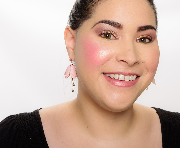
Natasha Denona Darya Diamond & Blush Palette ($89.00 for 1.50 oz.) is a pinker, cooler combination and is new for spring and includes a cream highlighter, cream blush, three powder highlighters, and one powder blush. They are designed to be layered but can also be worn alone.
Darya Diamond & Blush Palette


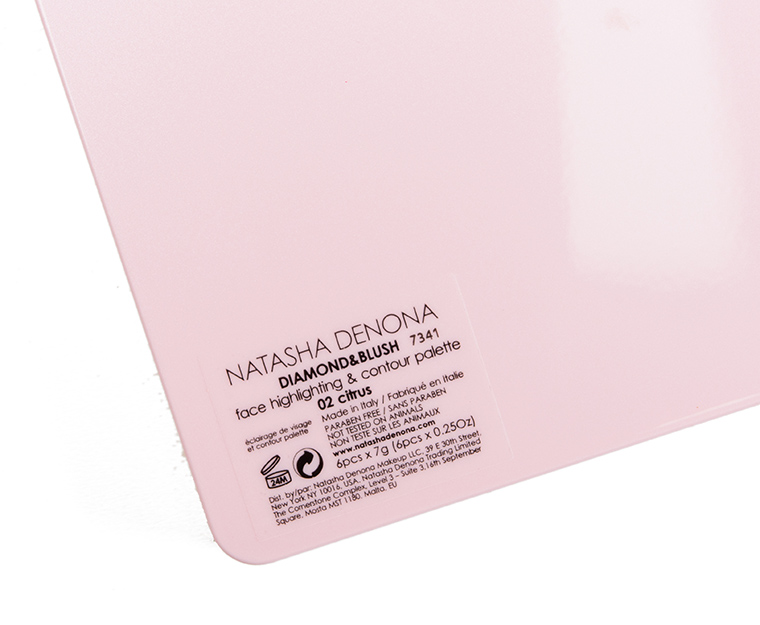
Natasha Denona Citrus Diamond & Blush Palette ($89.00 for 1.50 oz.) is a warmer, more golden/coral color combination and is new for spring and includes a cream highlighter, cream blush, three powder highlighters, and one powder blush. They are designed to be layered but can also be worn alone.
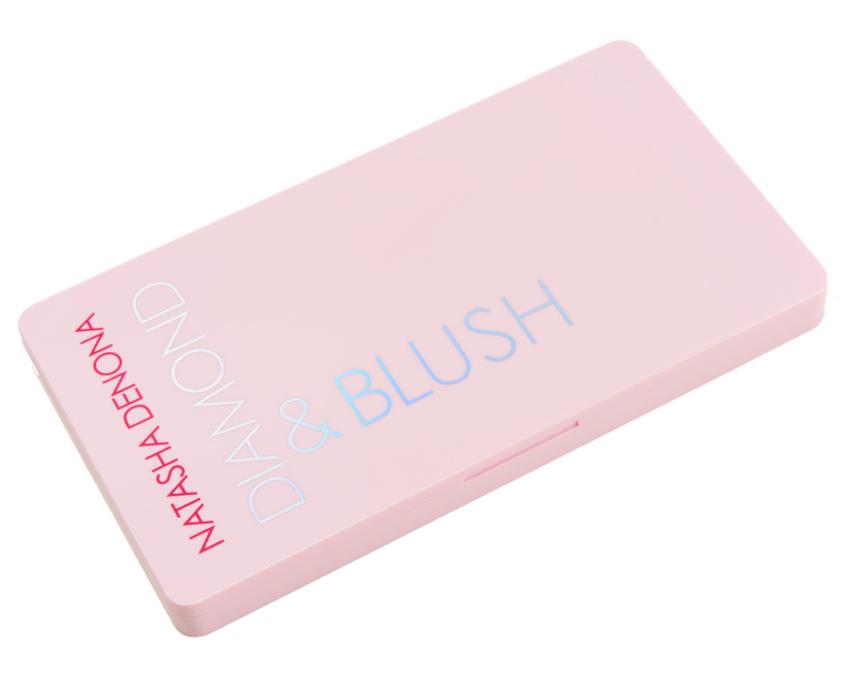
Citrus Diamond & Blush Palette


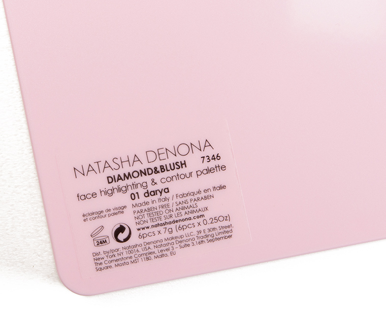
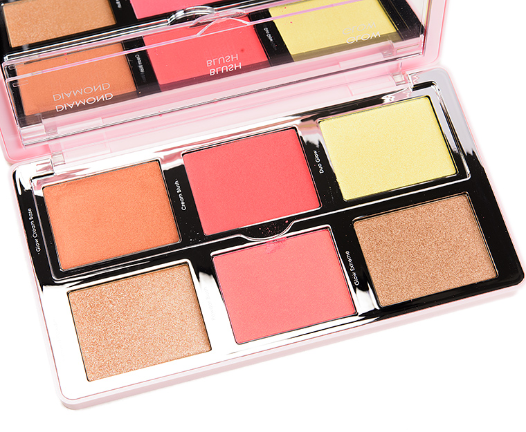
Natasha Denona Darya Diamond & Blush Palette

Natasha Denona Darya Diamond & Blush Palette

Natasha Denona Darya Diamond & Blush Palette
Natasha Denona Darya Diamond & Blush Palette
Natasha Denona Darya Diamond & Blush Palette
Natasha Denona Citrus Diamond & Blush Palette
Natasha Denona Citrus Diamond & Blush Palette
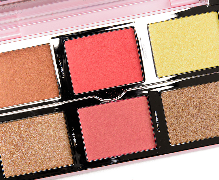
Natasha Denona Citrus Diamond & Blush Palette
Natasha Denona Citrus Diamond & Blush Palette
Natasha Denona Citrus Diamond & Blush Palette
Natasha Denona Citrus Diamond & Blush Palette
Aaaaaaccck!!! Oh no!! I like everything here!!! Need Pink Champagne! And you look SO glowy! Bye bye money!!! Are these LE or permanent?
They seem new but not LE!
I really like the colors here (save for the yellow-green…) but that price point is harsh and cream formula inclusion is always a deal breaker for me. Oh well- I certainly didn’t need another cheek palette anyway!
Hmm…I wish she would have instead made these customizable as opposed to both being painfully one note wonders. Like, for instance; I’d LOVE a palette less samey-ness than either one of these.
Concur!
So true. Would have been nice to maybe combine pinks and corals into one instead of getting just ONE giant pink pan of stuff.
I’m on the fence about the Darya palette. It’s so tempting and I love the colors but I’m not crazy about the cream products. Can’t wait to see your review. I may consider purchasing!
PS – what lip product are you wearing? It’s gorgeous on you. Love the color
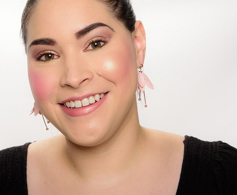
Estee Lauder Naked Truth Pure Color Envy Lipstick, Stila Enchantress Glitter & Glow Eyeshadow.
The cream products are so kind to the skin. Much less texture and so so young and so spring!
Why?! i want cream version of this , please <='~
This kit is so beautiful just so expensive. Looking forward to hearing your thoughts!
I wonder what skin tone would suit the yellow/lemon shade? The inclusion of a cream blushes with powders would put me off and you would have to like/use the majority of them to make it cost effective. A very expensive palette.
The yellow/lemon shade would suit my skintone. I have pale yellow skin (cream) that’s both too light and too yellow for most foundations, and cool yellows (bordering on green) actually work pretty well for me.
Thanks Alecto – I wasn’t sure whether Natasha Denoma was putting in that shade for fun or because there were seriously those who would use this shade and it works for their complexion.
Well, if your original instinct was that it was for fun, I’d say you were probably right. While that kind of color works perfectly for me, I feel like I’d have to be in the minority. 🙂 It was probably meant as an edgy, nonstandard option, like the purple in the pink palette.
I have a soft yellow pearl pigment that I use for a highlighter, and it leaves a very beautiful soft glow (think Marilyn Monroe). There is also a shimmer version by Ben Nye of the famous banana powder, and both of these capture light without looking icy or too cool. Under the eyes or on the high points of the face, it’s quite lovely. I imagine many skin tones can pull it off if blended correctly, my skin tone is a warm golden brown.
Thanks Ashley – It’s good to know that ND is including this shade because it suits many complexions that I wasn’t aware of. I hope this works for you.
For whatever it is worth, I wear lime green duochrome in my lipstick, highlight, and eyeshadow quite often when I am wearing a lot of bring spring warm colors. I also wear aqua duochrome in my lipsticks, highlighter, eyeshadow, etc and it works- but only if carefully coordinated with what is being worn, haircolor, face makeup, etc.
Colors like that if managed correctly look stunning on the right people. But on others it looks crazy, esp if it is not coordinated with the entire visual picture that other people see when they see us. We tend to look in a mirror and think only of a certain spot, but others see us as the entire visual effect.
Thanks for the swatches! I just saw a review on You Tube of these that made me remove the Citrus palette from my Sephora cart. The blush wasn’t pigmented or long lasting and the yellow highlight looked straight up green on her dark complexion. I have a Natasha Denona coral blush duo palette that is pretty to look at but has poor color payoff. I’m curious to see how these wear on you Christine.
I don’t need either of these, so I’m not getting either, but the coral one seems a lot more interesting (is it me, or does the pinker one contain its own dupes?). If I were in the market for this type of palette, I’d be turned off by the one powder product behind the shield for the creams. What’s the point? If I have to lift the shield to use the powder product, the powder is going to get into the creams. Why not make the third product in that row a cream? Confusing.
Actually, now that I look again, the coral one is equally internally dupe-y, it just has better colors (for me).
I love the Natasha Denona blushes I have, and have been on a ND kick lately, so I think Darya at least is going to come home with me. I’m obsessed with the yellow-green in Citrus, but don’t quite know how it would work on someone as pale as I am.
I purchased both of these!I couldn’t resist after her teasing them on Instagram and the full unveil demonstration on a model in her Instagram stories. On 1 half of the models face she used Darya and the other half Citrus. They looked stunning on the skin in the video. I just posted them on my Instagram and I am planning on using one tomorrow!I think both palettes would on anyone with a medium skin tone.
I don’t really understand the point of these palettes. Maybe for artists or people who really like to layer their cheek products? But for me, having the same shade of blush in a cream and a powder formula is a waste of palette space – and money. The same is true for the highlights, being so close in tone. And these diamond powders look like they contain huge chunks of glitter. Really not for me.
I feel exactly the same, the concept just doesn’t appeal to me. I believe this is $115CAD…for similar shades that I can layer? No thanks. I’m not a fan of creams in general, let alone combined in a palette with powders. This whole thing is just a giant no for me.
I do love cream blush – some of my favorite blushes are in cream or liquid formulas. But mixed with powders of the exact same shade in a palette, why?
I layer cream and powder blushes, but I don’t pick exactly the same color in each — what’s the point of that? Variation looks more natural, more like real skin. I like the idea behind these palettes, but not the execution.
When I reached “a certain age,” cream blush seemed more flattering than powder but since it is age related, there doesn’t seem to be any point to having the two formulas in the same palette.
The Darya palette is absolutely stunning! The Citrus palette is pretty, too, though the Golden Peach shade looks a bit iffy. I’m really liking the Yellow-Green Duo Glow. It’s really pretty and unique. I’ll have to try to dupe it.
Omg the Pink-Champagne Duo Glow reminds me of MACs Stark Naked!!!! Too bad it’s a cream and not a powder 🙁
Well, I’m just not a big fan of highlighters (in particular in a palette). And though I do like Natasha Denona products overall, I’ll easily pass this up in wait for the next bomb palette (I didn’t even get Lila [yet 😉 ]) because I have purples and there are too many browns in it for me.
One perspective on this palette though, I would have preferred singles or duos. I like a couple in each one, and neither do I care for in its entirety.
I was tempted, but glad to have held off. I think both palettes are lovey. My preference of the two would be darya, but 2 of the shades look like they are practically duped in the same palette. A little more variation betwee them would have tipped me over to the buy side.
I think I’m done with sparkly blushes, I don’t have visible pores/texture on my cheeks until I use sparkly blush. I paid extra for wayne goss holiday brush, because it doesn’t pick up any sparkles in my already existing blushes.
A pass for me. Way too much shine/strobing. The model who debuted the collection look like she had coloured plastic on her cheeks. I’d prefer an all cream or all powder palette of varying finishes.
Im eyeing the citrus one since it seems my skin tone friendly and Darya just has TOO much pink. Little variety for that hefty price would have been nice. Maybe even some customization.
These shades are stunning, but I have no idea if I’d get any use out of some of them!